
Fine line roman numerals are everywhere online right now, but what posts well and what lasts are not the same thing. Fading, blowout, and placement pain are the three practical headaches people bring into consultations most often. This list focuses on reference ideas that balance visual impact and longevity, with what to ask your artist at the stencil stage so the piece reads clean long after the touch-up window.
1. Fine Line Roman Numerals on the Inner Forearm
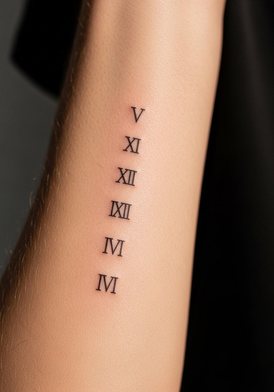
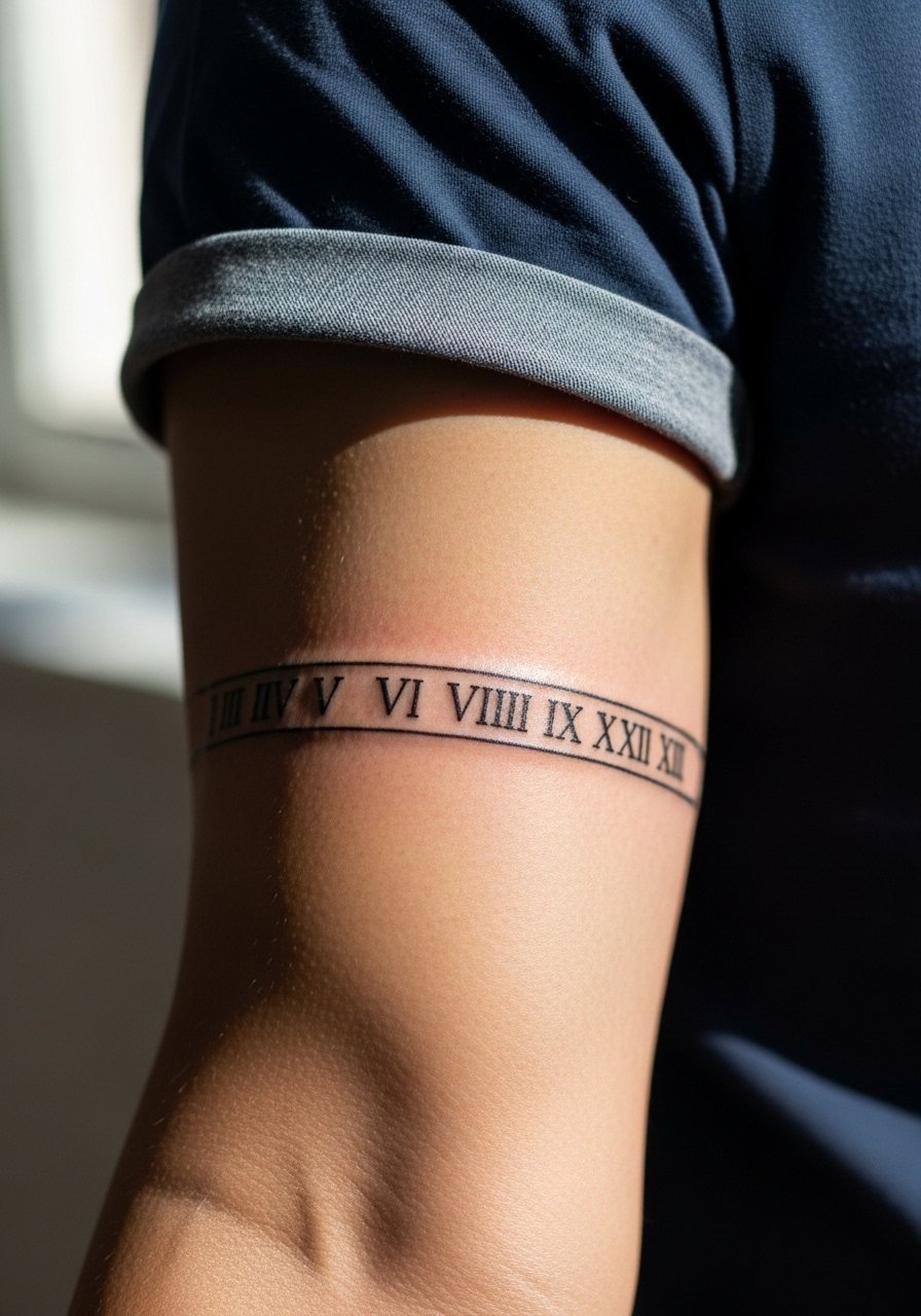
I've seen this placement on people who want something readable but discreet, and the inner forearm shows date numerals cleanly for years if you size them right. Tell your artist you want a slightly heavier line weight than the needle's finest because too-fine strokes blur into a gray line by year three. Expect mild pain and a single short session. Common mistake is asking for numerals that are too small and tightly spaced. For showing it off, roll up sleeves and wear a loose linen button-down so the forearm is visible without stretching the skin during the session.
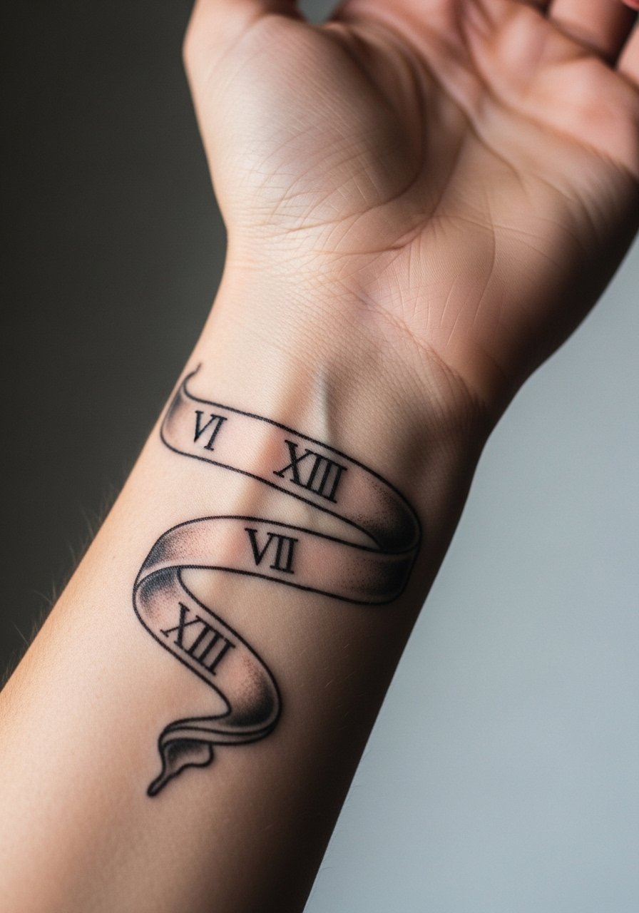
2. Small Wrist Numerals in Micro Script
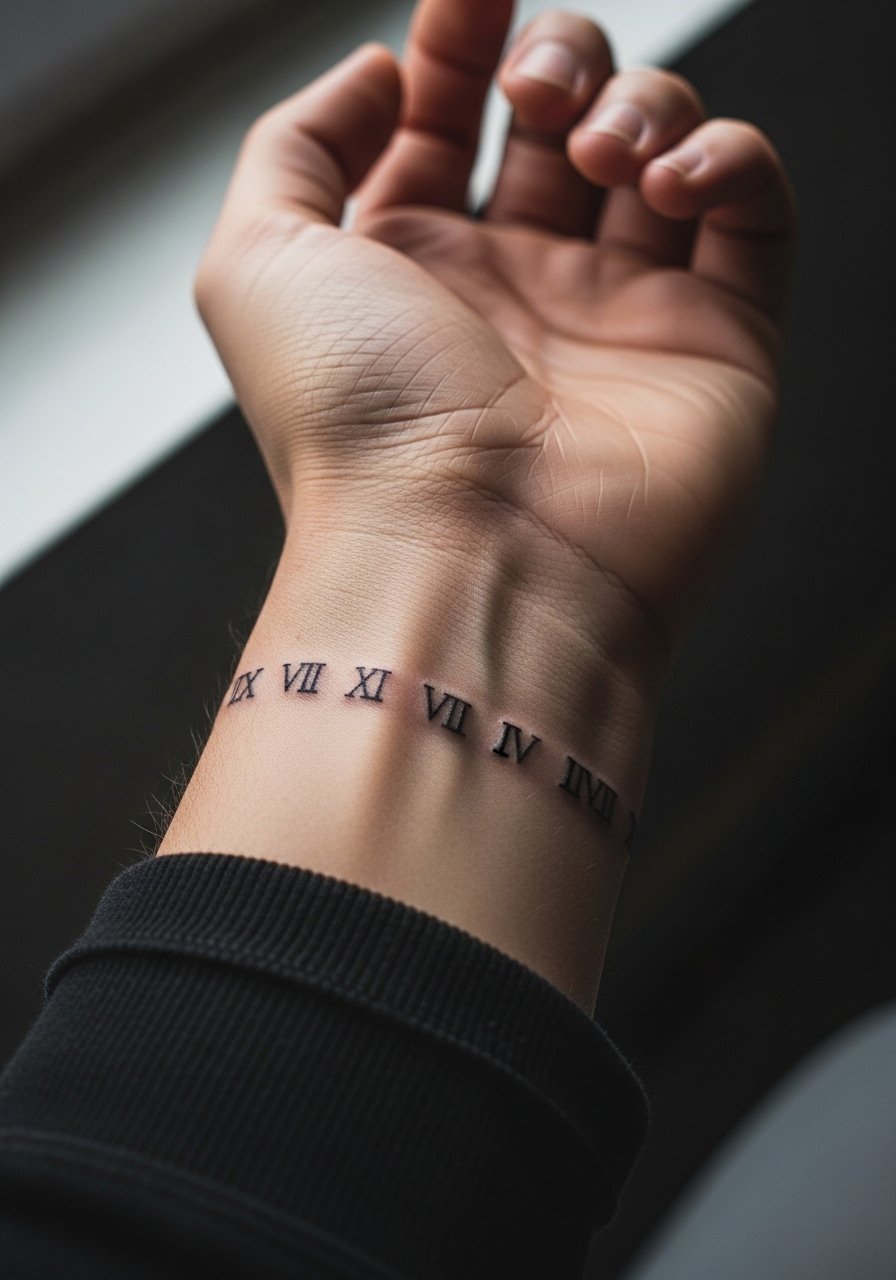
Fair warning, the wrist sees a lot of friction from bracelets, watches, and constant washing. I recommend slightly bolder numerals than you think you need so the digits remain legible at two years. During consultation, ask for shallow but deliberate depth and for spacing between numerals to avoid merging. Touch-ups are common around year two for wrist placements. Style-wise, pair the piece with a thin chain bracelet that does not rub directly on the tattoo while it heals.
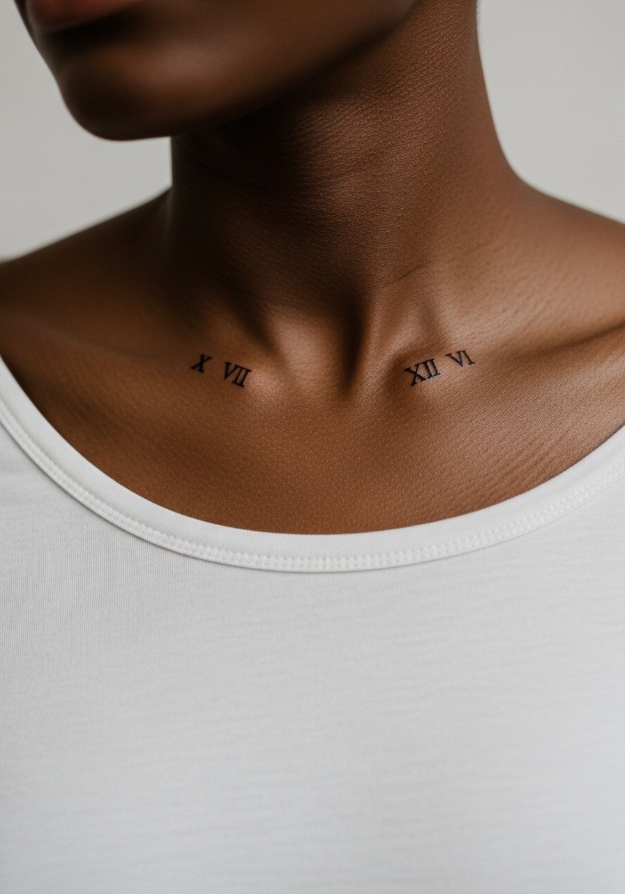
3. Roman Numeral Collarbone Strip
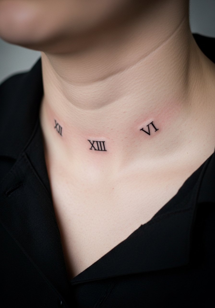
There's something satisfying about numerals that follow the collarbone line, but the skin there moves when you breathe which can nudge ink during healing. When you sit in for this piece, wear a wide-neck shirt you can pull aside. Ask your artist to map the numerals on standing and then again lying down so the placement reads correctly both ways. The biggest mistake is centering the stencil by feel alone. Expect a moderate pain level and a quick session. Over time the numerals keep contrast well if the artist uses confident linework.
4. Tiny Finger Numerals Along the Side
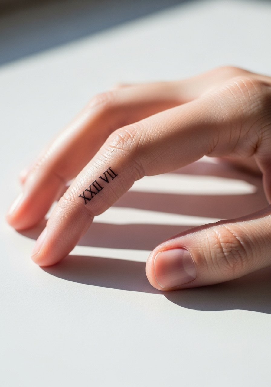
Finger work is divisive. One camp points out that fingers blur and fade quickly because the skin renews rapidly and sees constant abrasion. The other camp says that careful placement on the lateral finger with touch-ups keeps numerals readable. The truth is you should expect fading and plan for a touch-up within a year. If you still want this, ask for spacing between characters and accept that the first session may need follow-up. For showing it off, a minimalist stacking ring set keeps attention on the finger but avoid rings that sit right over the ink while healing. Also consider career implications before committing.
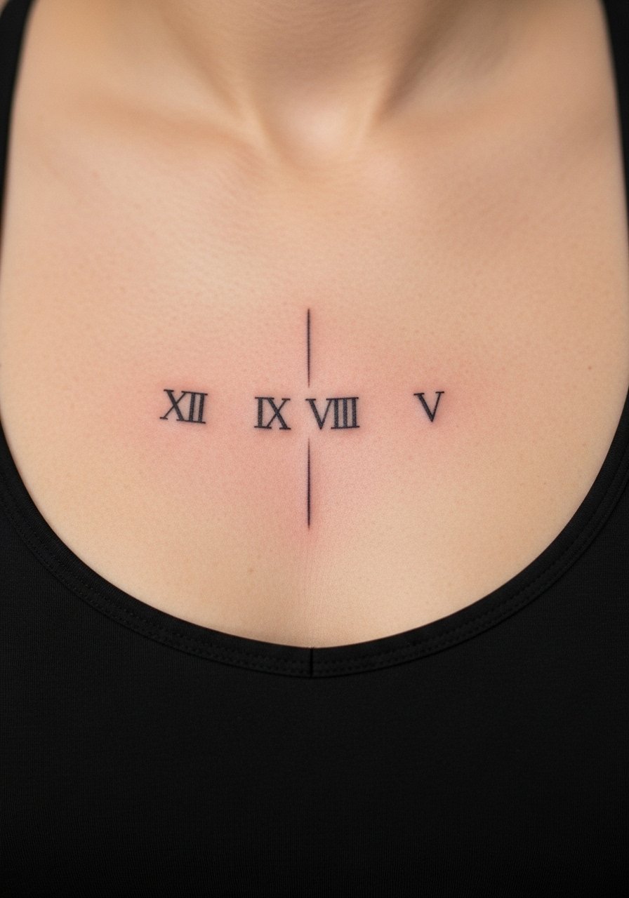
5. Vertical Sternum Numerals Under a Bandeau
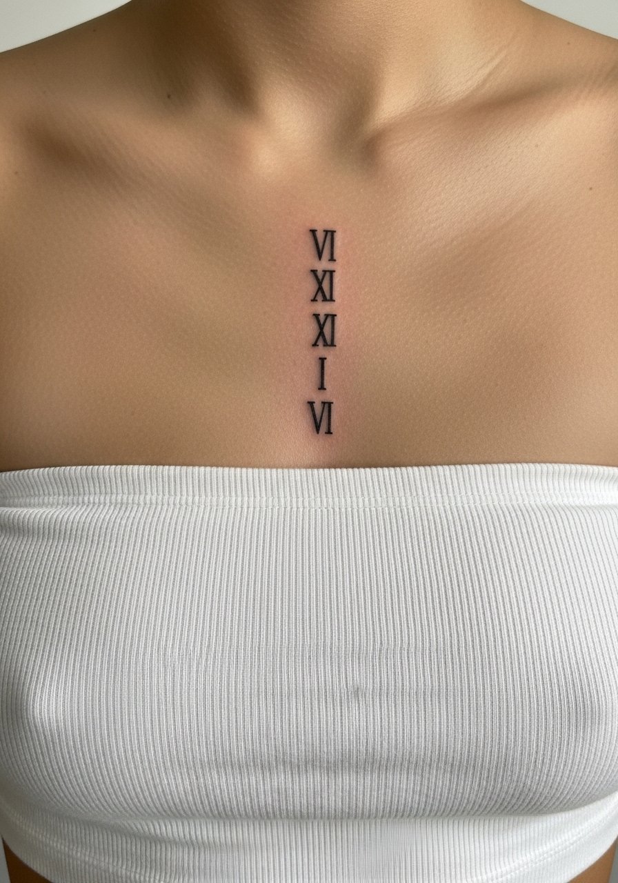
The sternum is a sensitive spot and session comfort matters. For the session wear a strapless or bandeau top so the artist has clean access. I recommend slightly increased spacing and mid-weight linework. The common mistake is compressing too many numerals into a narrow vertical column which creates a greyed, unreadable block after a few years. Pain is higher here and sessions run longer than wrist work. If you want a cleaner long-term result, avoid ultra-fine scripts and ask about touch-up willingness upfront.
6. Bold Blackwork Roman Numerals Across the Upper Back
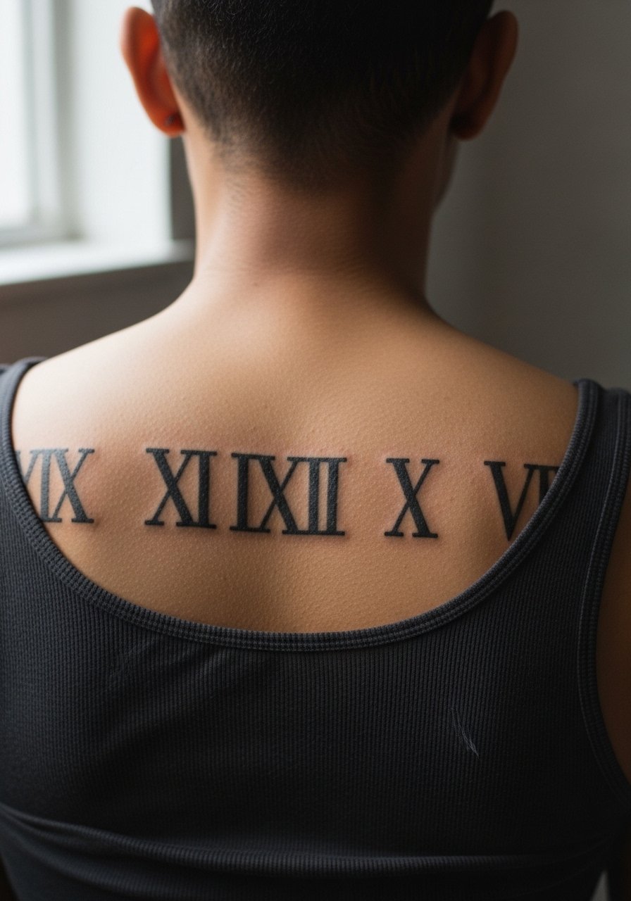
Visual impact is immediate with bold numerals across the upper back, and this style ages well because saturation holds. For the session, a tank top you can lift slightly keeps access neat. Tell the artist you want full saturation rather than hairline strokes. The biggest mistake is choosing a font meant for paper that reads too thin on textured skin. Expect moderate pain, longer session time, and less need for early touch-ups compared with fine line placements.
Studio Day Picks
The wrist, sternum, and upper back pieces above need different prep and a few small items smooth out the session and the first week.
-
Stencil transfer paper kit. Lets you preview the numerals on skin and confirm spacing for narrow placements like sternum and finger work.
-
Topical numbing cream. Applied as directed before shoulder or sternum sessions eases the first thirty to sixty minutes of the appointment.
-
Thin protective film roll. Useful for wrist and finger pieces that will see friction from daily tasks during the first few days.
-
Fragrance-free gentle body wash. Cleanses healing areas without irritating thin linework on forearms.
-
Aquaphor healing ointment. A thin layer in the early window helps protect fine numerals from drying out and scabbing too thickly.
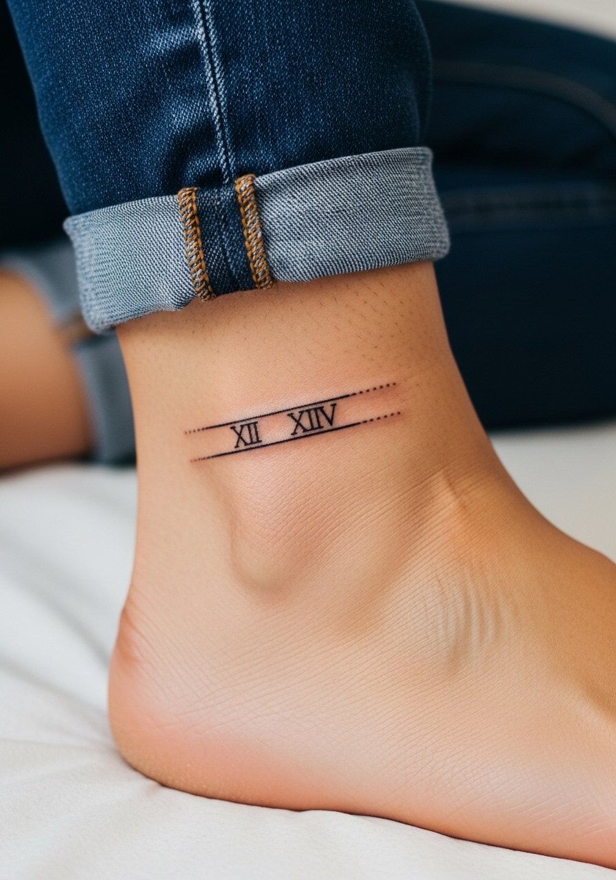
7. Roman Numeral Anklet Tattoo Above the Ankle
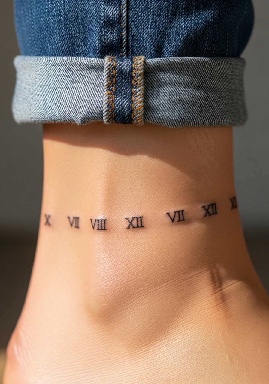
A neat number encircling the ankle reads like jewelry and shows well with low shoes. The ankle sees shoe friction and swelling, so plan for a slightly thicker line weight than on the forearm. For the session wear rolled-up jeans or low-cut sandals so the artist can work without fabric rubbing the skin. A common mistake is placing numerals too close to the bone where blowout risk increases. Expect a short session but know touch-ups are likely within two years.
8. Roman Numeral Ribcage Curve Under a Cropped Top
Aging reality matters on ribs. One camp argues small, fine-line numerals blur quickly because the skin there flexes with breathing. The other camp contends that with correct needle depth and spacing, numerals can remain crisp. I suggest moderate line weight and extra spacing between characters. For the session wear a cropped top so the artist can access without exposing other areas. Pain is high and sessions can be interrupted for breaks. Plan on a possible touch-up and allow extra healing time given friction from clothing.
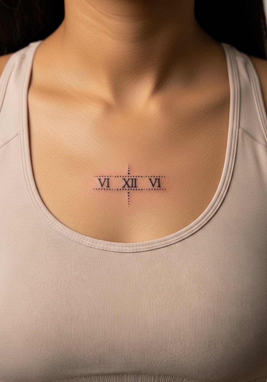
9. Minimalist Sternum Date with Negative Space
Most people underestimate how movement affects sternum pieces. I recommend generous negative space so the numerals do not read crowded as the skin settles. Tell the artist you want spacing proportionate to chest width and that you prefer a mid-weight stroke rather than hairline detail. Session pain is significant and watch the array of shirt choices for post-session comfort. For showing it off, an open-back dress or a thin chain pendant necklace frames the area without covering the numerals.
10. Wrist Wrap Numerals in Scripted Serif
Consultation matters here. Ask to see the stencil wrapped around your wrist while your hand is relaxed and then while making a fist so the numerals read consistently. The main mistake is ignoring how the wrist bulges and compresses when active. Expect light to moderate pain and a short appointment. Over time the central digits can soften, so plan a touch-up at one to two years. Pair with a minimalist racerback tank for casual days that show the wrist without crowding it.
11. Inner Bicep Roman Numeral Block
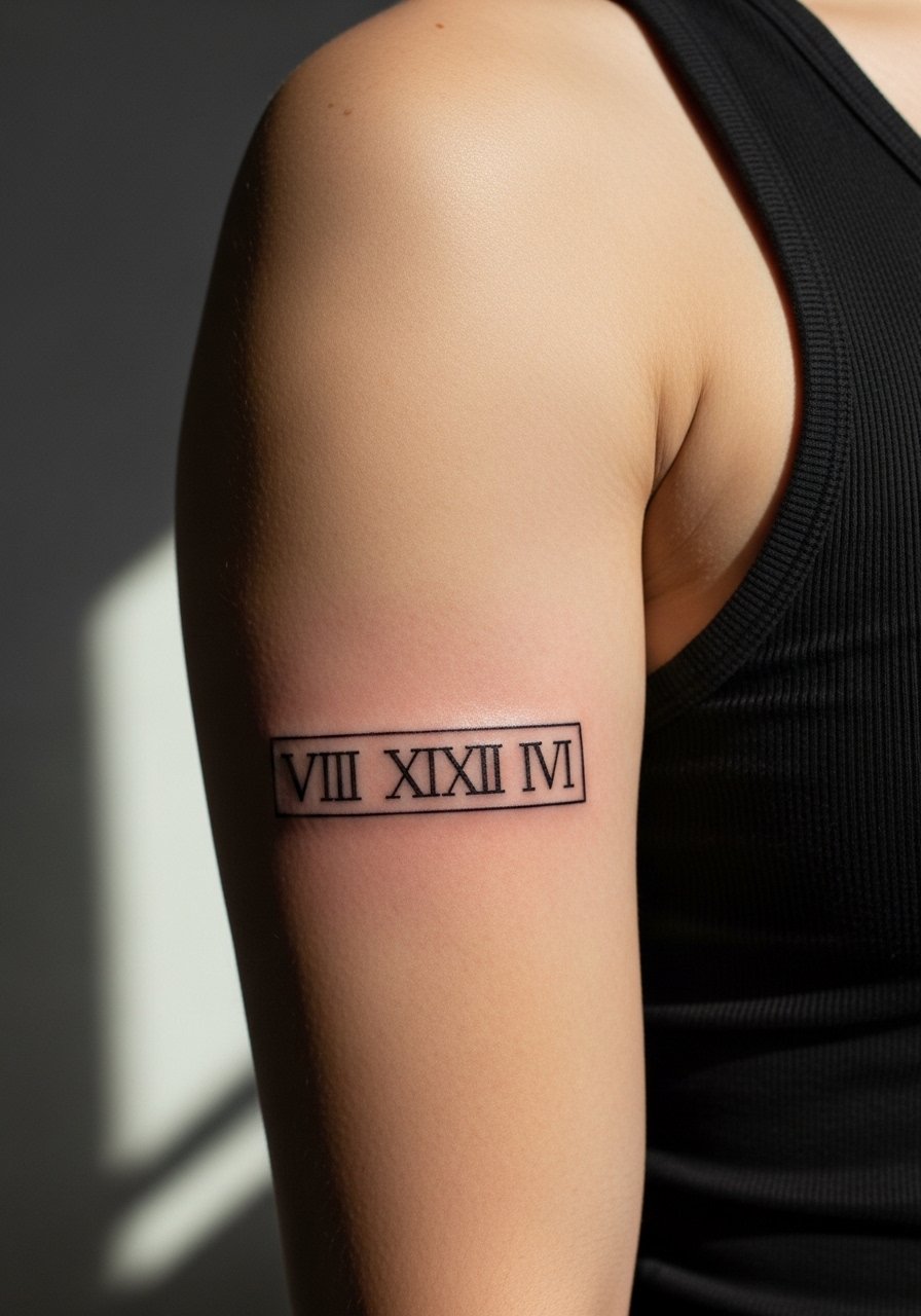
The inner bicep is forgiving for slightly denser numerals and holds linework well if not placed too close to the armpit crease. Pain is moderate and sessions are comfortable if you wear a sleeveless top. Tell your artist you want the stencil placed while your arm is relaxed and then checked again with the arm slightly flexed. The common mistake is letting a design creep too close to the crease which accelerates blur and touch-ups. For showing it off, a sleeveless linen top keeps the area visible without stretching the skin.
12. Roman Numeral Spine Stack
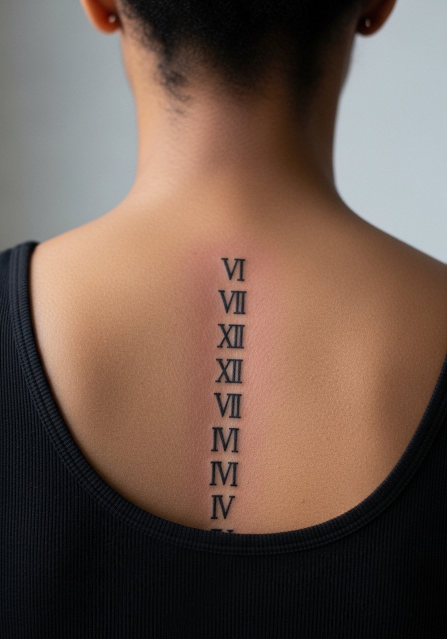
Vertical spine work has a strong visual line and ages well because the skin there moves less than the ribs. Session time can be longer because the area is tight and requires careful positioning. The main consultation tip is to check the numerals while standing and while slightly bending to ensure legibility. Beware of clothing that rubs the spine in the first week. A low-back dress or an open-back top highlights the numerals once healed and keeps pressure off during recovery.
13. Ankle Side Numerals Near the Achilles
This placement can look like an anklet without encircling the whole limb. The skin near the Achilles is thin and prone to blowout if the artist goes too deep. In the consultation ask for a slightly lighter hand and for the stencil to be checked against how shoes will sit. Pain is minor but aftercare is crucial because shoe straps can irritate the area during the first week. Pair with low-top shoes and consider a no-show sock during healing to avoid rubbing.
14. Chest-Centered Roman Numeral Line Between the Pectorals
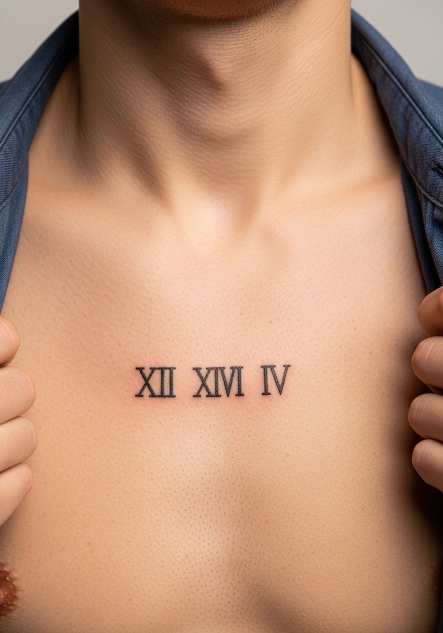
Center-chest numerals make a bold statement and age reasonably if placed on the firmer part of the chest. The main mistake is placing the digits too low where stretching with movement softens the lines. Ask the artist to place the stencil while standing upright and then while lifting arms to check visual balance. Sessions here can be moderately painful and require a shirt you can easily adjust. For showing it off, a loose button-down shirt left open frames the stripe without pressing into the skin.
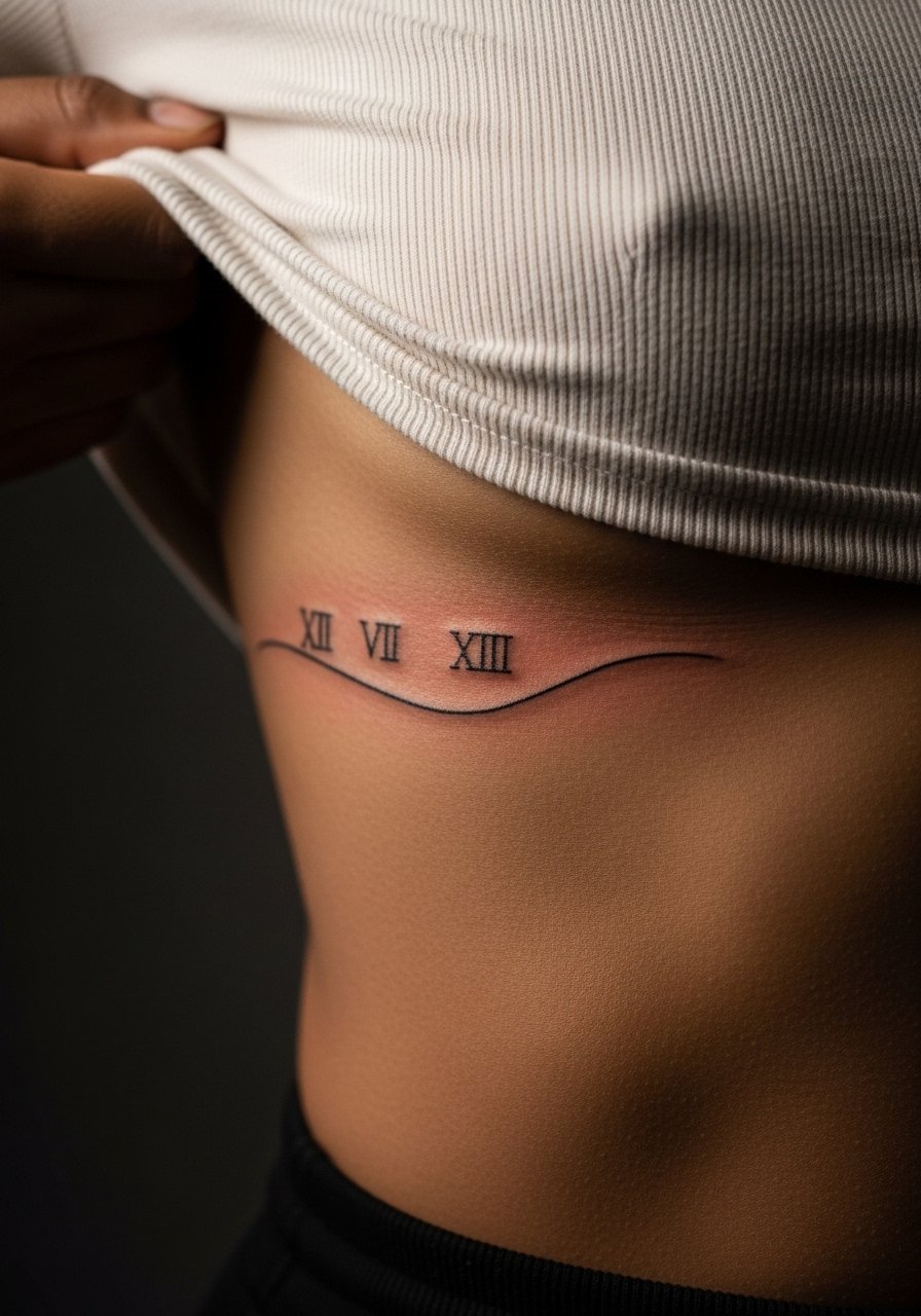
15. Rib-to-Hip Roman Numeral Sweep
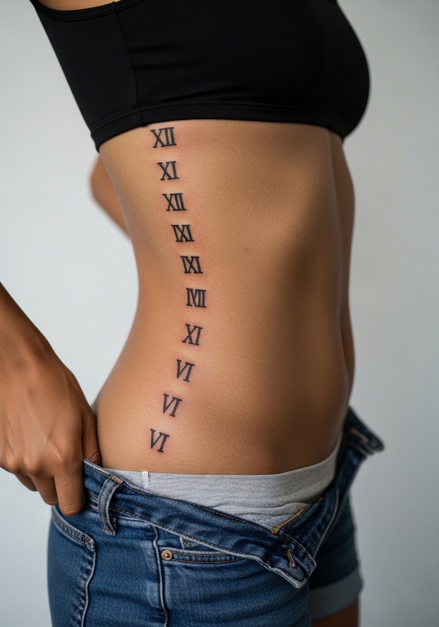
Long, curved numerals along the torso look elegant but the area flexes with movement and clothing. One common mistake is running the numerals too close together which results in a grey block after several years. If you want the sweep, insist on extra spacing and a mid-weight stroke. Sessions can be long and the pain is significant. For the appointment, wear high-waisted bottoms you can shift slightly and a crop top so the artist only needs to expose the target area.
16. Tiny Behind-the-Ear Roman Numerals Below the Hairline
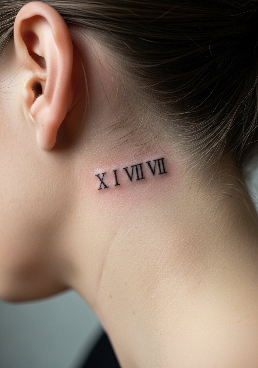
Behind-the-ear numerals are barely visible most of the time and that is their appeal. For safety and modesty the image shows the skin below the hairline with hair tucked back. The area can blur if ink is placed too close to cartilage, so ask for a shallow placement and a small, bold type rather than hairline strokes. Pain is low to moderate and sessions are short. Consider how often you will show this spot and whether you need extra touch-ups in a year.
17. Bicep Wrap in Classic Roman Typeface
The outer bicep is a forgiving canvas for a font-forward numeral piece. I advise asking for a font sample printed and pinned to the skin so spacing reads at actual scale. Mistakes happen when clients choose a condensed font that narrows on curved muscle and then blurs. Sessions are comfortable and touch-ups are uncommon if the artist uses steady linework. For casual wear, rolled sleeves or a short-sleeve linen shirt showcase the wrap without heavy compression.
18. Calf Roman Numerals in Vertical Block
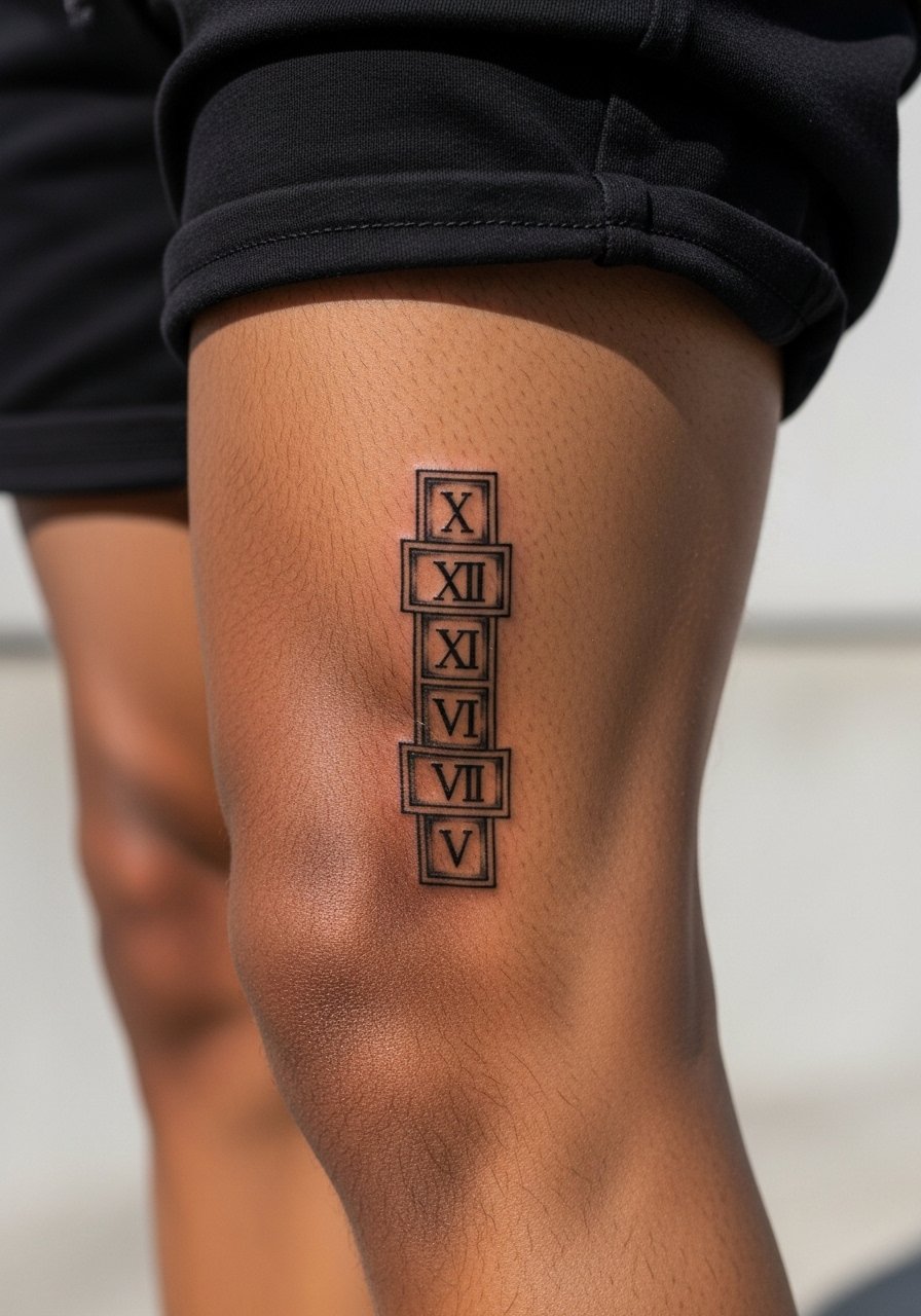
Calf pieces heal reliably because the area sees less constant friction than hands or wrists. A vertical block of numerals benefits from a slightly wider tracking between characters so the muscle curve does not compress the digits. If you plan running or daily tight leggings, mention that during the consult because fabric can rub the fresh ink. Session pain is low to moderate and touch-ups are rarely needed within the first two years.
19. Small Sternum Cluster with Roman Numerals and Dot Work
Combining numerals with dot work gives a textural frame that ages differently than pure linework. When you ask for dot accents, specify that dots should be spaced rather than clustered to avoid dense shading that can blur. Sternum work is sensitive and session times are longer. For showing it off, a fitted top with a gentle neckline keeps the piece visible and reduces fabric friction during healing.
20. Inner Wrist Roman Numeral with Tiny Accent Glyph
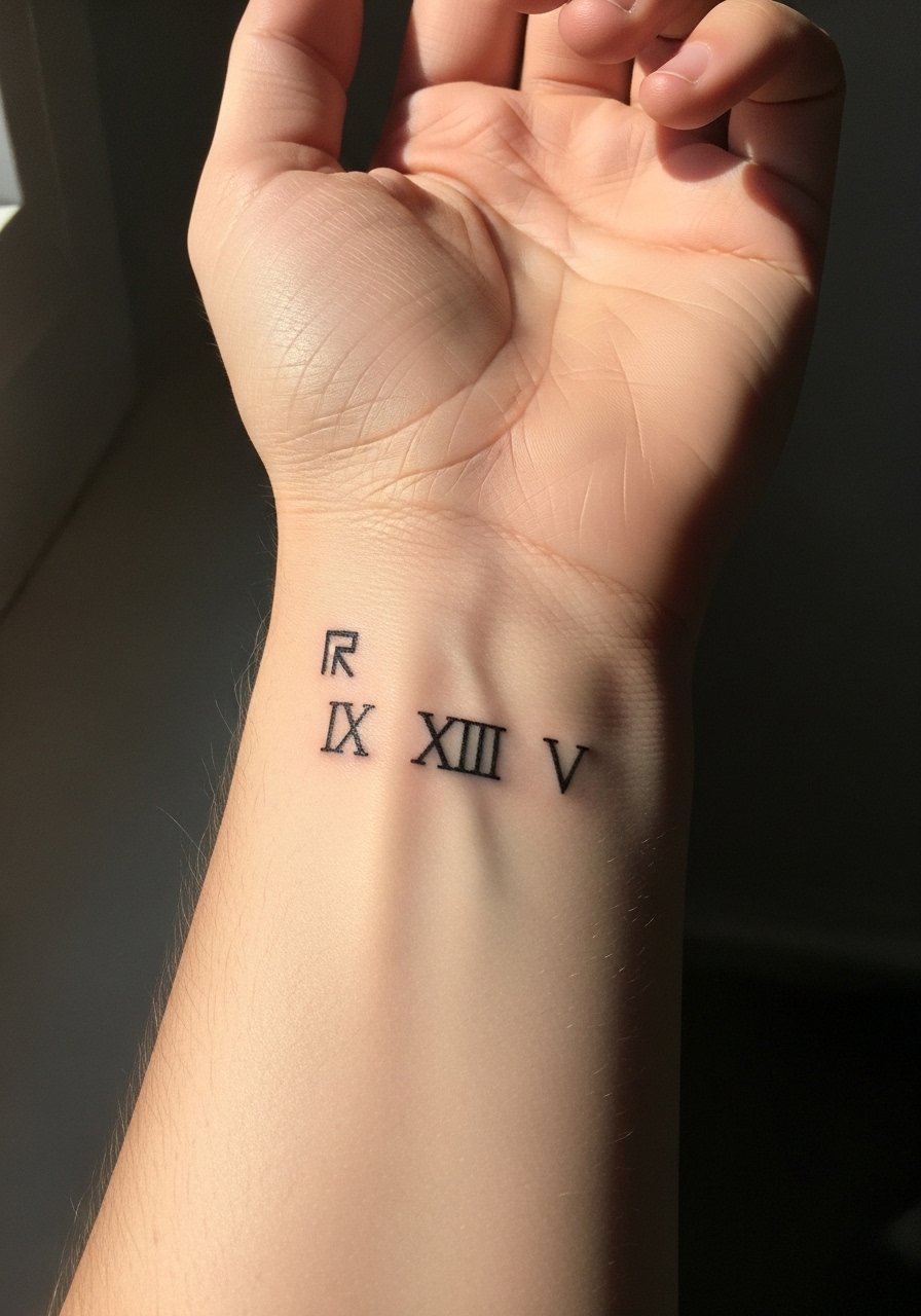
Most people do not realize that adding small glyphs beside wrist numerals increases the visual clutter and the chance of merge as the skin ages. The better approach is to add a single, slightly separated glyph and request extra spacing in the stencil. Pain is low and sessions short. For the session, wear a loose button-down shirt you can slide up over the arm. Expect touch-ups in the two-year window for fine details.
21. Petite Clavicle Numerals with Minimal Serif
The clavicle is a visible and elegant spot for short numerals, but the skin there moves subtly and can soften the edges over time. A minimal serif helps maintain character shape without hairline fragility. During the consult request proofing in both standing and reclining positions, and ask about a planned touch-up if the numerals are small. Sessions are quick and pain is light to moderate. For evenings out, an open-collar blouse showcases the piece without compressing it.
Frequently Asked Questions
Q: Will a fine line Roman numeral on my wrist blur faster than one on my forearm?
A: In my experience wrist numerals are more exposed to friction and hand washing which accelerates softening. Forearm placements have flatter skin and less constant abrasion so they often stay legible longer. If you want a wrist piece to last, ask for slightly bolder linework and expect a touch-up around year two.
Q: How small can Roman numerals be before they risk turning into a gray blur?
A: Small is relative to placement and skin texture. On fingers and ribs you need larger character spacing than on an outer bicep. As a rule, avoid hairline strokes for small numerals and ask your artist to test a slightly heavier weight of ink at stencil stage.
Q: Should I expect more pain for sternum and rib numerals than for forearm pieces?
A: Yes. Sternum and ribs are typically higher on the pain scale because the skin lies over bone and nerve endings. Forearms and calves tend to be more comfortable. Plan session length and breaks accordingly and wear session-ready clothing like a fitted sports bra or loose tank depending on placement.
Q: Is it worth getting touch-ups for Roman numerals or should I accept fading?
A: That depends on how important crisp legibility is to you. Some people like the softer, lived-in look. Others prefer to maintain sharp numerals and budget for a touch-up at year one or two. Discuss your maintenance tolerance during the consultation.
Q: Do hand and finger numerals affect job prospects more than other placements?
A: Hand and finger tattoos remain more visible and can still influence hiring in some fields. If career flexibility matters, consider placements that are easily covered by sleeves or jewelry and discuss concealment options before committing.