
Fine line is taking over saved boards and wrist stacks, but the gap between what looks great fresh and what holds up is wider than people think. Some of the designs that get the most likes the day you get inked need touch-ups sooner, while bolder matching pieces often age into a cleaner silhouette. Below are 27 arm-matching ideas that balance today’s trends with realistic aging so you can commit with fewer surprises.
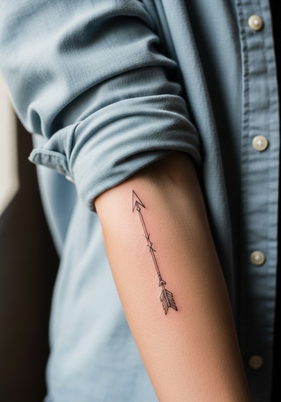
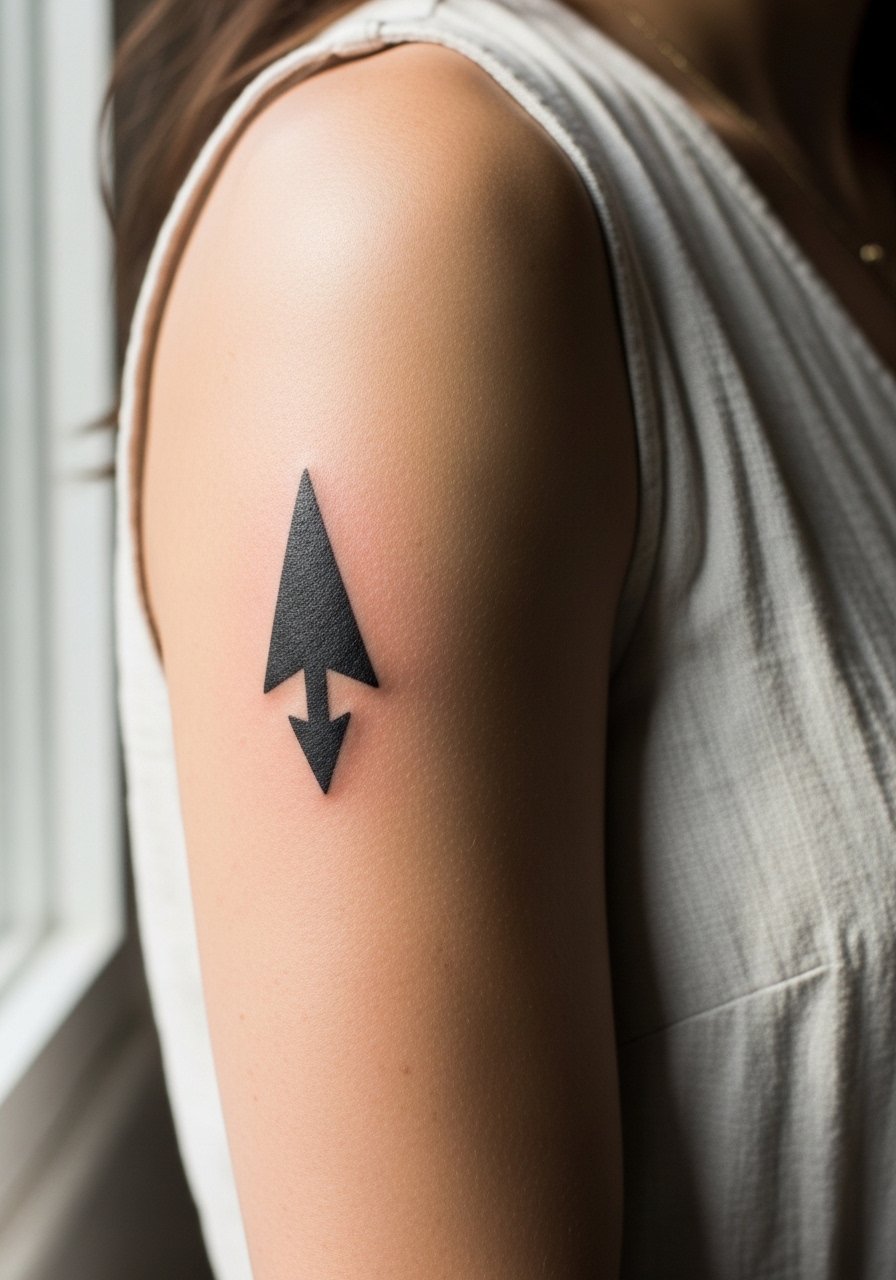
1. Fine Line Arrow on Inner Forearm
A paired fine line arrow on the inner forearm reads like a small promise between two people. Ask your artist for a slightly heavier shaft and an open tip so the lines do not merge over time. Fair warning, thin arrows placed too close together on small forearms can blur at year three. For the session, wear a loose button-down shirt that you can slide off the shoulder easily so the artist can work without tugging. Pain is low to moderate and touch-ups are common around year three for really skinny arrows.
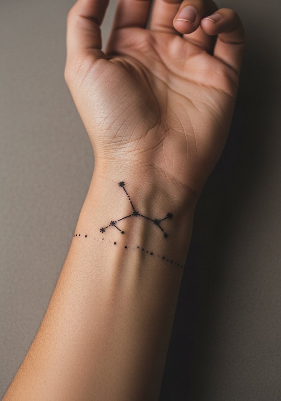
2. Tiny Constellation Wrap at the Wrist
Matching constellations that wrap a finger or wrist feel discreet and personal. The biggest mistake is asking for too many tiny stars in a tight cluster, which leads to early merging. Tell your artist to space the main stars and use slightly bolder dots for the points that should last. These heal well but take careful upkeep if you type a lot or wash hands frequently. Pair this with a thin chain bracelet to frame the piece without crowding it.
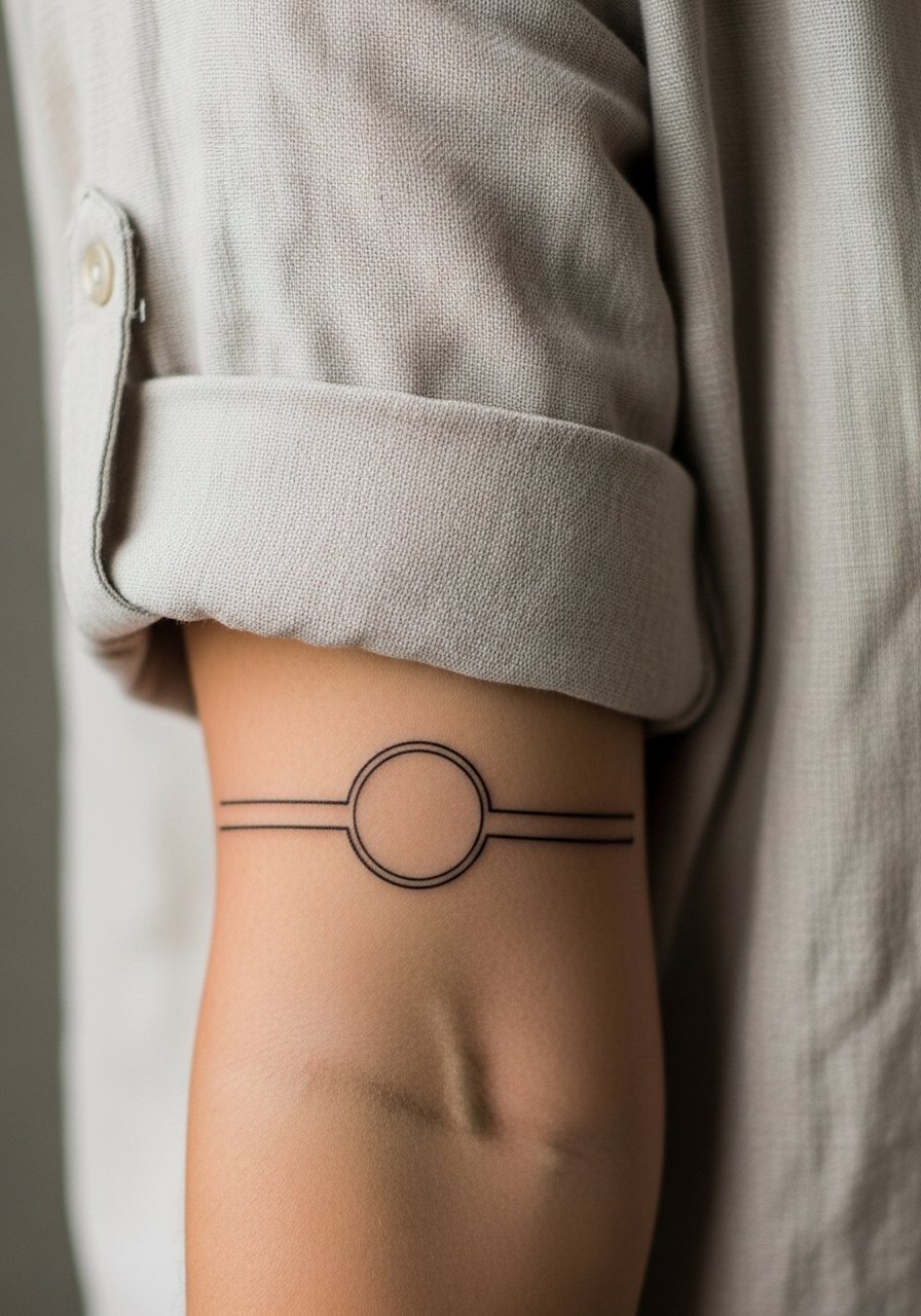
3. Matching Minimalist Band Around the Forearm
A thin band around the forearm is subtle and elegant when done as a matched pair. The session feels like light vibration and a steady hand. A common error is making the band too thin or placing it over a scar, which leads to patchy saturation. Request consistent lineweight and a trial stencil so both bands sit at the same height. For showing it off, rolled-up sleeves or a linen shirt cuff make the band visible without competing with other jewelry.
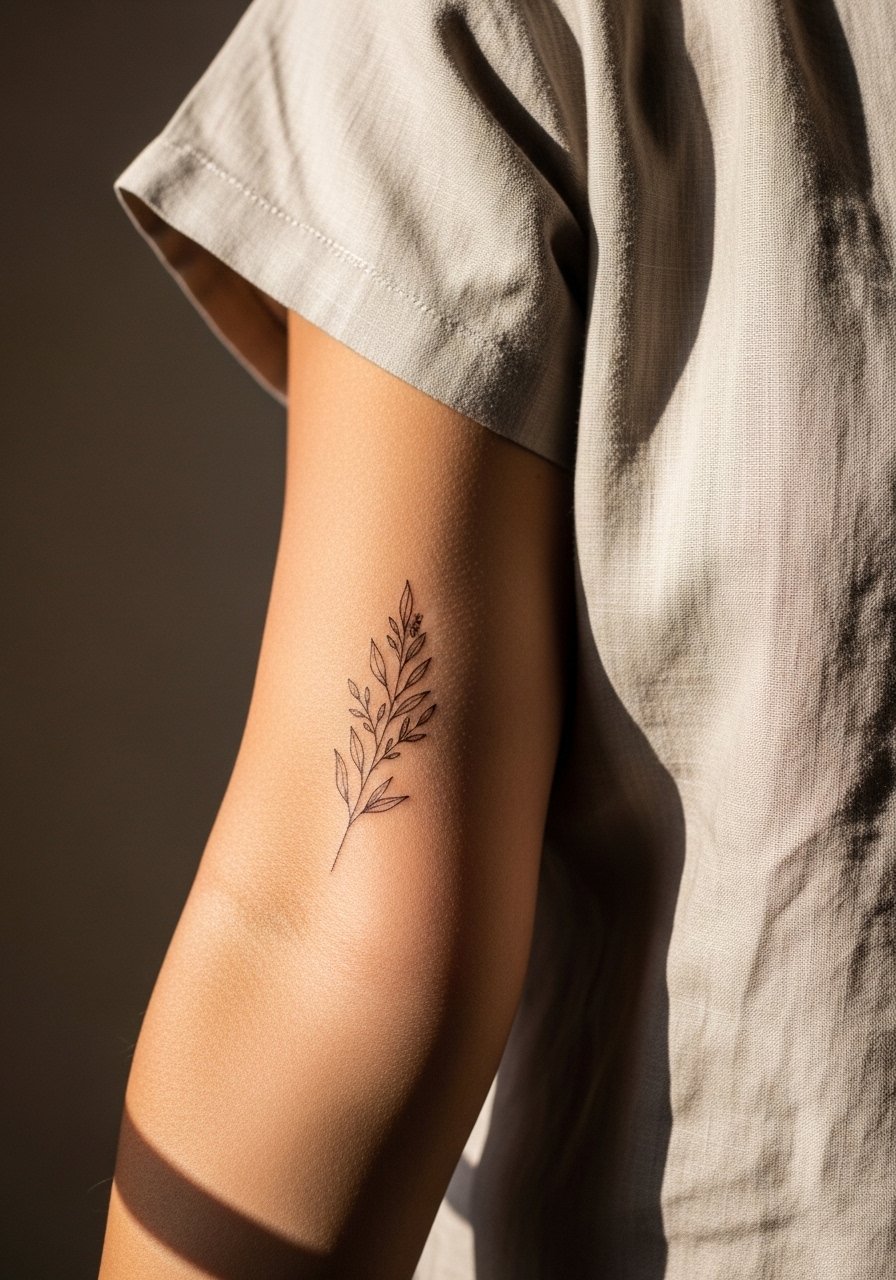
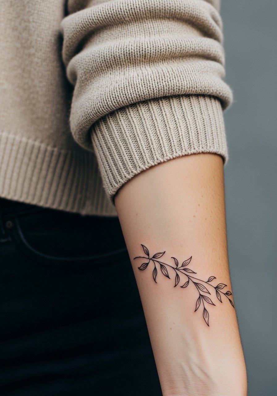
4. Botanical Sprig Along the Outer Forearm
Matching sprigs or single-stem botanicals running along the outer forearm read as delicate and wearable. Tell the artist you want negative space between leaves and avoid super-fine veins that will soften. The piece looks lovely at six months with crisp linework and subtle shading, and at two to five years the outline will soften depending on sun exposure. Pair this design with a rolled-up linen shirt or short-sleeve tops to let the art shine.
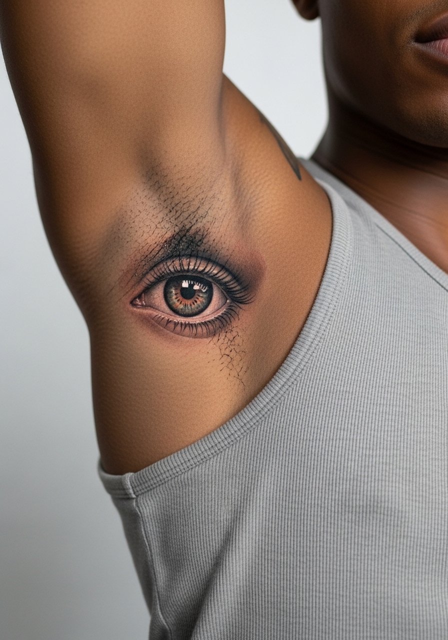
5. Micro-Realism Eye on the Inner Bicep
A pair of micro-realism eyes opposite each other on the inner biceps can feel like a private signal that surfaces when you want it to. This placement is moderate on pain and needs a raised-arm position during the session. Common mistakes include asking for hyper-detail too small for skin that stretches. Ask for slightly larger pupils and softer surrounding stipple shading to preserve the gaze as the skin ages. Wear a tank top to your appointment so the artist can access the inner arm without irritation.
6. Matching Script on the Side Wrist
Two matching single-word scripts on the side of the wrist read intimate and discreet. The biggest mistake is choosing very thin cursive that collapses under frequent hand motion. Ask for a modest stroke width and slightly increased kerning between letters. Expect touch-ups earlier than for bolder pieces because wrist skin moves constantly. For display, pair with a minimalist watch worn on the opposite wrist so the script gets attention without rubbing.
Studio Day Picks
Those inner bicep, wrist, and forearm matching pieces above need small prep items to make the session and the first week smoother.
-
Stencil transfer paper kit. Lets you preview placement precisely for matching scripts and bands before the needle touches skin.
-
Topical numbing cream. Applied as directed 45 minutes before a wrist or inner bicep session to ease the sting without disrupting linework.
-
Thin protective film roll. Useful for wrist and forearm pieces that get friction from clothing or straps in the first week.
-
Fragrance-free body wash. Cleanses healing arm work gently so delicate linework does not get scrubbed away.
-
Aquaphor healing ointment. Thin layer for the initial days helps keep fine ink moist while preventing heavy clogging of tiny needle channels.
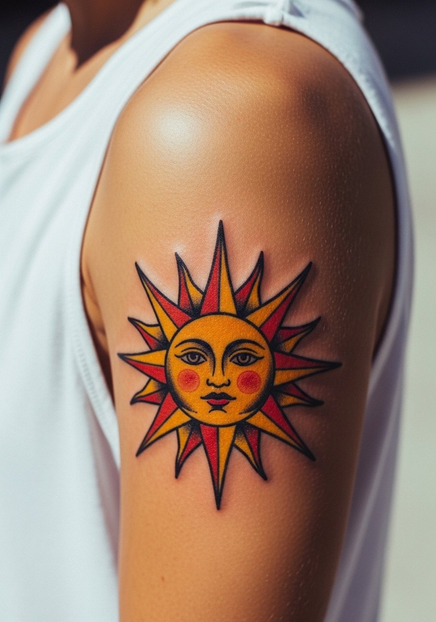
7. Opposite Sun and Moon on Upper Arm
Matching sun and moon tattoos on opposite upper arms make a clear paired statement when you stand side by side. The upper arm tolerates heavier saturation so this is a good spot for slightly bolder fills. A frequent mistake is crowding tiny celestial details that blur under motion. Request bigger highlights and controlled negative space inside each symbol to preserve contrast. During the session wear a loose tank top so the artist can access the shoulder and upper arm easily. Expect low pain and fairly stable aging.
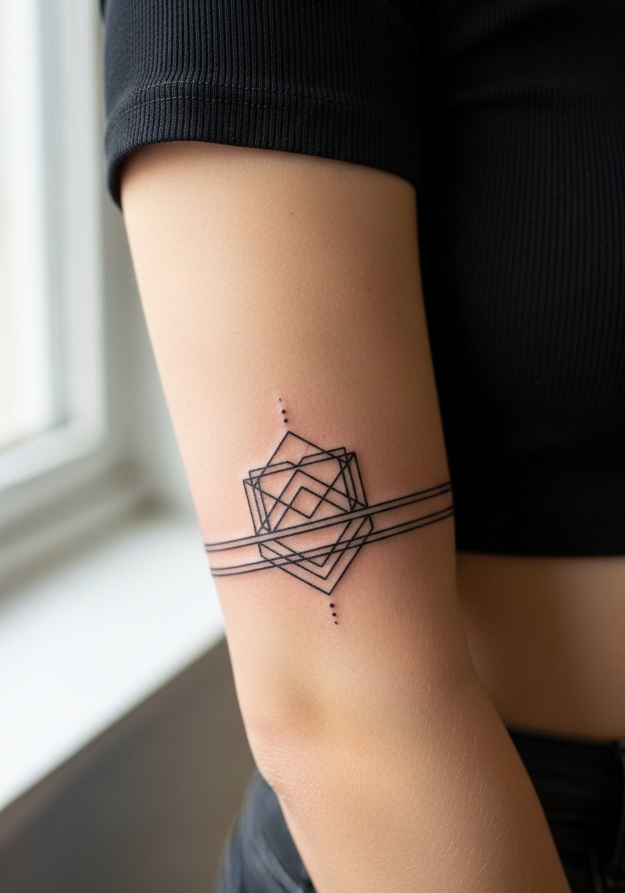
8. Matching Geometric Cuff Above the Elbow
A geometric cuff sitting just above the elbow reads like an arm bracelet that moves with you. The tricky part is the skin fold at the crook of the arm. Ask your artist to place the cuff slightly above the crease so the geometry does not warp when you bend. Fine line geometry done too close to the joint tends to blur faster. Pair this with short sleeves or a cropped sleeve top to show the cuff without snagging.
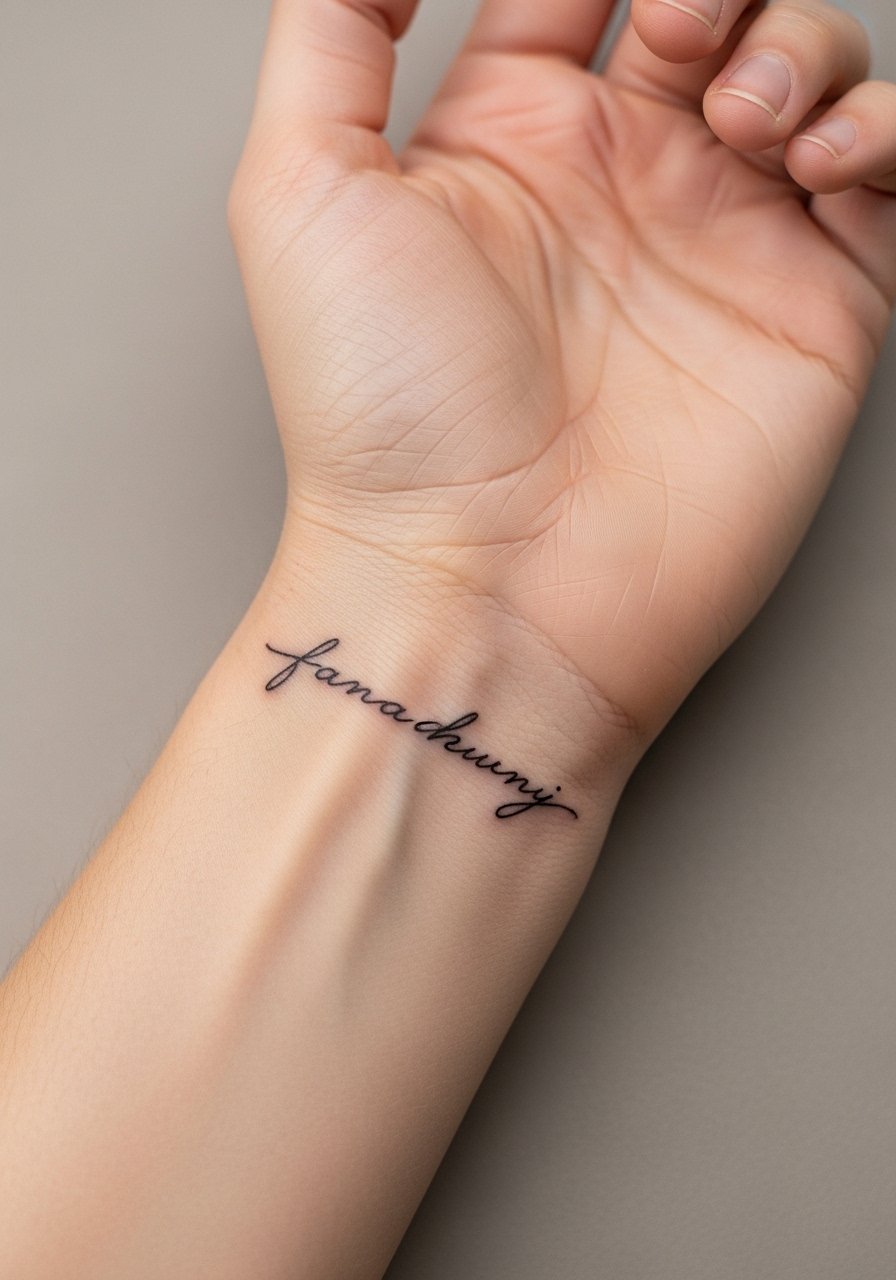
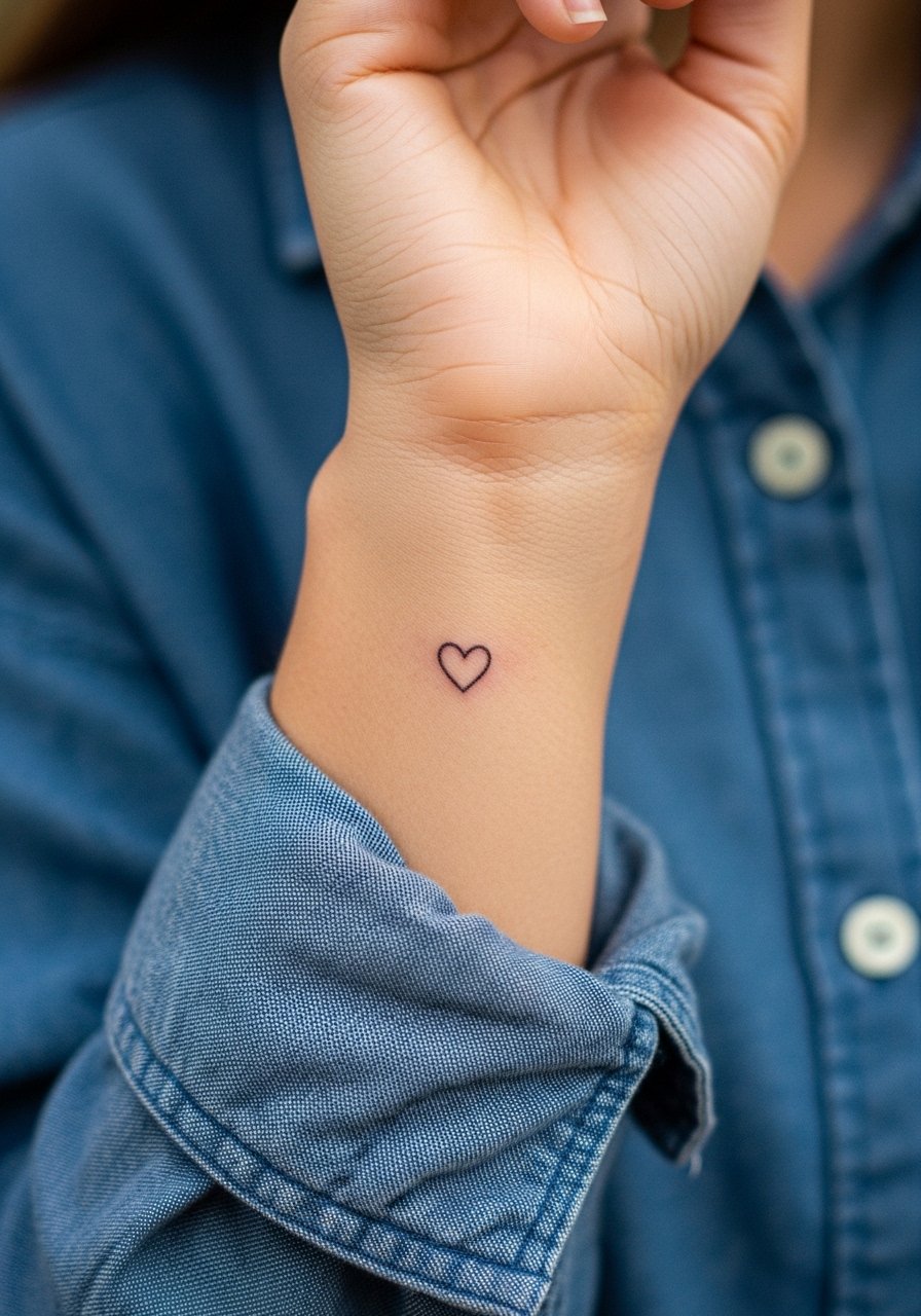
9. Matching Tiny Heart on the Inner Wrist
A tiny heart on the inner wrist is a classic matching choice for two close friends or partners. The inner wrist moves constantly, so slightly thickening the outline prevents early spreading. A common mistake is locking in a micro-heart that becomes a soft smudge from friction and washing. During the appointment, wear a button-up shirt you can roll the sleeve of to expose the wrist cleanly. This placement is low on pain but high on hands-on wear, so plan for a touch-up if you want crisp edges long term.
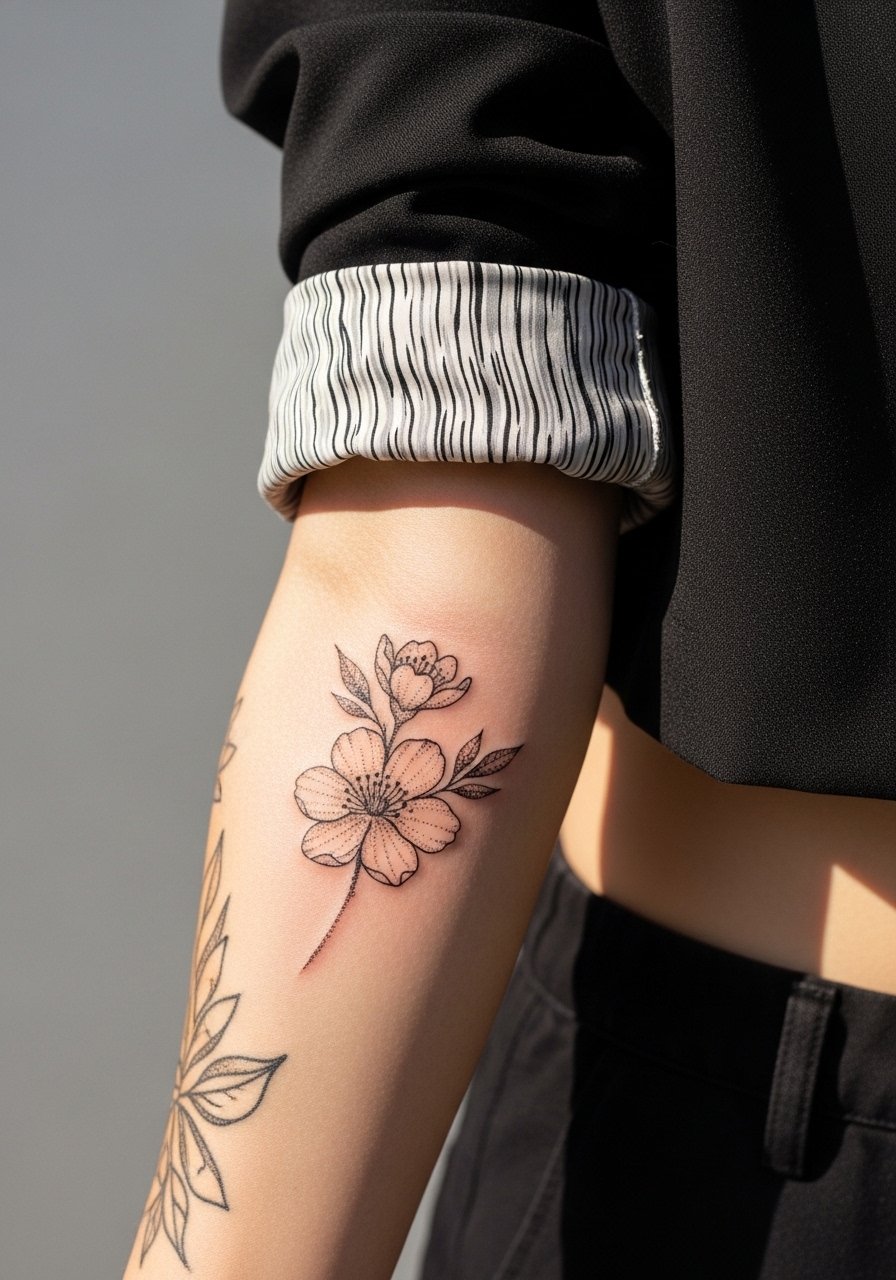
10. Mirror Blossoms Along the Outer Forearms
Two matching blossom stems that mirror each other across the outer forearms look cohesive when you sit or stand side by side. Ask artists to leave breathing room between petals and to use stipple shading rather than heavy color fill. The mistake is over-filling petals that age into blotches. At six months the stipple will give depth and at two to five years the outline softens while the negative space preserves shape. For showing off, cuffed sleeves or a cropped blazer frame the blossoms without hiding them.
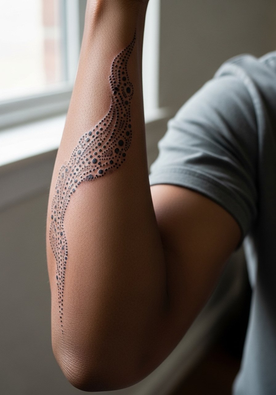
11. Matching Trail of Dots to the Elbow
A trail of progressively larger dots that runs toward the elbow is an understated matching motif. Dot work should be spaced to avoid merging. The common error is packing dots too close or using inconsistent dot size between the pair. Request a test strip on each arm so symmetry is checked before inking. For appointment comfort wear a short-sleeve tee that you can push up without squeezing the arm. Pain is moderate and touch-ups are usually cosmetic.
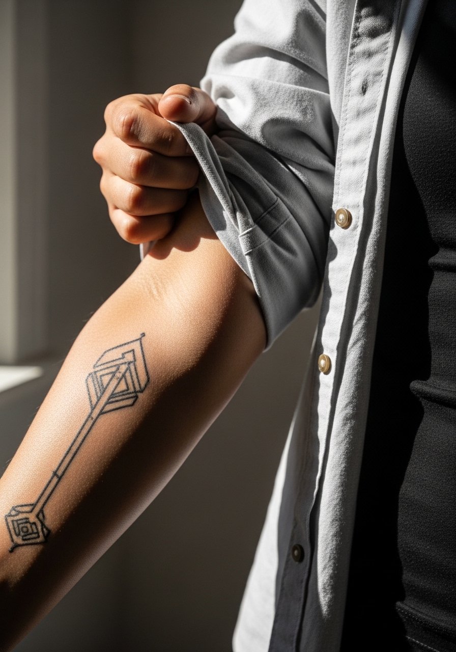
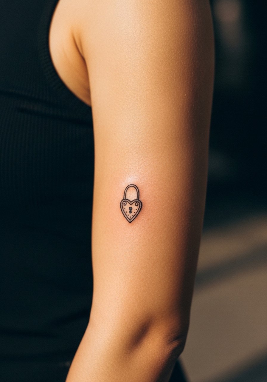
12. Matching Lock and Key on Inner Arm
One person gets a key on the inner forearm and the other gets a matching lock. The mistake is asking for tiny filigree that becomes unreadable with time. Ask for simplified shapes with a hint of shading to hold structure. Inner forearm placement makes the design visible but also exposed to sun, so plan for sunscreen later. For the session wear a loose button-down shirt you can slide off the shoulder or roll up. Expect low to moderate pain and possible touch-ups at year three if you prefer very crisp detail.
13. Matching Thin Vine Sleeve on the Inner Forearm
Two thin vines wrapping the inner forearm create the feel of a shared cuff without full saturation. Vines need negative space between leaves to keep their shape as they age. A common error is adding small shaded fillers that merge into a block. Tell your artist you want open spacing and light whip shading rather than heavy stipple. This placement feels intimate and shows with rolled sleeves or a cropped sweater. Session time is moderate and touch-ups may be needed for very thin stems.
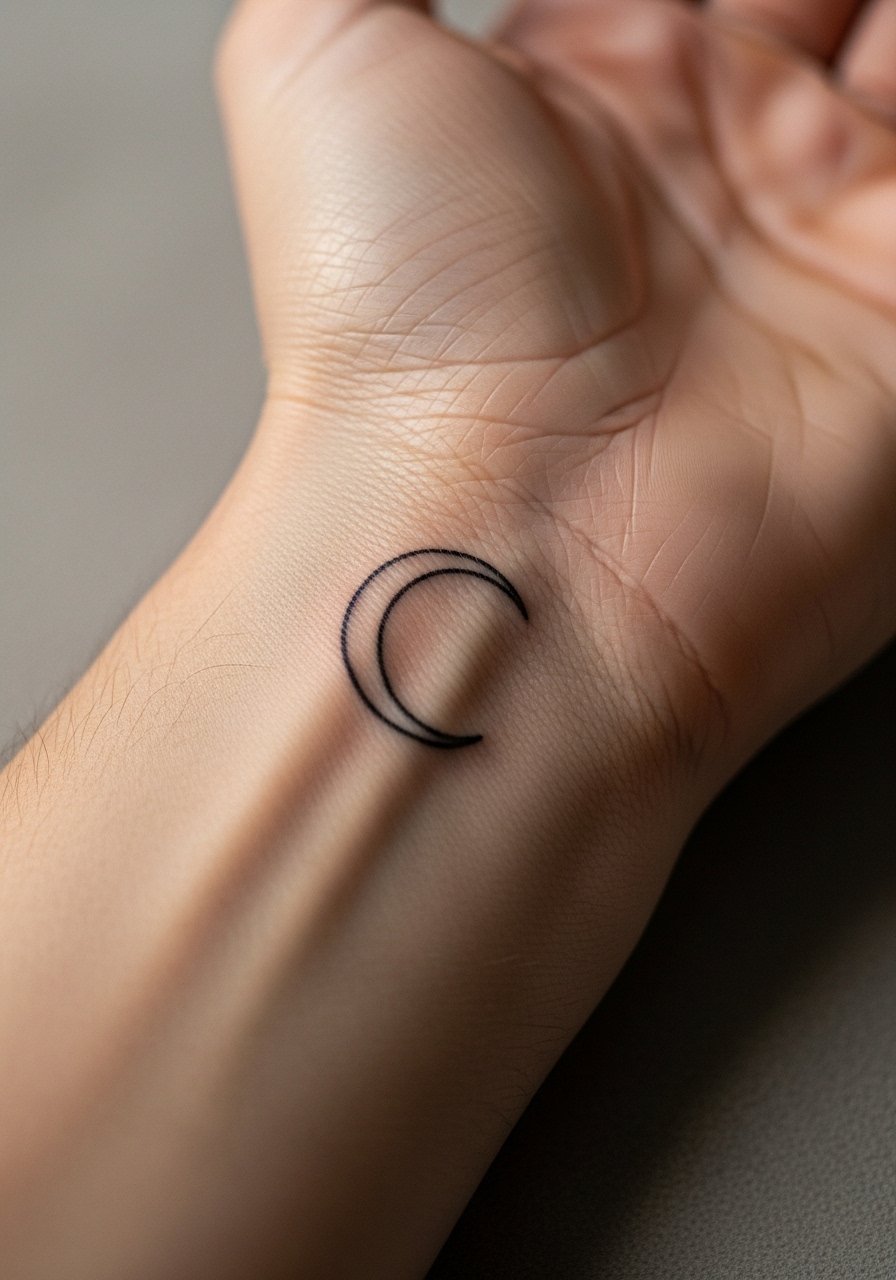
14. Matching Negative Space Crescent on the Outer Wrist
A crescent using negative space where the skin is left untouched inside a halo makes a low-maintenance matching wrist piece. Avoid placing the halo too close to the wrist fold. The controversy here is clear. One camp thinks negative space crescents are resilient and age well because there is less ink to spread. The other camp says the tiny outline that defines the halo is vulnerable and blurs without periodic touch-ups. Ask your artist which side they take and why before booking. For display, a slim cuff bracelet complements the curve.
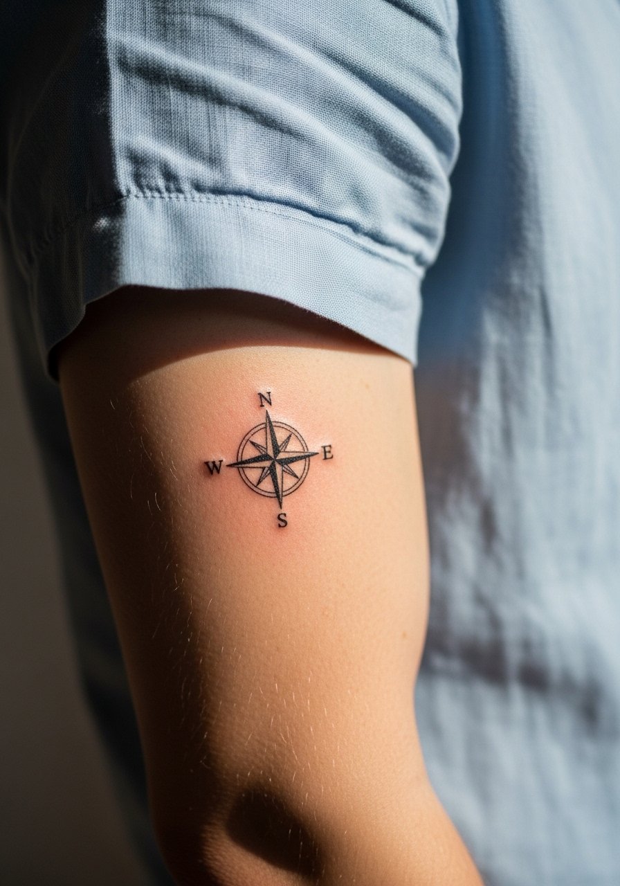
15. Matching Compass Points Near the Elbow
Compass points placed just above or below the elbow read like directional promises. The tricky part is skin folding. Ask your artist to keep the compass simple and avoid tiny directional ticks that disappear when you bend. A common mistake is centering the compass on a crease. Wear a short-sleeve button shirt to your session so the artist can assess placement with your arm bent and extended. This area tolerates medium saturation and usually ages steadily if placed off the joint.
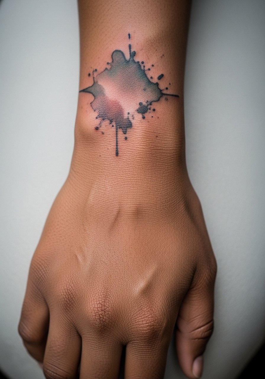
16. Matching Watercolor Wrist Splash in Muted Tones
Matching small watercolor splashes at the wrist make a painterly shared accent. Watercolor fades faster than saturated black, so expect earlier touch-ups. The common error is asking for too much dilute color without anchor lines, which turns into a blur. Ask for a fine line outline or dot anchors to preserve shape. For showing it off, try a delicate chain bracelet that sits above the splash so the color peeks from below.
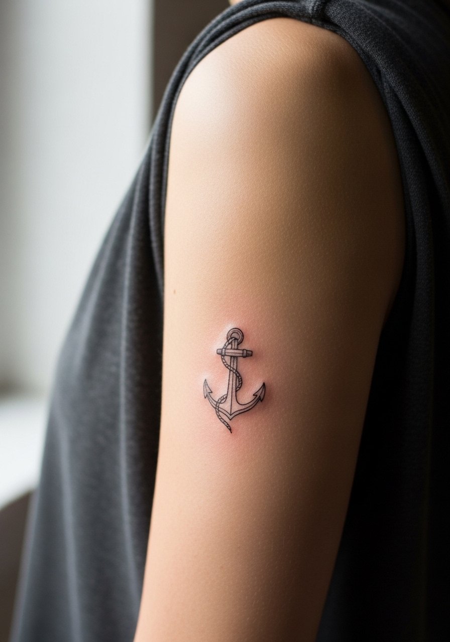
17. Matching Small Anchor on the Outer Bicep
A tiny anchor on the outer bicep is visible with short sleeves and holds up well because the area sees less friction. Avoid asking for overly intricate rope details that require dense linework. Ask for clean silhouette shapes and slight shading to give weight. For the session wear a sleeveless top that lets the artist work without tugging fabric. Pain is low here and long-term touch-ups are rarely necessary unless you want very crisp edges.
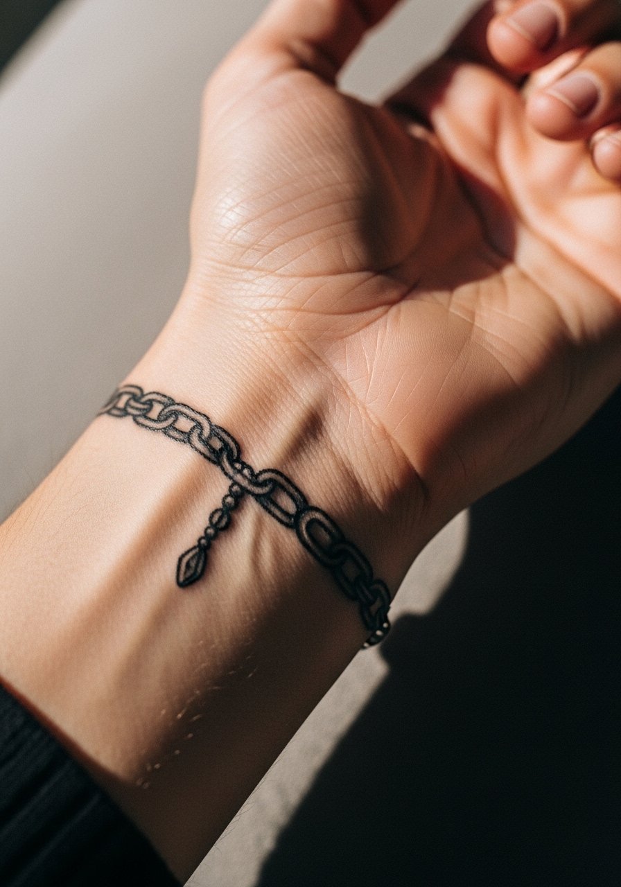
18. Matching Chain-Link Bracelet Around the Wrist
A chain-link bracelet tattoo gives the same visual weight as metal without the cold. The frequent mistake is over-detailing tiny links that blur into a single band. Request slightly larger links with negative space between each to maintain definition. This spot sees a lot of movement and washing, so a protective film for the first week helps. Pair the tattoo with an actual chain bracelet on the opposite wrist for symmetry.
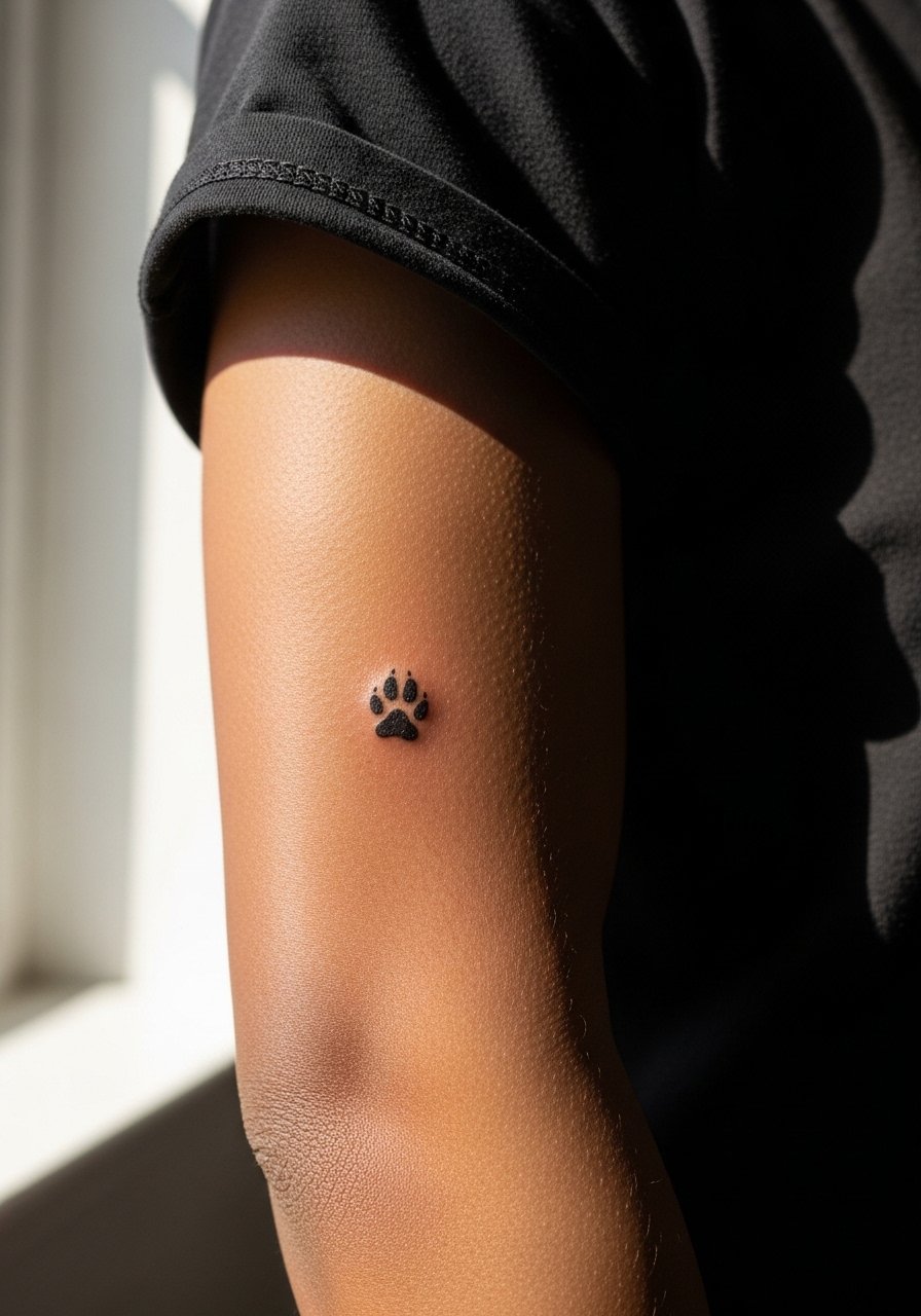
19. Matching Tiny Paw Print Near the Elbow
A small paw print placed near the outer elbow can be meaningful and whimsical. The elbow area moves and creases, so the print should be slightly enlarged to keep toes distinct. A common error is placing it over the crease itself which distorts the print. For the session pick a short-sleeve tee you can move without tight fabric pressing on the spot. Pain is mild to moderate and the print usually ages predictably if sized correctly.
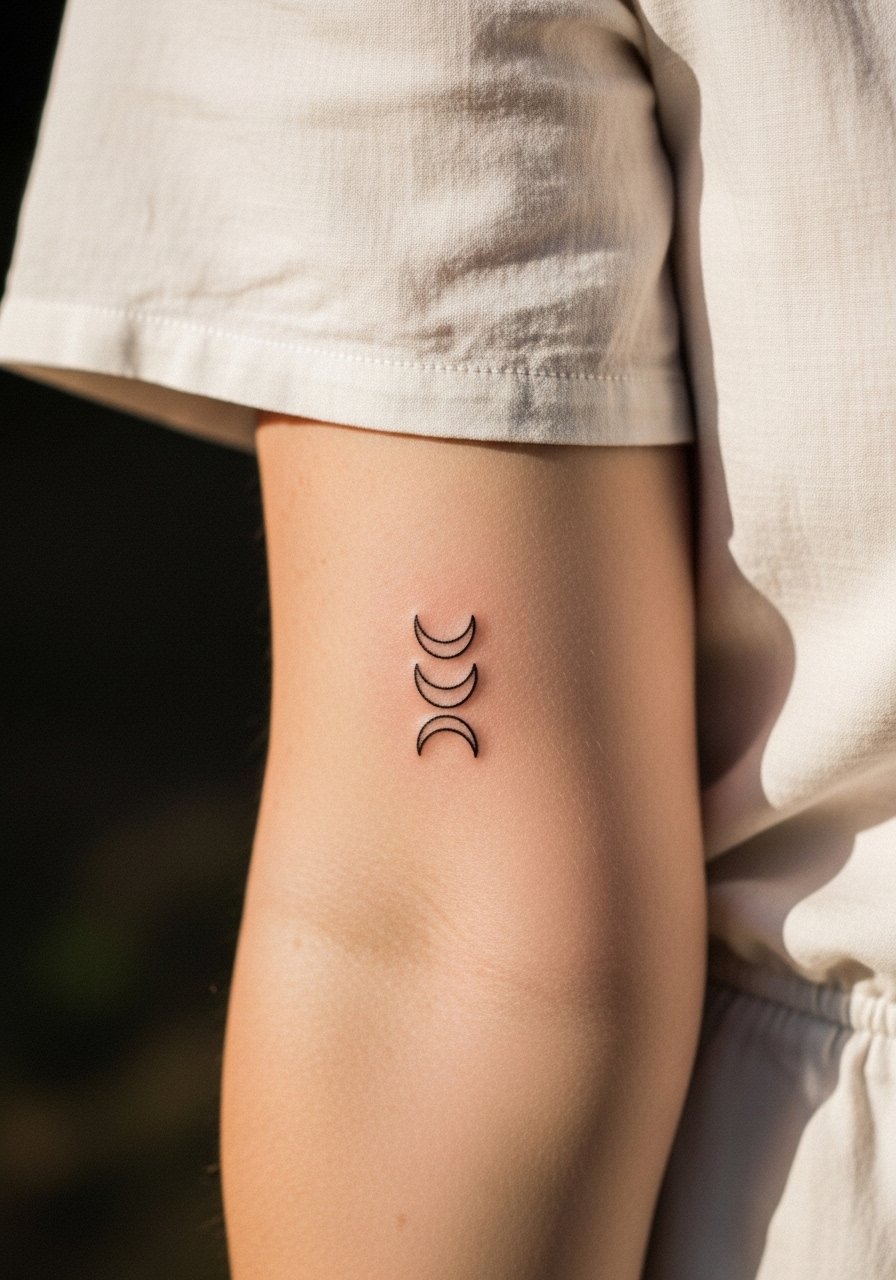
20. Matching Crescent Lines on the Inner Forearm
A set of three small crescent curves lined up on the inner forearm makes an understated pairing. The biggest mistake is making them too thin and too close together. Ask for deliberate spacing and slightly bolder lineweight on the first and last crescent so the progression reads clearly after a few years. For the session wear a loose blouse that you can pull aside without rubbing the fresh ink. Expect low pain and mainly cosmetic touch-ups when desired.
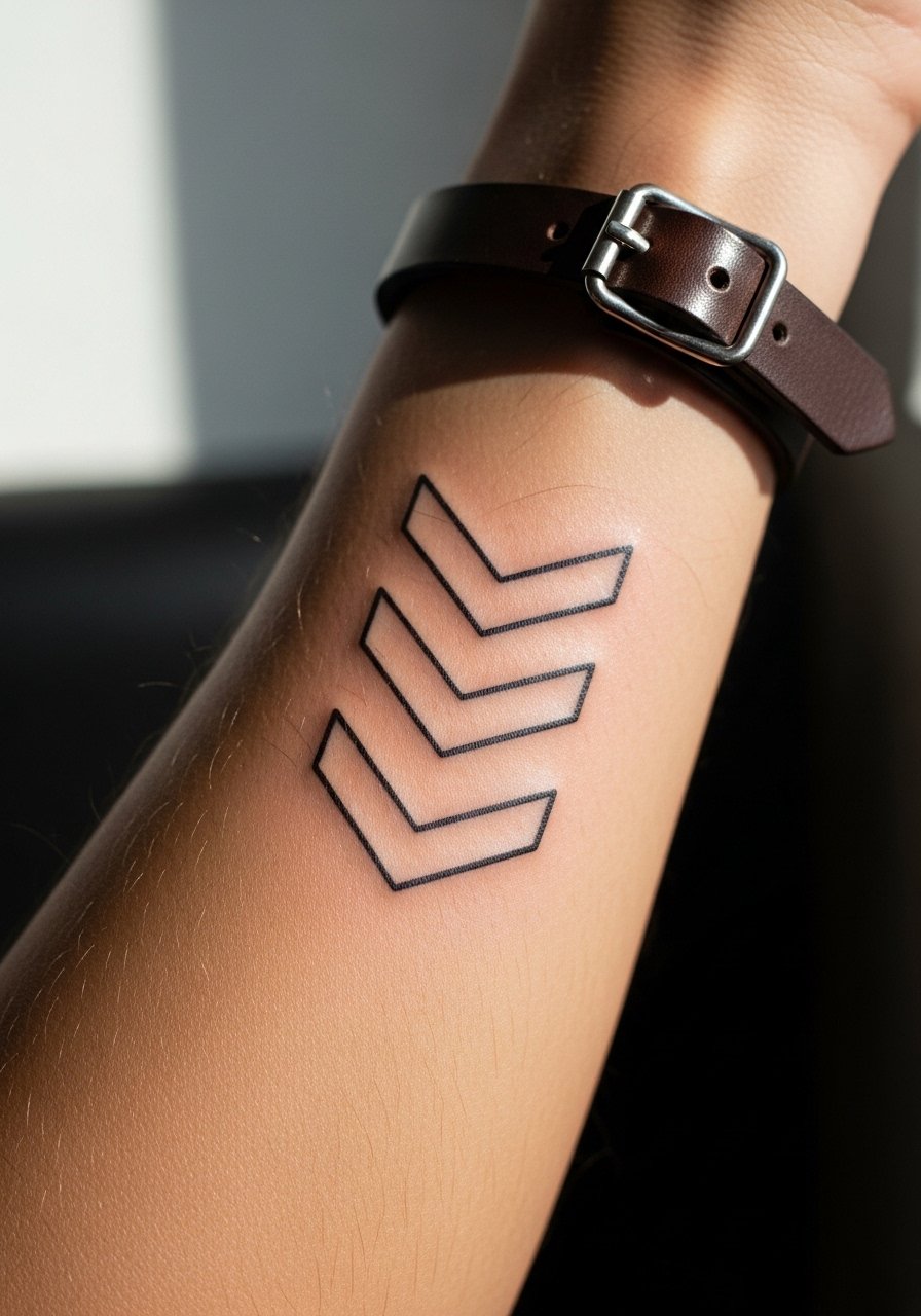
21. Matching Chevron Rows Along the Outer Forearm
Chevron rows that mirror each other on both forearms read graphic and modern. The mistake is creating too many tight chevrons which merge over time. Ask for bold outer lines and open interior spacing. This style tends to age better if given room to breathe. Pair with a minimalist leather cuff when you want to emphasize the graphic repeat. Session time is moderate and discomfort is minimal on fleshy forearm areas.
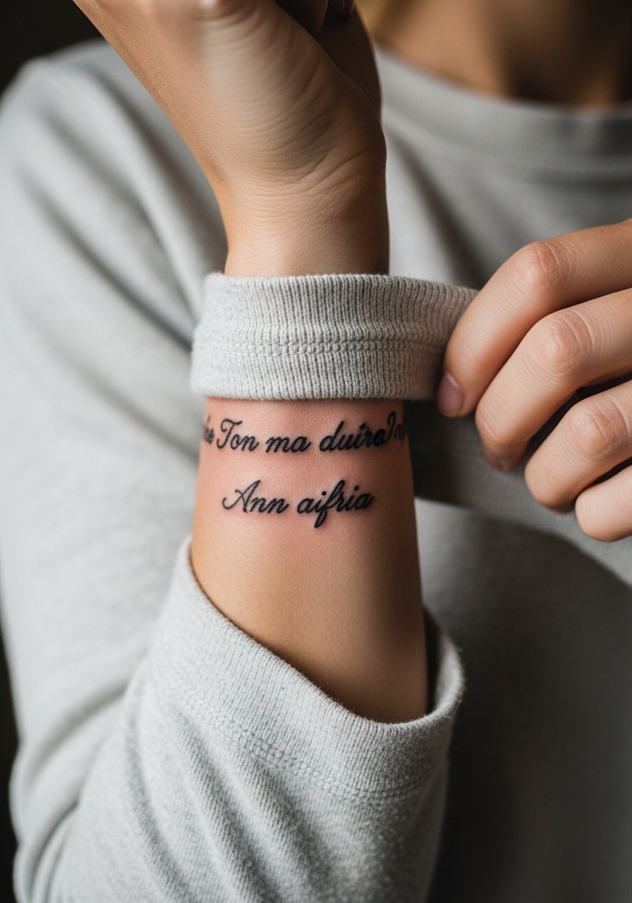
22. Matching Tiny Script Wrap on the Inner Wrist
A short matching phrase that wraps slightly around the inner wrist reads intimate and can be hidden easily. The common error is asking for cursive with tight letter spacing which blurs into unreadability. Ask for modest spacing and slightly thicker downstrokes. For the appointment choose a soft long-sleeve top you can roll without friction. This area needs minor touch-ups over time if you want the text to remain crisp.
23. Matching Tiny Palmistry Lines on the Side Forearm
Tiny palmistry-inspired lines along the side forearm can be personal and symbolic. A key mistake is overcomplicating the lines with micro-details that do not stand up to motion and washing. Ask for clean, slightly bold strokes and have the artist map the lines across both arms for alignment. Wear a short-sleeve shirt to the session so the artist can check how the pattern reads when your arms hang naturally.
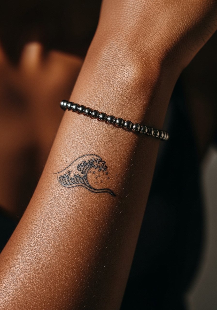
24. Matching Tiny Wave Motifs Near the Wrist
Small matching wave motifs echo motion and pair well for those who travel together. Place them slightly above the wrist fold to avoid constant rubbing. The common mistake is making the crest lines too thin which fade into softness. Ask for slightly heavier crest lines and open space beneath each wave. For showing the design, a simple beaded anklet-style bracelet worn higher on the forearm keeps attention on the wave without overlapping.
25. Matching Arrowheads on the Outer Bicep
Two arrowhead silhouettes inked on the outer bicep align visually and resist heavy wear. Avoid micro-texturing that adds density without longevity. The common mistake is adding thin crosshatches that blur into tone. Request clean silhouette shapes with a small highlight dot to keep the arrowhead readable. For the appointment throw on a sleeveless dress or tank so the artist can reach the outer bicep easily. Pain is low and longevity is good with simple shapes.
26. Matching Lockets Near the Inner Elbow
Tiny locket silhouettes placed near the inner elbow feel intimate and can be tucked away. The inner elbow moves and creases, so avoid fine filigree and ask for bold edges around the shape. A common error is centering the locket on the crease which distorts the shape when you bend. Wear a sleeveless top that allows the arm to extend and relax without fabric pressure. Expect moderate discomfort but steady aging if placed off the fold.
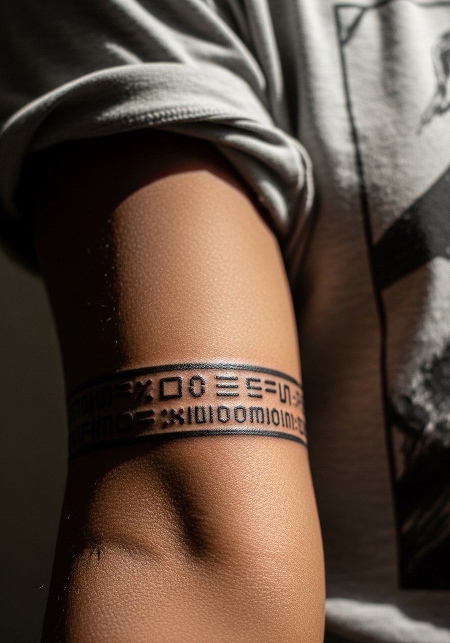
27. Matching Morse Code Bands Along the Forearm
Morse code bands spelling a shared word across the forearm offer a subtle, private connection. The risk is spacing errors that make dots and dashes read as a blob when too close. Ask your artist for a measured template and to keep dashes a touch longer than the dots so the rhythm reads even after slight spreading. For day-of comfort wear a lightweight tee that you can push up without pinching the skin. Touch-ups are often cosmetic and predictable.
Frequently Asked Questions
Q: Do fine line matching tattoos on the wrist need touch-ups more often than bold pieces on the upper arm?
A: Yes, from what I've seen fine line wrist pieces tend to require touch-ups earlier because wrist skin moves and sees constant friction from washing and bracelets. Bold upper arm pieces sit on fleshier skin and tolerate aging better. Ask your artist how they adjust line weight for wrists if you want longer-lasting crispness.
Q: Are matching tattoos on the inner bicep riskier for blowout than outer forearm pieces?
A: Inner bicep skin is more elastic and sees different stretch patterns, so some artists say it carries a higher blowout risk and others say proper depth makes it safe. Name both camps when you consult the artist and ask to see healed examples from their portfolio on similar placements.
Q: What should we wear to a session for matching forearm roses to make the appointment comfortable?
A: Wear clothing that gives full access without pressure on the area, like a loose button-down shirt or a tank. That prevents tugging and lets the artist position your arm naturally as they ink.
Q: Do watercolor-style matching wrist pieces require special aftercare compared with black linework?
A: Watercolor pieces tend to lose their subtle pigments faster than saturated black linework, so they often need touch-ups sooner. The initial aftercare is similar but expect to protect the color from sun and abrasive contact more aggressively.
Q: Are matching hand or finger tattoos a good idea if one of us works in a conservative office?
A: Hand and finger tattoos remain visible and some workplaces still judge them. If career flexibility matters, consider placing the matching mark on the inner forearm or above the wrist so it can be covered easily with long sleeves.
Q: How do we find an artist who has matched tattoos on forearms and can show healed examples?
A: Use discovery pathways like local shop directories, convention guest lists, and community threads to find artists who post healed portfolios. Ask to see healed pictures specifically of matching or mirrored forearm work and check consistency across different skin tones before booking.