Fine line and soft-shaded sleeves look effortless until you live with one for a few years. Trends push tiny details and delicate stems, and then realities like sun exposure, skin movement, and friction show up. Pick designs that give lines room to breathe, tell your artist exactly how it should sit on your arm, and plan a wardrobe that keeps the focal points visible. The ideas below start with gentle, wearable sleeves and move into bolder soft looks you can actually enjoy long term.
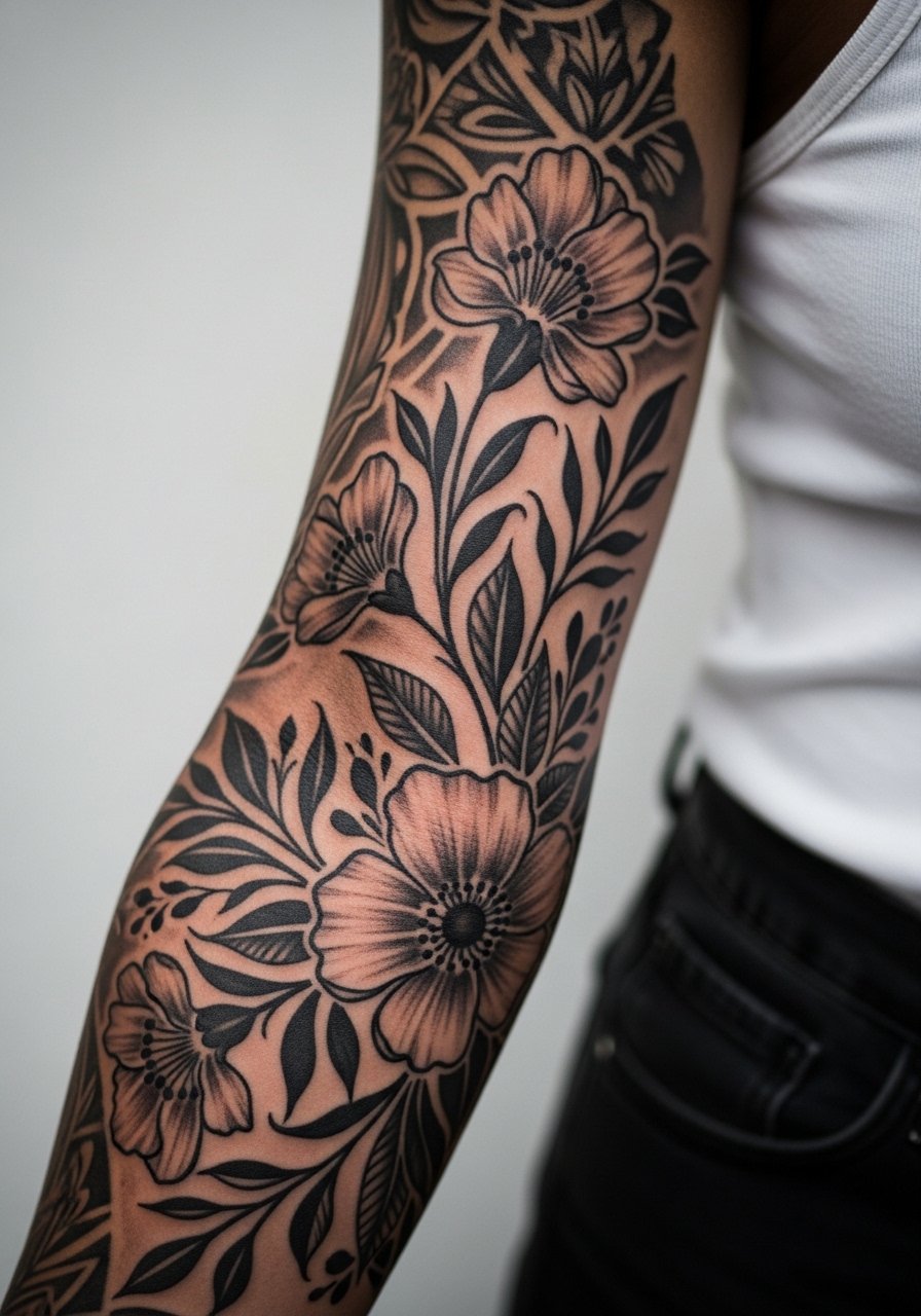
1. Fine Line Botanical Full Sleeve
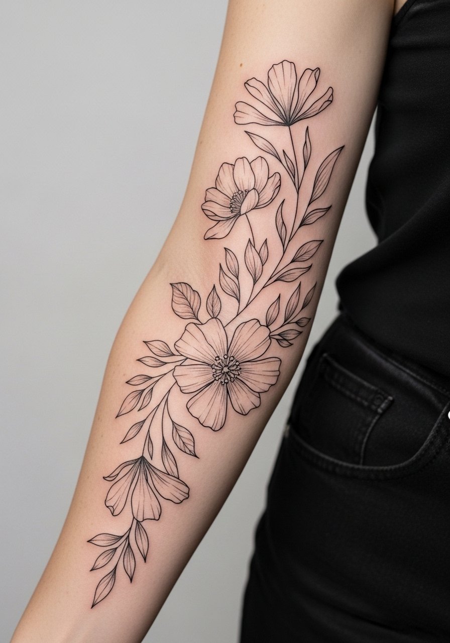
I recommend this when you want a sleeve that reads delicate but still survives everyday wear. In consultation, ask your artist to space stems and leaves slightly wider and use a mix of single-needle linework and stipple shading so small details do not merge over time. Pain on the inner arm and near the elbow is moderate. Sessions usually split into two to four sittings depending on saturation. A common mistake is asking for ultra-tight veins and micro leaves, which tend to blur into solid areas by year three. For showing this off, roll your sleeves into rolled linen shirts or cuffed short sleeves to let the forearm work stay visible.
2. Watercolor Florals with Soft Black Line Anchors
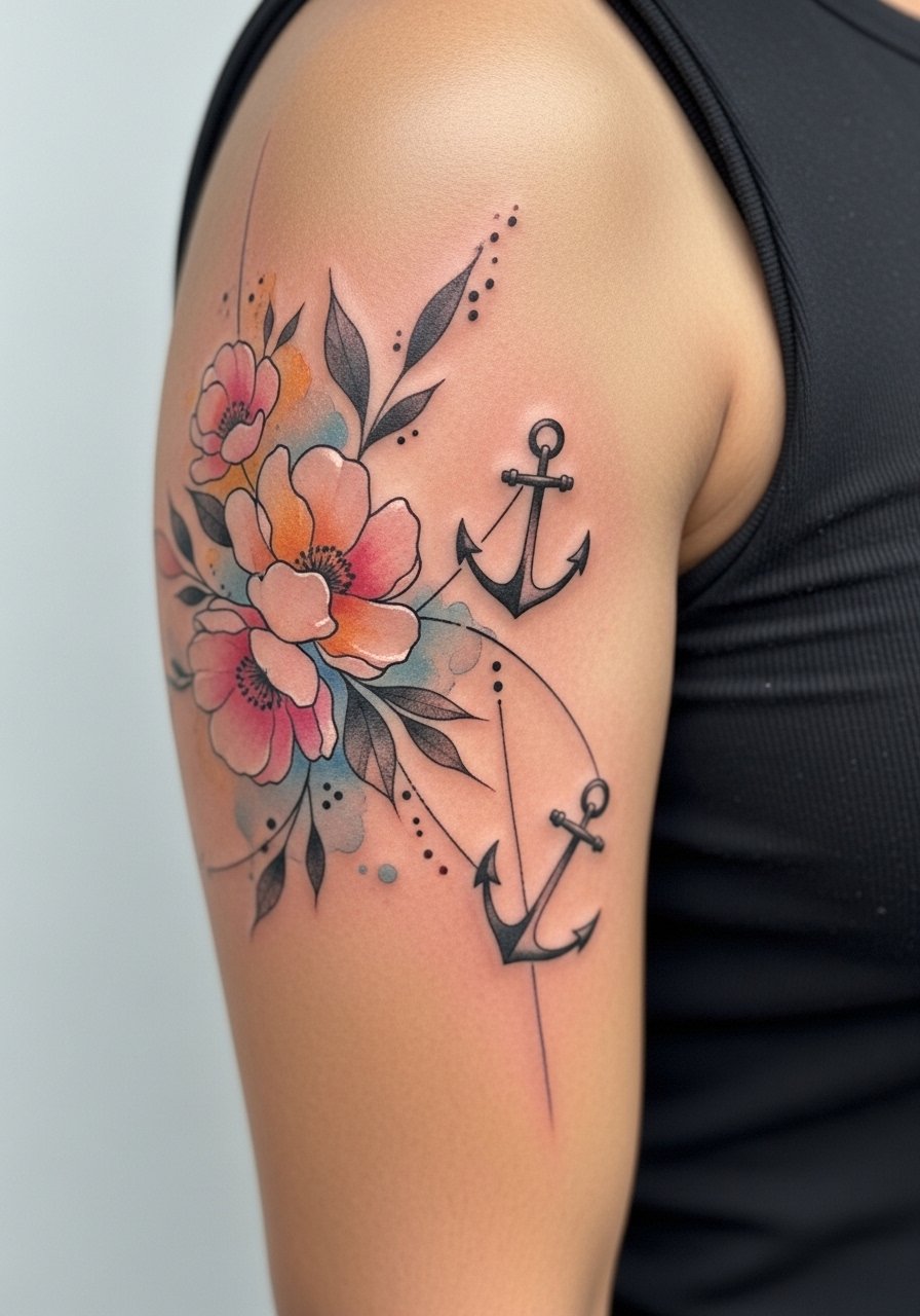
This version mixes faint washes of color with thin black linework to keep forms readable as pigments fade. Tell your artist to keep the color washes airy and avoid dense saturated blocks, because watercolor pigments can look patchy as they heal. The session feels less painful on the outer arm and more sensitive near the armpit. Expect touch-ups sooner than with solids. One controversy with watercolor is whether it is suitable for full sleeves. Some artists say the style is fine if layered carefully. Others argue it ages into indistinct patches unless refreshed regularly. Wear open-sleeve tops and consider short sleeve blouses that frame the washes without covering them.
3. Micro-Realism Portraits Framed by Florals
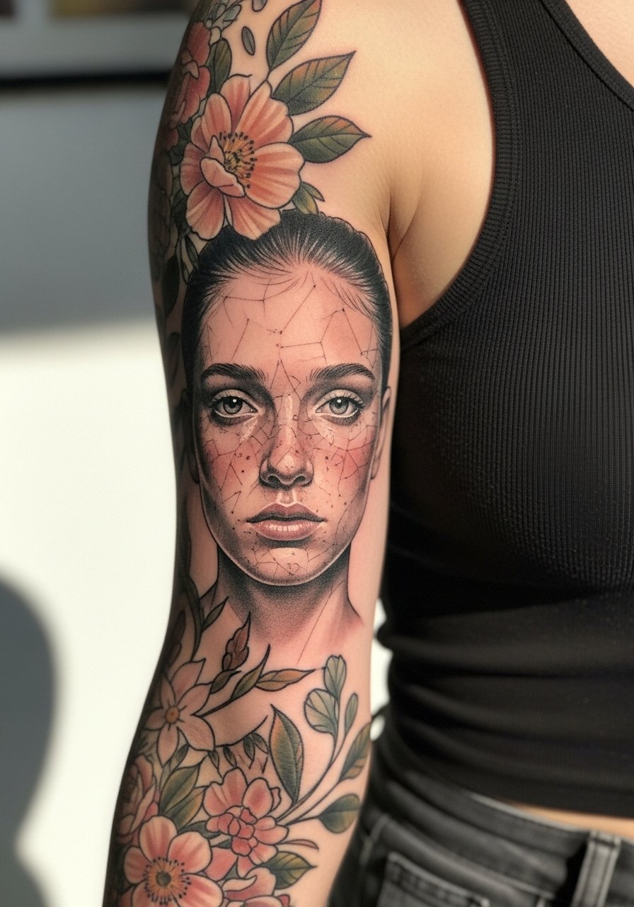
Micro-realism in a sleeve reads like an heirloom when the portrait is given room and not shrunk to fit. Tell your artist exactly which facial plane matters to you and bring multiple references that show the face at different angles. Inner bicep placement increases pain and can cause more swelling during the session. A frequent mistake is crowding the portrait with small decorative motifs. Let the portrait breathe and use florals as framing elements only. For the appointment, wear a loose tank top so the artist can access the area without you getting cold.
4. Stipple Shading Sleeve with Negative Space Motifs
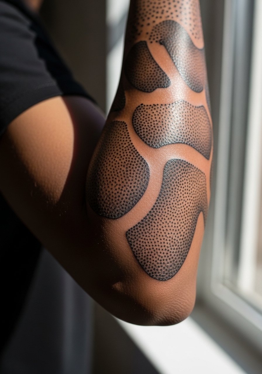
Stipple shading gives a soft textured look that stays readable because the dot work resists the merge pattern of continuous shading. Ask for a mix of dot sizes and clear negative space around motifs to prevent the sleeve from looking muddy at two years. This style feels like long sessions with careful hand speed rather than heavy machine saturation. Blowout risk is lower with dot work but still present near the inner arm where skin is thinner. Expect gentle touch-ups at year three. Pair it with rolled sleeves or cuffed button-down shirts to show off the stipple texture.
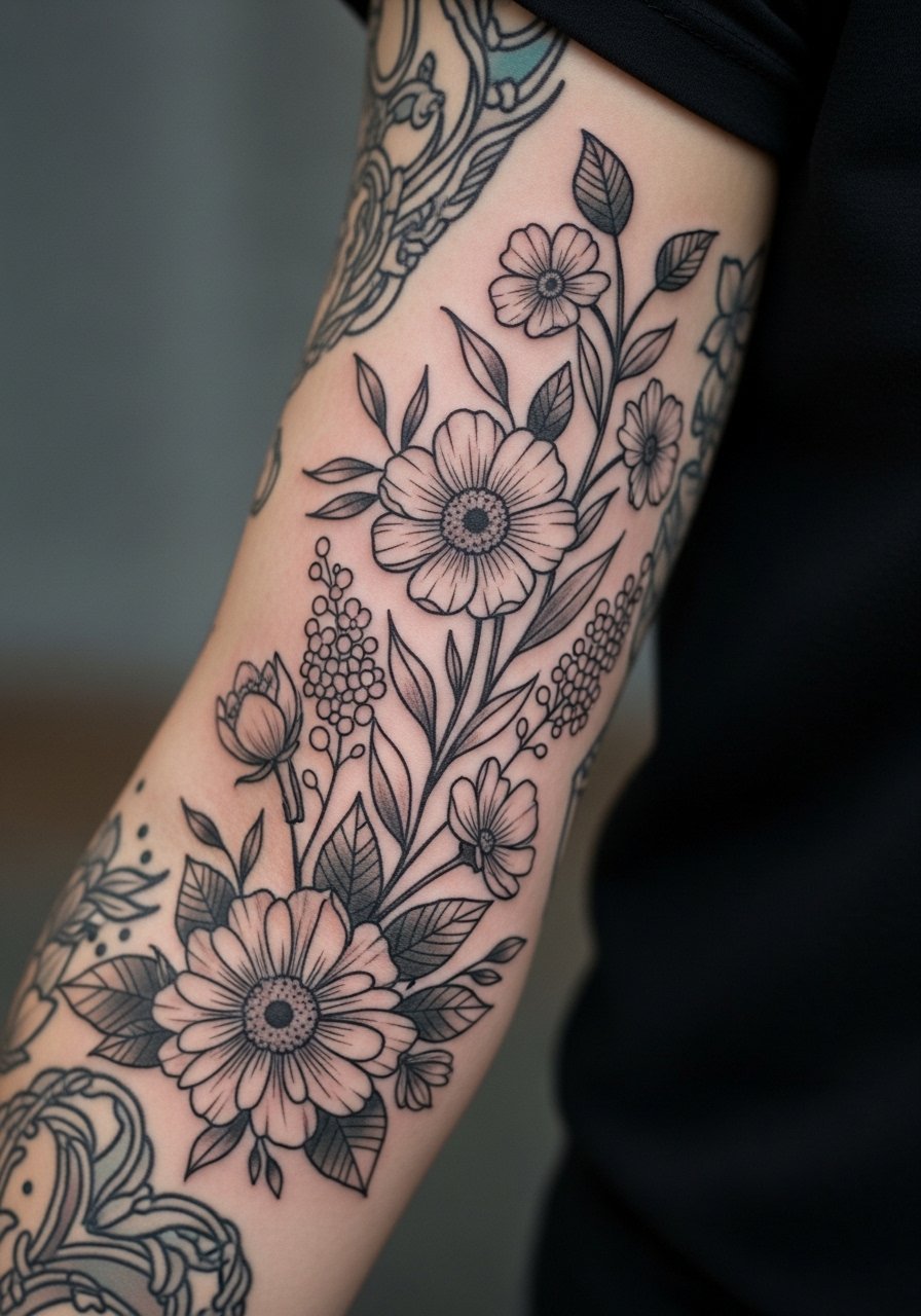
5. Soft Color Realism Garden Sleeve
Color realism can feel soft when the palette leans pastel and shading is feathered. Tell your artist you want lower saturation and gradual transitions so the piece maintains softness rather than looking like a poster. Outer arm sessions are easier on pain and heal with less swelling than inner placements. The common mistake is asking for hyper-saturated pigments in tiny petals. That approach creates patchy fading. Plan two medium-length sessions and budget a touch-up at year two. For evenings out, a short sleeve wrap dress will frame the arm without overpowering the colors.
6. Minimalist Chain of Small Botanicals Around the Arm
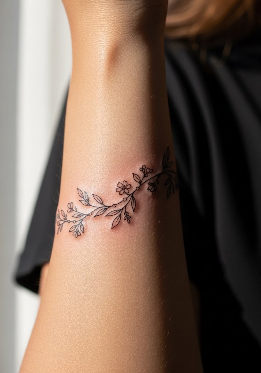
This chained-botanical approach reads as delicate jewelry on the arm. When consulting, emphasize consistent lineweight across the chain and ask for slightly bolder anchors at spacing points so the pattern ages into a readable rhythm. Pain is low on the outer forearm but higher near the wrist. Sessions are short but you may need multiple small passes for even saturation. A mistake is requesting the links too close together. They need breathing room or the chain will blend. For showing off, stack with a thin chain bracelet that does not rest directly over the linework.
Studio Day Picks
The forearm and wrist pieces above react differently to friction and washing, so a few specific items smooth the session and the first week.
-
Stencil transfer paper kit. Lets you preview exact placement on skin, which is useful for the chain and botanical wraps shown above.
-
Topical numbing cream. Applied before appointment can reduce wrist and inner-arm sensitivity without affecting linework when used as directed.
-
Thin protective film roll. Helps protect forearm and wrist pieces from friction and water during the first few days of healing.
-
Fragrance-free gentle body wash. Cleanses without irritating delicate lines and light color washes on the forearm.
-
Aquaphor healing ointment. A thin layer for the initial days locks in moisture for fine line work and light color zones without suffocating the skin.
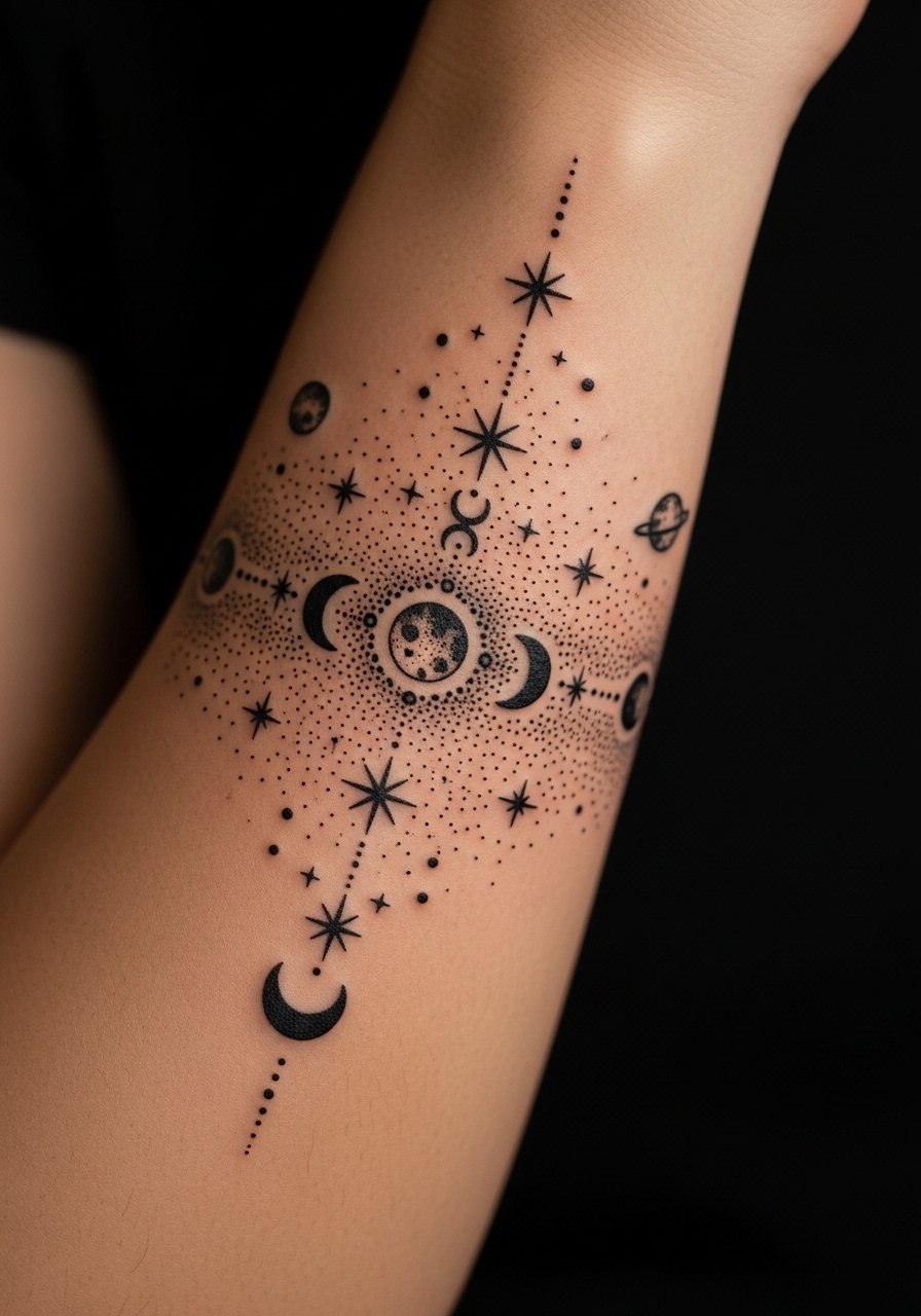
7. Crescent Moon and Star Sleeve in Micro Lines
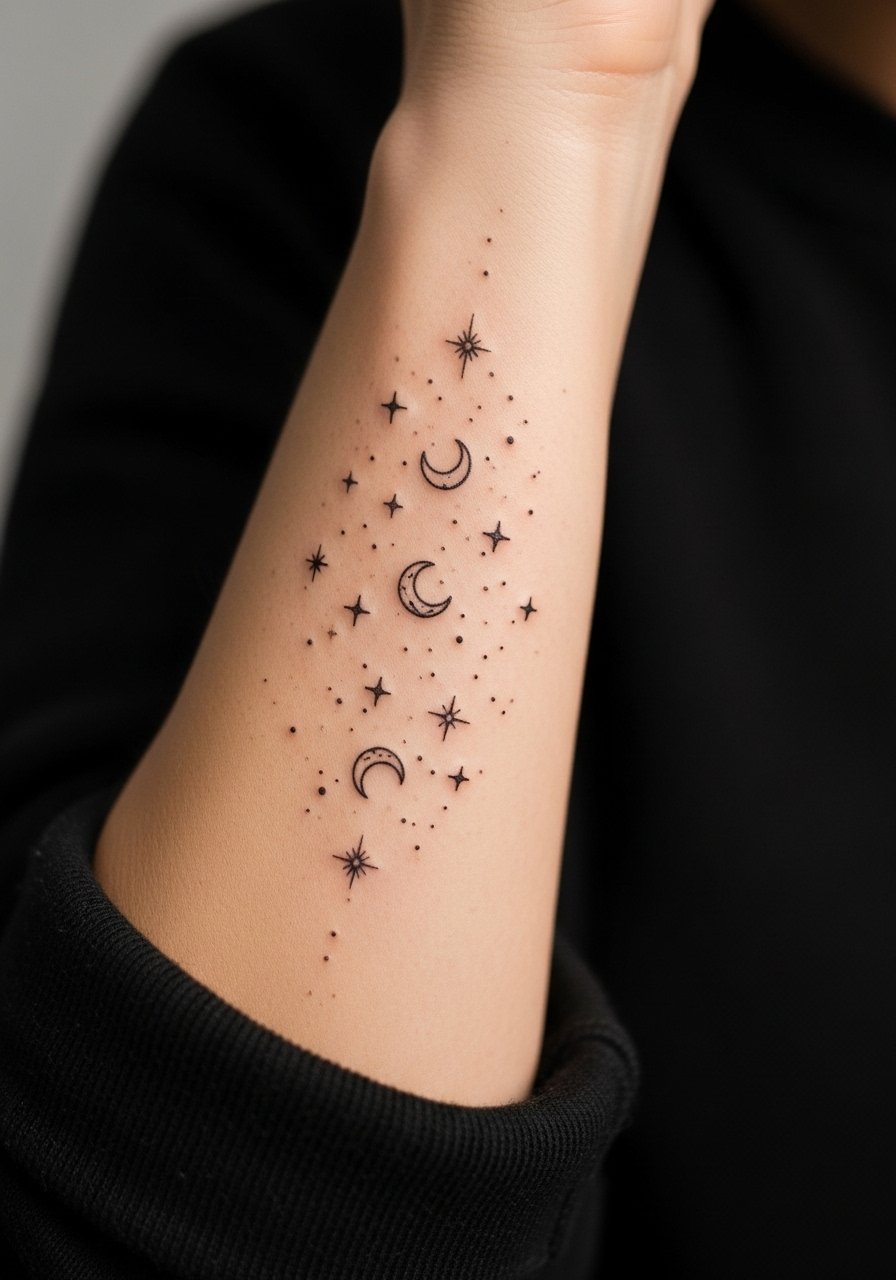
This celestial chain reads like constellations sketched on skin. Ask your artist to space motifs and to vary lineweight slightly so tiny stars do not disappear over time. The outer forearm is forgiving and sessions are quick. A common mistake is overloading the area with dots and tiny crescents that merge by year two. Expect a touch-up earlier than with thicker lines. For showing off the sleeve, pair it with a racerback tank or three-quarter sleeve so the forearm remains visible while other skin stays protected.
8. White Ink Accents Over Gentle Shading
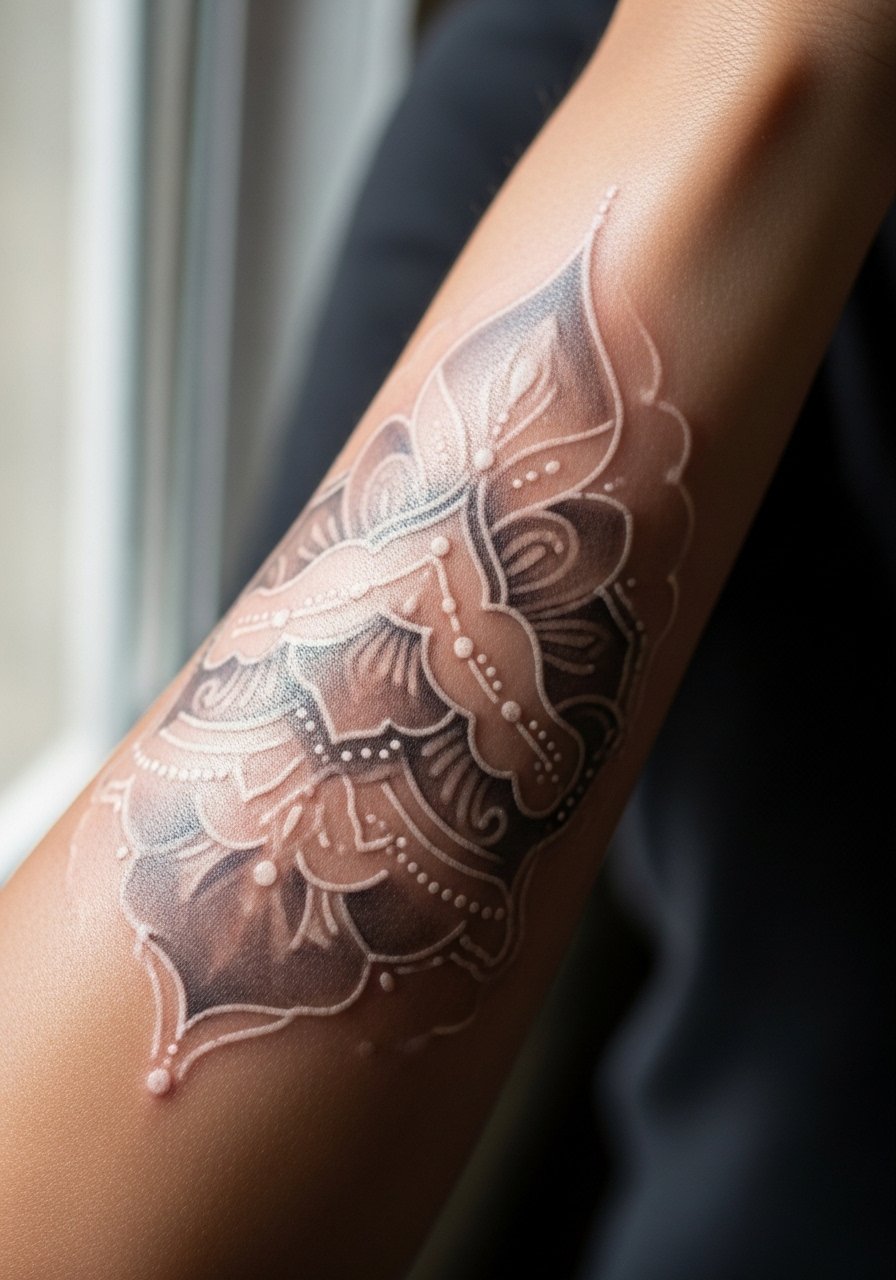
White ink can brighten a soft sleeve when used sparingly. During consultation, ask the artist to test a small patch first. White fades faster and can take on a subtle yellow over time depending on skin chemistry. This placement on the outer arm is low pain. Mistakes include asking for heavy white coverage or large white fills. Keep white as highlights to maintain contrast without creating opaque patches. Pair with neutral linen tops like a loose linen blouse to let the accents read against soft fabric.
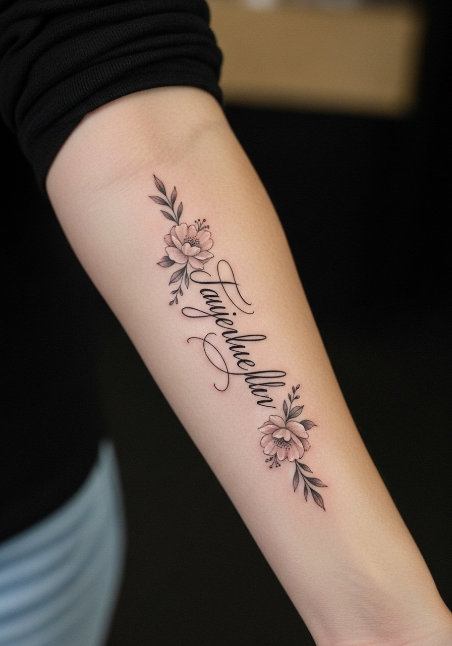
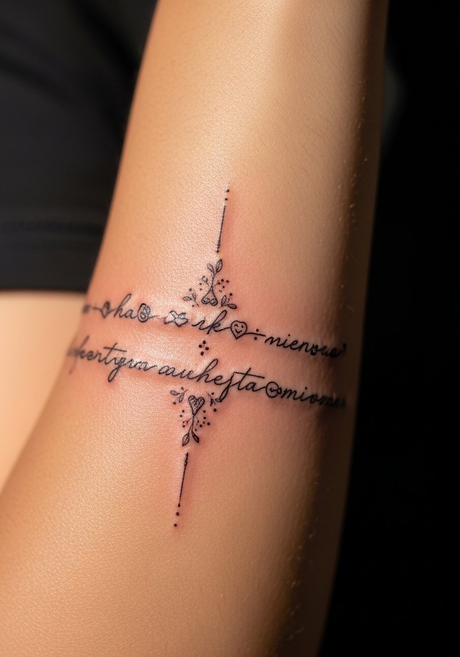
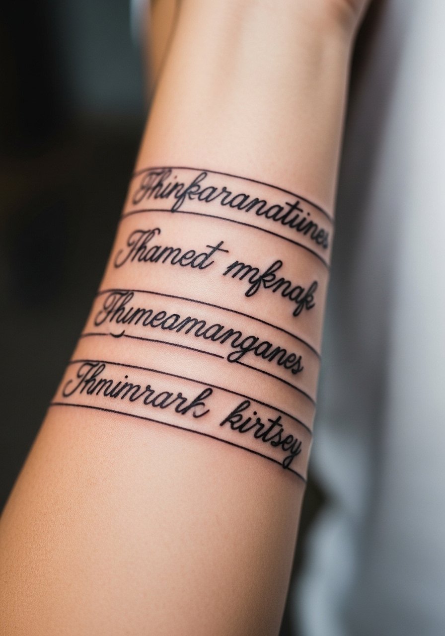
9. Sleeve of Tiny Script and Dates Interspersed with Florals
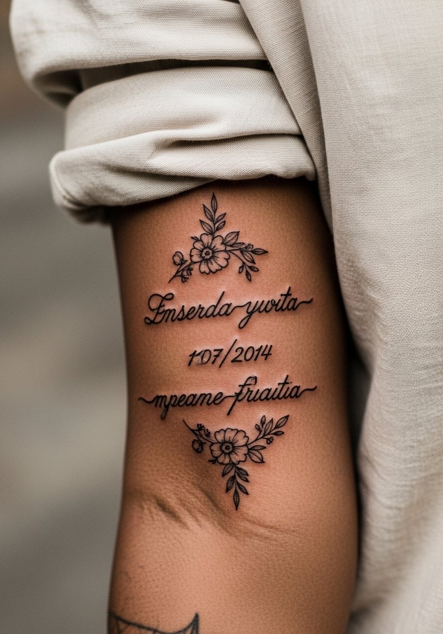
Text in sleeves must be sized for longevity. Tell your artist the exact font and ask for slightly larger x-height so letters remain legible after healing. Inner forearm script may look crisp at six months and slightly softer at two years depending on sun exposure. A key mistake is choosing ultra-tiny type. Also specify exact wording in the stencil step. For the session wear, pull on a loose button-down shirt you can move aside easily.
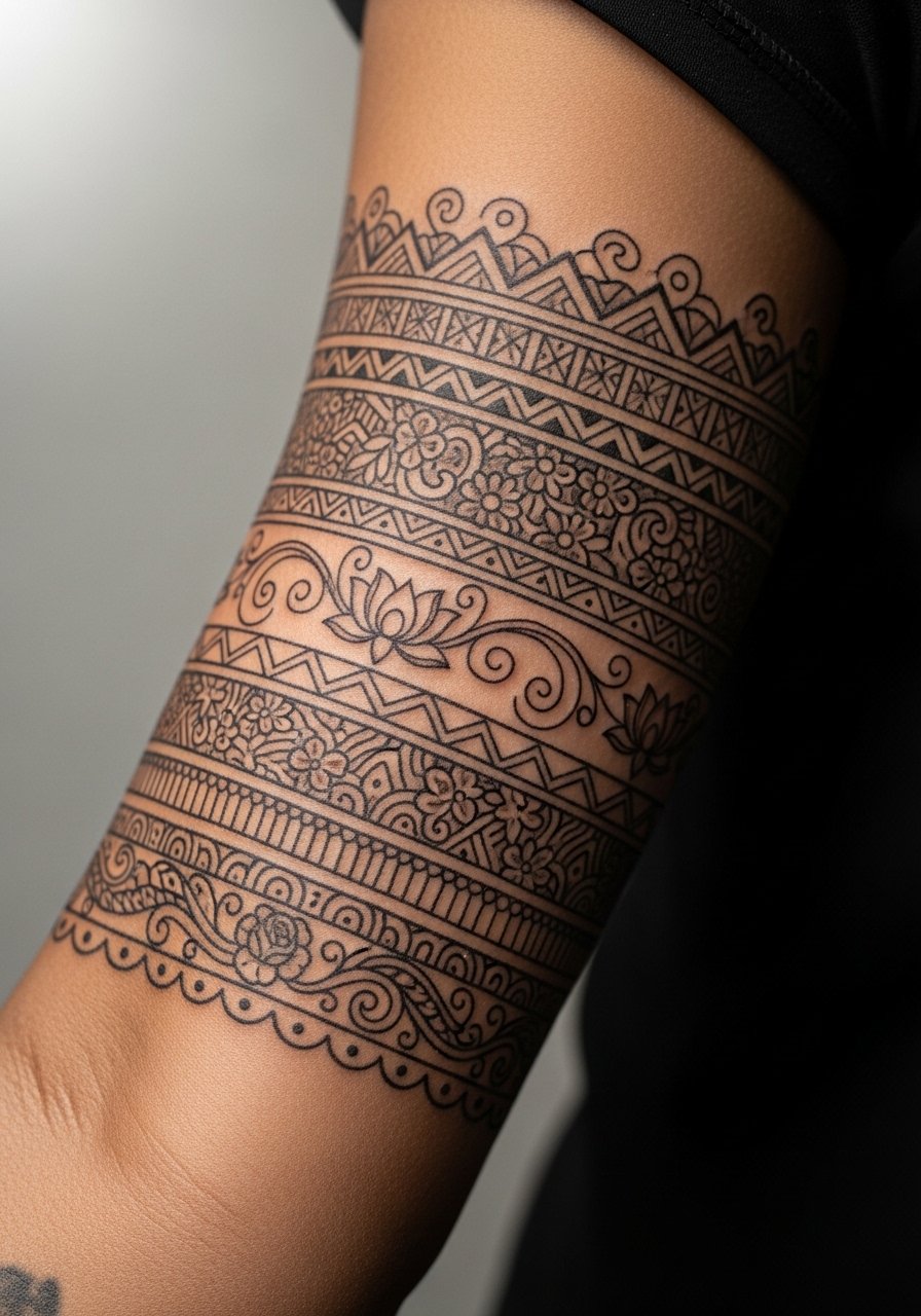
10. Botanical Sleeve with Geometric Frames
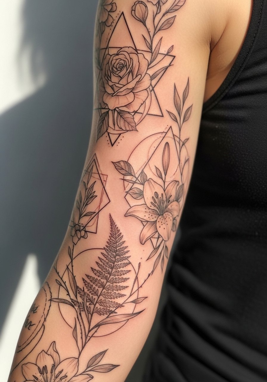
Combining organic forms with geometry gives a modern soft look that still reads from a distance. Ask for clear negative space between frames and florals so the geometry does not fade into a block. Outer arm placement reduces blowout risk compared with inner areas. Many people err by compressing frames too tightly. Space keeps the mandrels of the needle from overworking one area. This piece pairs well with rolled sleeves and a short sleeve linen dress for balanced contrasts.
11. Delicate Lacework Sleeve Inspired by Fabric Motifs
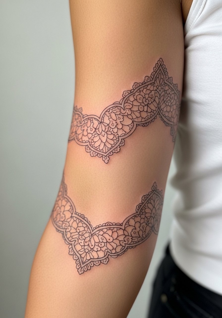
Lace-style sleeves read feminine without being fragile when the artist uses slightly thicker anchor lines at key motif joins. Tell your artist to avoid single-thread lines across broad areas. Pain varies across the arm. The mistake is asking for uniformly thin strands throughout. That choice makes the piece vulnerable to early blur. A small touch-up after a year keeps the lace crisp. For show-off outfits, a sleeveless blouse with lace trim frames the sleeve without matching patterns exactly.
12. Subtle Blackwash Floral Sleeve
Blackwash uses diluted black to create soft tonal shading that stays readable because saturation is controlled. Ask for layered washes rather than solid fills so the piece ages into soft contrast. Sessions tend to be medium length and can feel like long passes of shading rather than concentrated lining. A common error is asking for a fully soft wash over the whole arm without anchor lines. That creates a gray patch as it fades. Pair with rolled jeans and a short sleeve tee to balance casual and delicate.
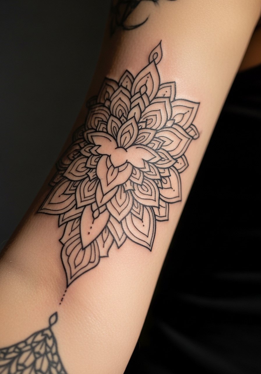
13. Mandala Panels That Flow with Muscle Shape
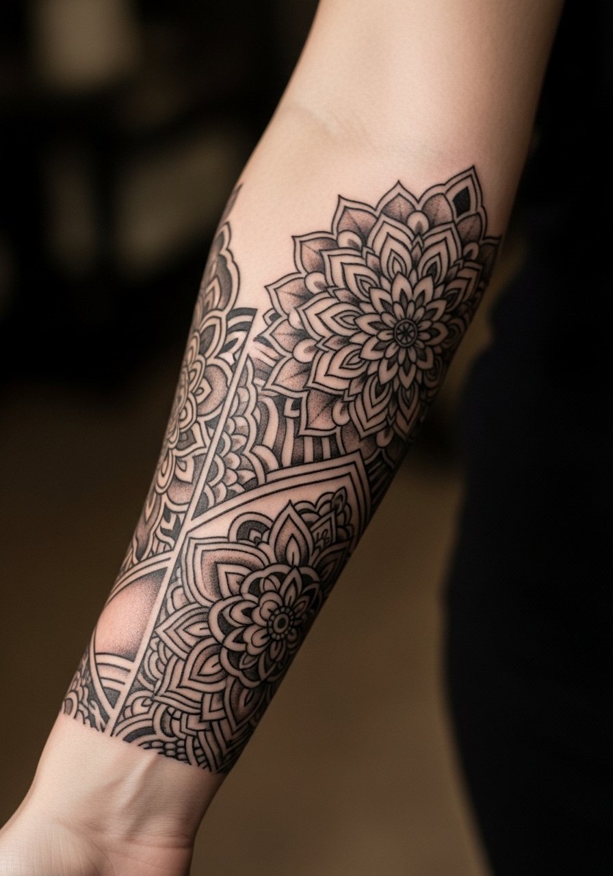
Mandala panels can stay tidy when each section has breathing room. During consultation, ask the artist to map panels to your muscle flow so designs do not warp with movement. Mandalas that are packed too densely on the wrist or inner elbow tend to blur first. Pain is higher near joints. Touch-ups are common at year three for crisp center points. For wearing, a 3/4 sleeve wrap top shows panels while protecting them from sun.
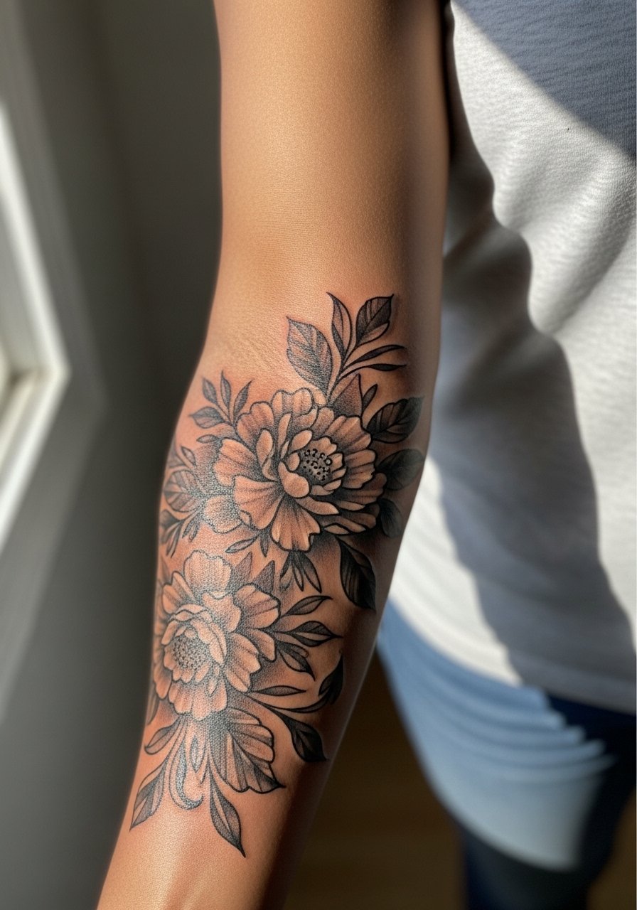
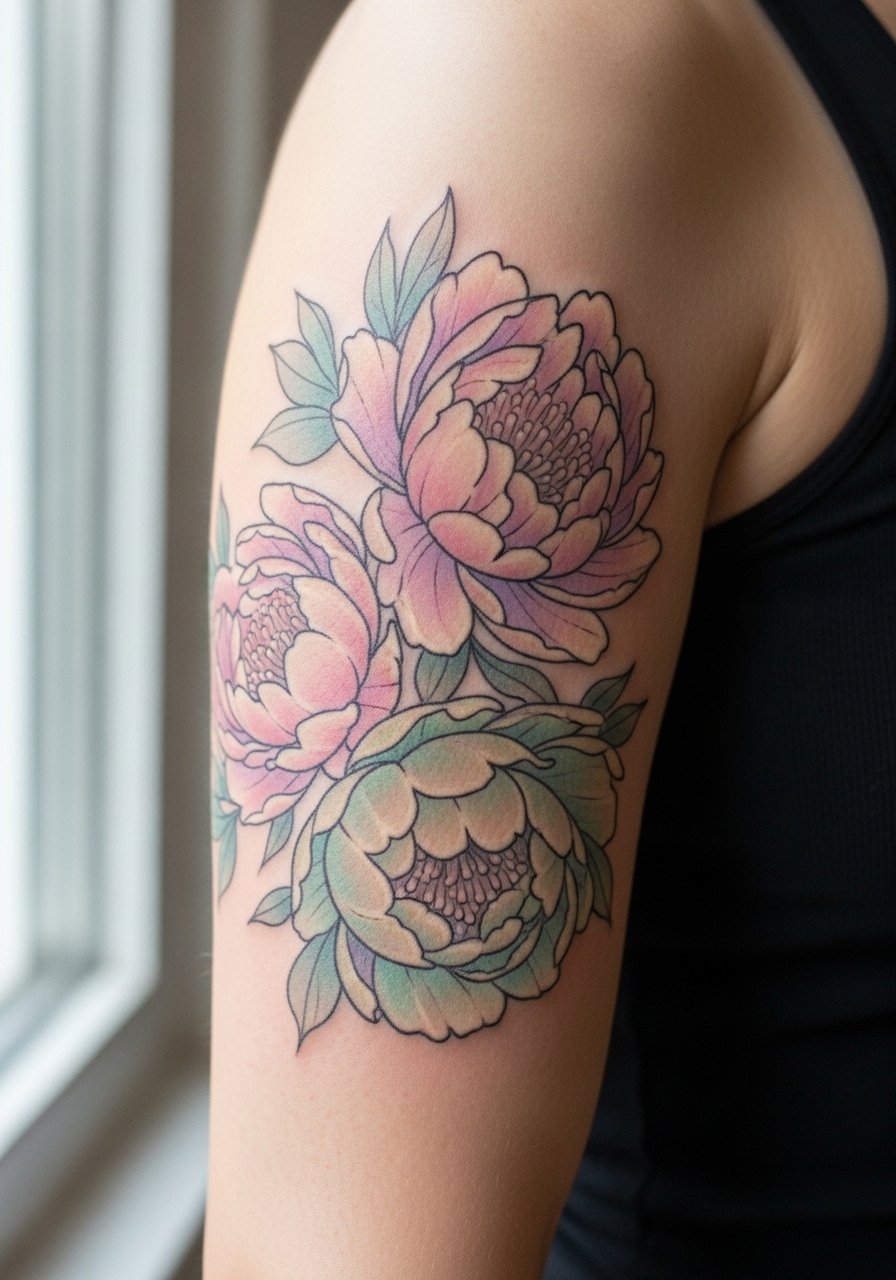
14. Whip Shaded Peonies with Soft Edges
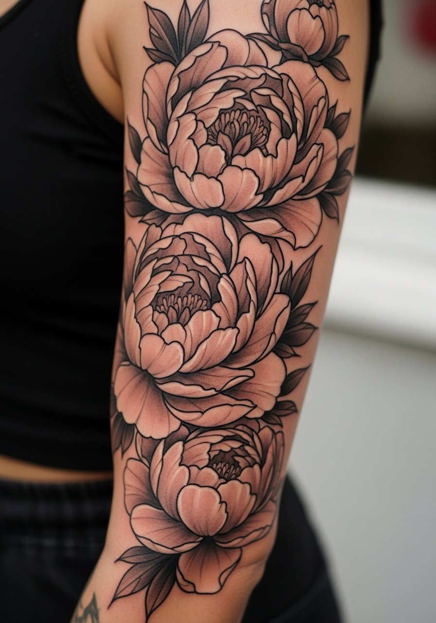
Whip shading gives petals a soft feathered edge that looks like watercolor without heavy color. Specify feathered transitions rather than solid fills to avoid early patchiness. Outer arm and shoulder areas handle whip shading well. The typical mistake is asking for dense saturation on every petal. That reduces the soft feel and shortens time until touch-up. This design looks great with sleeveless tops and a halter top when you want the shoulder elements visible.
15. Fine Line Animal Portraits Integrated into a Floral Sleeve
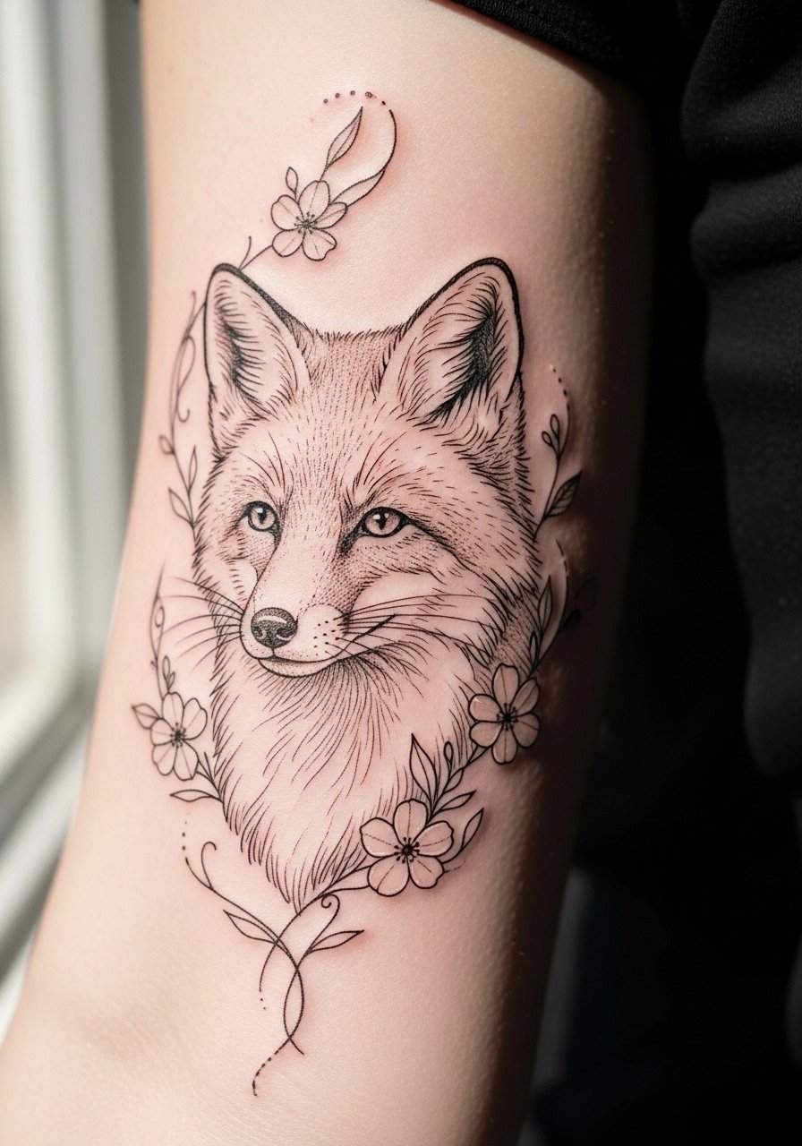
Animal portraits work when not overly tiny and when they have botanical framing to prevent them from getting lost. Ask for slight bolding around the eyes and nose so the portrait still reads at distance. Sessions can be long because of detail. A common mistake is forcing hyper-fine texture that blurs into grey in two years. For the session, wear a button-down shirt that you can pull aside for upper-arm work.
16. Sleeves Built Around a Central Script Panel
A central script can be a focal spine for a sleeve if the lettering is sized for longevity. Discuss font weight and spacing with your artist and request a slightly bolder main stroke. Inner forearm script is visible but takes more sun exposure. People often pick too-small fonts. That decision forces early unreadability. Pair with a thin chain pendant necklace that sits above but does not compete with the panel.
17. Pastel Peony Sleeve with Soft Edge Outlines
Pastel inks create a soft look when outlines are kept slightly darker to hold structure. Ask your artist to anchor petals with low-saturation outlines so the design does not wash out. Pastels fade faster under sun. The outer arm is forgiving but plan touch-ups at two to three years. A mistake is requesting barely-there outlines because that invites blotchy fade. Wear a short sleeve linen shirt to protect the palette while showing the upper arm.
18. Sleeve Combining Dot Work and Thin Black Line Florals
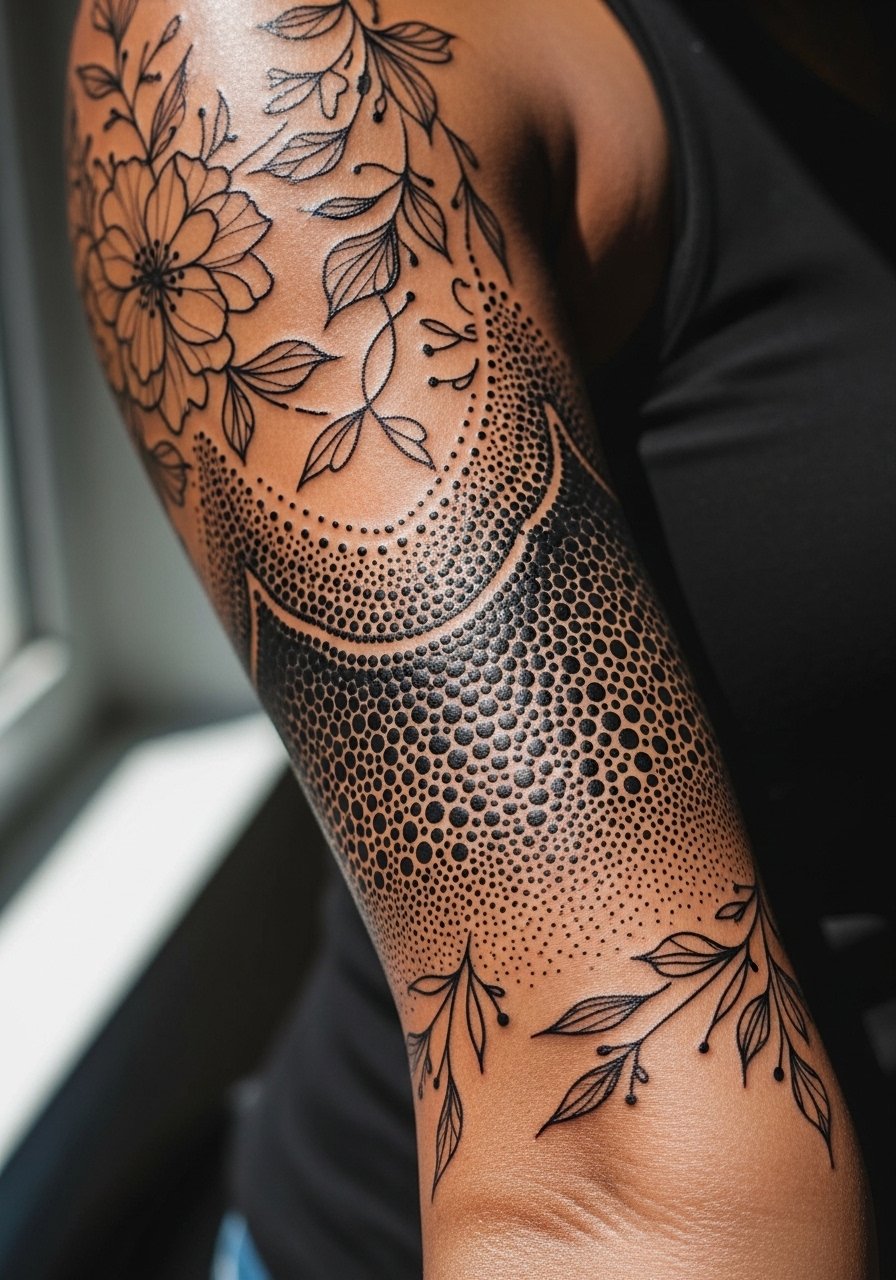
Dot work gradients give a soft sculptural feel that complements thin line florals. Tell the artist where you want denser dots and where negative space should remain. Dot work lowers blowout risk when applied by hand. Sessions are patient and detailed. People who push for too fine dot density across broad areas often see muddy patches later. Pair the sleeve with a stacked ring set that draws attention to hands while keeping the arm balanced.
19. Lace Cuff Sleeve That Mimics Jewelry
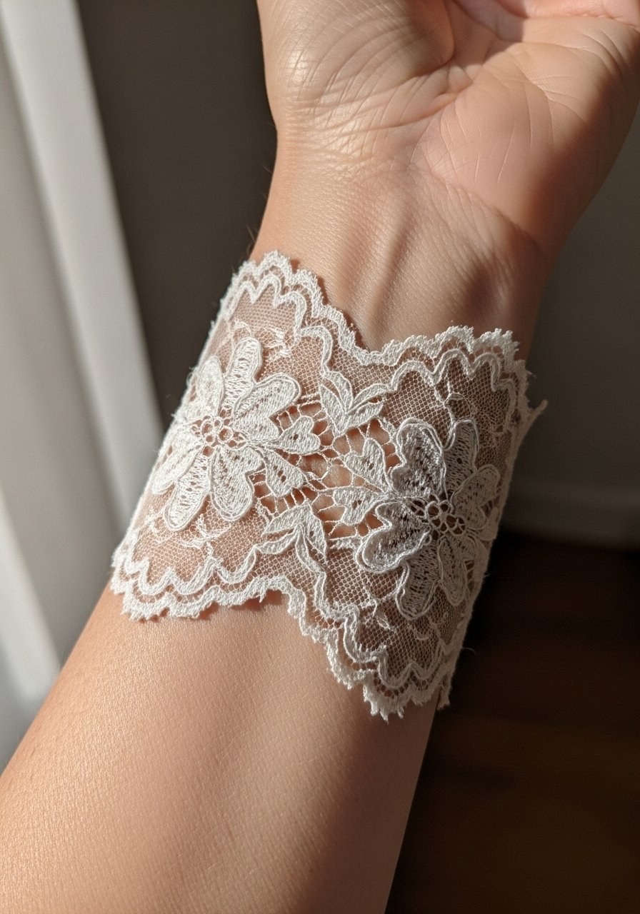
A lace cuff can act like permanent jewelry when sized correctly. Ask for slightly bolder structural lines at joins so the lace remains defined as the finer threads soften. Wrist areas face high friction and washing. A common mistake is asking for ultra-fine filigree that cannot withstand daily handwashing. For wearing, choose a thin chain bracelet that layers without sitting directly over critical linework.
20. Sleeve of Small Celestial Symbols and Subtle Dot Fields
This approach reads airy because symbols are set into sparse dot fields rather than dense shading. Ask for varied symbol sizes and for negative space to remain consistent. Outer arm placement keeps the motifs readable. Many go too dense with background dots which erases the delicate feel. For show-off outfits, a crop top lets the full sleeve read without competing elements.
21. Sleeve Focused on Horizontal Bands with Floral Insets
Bands give the sleeve structure and make touch-ups easier because each section can be addressed separately. During consultation, pick band width that suits your limb width and ask for clean negative spacing. Narrow bands on thin wrists blur faster. The common mistake is over-embellishing each band which makes the sleeve visually heavy. Pair with a short sleeve mock-neck top that shows the bands without crowding the neckline.
22. Sleeve with Soft Script and Tiny Iconography
Mixing script with small icons reads like a personal ledger across the arm. Increase letter size slightly from your original idea so the script ages into legibility. Outer placements endure better. The error is micro-icons crammed too close. For the session, wear a loose long sleeve you can roll up so the artist has easy access and you stay comfortable.
23. Garden Sleeve with Subtle Black Outline and Soft Interior Color
A thin black outline with gentle interior color gives the charm of color work while maintaining structure over time. Ask for lower pigment density inside petals and stronger line anchors. The outer arm tolerates this approach best. Over-saturation in every area makes the sleeve heavy and speeds fading. Pair this sleeve with open-back midi dresses for nights out where the arm is visible.
24. Sleeve That Uses Negative Space to Create Lightness
Negative space sleeves look soft because much of the skin becomes part of the design. Ask your artist to map negative areas during the stencil step so you can see how it moves with muscle. Mistakes include underestimating the amount of skin that needs to remain clear. Negative space must be intentional. Wear a sleeveless knit top to let the skin-sculpting effect show.
25. Sleeve with Soft Black Outline Covering a Tattoo Crossover
When blending old pieces into a new soft sleeve, outline cohesion matters more than matching color. Ask for a unifying lineweight and transitional florals that ease the eye across styles. Pain depends on how much existing scar tissue is present. A frequent error is trying to cover too much with low-contrast details. A clearer outline approach keeps the sleeve coherent and touch-ups manageable. For sessions, wear a button-down shirt to easily expose just the area being worked on.
26. Sleeve That Embraces Negative-Space Script Bands
Script bands carved out of skin tones can read like lace if spaced correctly. During consult, test the negative-space width and request slightly thicker anchoring lines at joins. The wrist and inner forearm need extra space. Overly tight bands will merge. For showing off, a rolled sleeve denim jacket gives contrast while keeping the bands front and center.
27. Soft Sleeve with Sparse Color Pops and Thin Black Linework
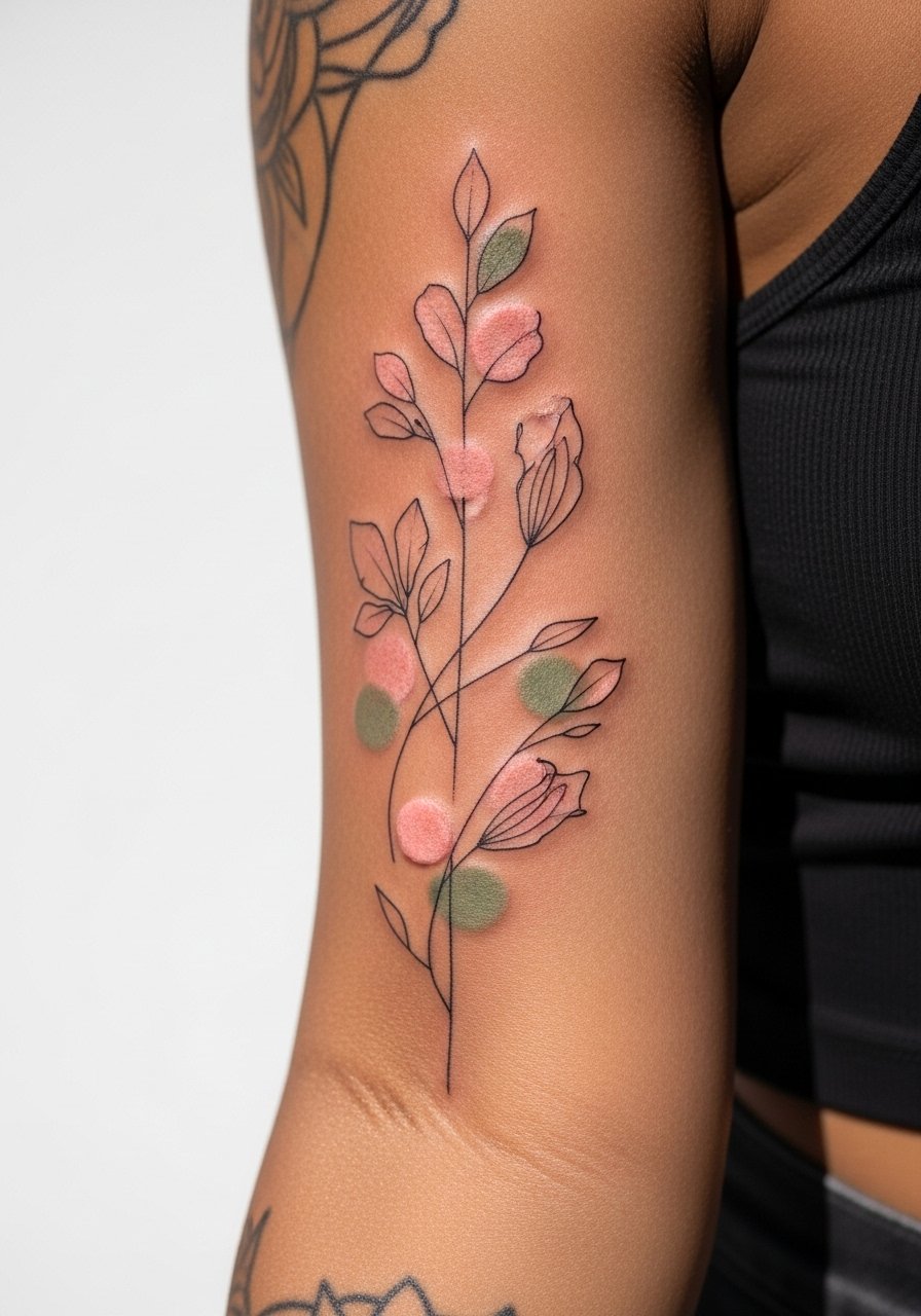
A sleeve with selective color pops looks delicate and intentional. Tell your artist exactly which elements get color so saturation is controlled. Outer arm placements extend color life. Common mistakes include coloring every motif which removes the soft focus. Expect a touch-up on colored spots at two to three years. For showing it off, a cap sleeve top keeps attention on the arm while providing sun protection for the rest.
Frequently Asked Questions
Q: Will fine line elements in a sleeve blur together over time?
A: It depends on spacing, placement, and sun exposure. Fine line holds best when motifs have negative space and anchor lines. I advise asking for slightly bolder anchors in the consultation so the piece keeps structure as the hairline strokes soften.
Q: How often should I plan touch-ups for soft color pastel sleeves?
A: Plan for a light refresh at two to three years for low-saturation pastels. The outer arm can stretch that timeline. Touch-up frequency depends on sun exposure and how often the area rubs against clothing.
Q: Are hand or wrist sleeves still controversial for job prospects?
A: Yes, two camps exist. One says hand and wrist tattoos are increasingly accepted in creative fields. The other points out visible ink can still affect opportunities in conservative workplaces. Consider your career path and placement visibility before committing.
Q: What should I wear to a multi-hour sleeve session to stay comfortable and give the artist access?
A: Loose button-downs, tank tops, or a zip-up hoodie are practical. For lower-arm work, a loose linen drawstring pant helps if the session moves toward the wrist or forearm and you need mobility.
Q: Do watercolor sleeves need different maintenance than black linework?
A: Watercolor approaches often require more frequent touch-ups because pigments are lighter. Keep the palette airy and ask about layering strategy during consultation so the artist can plan for longevity.