
Fine line chest pieces are everywhere, but the vintage-looking ones that still read crisp after a few years start with different choices. Scale, spacing, and texture matter more than tiny detail. These 27 in-between chest ideas for women focus on what holds up, what to avoid, and the exact notes to bring to your consultation so the piece looks intentional now and aged well later.
1. Vintage Script Banner Centered on Sternum
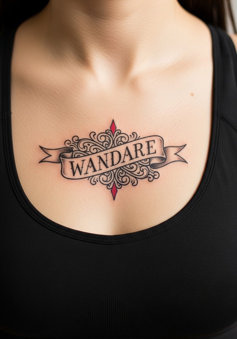
Start with slightly bolder linework than you think you need for script in the sternum area. The skin there moves with breathing and can blur delicate hairline strokes. Tell your artist you want medium-weight linework with modest letter spacing so the letters do not collapse over time. A common mistake is asking for ultra-fine cursive that reads like lace the day after, then smudges in year two. Session feel is moderate; expect the sternum to be sensitive around the center but manageable in short passes. For showing it off, a bandeau top frames the band without cutting off the design.
2. Ornamental Dot-Work Medallion Between Breasts
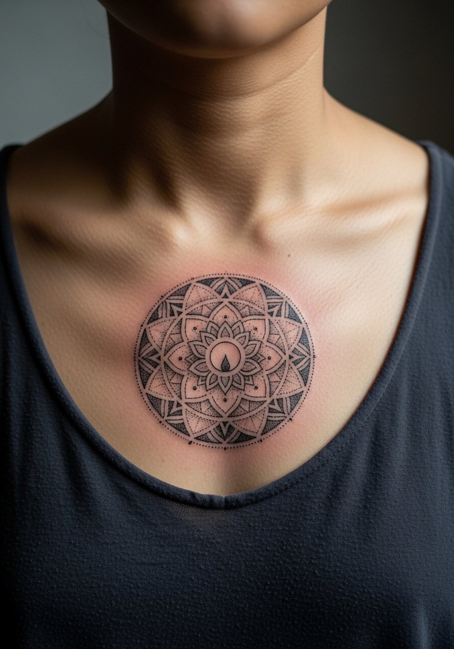
Dot work or stipple shading reads as texture that ages into soft shadow rather than muddy patches when done with proper spacing. Ask for stipple shading with intentional negative space and avoid filling dense black in the center. Artists sometimes overwork dots into solid shading, and that is the version that loses crispness. This placement tends to need touch-ups at year three for dense darks, but stippling usually softens elegantly. During the session, expect a steady vibration rather than sharp twinges. Pair the medallion with an open-back midi dress to reveal the center detail on nights out.
3. Tiny Cameo Portrait Nestled Under the Collarbone
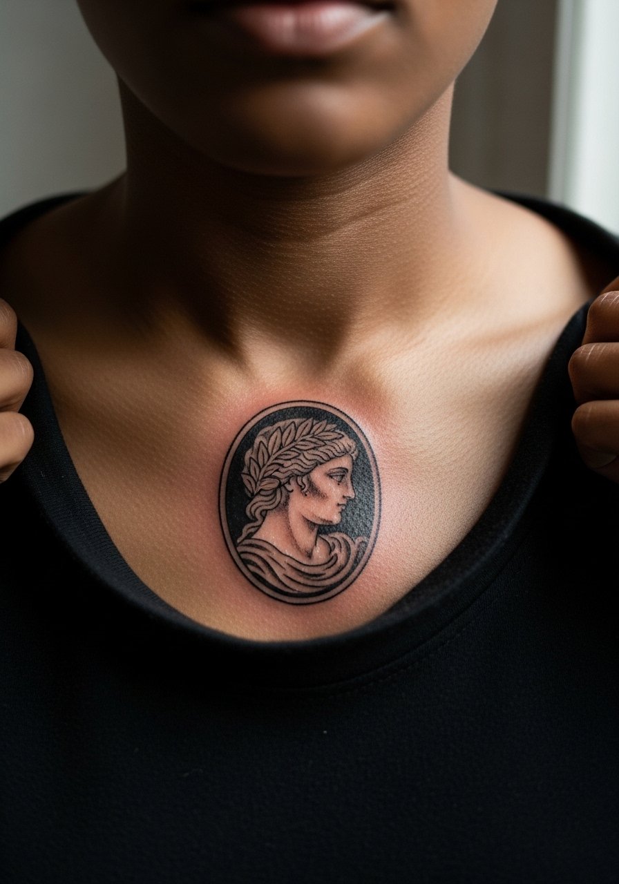
Micro-realism portraits can read vintage if you pick a simple oval frame and slightly desaturated shading. Tell the artist you want the portrait simplified, with emphasis on shape over tiny facial detail. The biggest mistake is cramming too much facial detail into a small space, which becomes blurrier over time. Expect a longer session for shading and a touch-up around year two for contrast. This area has moderate blowout risk because of thin skin near the clavicle, so ask the artist about their needle depth approach. For evenings, a thin chain pendant necklace can sit above the cameo without covering it.
4. Art Nouveau Floral Cluster Centerline
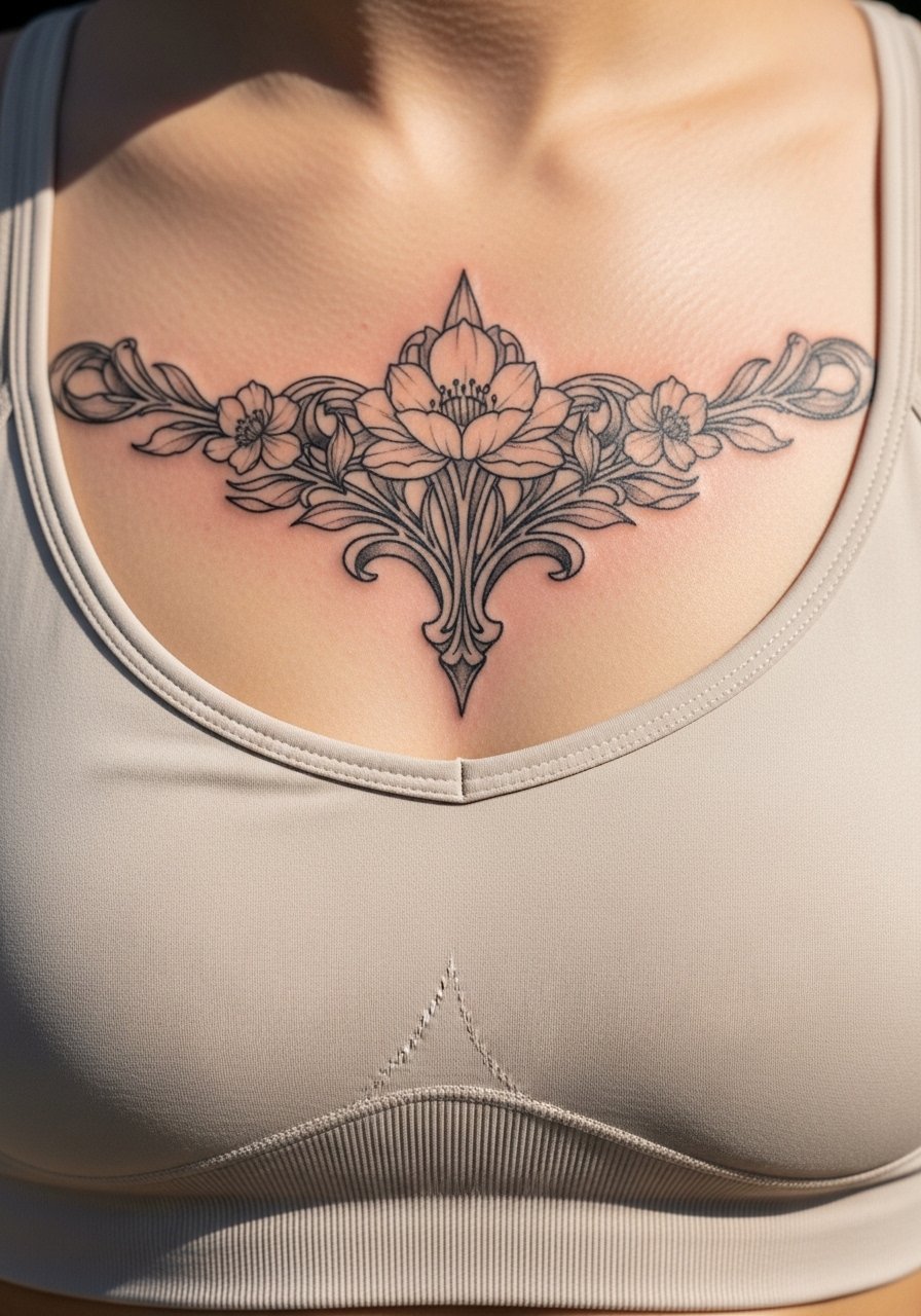
Art Nouveau curves translate well to the in-between chest because they follow the natural flow of the sternum. Ask for slightly exaggerated stems and mid-weight outlines to keep petals readable as skin shifts. A common error is adding tiny filigree that vanishes as the piece ages. At six months the curves are crisp, at two years the shading blends softly, and at five years the silhouette is what matters. The session is steady; shading requires sitting still for a few passes. Pair with a loose button-down shirt you can pull aside for the appointment.
5. Vintage Key with Filigree Backplate
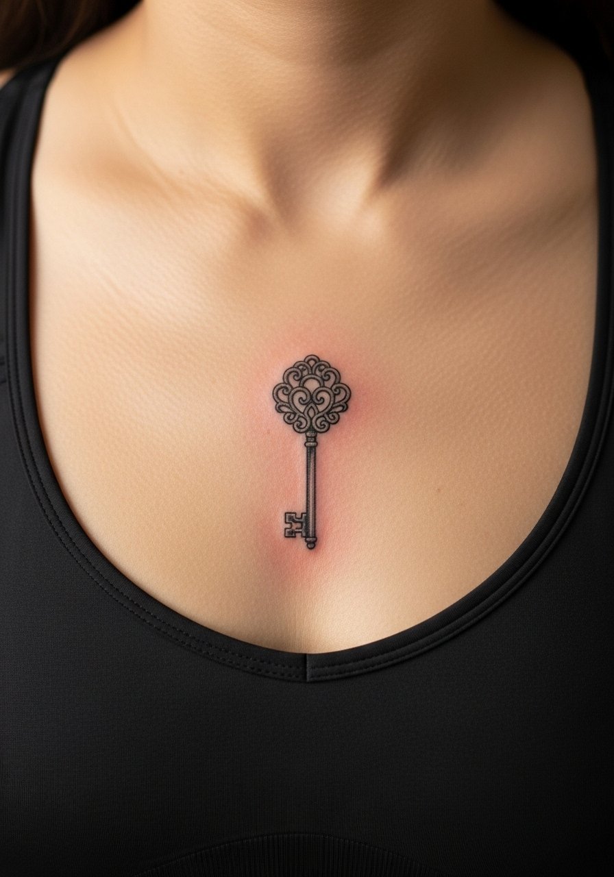
A single key with a filigreed backplate reads antique and ages well if the teeth and handle are kept bold enough. Tell your artist to avoid hairline crosshatching inside the key. That kind of micro detail blurs fastest. The main mistake is placing the design too small under the bust; scale it so the backplate breathes. Pain is moderate near the bone and lighter as the needle moves outward. Style it with a racerback tank for a casual reveal that keeps the tattoo visible without being exposed.
6. Symmetrical Anchor with Rope Motif on the Midline
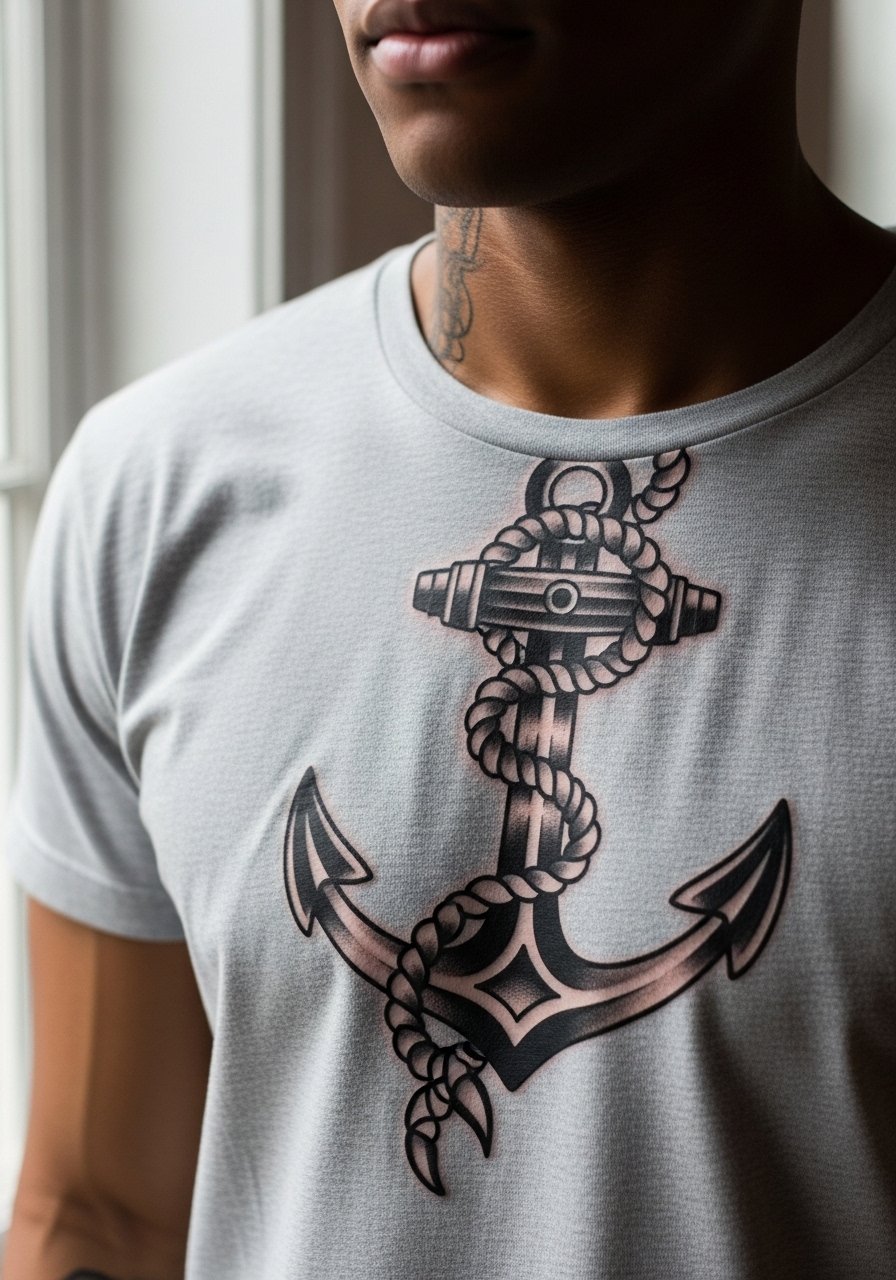
Classic anchors read vintage by virtue of their line weight and negative space. Ask for clear, bold outlines and spare internal shading. The worst version is a tiny, fussy anchor with weak contrast that fades into the skin. Expect the first session to focus on clean linework and a short color pass, then a touch-up after healing. The sternum can be tender, so break the session into shorter passes if needed. For a nautical mood, pair the piece with an open-collar linen shirt for relaxed days.
Studio Day Picks
Those early chest and sternum designs above can react differently during healing than forearm work, and a few focused items smooth the session and the first week.
-
Stencil transfer paper kit. Lets you test the exact placement on skin before the needle hits, which is invaluable for centered chest pieces.
-
Topical numbing cream. Used with care, it takes the edge off sternum sensitivity for short passes without masking too much detail for the artist.
-
Thin protective film roll. Keeps the midline work clean during the first days of friction from clothing.
-
Fragrance-free body wash. A gentle cleanser helps rinse sweat and oils without stripping the newly tattooed skin.
-
Aquaphor healing ointment. A thin layer for the initial days helps keep fine line and shaded vintage details from drying into hard flakes.
7. Crescent Moon with Filigree Baroque Frame
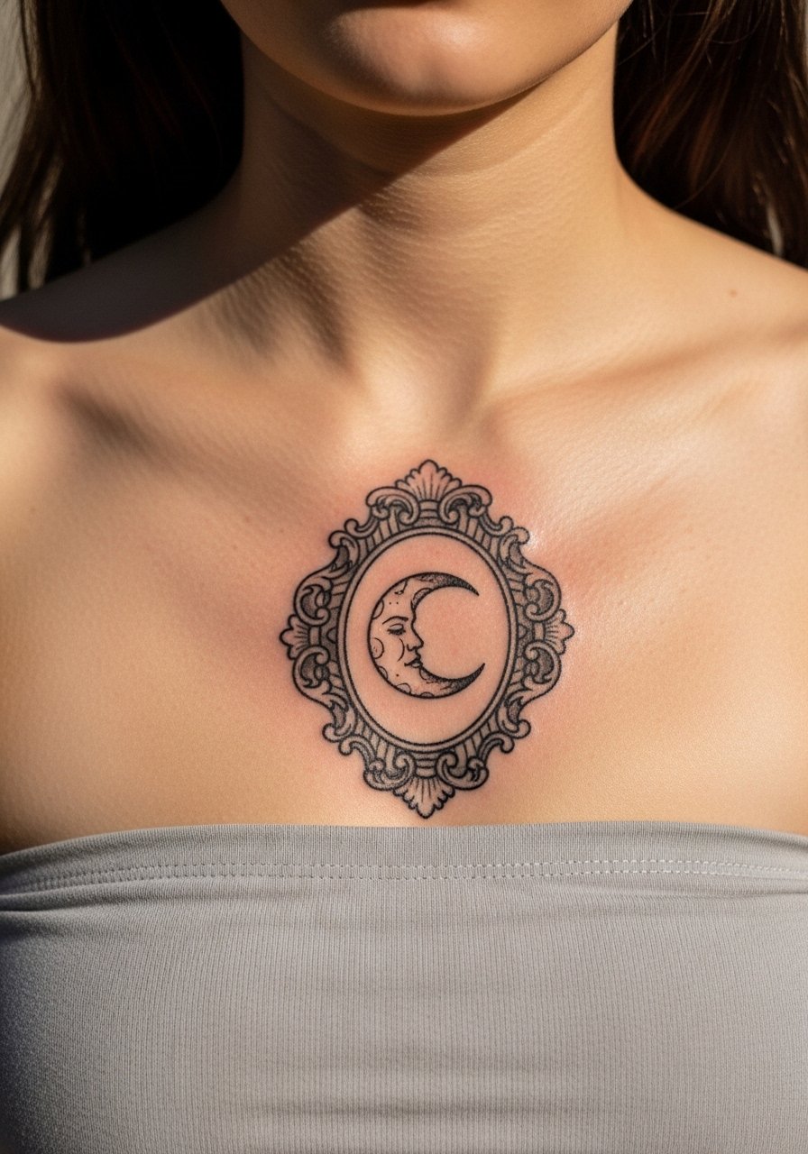
A crescent moon rendered with baroque filigree feels inherently vintage and suits the chest center. Ask the artist for open negative space inside the frame so the moon and curls remain legible. The mistake is over-detailing the interior curls. At six months the frame holds its silhouette, but dense internal detailing often needs a touch-up at year two. This placement is sensitive but tolerable. For showing off, a slip dress with a low neckline highlights the curve without covering it.
8. Antique Compass Rose Aligned to the Sternum
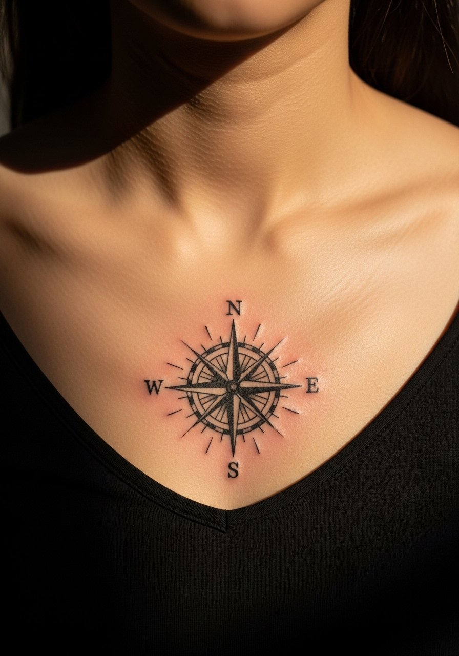
Compass roses feel vintage when the points are spaced generously and interior lines are restrained. Tell the artist you want deliberate spacing between cardinal points and thicker outer ring lines. The common error is packing too many directional ticks, which muddle as the ink settles. Expect some sensitivity midline, and plan for a touch-up to restore crisp radial contrast after healing. For date nights, a deep V neckline blouse frames the compass beautifully.
9. Scripted Phrase with Vintage Flourishes
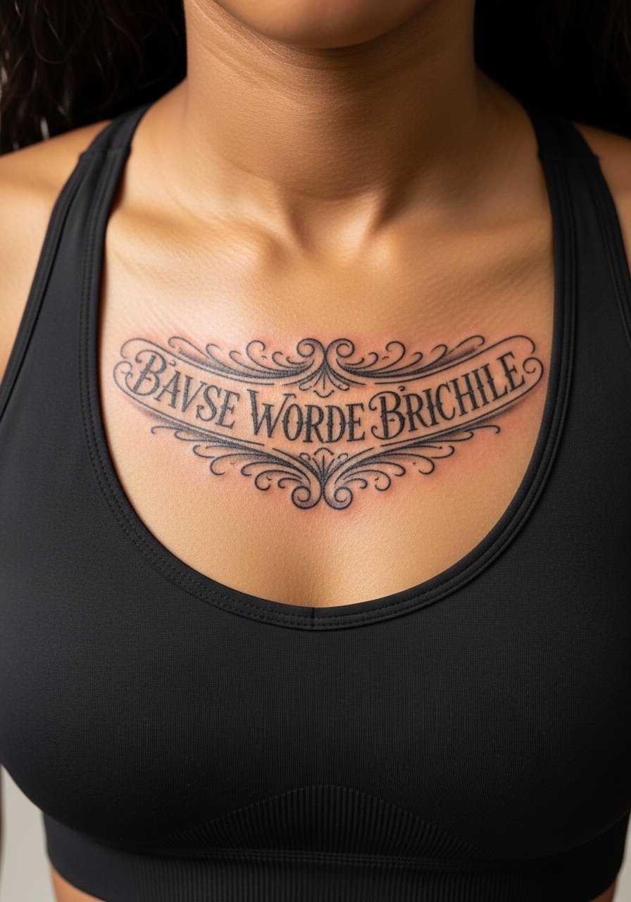
Longer script works if the letters keep airy spacing and the flourishes stay sparing. Ask for letterforms with breathing room and a slightly heavier downstroke so counters remain clear. The mistake is running script too narrow across the sternum where the skin flexes. That causes letters to compress after a year. Sessions for phrases are steady with short bursts of outlining and shading. Pair the phrase with a delicate pendant necklace that rests just above the text to draw the eye.
10. Botanical Sprig Running Up the Centerline
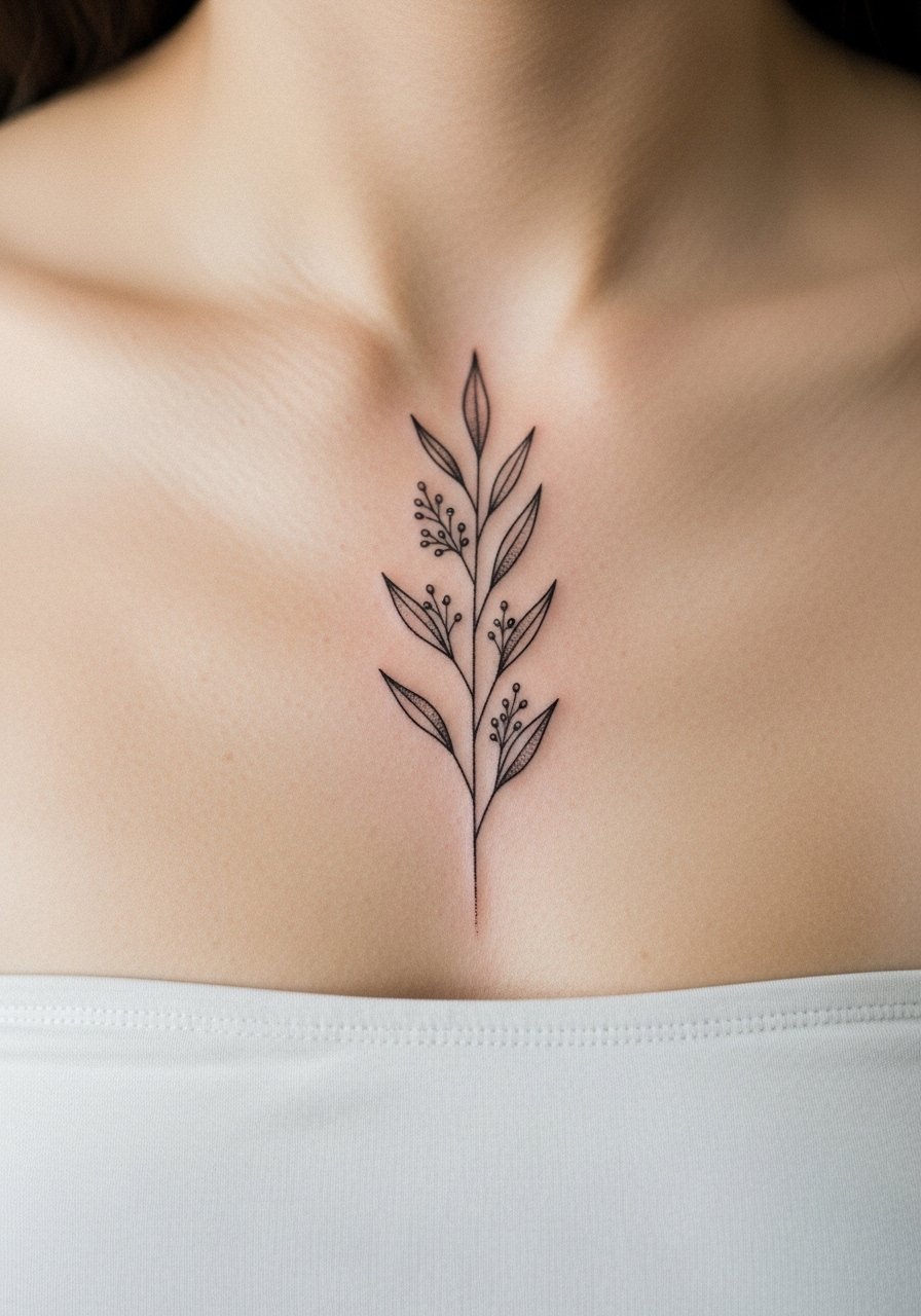
A vertical botanical sprig can read vintage by keeping leaves spaced and stems not too thin. Ask for slightly tapered stems with leaf veins suggested rather than filled. The most common mistake is over-detailing veins that merge into shaded blobs over time. This placement flexes with breathing so expect a touch-up at year three for delicate shading. For casual showing, a cropped button-down tied at the waist gives a breezy reveal.
11. Retro Keyhole with Lace Motif
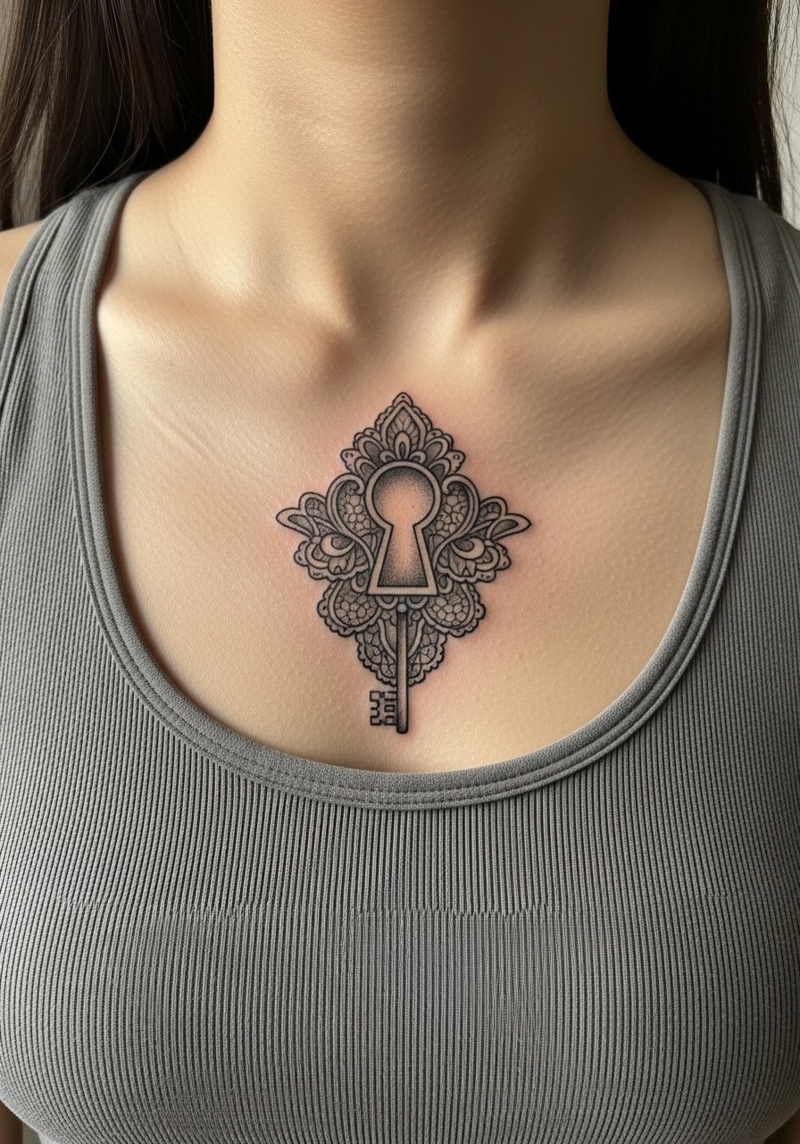
Keyholes framed by lace read antique when the lace stays airy instead of solid. Tell the artist you want negative-space lace and a pronounced keyhole core. People often ask for heavy lace that ends up looking like a smudge across the chest. The sternum is tender, expect intermittent sharp spots when the needle crosses bony areas. Style it with a high-waisted skirt and cropped top so the keyhole sits neatly between garments.
12. Small Cameo of Botanical Silhouette
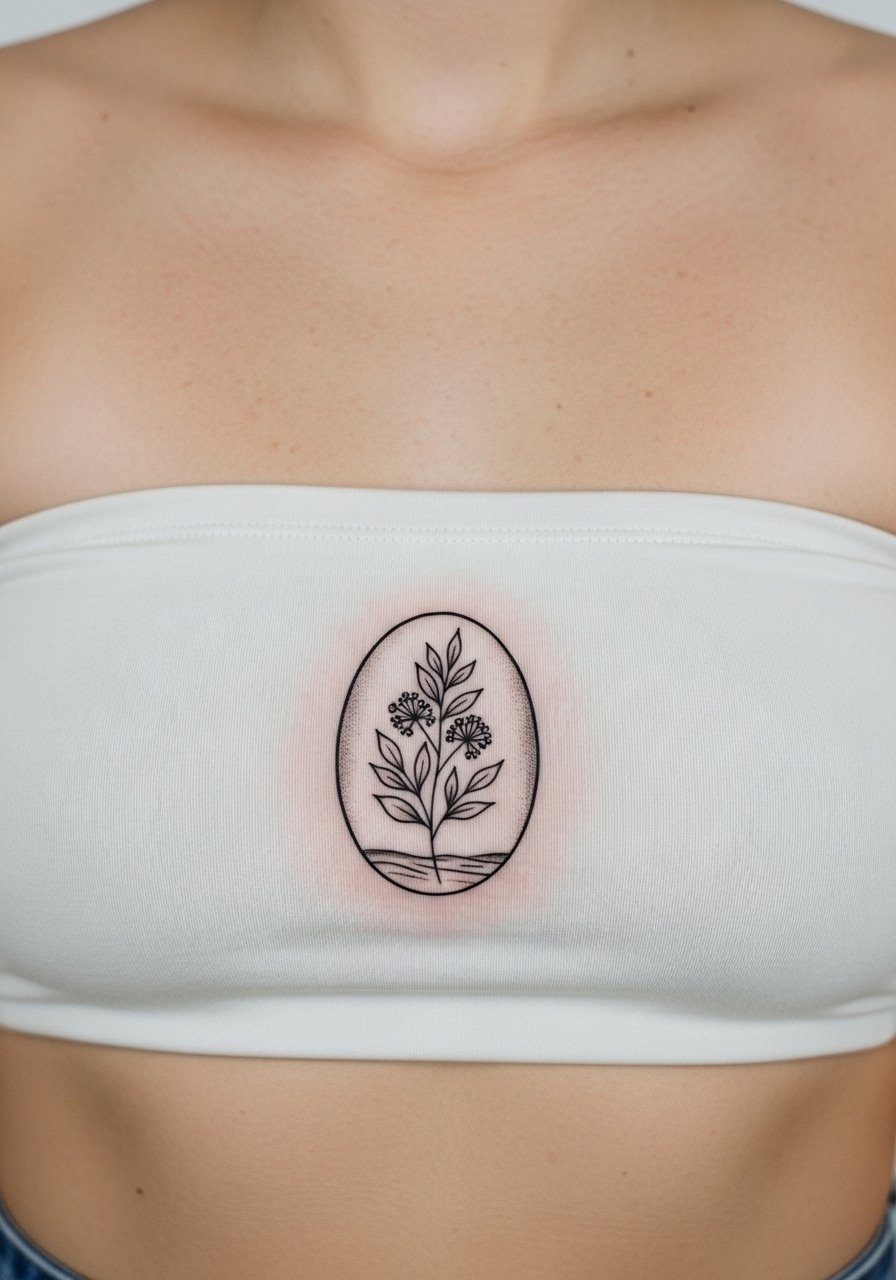
Simplified silhouettes have longevity because they depend on shape rather than tiny detail. Ask for bold outer contours and minimal interior shading. The common mistake is insisting on interior micro shading that will soften and lose definition. Expect the session to be quick if kept to silhouette only. For low-key days, layer a thin chain choker above the cameo to create a framed look.
13. Vintage Lock and Heart Motif Aligned Midline
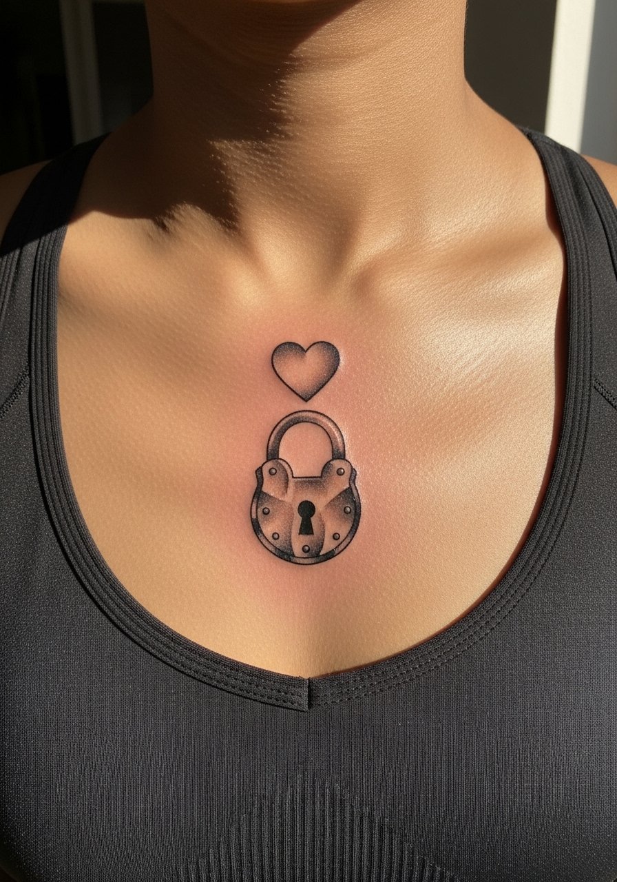
Locks paired with simple heart outlines read like heirloom pieces when the lock is given solid outlines and the heart is left open. Ask for a modest scale so both elements breathe. Many request tiny locks that lose shape, so resist shrinking the component. Midline work here can be more painful over the bone, so plan breaks. For an evening reveal, a wrap-front blouse shows the motif in a soft way.
14. Ornate Anchor with Vintage Ribbons
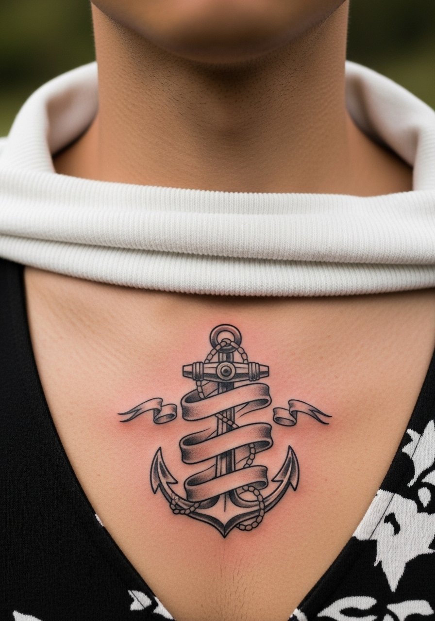
Ribbons give a vintage feel when they flow and have generous negative space inside. Ask your artist to keep the ribbon tails airy and ask for thicker outline on the anchor itself. The mistake is adding tiny type inside the ribbon that fades into an unreadable smudge. Expect steady discomfort near the sternum center and a short shading pass. Pair with a loose linen blazer left open for daytime styling.
15. Victorian Cameo Frame with Negative Space Portrait
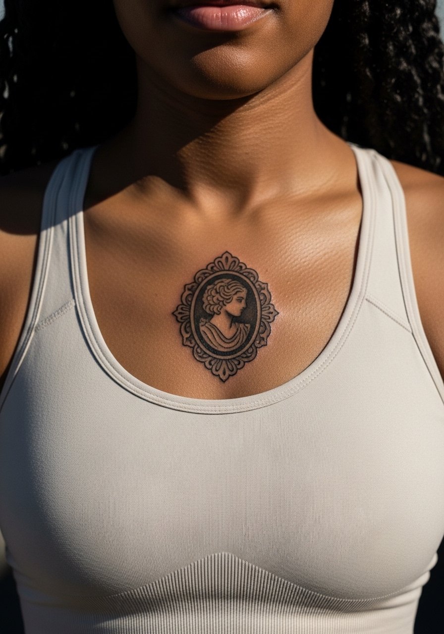
Using negative space for the portrait inside a heavy frame yields a vintage look without overworking fine details. Tell the artist you want a bold frame and the face implied rather than rendered in micro detail. The mistake is insisting on full micro realism inside a tiny oval. Sessions can be focused on the frame first, then suggest minimal contrast inside. For an elegant outfit, a square-neck blouse highlights the cameo without covering it.
16. Minimalist Anchor with Rope Shadow
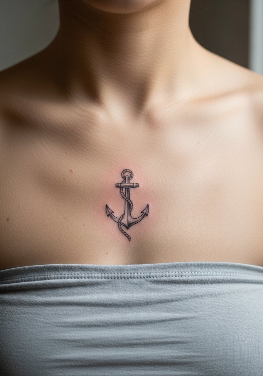
A minimalist anchor with a shadowed rope creates depth without heavy fill. Ask for a slightly thicker anchor outline and a faint rope shadow rendered with airy dot work. A common mistake is leaving the anchor outline too thin. That leads to earlier blur. This placement has moderate sensitivity and may sting when the needle crosses sternum bone. For daily wear, a simple cropped tee keeps the tattoo visible without fuss.
17. Antique Script Monogram in a Shield
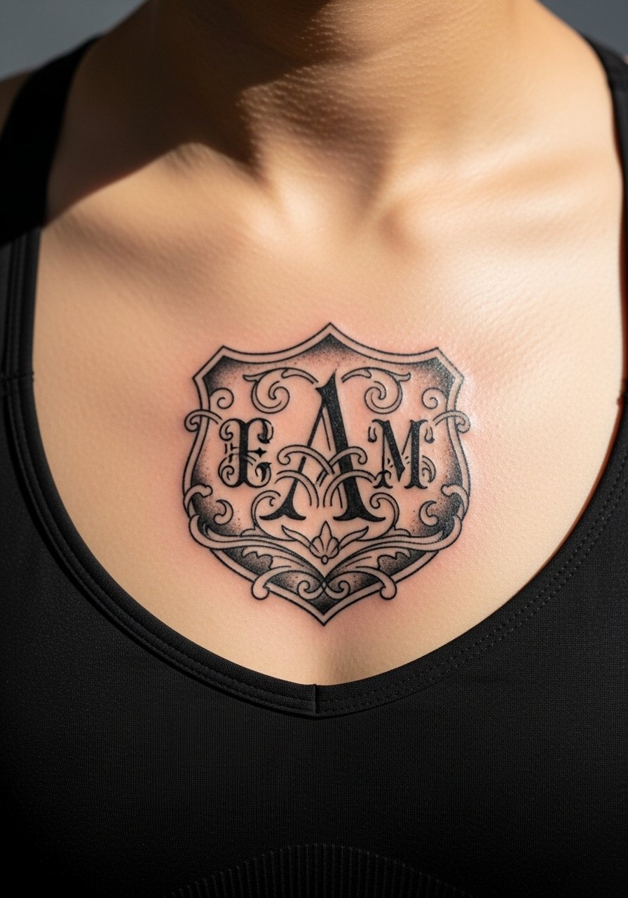
Monograms read vintage when letterforms are simplified and set within a bold shield. Ask for clear negative space between initials and a strong outer border. People sometimes request delicate curls that become muddled. This area is sensitive but not extreme, and touch-ups for contrast may be needed in a few years. For jewelry pairing, a thin chain pendant necklace can work above the shield without crowding.
18. Compass with Vintage Map Lines
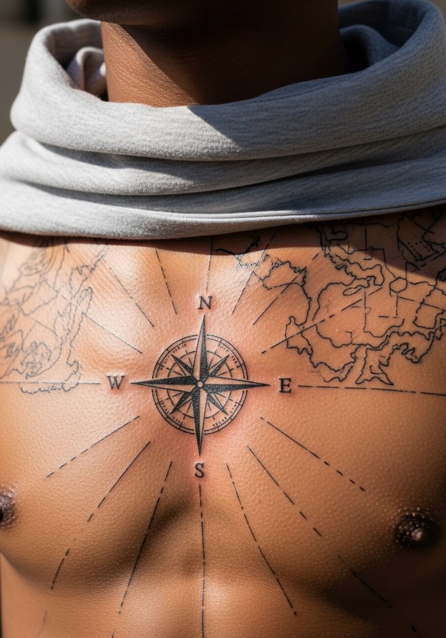
Combining a strong compass with faint map lines gives an aged cartographic feel. Ask the artist for bold compass lines and faint map strokes that stop before crowding the center. The mistake is making the map lines too heavy. That creates visual noise as they soften. Expect focused passes for radial lines and gentle shading for map strokes. Pair the look with an open collar shirt to display the map subtly.
19. Floral Garland Hung Like a Vintage Necklace
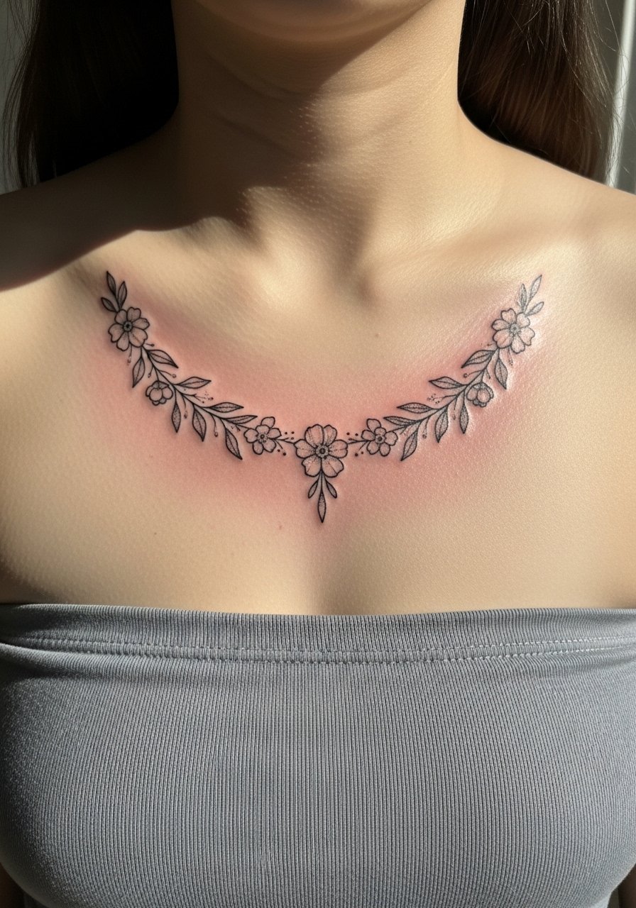
A garland that sits like jewelry works best when the flowers are spaced and the garland has a gentle curve. Ask for a slightly thicker outline on the blooms and airy shading. The common mistake is compact clusters that merge into a single dark mass over time. This placement is pleasant during the session but the uppermost petals near the collarbone may be ticklish. Dress it with a strappy tank for easy reveals.
20. Tiny Nautical Star Stack Centered Above Sternum
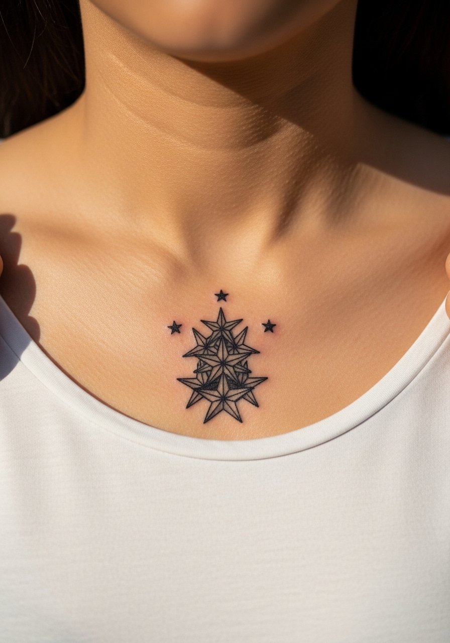
Small stars can look vintage when spaced vertically and done with bold black points. Ask for enough space between each star so they keep identity as they age. The biggest mistake is lining them too tightly; they conflate as skin shifts. Sessions are fast but crossing the central bone can feel sharp. For day wear, a button-front crop top frames the stack neatly.
21. Heraldic Mini Crest with Vintage Shading
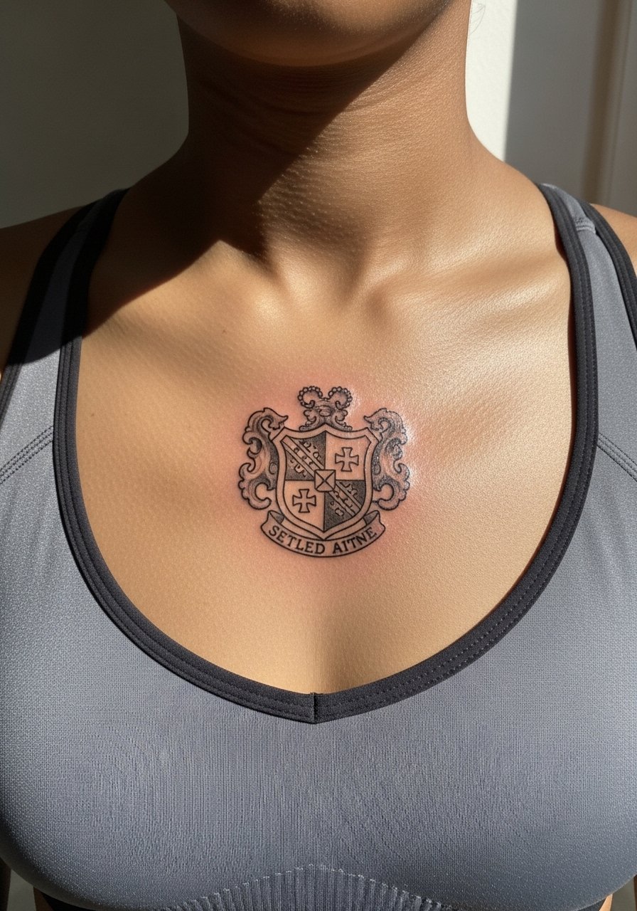
Heraldic crests feel antique when simplified and shaded sparingly. Ask for bold outer lines and minimal inner patterning to preserve contrast. The error is overloading the crest with tiny symbols that blur together. Expect the session to focus on clean outlines first, then a light shading pass. For a classic look, style it with a structured blazer left open that reveals the crest in a refined way.
22. Vintage Frame with Botanical Negative Space
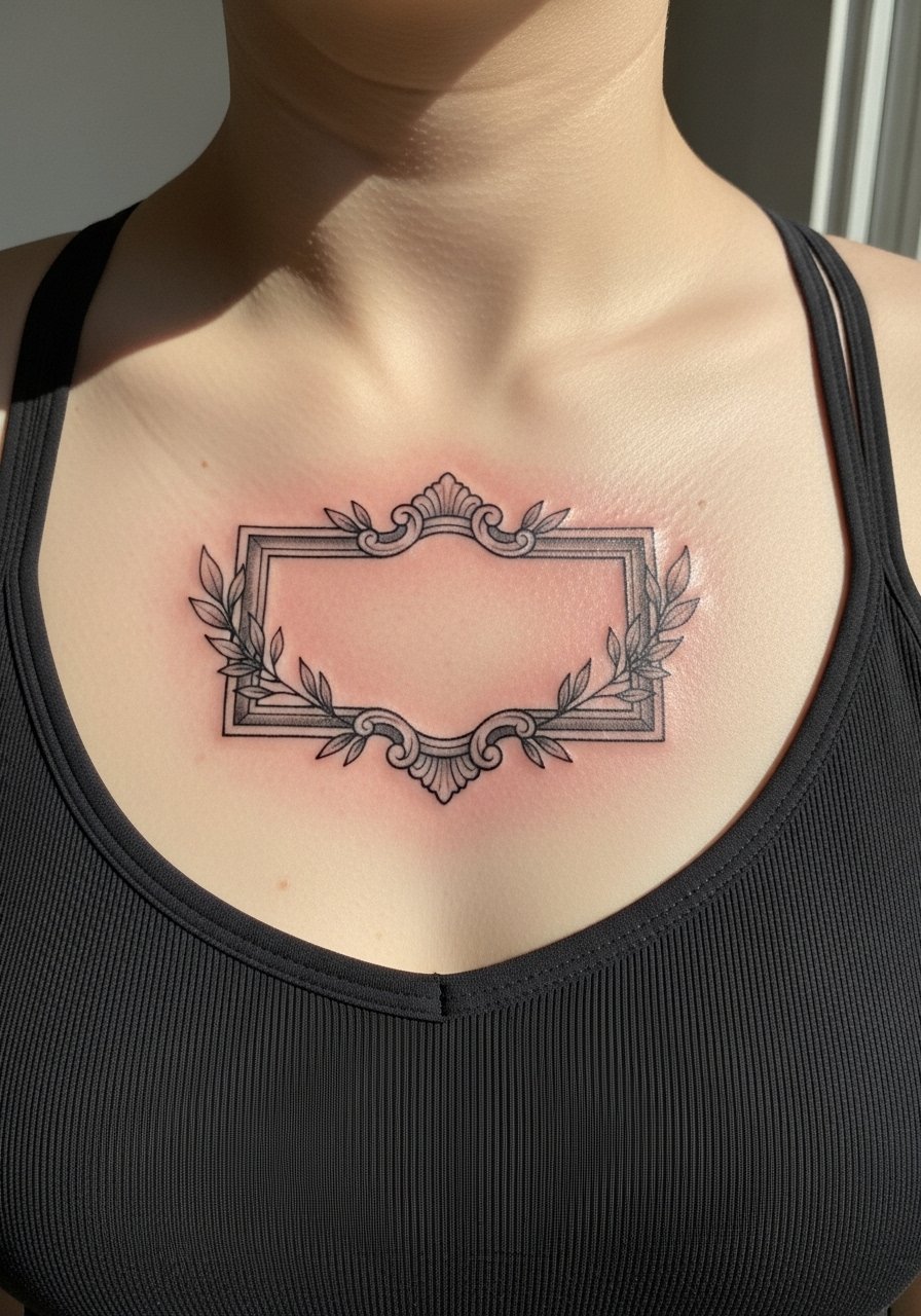
Frames that embrace negative space keep the center uncluttered and age gracefully. Tell the artist you want the frame to do the visual work and the interior to remain open. Many clients request interior detail that loses clarity in a few years. Expect modest discomfort along the sternum bone and a brief shading pass for the frame. Pair with a square-neck tank for a neat silhouette.
23. Small Hourglass with Filigree Base
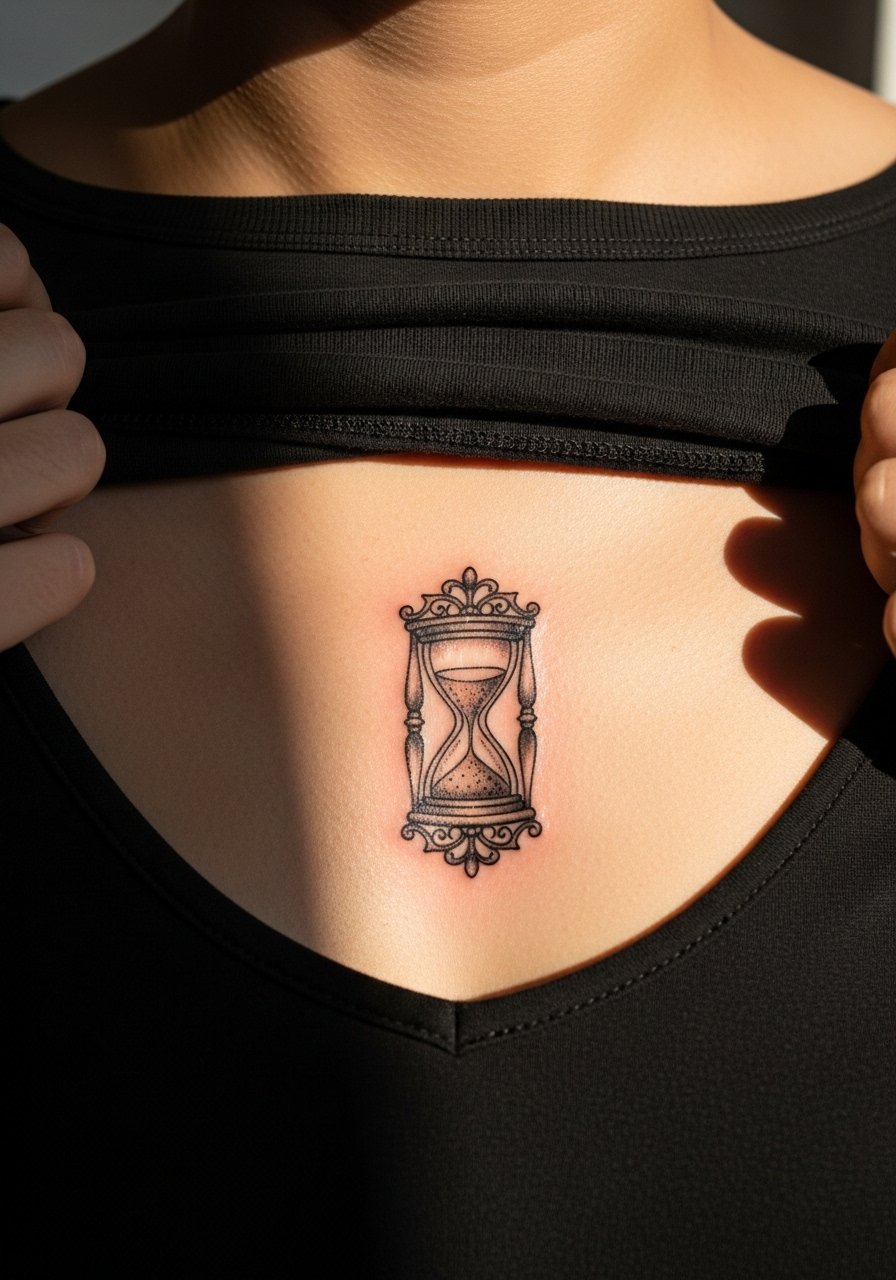
Hourglasses carry a vintage vibe and translate well when the glass and sand are suggested rather than fully detailed. Ask for clear glass contours and a light filigree base. The common mistake is insisting on tiny grains of sand that smear into an indistinct shadow. Sessions are focused and usually under an hour if kept simple. For a romantic outfit, a V-neck camisole displays the hourglass with ease.
24. Tiny Bell Jar with Miniature Scene
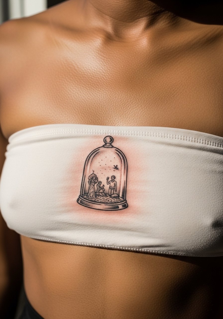
Bell jars read vintage when the scene inside is graphic and bold rather than overworked. Ask the artist to simplify elements into silhouettes so the scene reads at a glance. People push for micro detail that becomes a gray blur. This area can be sensitive but the work is usually brief. Pair with a simple slip dress for an elegant reveal.
25. Crescent and Stars Rowed Like a Necklace
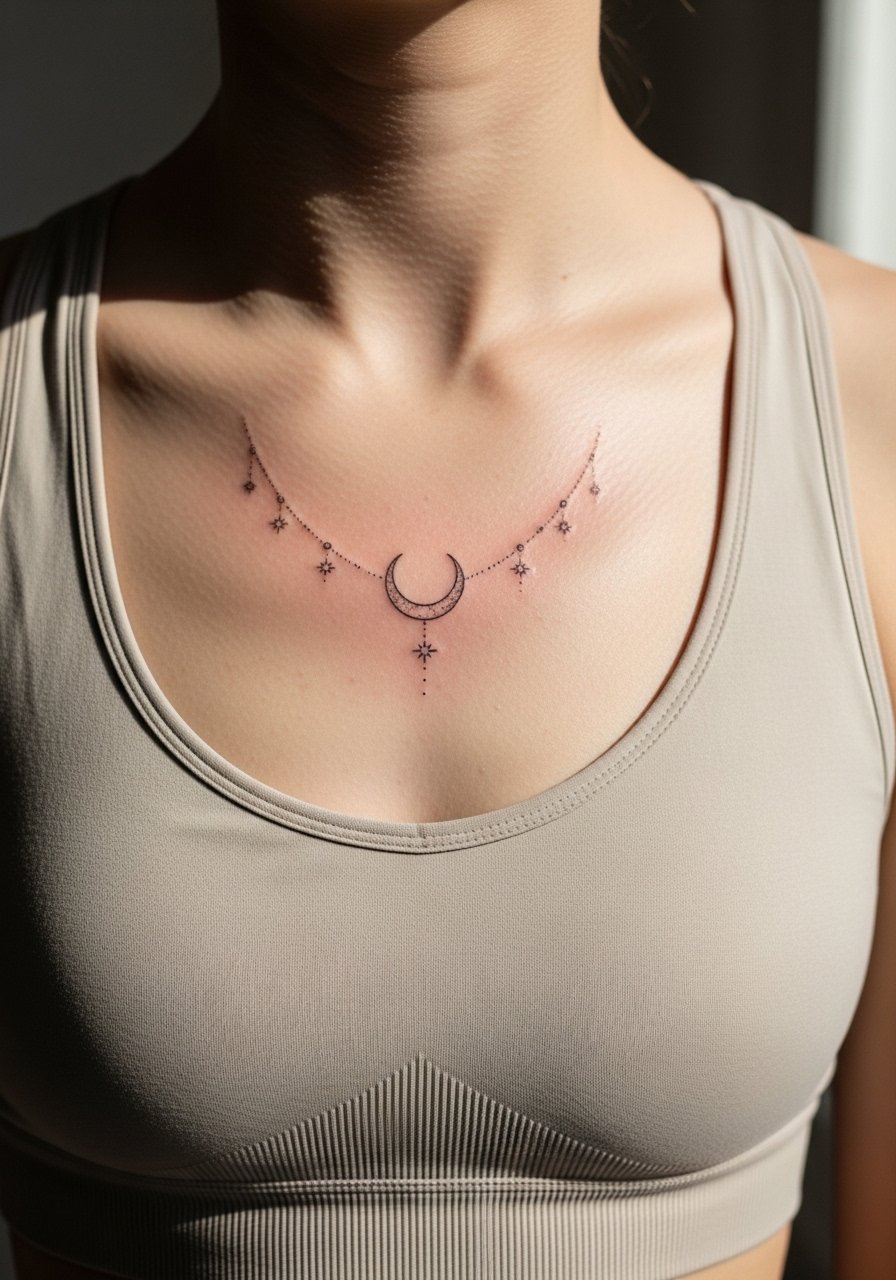
A horizontal row of celestial pieces reads vintage when spacing is even and the moon is slightly larger than the stars. Ask for clear spacing and avoid filling stars solidly if you want a delicate look. The main mistake is putting the elements too close so they blur into a single shape. Sessions are quick and less painful than deep sternum hits. For daytime styling, a scoop-neck tee keeps the row visible without fuss.
26. Antique Floral Brooch with Center Gem
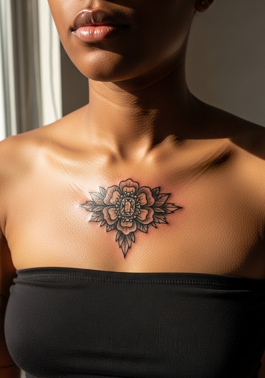
Brooch motifs feel like heirloom jewelry when a central gem is suggested with a tiny highlight rather than detailed facets. Tell the artist you want a simple highlight and moderate outline thickness. Over-rendering the gem leads to muddiness as it ages. This placement can be sharp when the needle crosses the bone, so short breaks help. Style with a vintage-style blouse that complements the brooch feel.
27. Monochrome Cameo Chain Drip to Midline
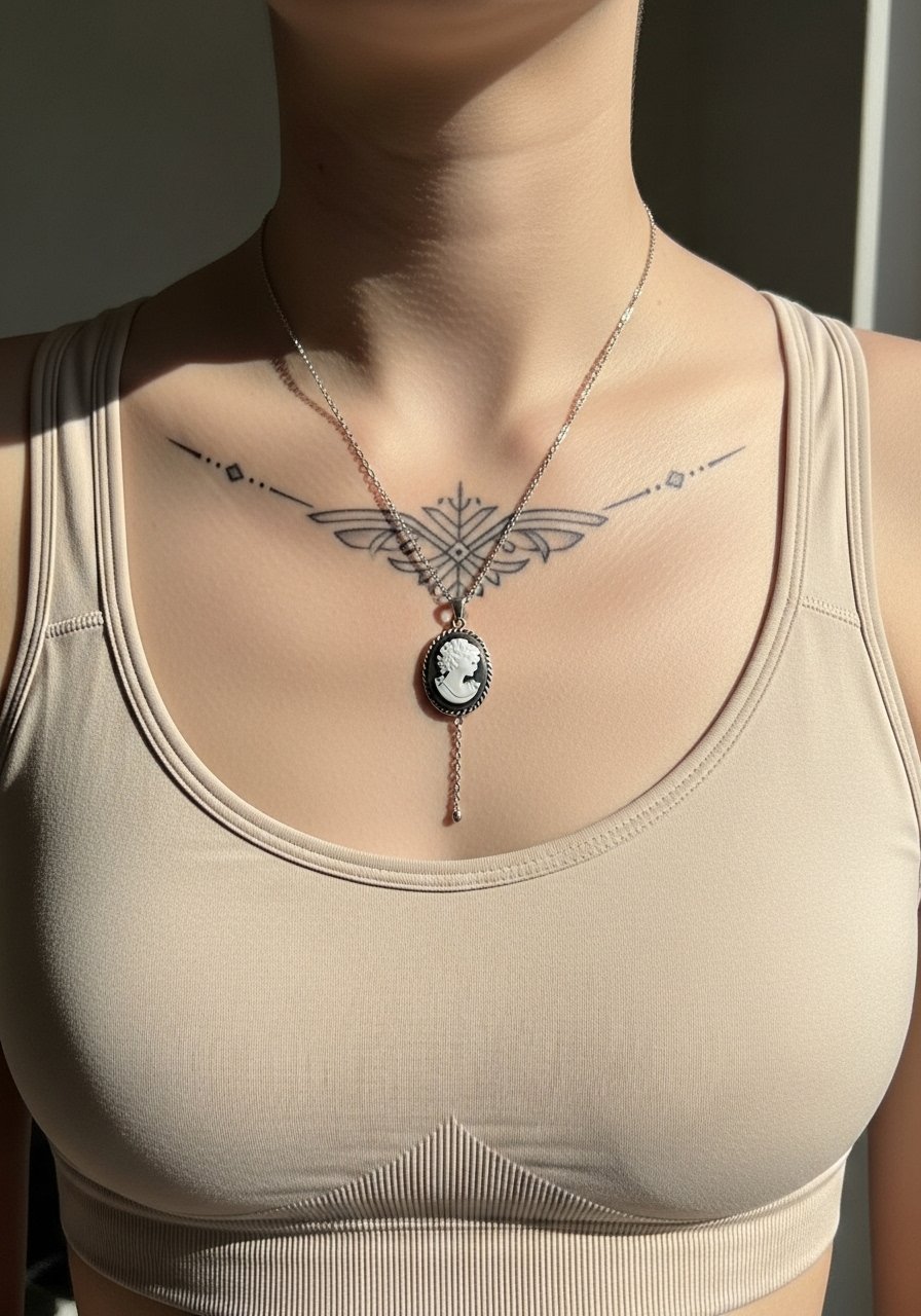
A cameo that connects to a delicate chain reads like a piece of jewelry when the chain is thin but purposefully spaced. Ask for chain links that are hinted rather than fully detailed, and request the cameo be the focal point with a bold outline. The error is trying to render every link in miniature, which becomes indistinct. Sessions may sting crossing sternum bone but are otherwise steady. For a curated look, pair with a delicate chain bracelet on the wrist for cohesion.
Frequently Asked Questions
Q: Will fine line vintage details on the sternum blur faster than bold blackwork?
A: Yes, fine line details tend to soften faster on the sternum because the skin flexes and the area gets a lot of movement. Bold outlines and slightly heavier downstrokes preserve the vintage look longer. If you love fine detail, plan for a potential touch-up in a couple of years and request extra spacing in the initial design.
Q: How should I dress for a sternum session so the artist has clean access?
A: Wear a fitted sports bra, bandeau, or a wide-neck shirt you can pull aside so only the tattoo area is exposed. Comfort matters, so choose breathable fabrics. If you prefer coverage after the session, bring a loose button-down you can zip or button up without rubbing the fresh ink.
Q: Are certain vintage motifs culturally sensitive or better adapted as variations?
A: Some patterns trace to specific cultural or religious traditions. If a design has clear cultural origin, consider adapting the motif with respectful variations rather than copying directly. Ask your artist about alternatives that honor the source while avoiding appropriation.
Q: How often should I plan touch-ups for intricate vintage chest pieces?
A: It depends on line weight and sun exposure, but many people expect to schedule touch-ups around year two to three for intricate, fine-lined chest pieces. More saturated, bold vintage elements often hold longer before needing refreshes.
Q: Artists disagree about whether very fine work holds on the sternum. What are the two sides and how do I decide?
A: One camp says the sternum and chest skin stretches and compresses so fine hairline work will blur within a couple of years. The other camp says that with precise depth control and intentional spacing, fine work can settle well. Ask potential artists where they stand, review healed photos of similar placements in their portfolio, and choose the approach that aligns with your priorities.
Q: Will necklaces or clothing rub the tattoo during healing and how can I avoid that?
A: Lightweight necklaces and loose collars are usually fine after the first day, but anything that rubs repeatedly can irritate the area. Wear soft fabrics and avoid tight choker styles for the first week. If you plan to wear jewelry to an event soon after getting tattooed, consider timing the session to allow at least a few days of undisturbed healing.
Q: Is there a recommended scale for vintage text or ornate frames so they age well?
A: Yes, slightly larger letterforms and thicker frame outlines help preserve readability. Ask your artist to increase spacing and stroke weight modestly from the reference you like. That adjustment keeps the design legible as the skin settles over time.