
Trash polka on the hand reads like a short, loud story. The black graphic shapes and red brushstrokes cut clean against skin and force choices about placement, scale, and how much negative space to leave. On hands the rules change because wear, washing, and sunlight all work against tight detail. These ideas move from tiny knuckle marks to full-back-of-hand compositions so you can see how the approach shifts before you book your appointment.
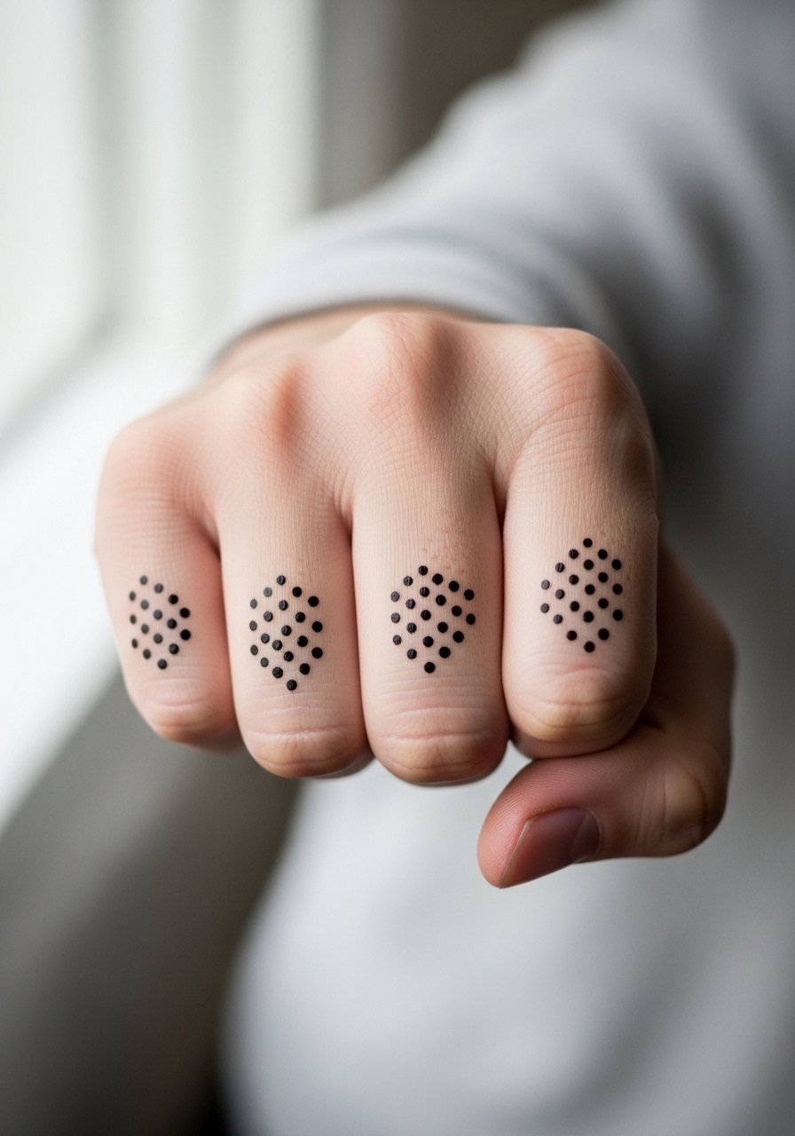
1. Tiny Trash Polka Knuckle Marks
A cluster of micro-trash-polka marks across one or two knuckles reads like a punctuation mark when you gesture. Pain on the knuckles is sharp for a minute or two and the session is short, usually under thirty minutes. Tell your artist to keep the black shapes bold and avoid extremely thin lines near joints, because the skin there shifts and thin work blurs faster. At six months the red may soften noticeably, and expect a touch-up earlier than on the back of the hand. For showing this off, stacked dainty rings frame the marks without covering them. Hand tattoos remain visible in many workplaces, so consider that when picking placement.
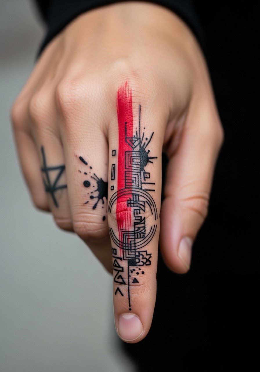
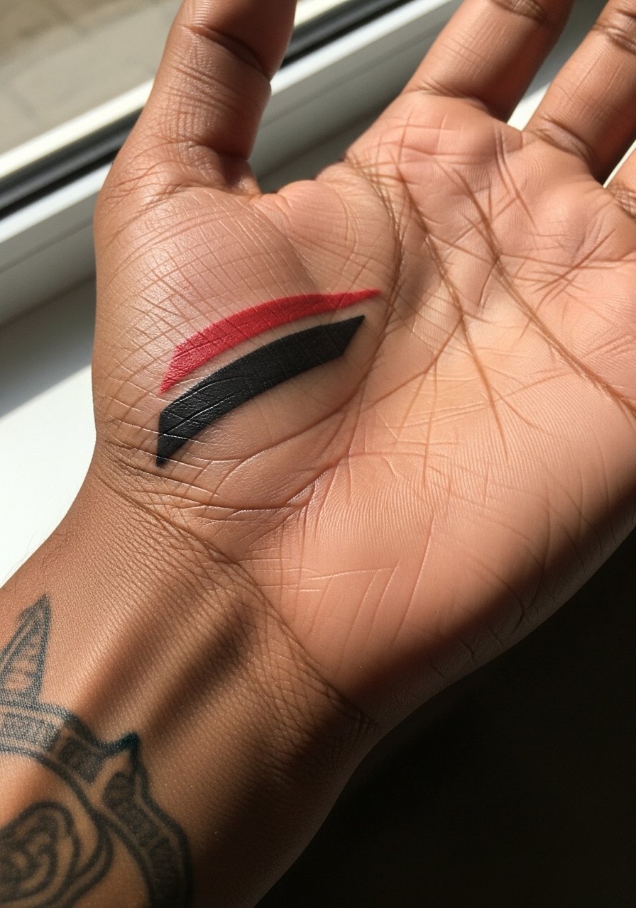
2. Red Splash Across the Index Finger
A single red brushstroke that runs down the index finger works when you want a visceral, graphic accent that still reads minimal. Fingers have a high fade rate because of constant washing, so expect the red to thin at six months and to lose brightness by year two unless you plan for periodic touch-ups. The common mistake is insisting on fine stipple inside the brushstroke, which disappears quickly. During consultation ask your artist for saturated pigment and a slightly bolder edge where the stroke meets the skin. Pair this with a minimal leather ring for contrast when you wear gloves or casual outfits.
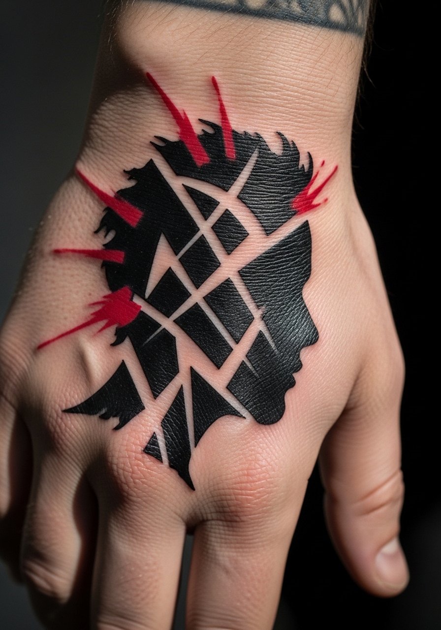
3. Back-of-Hand Portrait Silhouette
Trash polka portrait silhouettes combine stark black shapes with red paint splatters to keep the look graphic rather than photoreal. The back of the hand offers a flat canvas but it moves a lot when you type and grip objects. Describe to your artist that you want the portrait simplified into bold planes and no tiny facial details, because those blur first. Expect a one to two hour session and a touch-up at year one for saturation. When showing this piece off wear a rolled-up sleeve linen shirt so the hand is visible without appearing staged. Hand pieces can affect some job prospects, so factor that in.
4. Thumb Wrap Script with Red Accent
A short word or glyph wrapped around the base of the thumb in black, with a red graphic accent, reads like a secret mark you only reveal when you reach. Wrapping placement feels unusual during the session as the skin stretches while you move your thumb, so plan for the artist to test the stencil with different hand positions. The big mistake is choosing tiny serif script that clogs over time. Ask for slightly higher line weight and leave breathing room between letters. For the appointment wear a loose button-down shirt so you can roll the sleeve without tugging the skin. Hand tattoos of this type often need touch-ups by year two.
5. Negative Space Geometric on the Back of Hand
A trash polka take on geometry uses solid black blocks and red strokes to carve negative space shapes that read clearly from a distance. This approach holds up longer because it avoids dense micro-detail on moving skin. Tell your artist you want clear negative spaces between black masses so the piece does not compact as it heals. The session can run one to three hours depending on coverage. Avoid packing micro dot shading into the black fields on the hand, because that tends to flatten with time. For outfits, a short-sleeve cotton tee keeps attention on the back of the hand without competing patterns.

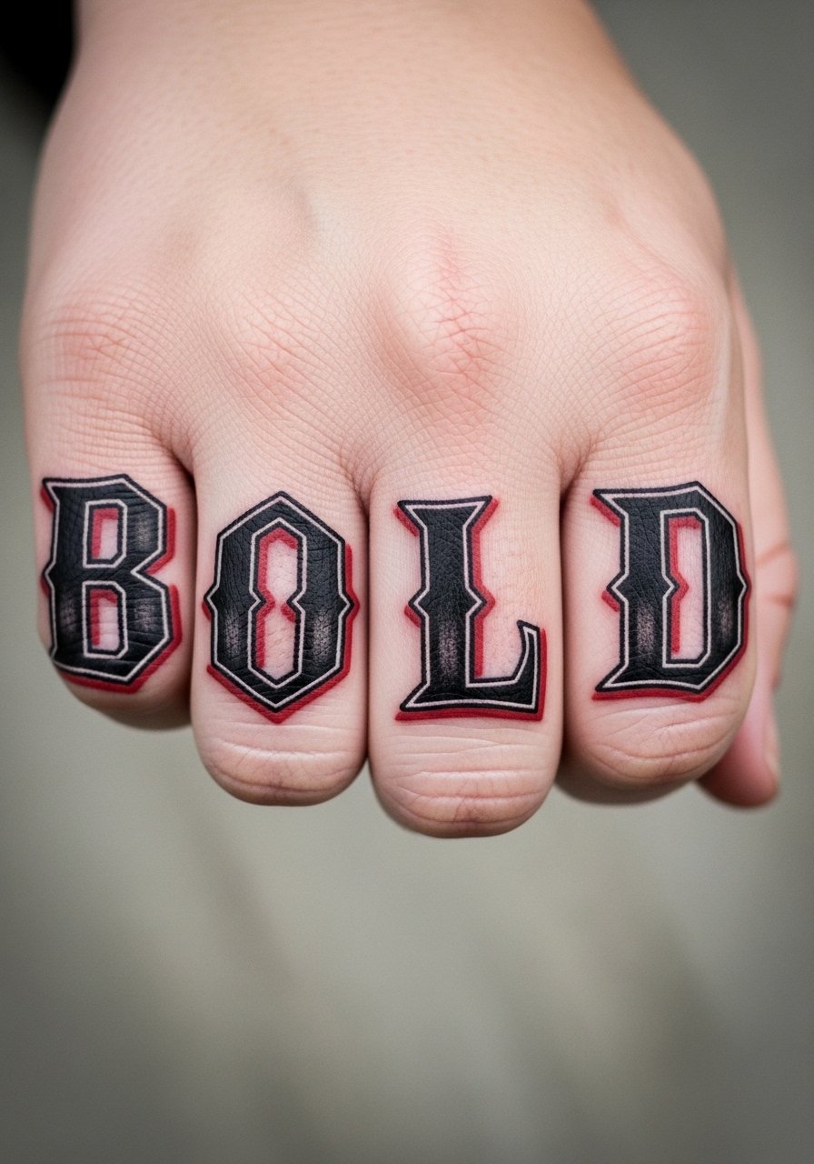
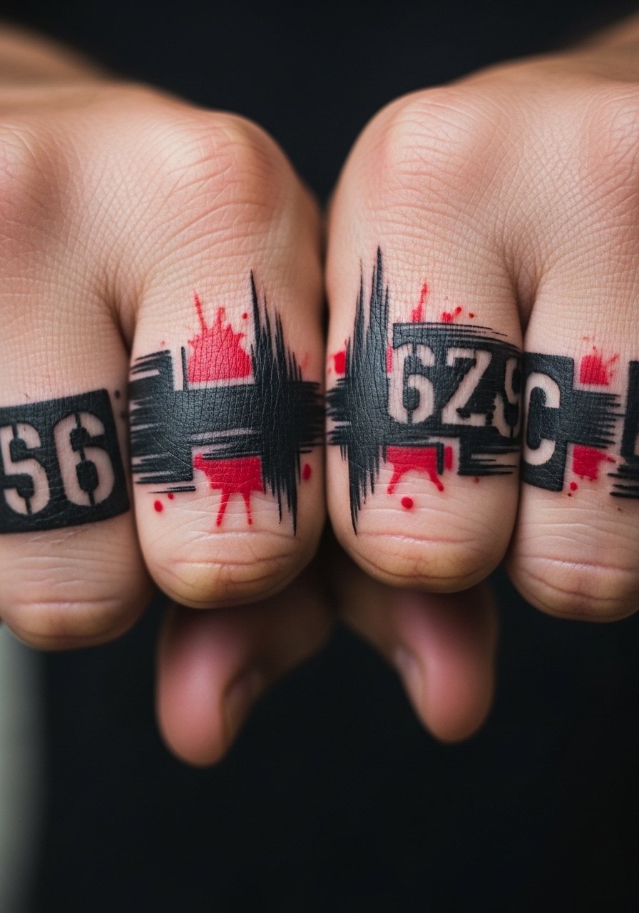
6. Knuckle Lettering With Graphic Red Underlay
Bold black lettering across the knuckles layered above a red smudge creates a punk-forward trash polka mood. Knuckle work is painful and sits at high risk of early fading because of constant use and friction. A common error is choosing thin script or tiny serifs, which lose definition quickly. During consultation be explicit about letter height and spacing so the text remains legible at year one and year three. For showing it off, stack with a thin chain bracelet that does not cover the knuckles but complements the horizontal read. Be aware some employers take a strict stance on knuckle tattoos.
Studio Day Picks
Those first six hand pieces ask for different prep than larger arm work, so a few targeted items smooth the session and the first forty-eight hours.
- Stencil transfer paper kit. Lets you check letter spacing and placement on the hand before the needle starts, which is vital for knuckle and thumb wraps.
- Topical numbing cream. Used correctly it eases the sharp sting of knuckles and finger edges for short sessions.
- Thin protective film roll. Keeps hand tattoos cleaner during the high-friction first days when you wash your hands repeatedly.
- Fragrance-free gentle body wash. Gentle cleansing helps preserve saturated red tones without irritating fresh ink.
- Aquaphor healing ointment. A thin layer for the first few days helps lock in moisture on high-use areas like the hand.
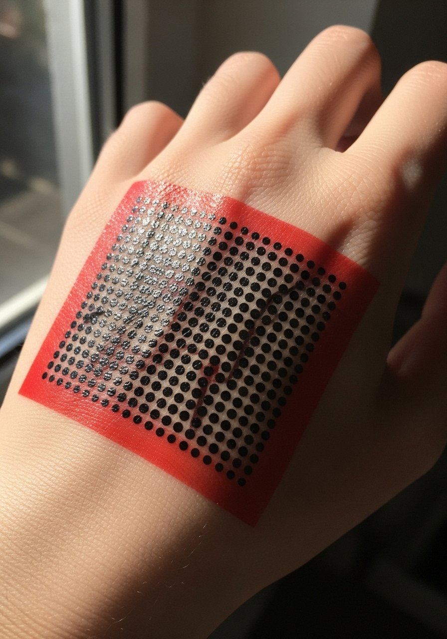
7. Full Back-of-Hand Graphic Block
A dense graphic block across the whole back of the hand uses heavy black shapes and red streaks to create a single readable image. The visual impact is immediate but it also puts more pigment under skin that moves, which increases blowout risk. Ask your artist to plan the shapes around the knuckles and metacarpal lines so the composition ages with the hand. Sessions for full back-of-hand blocks typically last two to three hours and often require a touch-up at the one-year mark. Pair wide graphic pieces with a simple cuff watch that frames the wrist without crowding the design.

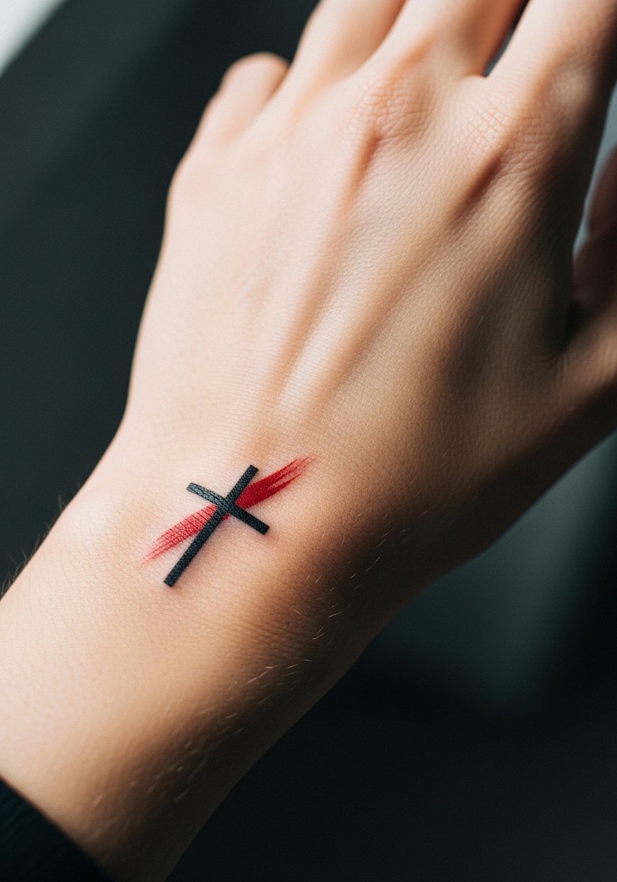
8. Small Cross with Red Brush Accent Near the Wrist
A compact black cross near the wrist with a red brush accent feels symbolic while staying subtle compared to full-hand cover. The inner wrist sees regular friction, so a small compact symbol will blur faster than larger, bolder marks. The common mistake is insisting on delicate serifs on the cross. If you want the symbol to last, choose solid black with a strong red accent and plan for a touch-up after the first year. For the appointment wear a loose drawstring linen pant if the session includes wrist and lower forearm so you stay comfortable while the artist works the area.
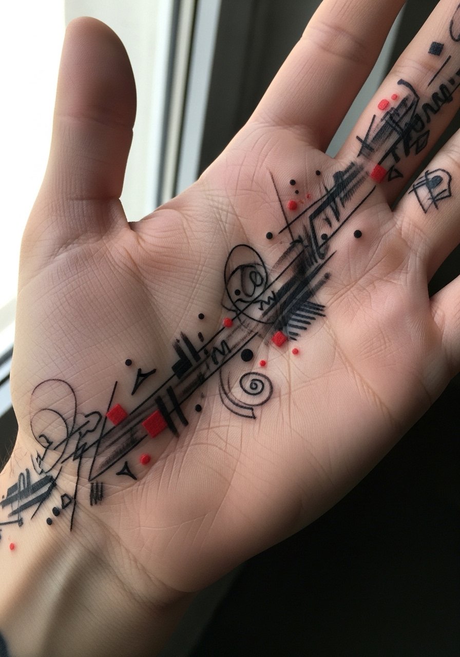
9. Palm-Edge Abstract Streaks
Streaks along the outer edge of the palm create a piece that is visible in gestures but mostly private when your hand is relaxed. Palmar-side placements fade extremely fast from friction and frequent washing. I tell people this only when they like that ephemeral quality, because the red will mute within months and the black will thin too. If longevity is important, place the marks slightly onto the lateral hand where skin is less abrasive. For session comfort wear a short-sleeve cotton tee so your sleeve does not tug while the artist works the palm edge.
10. Red-Gashed Ring Finger Band
A red-gashed band around the ring finger feels like a bold, modern ring that doubles as a tattoo. Finger bands are the most touchy for longevity since they soak up water and soap constantly. A frequent mistake is matching the band width to a metal ring width exactly, which looks thin after a year. Ask for a slightly thicker band and plan on small annual touch-ups. During the session bring a soft finger ring sizer or silicone ring to test placement and spacing without pressure on the skin. Consider career visibility before committing to a prominent finger band.

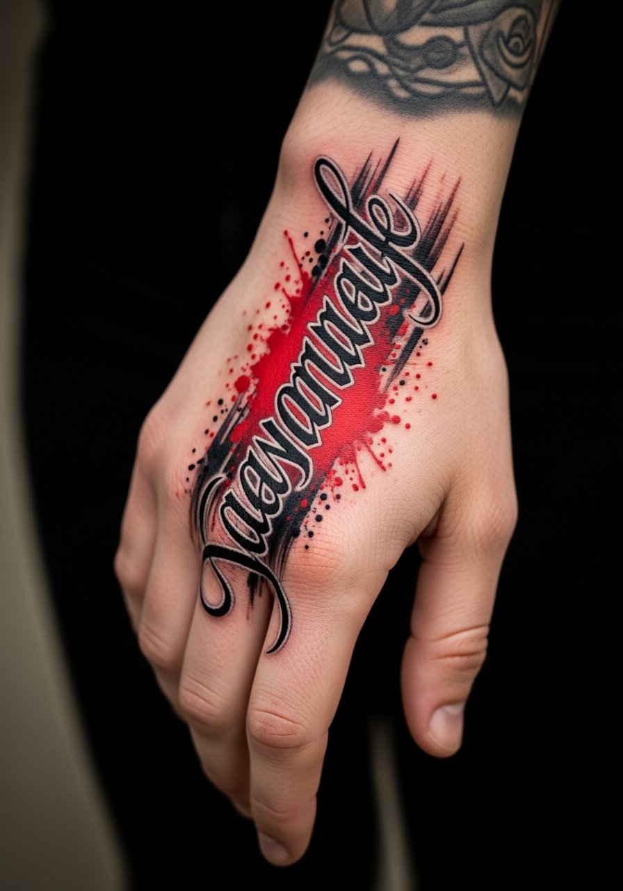
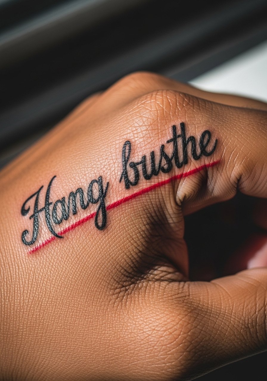
11. Contrast Script Across the Side of the Hand
A short, bold script that runs down the side of the hand toward the little finger pairs well with trash polka splashes behind it. Side-of-hand pieces see less rubbing than knuckles but more than the back of the hand, so pick a letter height that holds up into year two. Tell the artist you want strong black linework with red brushwork layered behind so the script remains legible even as the red breathes out. For evening outfits a thin chain pendant necklace draws the eye up and keeps the hand as an accent. Side-of-hand work often needs a touch-up at the one-year mark.
12. Minimalist Red Dot Accent Near the Thumb
A tiny red dot near the base of the thumb is subtle and low commitment, yet it still reads trash polka if surrounded with a small black shape nearby. The session is quick and relatively low on pain, but the dot will fade faster than adjacent larger areas. A common mistake is placing too many tiny accents together, which read as clutter as they fade. Keep it solitary or pair with one black mark for contrast. For the session wear a loose button-down shirt so the artist can access the thumb base without tugging the fabric.

13. Graphic Arrow From Wrist to Middle Finger
An arrow made from black planes and a red streak that points from the wrist toward the middle finger reads directional and dynamic in trash polka vocabulary. Movement along that axis means the design must account for skin folds where the wrist bends. Request that the artist test the stencil on the wrist in both flexed and extended positions so the arrow remains visually straight in action. Sessions can be one to two hours. Pair this with a minimal leather strap watch for a clean look that frames the arrow without covering it.

14. Small Portrait Fragment Behind Index Finger Knuckle
A fragment of a portrait tucked behind the index knuckle in black with a red smear reads like a visual secret that appears when you point. Knuckle-adjacent skin moves a lot, so keep facial detail to bold planes and avoid tiny pupils or lips. The controversy here is real. One camp says knuckle-area micro-detail will always blur within two years. The other camp says if the artist uses heavier lineweight and places the planes strategically it can read well longer. Ask your artist where they stand on that debate before booking. Plan for a touch-up at the one-year mark if you want saturation preserved.

15. Open-Palm Linework with Red Negative Space
An open-palm linear piece that uses red negative space inside black frames plays with the idea of reveal when your hand is open. Palm-side work fades the fastest, and the red will wash out more quickly than black. If you want a lasting read, move the red slightly toward the lateral hand where skin endures less abrasion. During consultation ask for higher saturation and slightly thicker edges to preserve form. For the session wear a racerback tank so you are comfortable if the artist needs to reposition your arm frequently.

16. Barbed Wire Motif Around the Wrist and Hand
A trash polka barbed wire motif blends heavy black lines with red splatters to look aggressive and deliberate. This motif can age reasonably well on the hand if the barbs are bold and the spaces between wires are generous. The common mistake is packing barbs too close together which leads to visual muddiness as the ink spreads. Ask the artist to map the wire around the natural contours of the hand so it does not sit awkwardly when you flex. For showing this off try a thin cuff bracelet that complements without covering the work.

17. Abstract Stamp on the Back of Index and Middle Fingers
An abstract black stamp across the back of the index and middle fingers with a red counter-stamp reads like a graphic statement when you point or hold objects. Fingers need bold shapes to remain readable after months of washing. The mistake is trying to include tiny textures inside the stamp. For longevity pick a clean silhouette and plan on an annual touch-up. When you want to frame the stamp, stacked silicone rings do not scratch the tattoo and add contrast to the black-and-red combo.
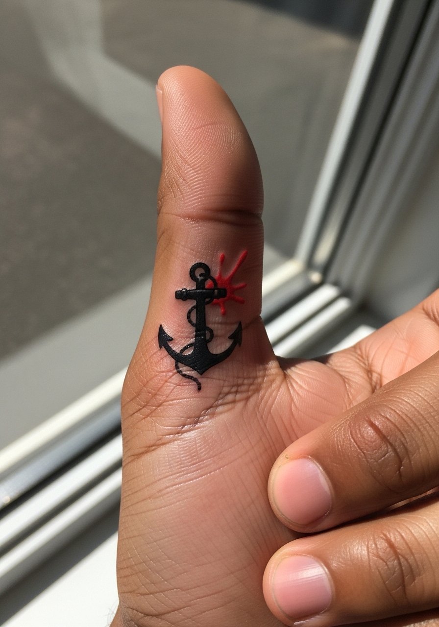
18. Tiny Anchor with Red Splash at the Thumb Web
A small black anchor with a red splash in the web of the thumb and index finger reads nautical with an edge. That web area sees moderate wear but is less exposed than the fingertips. Ask your artist to keep anchor details bold and avoid micro anchor ropes. The session is short and recovery is quick, but the red will need a touch-up sooner. For session comfort wear a loose tank top so you can move freely without restricting the shoulder while the artist works the thumb web.
19. Split-Hand Composition With a Red Line Connecting Both Hands
A split composition that sits on the back of both hands with a single red line connecting across the knuckles reads like a deliberate interruption. The coordination of symmetry matters because both hands age differently depending on dominant hand use. If you are right-handed the right-side black saturation will thin faster. Discuss asymmetry options with your artist instead of forcing perfect mirror images. Sessions may be done in one long appointment or two shorter ones. For showing this off wear a long-sleeve linen shirt with rolled cuffs so the connection line is visible when you gesture.
20. Stacked Symbols Along the Side of the Little Finger
A vertical stack of black symbols with red brush accents running along the side of the little finger is intimate and kinetic. Side-finger placements see a lot of friction but less water exposure than ring or index fingers. The main mistake is making each symbol too small. Ask for clear spacing between elements. This style tends to require touch-ups every one to two years. If you want to show it off without hands raised, a delicate gold chain bracelet sits visually nearby without stealing focus.
21. Red Slash Over a Black Geometric Palm Accent
A red slash layered over a black geometric accent on the palm edge and lower hand reads raw and deliberate. Palm edge placements fade quickly but the slash effect can remain as a ghost after months, if that is the intended look. During consultation make clear whether you want the red to be temporary looking or to be maintained with touch-ups. Sessions are short and mildly uncomfortable. For the appointment wear a loose drawstring linen pant so you are comfortable if you need to sit with your hand elevated afterward.
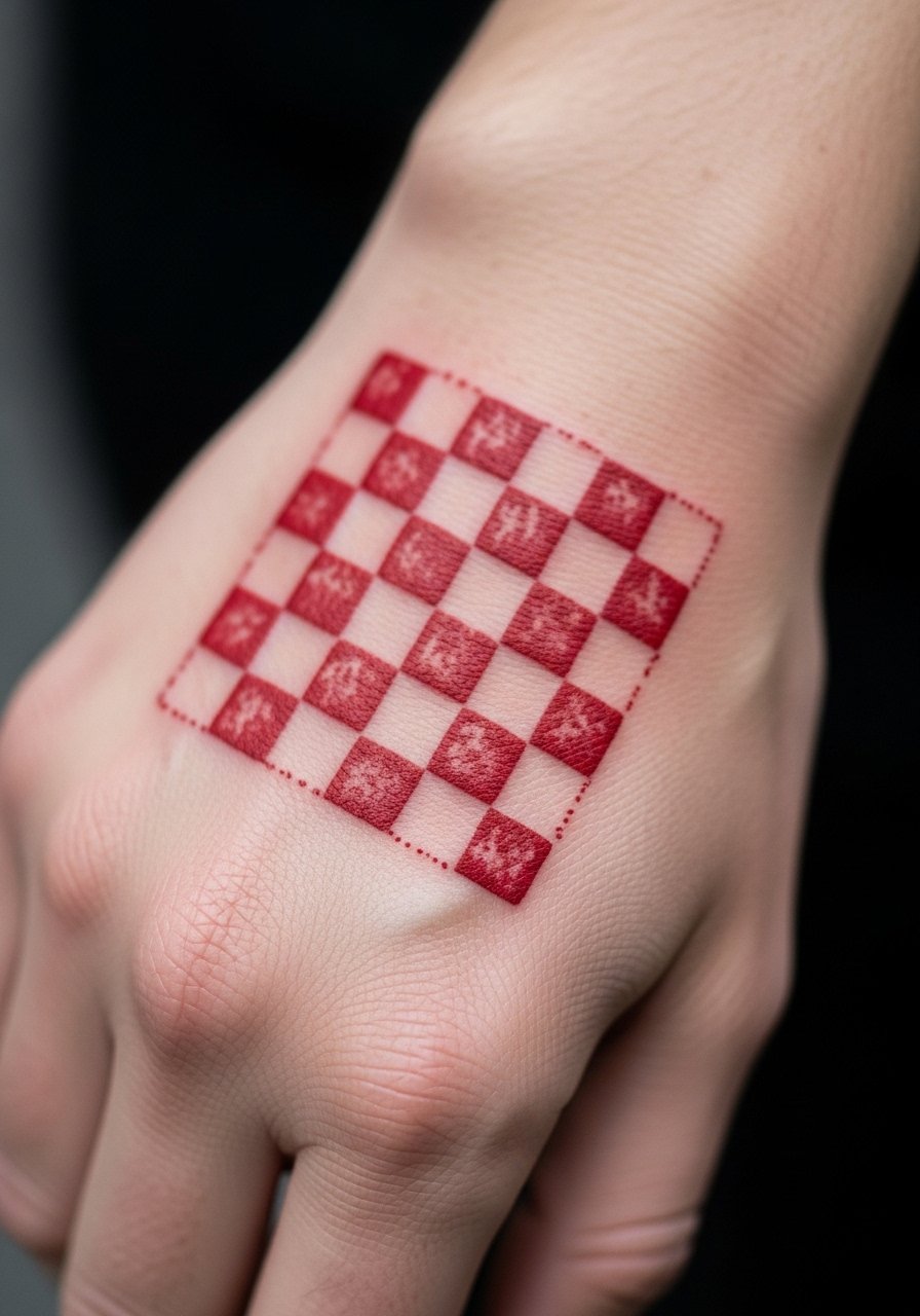
22. Bold Checkerboard Patch on the Back of Hand
A compact checkerboard patch in black with selective red fills reads graphic and modern when placed on the back of the hand. Checker patterns can blur at the edges if the squares are too small. Tell your artist you want slightly larger squares and strong contrast rather than micro scales. Expect a two-hour session for a clean read and a touch-up in the first year to refresh the red cells. For day-to-day framing use a short-sleeve cotton tee that keeps the hand visible without overwhelming the pattern.
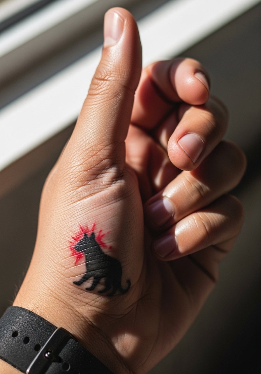
23. Small Animal Silhouette with Red, Near the Thumb Base
A small animal silhouette in black with a red splash nearby at the thumb base gives a narrative nod without detail. The thumb base is moderately stable so a compact silhouette holds its shape longer than knuckle detail. Avoid tiny fur textures in the silhouette or they will muddle. When booking, ask the artist to vector the silhouette into a bold plane so it reads well at year three. For showing this piece off, a thin chain bracelet keeps focus on the hand without covering the silhouette.
24. Scripted Phrase Across the Thumb and Index Joint
A short, bold phrase that crosses the thumb-index joint in black with red underline reads when you open the hand. Joint placement needs thicker strokes to avoid early blurring. The mistake is choosing cursive with tiny flourishes. Request blocky, high-contrast lettering and plan for a touch-up at the one-year mark. For pre-session comfort wear a loose tank top so the artist can access the area without you feeling constrained.
25. Halftone Dot Block with Red Overlay on the Back of Hand
A halftone dot block in black with a sweeping red overlay reads textured from close up and graphic from afar. Halftone on the hand needs larger dots than on an arm to avoid muddiness. Tell the artist you want dot sizes that still read when the skin stretches and avoid micro-dot gradients. Sessions for this take time because of careful packing, and a one-year touch-up helps retain the red overlay. For outfits, a short-sleeve linen shirt keeps the back of the hand visible while remaining casual.
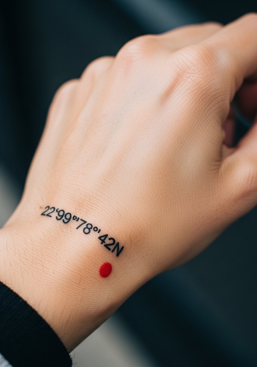
26. Tiny Coordinates in Black With Red Brush Dot
Coordinates tattooed in thin black script with a tiny red brush dot beside them at the base of the hand make for a personal, low-key trash polka detail. Text in a hand area must be large enough to stay legible as the skin changes. The frequent mistake is choosing too small digits. Ask for slightly larger numerals and strong spacing. This piece is discreet and pairs well with a thin gold band ring when you want to echo the minimalism.
27. Trash Polka Signet-Style Patch Near the Wrist
A compact signet patch near the wrist uses bold black negative space and a red highlight to imitate a stamped seal on the hand. Wrist-adjacent placements see regular motion and occasional friction, so keep the signet size moderate. The common mistake is trying to engrave tiny heraldry into it. Simplify the iconography into high-contrast shapes and plan a touch-up in the first year. For session-day ease wear a loose button-down shirt you can pull aside so the artist has clean access.

Frequently Asked Questions
Q: How long do red accents in trash polka on the hand typically last before needing a touch-up?
A: Red fades faster than black on hands because the pigment sits in skin areas that get more sun and washing. From what I have seen most red accents will need a noticeable refresh by year one to three depending on placement and daily wear. If keeping the red vivid matters, plan on periodic touch-ups and use consistent sun protection once healed.
Q: Are trash polka designs on the hand more likely to blow out than on the forearm?
A: Yes, hands are higher risk for blowout because the skin is thinner and moves constantly. One group of artists recommends avoiding fine detail on hands entirely while another group says bold planes and careful spacing mitigate blowout. It depends on your chosen artist and their portfolio of healed hand work, so ask to see healed photos of similar placements.
Q: What should I wear to a hand tattoo session to make the artist's job easier?
A: Wear clothing that gives the artist clear access without tugging the area. A loose button-down shirt or a short-sleeve cotton tee are good options. If your piece sits near the wrist, a rolled sleeve linen shirt works well. Comfort matters because you might rest your arm for a while during the session.
Q: How do I style trash polka hand tattoos for evenings out without covering them?
A: Simple jewelry keeps attention on the tattoo. A thin chain bracelet or stacked dainty rings can frame the hand without hiding the work. Try a delicate gold chain bracelet for a low-contrast look that plays well with black and red ink.
Q: Can a trash polka hand tattoo be used to cover up older ink?
A: It can, especially because the style uses heavy black masses and red overlays which help mask prior lines. Cover-ups on the hand are challenging though, given thin skin and movement. Expect a few extra sessions and honest appraisals from artists about what can realistically be concealed.