
Fine line thigh tattoos are all over saved boards, but trend and reality do not always match. Thin, airy pages can look gorgeous fresh and then blur if placed where skin stretches or rubs. Inner thigh heals differently from outer thigh and long sessions invite sweat that makes the experience harder. Below are designs and practical notes that help you pick a bookish thigh piece you will still want in five years.
1. Cascading Pages Stack on Outer Thigh
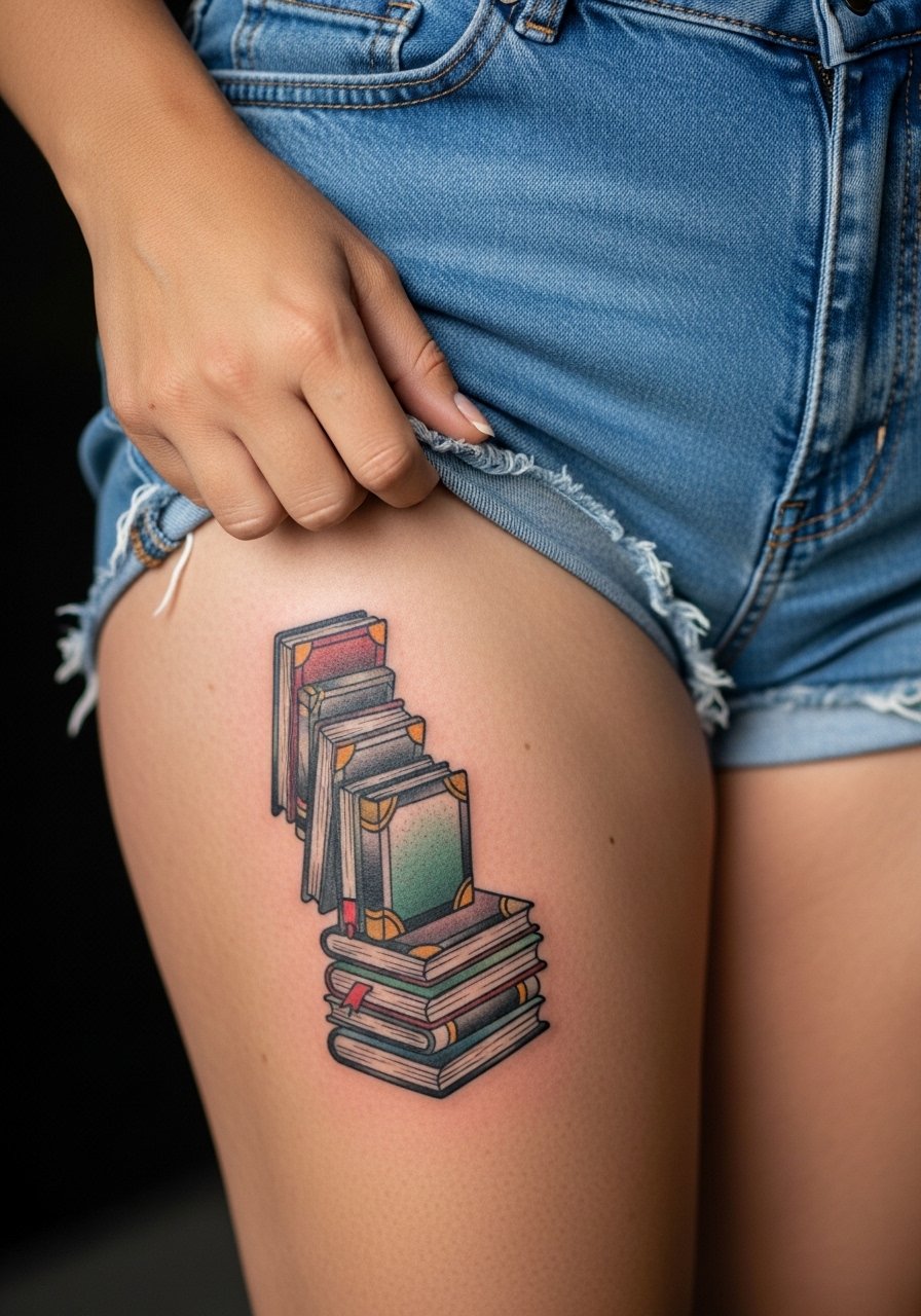
This stack uses bold outlines and selective color to follow the outer thigh curve so the pages never look squished. I recommend this when you want a visible piece that holds up if you gain or lose weight because thicker linework tolerates stretch better. Tell your artist to map the spine along the thigh curve and to avoid ultra-fine page edges. Expect a two-session ride and moderate pain for the outer thigh. A common mistake is requesting very thin page edges that blur into the skin texture after a few years. For the appointment, wear high waisted denim shorts so the artist can check wrap and placement easily.
2. Minimalist Silhouette with Quote Ribbon on Inner Thigh
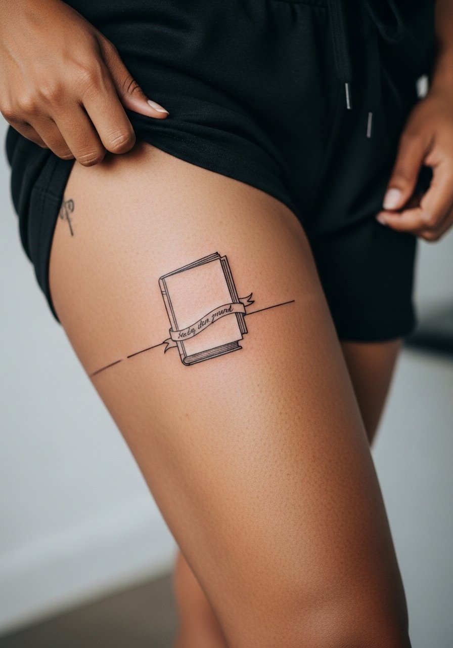
Inner thigh pieces need a privacy-first approach and gentle technique. This fine line silhouette works for a first thigh tattoo but comes with caveats. The inner thigh rubs against clothing and sometimes heals bumpy. Ask for slightly bolder lines than your online reference so the detail survives friction. Pain is higher on inner thigh than outer thigh and sessions should be short to reduce sweating. Expect a touch-up window around year two if you want crisp thin ribbons to remain legible. During the session keep a cool towel handy and wear bike shorts women so you can shift fabric without pressing on fresh ink.
3. Vintage Leather Stack with Quill on Mid Thigh

This traditional style ages well because saturated black and solid shading survive mobile areas. It suits anyone wanting a classic library vibe with an illustrated quill accent. Ask the artist for thick spine lines and dense gray wash rather than delicate crosshatching. The front mid thigh is easy to show off but expect a more visible pain rating than outer thigh. Common errors include requesting tiny gilt details that fuzz with time. For evenings out pair the piece with a line shorts to frame the rectangle composition while keeping the skin comfortable during longer sessions.
4. Geometric Page with Hidden Symbols on Lower Thigh
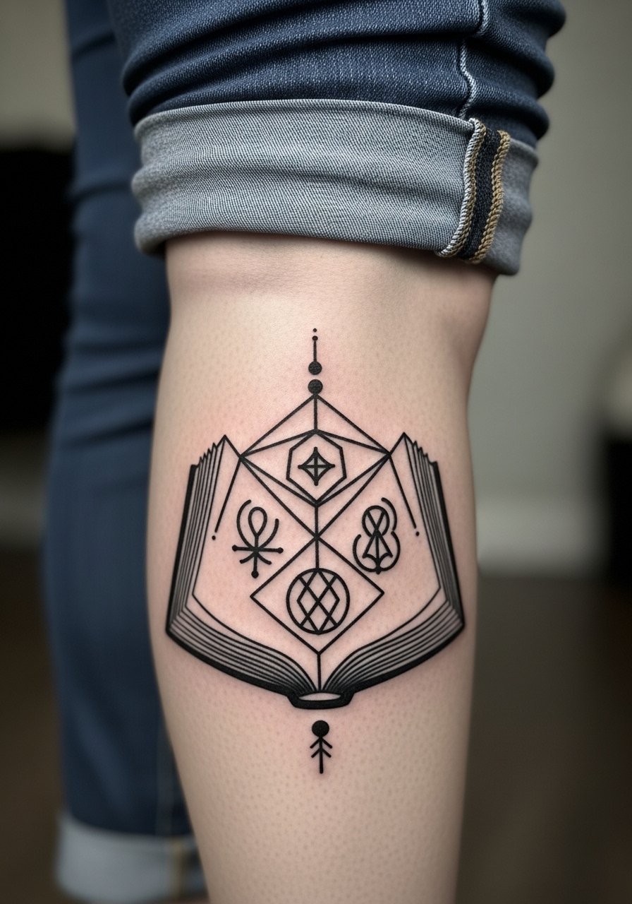
Geometric blackwork reads as a puzzle when designed to curve with the thigh. This design solves trend fatigue by hiding symbolic details inside negative space. Tell your artist to build in breathing room between solid fills so the shapes do not merge as skin shifts. Lower thigh placement faces more friction from waistbands and shorts, so bold fills beat micro lines for longevity. Sessions are often single but dense and can feel rough because the needle covers the same site repeatedly. Avoid asking for micro-symbols inside solid areas without extra spacing. For showing it off try culotte pants or rolled jeans so the geometric silhouette reads clean from a distance.
5. Fine Line Single Book with Flying Pages on Thigh Side
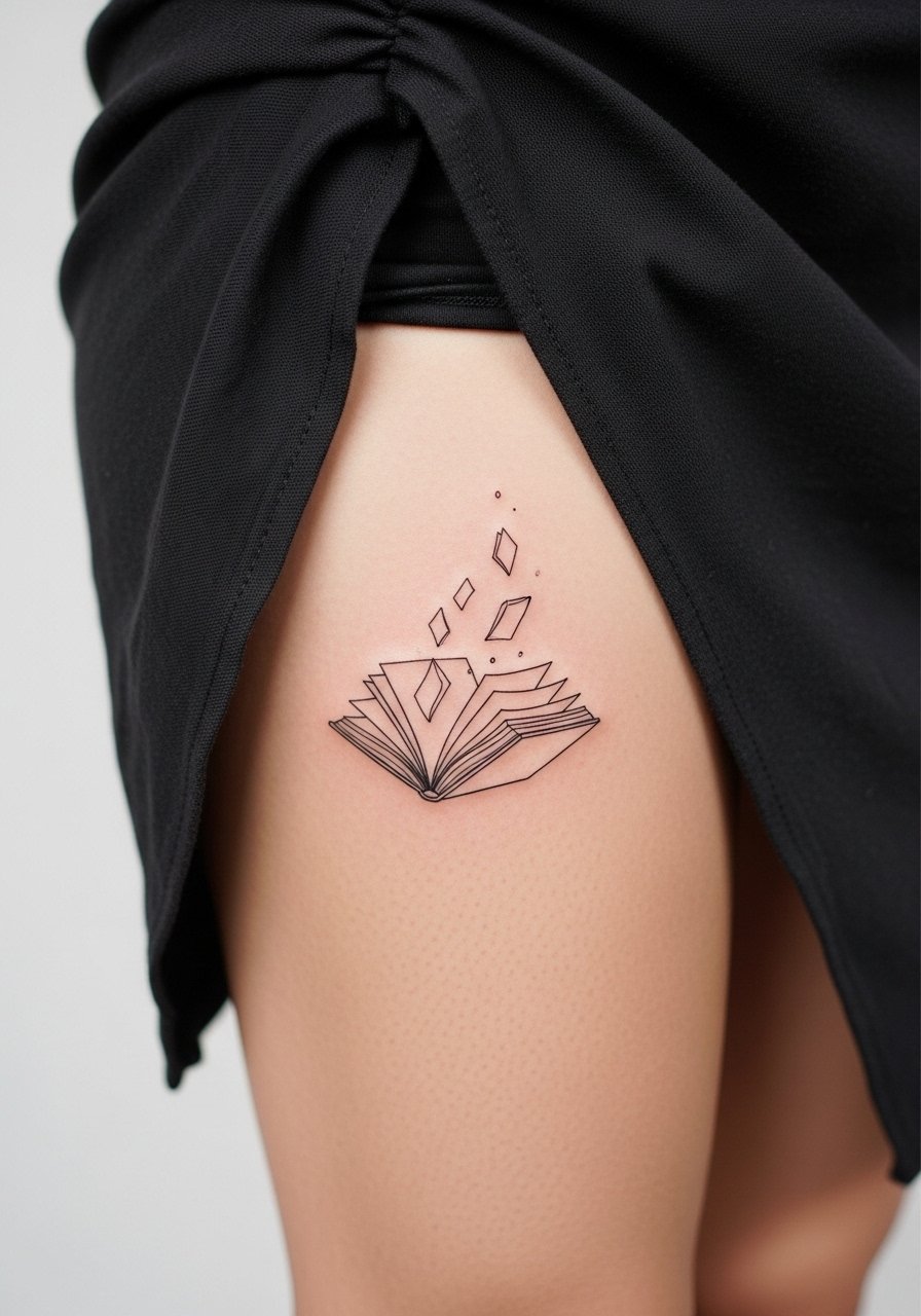
This airy design uses ultra-thin linework to suggest motion and suits readers who prefer subtlety with dramatic placement. The side thigh elongates the composition but invites argument about fine line durability. One camp says thin lines look ethereal and hold for years when placed well. The other camp insists bold linework is safer where skin moves and rubs. If you like the thin look ask for slightly heavier anchor lines on the book and feather-light page frays to keep the flight effect without losing definition. Pain is moderate and sessions are usually single. Pair with asymmetrical skirt styles to show the drifting pages when you walk.
6. Ornamental Spine with Constellations on Thigh Back
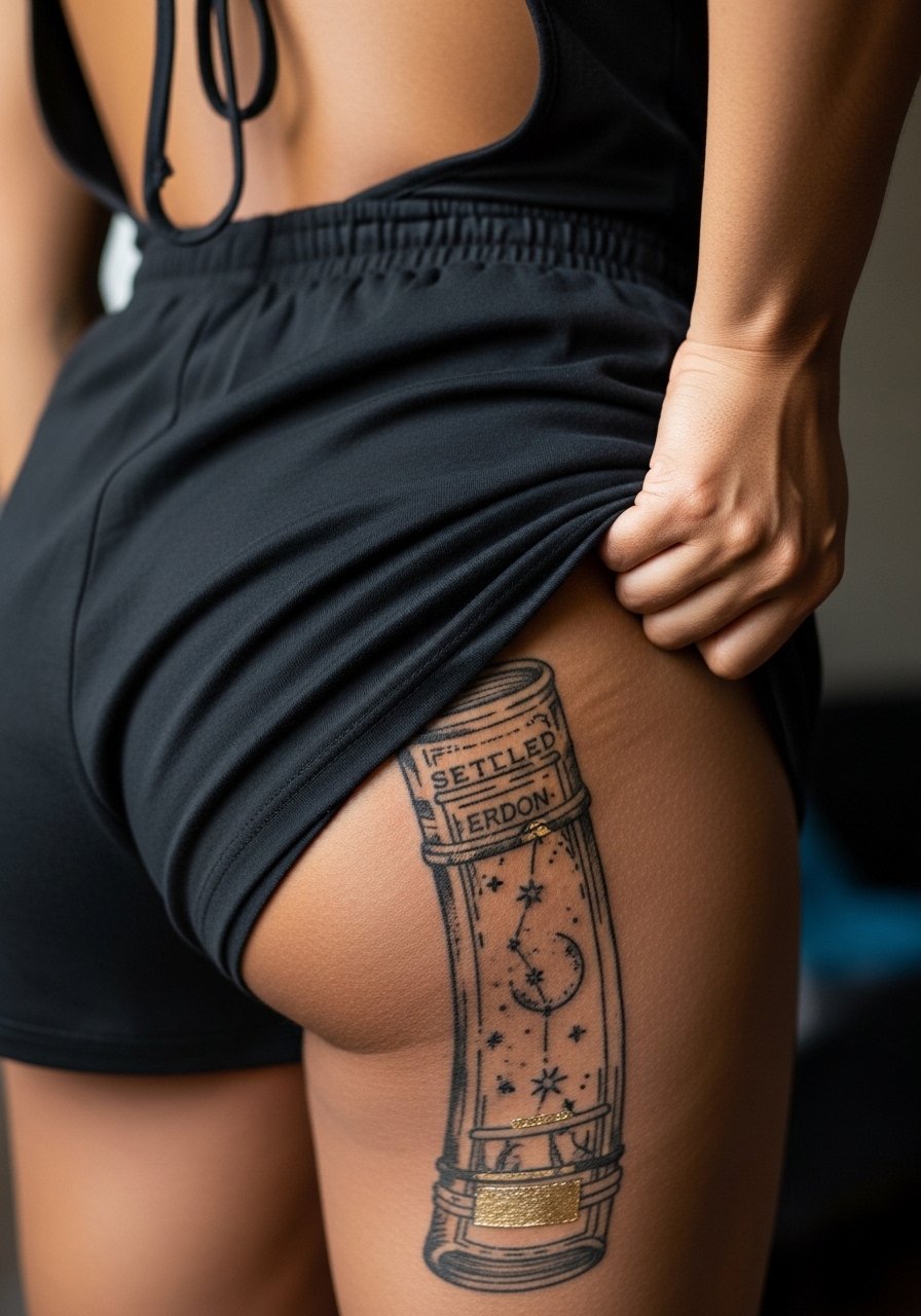
A vertical ornamental spine acts like a column along the back thigh and suits someone who wants an elongated, covered piece. This style often uses metallic gold ink touches for sparkle but ask the artist about pigment visibility on your skin tone. The back thigh tolerates vertical work well but needs multiple sessions because of size and saturation. Pain is lower than inner thigh but lying prone for hours can become uncomfortable. A real mistake is compressing too many tiny stars into a dense band, which can blur. For sessions wear loose shorts that the artist can pull slightly down and consider backless romper options for easy access when showing the vertical line.
Pack Smart
These thigh designs above cover inner, outer, side, and back placements so pack a few essentials that make sessions and healing easier for lower body ink.
-
Stencil transfer paper kit. Lets you preview placement on the curved thigh so you can check how pages sit before needles touch skin.
-
Topical numbing cream. Applied before a long thigh session it can reduce sweating triggered by high pain spikes and make extended sittings more manageable.
-
Thin protective film roll. Useful for inner thigh work where friction from clothing is highest during the first 48 hours.
-
Fragrance-free body wash. A gentle cleanser for showering heals delicate linework without adding scented irritation to the area.
-
Aquaphor healing ointment. A thin layer during the earliest phase helps keep fine line edges from scabbing too hard on the thigh.
7. Micro-Realism Torn Page on Inner Thigh
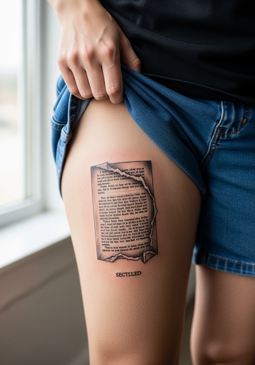
Micro-realism gives paper texture and torn edges that appear convincingly aged. Inner thigh hides the piece when desired but expect more touch-up risk because delicate shading can lose crispness under constant friction. Tell your artist you want high-contrast texture with defined shadow edges rather than soft blur so the torn look holds visually. Sessions will be focused and may require two appointments to layer depth. Healing feels bumpier on inner thighs for many people. If your skin tends to rub, plan for a touch-up at year two to restore crisp shadows.
8. Storybook Silhouette with Character Shadows on Outer Thigh
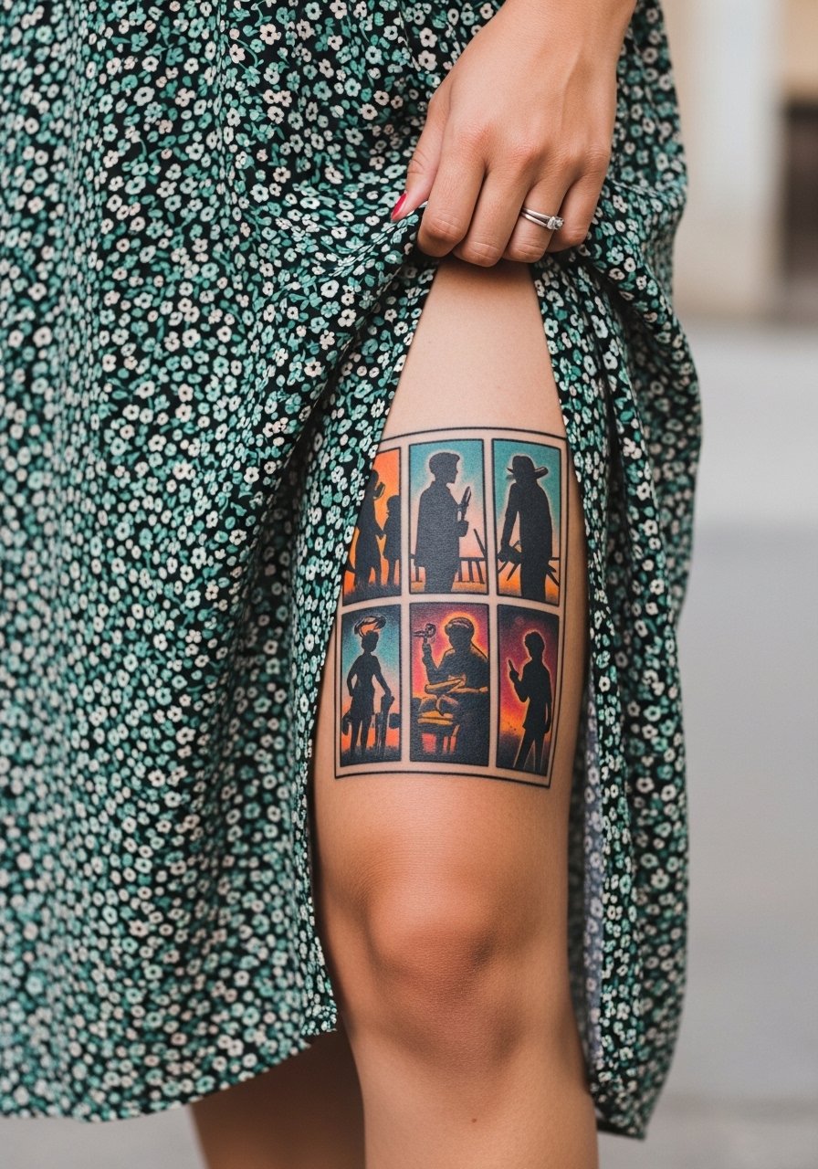
This nostalgic snapshot uses bold outlines and saturated fills so silhouettes remain readable from a distance. It is ideal if you want nostalgic imagery that still reads after sun exposure. Ask your artist to simplify background textures and to prioritize saturation over tiny details that will muddle later. Outer thigh is a forgiving show-off spot with moderate pain. A common misstep is overloading the page with micro elements that vanish once healed. For wardrobe pair this with midi skirt thigh slit looks that reveal the panels when you move.
9. Ignorant-Style Burst on Front Thigh
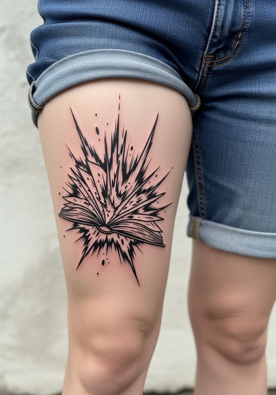
Ignorant style celebrates imperfect energy with loose, expressive marks. The front thigh is perfect for impact pieces because it shows well and accepts high-contrast marks. This style only needs one session but the risk is that rough strokes may read rushed if the artist overdoes filler marks. In consultation, ask for controlled chaos with intentional negative space so the explosion reads cohesive. Pain on the front thigh is manageable and healing tends to be straightforward because clothing friction is less than inner thigh. Pair the design with vintage style shorts for bold retro energy when you want to show it off.
10. Watercolor Vines Emerging on Upper Thigh
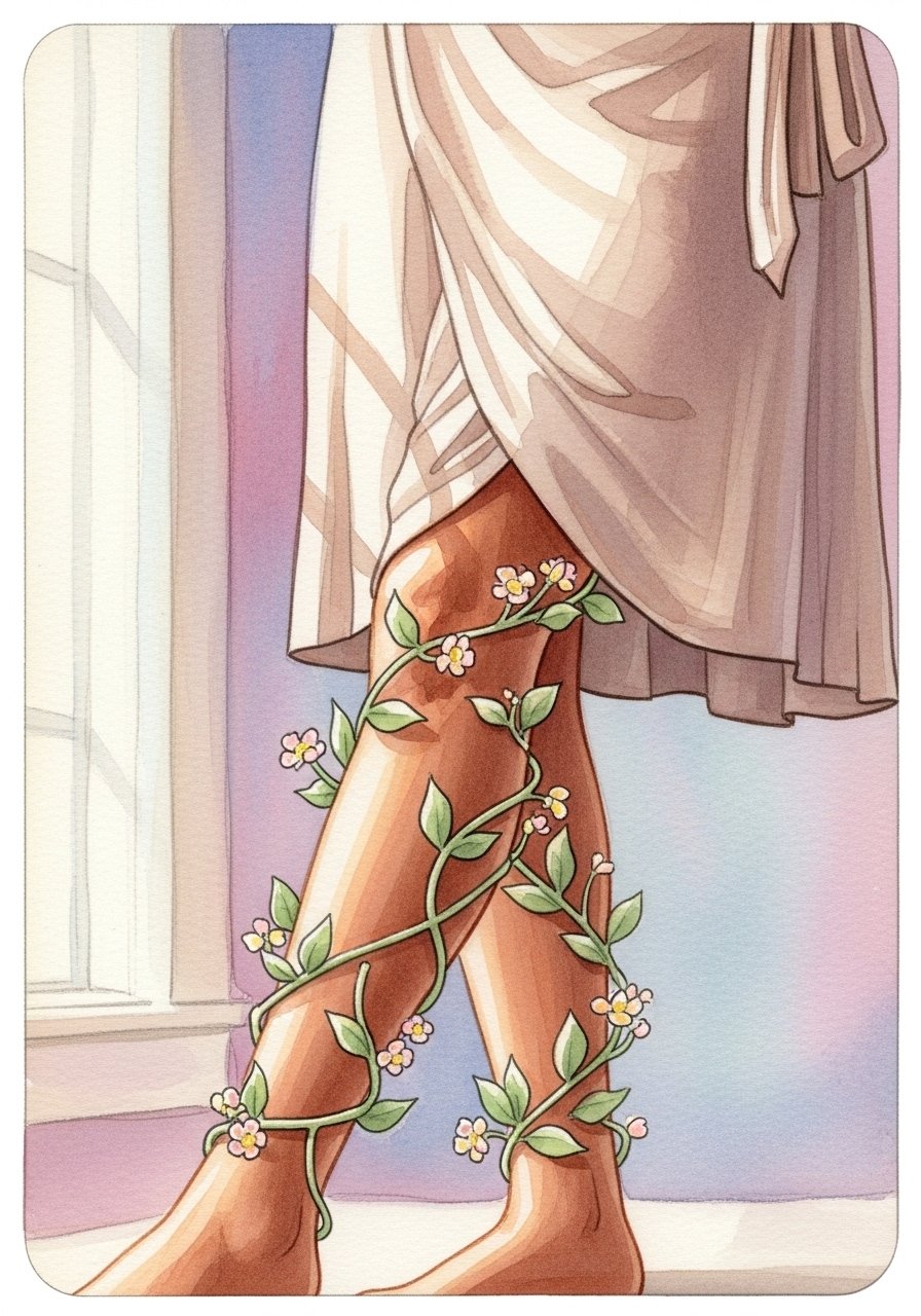
Watercolor fades softly into skin and gives a painterly look to floral vines. Upper thigh is a forgiving canvas for color blends but watercolor can appear patchy if the artist overworks delicate tones. I recommend asking for a subtle outline around key elements and then soft washes to protect edges. Sessions usually span two appointments for full saturation. Pain is lower on the upper thigh and healing is easy if you avoid tight waistbands. For wardrobe pick wrap mini skirt silhouettes that complement the pastel palette and let the vines breathe.
11. Bookmark Trail Wrapping the Thigh
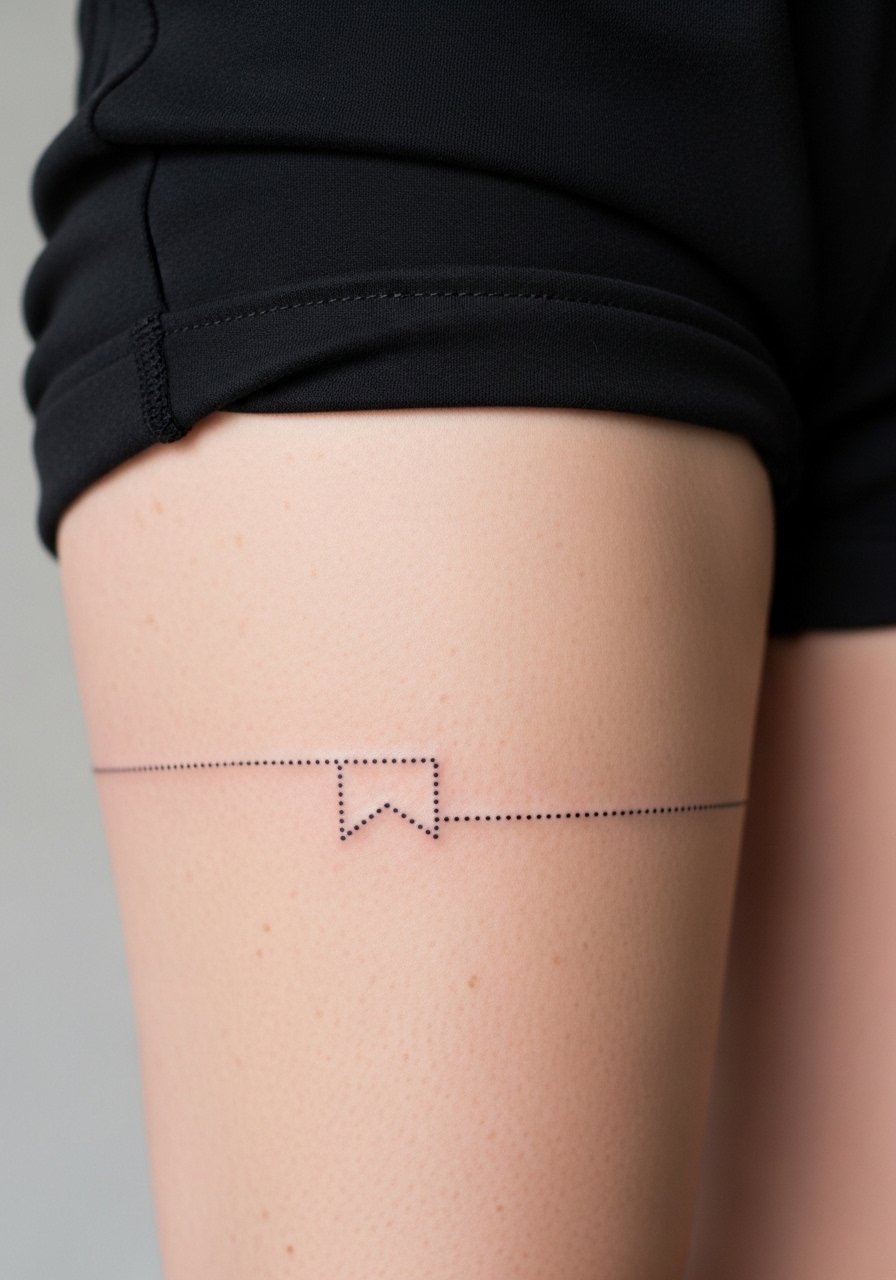
A bookmark trail is a clean option for people building a patchwork thigh collection. Its wraparound design avoids distortion by following the limb circumference. Ask for consistent spacing between dots or marks and request a composite mockup so you can judge how it sits when you stand and sit. Single-session work with low to moderate pain makes this friendly for incremental additions. The main mistake is making the band too tight or too thin, which causes crowding as skin shifts. For session day wear comfortable elastic waist shorts so the artist can roll fabric down easily without pressure.
12. Neo-Traditional Fairy Tale Spread on Outer Thigh
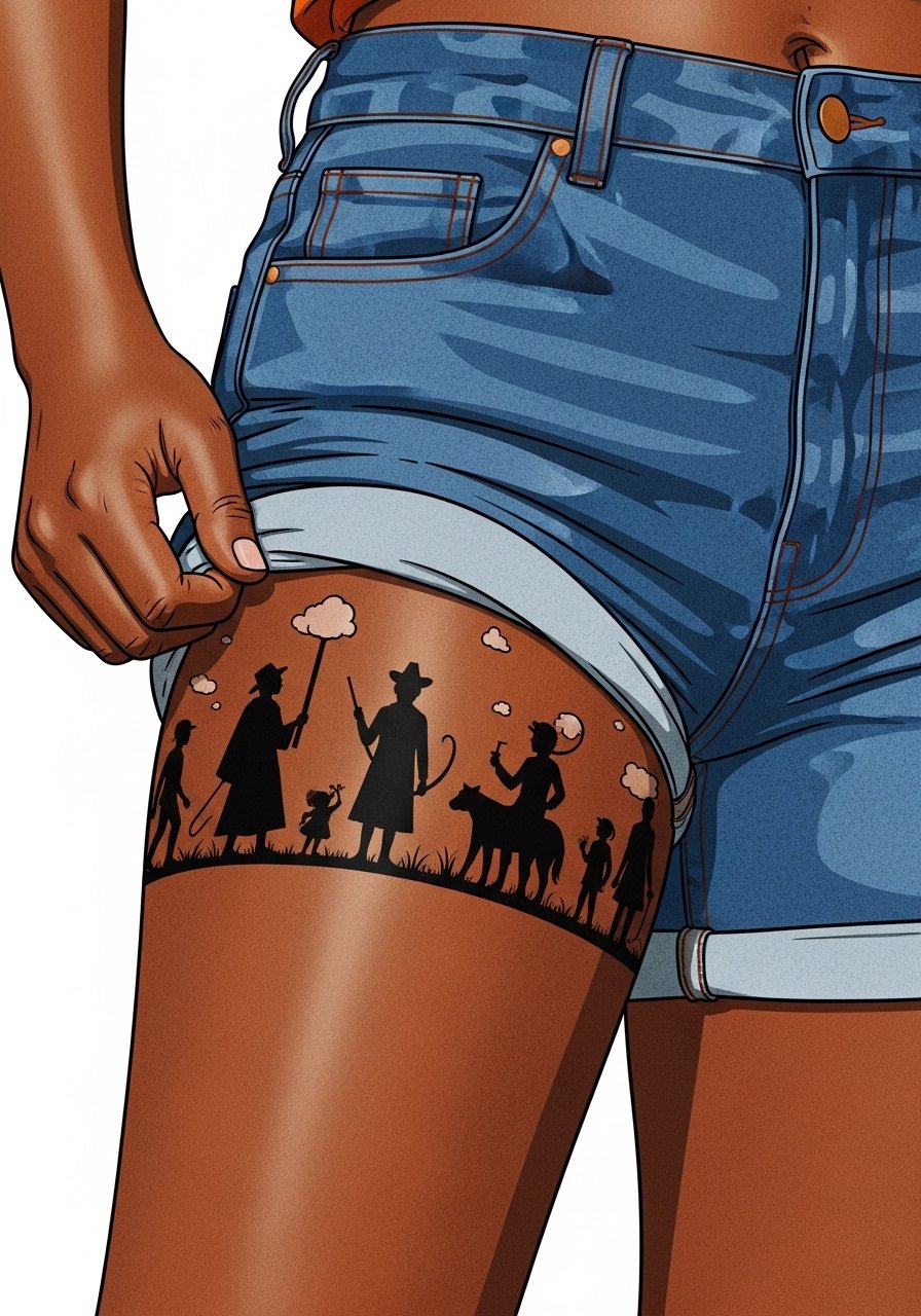
This spread reads like a small mural and benefits from thicker outlines so the silhouettes stay legible over time. It works well as a statement piece for collectors who want narrative elements that can be added to in future sessions. Tell the artist where you might want expansion so composition leaves room. Outer thigh sessions take two to three visits depending on color depth. A typical error is insisting on too many small facial details in character silhouettes which become indistinct later. Show it off with high waisted denim shorts that let the panels sit flat.
13. Torn Page with Script on Inner Thigh
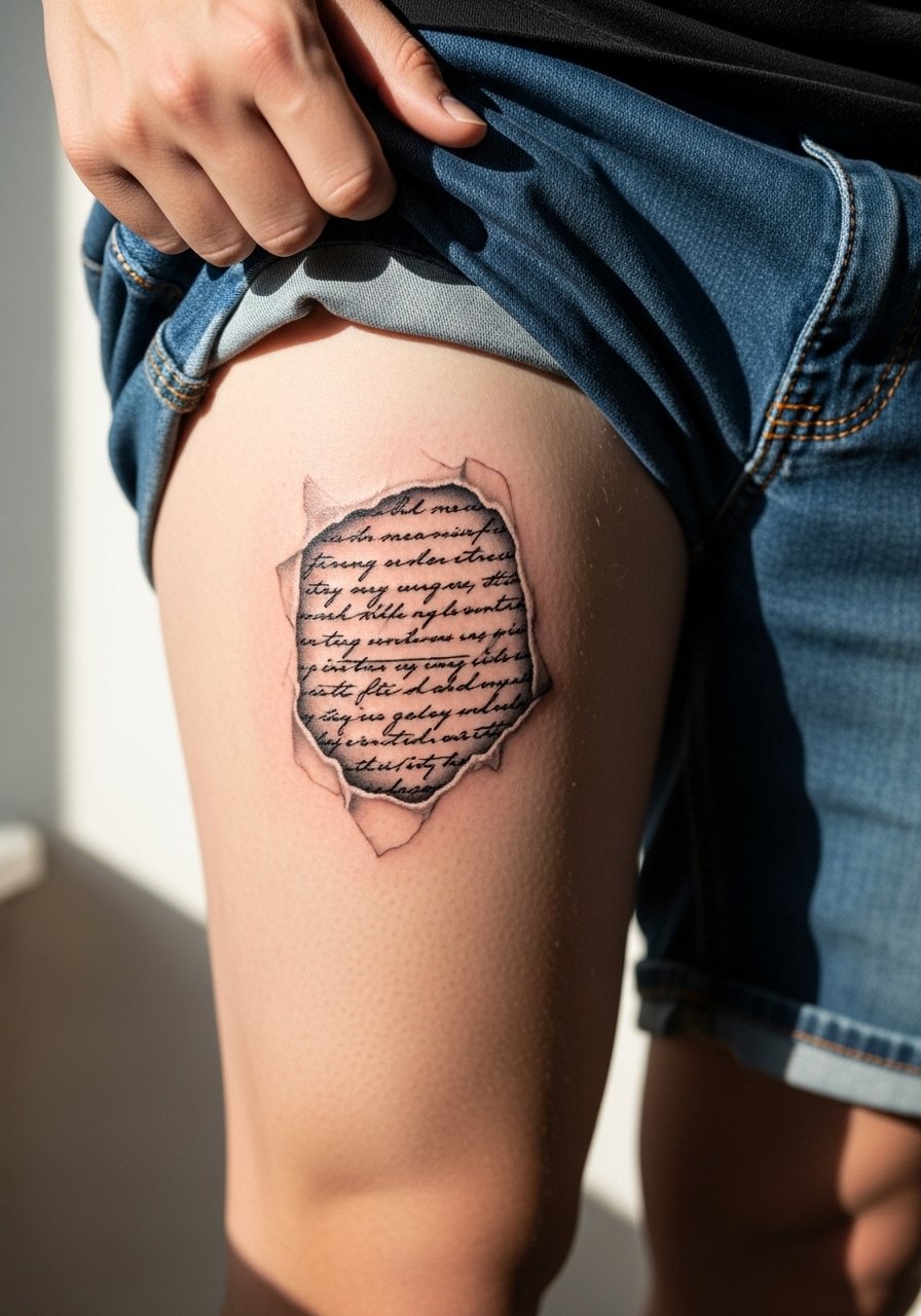
A torn page plus script feels intimate and reads like a private journal entry. Inner thigh friction is the main concern so opt for script with slightly heavier strokes than the thinnest cursive you find online. Ask for script spacing that anticipates slight softening, and plan for a touch-up within a couple of years if you want razor-thin lettering to remain perfect. Sessions will be focused and the area can feel tender while healing. For the appointment wear loose linen pants that are easy to adjust without pressing fresh ink.
14. Geometric Folded Page on Side Thigh
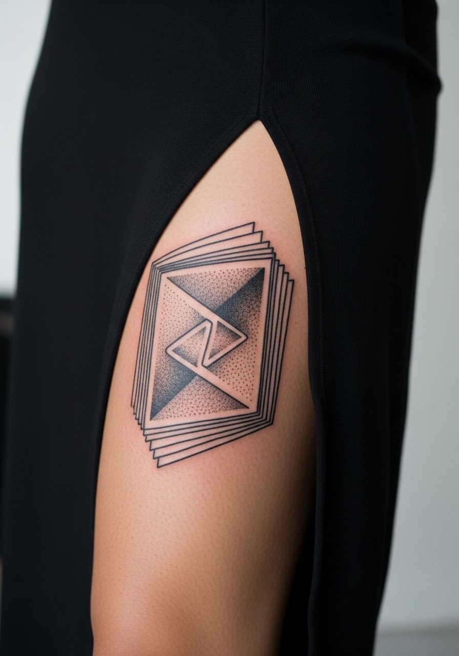
A folded page motif uses angles to suggest depth and works best when the artist gives lines breathing room. Side thigh placement elongates the fold and makes the illusion convincing. The frequent mistake is compressing too many angled lines into a small area which leads to merging as the skin ages. Tell the artist to scale the pattern so each fold has at least two to three millimeters of space between lines. Sessions are usually one or two depending on fill. For showing the geometry wear side slit dress silhouettes that let movement reveal the folds.
15. Ornamental Spine with Metal Tones on Upper Thigh
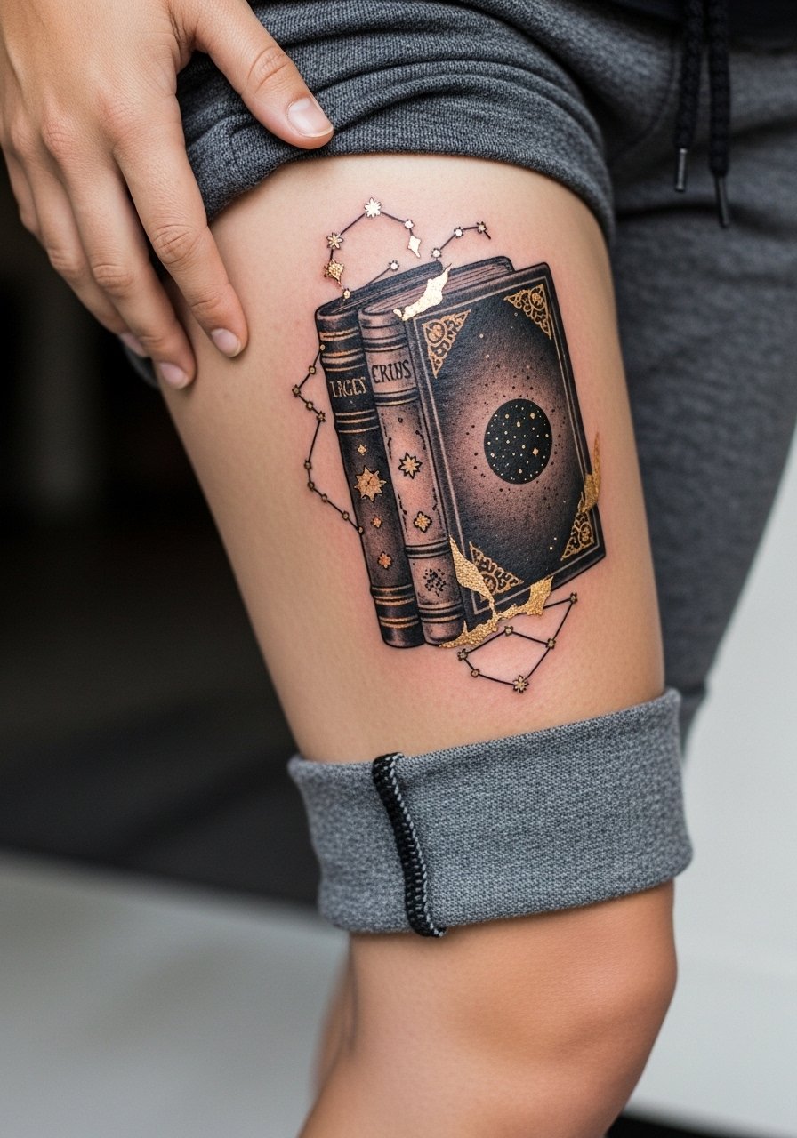
When an ornamental spine uses gold or metallic tones be realistic about pigment visibility on darker skin. The design is striking when black outlines carry the structure and metallic is used sparingly. This piece often needs three sessions for layering and careful saturation. Discuss pigment choices in consultation so the artist can show healed examples on similar skin tones. Pain is modest on upper thigh. The error I see is asking for full metallic coverage rather than accents which tends to lose contrast later. Session wear like cropped joggers makes positioning easy and comfortable.
16. Small Bookmark Bookmark Trail for Patchwork Thighs
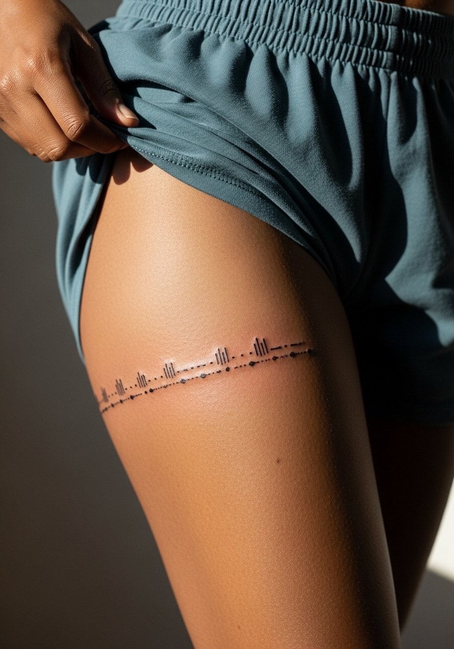
This pared-down trail is perfect if you want to keep adding over years without overwhelming the area. The wrap helps disguise distortion and lets you place new motifs between markers. Keep the marks slightly bolder than ultra-fine pin dots to avoid early merging. Sessions are short and pain is low. A mistake is choosing marks that are too close together which makes future additions awkward. For the session wear elastic waist shorts so the band can be revealed or covered easily.
17. Photoreal Page Edge with Burnt Corners on Outer Thigh
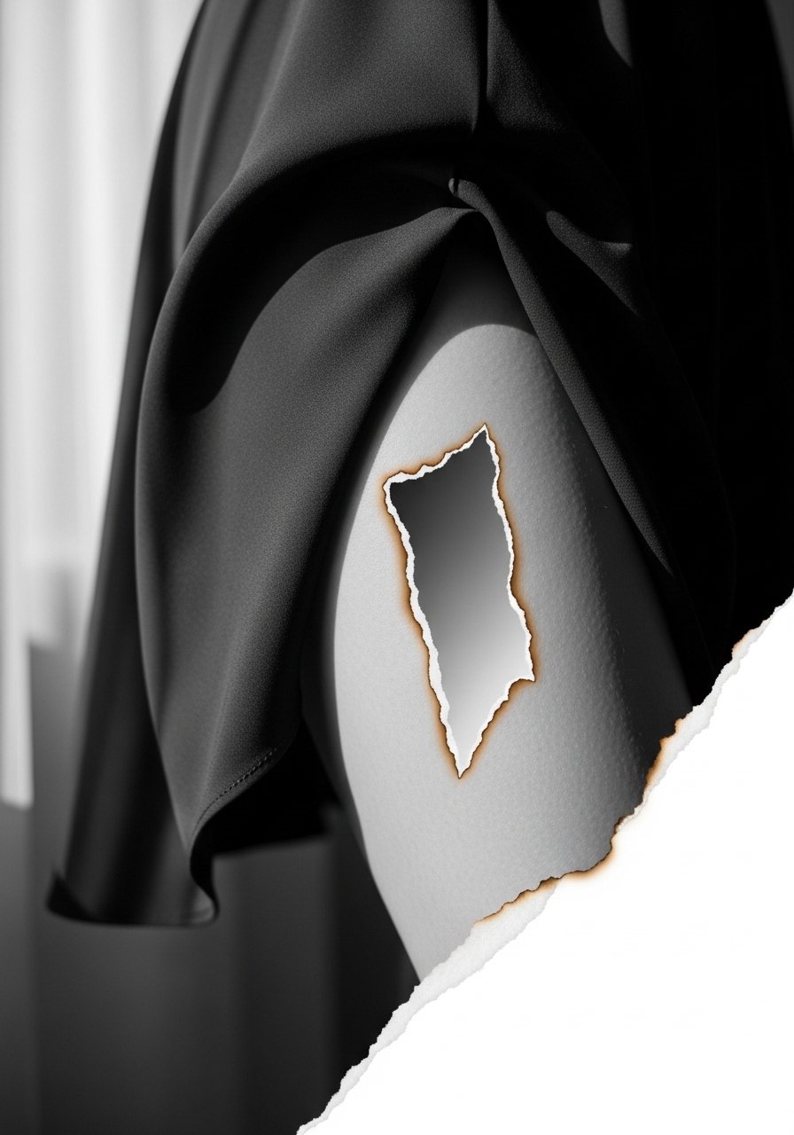
Photoreal edges need tight contrast to sell the illusion of paper and singe marks. For the outer thigh this reads beautifully because the canvas is broad and the detail can be scaled. Tell your artist you want crisp dark anchor shadows with lighter feathered edges so the burnt effect keeps shape over years. Sessions will be multi-step to build depth. A common mistake is requesting extreme micro texture in a small area which does not translate after healing. Pair with flowy midi skirt styles that let the edged detail peek out.
18. Storyboard Panels Running Up the Side Thigh
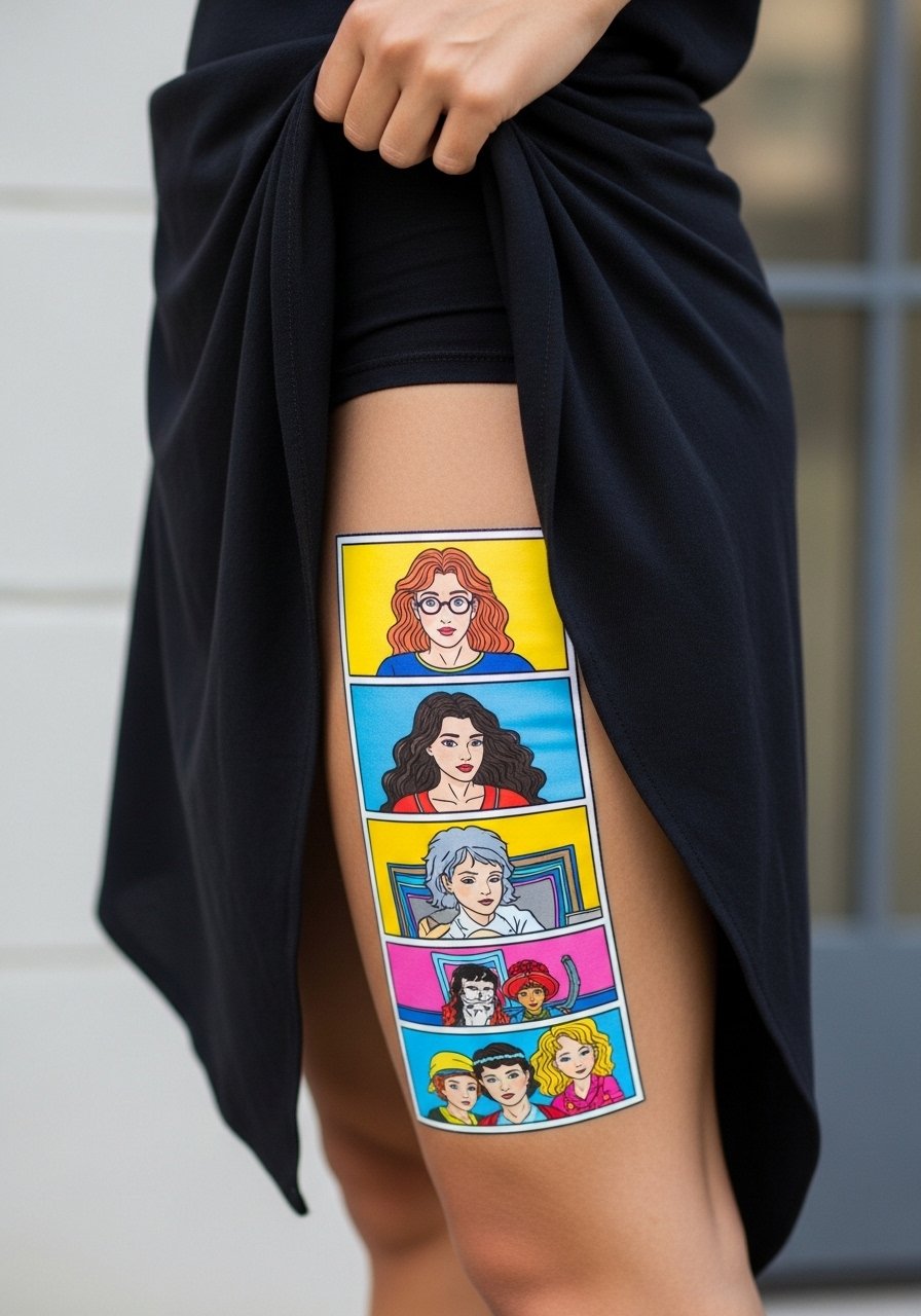
Storyboard panels feel cinematic and allow for narrative additions across visits. Side thigh placement works for sequential content but requires planning for line weight so panels remain distinct. In consultation mark where future panels might live and ask the artist to maintain consistent margins. Sessions are typically two to three depending on color depth. The mistake is cramming too many small frames into a short vertical span which blurs into a block. Wear asymmetrical skirt looks that reveal panels when you move.
19. UV Hidden Quote on Inner Thigh
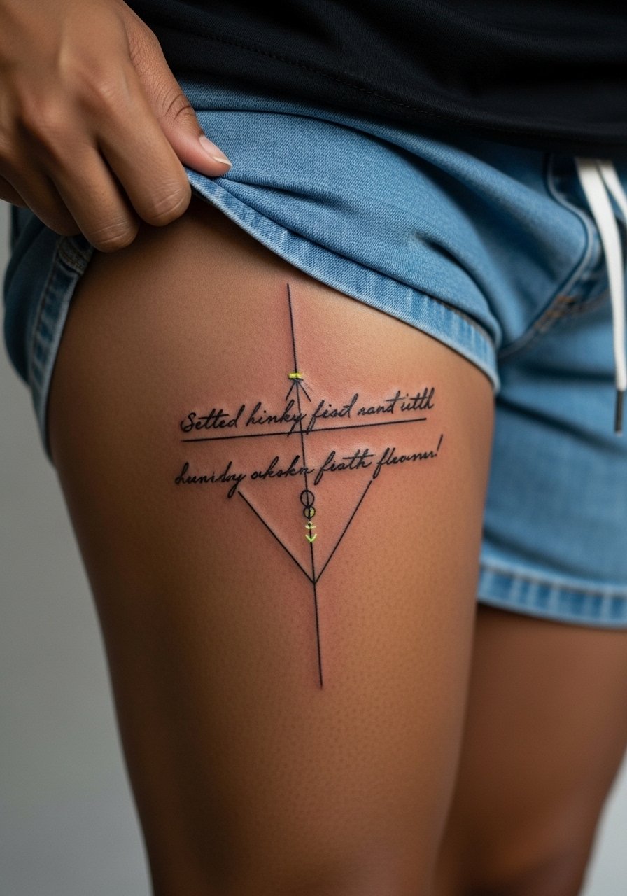
UV ink elements add a secret layer that only appears under blacklight and can be intriguing for inner thigh placement. This approach has risks because UV pigments behave differently in healing and care. Discuss the pigment brand and long-term color retention with your artist and consider a small test patch first. Pain and healing mirror fine line inner thigh work and friction is the main issue. A common misstep is expecting UV detail to match visible ink longevity. Plan to book touch-ups down the line if you want the hidden quote to remain vivid.
20. Curved Spine Mimicking Book Binding on Thigh Curve
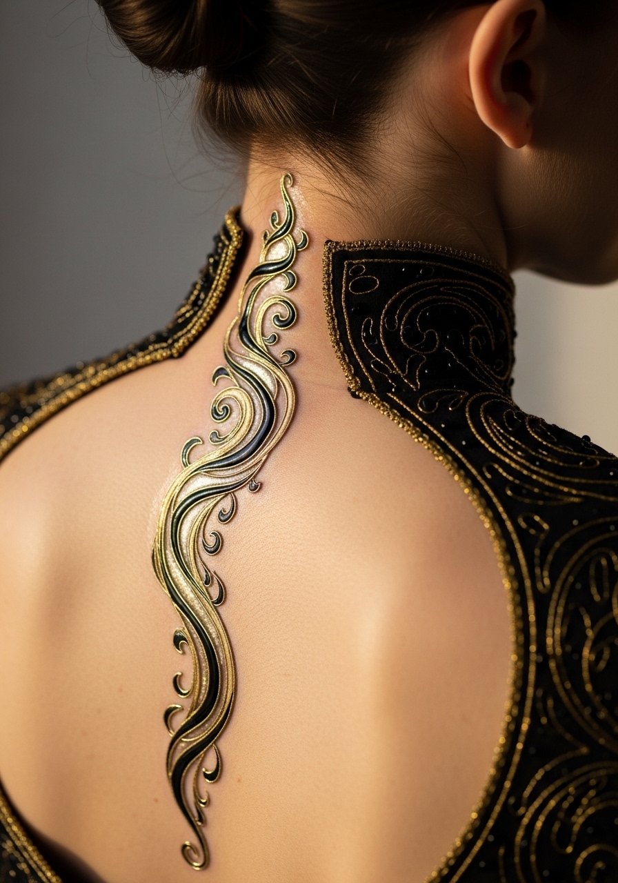
This design intentionally follows the thigh curvature so it reads like an actual bound volume when you stand. It is a clever answer to the problem of thigh distortion and works best when the artist sketches directly on skin and tests the curve with movement. Ask for a mock stencil that you can photograph while standing and sitting. Sessions will be paced to maintain consistent spacing along the curve. The mistake is applying a straight spine design to a curved zone which leads to visual warping. For session comfort wear high-cut shorts so the artist can access the curve cleanly.
21. Thigh Journal: Sequential Pages to Add Over Years
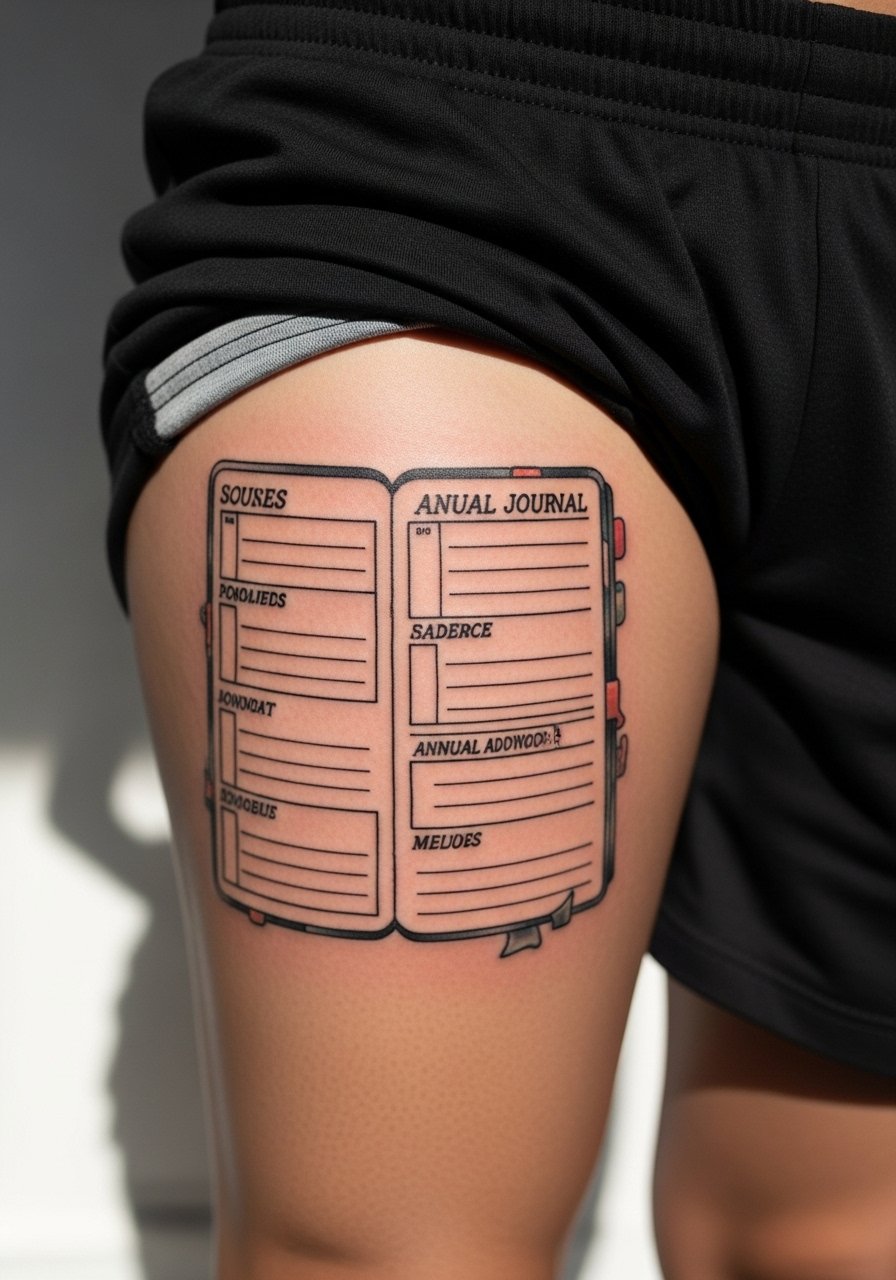
A thigh journal is the idea of building a chronological collection of small page pieces each year. It answers the gap most galleries miss because it plans future space and avoids crowding. Tell your artist you want negative space buffers and set a rhythm for size and spacing so new entries integrate naturally. Pain per visit is low if each addition is small and sessions are easy to schedule. A real advantage is you can test styles gradually and pivot without disrupting earlier work. The main mistake is failing to leave room for growth, which makes later pages look cramped.
Frequently Asked Questions
Q: Will fine line page details blur faster on darker skin tones when placed on the thigh?
A: Fine line work can lose crispness faster on some darker skin tones because contrast matters more than line thinness. I suggest testing a small patch or asking the artist to show healed examples on similar skin. Choosing bolder anchor lines with delicate interior strokes often balances the look without losing the airy feel.
Q: How should I prepare clothing for a long thigh session to reduce sweat and friction?
A: Wear loose, breathable bottoms that can be pulled down without pressing the tattooed area, like loose athletic shorts, and bring a cooling towel. Schedule a morning appointment when your body heat and sweat levels are lower so the session stays comfortable.
Q: For inner thigh script and torn page pieces what realistic touch-up timeline should I expect?
A: Inner thigh scripts and micro-realism often need touch-ups around year two to three because of friction and occasional scabbing. Expect a lighter touch-up rather than a full redo if the original saturation was strong and the stencil placement respected the area movement.
Q: Artists are split on fine line versus bold lines for thigh tattoos. How do I decide which camp to follow?
A: Name both camps to your artist. One group favors fine line for its delicate look and claims good placement holds it. The other prefers bolder lines for longevity on mobile zones. The right call depends on your skin type, placement, and how you plan to show the piece. Ask the artist for healed photos that match your skin tone and placement before booking.
Q: Can I build a thigh journal piece over time without the earlier pages looking out of place?
A: Yes if you plan spacing and scale from the start. Tell your artist you want room for annual additions and request a layout grid so each future page has breathing room. Keeping a consistent line weight range across entries makes the whole journal feel cohesive.