
Fine line neck work is everywhere online, and the pieces that still look crisp after three years are not always the ones that get the most likes the day they are done. Placement and spacing matter more than flash detail. Pick a style that suits your movement and wardrobe and you cut down on touch-ups. Start with the first idea below and compare how each option wears on real skin.
1. Micro-Realism Portrait on the Side Neck
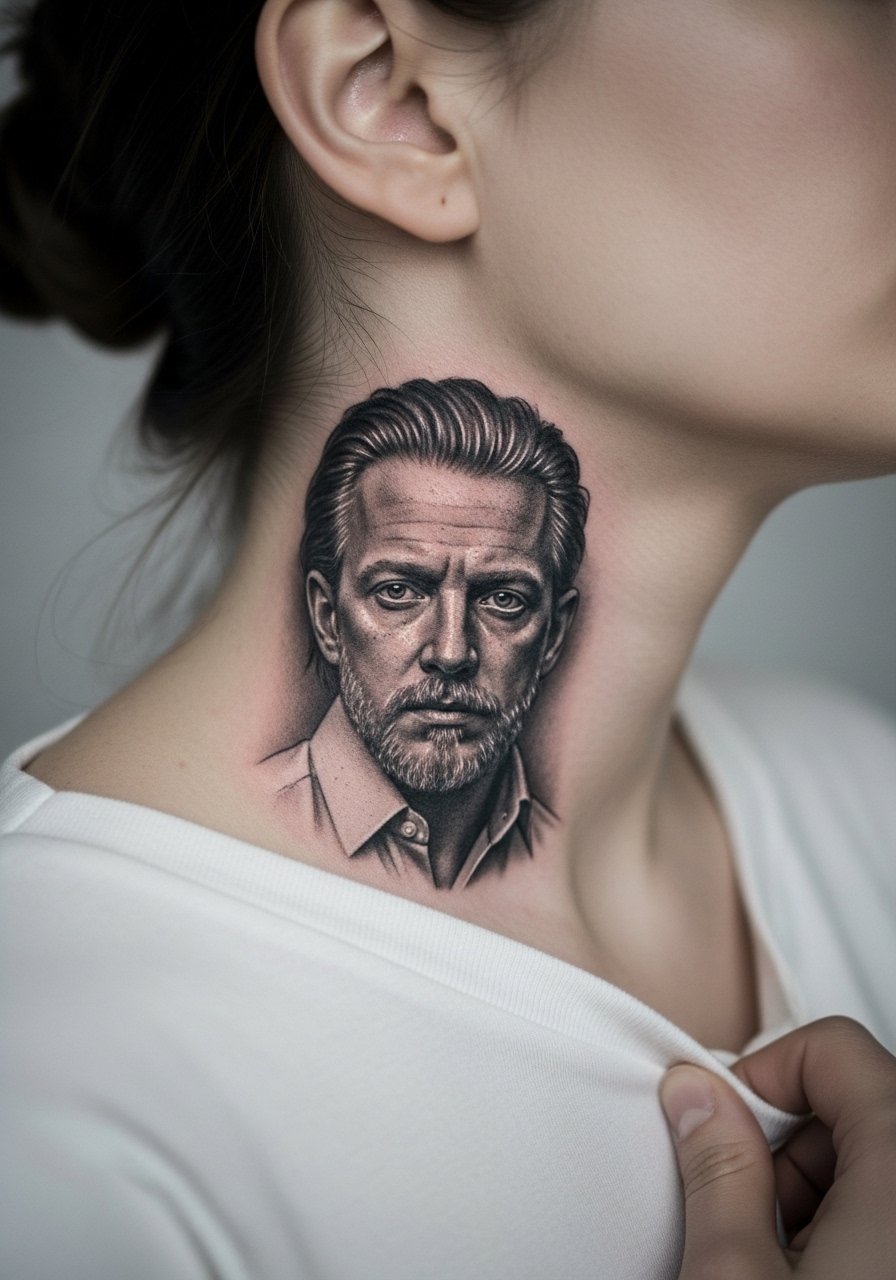
This small portrait reads like a private emblem when placed on the side of the neck. I recommend this style when you want detail without a full-chest commitment. Tell your artist you want confident mid-tone contrast rather than ultra-fine hairline detail. Fine stipple shading holds better than tiny hair strokes in this spot because the skin moves more than you expect. Expect moderate pain and a session that runs one to two hours. A common mistake is asking for photo-level detail at too-small a scale, which causes smudging by year two. Note that neck portraits need a specialist comfortable with micro-realism and portrait depth. For showing it off, pair with a wide-neck shirt that frames the piece.
2. Bold Blackwork Band Around the Lower Neck
A saturated band reads loud and ages predictably because it relies on saturation, not tiny lines. I recommend this when you want a bold statement that resists early blur. Mention to your artist that you want solid saturation and thicker linework so the band does not thin into broken segments over time. Pain is higher than a collarbone piece but sessions are usually under two hours. The main mistake is going too thin with the band. Expect the black to soften at the edges by year three and plan for a touch-up if you want the original contrast back. For outfits, a crew neck t-shirt or an open collared shirt highlights the wrap without competing.
3. Script Name Curving Along the Throat
A centered script on the throat is intimate and visible. Ask for slightly heavier lineweight than you would for a wrist script so the letters remain readable as the skin moves. Expect sharp pain and a short session under an hour if kept minimal. The usual error is choosing an overly ornate font at tiny scale, which merges inside a year. This placement responds well to bold cursive that leaves breathing room between letters. Because this is a visible spot, think about career implications and ask your artist for portfolio examples of healed throat scripts. For the session, wear a button-down shirt you can pull to one side for clear access.
4. Realistic Rose on the Side Neck, Petals Flowing Toward the Jaw
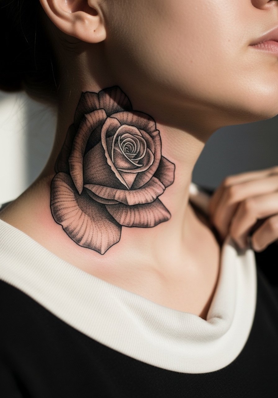
A realistic rose uses mid-tone shading and stipple shading to keep form without tiny hairlines. I suggest this when you want organic movement that follows the neck curve. Tell your artist to use stipple and gradual saturation in the petals rather than dense micro-lines. At six months the petals will show contrast; at two years the soft edges will be more blended, which suits the organic look. Common mistakes include packing too many tiny details near the stem where the skin folds. Pain is moderate and sessions usually run 60 to 90 minutes. For showing it off, a v-neck shirt or a simple chain necklace complements the flower without crowding the composition.
5. Small Anchor Behind the Ear, Nestled Under the Hairline
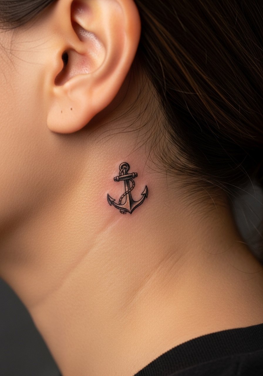
Behind-the-ear pieces read as secret accents and heal quickly if kept small. Ask for a compact design with bold internal shapes rather than micro-lines that can blur. The session is short but the spot is close to bone so expect sharp stinging. A common error is trying to scale up a hand-sized design into the behind-the-ear area. Remember to tell your artist you want the design sized to fit the small plane of skin there. This area can be sensitive during touch-ups, so plan accordingly. Because it sits under the hairline, a neat grooming choice like a short cropped haircut or a low fade exposes the piece when you want it visible.
6. Chain Link Wrap That Tucks into the Collarbone
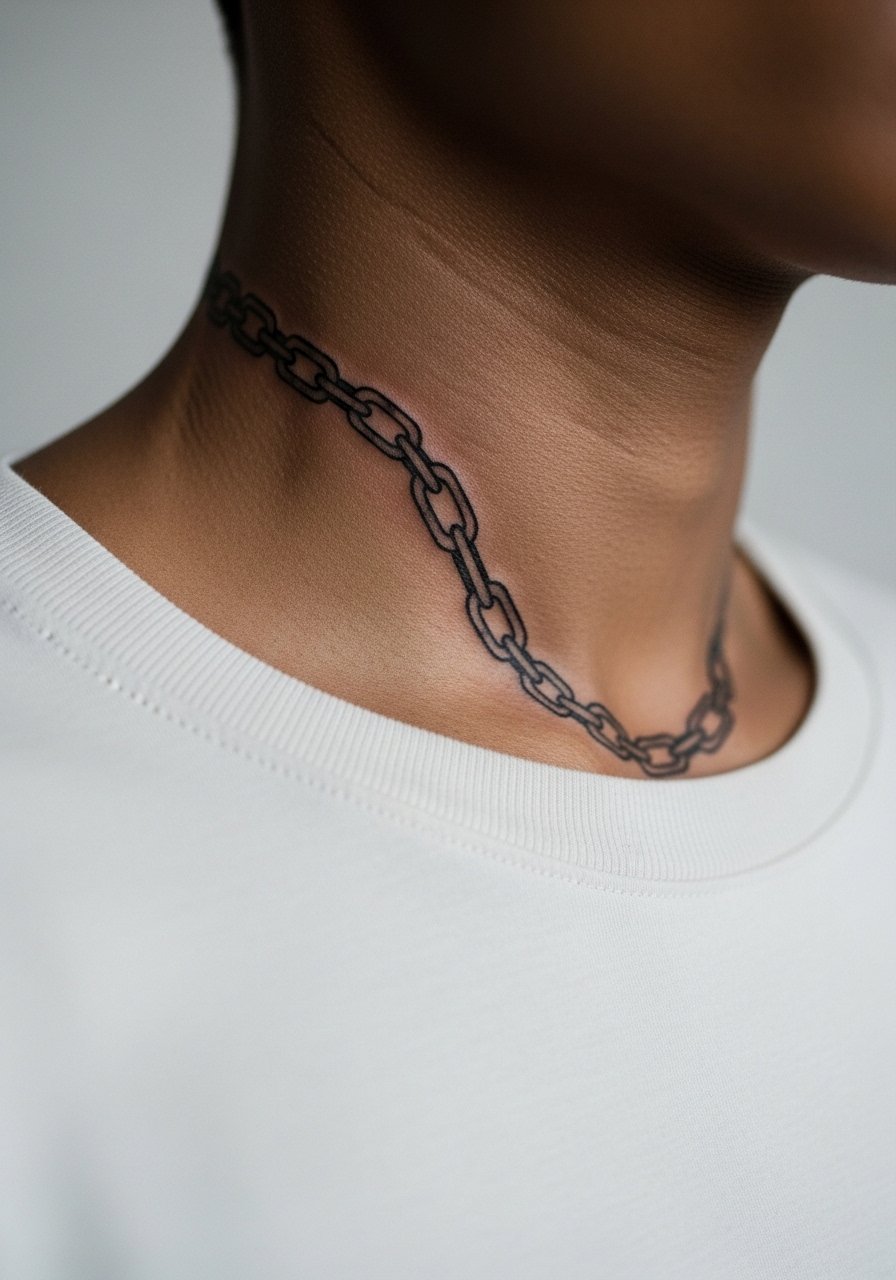
A chain motif that meets the collarbone reads like an accessory and travels well with movement. This is a good choice when you want the neck to feel like part of a layered look. During consultation say you want defined links with negative space inside each link so the pattern does not fill in over time. The mistake I see most is filling the negative space too early, which ages into a solid band. Session time is typically 90 minutes. This placement pairs with open collars and is best framed by a thin chain pendant necklace for evenings out.
Pre-Session Essentials
The side neck, behind-the-ear, and collarbone-adjacent pieces above need easy access and light prep. A few small items smooth the session and first week.
-
Stencil transfer paper kit. Lets you preview placement on the curved neck skin before the needle starts, which is helpful for script and portrait pieces.
-
Topical numbing cream. Applied as directed takes some of the edge off near-bone spots like behind the ear without blocking the artist's work.
-
Thin protective film roll. Useful for initial coverage on pieces that rub against collars or chains.
-
Fragrance-free gentle body wash. Cleans the area without stripping oils that help linework settle, which matters for fine work on the throat.
-
Aquaphor healing ointment. A thin layer helps retain moisture in delicate neck linework during the first few days.
7. Micro-Realism Eye Below the Jawline
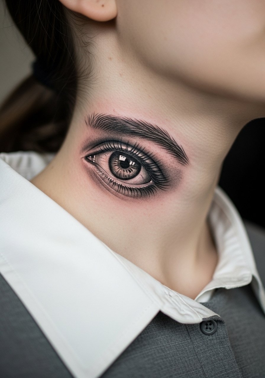
An eye under the jawline feels like a hidden signal that peeks out with certain angles. I recommend this when you want symbolic detail that sits off-center from the throat. Tell the artist to focus on mid-tone contrast and to avoid extreme ultra-fine lashes. At six months the highlights settle and by two years the contrast softens, which keeps the eye from appearing too stark. Mistakes include insisting on extreme micro-detail at small scale. This placement can be tender during the session and usually takes under 90 minutes. To frame the piece, a loose button-down shirt worn open at the collar offers glimpses without forcing exposure.
8. Minimalist Geometric Mandala at the Nape
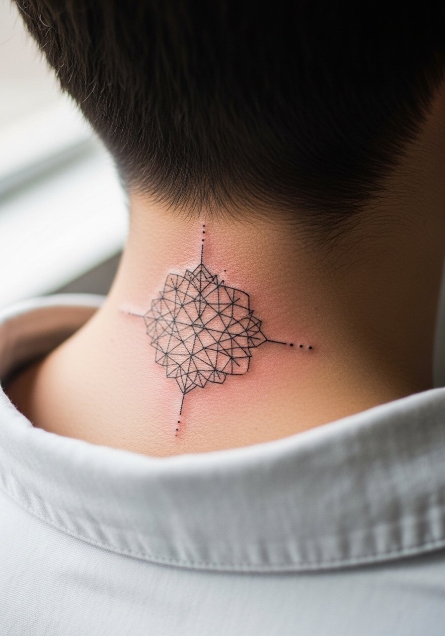
A small mandala at the nape reads as an anchor under hair and works well with short or long styles. For cultural sensitivity, note the mandala’s spiritual origins and ask for a simplified or inspired composition if you are not replicating a traditional sacred design. I recommend stipple shading and generous spacing so lines have breathing room as the skin stretches. Expect sharp needle sensation and a session usually under an hour. A frequent error is cramming too many concentric rings into a small circle, which causes merging by year two. This spot is easy to hide with collars or show with a [low ponytail] when you want attention.
9. Realistic Snake Coiling Up the Side Neck
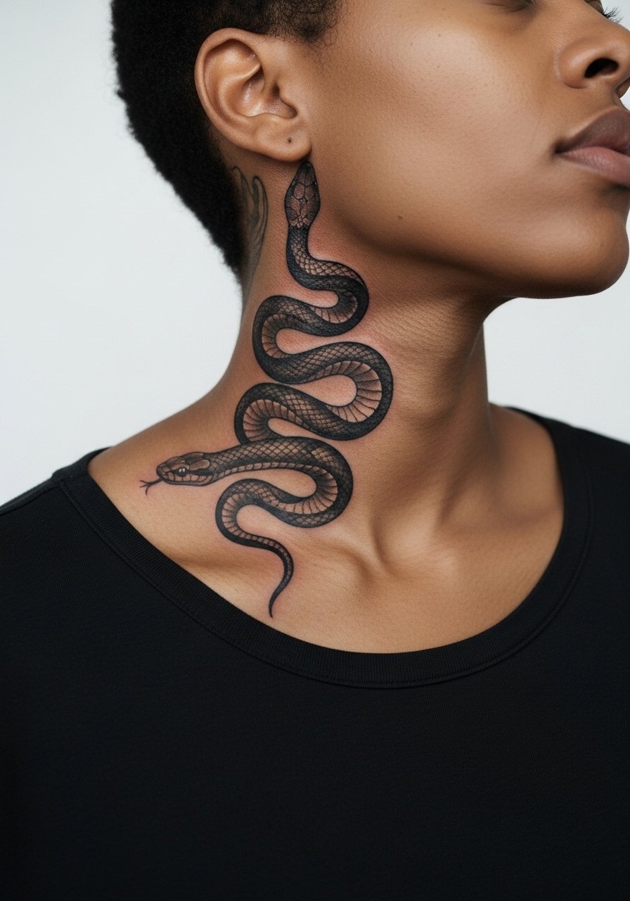
A realistic snake plays with curve and motion on the neck plane. Ask your artist to emphasize body volume with flowy shading and to leave negative space between coils for longevity. This placement can feel intense during the session near the jaw. The mistake is running the snake too tightly against the ear or hairline which leads to distortion with movement. Expect a one to two hour session depending on length and shading. For showing it off, a simple racerback tank or open-collar shirt keeps the eye moving along the neck without competing.
10. Micro-Realism Compass Over the Adam’s Apple
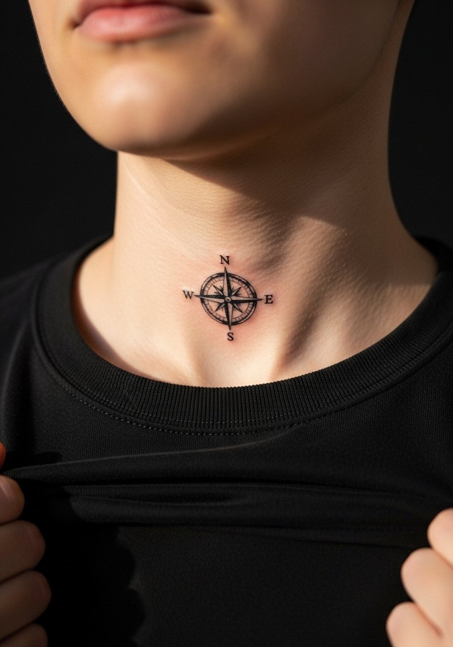
A small compass over the Adam’s apple reads as literal navigation and sits visibly at the throat center. I recommend bold contrast in the points rather than faint hairline marks to preserve the shape over time. Sessions are short but the area is sensitive. Common mistakes include requesting tiny ornate details that lose fidelity as skin moves. In two years you will likely notice a softening at the outer points so plan for a touch-up if you want razor edges after several years. Think about pairing with a simple pendant or leaving the neckline open on shirts to let the compass show.
11. Photo-Realistic Koi Swimming Toward the Back of Neck
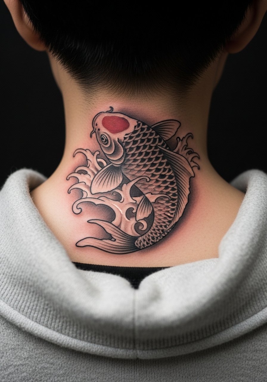
A colorful koi on the back of the neck is a dramatic option that ages according to saturation choices. I advise deep, saturated color in the initial session with soft gradients so the fish still reads in five years. Discuss color retention and sunscreen use with your artist since UV exposure reduces vibrancy. The session can be longer if color is involved and may require a touch-up at year two for bright pigments. A typical error is ultrafine scale texture that blurs into muddiness. This placement pairs well with an open-back or wide-neck top for nights out.
12. Script Quote Curving Under the Jawline

A curved quote under the jaw translates well when the font has moderate weight and clear spacing. During consultation ask for increased stroke width compared to a wrist script so letters age more gracefully on moving skin. Most people underestimate how the neck shifts during expression and talking, which causes tight scripts to smudge. Expect noticeable sensitivity and a session under an hour. A typical mistake is choosing a dense cursive at small size. For outfits, a thin chain pendant sits above the quote without crowding the letters.
13. Black and Gray Skull Throat Piece
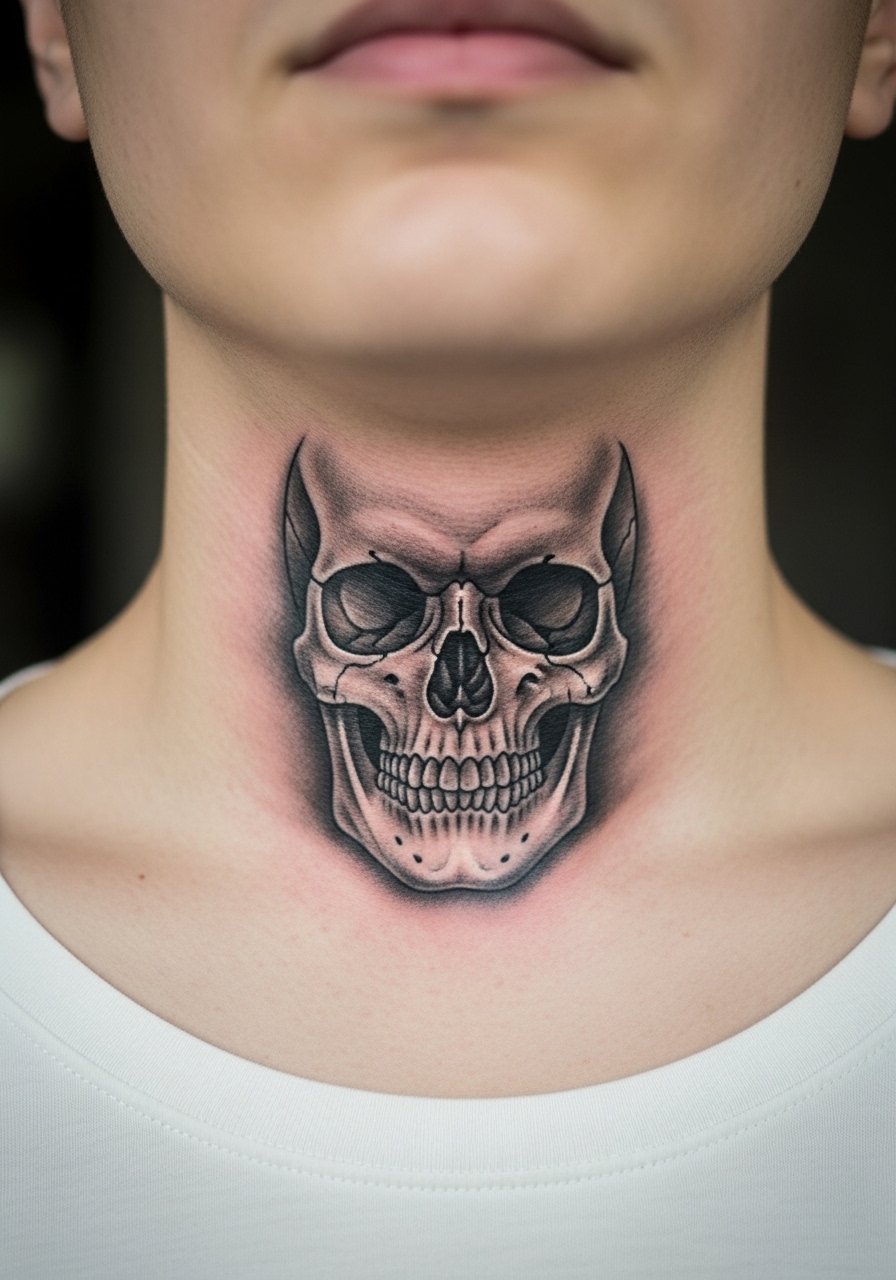
A skull centered on the throat is bold and symbolic. Artists are split on scale for this spot. One camp says you need heavy saturation to read over time. The other camp recommends slightly larger shapes and negative space to avoid dense black that can look heavy as skin changes. The right approach depends on your preferred aesthetic and your artist’s healed portfolio. Expect a sharp session and a touch-up timeline around year two if you want the original depth maintained. Avoid asking for micro-detail in tiny teeth, which blurs. This placement pairs with V-necks or open collars when you want to show the piece.
14. Small Crescent Moon at the Nape Side
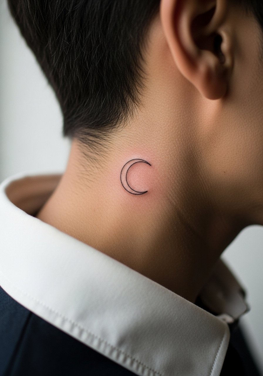
A crescent moon at the nape is subtle and age-resistant when given simple bold outline rather than hairline strokes. I suggest asking for medium lineweight so the curve keeps its clarity after a year or two. This area handles small designs well and sessions are usually under 45 minutes. The most common mistake is choosing an ultra-thin outline that becomes patchy with time. Because of its location, the nape is easy to hide with collars or reveal with a [low ponytail]. Consider how often you want people to see it before you book.
15. Floral Vine That Climbs the Side Neck
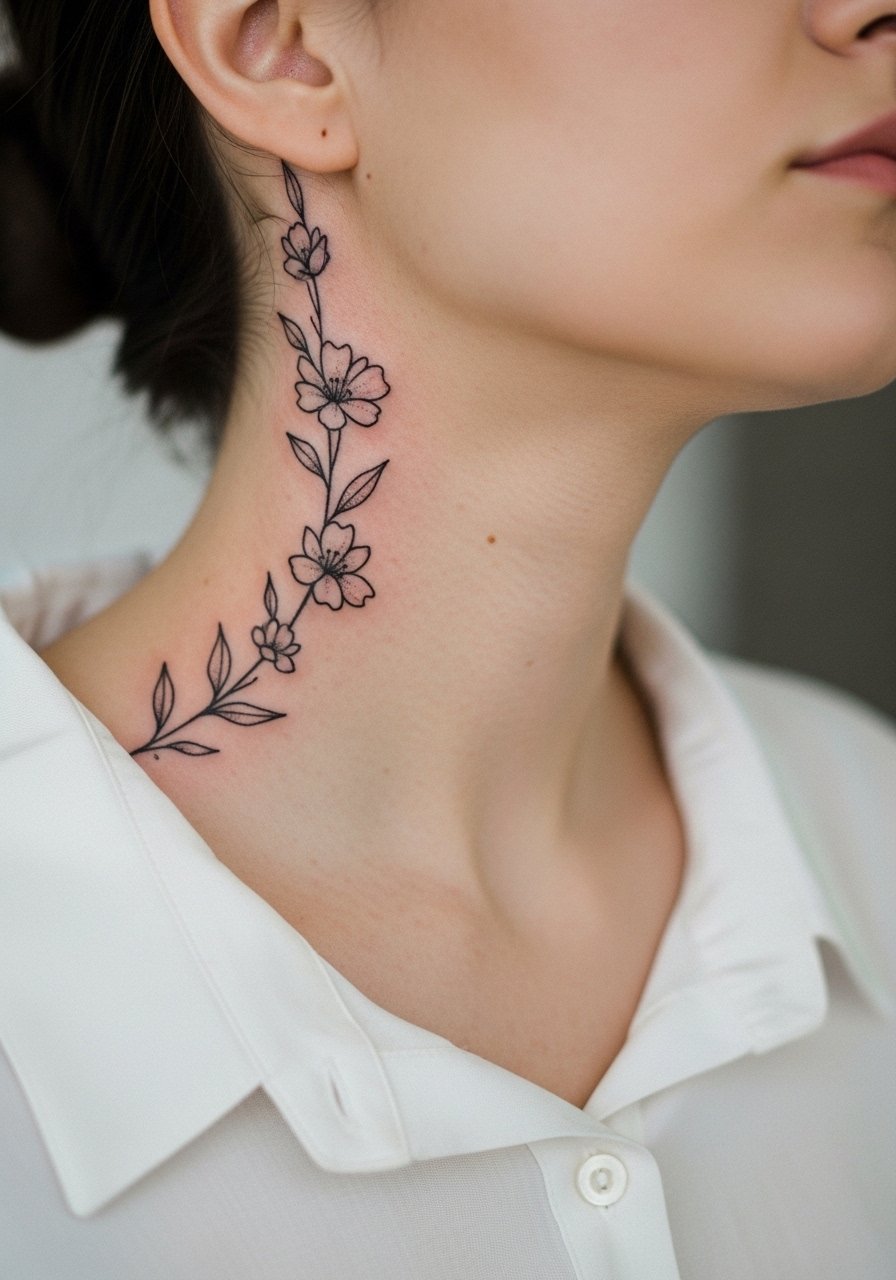
A vine that follows the neck curve feels organic and wearable. Recommend to your artist that leaves and petals have breathing room and that the vine does not have overly tight loops which can merge with time. Sessions can be split into multiple short passes for comfort. The common mistake is overcrowding the vine with tiny leaves that flatten at year two. For showing this piece, a soft linen shirt in neutral tones frames the design without competing for attention.
16. Realistic Timepiece on the Side Neck

A small realistic timepiece plays with scale and requires clear contrast to remain legible. I recommend opting for simplified hands and defined negative space around gears rather than piling tiny teeth and screws. At six months the highlights settle and by two years the outer rim softens, which still reads as vintage. The error is demanding tiny mechanical parts that stop reading as separate elements later on. Expect a moderate session length and plan a touch-up if crisp numerals matter to you. This piece looks good under open collars for a classic silhouette.
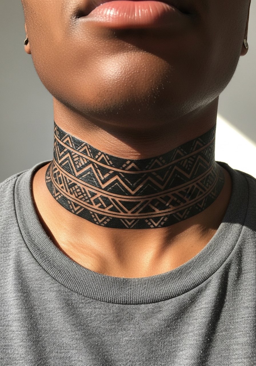
17. Subtle Barbed Wire Wrap at the Lower Neck
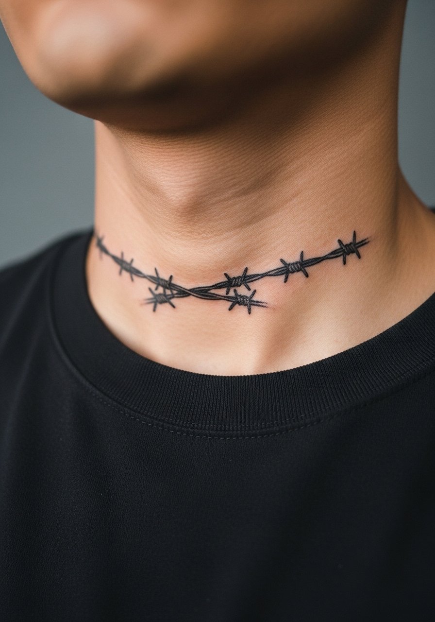
Barbed wire around the lower neck functions like an accessory and ages well if the barbs are not microscopic. Ask for distinct gaps between barbs and moderate lineweight to keep the pattern readable. A common mistake is ultra-thin connectors that merge into a single dark band after a couple of years. Sessions are short but can sting near bone. For showing the wrap, a simple crew neck or open jacket frames the piece without competing.
18. Micro-Realism Wolf Head Facing Forward on the Throat

A wolf head on the throat is bold in imagery and needs strong mid-tone contrast to retain expression. Tell your artist you want the facial planes defined with stipple and whip shading rather than only tiny fur strokes. There is a controversy here. One camp says animal faces need heavy contrast to read after movement. The other camp argues that careful negative space and placement of highlights can preserve detail without heavy black. Ask where your artist stands and review healed wolf pieces before committing. Expect significant sensitivity and a session that may take up to two hours. This placement suits open collars.
19. Tiny Zodiac Glyph Near the Adam’s Apple
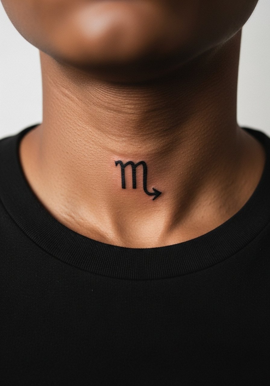
A compact zodiac glyph reads like a nod to personal symbolism. I recommend slightly enlarged strokes compared with a finger glyph so the shape does not lose form as skin moves. Sessions are brief and stingy. The usual mistake is using an elaborate typeface that collapses into an unreadable mark. This spot is visible, so think about how often you want it seen. A thin pendant or open neckline frames the glyph without overwhelming it.
20. Winged Collarbone-to-Neck Transition
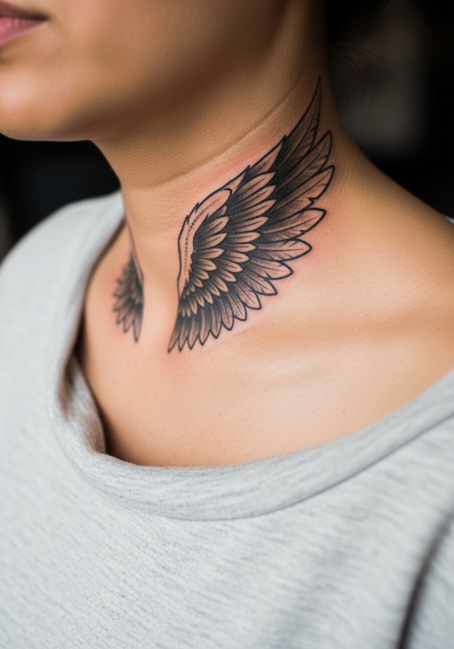
A wing that begins at the collarbone and reaches the neck creates movement with the body's natural lines. I suggest feather groupings with alternating negative space so the texture stays readable as it ages. A mistake is over-detailing every feather at small scale, which becomes visually flat in a few years. Sessions vary with size and are often split into two visits for comfort. For evenings out, a wide-neck top shows the wing silhouette nicely and keeps the look intentional.
21. Tiny Locket With Chain Dripping Toward the Throat
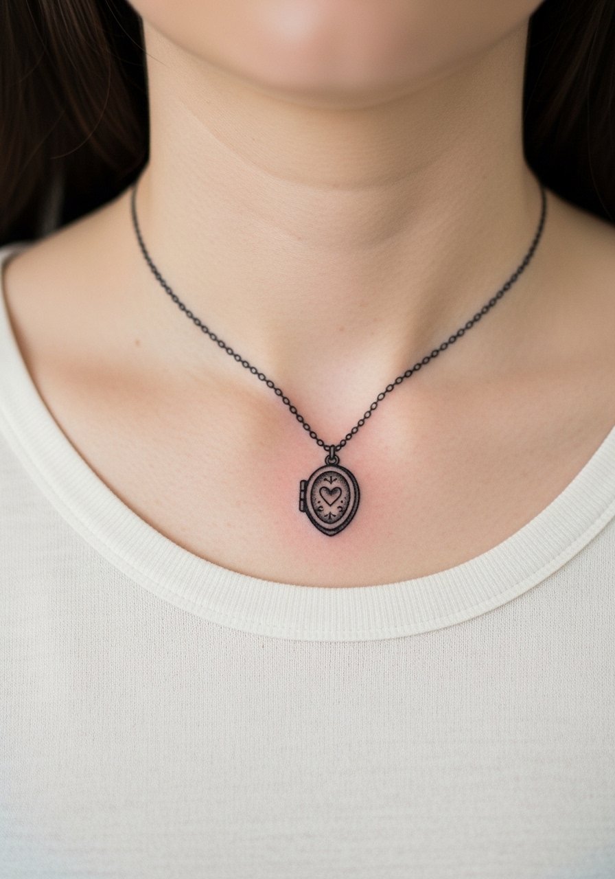
A locket with a short chain reads like jewelry and can be a sentimental pick. Ask your artist to emphasize a small central highlight and to keep the chain links slightly spaced so they do not merge. This placement can be tender near the throat and typically takes less than an hour. The frequent error is cramming tiny ornamental details into the locket that get lost over time. For showing it off, layer with a real thin pendant or let a wide-neck shirt frame the area.
Frequently Asked Questions
Q: Will fine line neck scripts blur faster than bold blackwork?
A: From what I have seen, fine line scripts tend to soften sooner than bold blackwork on the neck because the skin moves a lot. Bold pieces weather into a cohesive shape, while delicate scripts require more spacing and slightly heavier strokes to stay legible. If you want script, ask for medium lineweight and generous letter spacing.
Q: How should I prepare wardrobe-wise for a neck session that includes the collarbone?
A: Wear something with an easy neckline like a wide-neck shirt or a button-down you can pull aside. This gives the artist clear access and keeps fabric from rubbing against the fresh ink during the session and the first day.
Q: Do colored neck pieces need different aftercare than black and gray?
A: The aftercare window is similar, but color can fade faster from UV exposure. From my observations, keeping colored neck work out of the sun and using sunscreen after it heals preserves saturation. For immediate healing products, check the Pre-Session Essentials bullets above.
Q: How often will neck tattoos need touch-ups compared with arm tattoos?
A: Neck tattoos usually need touch-ups sooner because the skin is thinner and moves more. Plan for a potential touch-up at around two to three years depending on your lifestyle and sun exposure. Ask your artist for portfolio examples of healed neck pieces to gauge how they hold up.
Q: Is it okay to get a neck tattoo if I work in a conservative job?
A: Think about visibility and your career path. Some people opt for placements like the nape or behind the ear that can be hidden by collars or hair during work hours. Discuss concealability and long-term visibility during consultation so the placement aligns with your job expectations.