
Fine line script looks delicate on an iPhone screen and very different on skin under salon lights. The tattoos that stay readable at year five are often the ones planned with spacing, the ones where you and your artist agreed on line weight and placement up front. These 17 quote ideas give phrasing, placement, what to tell the artist, and how to show the finished piece without losing its meaning over time.
1. "Breathe" on the Inner Wrist
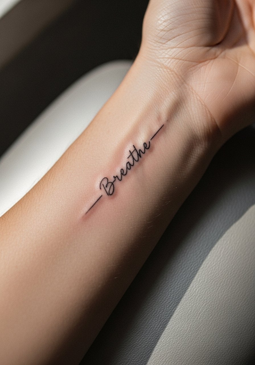
I recommend a single-word script for the inner wrist when you want something discreet that reads quickly. Fair warning, the wrist sees constant washing and friction, so ask your artist for slightly bolder linework than the thinnest option to avoid early blurring. The session feels short, about 20 to 40 minutes, but expect touch-up conversations at year two or three for very fine scripts. For showing it off, stacked dainty bracelets frame the wrist without stealing attention. Try stacked dainty bracelets in mixed metals for daily wear and fewer pulls on the skin during healing.
2. "Begin Again" on the Sternum
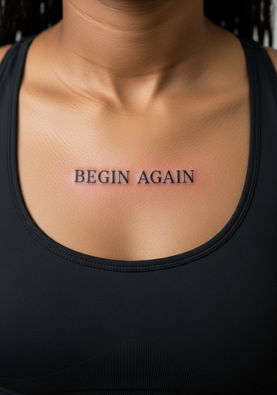
Sternum text shows up best centered and short. Plan for higher pain and longer sessions than wrist work, and tell your artist you want shallow but consistent depth to avoid heavy saturation that puckers the skin. One common mistake is going too long with a sentence across the sternum, which forces tiny letters that blur. For the appointment, wear a fitted sports bra so the artist has clean access without full exposure. Pair the finished script with a thin chain pendant that sits above the line, like a thin chain pendant necklace, to keep attention on the center chest without covering the text.
3. "Hold Fast" on the Side of the Hand
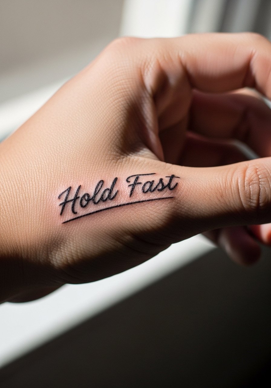
Hand and side-of-hand text ages differently because of constant movement and thin skin. Expect faster fading and the possibility of more frequent touch-ups than arm pieces. Artists split on hand work ethically and practically, so know both camps: one group says hand text is fine if you accept future touch-ups, the other warns that blowout and ink loss are likely no matter who inks it. If you proceed, choose slightly larger letterforms and accept that the session will be tetchy for pain. For styling, minimal rings work with this placement. A simple thin stackable ring set frames the script without rubbing during healing.
4. "This Too Shall Pass" on the Ribcage
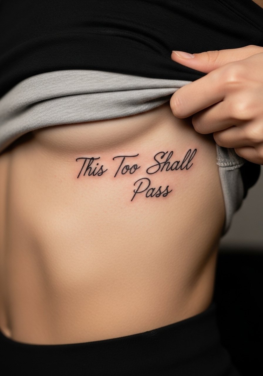
Ribcage text is dramatic and private, but ribs are a high-pain zone and the skin stretches with breathing. The biggest mistake is making the letters too dense to fit a long phrase. Ask for more spacing and slightly heavier downstrokes so the script keeps its shape as it heals. Expect a longer session with careful breaks, and plan for touch-up at year three if you want crisp edges long term. For the appointment wear a cropped top you can lift without awkwardness. Afterward, an open-front hoodie or cropped zip hoodie keeps the area covered yet comfortable during showers.
5. "Still I Rise" on the Upper Chest Near the Collarbone
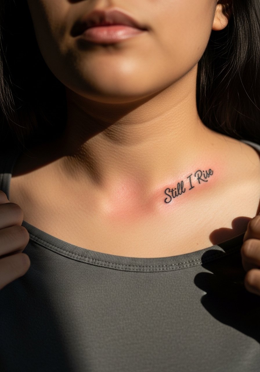
Short phrases across the upper chest read well because the natural curve gives the line flow. Artists caution against letters that hug the bone too closely because contour variations can warp tiny scripts. Ask the artist to map the lettering along muscle lines to preserve legibility as the body moves. This placement is visible with open collars and looks deliberate when paired with an open-neck shirt. Consider an open-neck blouse to frame the line without covering it.
6. "Not All Who Wander" on the Outer Forearm
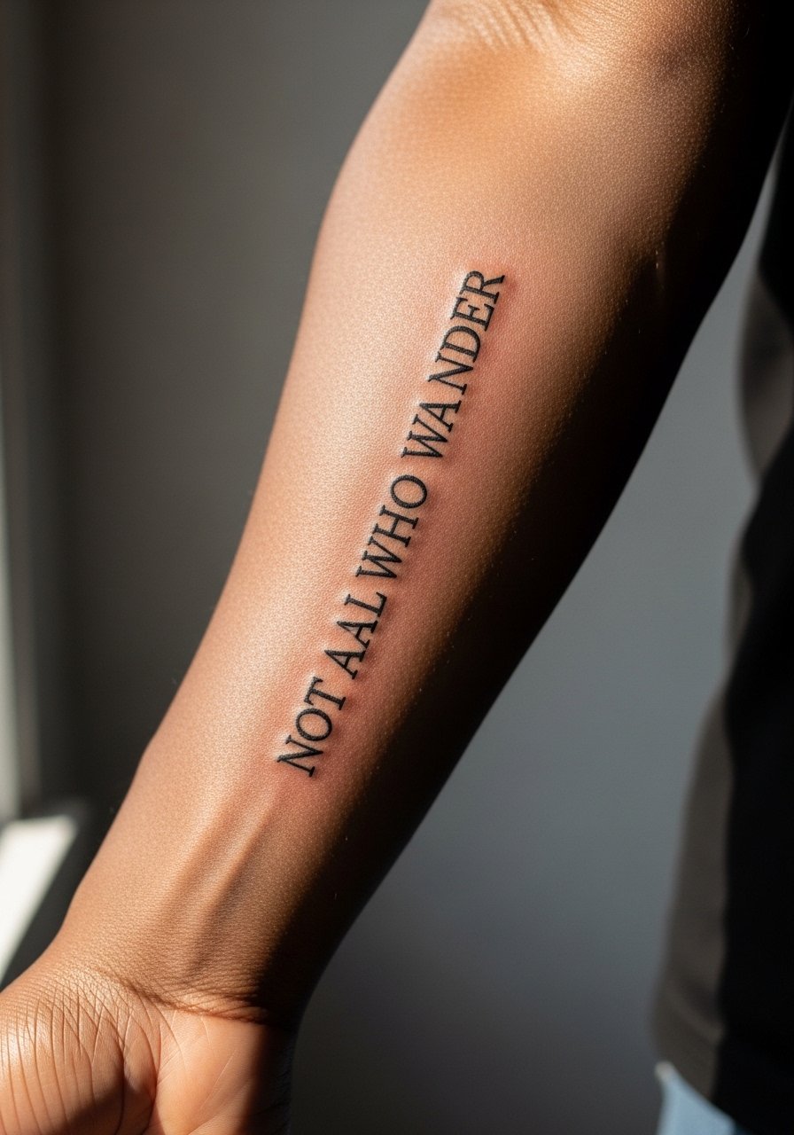
Forearm scripts are easy to read and fairly low pain for the wearer, but fine-line text can blur if placed too low near the wrist or too close to the elbow crease. A common error is choosing a font that is beautiful small on a phone and unreadable in real life. When you consult, bring examples of font weight and ask for modest spacing. Expect a one-hour session for medium-length phrases. For everyday outfits, a rolled-up sleeve or a loose linen button-down frames forearm work and keeps attention on the text without overwhelming it.
Studio Day Picks
The short chest, ribcage, and forearm pieces above benefit from a few practical items that smooth the appointment and the first week of healing.
-
Stencil transfer paper kit. Lets you preview exact line placement on skin before the needle touches, helpful for phrases on the sternum and ribcage.
-
Topical numbing cream. Applied as directed before a rib or sternum session eases the first passes while keeping the artist's work intact.
-
Thin protective film roll. Useful for wrist and finger pieces that face constant washing and friction the first week.
-
Fragrance free gentle body wash. Cleans healing skin without irritating delicate script linework on arms and chest.
-
Aquaphor healing ointment. A thin layer during the initial days keeps fine line work moisturized without clogging the tiny channels.
7. "Find the Quiet" on the Skin Behind the Ear
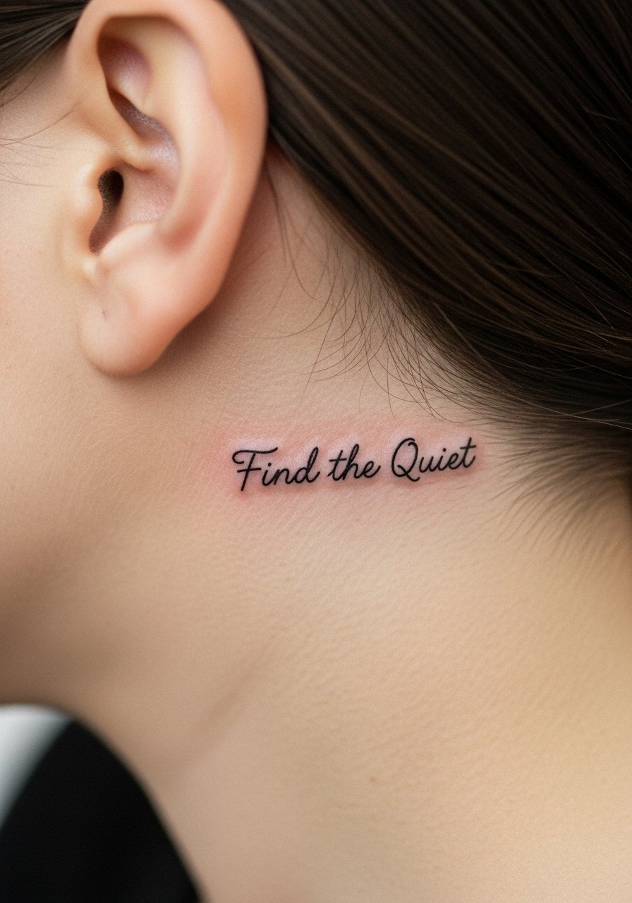
Behind-the-ear text reads as a secret and is great for a short phrase. The area needs a careful stencil because the skin curves and hair can obscure lines during healing. Pain is low but access is fiddly, so book a shop that has done small neck placements before. If your job involves visible grooming standards, remember this spot is easy to conceal with hair. Keep the phrase short and choose letterforms with modest spacing to avoid merging as the skin settles.
8. "Memento Mori" on the Inner Bicep
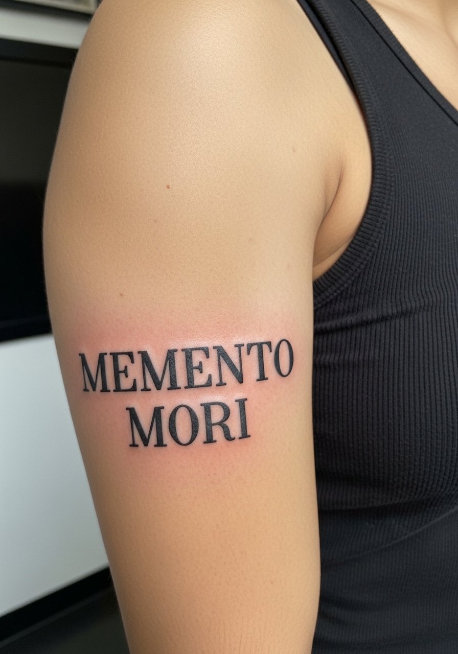
Inner bicep text sits on softer skin and can take ink differently than an outer arm. There is a debate among artists about whether dense lettering is safe there. One camp says softer skin can hold crisp edges with proper depth. The other camp warns that too much saturation causes feathering. I recommend moderate saturation and spaced lettering. For the session wear a tank top so the artist has clear access. The inner arm looks intentional when paired with sleeveless tees and a simple racerback tank top.
9. "Love Like Water" on the Ankle
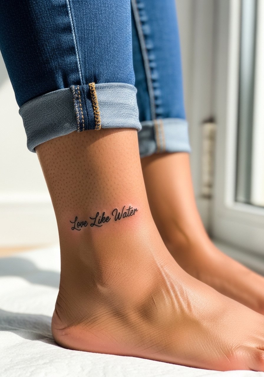
Ankle scripts face friction from socks and shoes and typically need touch-ups more frequently than arm work. Tell your artist you want slightly thicker downstrokes so the letters keep their shape as they heal. The session feels short but the area can sting when the needle is near bone. For showing the piece, low-ankle boots or sandals work well. A casual strappy sandal keeps the tattoo visible without constant rubbing from socks.
10. "She Persisted" on the Upper Outer Arm
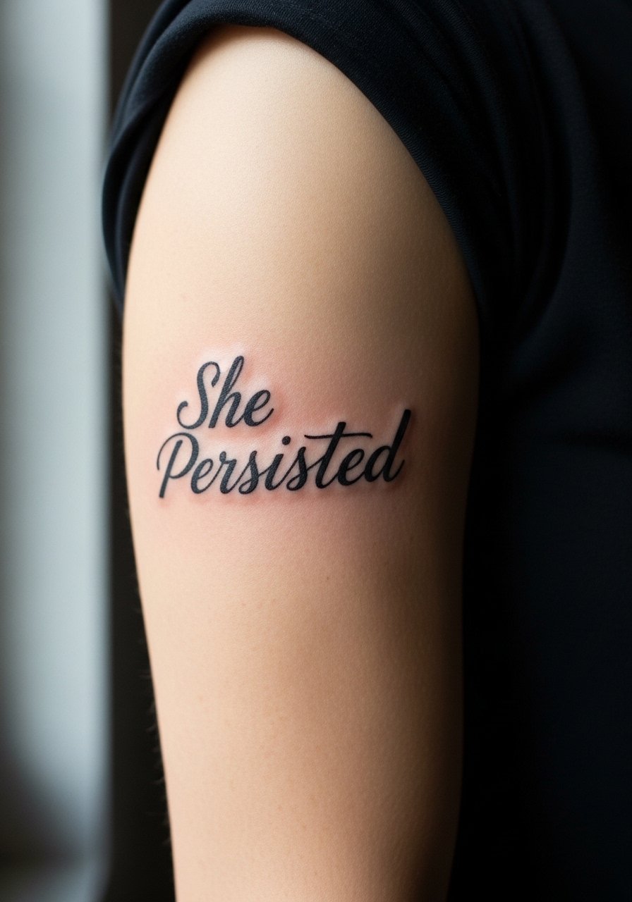
Upper arm text is forgiving for small to medium scripts and tends to age well because the skin is stable. The main mistake is crowding a long phrase into a small patch of skin. Ask the artist to scale letters to the available canvas and to avoid micro fonts. Sessions are comfortable and healing is straightforward. For everyday wear, short sleeves or a rolled cuff let the piece peek out. A short sleeve cotton tee keeps the arm breathable during healing.
11. "Light, Not Loud" on the Side Neck
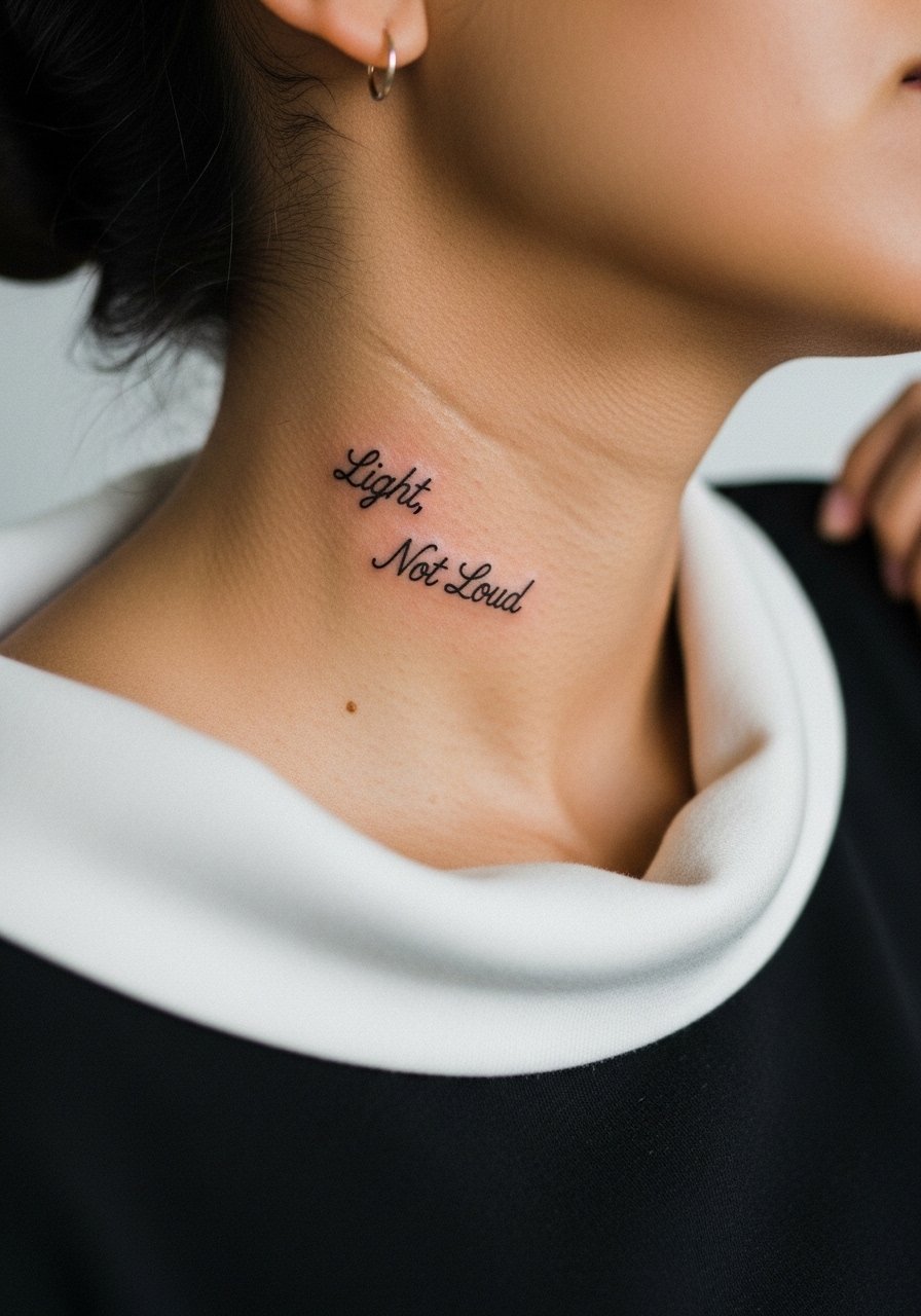
Neck text is a visible statement and sometimes a career consideration, so this placement brings a candid conversation up front. Artists split into two camps here: some will refuse neck text based on long-term regret rates, others will accept it with a clear plan. If you book it, choose bold letterforms spaced to allow for slight skin shifts and expect a touch-up conversation at year two. For outfits, wide-neck tops frame the area without hiding it. A loose wide-neck sweater softens visibility while you heal.
12. Coordinate Line Along the Spine
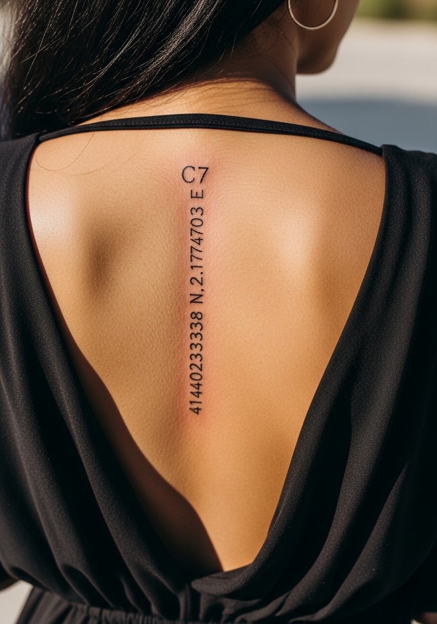
A vertical coordinate line down the spine is crisp and personal, and it benefits from tight, consistent spacing. The spine has curves that can stretch letters slightly, so ask your artist to stencil with the body standing and bending so the placement reads both upright and in motion. Sessions on the spine require breaks and tend to be more painful than arm work. Show-off styling pairs well with open-back dresses. Try an open-back midi dress for evenings when you want the coordinates visible.
13. Micro Script "Carry On" on the Side of a Finger
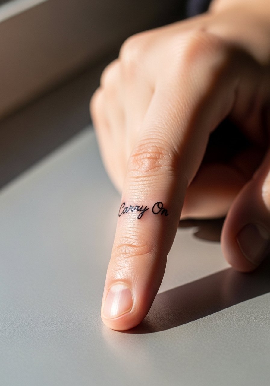
Finger scripts are the most likely to lose crispness fast due to constant use and thin skin. The usual trade-off is vibe versus longevity. Keep letters large enough to read and accept that the piece will need touch-ups on a regular schedule. The session is short but can be painful because of bone proximity. Rings and daily hand use add friction; choose ring styles that do not rub the tattoo while it heals. A slim minimalist ring complements micro text without excessive rubbing.
14. A Date in Roman Numerals on the Calf
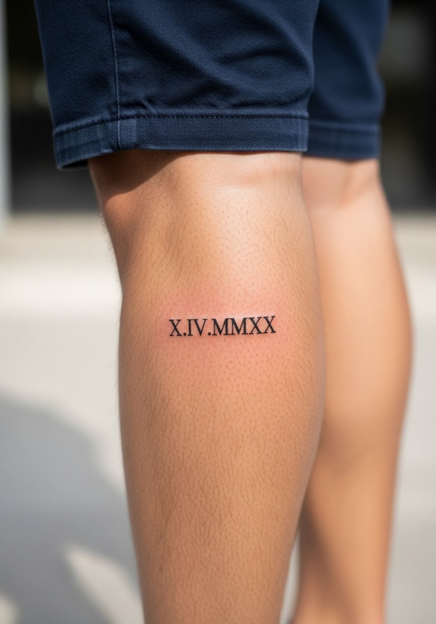
Calf scripts and dates have plenty of space so you can keep letterforms larger and more durable. Tell your artist you prefer consistent spacing and a slightly heavier primary stroke to prevent early blurring. The session is comfortable and healing is straightforward because the calf is a low-friction zone. This placement pairs with shorts and sneakers for casual days. A loose pair of high waisted denim shorts lets you show the numbering without rubbing it during recovery.
15. "Still Here" on the Inner Ankle
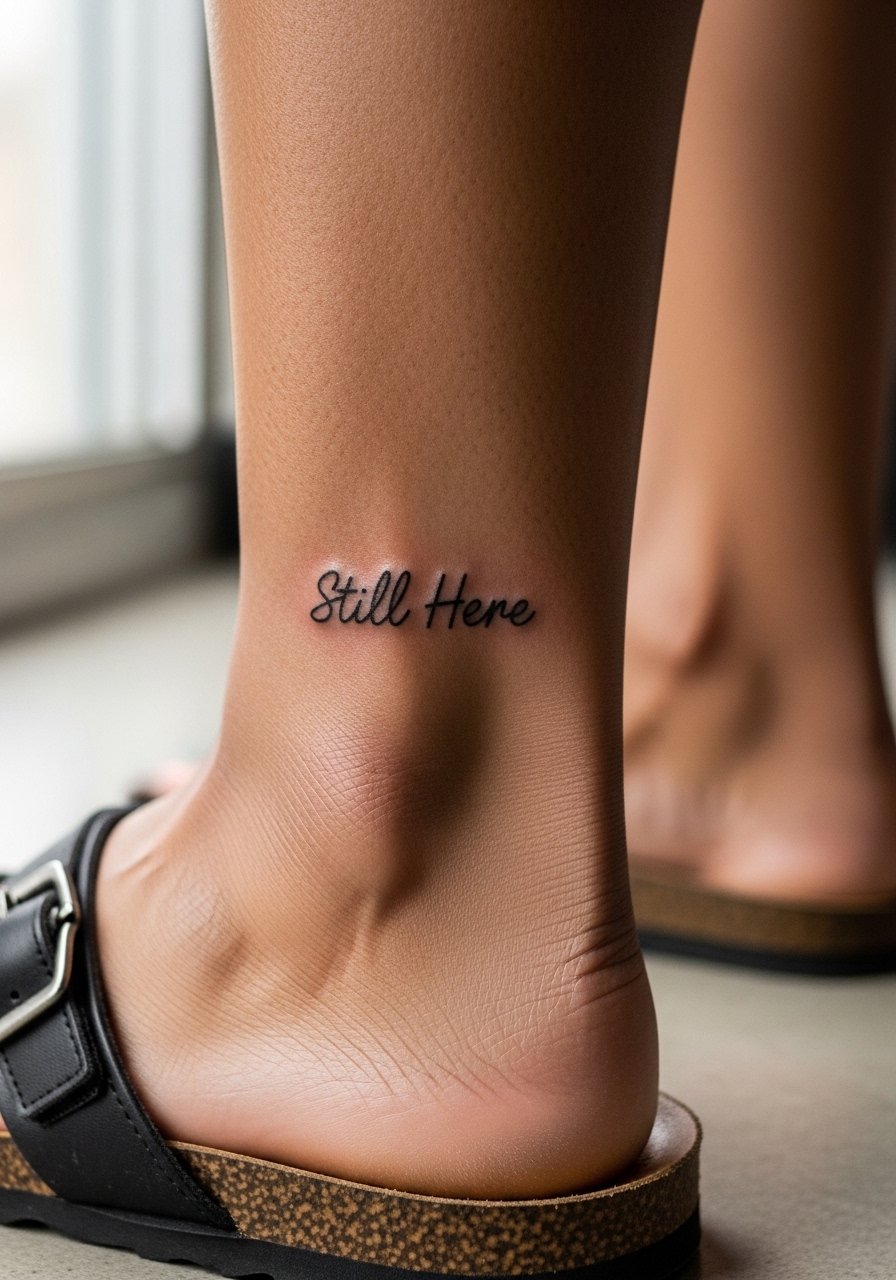
Inner ankle text sits in a thin skin area and may blur where tendons and shoes press. Plan for modestly bolder scripts than your phone reference, and expect slightly more frequent touch-ups than upper-arm work. The session is brief but can sting near bone. For footwear choices while healing, opt for open sandals rather than socks and closed shoes. A simple flat strappy sandal reduces rubbing and keeps the piece visible.
16. "Ad Astra" on the Shoulder Blade
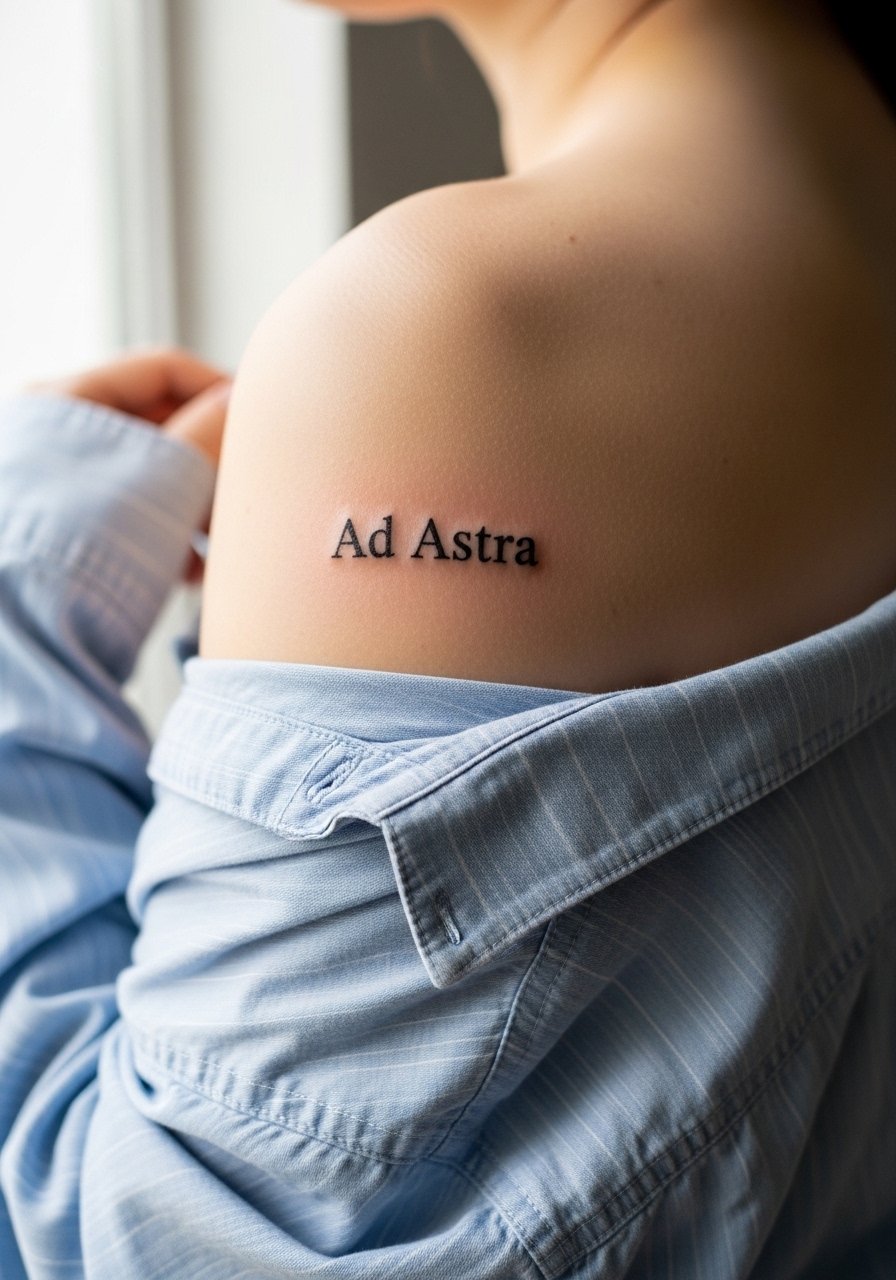
Shoulder blade text ages well because the area moves less and is easier to protect from sun. The common mistake is stacking too many words on the narrow blade. Ask for spacing that follows the shoulder contour so the phrase sits naturally when you wear tanks or backless tops. The session is medium in length and healing is usually uneventful. For showing the tattoo, a loose button-down you can pull aside looks editorial. Try a loose button-down shirt that reveals the line without full exposure.
17. "Keep Going" on the Top of the Foot
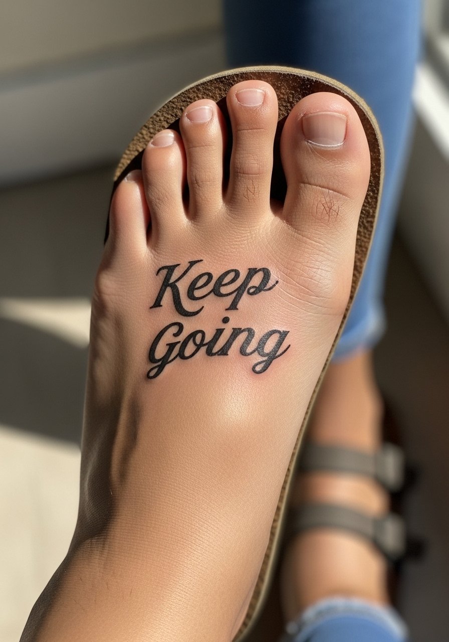
Foot text looks delicate but faces constant pressure from shoes and walking. Expect a higher fade rate and plan for touch-ups if you want the phrase to stay crisp. Many artists recommend slightly larger letters and minimal shading to avoid dense patches that heal patchily. The session is short but can be sharp near the toes. For footwear while healing, open sandals are best. A breathable slide sandal keeps the area aired and reduces rubbing.
Frequently Asked Questions
Q: Will a fine-line script like the wrist "Breathe" blur faster than bold lettering on the forearm?
A: In my experience fine-line script will usually require touch-ups sooner because the tiny needle channels close and pigment spreads with daily friction. Bold letters tend to hold form longer. If you love the fine look, ask for slightly heavier downstrokes and position that keeps the text away from high-friction zones.
Q: Are sternum and ribcage quotes worth the extra pain for longevity?
A: Many people say yes because those placements stay private and are easier to protect from sun. The trade-off is higher pain and a more careful healing period. If longevity is the priority, choose spacing and letter size that gives the tattoo room to age instead of cramming a long sentence into a narrow zone.
Q: How do I decide on font size for a finger or hand quote to avoid premature fading?
A: Go a size up from the font you like on screen and ask the artist to test a thicker primary stroke. Fingers and hands take more abrasion, so bigger letterforms reduce the chance of early blurring. Expect a regular touch-up rhythm and plan for it.
Q: Can I wear normal shoes after getting a top-of-foot script, or do I need special footwear?
A: Wear open sandals or slides for the first week to avoid pressure on the ink. Closed shoes can rub and lift scabs. A simple pair of slide sandals keeps the area cool and lowers irritation.
Q: Should I avoid certain phrases that might be culturally sensitive for a quote tattoo?
A: Yes. When a phrase traces to a specific tradition or language, ask about respectful use and consider slight variations that honor the origin. Mention cultural origin in your consultation so the artist can advise on respectful execution.