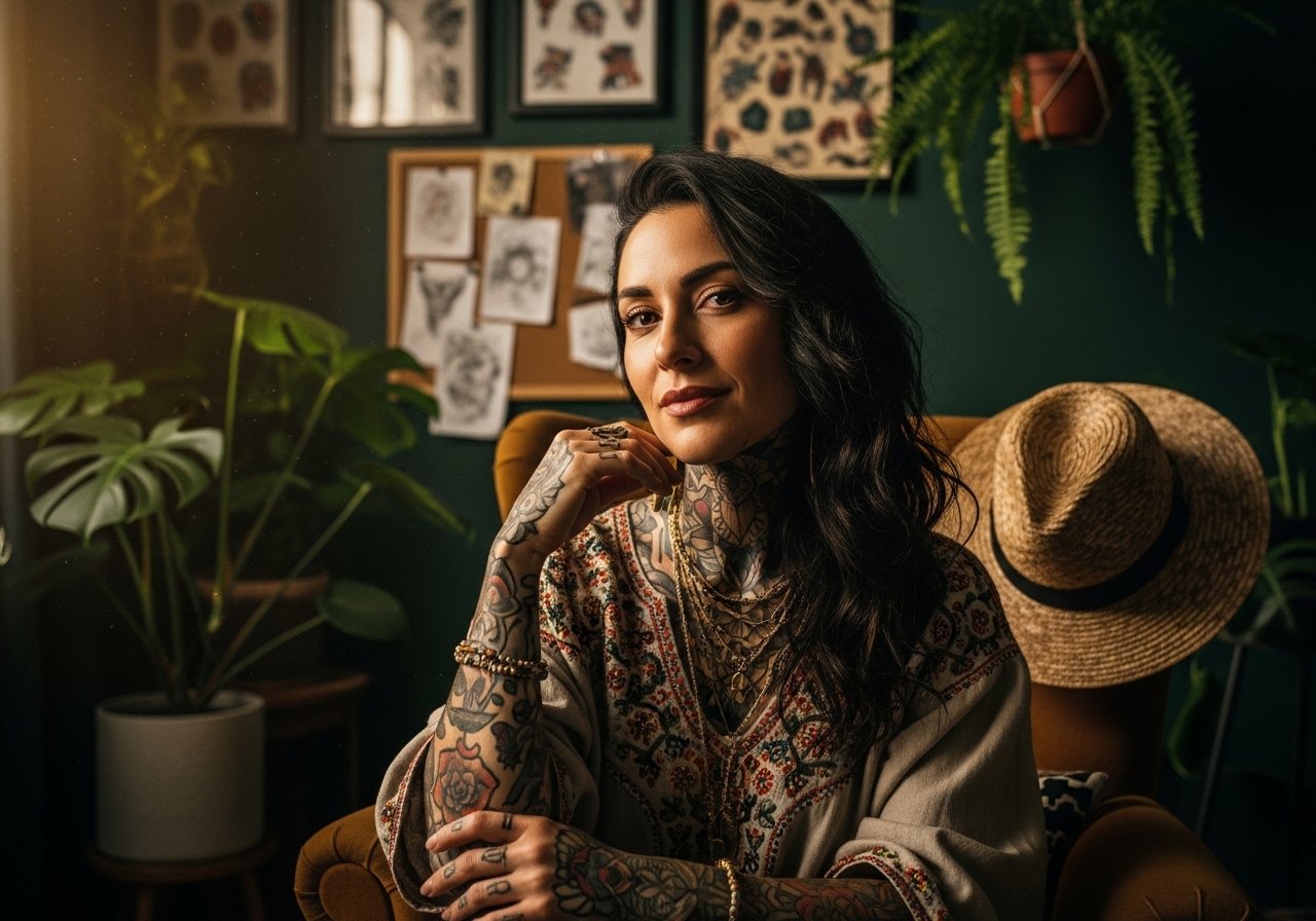
Fine line is trending, and a lot of the most saved forearm pieces look fragile in photos. The reality is that matching forearm tattoos for men need spacing, placement, and clothing plans to still read sharp after a few years. These 27 matching ideas focus on how the design will age, what to say in consults, and the wardrobe moves that actually show them off without compromising healing.
1. Minimalist Twin Arrows on Inner Forearm
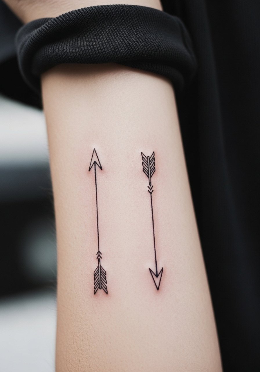
I've seen twin arrows read like a pact for years when the lines are kept simple and spaced. Ask your artist to keep negative space between the shafts so the lines do not blur together over time, and request slightly heavier line weight than you'd pick from a phone photo. Inner forearm feels less painful than the wrist but expect a persistent vibration during sessions. Common mistake is asking for ultra-fine lines with tight detail. That looks delicate fresh and then softens by year two. For showing this off, roll sleeves to a loose button-down shirt so the staggered arrows peek out without being crowded.
2. Matching Roman Numerals on Outer Forearm
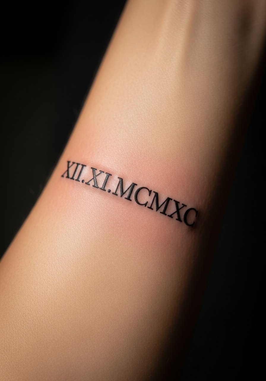
When you want a date that reads like a twin code, roman numerals age predictably if the digits are spaced and scaled. Tell the artist the exact font weight and show examples of serif numerals at life size. A common error is squishing characters to fit a short area. At six months the numerals look crisp. At two years expect subtle softening between strokes if the font was too thin. Outer forearm session time is moderate. This pairing works best with a utilitarian watch or a classic leather cuff bracelet that frames the numerals without covering them.
3. Mirrored Half-Compass on Each Forearm
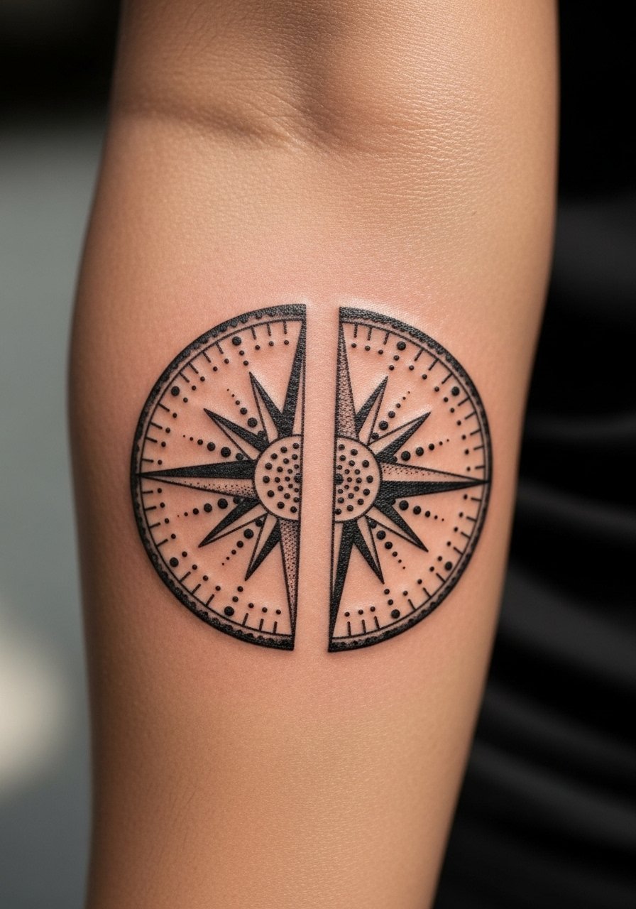
Personal observation suggests compass halves feel like two pieces of one map when the artist aligns negative space between the halves. Ask for a shared center axis to match rotation when you hold hands or stand side by side. Mistake to avoid is having overly intricate shading in the pivot area. That detail can merge into a muddy spot by year three. For texture, request stipple shading around the needle rather than heavy gradients. Expect a moderate session with steady handwork. This design pairs well with rolled sleeves and a minimalist metal watch to keep the attention on the compass face.
4. Matching Mountain Range Silhouettes, Opposite Directions
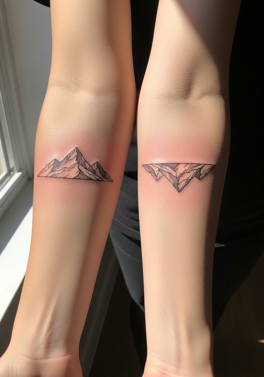
Aging/healing lead applies here because solid silhouettes tend to hold up better than tiny peak lines. When you want a shared memory of a place, bring photos of the exact skyline and dial in overall scale. Artists often make the peaks too small, which loses character after a year. Recommend slightly bolder outlines and leave interior negative space for texture. The inner edge of the forearm can feel more sensitive when the needle crosses tendons, so expect a sharper pinch for a few minutes. For daytime wear, these read clean with rolled-up long-sleeve shirts in muted tones that let the silhouette stand out.
5. Matching Minimalist Wave and Line on Wrist-to-Forearm
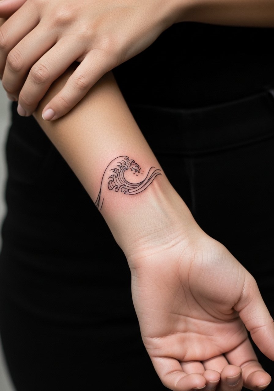
Mistake lead: people often want the wave drawn too close to the wrist bone where constant movement and washing speed up fading. Place the crest slightly onto the lower forearm for longevity and ask for a steady line weight that reads in motion. Expect a short but precise session. The wrist area deals with friction from watches, so if you wear one during the day pick a thin sport strap that does not rub directly over the ink while it heals. Plan touch-ups around year three for this placement.
6. Interlocking Geometric Halves That Form a Whole
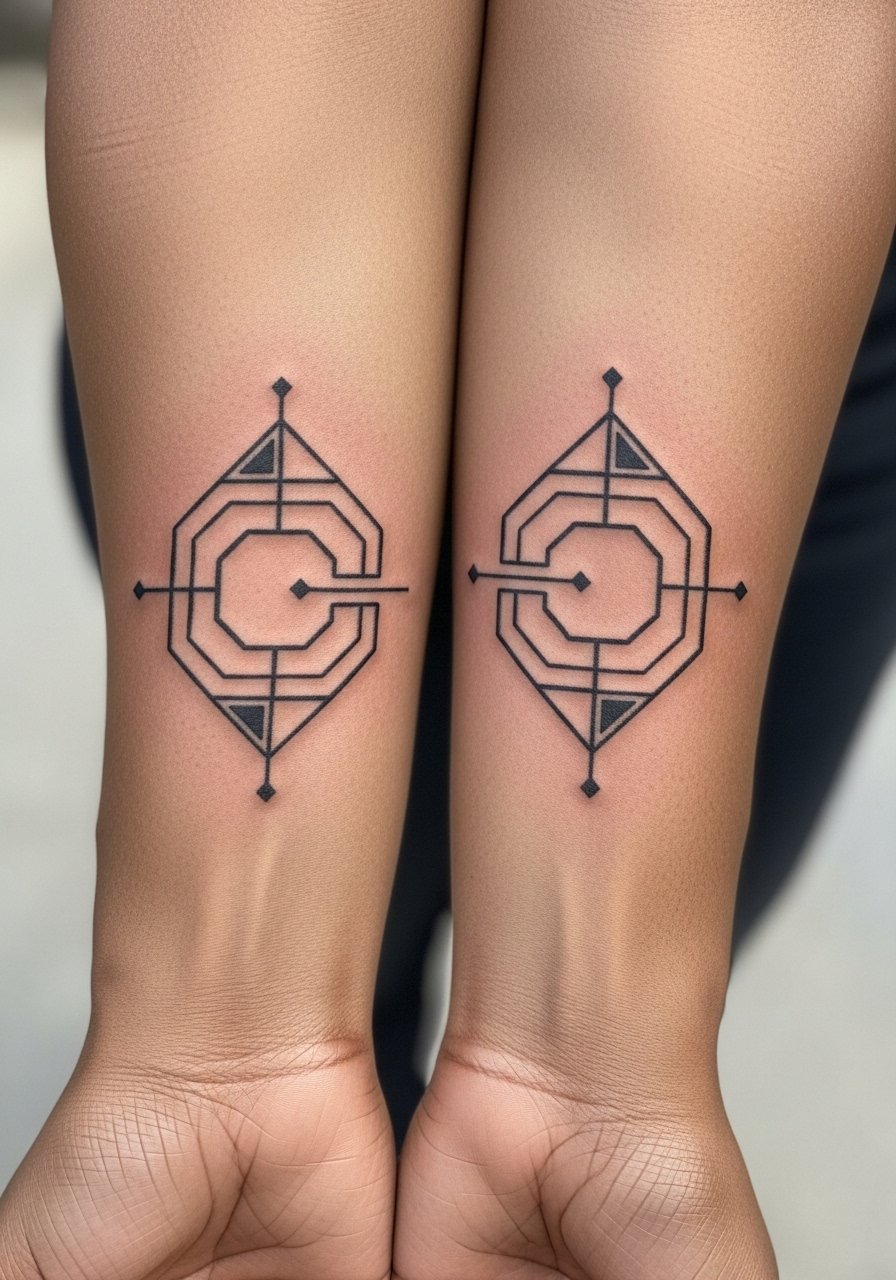
Consultation lead: when you sit with your artist for this one, bring a mock-up that shows both arms aligned side by side at rest. The spacing between shapes is what keeps the pattern from becoming a single mass as it ages. A common error is using too many tiny intersecting lines. Those merge first. For longevity, ask for slightly thicker primary lines and stipple fills for texture. Inner forearm sessions are comfortable but require patience for precise linework. For evenings out wear a short-sleeve henley with sleeves that hit just above the tattoo so it is visible without being exposed.
Studio Day Picks
The outer and inner forearm pieces above have different friction and washing realities, so a small kit streamlines the session and the first-week healing.
-
Stencil transfer paper kit. Lets you preview placement and symmetry across both forearms before the needle touches skin.
-
Topical numbing cream. Applied per the product directions it can ease sensitivity near the wrist and inner arm during longer matching sessions.
-
Thin protective film roll. Useful for early protection of wrist-level pieces that face constant handwashing and friction.
-
Fragrance-free body wash. Cleanses the forearm area without stripping delicate linework during the first week.
-
Aquaphor healing ointment. Thin layers support moisture retention on fine line forearm work without clogging the healing surface.
7. Matching Morse Code Bands Around Forearm
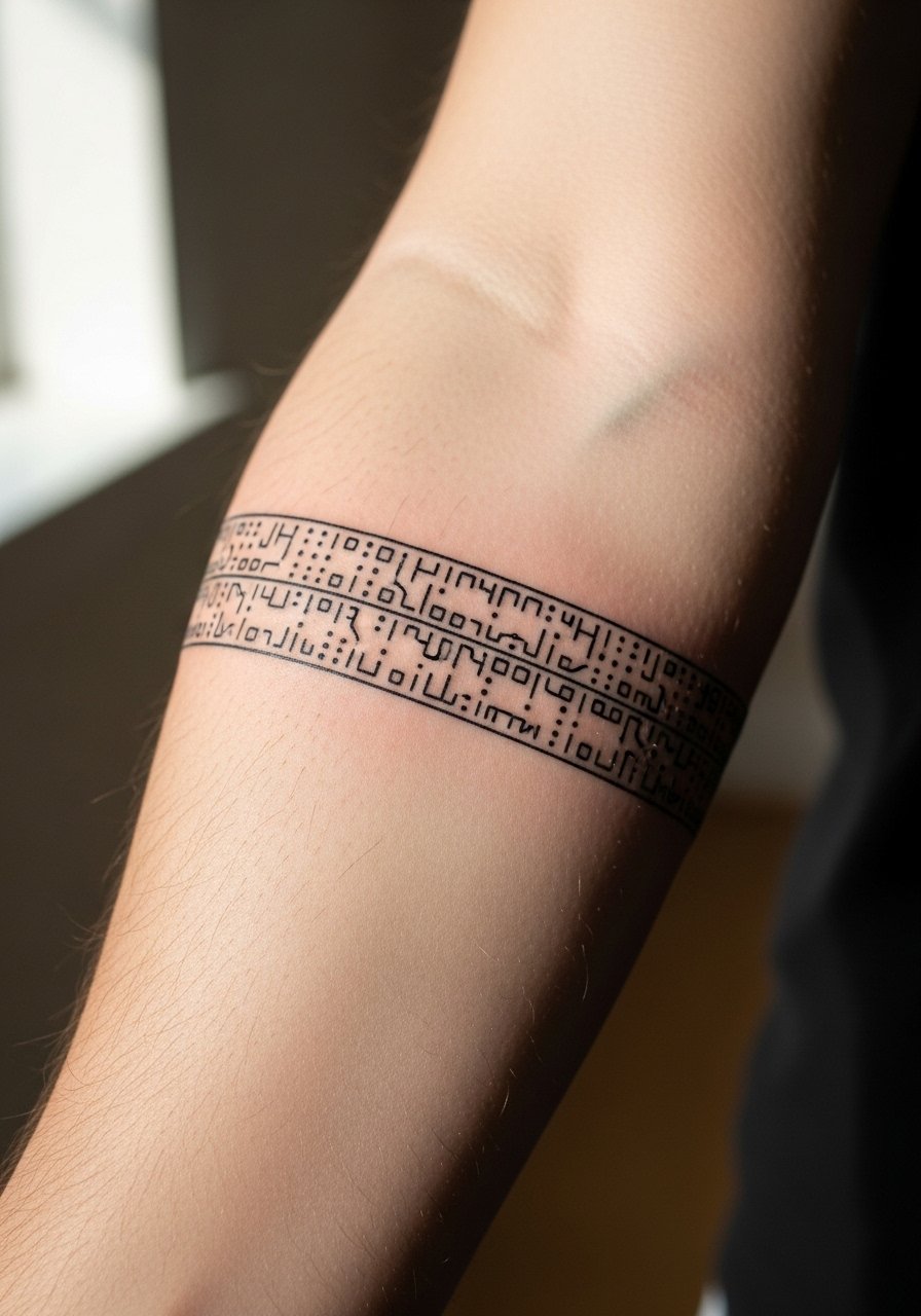
Styling lead: a wrist-to-forearm band reads like a secret language when left simple. Tell your artist the exact sequence you want and have the dots and dashes spaced to allow breathing room between elements. Blending too many small marks into a tight band is a typical mistake. At six months the pattern looks crisp. At two to three years expect the dots to soften if they were too tiny. Pair with a slim woven bracelet or roll sleeves to show the band uninterrupted. Session time is short but precise placement matters.
8. Matching Micro-Realism Eyes Facing Each Other
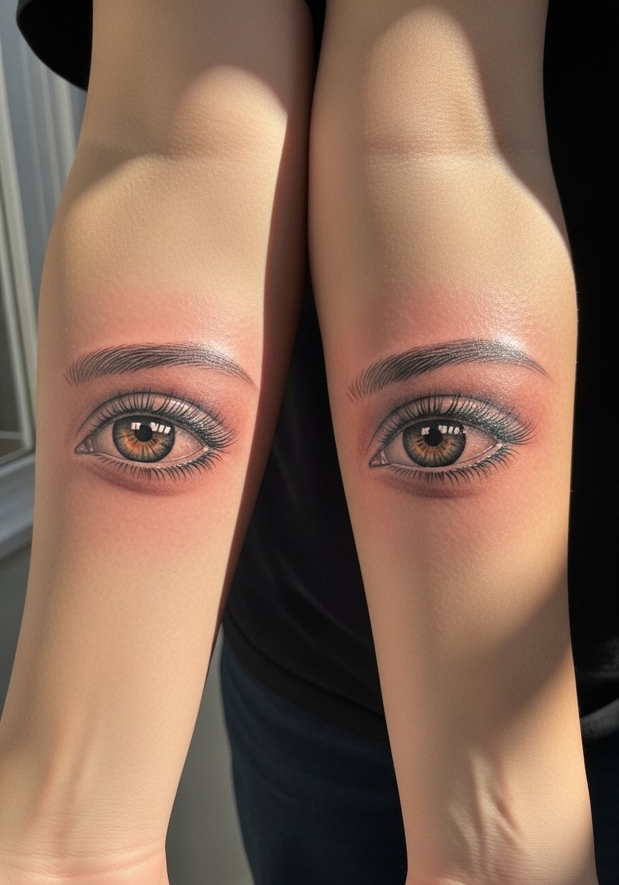
Visual impact lead: micro-realism eyes can look intense fresh and then soften into a gentler expression over time. Ask for slightly larger irises than your phone image to allow for pigment spreading and for the artist to use dot work instead of heavy shading. A common error is over-saturating tiny pupils which later read as dark smudges. Expect a longer session because of detail. For placement discussion, note how the eyes align when arms rest so the gaze reads as intended.
9. Matching Script Words, Opposite Wrists
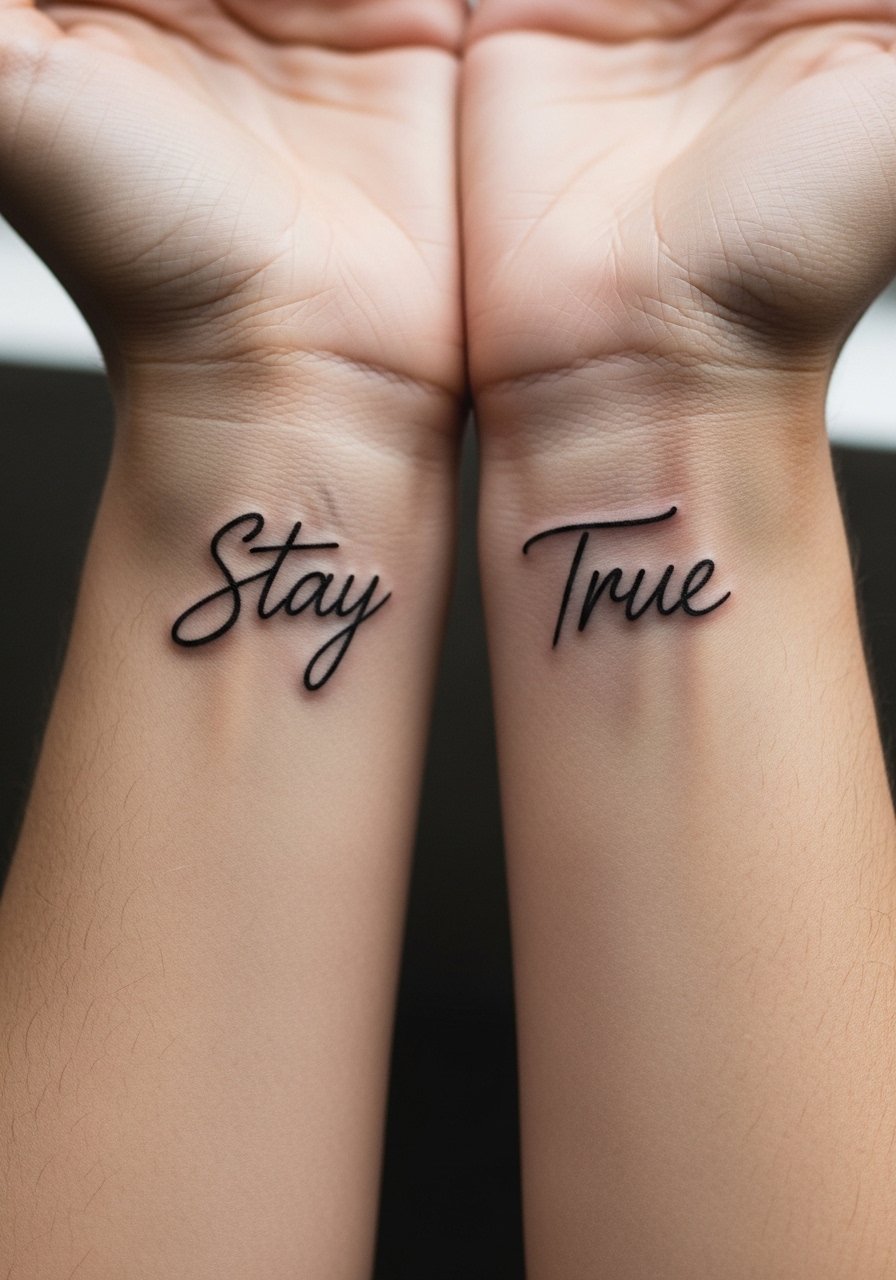
Mistake lead: text on the wrist often suffers from tight letter spacing. During consult ask for slightly taller letterforms and to space characters for movement. Script ages into a softer silhouette, so choose a style with clear counters rather than excessive flourishes. For showing this, a thin chain pendant necklace sits above the script without competing for attention. Expect a short session and anticipate touch-up of fine terminals at year two to three.
10. Matching Minimalist Tree and Root Halves
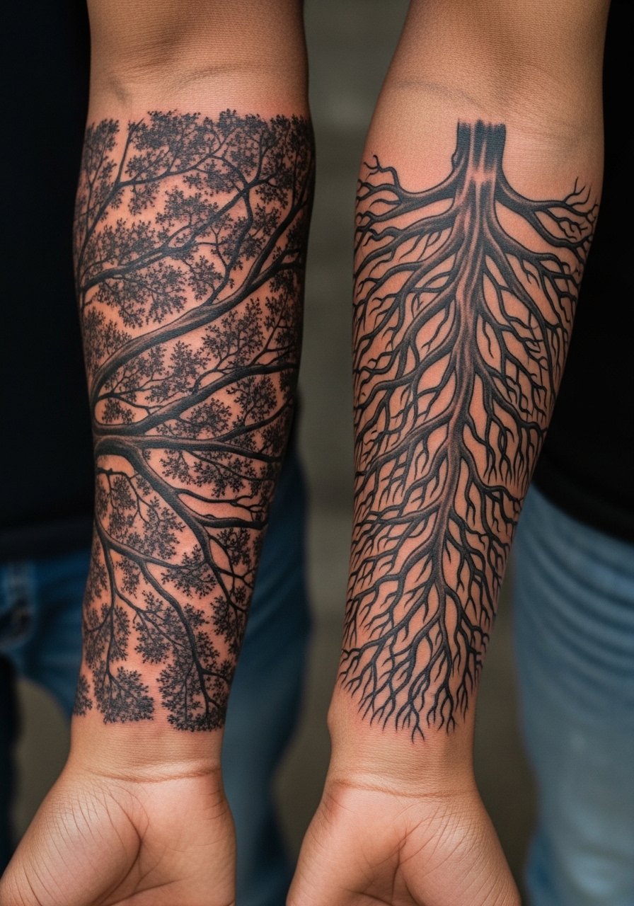
Aging/healing lead: silhouettes with negative space like tree canopies and roots tend to keep their graphic identity longer than dense shaded versions. Ask your artist to leave deliberate negative gaps in the root network to avoid early blotching. A common mistake is wanting dense micro-shading that collapses into a dark patch. Forearm placement makes this design visible in shirtsleeves. The session will include delicate linework and some dot shading for texture. Expect touch-up within three to four years depending on sun exposure.
11. Mirrored Geometric Band with Negative Space
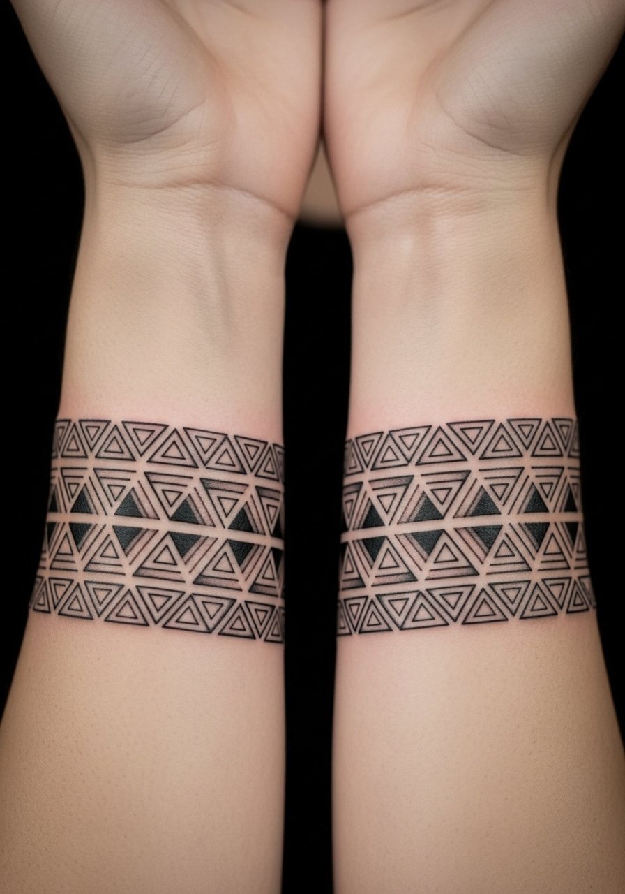
Styling lead: geometric bands work as arm jewelry when they are scaled to sit cleanly near the wrist. Tell your artist you want consistent negative space so the triangles do not join as the skin settles. A common error is creating too narrow a repeat which melts over time. For showing this design wear a short-sleeve button shirt with the sleeve rolled or a slim bracelet to visually tie into the repeat. Session time is moderate and depends on symmetry checks.
12. Matching Minimalist Anchor and Wheel
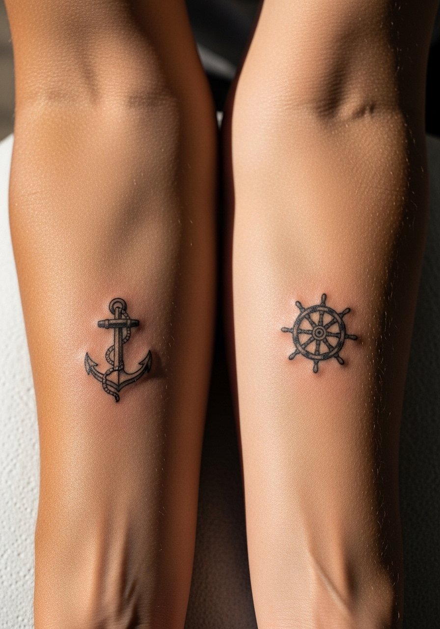
Personal observation: nautical motifs read classic when proportionate. Ask for the wheel and anchor to be scaled so neither dominates when standing side by side. Rookie mistake is heavy interior shading on the wheel spokes which can smear into a blob. Outer forearm sessions are straightforward but plan breaks if your artist needs symmetry checks across both arms. For career-conscious wear, keep the pieces low on the forearm so short sleeves conceal as needed.
13. Matching Puzzle Piece Halves That Lock
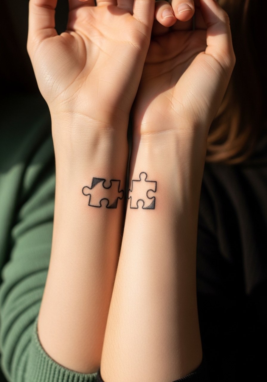
Consultation lead: when the pieces need to lock visually, bring photos of your pair holding hands in different positions so the artist can place the interlock axis correctly. Common error is misaligned sizing which makes the pieces look off when standing. Inner forearm placement reduces friction but watch for stretch during heavy lifting in the weeks after. For display, this reads well with a rolled-up sleeve linen shirt that lets both pieces show without interruption.
14. Matching Tiny Constellations Starting at Wrist
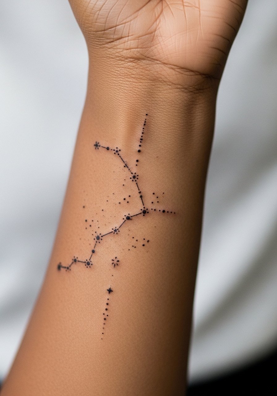
Mistake lead: constellations done too tiny lose the connecting lines as the dots soften. Request slightly larger star dots and consistent spacing so the pattern still reads after a year. Wrist proximity means more fading from hand use and washing. Plan a touch-up at year two rather than assuming permanence. Session time is short but requires precision. For discreet show-off, a thin bracelet or rolling a sleeve will frame the constellation without covering the whole arrangement.
15. Matching Minimalist Arrow Band That Wraps
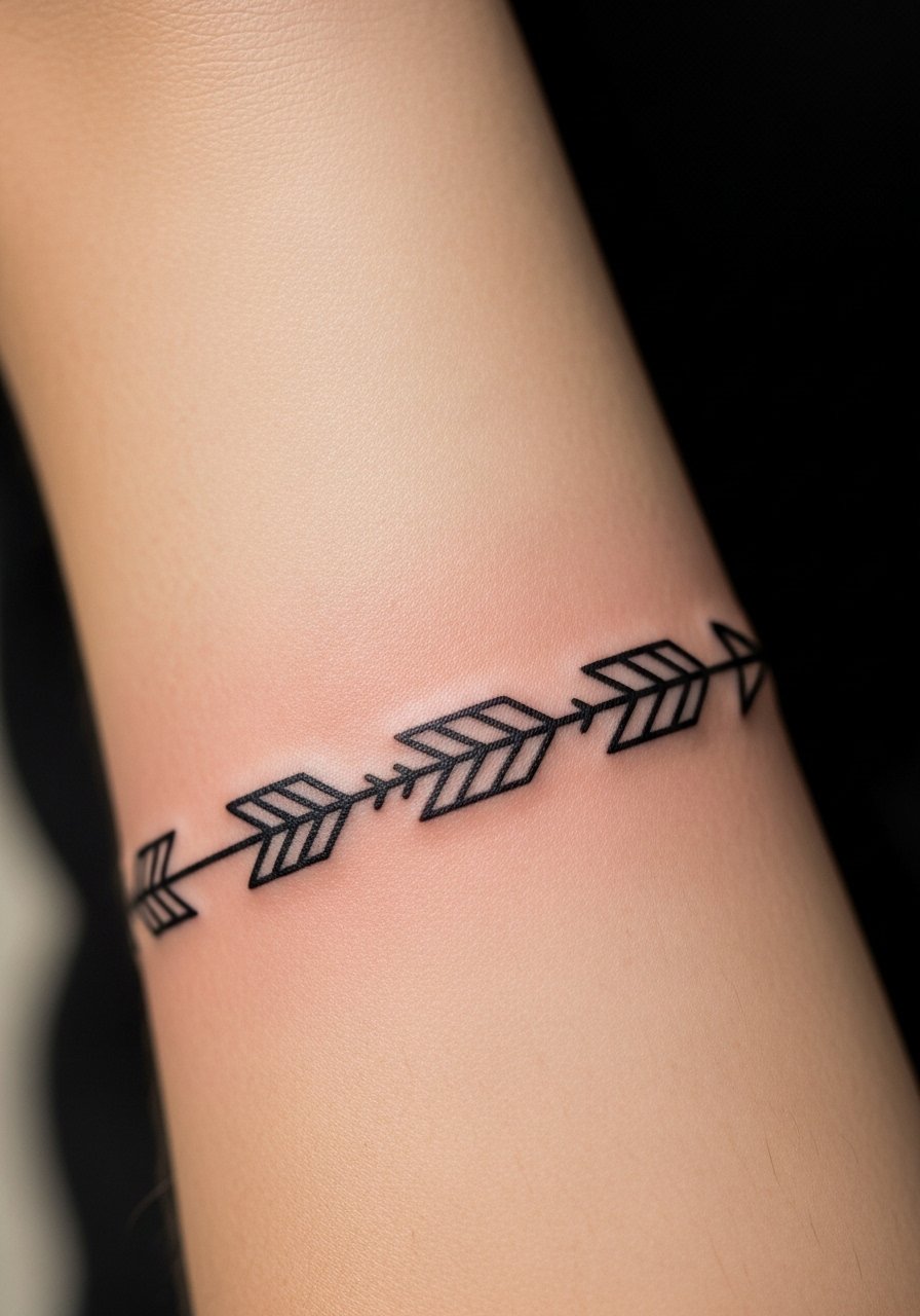
Visual impact lead: a wrapping arrow band acts like a directional cuff when scaled correctly. Tell the artist where you want the arrowhead to rest when arms are at your side so it does not end awkwardly under clothing. Too many small chevrons is a common mistake because they merge into a dark strip. For wearing this design, try a minimal leather bracelet on the opposite wrist so the arrow band remains the focal point. Expect a focused session oriented around consistent spacing.
16. Matching Bottle and Cork Minimal Icons
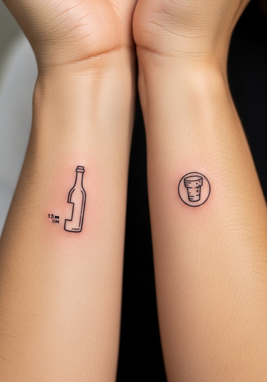
Mistake lead: small icon tattoos need clarity of silhouette. Ask for slightly thicker outlines and reduced internal detail so the bottle reads at a glance. These feel more playful than statement. Forearm placement keeps the icons visible but susceptible to friction from backpacks or straps. Sessions are brief and precise. Keep in mind that touch-ups may be needed earlier than with bolder work if you pick very fine interior detail.
17. Matching Soundwave Strips from a Shared Clip
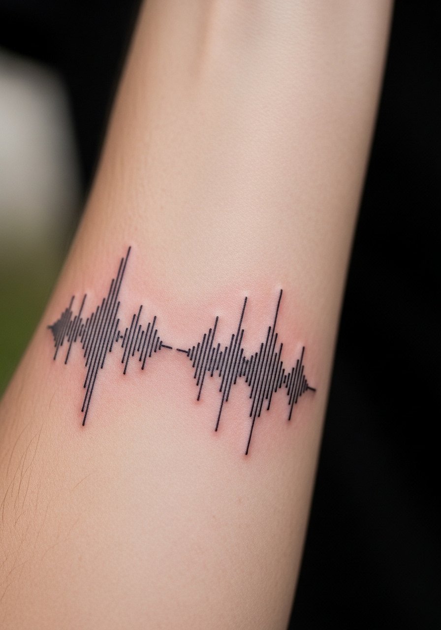
Styling lead: a soundwave from a shared song or phrase becomes personal when sized for visibility. Bring the exact audio file so the artist can generate the waveform and scale it for your forearm length. A common mistake is compressing the waveform to fit a small wrist area. Inner forearm sessions are steady but precise. For showing it off, a short-sleeve tee or rolled sleeves keep the waveform visible without overexposing the area while it heals.
18. Matching Bar Code or QR-Like Graphic
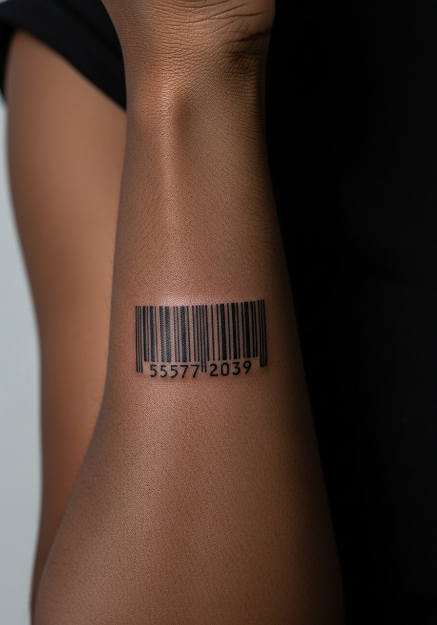
Mistake lead: bars drawn too thin will blend into a wash over time. Ask the artist to widen primary bars and leave breathing room between groups. This design reads like an ID and works best when kept simple. Expect a short session. Be mindful that some workplaces may read barcode motifs differently, so consider placement that can be covered by a short sleeve if needed.
19. Mirrored Wolf Silhouettes Facing Outward
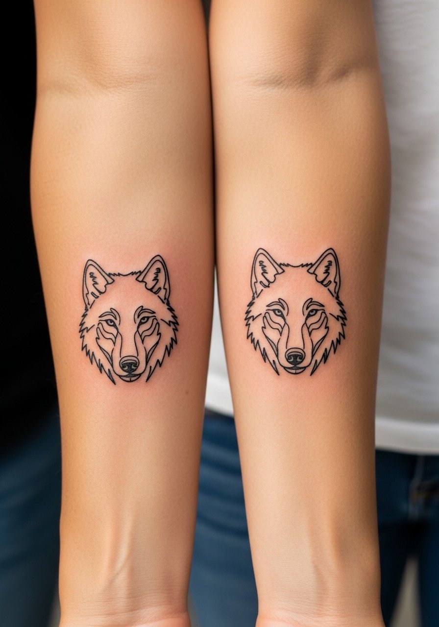
Styling lead: bold silhouettes age well because the negative space defines the animal. Tell the artist you want the jawline and ear tips slightly bolder than you think. Too much internal detail is the usual mistake and it colors into an unclear mess. For casual show-off, a rolled-up denim jacket sleeve or short-sleeve shirt frames the wolves well. Session time is moderate with focus on crisp contour.
20. Matching Minimalist Anchor Band Near Wrist
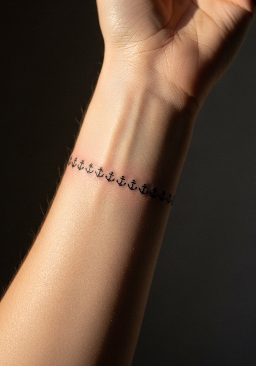
Consultation lead: anchor bands are maritime jewelry and work when the icons are sized to avoid rubbing under watches. Ask the artist to consider how you wear timepieces so the band does not sit under metal. The common error is packing too many anchors close together which blurs over time. For session wear, remove watches and bracelets so the artist has clean access. Expect brief sessions and possible touch-up in two to three years.
21. Matching Minimal Script Coordinates on Inner Forearm
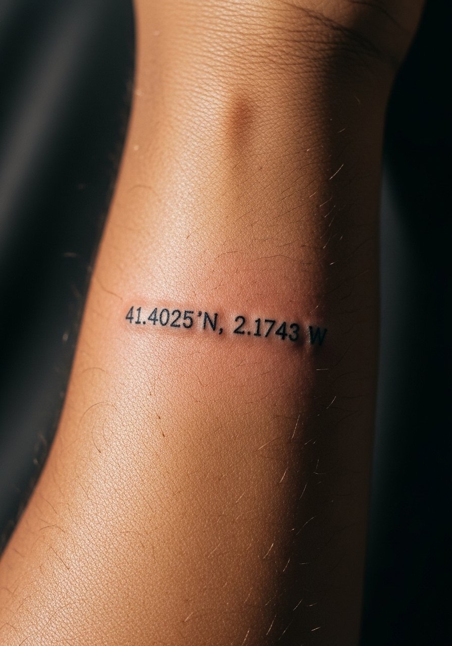
Styling lead: coordinates require exact text so specify the numbers and formatting. Monospace or thin serif works best because of the consistent stroke width. The mistake is compressing too many characters into a short length. Inner forearm placement keeps the script readable and lower risk of friction. For nights out, a long-sleeve button shirt with sleeves rolled frames the coordinates nicely while keeping them visible when desired.
22. Matching Minimalist Feather Turning Into Birds
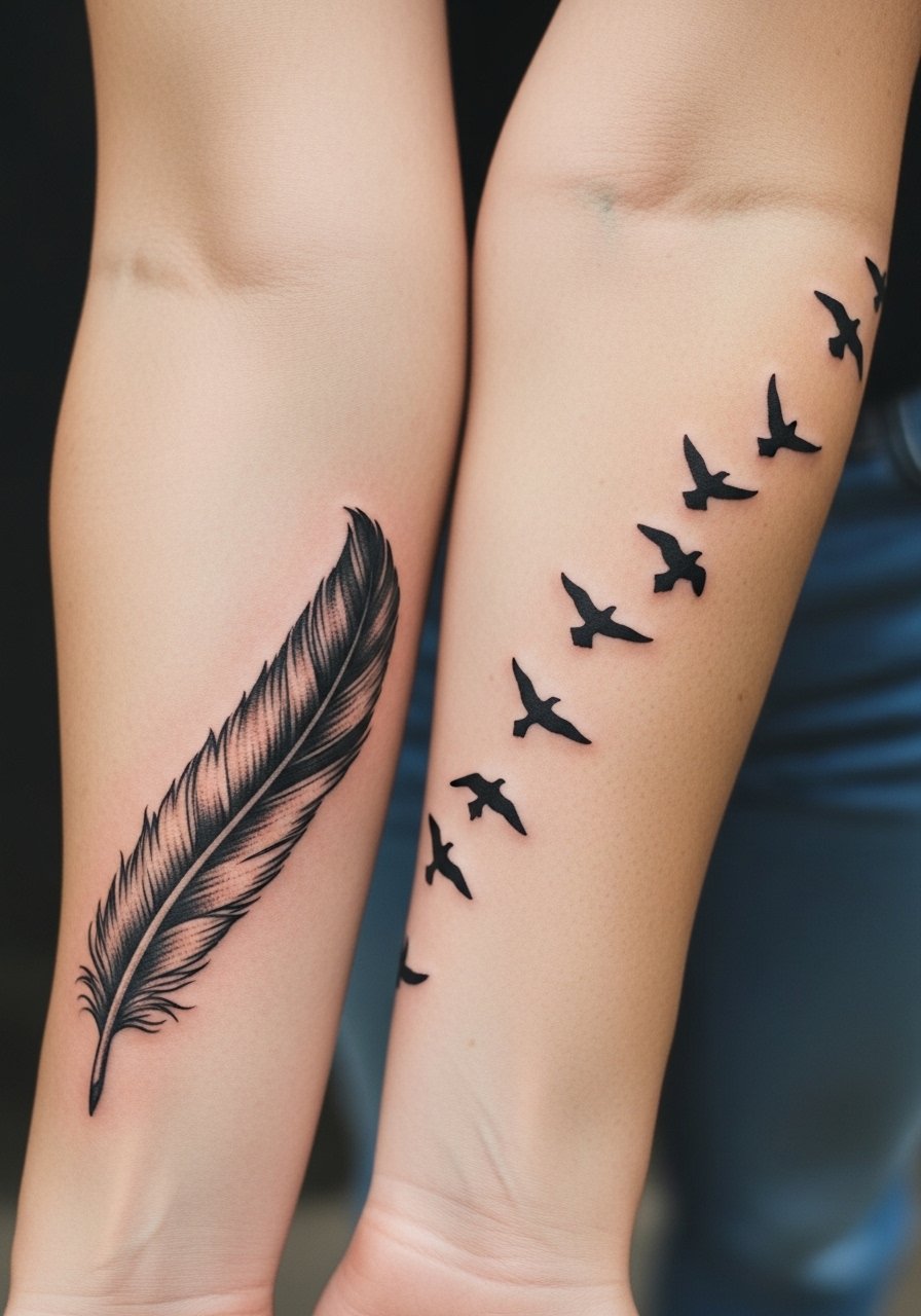
Visual impact lead: a feather that fragments into birds is narrative when scaled across both arms. Ask for the break point to align when your arms are at rest. Too-small bird silhouettes can disappear into a blur. Expect a longer session to map the transition correctly. For evening wear, keep sleeves that can be rolled so the flight reads uninterrupted. Plan for a touch-up around three years to keep the birds crisp.
23. Matching Minimalist Gear Halves for a Biomechanical Look
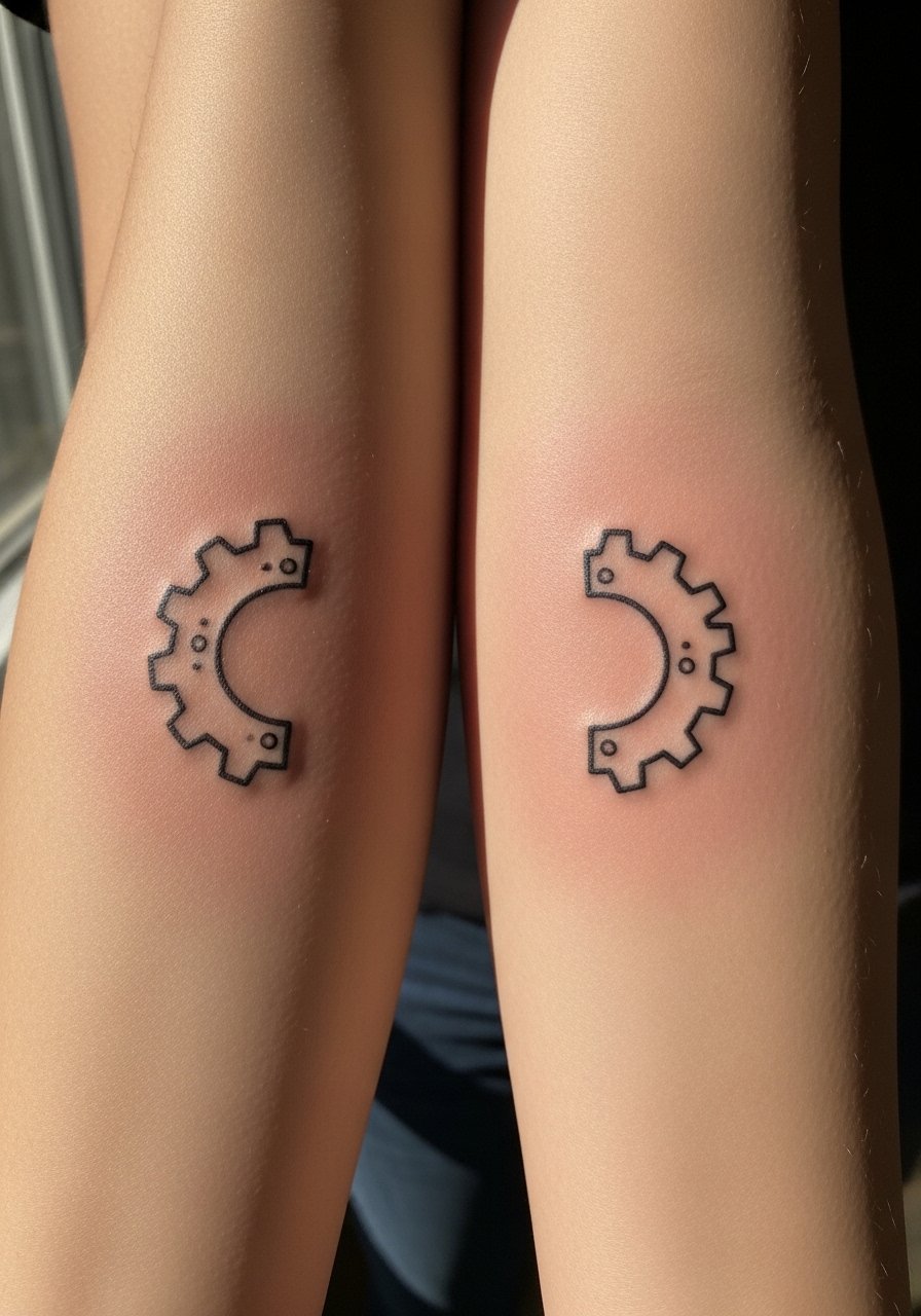
Styling lead: streamlined gear halves work when the teeth are spaced to avoid merging. Tell the artist you want clear negative gaps between cogs. A common error is packing teeth too tightly to mimic machinery. Outer forearm sessions are steady but require symmetry checks. For an industrial pairing, wear a slim metal bracelet on the opposite wrist so the mechanical theme stays cohesive without hiding the ink.
24. Matching Tiny Anchor and Star Pair Near Wrist
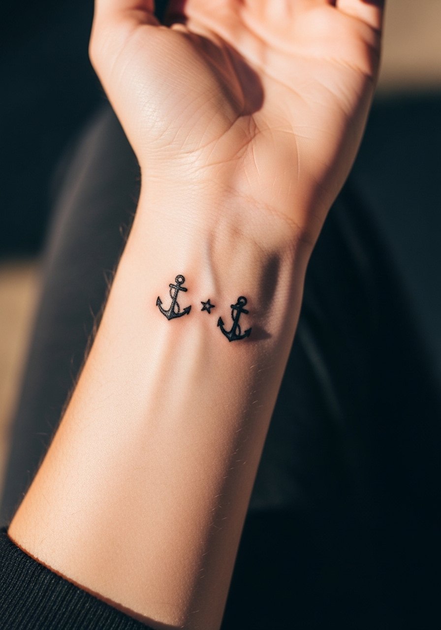
Mistake lead: pairing tiny symbols near the wrist is tempting, but crowding creates early fading. Ask for slightly larger star points and an anchor silhouette that reads at arm distance. These take little time in the chair but may need touch-ups if you wear wristbands constantly. For showing them without overexposure, a thin watch strap worn slightly higher keeps the motifs visible and protected.
25. Matching Minimalist Shield and Sword Icons
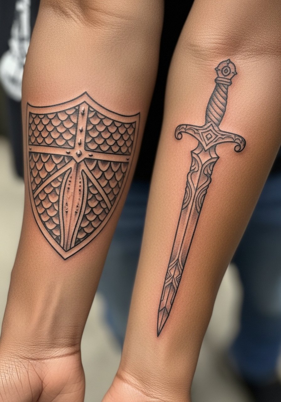
Styling lead: icons with vertical alignment rely on consistent scale. Tell the artist the sword length relative to your forearm so it does not cross joints. A common mistake is making the sword too thin which blurs into a line. For display pair with a short-sleeve cotton tee that keeps the whole motif visible. Sessions are straightforward with a focus on even saturation.
26. Matching Minimalist Sound Notes or Single Bars
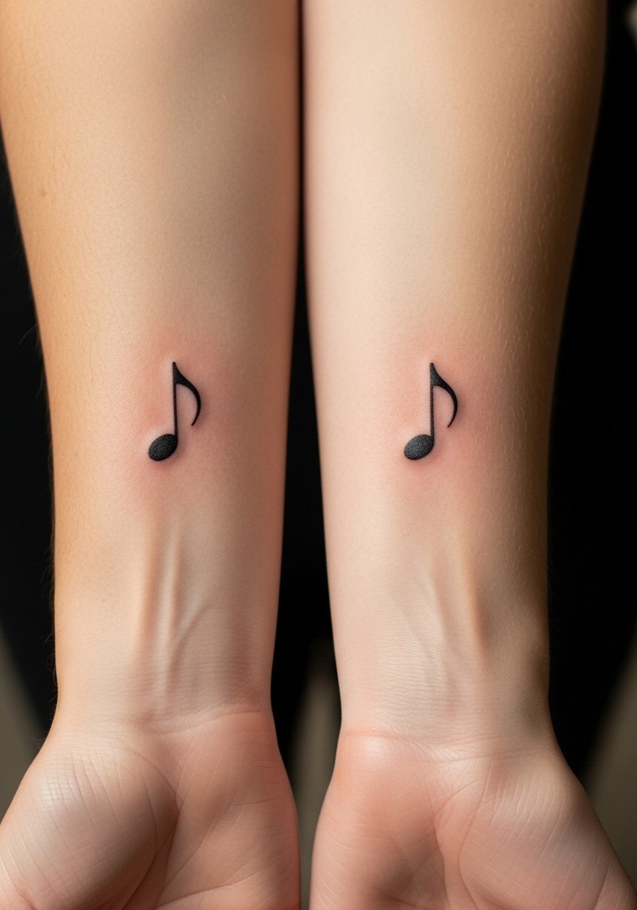
Mistake lead: tiny music notes need clear counters so the head of the note does not fill in. Ask the artist to slightly enlarge the note head and keep the stem consistent. These sessions are brief. The common longevity issue is friction from backpacks or arm rests so plan garment choices around healing. For subtle show-off, wear rolled sleeves or a slim bracelet on the opposite wrist.
27. Matching Thin Line Portrait Silhouettes Facing Each Other
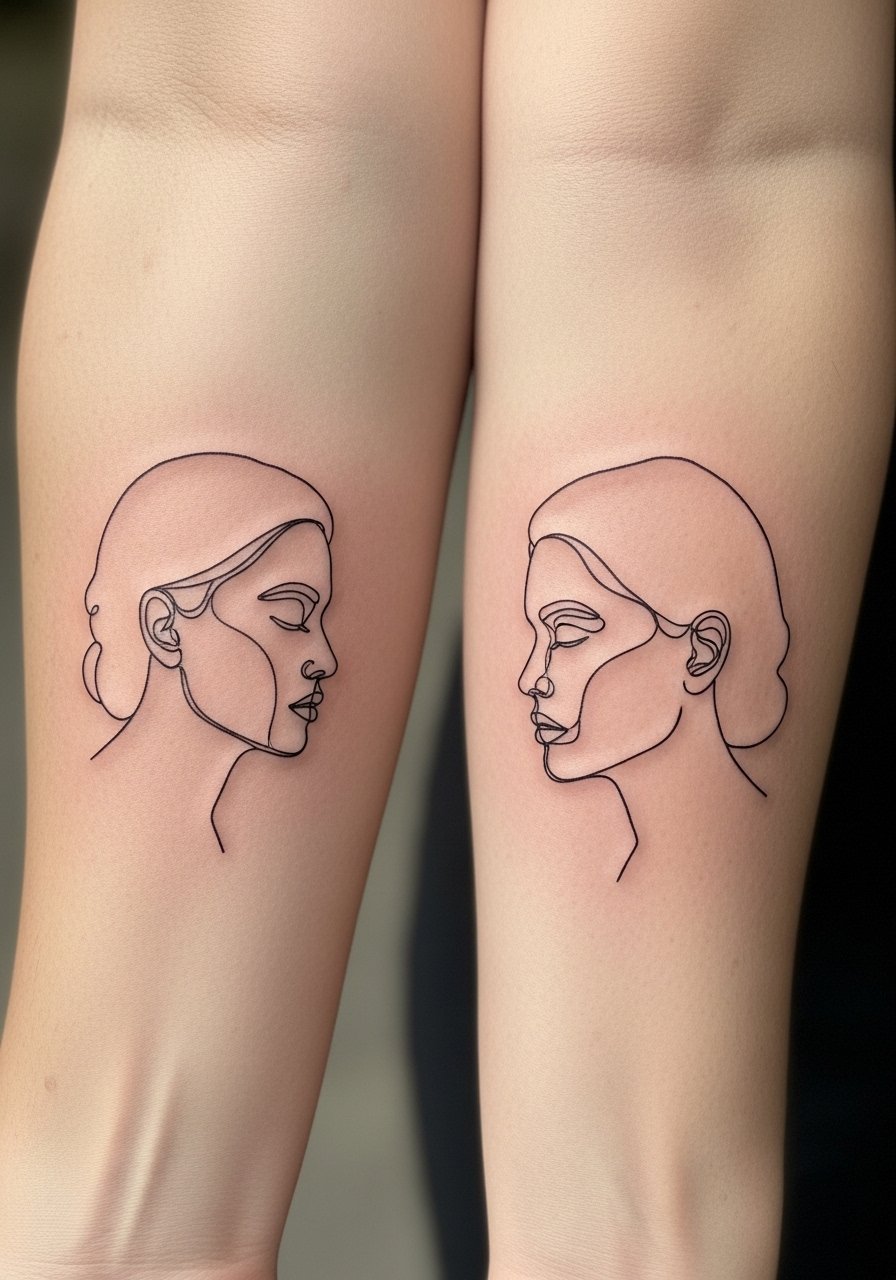
Consultation lead: continuous-line portraits are deceptively simple and rely on proportion. Bring clear reference photos. The most frequent mistake is shrinking facial features too small which loses recognition as lines soften. Inner forearm placement reduces friction and makes the silhouette readable for longer. Sessions will be careful and patient. For display, a short-sleeve henley that sits above the forearm keeps the portraits visible without exposing more skin during early healing.
Frequently Asked Questions
Q: Will fine line matching forearm tattoos blur into each other if I get a full sleeve later?
A: It depends on scale and spacing. Fine line pieces that are left with clear negative space and slightly bolder primary strokes are easier to incorporate into a sleeve later. Tell your sleeve artist where the existing lines sit so they can plan fills that respect the original pieces.
Q: How should I dress to both protect and show off matching forearm work during the first week?
A: For sessions wear a loose short-sleeve or a button-down you can pull aside. After the session choose breathable fabrics and avoid tight long sleeves that rub. A loose button-down shirt works well for showing forearm ink while keeping the area comfortable.
Q: Do mirrored geometric bands need special aftercare compared with small icons?
A: The aftercare steps are the same, but geometric bands show irregular fading more quickly because the pattern is repetitive. Keep them out of direct sun and be prepared for a touch-up around year two to three if exposure is high.
Q: Are wrist-adjacent tattoos more likely to need touch-ups than mid-forearm pieces?
A: Yes, wrist-adjacent work sees more friction and washing which speeds fading. If you want longevity, place key elements slightly higher onto the lower forearm where skin changes less with daily motion.
Q: If my partner and I want matching forearm scripts, what exact thing should we bring to the consult?
A: Bring the precise text, the preferred font at life size, and photos of both forearms held side by side. Ask the artist to mock the placement on both arms before inking so orientation and spacing are identical.
Q: Should we plan matching pieces at the same session or separate appointments?
A: Doing both in one session helps match saturation and line weight perfectly, but it can be long. If you split appointments, bring the healed piece as a reference or photos under similar lighting so the second artist can match the tone and linework.