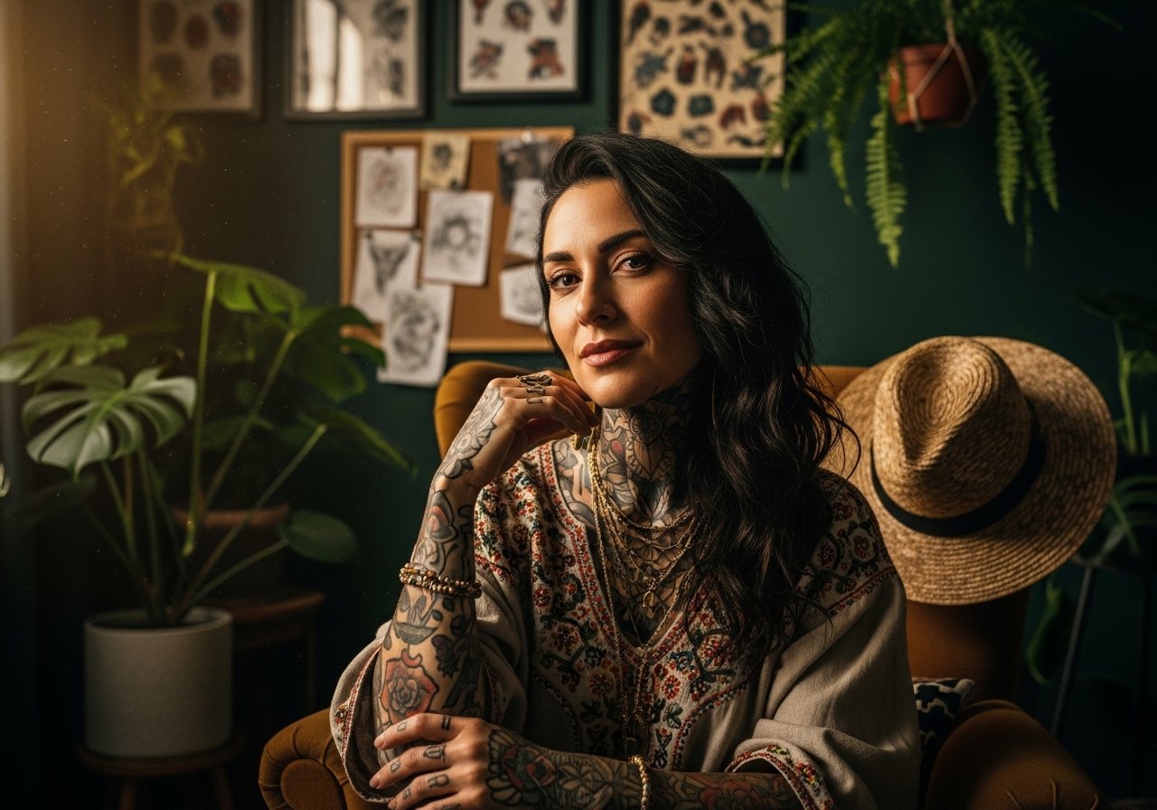
Fine line trends look gorgeous on a phone screen, but knees are a different animal. The skin stretches, the cap moves, and what looks delicate in a saved post can blur or break up faster than you expect. Start from how the joint moves, pick line weight that will survive bending, and bring wardrobe choices that let the piece breathe from day one. The list that follows shows 17 designs that take the knee into account so your ink holds up and still looks intentional.
1. Shark Jaw Centered on the Kneecap
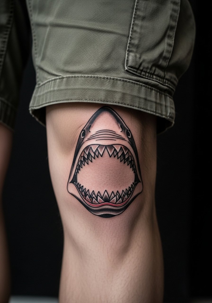
This neo-traditional shark jaw reads well on the bulbous kneecap because the design uses a circular composition that moves with the joint. I recommend telling your artist to keep the main outlines thick enough to survive repeated flexion and to place the teeth so they curve with the cap. Common mistakes include tiny teeth and overly fine detail that merge after a year. Expect a medium pain level when the needle hits the bone, and one to two shorter sessions for clean saturation. For show-off outfits, pair the finished piece with khaki cargo shorts and low top sneakers so the knee reads clearly in photos.
2. Mandala Wrap That Follows the Joint
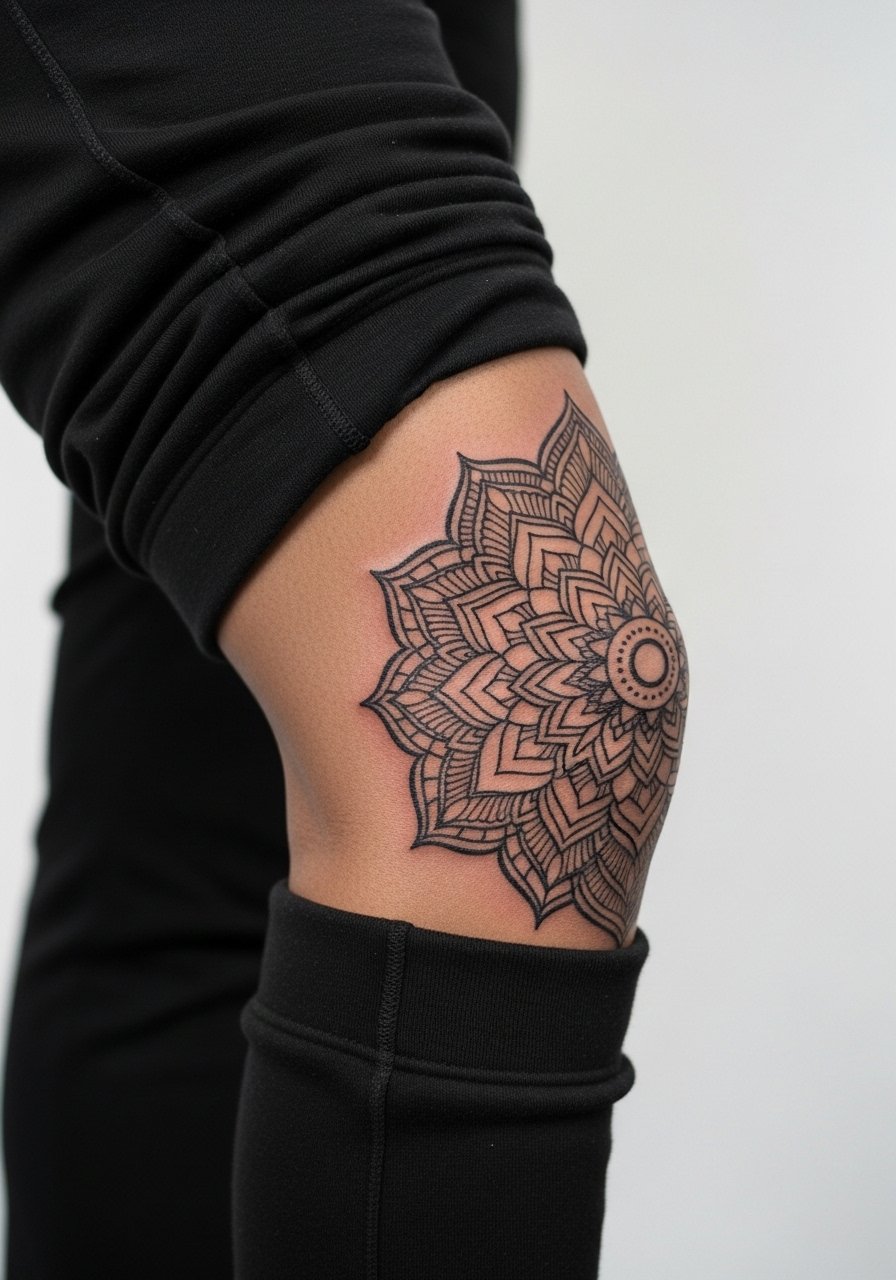
Mandala wraps that use radial spacing complement the round shape better than single flat motifs. When consulting, ask for increased spacing between concentric rings and slightly heavier linework in outer bands so tiny dots do not merge as the skin stretches. A common aging problem is cramming too many stipple details into a small ring, which becomes muddy after motion. This style ages predictably if the artist plans for 2-3 year touch-ups on dense areas. For a casual display, cuffed gray joggers keep the detail visible without distracting patterns.
3. Tribal Band Around the Joint
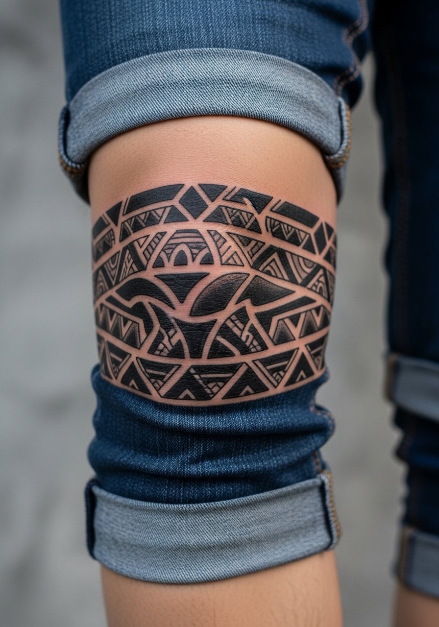
Circumferential tribal bands play to the knee's wrapping anatomy. The right approach uses broad negative spaces and solid black fills rather than thin filigree. One mistake people make is asking for ultra-fine linework that looks fragile the moment the knee bends. Session feel is brisk because artists move quickly through black fills, but expect some sting where the cap sits directly over bone. For showing it off, roll dark wash jeans to mid-calf or wear board shorts and pair with rugged leather boots to frame the wrap, such as dark wash cuffed jeans.
4. Skull Kneecap Centered for High-Visibility Edge
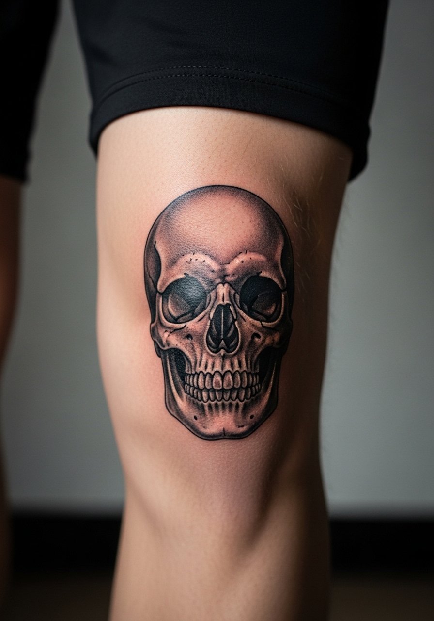
A skull placed directly on the kneecap uses the dome to make the forehead and jaw feel three-dimensional. Tell your artist to keep shading slightly bold around the eye sockets to avoid softening into gray patches over time. The most common error is overworking tiny facial details that look great fresh and then blur. Pain spikes when machines cross the bone, but a focused 60 to 90 minute session often finishes a medium-sized skull. Pair it with knee length athletic shorts and a vintage tee when you want people to notice the cap placement.
5. Spider Web Dome That Reads 3D
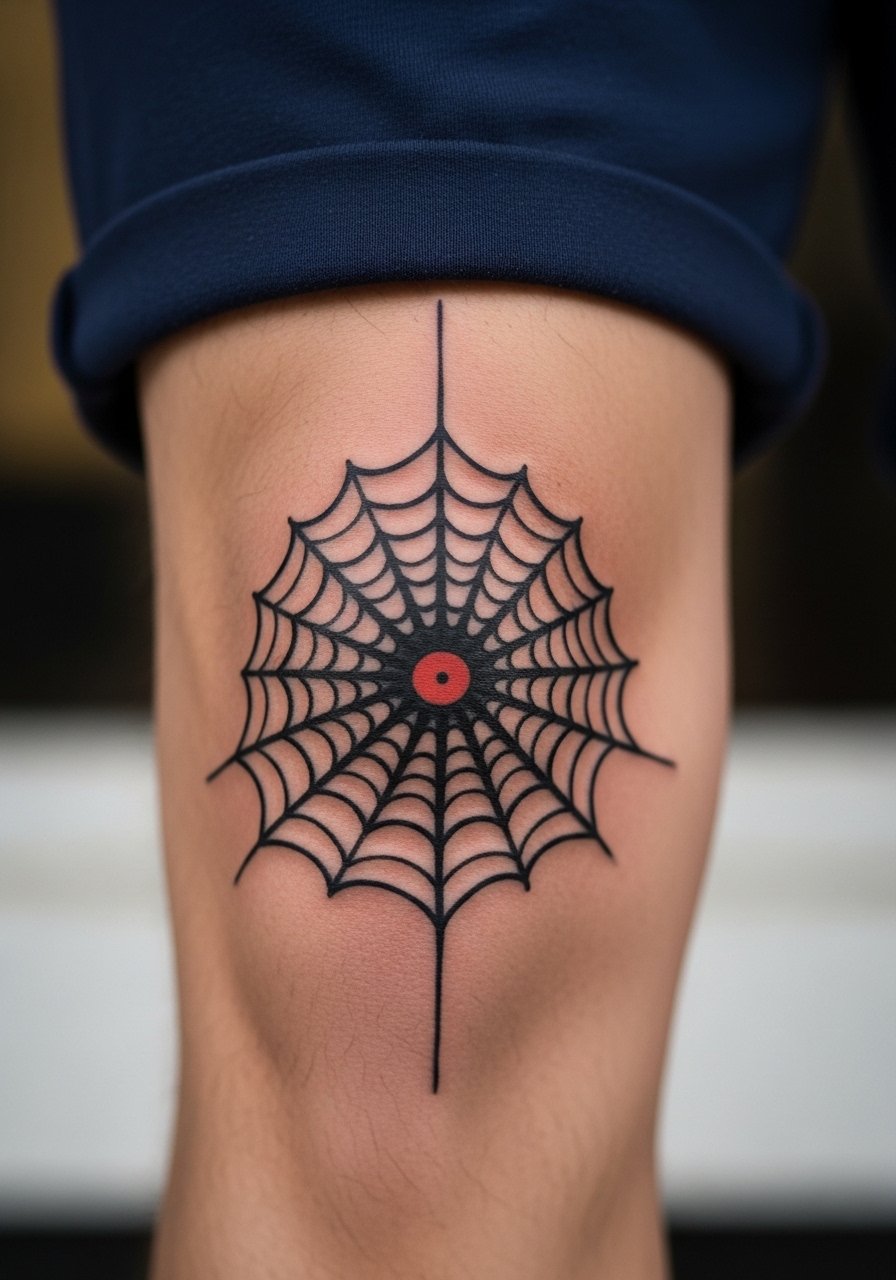
Spider webs exploit the kneecap curvature to deliver obvious radial lines. Ask for a few thicker anchor lines and cleaner spacing between strands so the 3D effect survives stretching. A common mistake is making every strand equally thin, which causes the web to lose definition as the skin moves. Expect a single session for a medium dome web. If you want an everyday outfit tip, pair this with navy gym shorts and crew socks for a casual, visible look.
6. Geometric Shield That Protects the Cap
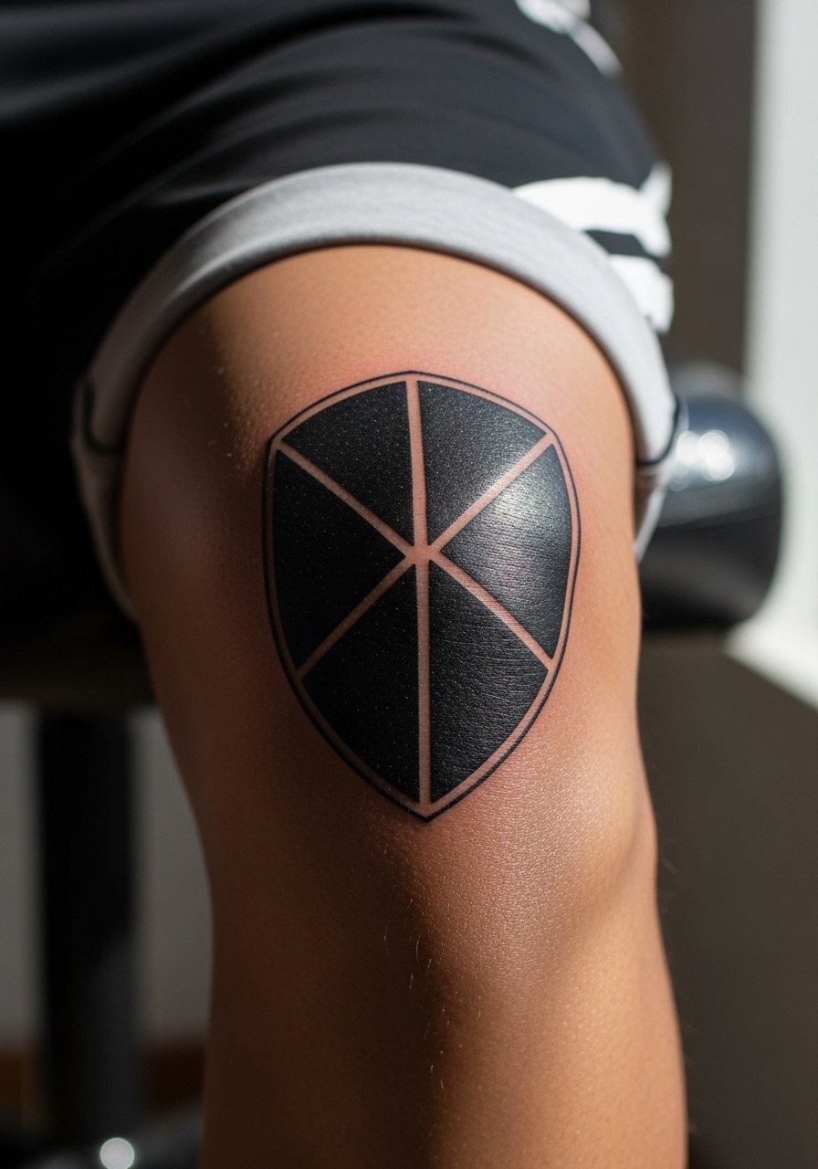
A shield motif pairs with the kneecap because the rounded shape lets polygons sit naturally. The trick is to design larger geometric fields rather than tiny repeating diamonds, which blur. In consultation, ask for solid fills in critical zones and a proof of how the design looks with the knee slightly bent. Expect two sessions for larger shields. For an outfit that frames the geometry, try olive athletic shorts and low top sneakers so the sharp shapes get visual room.
Pack Smart
Those first six knee pieces share common needs around joint movement and friction, so a few items smooth the appointment and the initial healing window.
-
Stencil transfer paper kit. Lets you preview line placement on a rounded surface before finalizing a kneecap-centric stencil.
-
Topical numbing cream. Useful if you are nervous about bone pain for cap-centered work and want the session to feel more manageable.
-
Thin protective film roll. Helps guard wraps and circumferential bands against rubbing from shorts during the first 48 hours.
-
Fragrance-free gentle body wash. Cleans the joint without irritating fresh linework that sits over active skin folds.
-
Aquaphor healing ointment. Thin layers in the first days lock in moisture for fine-to-medium linework without suffocating the area.
7. Lotus Side-Knee Accent for Flow
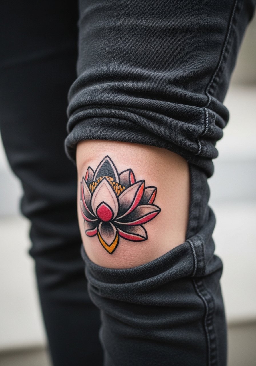
A lotus on the side of the knee rides the curve and gives a vertical flow as you walk. Tell the artist to anchor larger petals near areas that crease the least so colors do not pool into folds. A frequent mistake is stuffing too many small color washes into petal edges. Expect two sessions for color saturation. For showing it off, pair the placement with cuffed joggers and minimalist sneakers so the detail stays the focal point.
8. Wings Expanding Across Both Knees
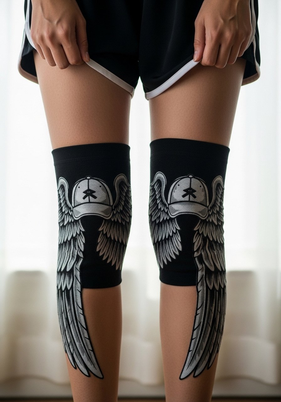
Wing pieces that span both knees use movement to animate the feathers. Plan the composition so the cap is the pivot and the longer feathers sit on less mobile skin above and below the joint. A mistake is letting the smallest feather lines sit directly on the cap where blowout risk is higher. Session time varies but most artists work knee-to-knee in one longer appointment. For casual wear, knee-length shorts and crew socks give repeated glimpses when you sit or crouch.
9. Sun Burst Radiating from the Cap
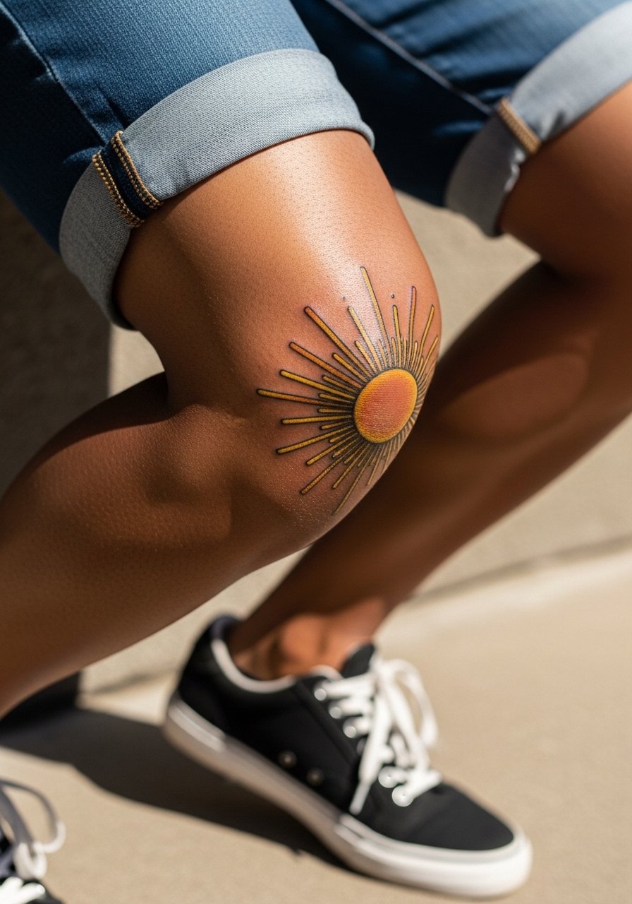
Sun burst designs centered on the cap are compact and readable if the rays are kept broad and not overly detailed. I recommend asking for color placement tests so orange and yellow washes sit in areas that do not crease heavily. The biggest aging problem is using tiny stipple within rays that disappears as the joint moves. This can be done in a single session. For daytime showing, pair with low top high sneakers and solid shorts.
10. Barbed Wire Circumferential Wrap
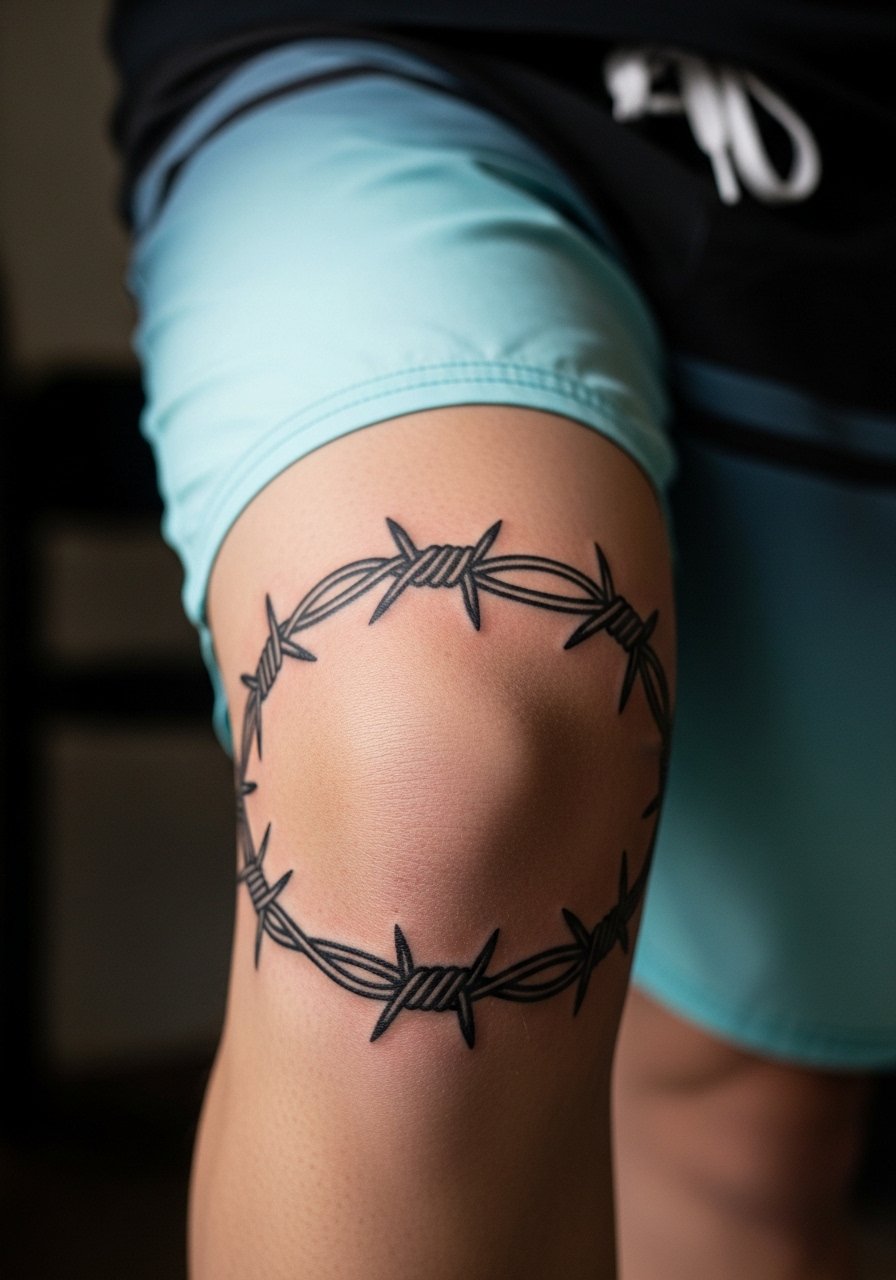
A barbed wire wrap needs clean negative spacing to keep the illusion of depth as the band crosses the joint. Tell your artist to keep knots slightly larger than the band lines so they do not wash out. A common error is making the barbs too fine and too close together. This style often finishes in one session. For show-off attire, roll slim-fit jeans to mid-calf or wear board shorts so the full circumferential effect is visible.
11. Diamond Patch for Symmetry
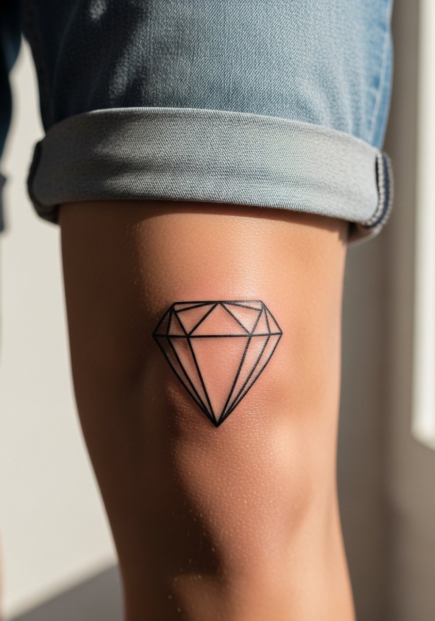
A rhombus or diamond patch behaves like a badge over the knee. The key is not overcomplicating the interior with micro-patterns. Ask for a slightly bolder outline on the edges that meet the cap, and keep interior linework minimal so it ages cleanly. The top-of-knee placement is less painful than the true cap but still sensitive. This is a good single-session project for someone who wants geometry without a full wrap.
12. Butterfly Outline That Moves With You
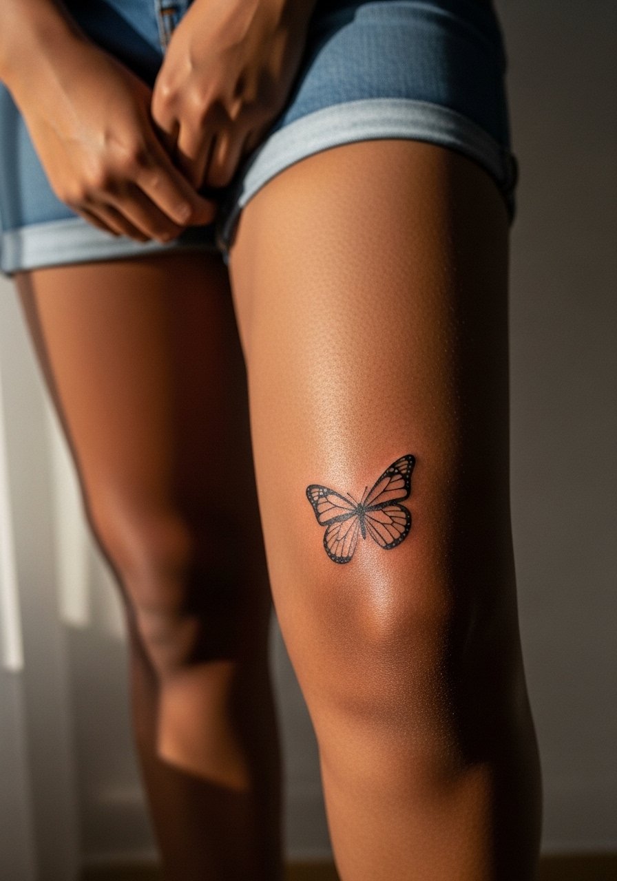
A butterfly that sits just off the cap uses articulation to suggest lift when you walk. For longevity, request a slightly heavier outline and restrained watercolor fills. The common mistake is relying on diffuse color that fades unevenly in mobile zones. Expect two sessions for color and blending. For outfits, try neutral shorts so the color wash pops against bare skin while keeping the rest of the leg minimal.
13. Realistic Predator Head That Uses Roundness
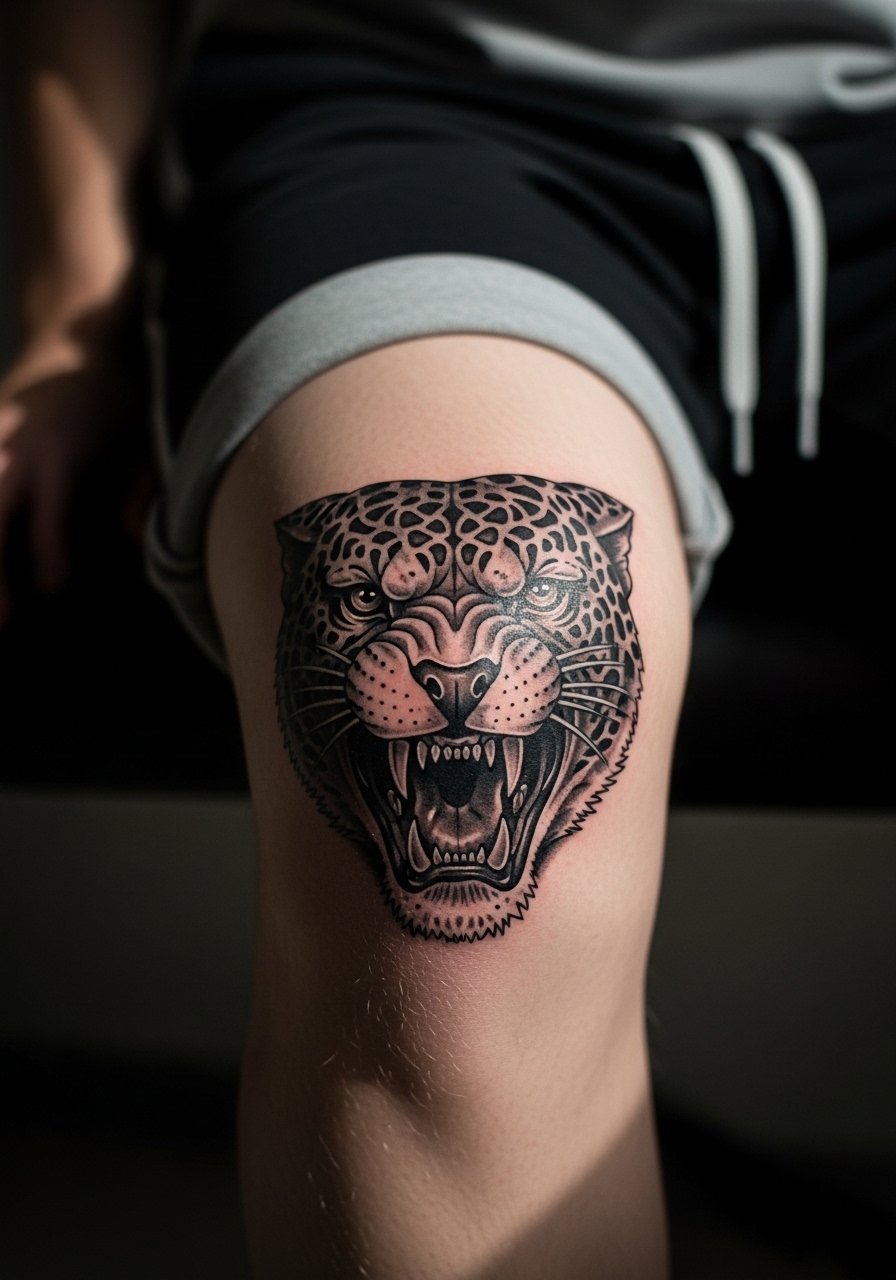
Realistic animal heads can work on kneecaps because the dome provides natural perspective. The artist needs to plan the eyes and snout so they do not fall into creasing areas. A common error is packing too much tiny texture on the cap where blowout risk is highest. Expect longer sessions, sometimes two to three, for detailed micro-realism. For a rugged look, pair the finished work with khaki cargo shorts and low top sneakers so the lifelike face reads properly.
14. Anchor or Nautical Motif on the Side Cap
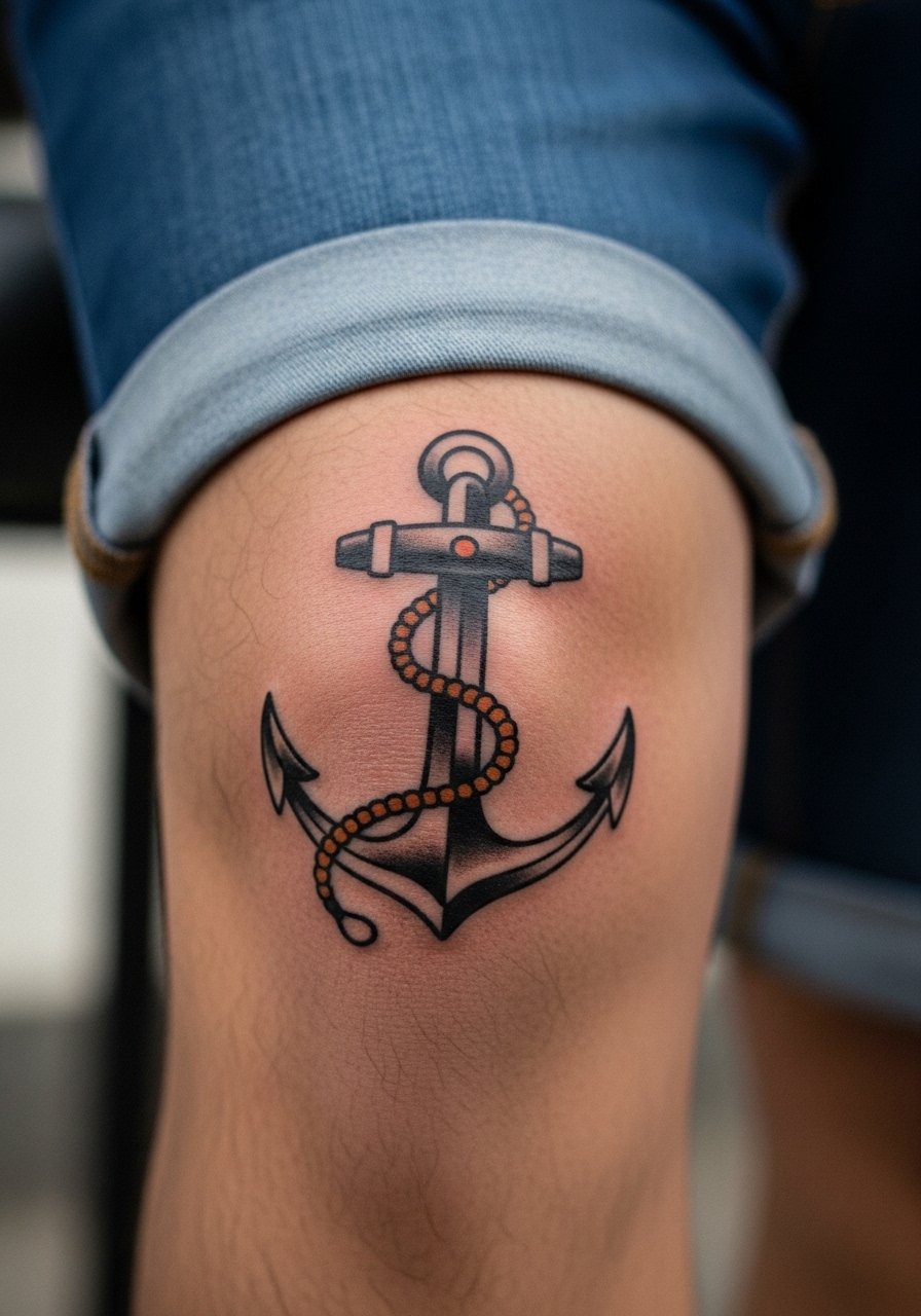
A small anchor shifted to the side of the kneecap reads like a maritime badge. Keep the anchor proportions moderate so the shaft does not sit exactly over the bone ridge. A rookie mistake is elongating the anchor too much which then looks distorted when you bend. This is a relatively low-session option and a good starter for someone nervous about cap pain. For session wear, bring loose gym shorts so the artist can access the side placement without fabric rubbing.
15. Compass Patch That Follows Movement
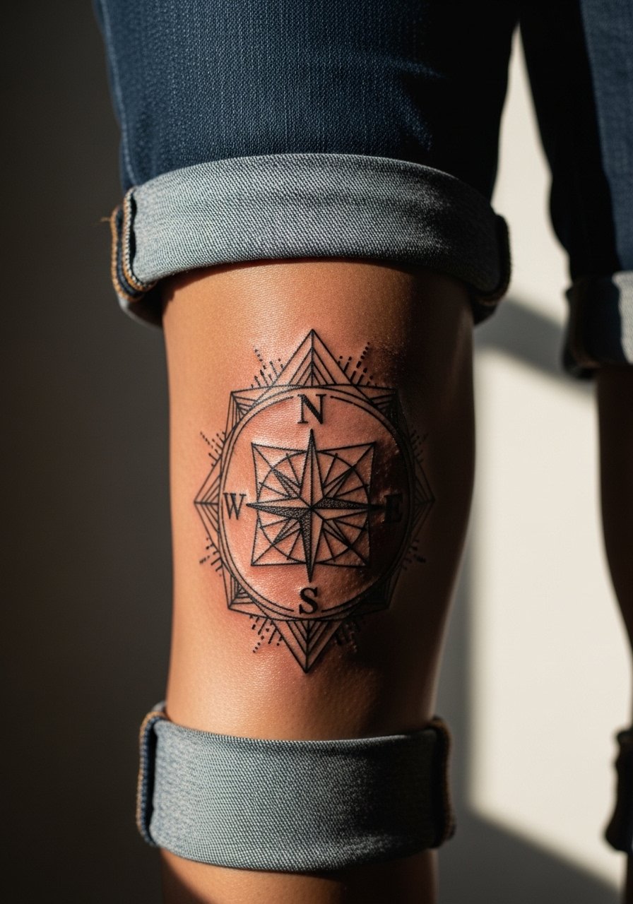
A compass uses symmetry that reads well even as the knee moves. Ask for thicker primary lines for the cardinal points and finer secondary ticks set away from the crease. The mistake to avoid is placing too many tiny ticks close to the cap edge. Expect one to two focused sessions. Slim rolled jeans or board shorts keep this kind of symmetrical piece easy to display.
16. Minimalist Numbered Dots or Roman Numerals
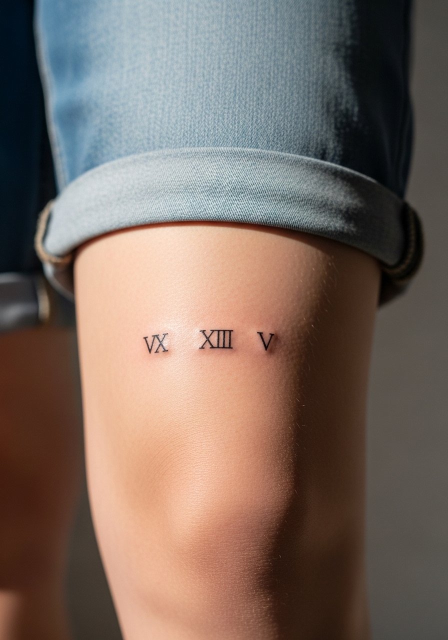
Tiny text or numerals can work if scaled properly. Text over the cap must be larger than you think because the skin stretches and letters can blur. Tell the artist the exact font size you want and ask for a stencil preview with the knee both straight and bent. A common error is choosing a very thin script that disappears within a year. This is a low-session, low-pain option compared with full caps. For subtle display, keep pants rolled or wear shorts that let the numerals peek when you sit.
17. Traditional Anchor-and-Rope Wrap
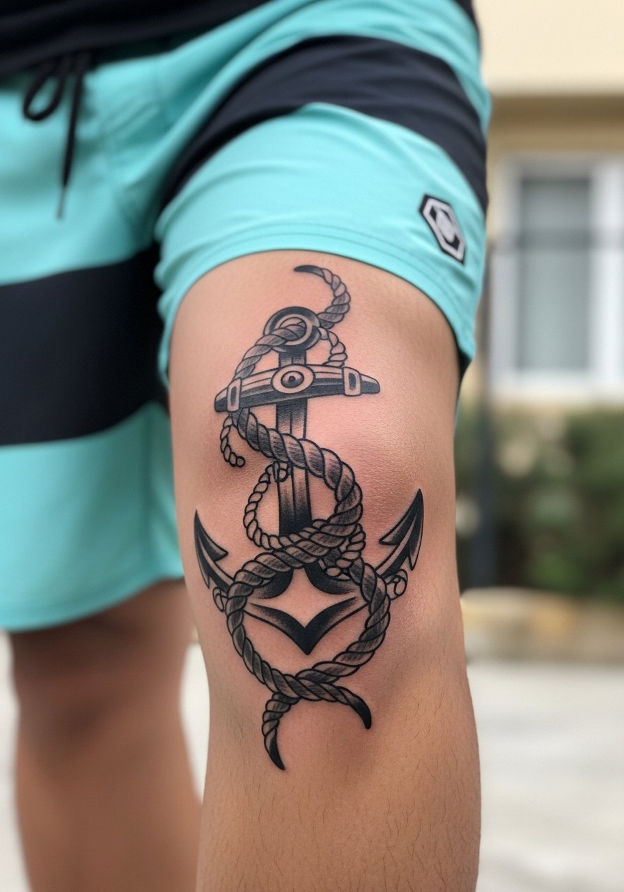
Wrapping a rope motif that ties into an anchor uses the joint as an active element of the composition. Ask for rope texture that reads as thicker bands rather than fine crosshatch. The typical mistake is too many tiny twists that blur as the knee bends. One session usually handles a medium wrap. For showing off, cuff slim-fit jeans or wear board shorts and leather boots to add contrast with the rope texture.
Frequently Asked Questions
Q: Do fine line designs hold up on the knee or should I stick to heavier linework?
A: Artists split into two camps on this. One camp says the knee's elastic skin and frequent motion blur fine line work faster than thicker linework. The other camp says fine lines can settle if the artist spaces them and hits the right depth. My recommendation is to prioritize spacing and ask for a stencil preview with the knee bent so you can see how delicate lines will behave before you commit.
Q: How should I manage healing for a knee tattoo that sits on or wraps the joint?
A: Limit deep bending for the first week, keep the area moisturized regularly, and avoid tight pants that rub the ink. Wrapping protects against friction early on but leaving a breathable routine is important so skin does not macerate. If you plan active days, bring loose shorts for the session to avoid early irritation.
Q: Will kneecap tattoos be much more painful than side-knee or top-knee placements?
A: Yes, kneecap work typically hits bone and that raises pain levels compared with side placements that rest on softer tissue. Most people find cap-centered pieces more intense for short bursts. Numbing can help some clients, but opinions differ, so discuss options with your artist ahead of time.
Q: How often should I plan a touch-up for a detailed mandala wrap or micro-realism predator head?
A: Expect denser work on mobile skin to need touch-ups sooner than flat areas. For mandalas and micro-realism over the knee, a realistic timeline is a touch-up check at year two or three depending on activity and sun exposure. Regular moisturizing and sun protection stretch that timeline.
Q: What should I bring to the appointment and what should I wear for a knee session?
A: Wear loose gym shorts or sweatpants with an elastic waist so the artist can roll the leg without pressure. For show-off planning, pick shorts or cuffed jeans that frame the knee after healing. If you want outfit ideas, a cuffed pair of dark wash cuffed jeans makes kneecap work easy to show off while staying casual.