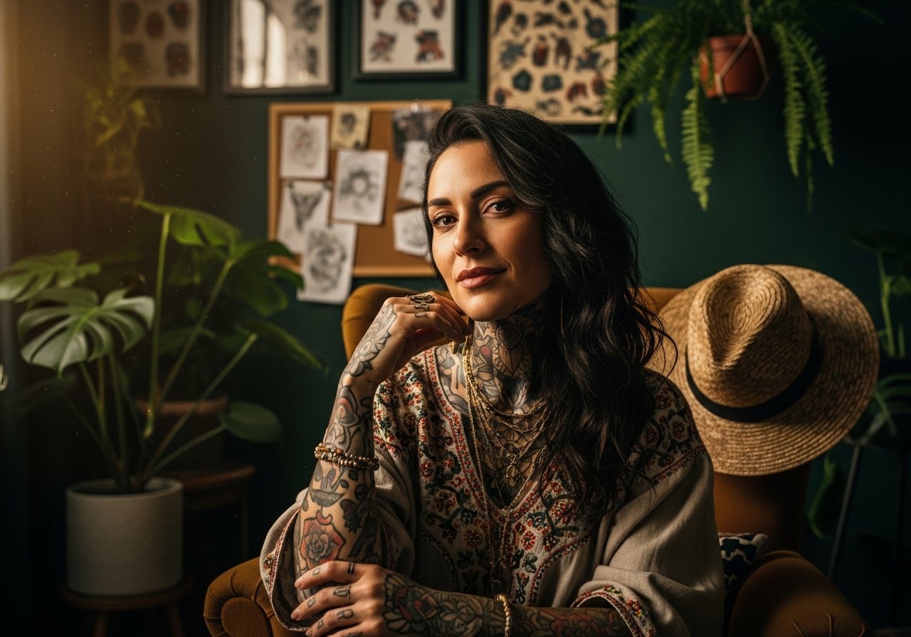
Fine-line hips are trending on feeds, but trend and real life do not always match. Fine detail and watercolor look incredible fresh, yet movement, sweat and weight changes can soften those lines within a couple of years. Artists also vary on intimate bookings, so expect scheduling friction. Read on for 21 hip bone tattoo references that account for aging, pain, skin tone, and what to wear to the session so the result still reads well down the road.
1. Fine Line Floral Mandala on Upper Hip
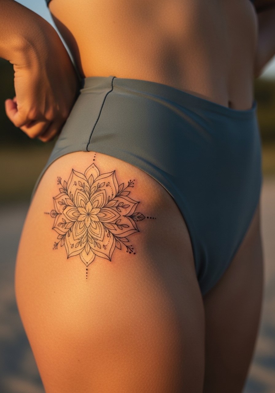
This is the go-to for people who want curved designs that hug the pelvis. I recommend slightly larger petal spacing than the Pinterest version. Ask your artist for single-needle linework with 1.5–2 mm spacing between dense sections so the mandala can breathe as skin moves. The common mistake is packing the mandala too tight, which looks crisp fresh and then blends into a gray mass at year two. Pain sits around a four on most personal scales when placed off the direct crest. For showing it off, wear a high waisted bikini bottom or a cropped tank that highlights the curve without cutting the design.
2. Neo-Traditional Snake Coiling Around Hip Bone
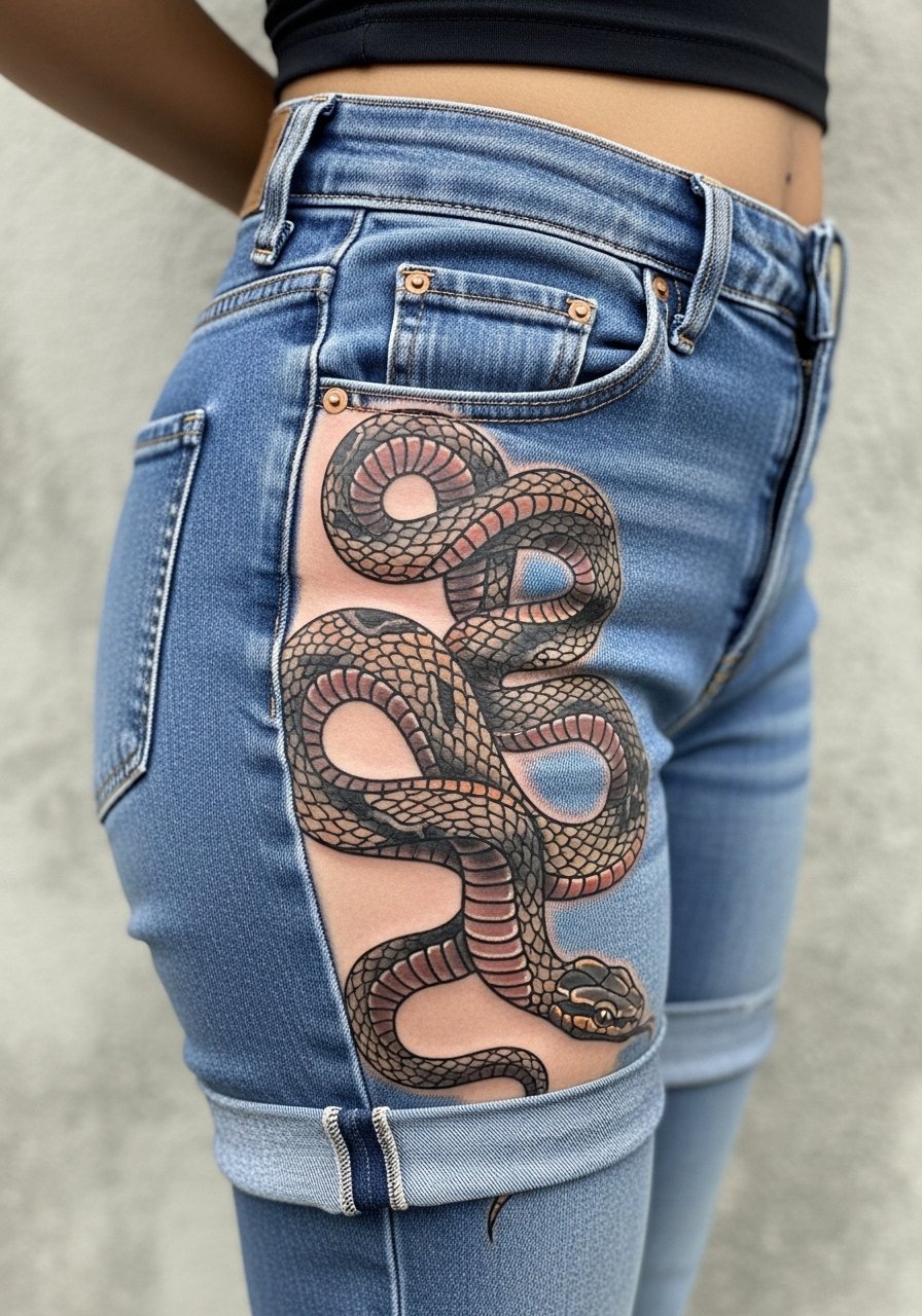
Snakes follow curves naturally so they age better with weight fluctuation than compact florals. When I discuss this with people I push for elongation in the body of the snake rather than a tightly coiled head. Tell your artist you want scale detail to stop short of the most mobile crease. The common error is too much small shading near folds, which blurs into a textured patch after touch-ups. Expect two sessions for color saturation and a realistic touch-up timeline of one to two years. Pair the healed piece with high rise bootcut jeans or a side slit bodycon dress when you want the coils to peek out.
3. Watercolor Phoenix Rising from the Hip Dip
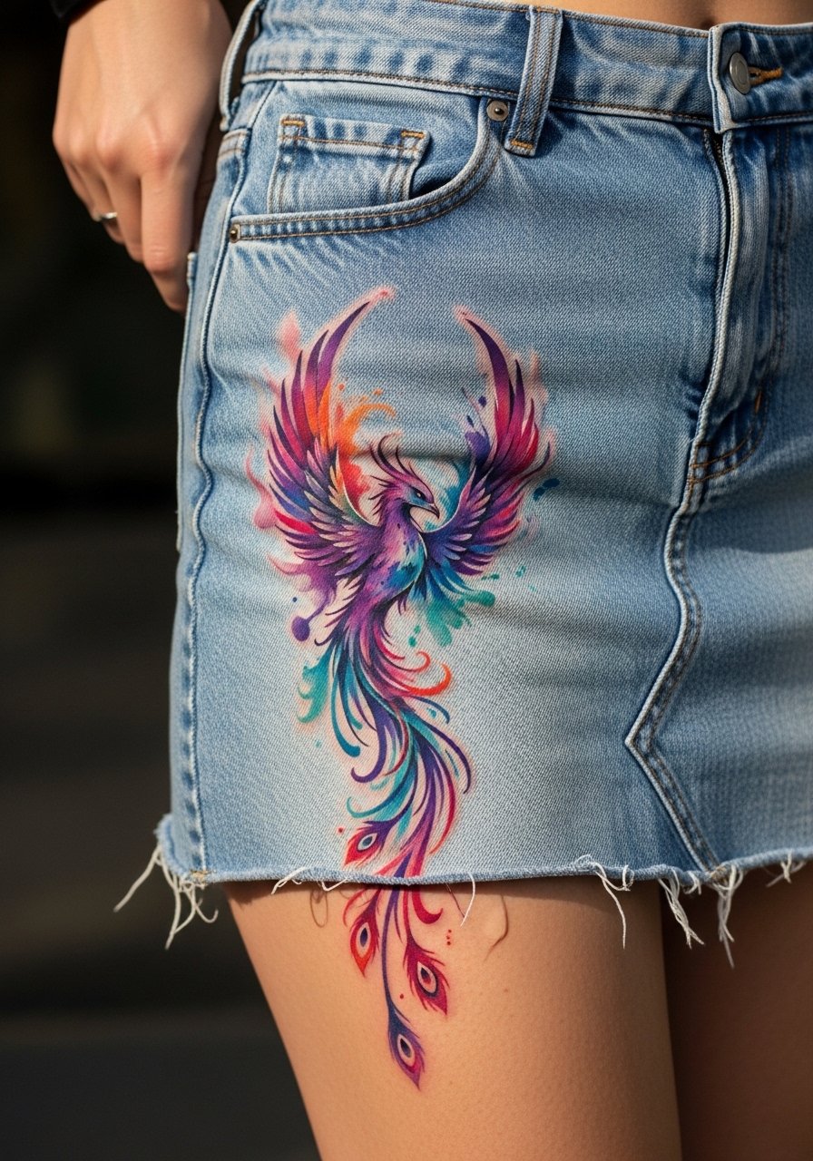
Watercolor gives a painterly pop, but on mobile hip skin the washes sometimes feather. I recommend stronger black anchors in the design so color has structure. In consultations I ask artists to map the wing sweep along the thigh so movement looks intentional. Expect more touch-up attention in years two to three if you want the same vibrancy. Session time runs two to three hours for a five-inch piece. For show-off outfits, a denim mini skirt or thigh high boots makes the color pop without hiding the flow.
4. Minimalist Script Quote Along the Inner Hip Bone
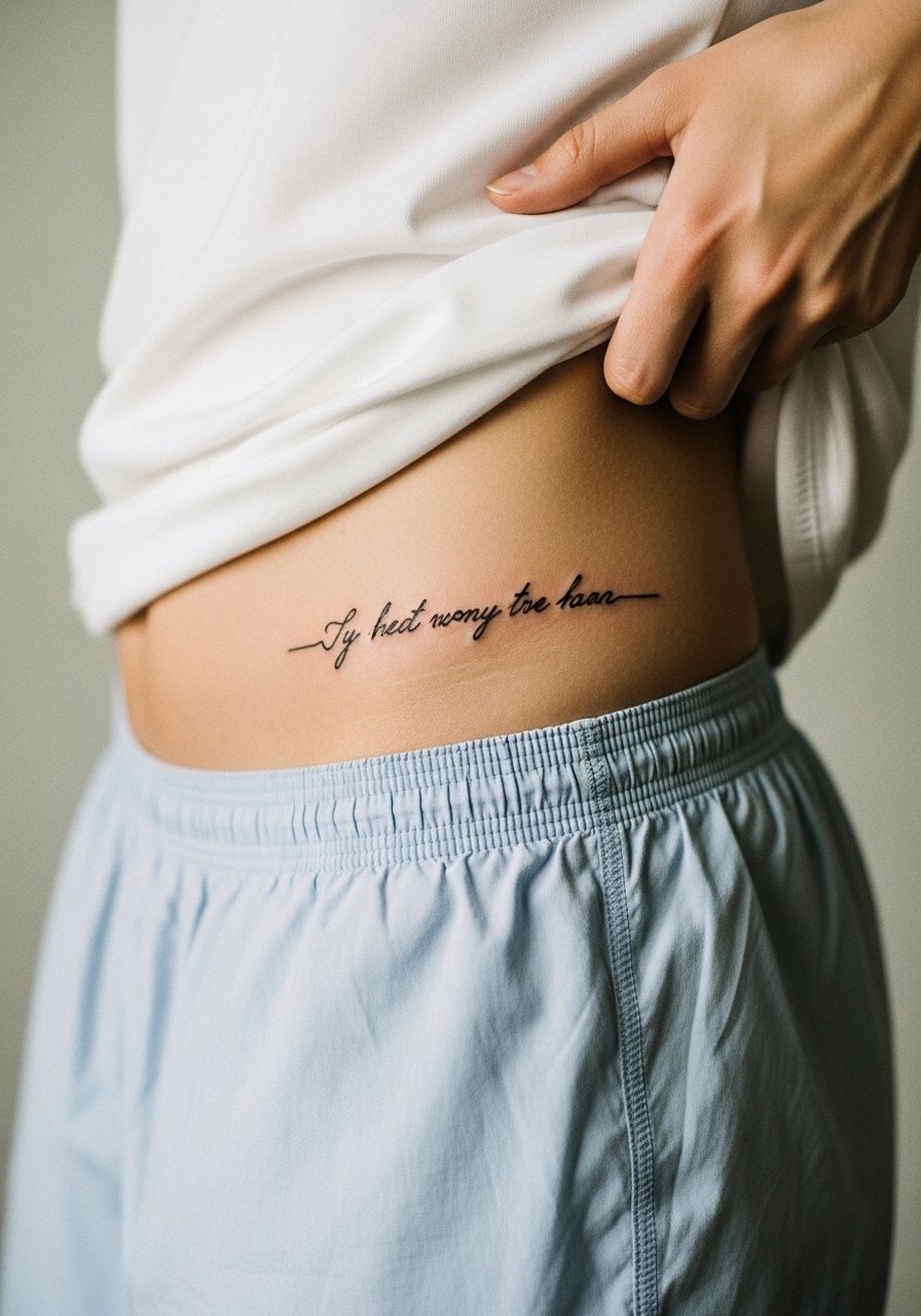
A simple horizontal line of script reads best when spaced and angled to follow the pelvis. The biggest mistake is asking for ultra-tiny lettering. On hips the text needs room or it will ghost on darker skin tones. Tell your artist the exact font weight and bring printed mockups with the line sitting on your hip during consultation. Pain is lower when the ink sits off the crest, but inner placements can be more sensitive. For the session wear a thong or loose shorts so the artist has clear access without full undress.
5. Blackwork Geometric Waves Draping the Outer Hip
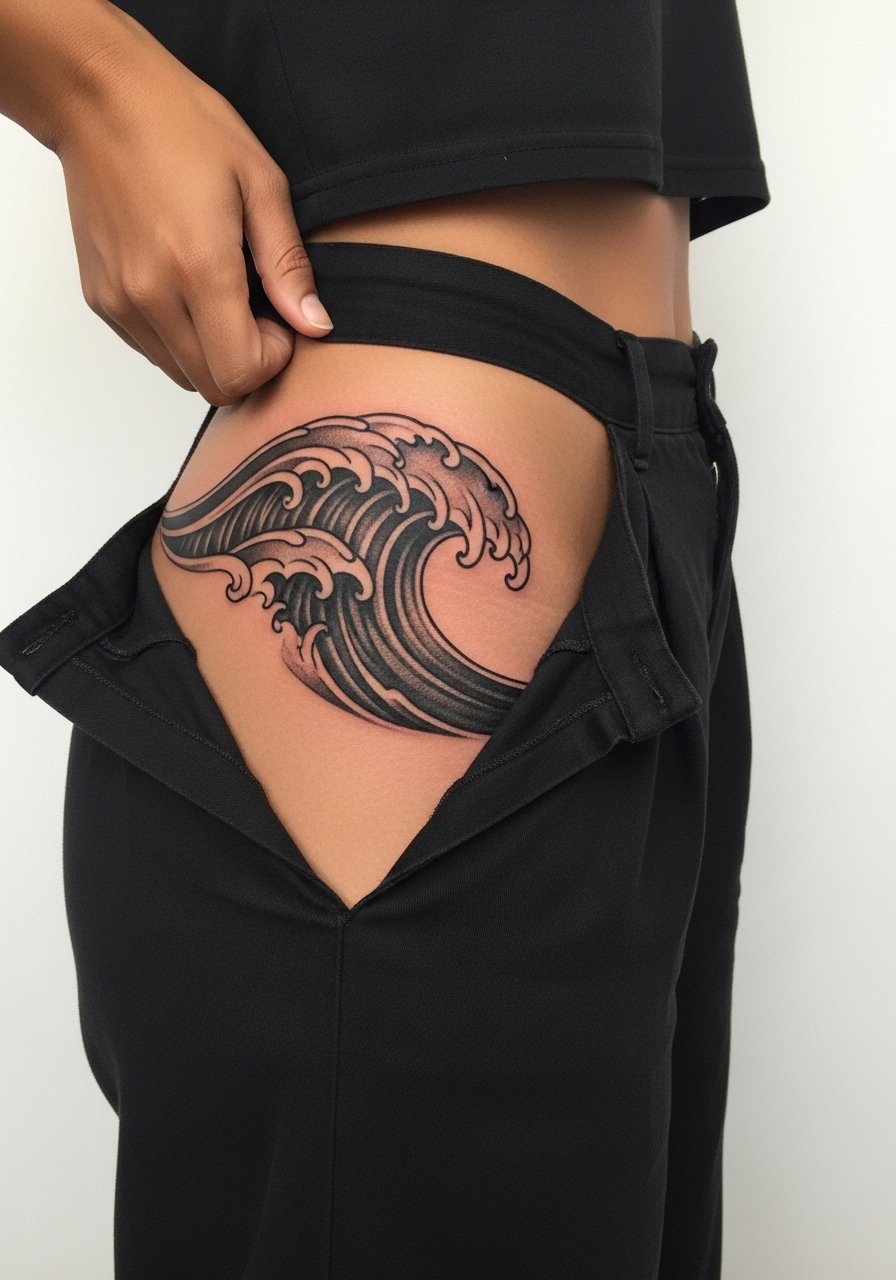
For longevity on hips, solid blackwork often outperforms delicate fills. The trick I tell collectors is to allow negative-space breaks inside the pattern so the eye sees intentional gaps not smudging. The common error is overcompacting parallel lines. That invites merging after a couple of years. Expect one to two sessions depending on saturation. Show it off with black high waist leggings or cuffed wide-leg pants to keep the monochrome look cohesive.
6. Micro-Realism Rose on the Hip Crest
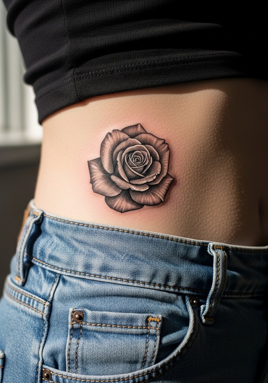
Micro-realism reads intimate and personal. On curved hip crests it can age gracefully if the piece is slightly larger than a fingertip. I tell people to size up by at least 25 percent of their initial thought to keep petal separation over time. The typical mistake is compressing detail into a two-inch spot. That looks sharp fresh and turns muddy as skin moves. Pain is moderate when the piece avoids the bone crest. Keep session wear simple with disposable paper shorts so studio privacy is preserved.
Studio Day Picks
The first six ideas above include upper hip, outer hip, and inner hip placements that need different prep. These products smooth the session and the first week.
-
TattShield spray. A light spray option folks on sweaty hips mention for non-greasy healing in humid months.
-
Indie Butter tiny jar. Thinner consistency prevents pore clogging on hips that sweat, which helps with scab control.
-
Hada Labo lotion. Lightweight hydration that users with darker skin say avoids the greasy finish of heavier ointments.
-
OzHealer balm. Recommended in some recovery threads for a fast, low-shine heal on curvier placements.
-
Framyderma protective film. Thinner than standard second-skins, so edges lift less around curved hips during the first few days.
7. Ornamental Lotus Blooming from the Hip Bone
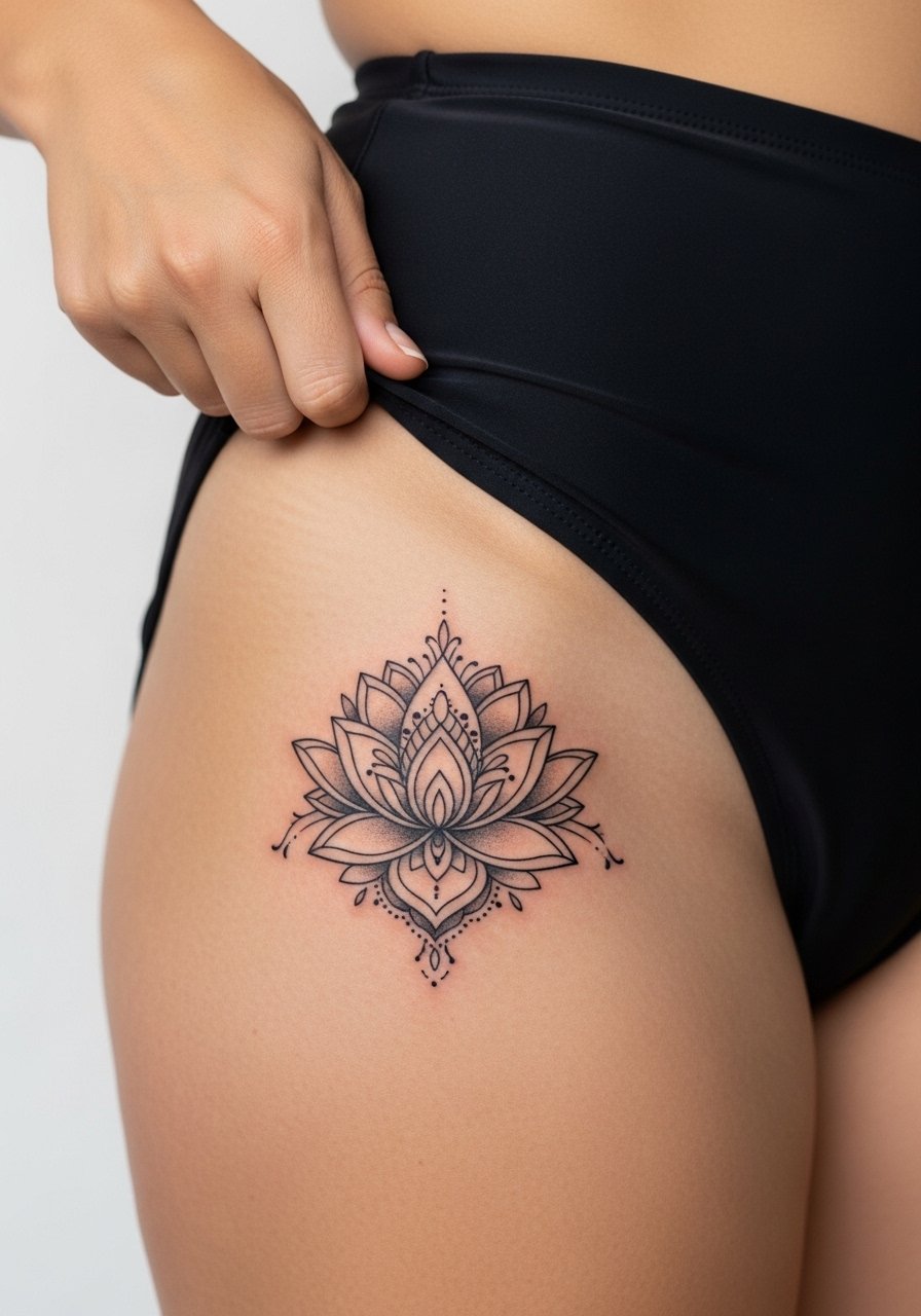
Lotus designs pair naturally with the arc of the pelvis. I usually advise a symmetrical horizontal layout so the petals read even as girth shifts. Ask for slightly thicker outer lines and stipple shading inside. A common mistake is tight mirrored dots that bleed together as the tattoo settles. Pain is lower if the center sits on the fleshy side of the crest. For beach days choose a sheer sarong wrap or a neutral cropped tank to reveal the bloom without rubbing the area.
8. Traditional Anchor with Ribbon on Lower Hip
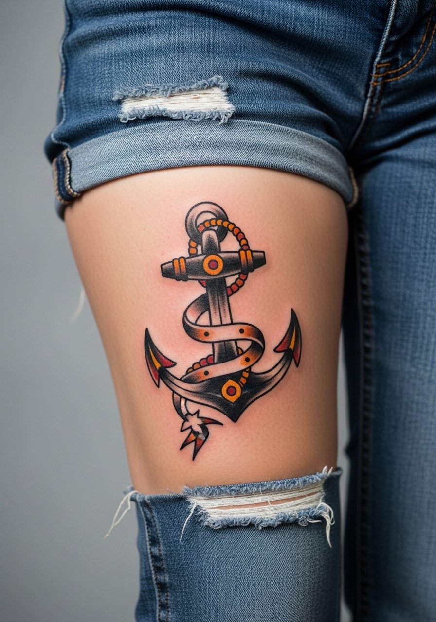
Traditional outlines and saturated colors hold up well on the lower hip because the shapes are simple and bold. If you want longevity, keep the anchor size to at least three inches so outlines do not crowd. I advise asking for a thicker outer line and restrained color fills. The common slip is tiny script in the ribbon that becomes unreadable. Pain is lower on the lower hip than on the crest. For outfits try a low rise cheeky underwear or a pair of stretch athletic shorts for session comfort.
9. Ignorant-Style Abstract Bones in the Hip Dip
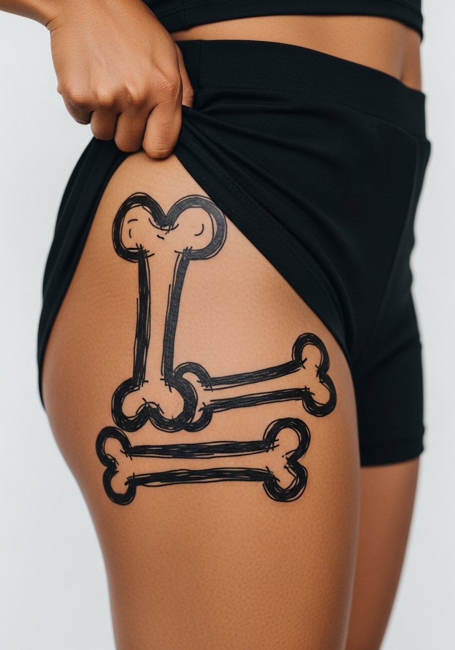
Ignorant style leans into sketchy marks and intentional roughness, which can hide future blur. For hip dips I like irregular, organic strokes that follow the curve. Tell the artist you want uneven line weight and reserved solid fills. A mistake is asking for ultra-fine scratch lines that will vanish on mobile skin. Expect two sessions if you want extra saturation without losing the hand-drawn feel. Session wear of stretch athletic shorts makes positioning easier while lying on your side.
10. Fine Line Vine Wrapping Hip to Pelvis
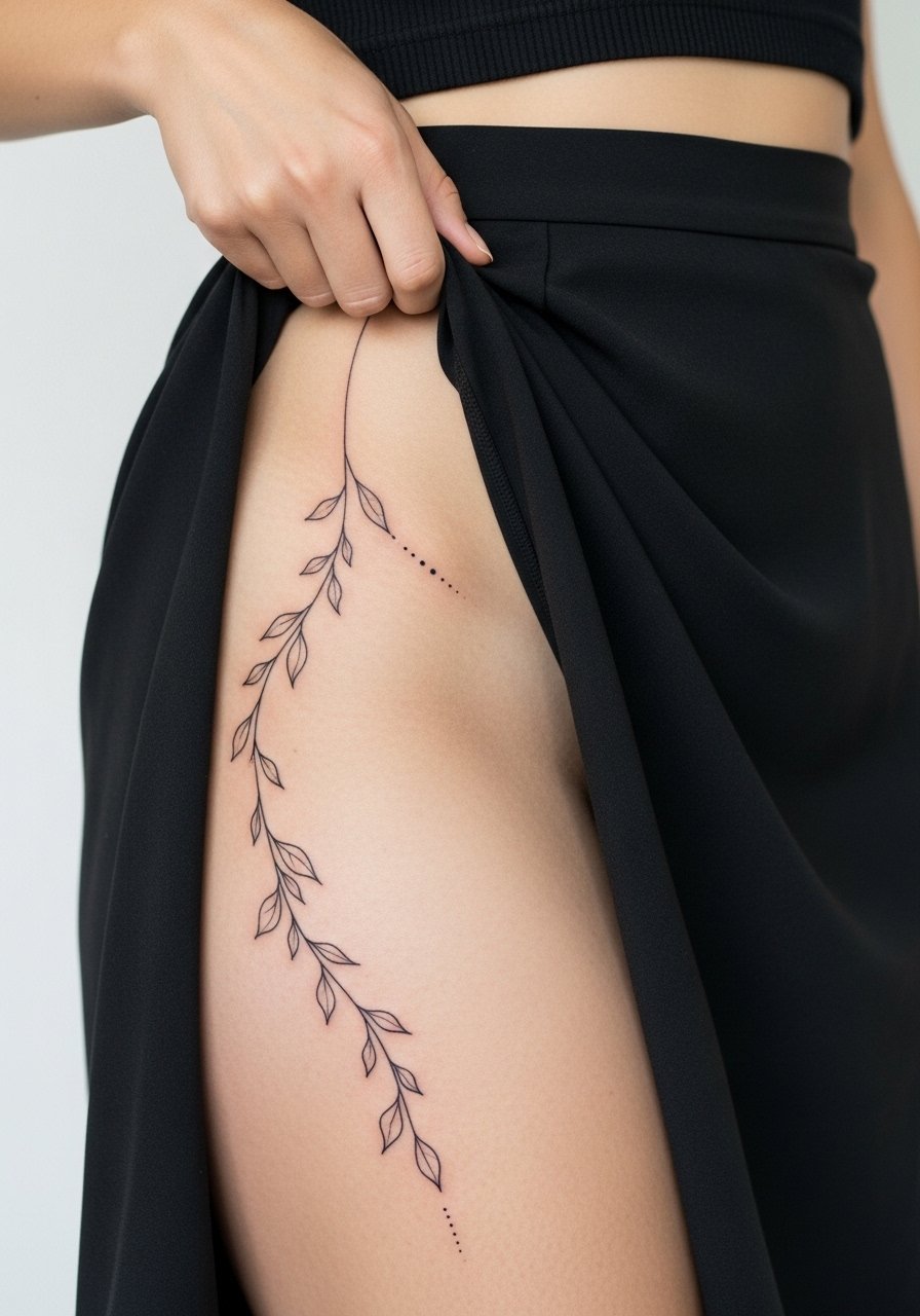
Vines elongate the silhouette and tend to flex well with the hip. I push for a longer run rather than a compact cluster. During consultation, show movement poses so the artist maps the vine with natural body lines. The main error is making the vine too dense. That invites loss of leaflet detail at six months. Pain is manageable off the crest and session time is often under an hour for a six-inch sweep. For outings, a flowy maxi skirt or a loose drawstring linen pant keeps the area from rubbing.
11. Lingerie Seam-Aligned Minimal Motif
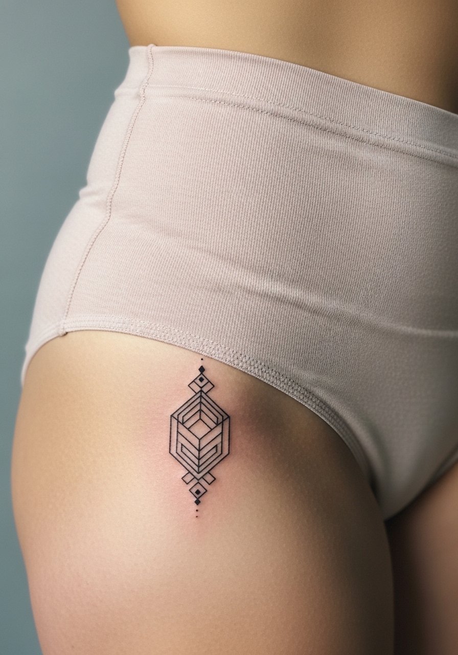
Designs that line up with lingerie seams are clever if concealability matters. I advise bringing the exact underwear or a photo during consultation so proportions match fabric lines. The common misstep is assuming every brand sits in the same spot on the hip. Ask for a mock placement stencil to check the seam alignment. Pain is low when the mark sits on soft tissue. For real-life wear, match the piece to your favorite underwear style, or test with the actual garment during consultation.
12. Negative-Space Hip Dip Shadowing
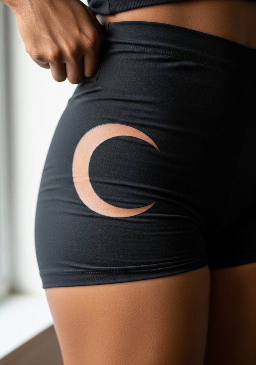
Using negative space to mimic the natural shadow of a hip dip creates a flattering optical effect. I tell people to let the negative area be larger rather than tiny cutouts. The mistake is relying on micro negative dots that blur. For consultations bring photos of the shape you want exaggerated so the artist can stencil correctly. This approach resists obvious distortion with mild weight shifts. Pain is mild. Pair the healed look with short denim skirts that reveal just enough curve.
13. Archaic Curved Quote Around the Pelvis
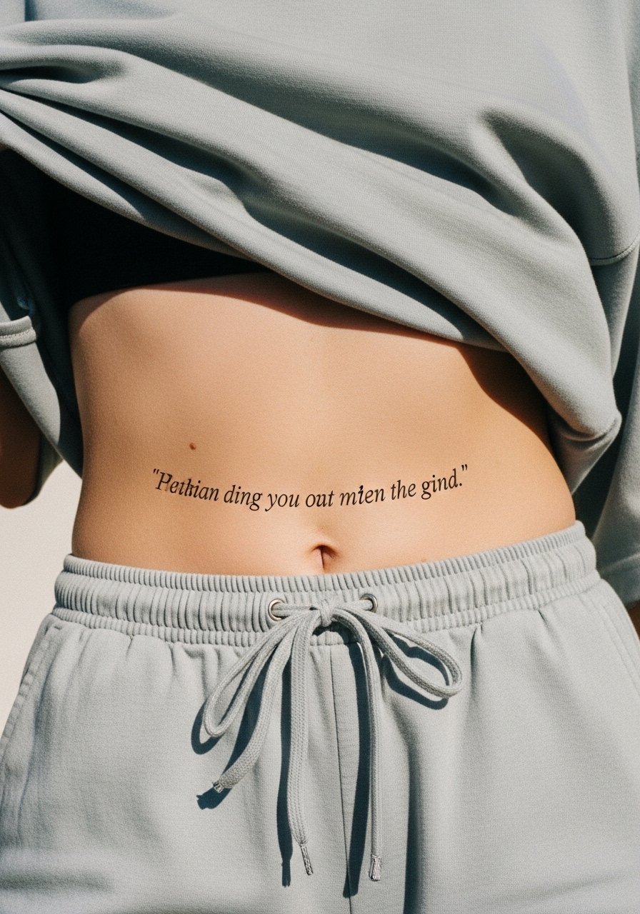
Curved archaic lettering can act as an optical illusion on the hip, bending with the body. Font weight matters. I recommend a mid-weight serif rather than ultra-thin calligraphy. The biggest mistake is curving the text without testing readability across movement. Request a full-size stencil and wear the garment you plan to show it with to see how letters fall. Inner-pelvis scripts may be more sensitive. For session wear choose disposable session shorts for privacy and easy access.
14. Phased Layered Hip Build, Start Small
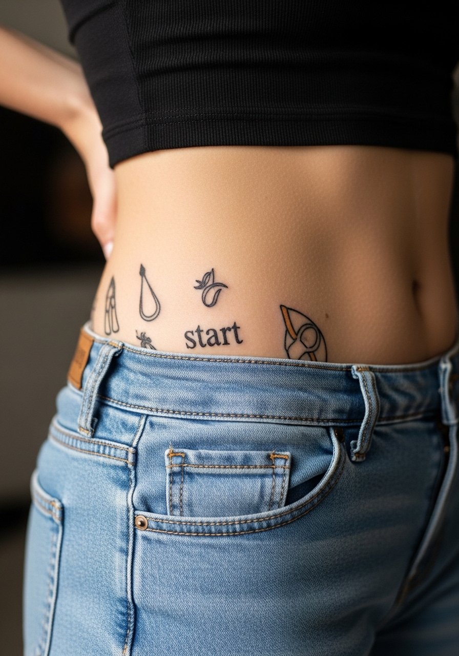
Phased builds let you start with a tiny motif and add elements over time. I like this for people who want to test placement and scale. The consultation should include a long-term sketch so future additions fit naturally. The common error is improvising later without respecting original line direction. Touch-ups and additions are easier if the first piece leaves clear breathing room. Start with something simple and plan patchwork sessions. For the appointment, wear baggy athletic shorts so the artist can shift fabric without disturbing the initial healing.
15. Small Constellation on the Hip Crest
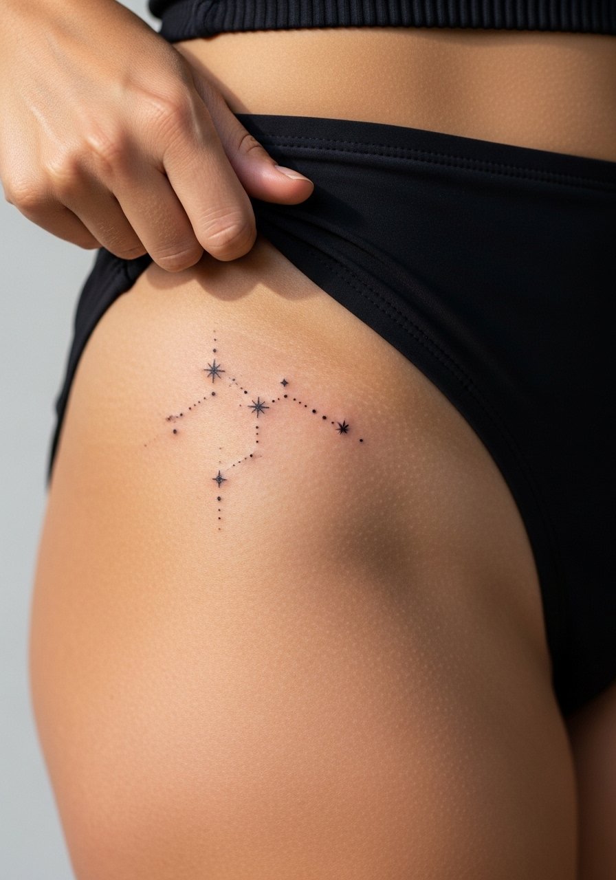
Tiny dotwork constellations look delicate but risk losing individual points over time on curvier skin. I tell people to space stars slightly further apart and to use a mix of dot sizes so pattern persists. The common mistake is asking for identical micro dots. That pattern blurs. Pain is lower on the crest flesh but higher if placed directly on bone. For reveal looks try short denim skirts or low-cut swimwear so the constellation peeks without rubbing.
16. Minimal Crescent and Star Cluster Near Hip Dip
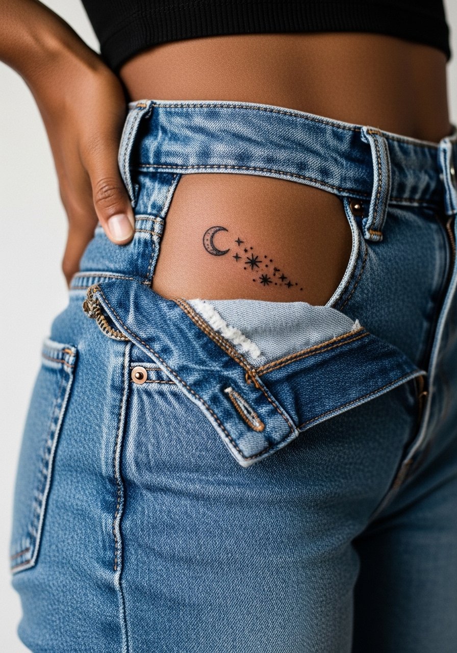
A small celestial motif reads well if contrast is considered. On darker skin, a slightly bolder crescent ensures it photographs. I advise testing a temporary marker version to see visibility under different lighting. The mistake is trusting a single-needle thin crescent without confirming visibility. Expect touch-ups sooner on the faintest lines. Pain is low when placed off the bone. Pair with high waist yoga pants when you want a subtle reveal.
17. Dotwork Half-Mandala Along the Hip Curve
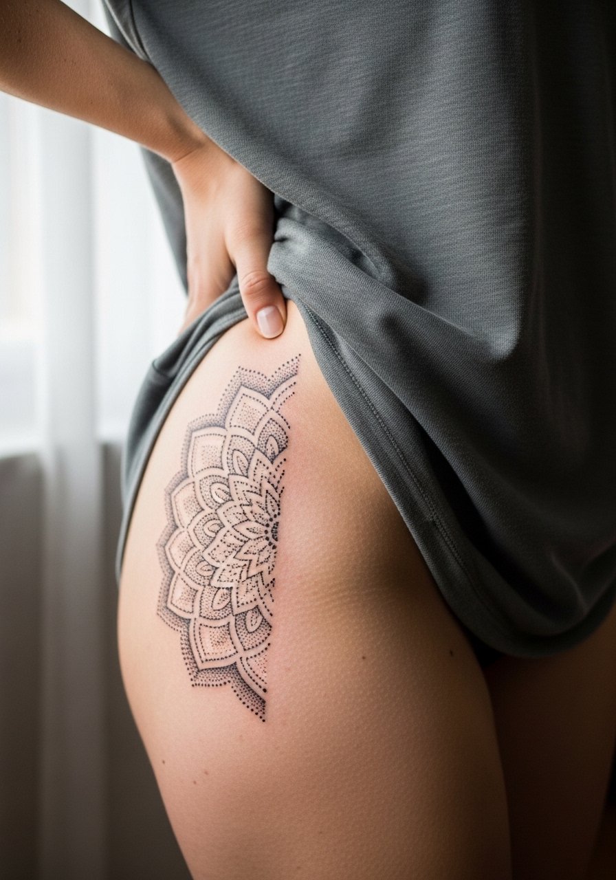
Stipple shading holds texture rather than line. For hips I prefer a half-mandala that opens toward the belly so the dot density can decrease into negative space. Tell your artist you want gradual stipple fade rather than abrupt stops. A common mistake is overpacking dots near creases. That makes the piece look solid over time. Pain is moderate when close to the bone. Show it off with a sheer sarong wrap or a simple tank that highlights the curved half-mandala.
18. Small Portrait or Micro-Realism Token on Lower Hip
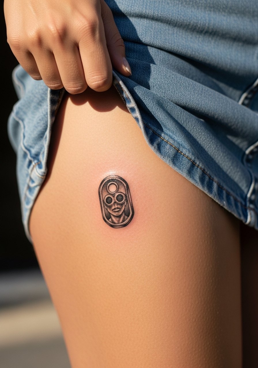
Micro-portraits can be very personal and concealed on the hip. Size matters a lot for legibility. I push for slightly larger scale and clear contrast. Bring a high-resolution photo for reference and ask the artist for previous healed examples on similar skin tones. The mistake is expecting photographic fidelity at postcard size. Sessions take longer for realism. For casual visibility wear a denim mini skirt or low-rise shorts when you want the detail to peek.
19. Geometric Wave with Negative Space Accents
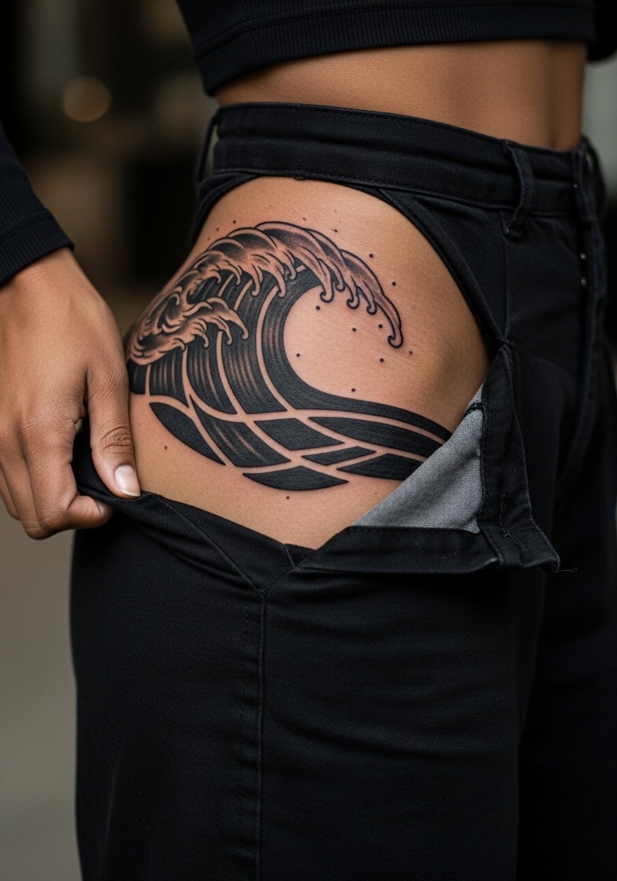
Geometric waves look modern and scale well on hips. Negative space accents keep the pattern readable as saturation shifts. I recommend larger shapes rather than thin parallel lines. The common error is an overly intricate grid that merges on healing. Touch-ups can refresh edges at year two. Pain is mild unless lines cross the crest. Pair the finished piece with black high waist leggings to amplify the bold look.
20. Tiny Compass or Nautical Token at Hip Crest
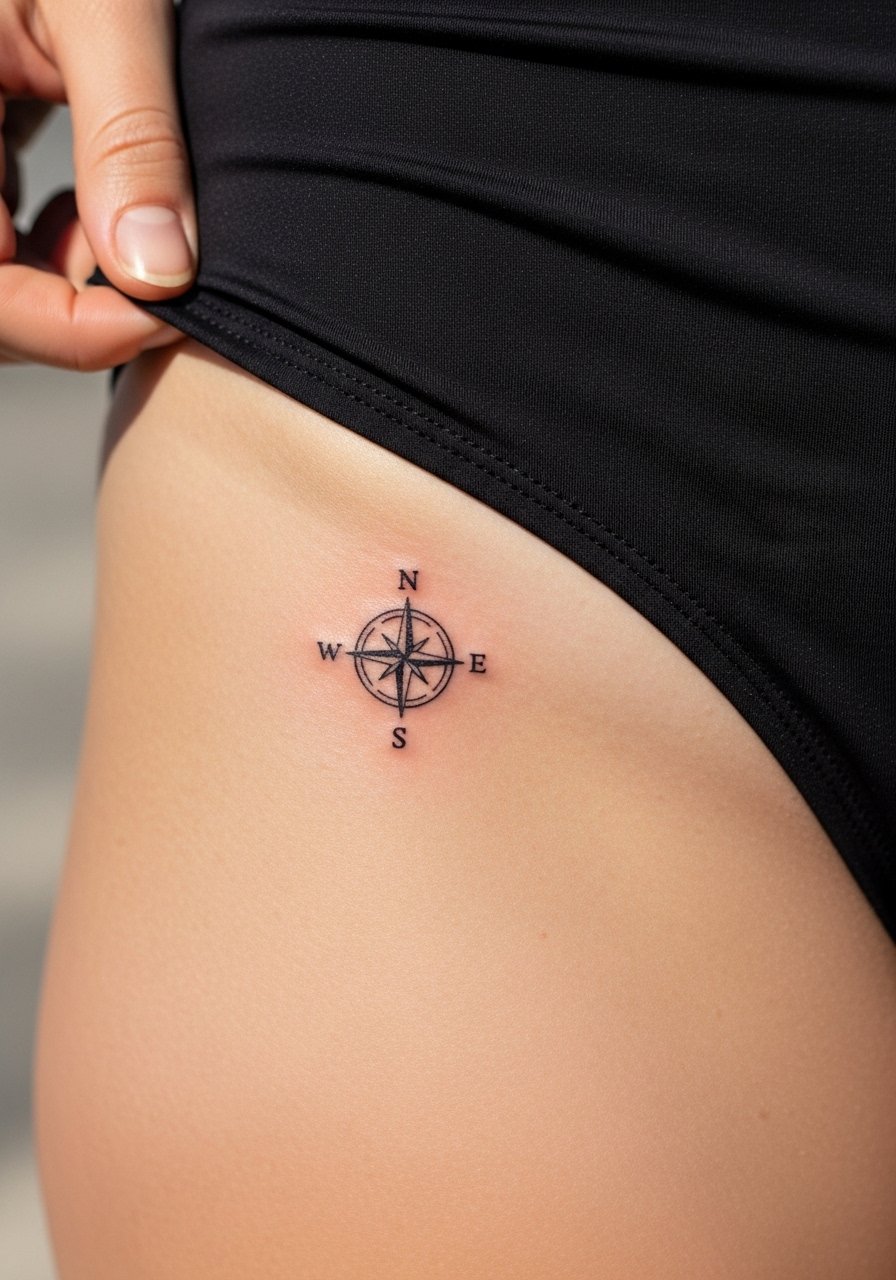
A compact compass reads best when given a bit more diameter than you think. The mistake is squeezing directional ticks into a very small circle. Request clear cardinal points and a thicker outer ring for longevity. These pieces are quick in studio but may need a touch-up sooner if you know you will gain or lose weight. Pain is low if the crest is avoided. For casual display try high waisted bikini bottoms that reveal the compass at the hip line.
21. Optical Illusion Curve That Mirrors the Hip Dip
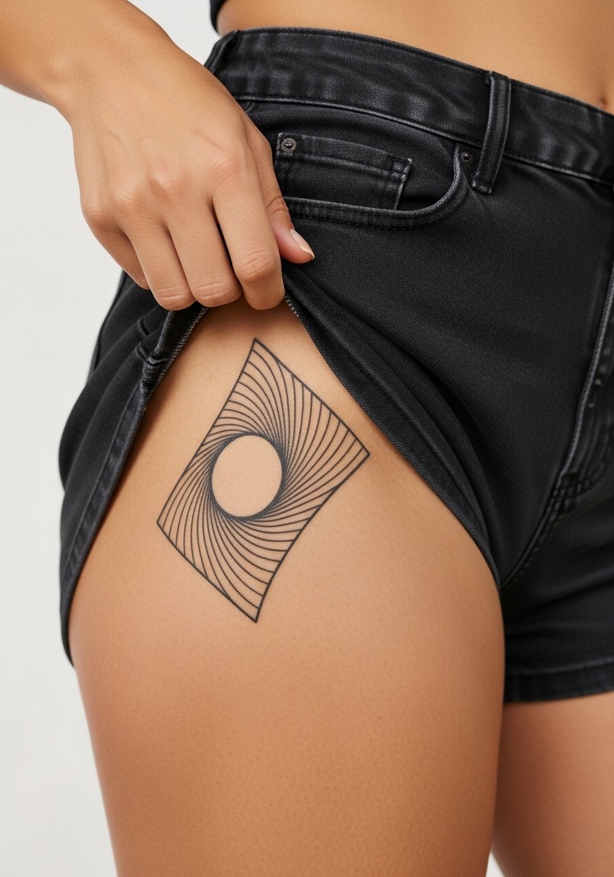
Using optical illusion linework to accentuate or mimic a hip dip is an under-covered idea. I advise designing with the body in motion so the curve reads as intended when standing, sitting, or squatting. The main error is ignoring squat and bend tests that artists can do with a stencil. Expect a one-hour session for a two- to three-inch piece. This approach holds up well because it works with anatomy rather than against it. For gym days the tattoo shows subtly under high waist yoga pants.
Frequently Asked Questions
Q: How much does a hip tattoo typically cost?
A: Expect a range depending on size and style. Small single-needle pieces often fall in the $150-$400 range. Medium blackwork or color pieces commonly sit around $300-$900. Bigger or realistic work can edge toward $1,000 depending on session count and studio rates.
Q: Will fine line mandalas fade faster on darker skin tones?
A: Fine line can appear fainter on medium and dark tones if the line weight is too thin. One camp favors single-needle fine line and spacing, while another recommends slightly thicker linework for higher contrast. Ask to see healed examples on similar skin tones and plan for earlier touch-ups if you prefer ultra-fine detail.
Q: Should I choose Saniderm or dry healing for a hip tattoo?
A: Artists split into two camps. One group says second-skin protects curved hips from friction and speeds initial healing. The other group argues breathable dry healing prevents trapped moisture on sweaty hips. Your choice depends on how much you sweat and how mobile the site is. Discuss both approaches with the artist who will handle your touch-ups.
Q: How painful is the hip compared with other placements?
A: Pain varies by exact spot. Fleshier parts of the hip are usually a three to four out of ten. The crest near the bone can climb to a five or six because you feel vibration more. Positioning off the bone and shorter sessions help keep it manageable.
Q: How do I find artists who specialize in hip pieces without relying on social handles?
A: Use placement filters and hashtags like #HipBoneTattoo and #FineLineHip on Instagram or search the Tattoodo app for "hip" placement. Check local Reddit threads for peer recs and monitor Booksy or convention rosters for guest spots that specialize in intimate placements.