
Fine line script like "Only God Can Judge Me" looks fragile on the stencil and bold in real life. Fresh ink often reads delicate, then either softens into a graceful patina or blurs if spacing and placement were rushed. Plan for spacing, realistic touch-ups, and wardrobe that frames the script. Below are 27 fine line layouts that treat the phrase like design, not a trend.
1. Slim Script on the Inner Forearm
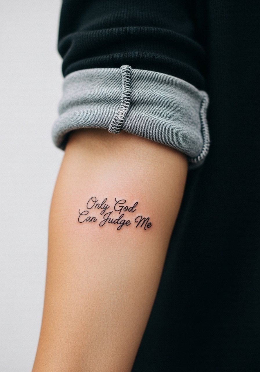
I've seen inner forearm scripts hold best when letters breathe. Tell your artist you want increased letter spacing and single-needle linework, not a dense cursive that crowds the letters. Pain is mild and sessions are short, usually under an hour, which makes touch-ups easier if some strokes soften. Common mistake is compressing the phrase to fit a narrow area. At six months you get crisp lines, at two years fine lines may fade depending on sun exposure, and by five years expect softening that benefits from a touch-up. For showing it off, pair with a rolled-up linen shirt so the arm is visible without glare.
2. Tiny Wrist Band Script
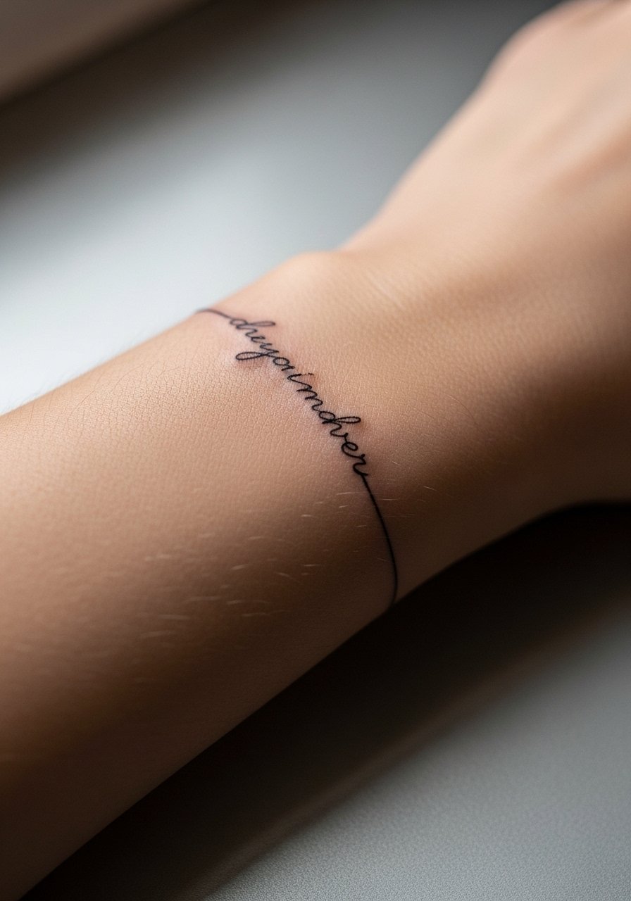
Wrist work looks discreet but faces constant rubbing from bracelets and watches. Ask the artist for slightly heavier line weight than micro single-needle so the letters last longer. Expect the session to be quick but tender, and budget a touch-up around year two. The common error is going too small. At six months it reads sharp, at two years the thinnest strokes are often the first to blur. For styling, this band pairs with a thin chain bracelet that frames the script rather than covering it.
3. Vertical Sternum Script
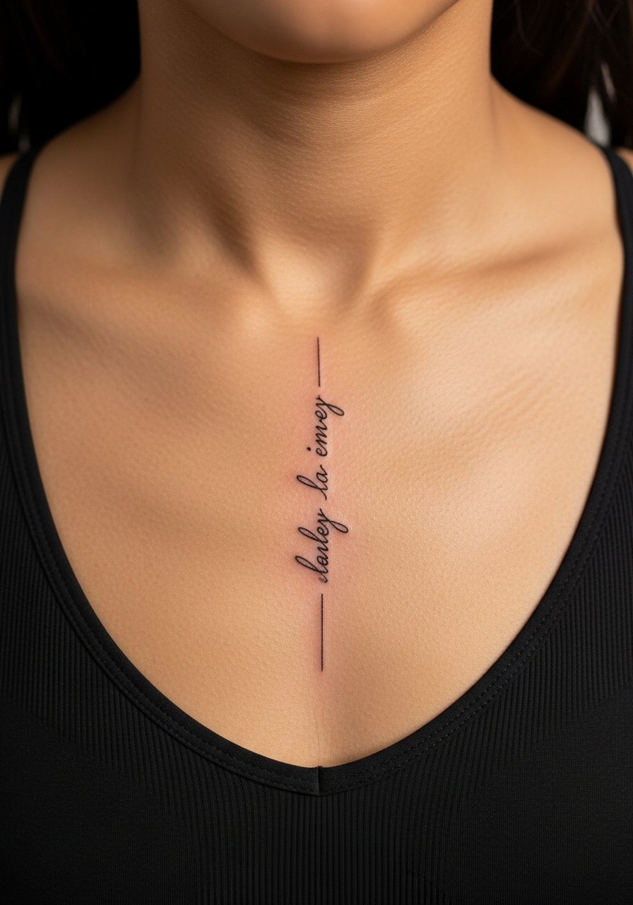
Sternum placements are intimate and phone-camera friendly. Fair warning, sessions here can be sharp because the skin is thin near the sternum. Artists split on fine line on the chest. One camp says the movement and stretch blur delicate work quickly. The other camp says proper spacing and depth make it settle well. Ask directly how they handle needle depth on sternum pieces. The typical mistake is making the script too small for the chest contours. Six months in the vertical read is bold, at two years expect slight feathering, and a touch-up at two to three years is common. For the session, wear a zip-up hoodie you can remove without stripping.
4. Collarbone Sweep Script
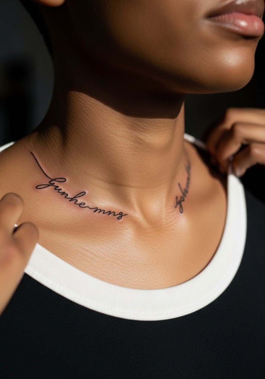
A collarbone sweep hugs bone and shows beautifully with open necklines. Ask for a gentle curve that follows the clavicle rather than a straight line across it. Pain is medium because the needle skips over bone, and sessions are often under an hour. The common mistake is placing the phrase too close to the bone where lines can look shaky. At six months it photographs well, at two years thin strokes may need a light touch-up. Pair this with an open-neck blouse to reveal the script without over-accessorizing.
5. Side Rib Script
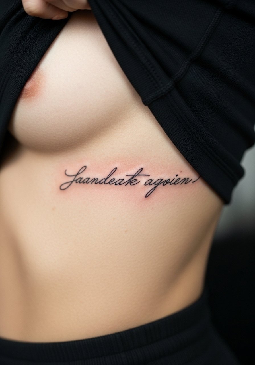
Ribcage script looks intimate and elongates the torso. Fair warning, the ribs are commonly a 7 to 9 out of 10 on pain scales. Artists split over fine line here. One camp argues the skin stretch and movement cause lines to blur within two years. The other camp insists that with careful spacing and reduced needle passes, fine line holds. If you choose ribs, ask for increased letter spacing and fewer passes. The session will be long and require breaks. At six months the script can look perfect, at two years thin strokes may soften, and you should plan for a touch-up if you want crisp lettering. Wear a zip-front sports bra for the appointment.
6. Vertical Spine Script
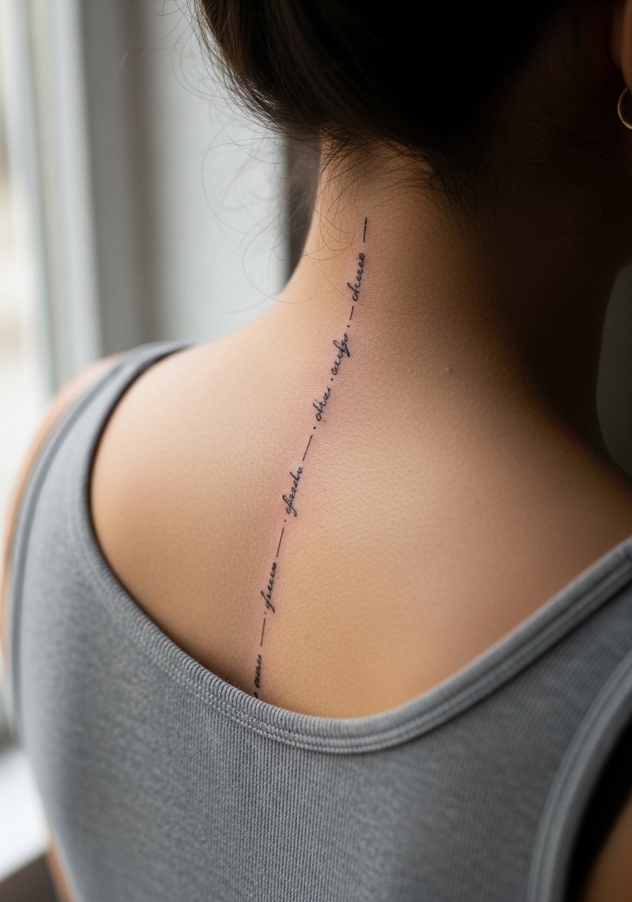
A vertical spine script reads dramatic on open-back dresses. Tell the artist how long you want the line and whether you prefer tall narrow letters or a compact block. Pain is moderate to high along the spine, and sessions may split into two short visits. Common mistakes include lettering that does not follow the spine's natural curve. At six months the script settles, at two years signs of softening appear depending on aftercare and sun. For evening looks, an open-back midi dress highlights the vertical layout without competing.
Studio Day Picks
Those rib, sternum, and collarbone sessions above demand different prep than a forearm piece, so a few targeted items smooth the session and early healing.
- Stencil transfer paper kit. Lets you preview spacing on the actual skin, which matters for script that wraps contours like ribs and collarbone.
- Thin protective film roll. Keeps delicate script clean during the first week on hands and wrists where friction is constant.
- Cooling gel pack. Useful after long spine or rib sessions to reduce swelling and soreness.
- Fragrance-free gentle body wash. Cleans healing skin without stripping the fine needle channels on forearm and chest pieces.
- Aquaphor healing ointment. A thin layer in the first days locks in moisture for fine line work without clogging lines.
7. Ankle Script Loop
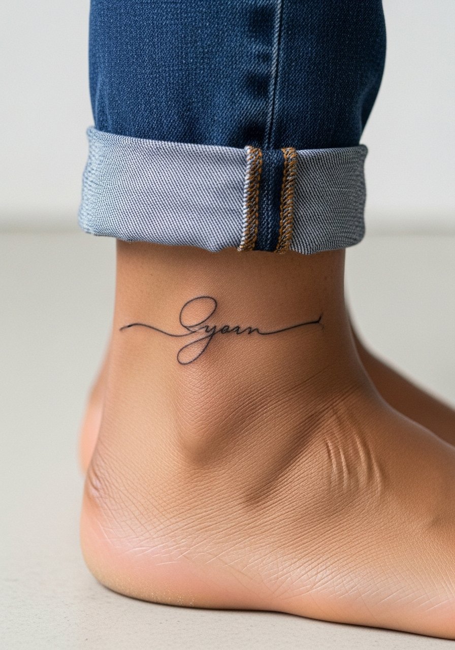
Ankle scripts can look like jewelry and photograph well on sneakers and sandals. Expect a light to moderate sting and quick sessions. The big mistake is placing text where shoes rub, which accelerates fading. Ask for slightly bolder line weight for the lower leg to resist abrasion. At six months details hold, at two years expect thinning in the thinnest strokes if you wear ankle straps constantly. Style it with minimal leather sandals that reveal the script without constant friction.
8. Side Riblet Script Below the Bust
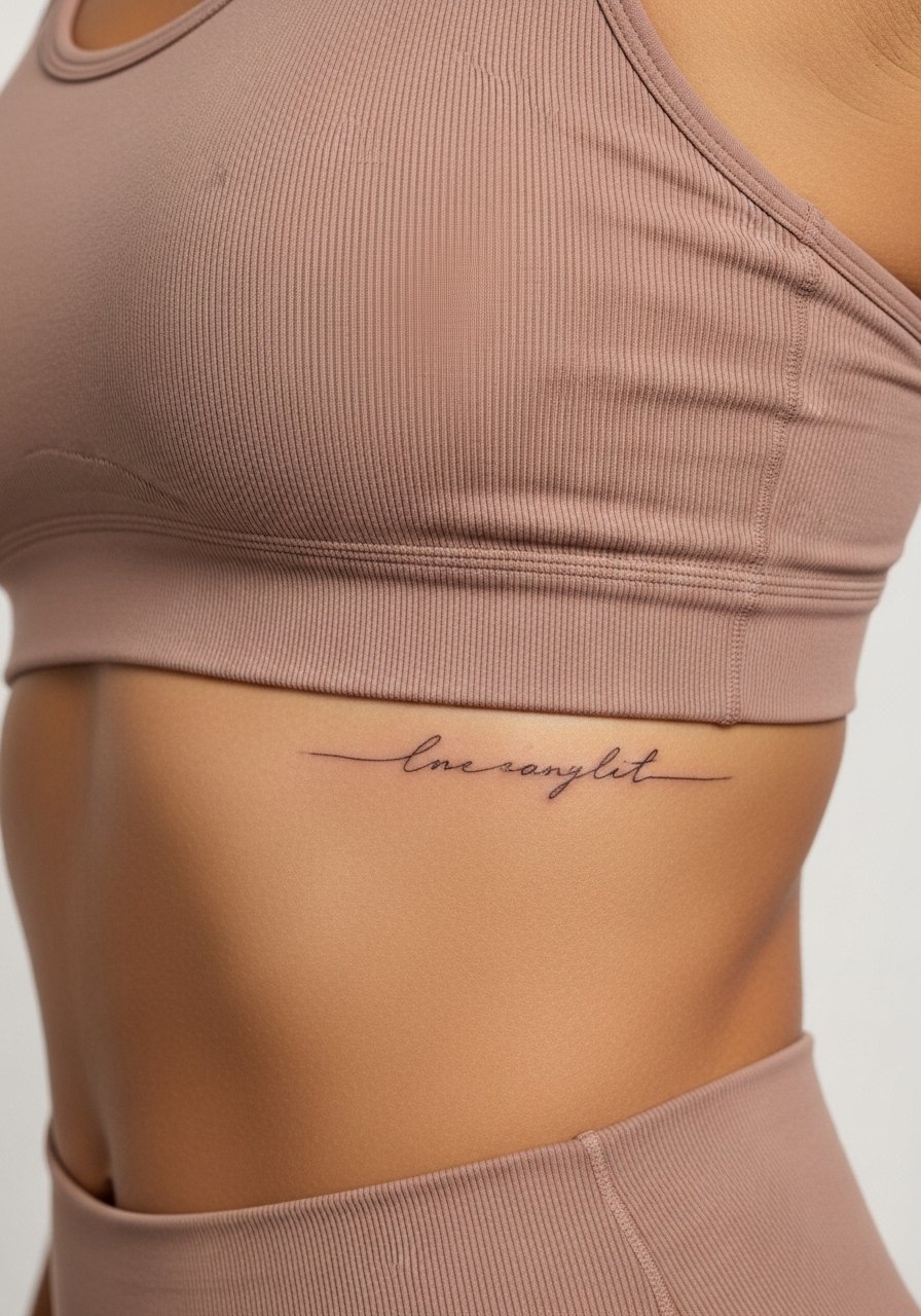
This tucked placement reads discreetly under swimwear and crop tops. The session is painful and requires steady breathing. A common error is trying to cram long phrases into a narrow arc. Ask your artist for a curvature mock-up so letters follow the body. At six months lines are usually clear, at two years the thinnest strokes can feather due to skin stretch. For session comfort, wear a zip-up top you can remove without twisting.
9. Inner Finger Mini Script
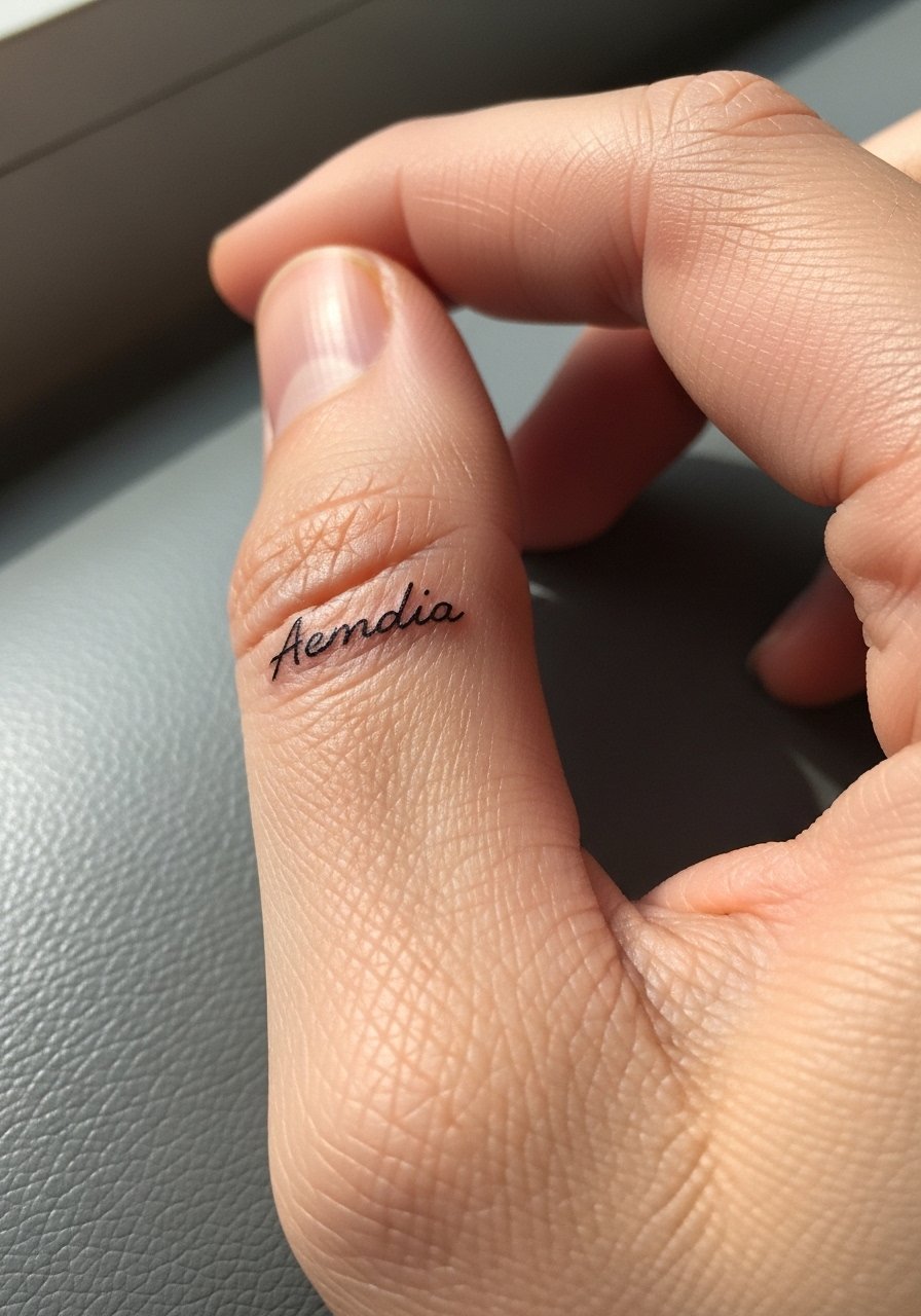
Inner finger text ages fast because of skin renewal and constant washing. Expect frequent touch-ups. Tell your artist you understand this will likely need a yearly refresh and ask for slightly heavier strokes to start. At six months the ink may look faint, at two years it often blurs into the soft tissue of the finger. A common mistake is assuming inner finger work behaves like wrist ink. Keep the phrase short here and avoid complex lettering.
10. Ankle Chain Script Accent
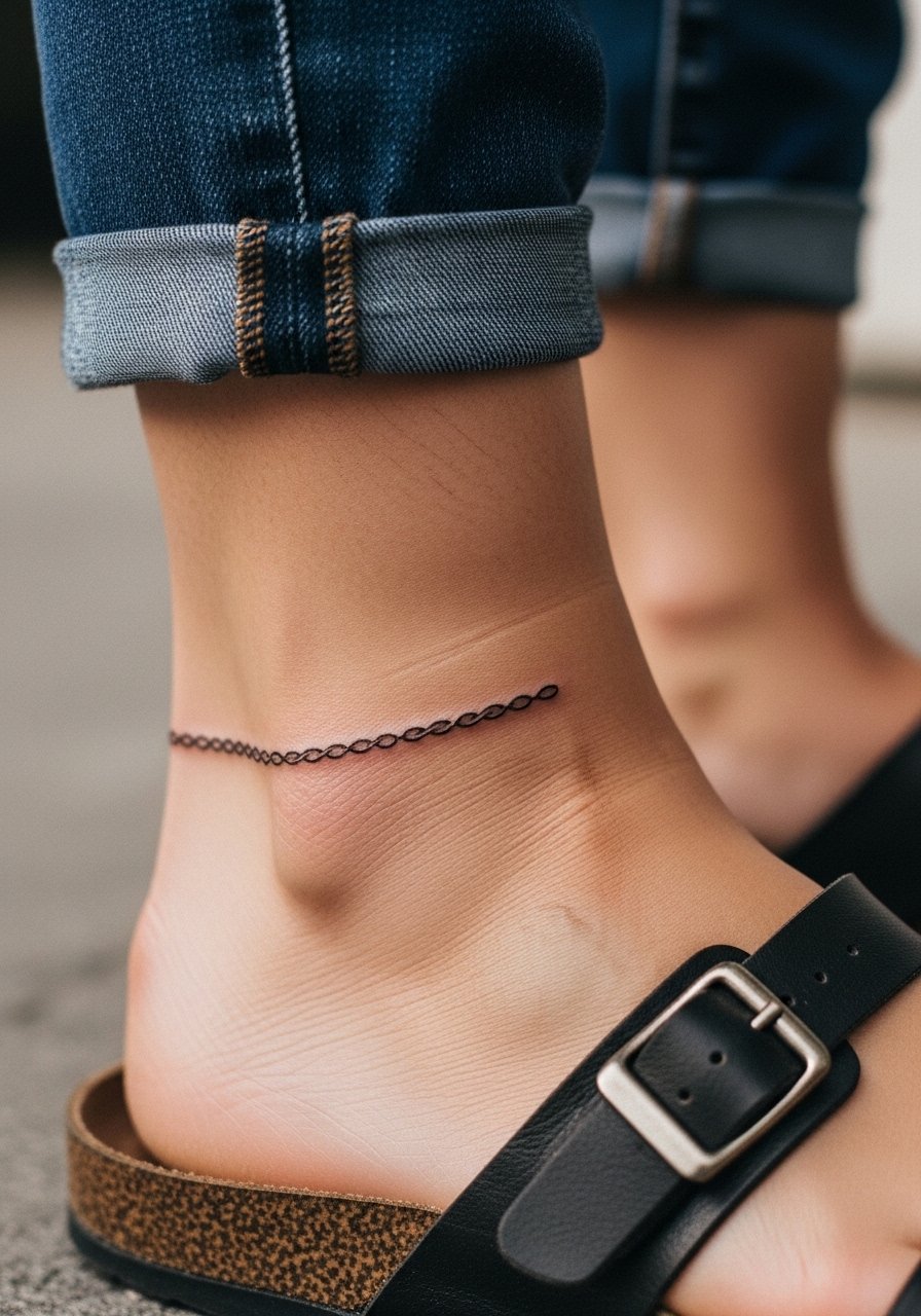
A chain-style script pairs well with ankle jewelry and low-profile footwear. The ankle takes light sessions and tolerates mid-range line weight. Ask for spacing that complements small anklets and for the letters to read horizontally rather than bowed. At six months the detail holds if abrasion is minimal, at two years expect the lightest connections to fade. Pair with delicate ankle chains that echo the linework.
11. Outer Bicep Flow Script
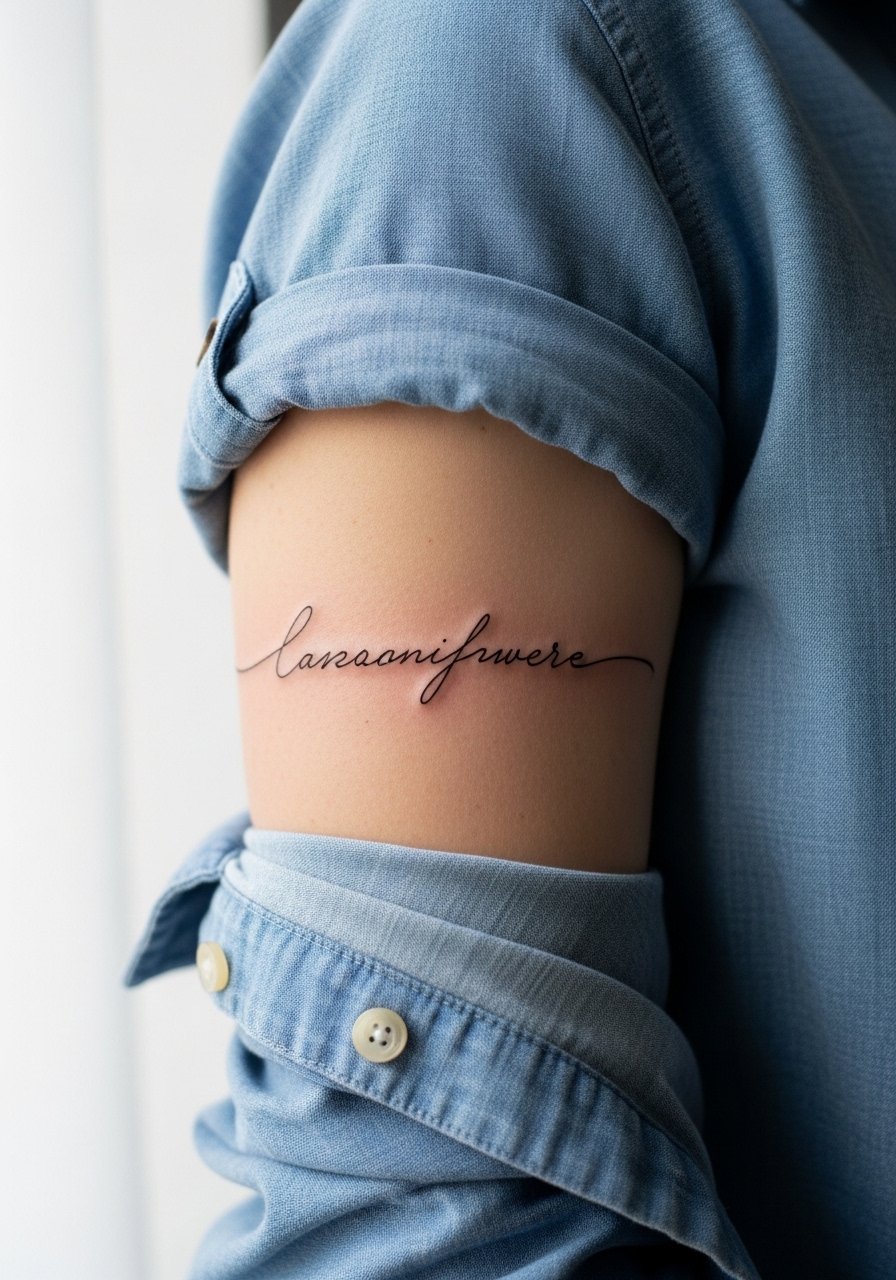
Outer bicep pieces sit where muscles change shape with movement. Ask the artist to place letters along the muscle line so the phrase reads at rest and in motion. Sessions are comfortable and often done in one sitting. The common mistake is ignoring the muscle contour which can stretch letters when flexing. At six months the piece still looks clean, at two years it softens but generally holds well. For showing it off, roll a loose button-down shirt to mid-forearm and let the bicep peek free.
12. Upper Thigh Curved Script
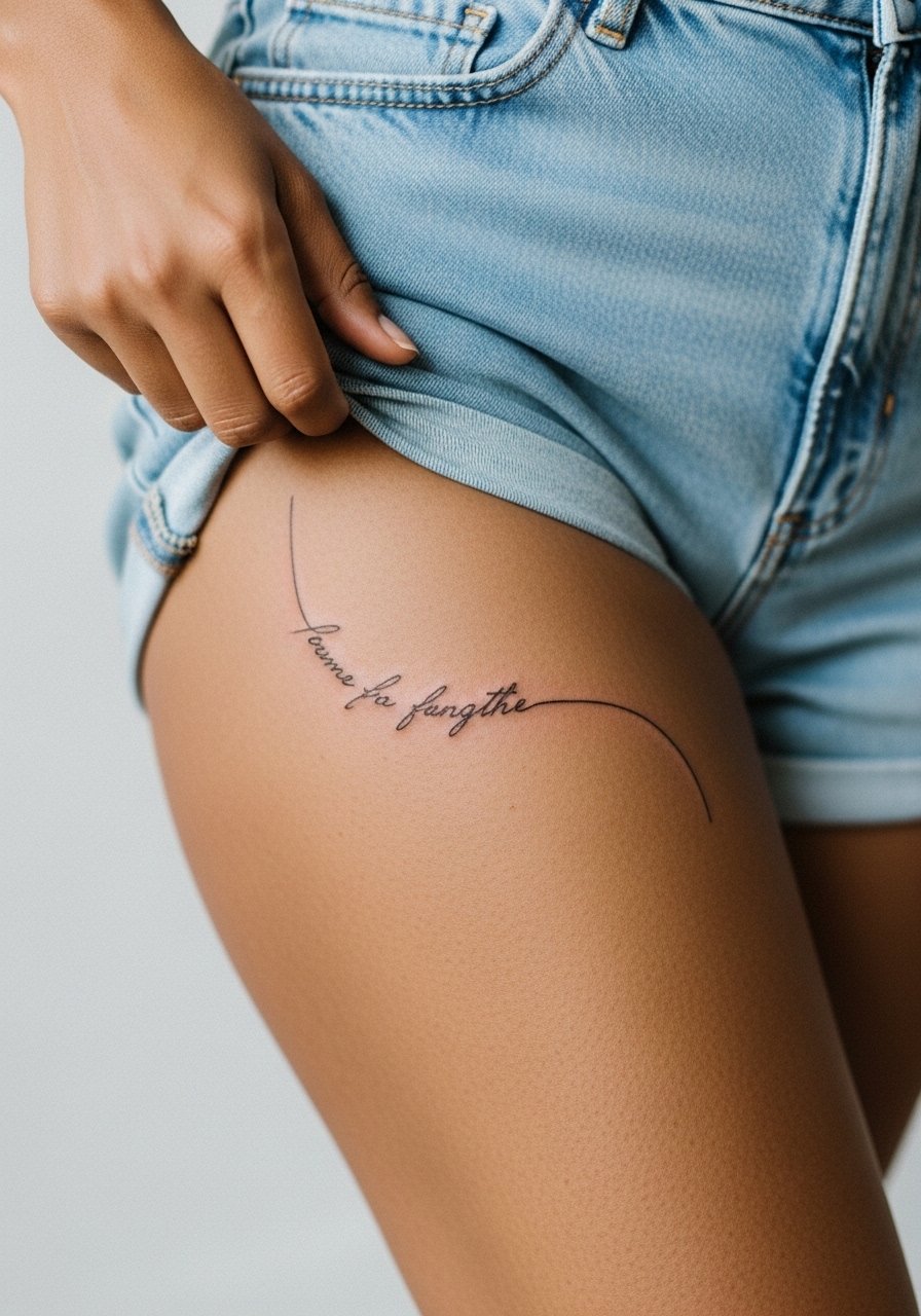
Upper thigh placements are intimate and age well because they see limited sun exposure. The session feels tender but manageable. Tell your artist if you prefer the phrase to curve with the hip or sit straight. A common error is placing text too close to the groin where fabric rub accelerates fading. At six months the script looks crisp, at two years it often only needs a light refresh. Wear loose shorts for the appointment so the artist can access the area without pressure.
13. Foot Arch Script
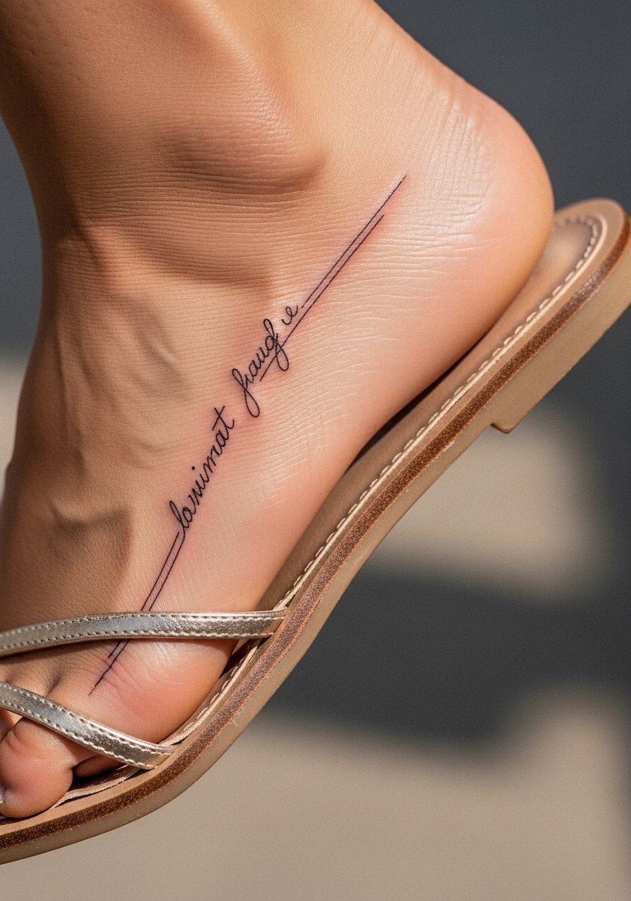
Foot tattoos deal with friction from shoes and frequent washing, so expect more fading. Ask for slightly deeper saturation and allow for a two-step session if needed. The typical mistake is ignoring shoe wear and choosing placement that sits where straps rub. At six months the script may be faint, at two years touch-ups are common. For showing it off, choose low-profile slide sandals that leave the arch unobstructed.
14. Behind-the-Ear Mini Script
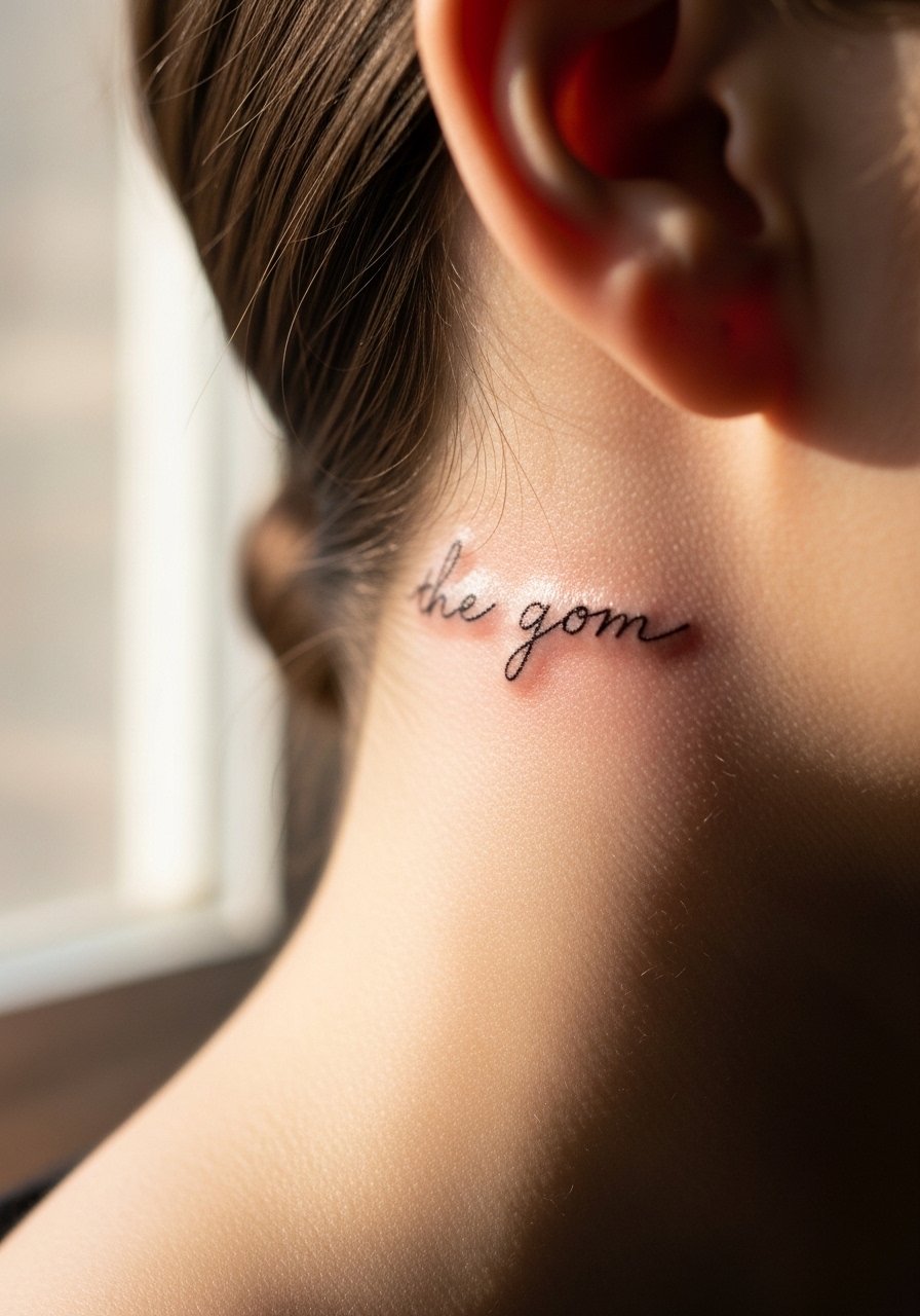
Behind-the-ear work is discreet and heals quickly if kept clean. This area requires an artist experienced with small curves because the skin there is delicate. The usual mistake is making letters too tall for the tiny canvas. At six months it photographs nicely when hair is up, at two years fine strokes may fade so plan for a touch-up if you frequently shampoo. Wear your hair up for the session and bring a hat for aftercare.
15. Clavicle Corner Script Accent
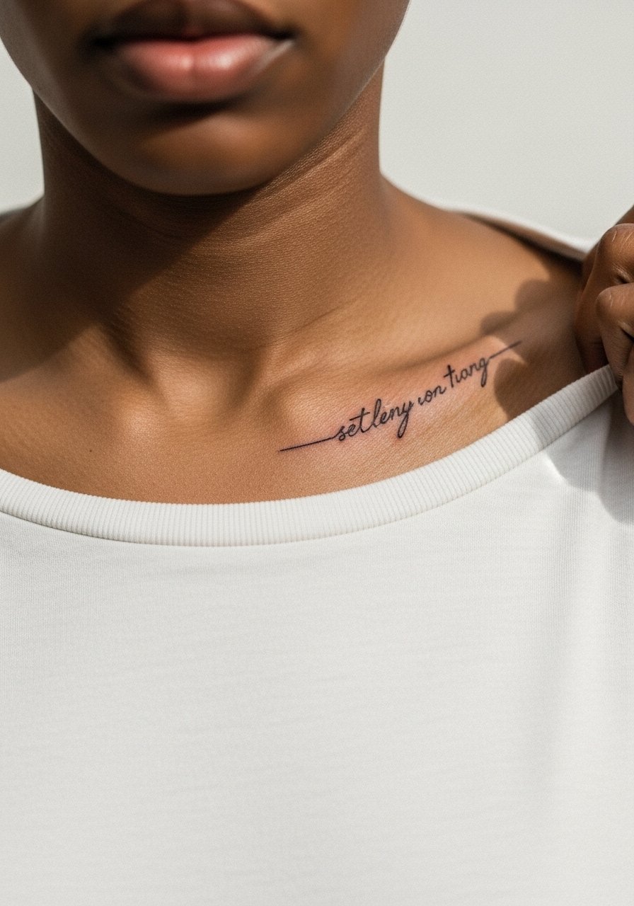
Small accents near the clavicle read elegant with off-the-shoulder tops. Ask for a low-contrast approach so the letters do not compete with jewelry. Pain is mild and sessions are short. A common mistake is placing the phrase where necklaces will sit directly on top of it. At six months the script remains crisp, at two years thin strokes may require a light touch-up. For evenings, an off-the-shoulder top frames the piece without covering it.
16. Inner Bicep Script Bar
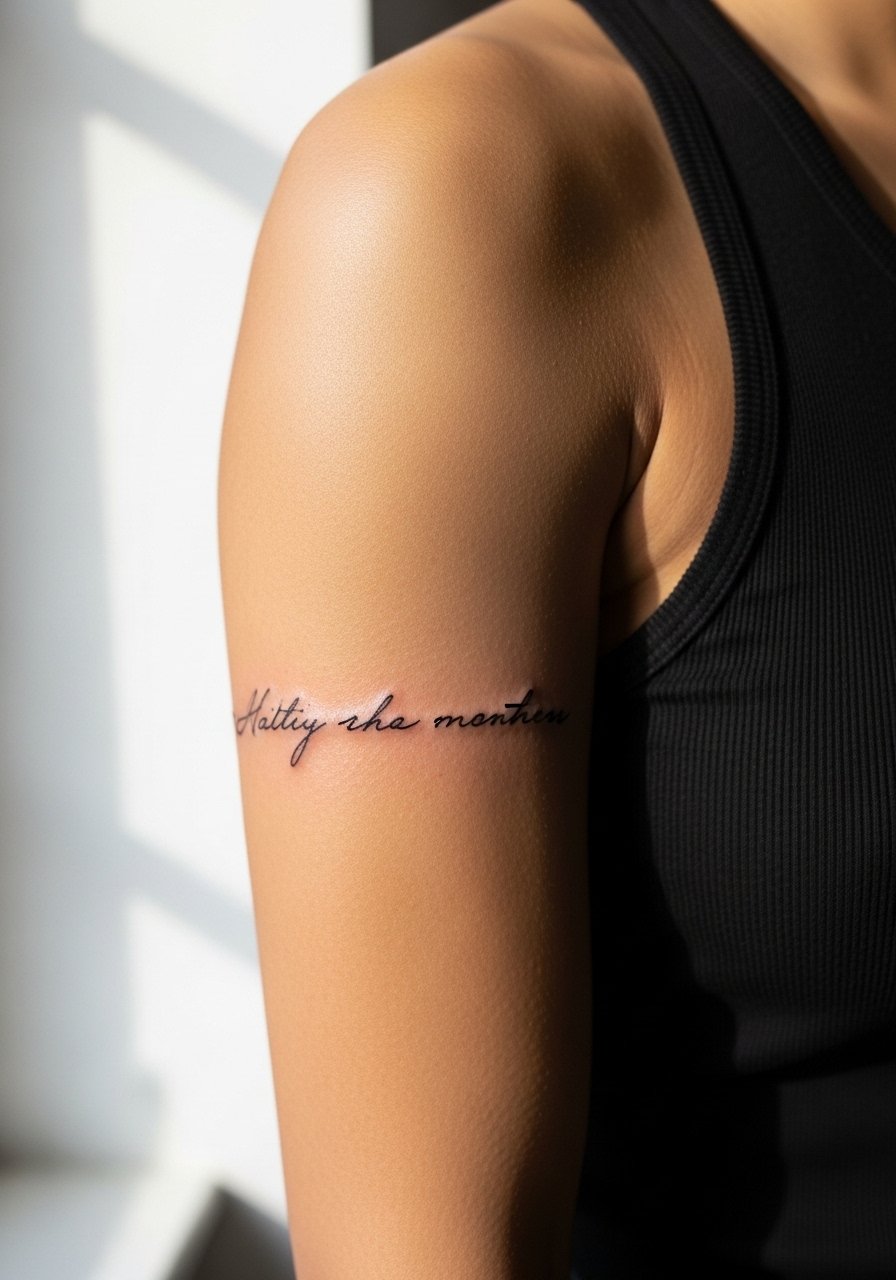
Inner bicep text sits in a soft area that tends to hold detail if spaced well. The session is sensitive because of thinner skin. Tell the artist you want shallow passes and increased spacing for longevity. A typical mistake is using overly ornate calligraphy that clogs as it heals. At six months detail is readable, at two years expect some softening in the thinnest strokes. For the appointment, bring a loose tank so the artist has clear access without you becoming cold.
17. Rib Flank Short Quote
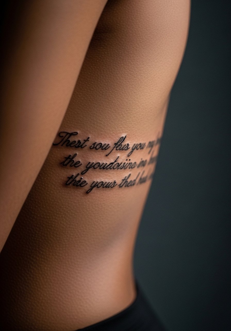
Rib flank text looks dramatic when placed vertically or diagonally. Sessions are painful and often need breaks. Artists split on the area for fine line. One group warns that repeated breathing stretches the skin and blurs tiny strokes. The other group points to careful spacing and low pass counts as a fix. If you proceed, ask for a mock-up that follows your body line. At six months the piece can be crisp, at two years expect some feathering. Wear a zip-front top to the appointment for easy access.
18. Side-of-Neck Horizontal Script
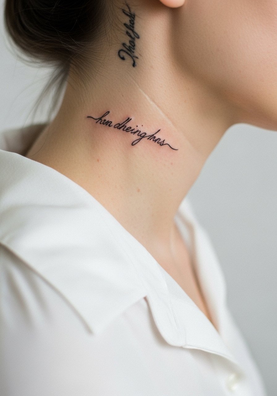
Neck work is visible and career-sensitive in some fields. The area accepts fine line but demands bold planning. A common mistake is ignoring how shirts and collars rub the area. At six months the script photographs well, at two years sun exposure and friction make the thinnest strokes vulnerable. If you plan for visibility, discuss career implications with your artist and ask about slightly heavier anchor strokes. For showing off, a wide-neck sweater frames the text without rubbing.
19. Back of Hand Single-Line Script
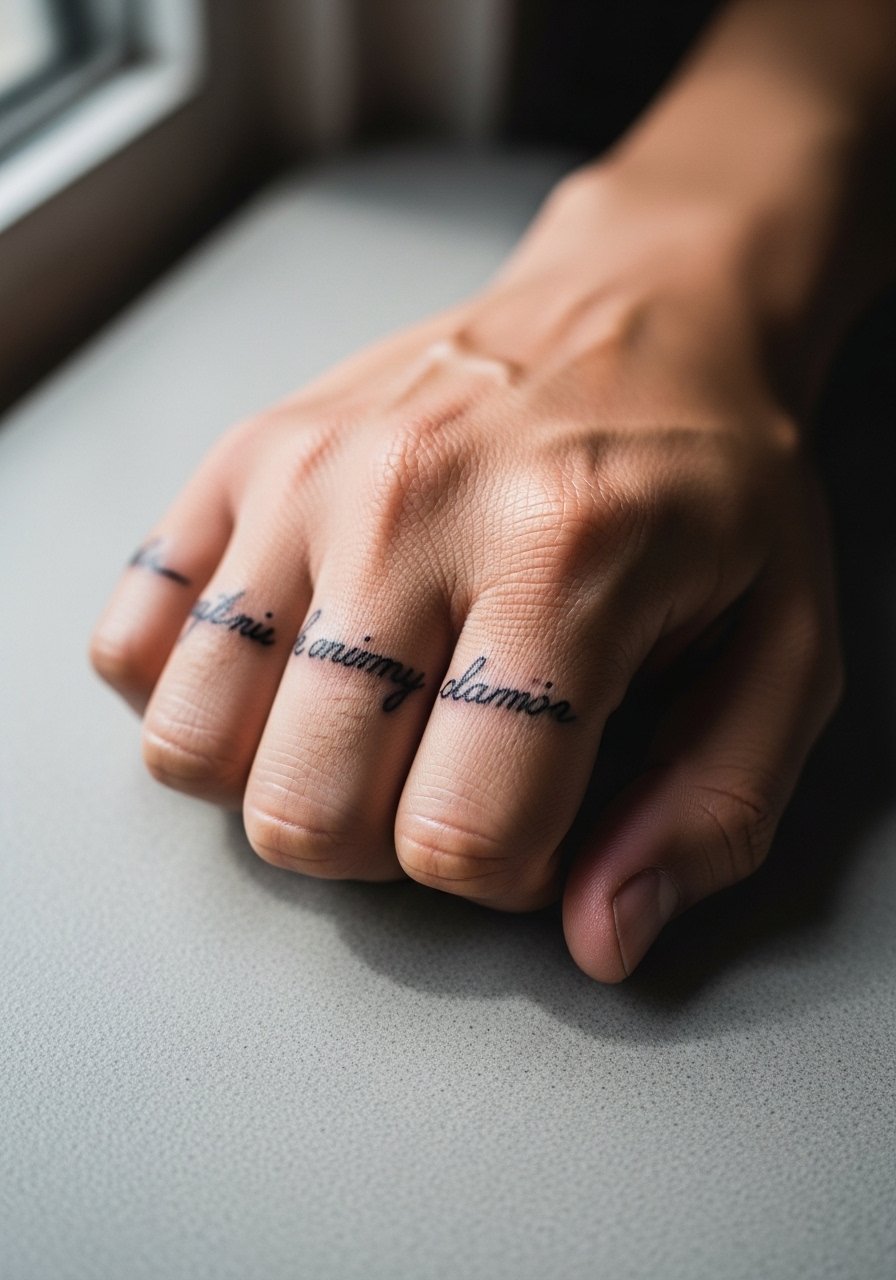
Hand tattoos are highly visible and often the subject of debate. One camp says hands fade fast because of constant washing and sun, leading to frequent touch-ups. The other camp argues certain inks and more deliberate depth help them last. Expect daytime fading and possible employment considerations. Ask about touch-up frequency and be ready for annual refreshes. A common mistake is assuming fine single-needle strokes will behave like arm work. Keep letters bolder than you think.
20. Shoulder Cap Script Curve
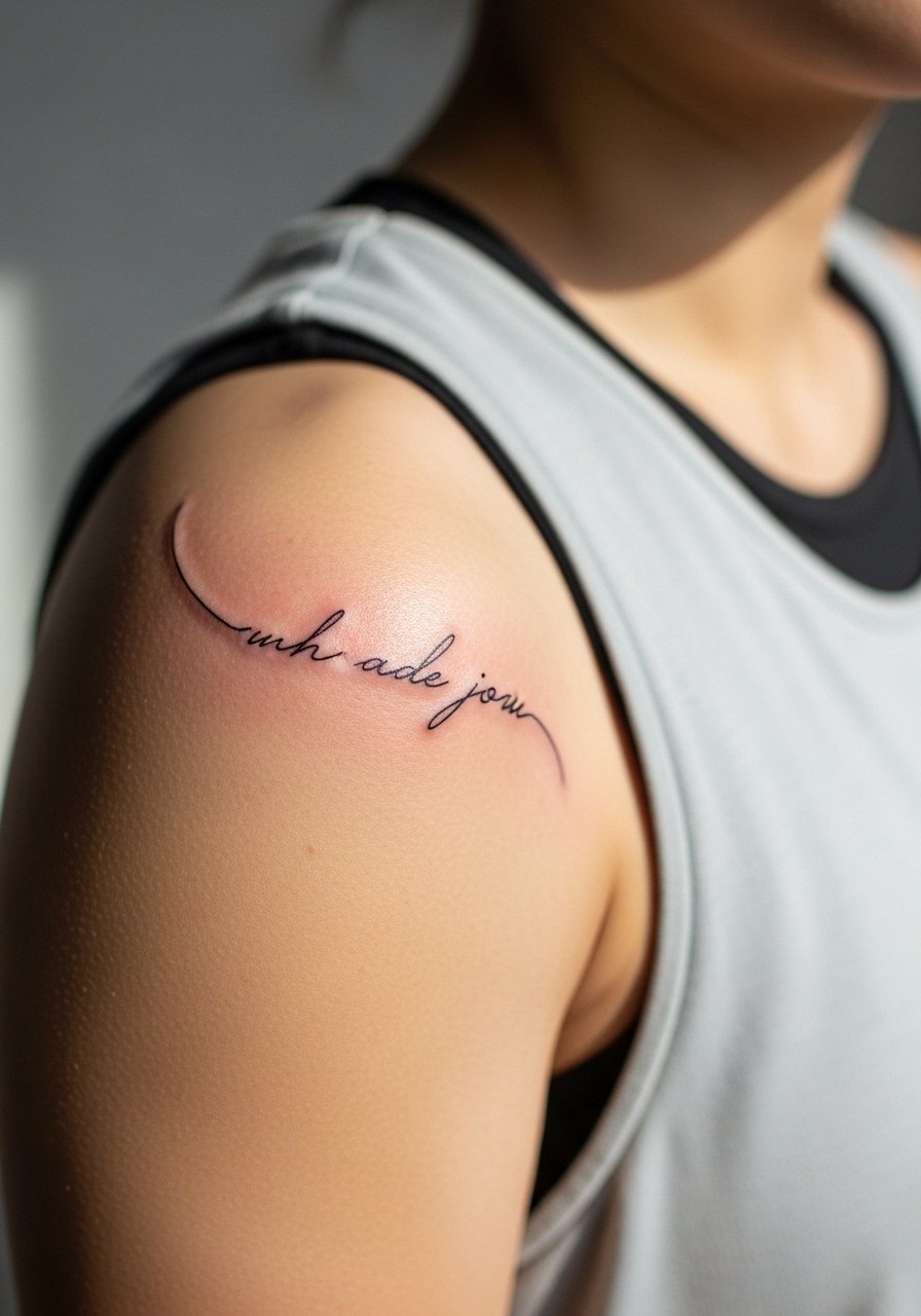
Shoulder cap placements photograph well with sleeveless tops and hold detail because skin there is stable. Sessions are comfortable and often done quickly. Tell the artist whether you want the phrase to curve with your deltoid or sit across the cap. A classic error is misaligning the curve so letters distort when you move. At six months the piece remains legible, at two years it rarely needs anything beyond a light refresh. For casual outfits try a racerback tank that reveals the cap.
21. Center Chest Short Script
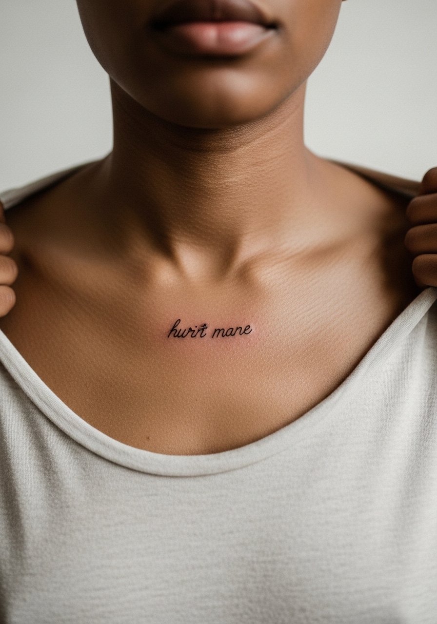
Center chest script is bold in a small area and shows well with open shirts. Sessions feel moderate and require steady breathing. A common mistake is placing text too low where bra straps or jewelry interfere. At six months the piece looks balanced, at two years thinnest strokes may feather. Wear a top you can shift aside easily to avoid disrupting the stencil during application.
22. Lower Back Horizontal Script
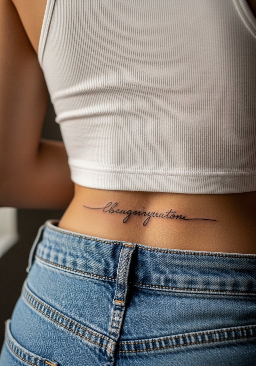
Lower back script sits just above pant lines and ages quietly if covered from sun. Sessions are tolerable and often short. The mistake is placing wording where waistband constantly rubs. At six months lines typically hold, at two years friction may lighten edges. For beach looks, pair with high-waisted swimwear that keeps the tattoo protected yet visible when desired.
23. Calf Vertical Script
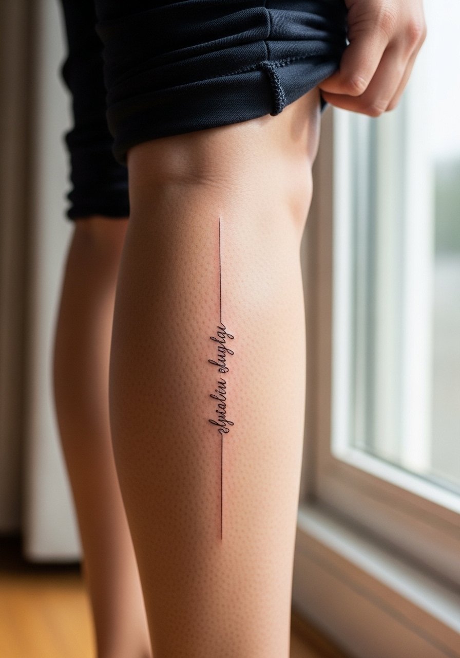
Calf placements weather well because they avoid constant sun for many people. Vertical scripts here can span longer phrases without distortion. Mention how the letters should align with muscle lines during consultation. Sessions feel moderate and can finish in one visit. The common mistake is ignoring boot and sock lines that might rub the area. At six months the piece holds, at two years expect minimal softening. For daily wear, a loose drawstring linen pant is easy to roll up for showing the design.
24. Outer Wrist Script Wrap
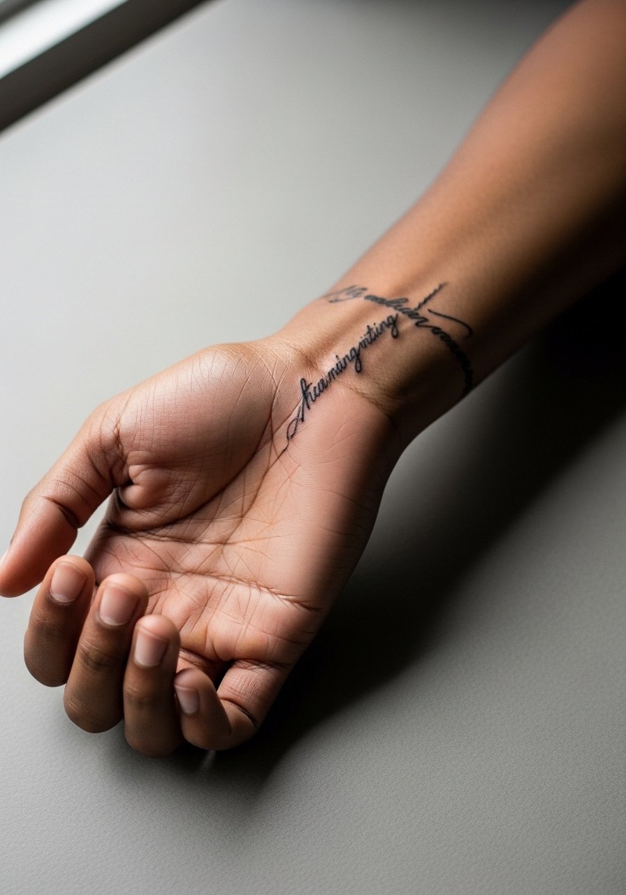
Outer wrist wraps are visible and photograph easily. The frequent mistake is making the wrap too tight so letters sink into the crease. Ask for a small gap at the wrist joint and slightly bolder anchors at the start and end of the phrase. Sessions are quick but the area gets a lot of sun, so expect slower fades. At six months it looks clean, at two years plan for a light touch-up. Style it with a minimalist watch that rests just above the script rather than on top of it.
25. Hip Bone Slanted Script
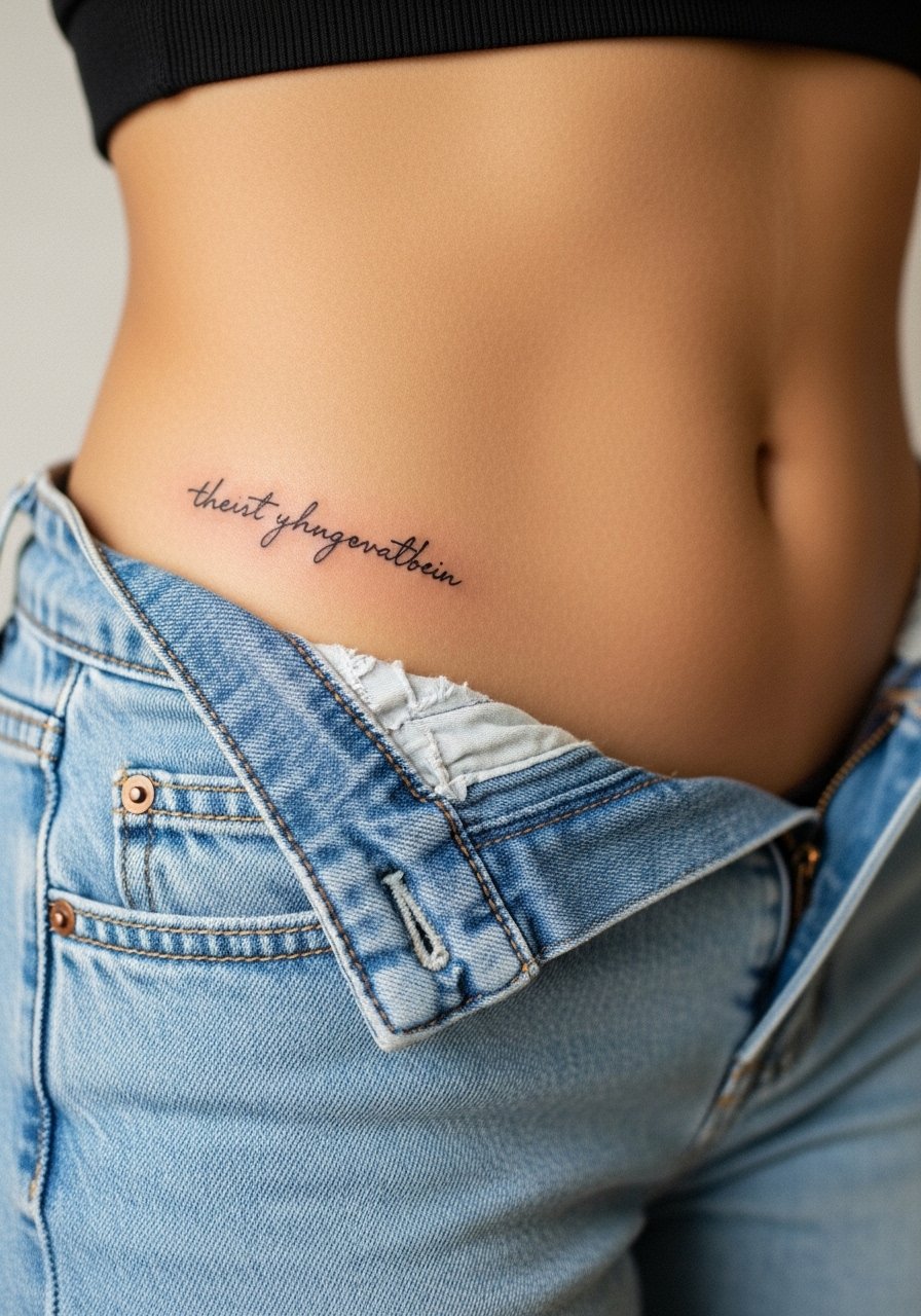
Hip script hides well under clothing and is a low-sun option for longevity. Sessions are moderately painful depending on body fat. A common error is placing the phrase where pant waistbands sit. Ask for a mock-up with your favorite jeans so placement avoids constant abrasion. At six months the piece looks clear, at two years the area typically remains stable. For the appointment choose high-waisted denim so you can reveal only the strip needed.
26. Inner Thigh Vertical Script
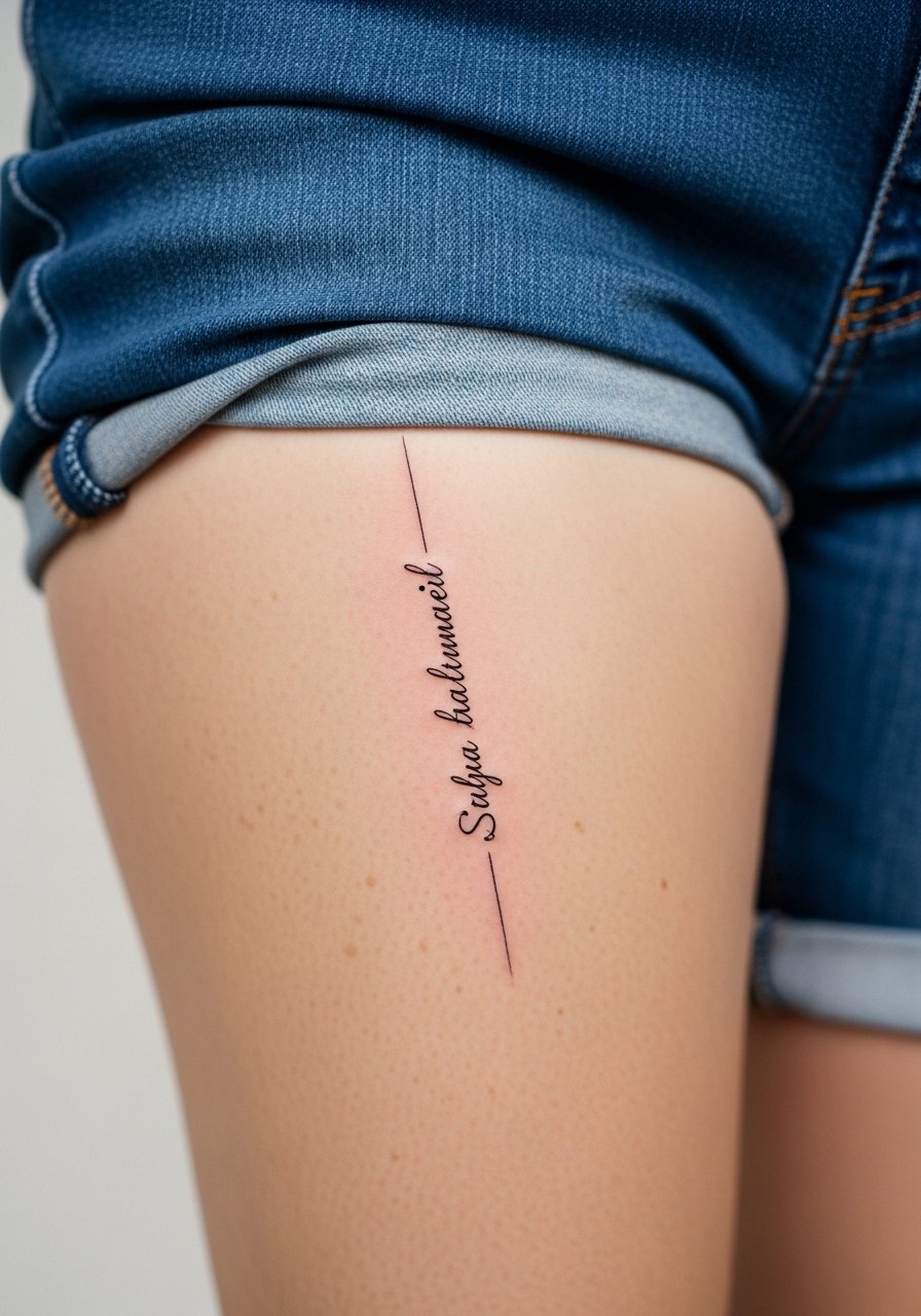
Inner thigh placements are intimate and protected from sun, which helps longevity. Sessions can be sensitive and sometimes require multiple breaks. Tell your artist whether you want the text visible when standing or seated so placement aligns. The mistake is choosing overly ornate lettering that clogs in the soft flesh. At six months the script usually looks great, at two years it often needs only minor refreshing. Wear loose shorts to the session and avoid tight undergarments for the first week.
27. Minimal Script Along the Collar of a Shirt
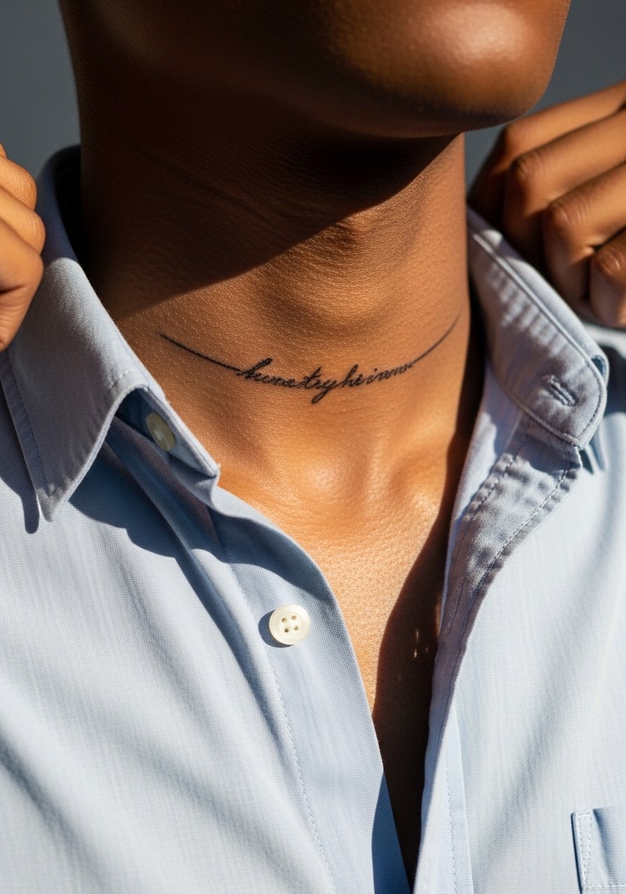
This tiny placement reads like an accessory peeking from a shirt. Sessions are short and tolerable. The usual mistake is not testing visibility with the clothing you plan to wear. Bring the top you plan to style with and ask for placement that sits exactly where the collar opens. At six months the piece photographs well, at two years thin strokes may need a refresh depending on sun exposure. For show-off looks bring a loose button-down shirt that reveals the script subtly.
Frequently Asked Questions
Q: How often do fine line scripts like "Only God Can Judge Me" need touch-ups?
A: It depends on placement and lifestyle. Visible spots like hands and fingers usually need touch-ups every 12 to 24 months. Less exposed areas such as the inner thigh or lower back can go much longer, often three to five years before a refresh feels necessary.
Q: Will a fine line script on the ribs blur faster than on the forearm?
A: Yes, ribs see more stretch from breathing and movement so the thinnest strokes can feather sooner. Some artists avoid super-micro lettering there. If you want ribs, ask for increased spacing and fewer passes to improve longevity.
Q: What should I wear to my collarbone or sternum session?
A: Wear something you can shift aside without pulling at the piece, such as a wide-neck shirt or a zip-front top. For collarbone pieces, an open-neck blouse is handy to preview placement and to avoid rubbing the fresh lines afterward.
Q: Are there career implications for visible script tattoos like on the neck or hands?
A: Some industries are still conservative. Hands and necks are the most visible and might affect first impressions in certain roles. Think about your job and how much visibility you want before committing to those spots.
Q: How does skin tone affect fine line readability over time?
A: Fine line reads differently across skin tones, but technique matters more. Proper contrast, slightly heavier anchors, and thoughtful spacing make script legible on any skin. Bring photos of healed work on similar tones when you consult.
Q: Can sun protection really extend the life of delicate script tattoos?
A: Yes. UV exposure speeds fading and softening of the finest strokes. Regular sunscreen on exposed tattoos keeps lines sharper between touch-ups, especially for forearm and wrist placements.