
Fine line Fear God script keeps trending, but appearances can be misleading. Popular references look crisp fresh, then fade, blur, or need touch-ups by year three. Expect fading from sun exposure, blowout in high-movement zones, and unexpected career visibility with hand or neck placements. Below are 17 minimalist concepts that balance that trend with real-world wear, placement advice, and what to ask your artist in the consultation.
1. Inner Forearm Single-Word Script
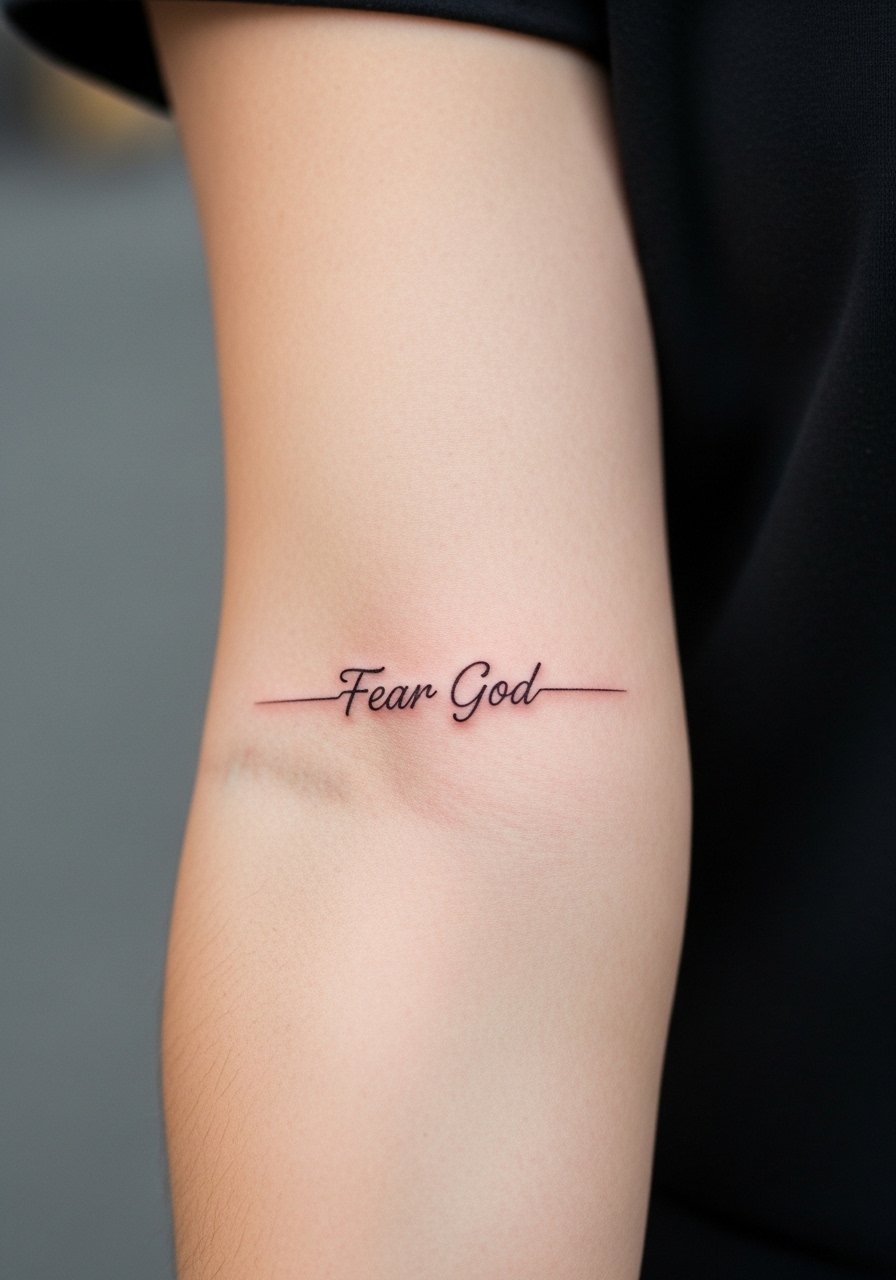
I recommend the inner forearm when you want visibility without overexposure. Fair warning, forearm pieces see daily sun and friction from sleeves so ask for slightly heavier linework than ultra hairline to maintain readability at year three. Tell your artist you want consistent linework and a touch-up plan at year two, not a hairline that risks early blurring. Session time is usually under an hour and pain is moderate. A common mistake is asking for tiny lettering that melts together when healed. For the session wear a loose button-down shirt you can roll up without rubbing the fresh ink.
2. Wrist Wrap Script Chain
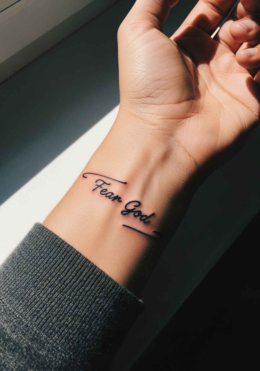
This wrist band concept reads like jewelry when done with crisp linework and careful spacing. The wrist is high friction, so a thin protective film in week one helps, and touch-ups are common around year two. Avoid dense script that circles the wrist too tightly. When you consult, show the exact font size to the artist and ask them to map the spacing around bone contours. The session is short but sensitive. For showing this off, a thin chain bracelet sits above the script without crowding the letterforms.
3. Ribcage Vertical Script
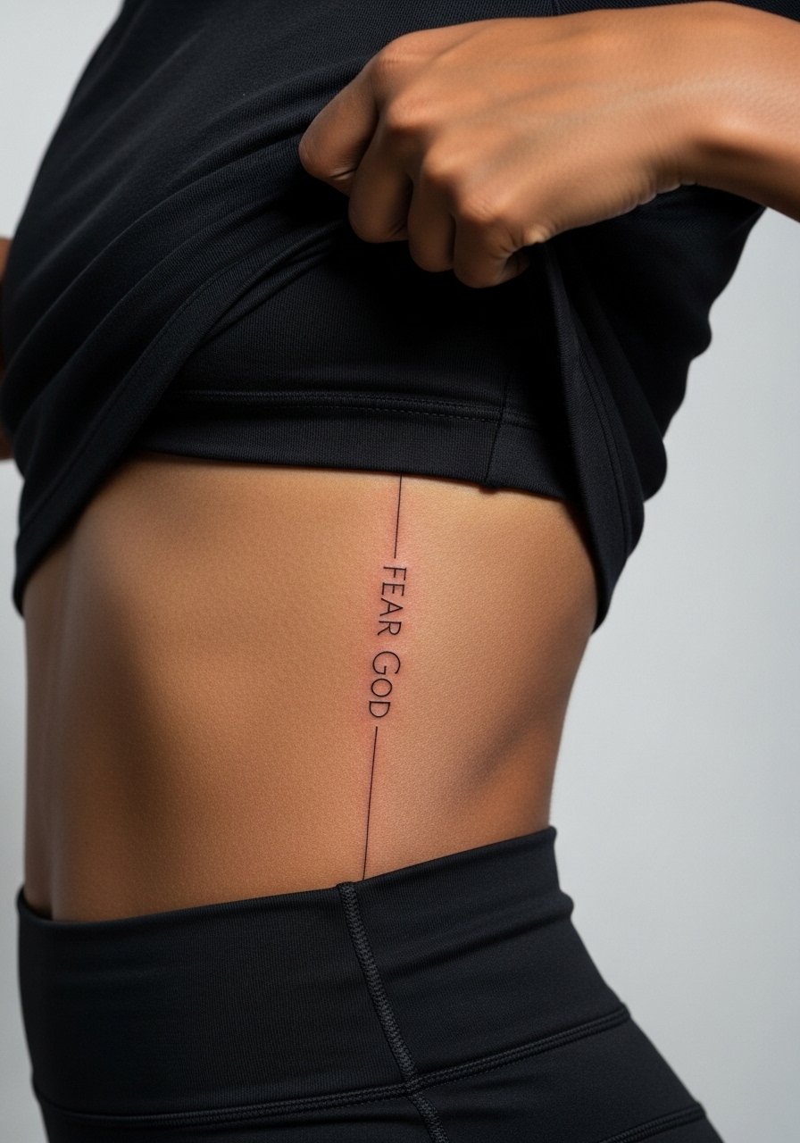
Artists split on ribs. One camp says thin lines blur because the skin stretches, and the other camp argues correct depth and spacing keep fine line legible. Be explicit in your consultation about spacing between letters and ask for slightly bolder lineweight in the first draft. Expect higher pain and a session longer than an hour. The common mistake is squeezing the script into too narrow a column. If you plan lingerie or open sides, remember this placement is intimate and not as visible daily, so treat it as a personal statement rather than a constant show-off piece.
4. Collarbone Edge Script with Micro Dot Accents
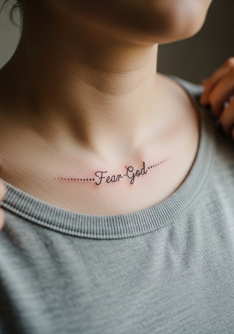
The collarbone presents an elegant frame for short phrases. Pain is moderate and you must account for the bone under the skin. Ask your artist for micro dot accents instead of heavy shading so the phrase remains airy. Overworking the area with heavy saturation leads to a blotchy healed look. For session wear, a wide-neck shirt you can shift aside is ideal. This placement pairs well with open-neck garments when you want the script visible without dominating an outfit.
5. Inner Bicep Vertical Script
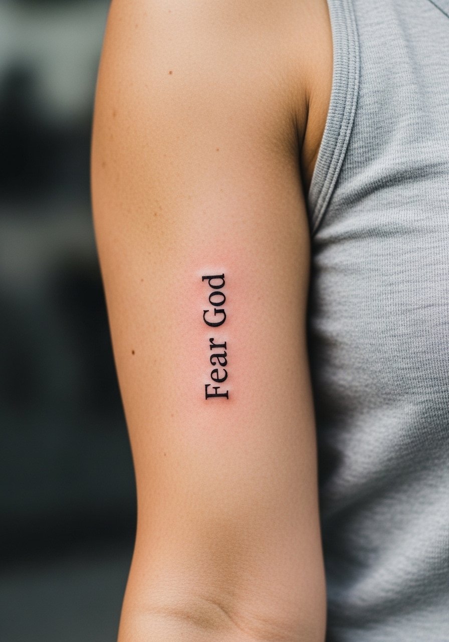
Inner bicep pieces age well if spaced for muscle movement. The biggest mistake is making lettering too tight where arm flexing will distort the word. Tell your artist you want spacing that accommodates flex, and plan for a longer session if the area needs stretching for accurate stencils. Pain is lower than ribs but higher than outer arm. This placement is easy to hide in professional settings. For the session, wear a tank top you can lift without pressure on the site.
6. Side of Finger Mini Script
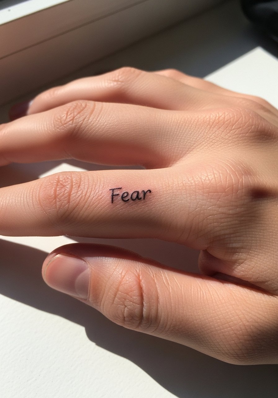
Finger script is a minimalist statement that needs realistic expectations. Fingers blow out faster due to thin skin and constant washing. Expect touch-ups as early as year one. Request slightly bolder linework or negative space around letters. The session is quick but the pain is sharp. A common error is expecting the tattoo to stay as crisp as a forearm piece. Hand and finger work can affect hiring in some industries, so think about career implications before committing.
Before You Book
The wrist and finger pieces above heal differently from larger forearm and rib work, so a few small items smooth the session and the first week.
-
Stencil transfer paper kit. Lets you preview the exact placement and spacing on skin before the needle goes in, which matters for script wraps and collarbone pieces.
-
Topical numbing cream. Applied as directed before rib or sternum sessions it can reduce the sharp edge of pain during longer sessions.
-
Thin protective film roll. Keeps wrist and finger tattoos cleaner during the first week of constant hand washing and friction.
-
Fragrance free gentle body wash. Cleanses healing lines without irritating delicate inked channels, useful for forearms and chest areas.
-
Aquaphor healing ointment. A thin layer in the first few days preserves moisture in fine line work without suffocating the skin.
7. Minimalist Chest Center Script
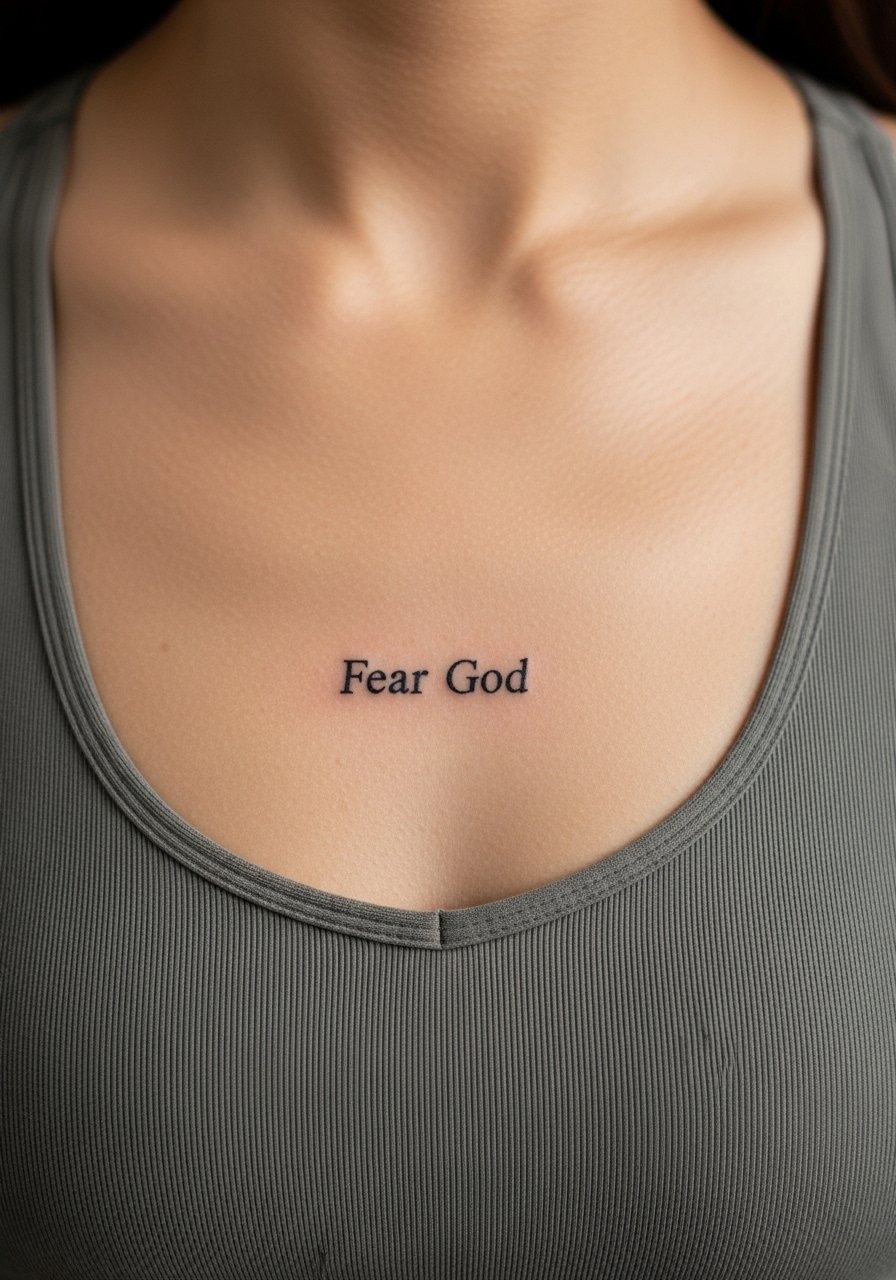
A centered sternum word reads intimate and quiet. The sternum area needs an artist comfortable with chest contours because heavy saturation can scar. Tell them you want a narrow, readable type that sits just above the fabric line. Expect moderate to high pain and a longer session than a wrist piece. The common mistake is squeezing too many letters into a small vertical space. This placement typically requires a specialist familiar with chest anatomy, so look at portfolios and discovery pathways like studio directories and local convention lists rather than just feeds.
8. Ankle Inner Script with Dot Work
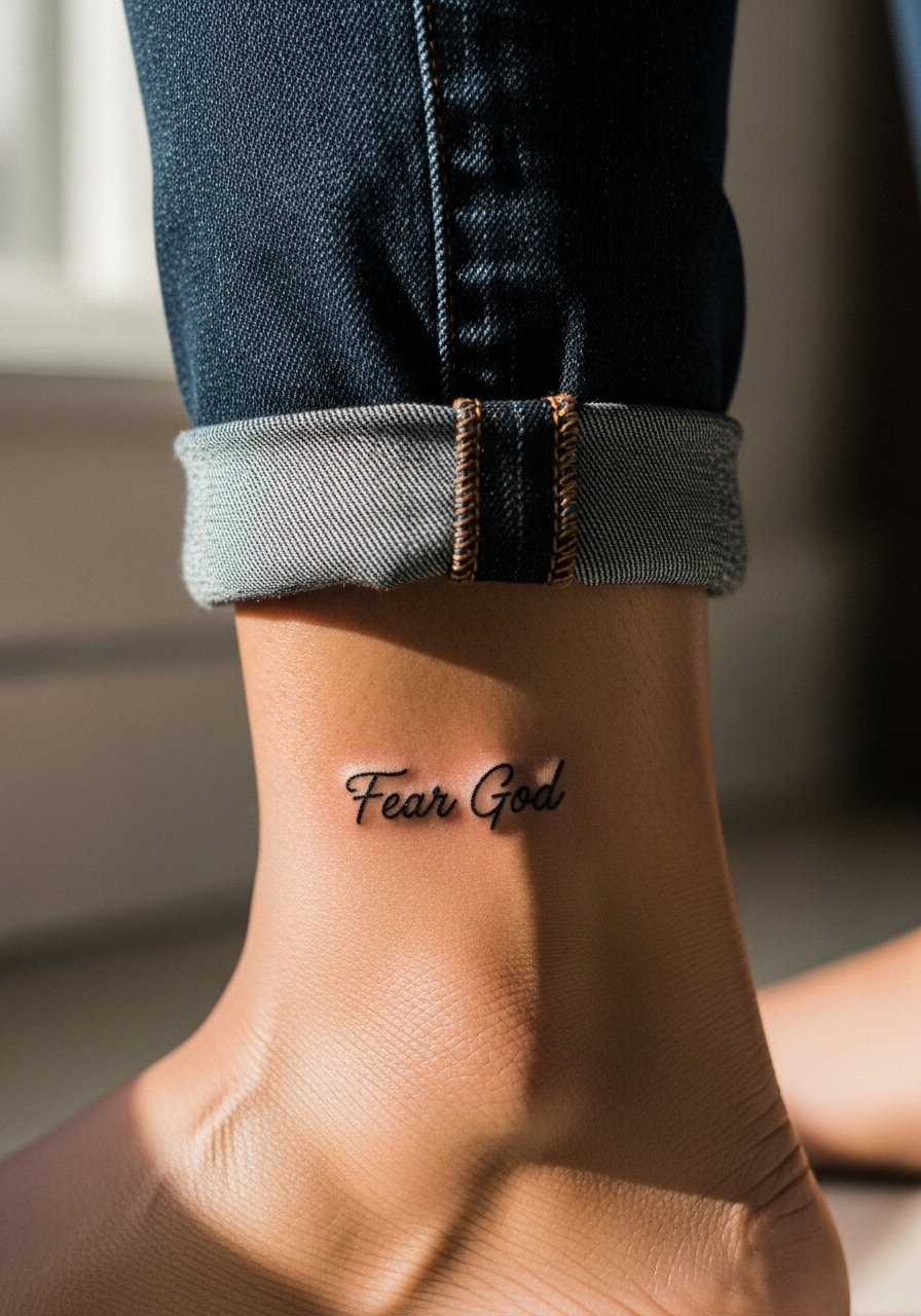
Ankle script reads like a talisman when placed vertically along the inner ankle. The area sees friction from socks and shoes so expect some fading. Ask for slightly bolder initial strokes and plan a touch-up at year two. Session time is short and pain ranges from moderate to sharp depending on bone proximity. For showing it off, rolled-up jeans work well, and a pair of low profile sandals keeps attention on the ankle without covering the linework.
9. Outer Forearm Block Script with Negative Space
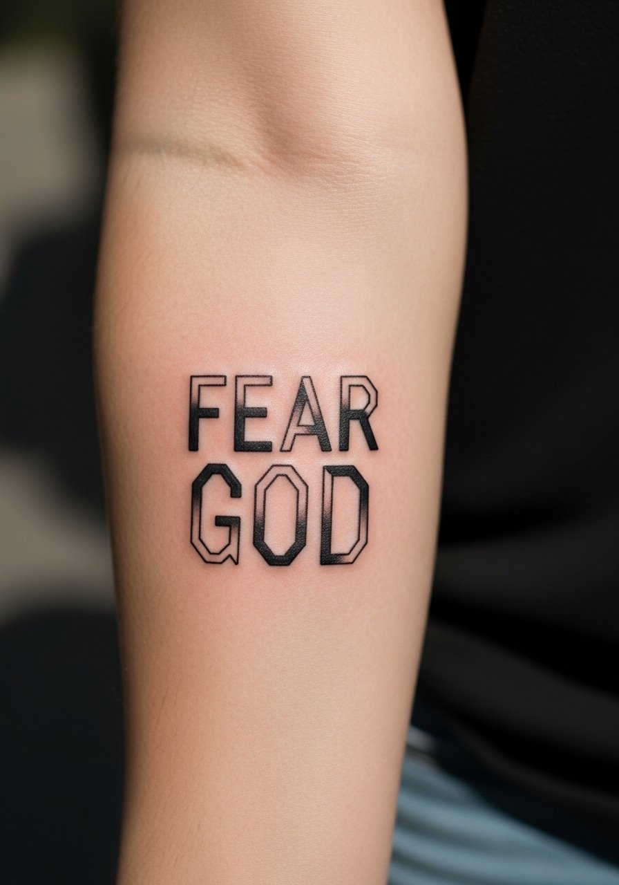
Outer forearm block script gives bolder graphic weight that ages into a clean silhouette. The visual impact is immediate and the saturation helps longevity compared with hairline scripts. Tell your artist you want crisp edges and negative space between letters to prevent merging. A common mistake is over-saturating tiny gaps that then look like one mass after healing. This placement is low pain and shows well with rolled sleeves, so try a casual linen shirt with sleeves rolled to frame the piece.
10. Knoted Rope Script on Upper Arm
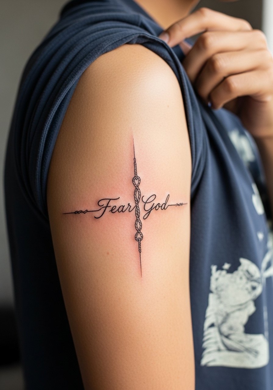
Combining a rope motif with the phrase adds symbolic weight while keeping the design minimal. Upper arm placement tolerates denser linework without risking blowout like hands or fingers. Ask the artist to show a mock-up of knot overlaps so letters do not disappear into the rope. Session is moderate and touch-ups are usually later than for wrist work. For the session wear a short sleeve tee you can shift easily without rubbing the site.
11. Micro-Realism Eye Above the Script
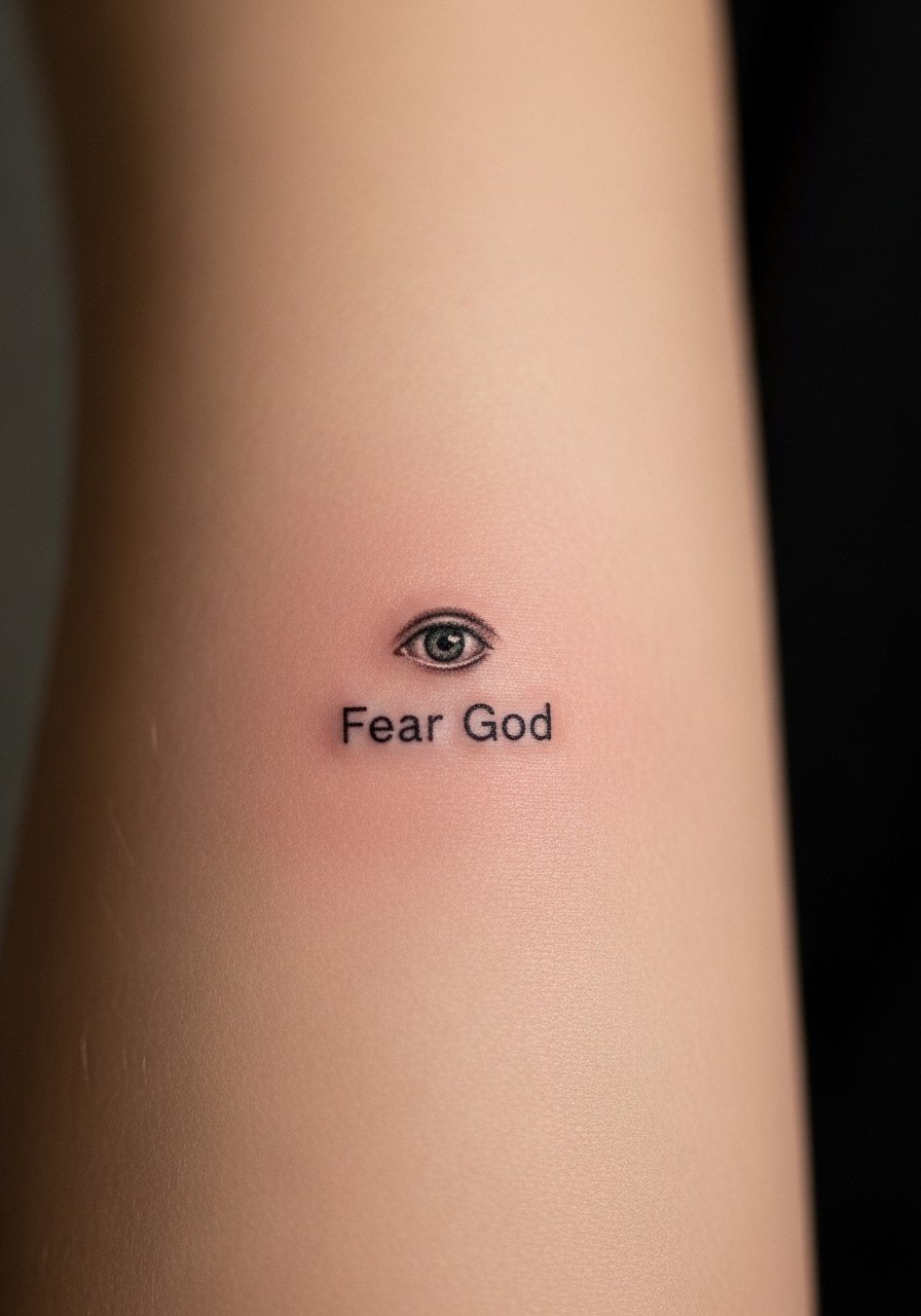
Pairing a small micro-realism eye with the phrase creates a watchful, minimalist composition. The key is scale. Micro details that are too small dissolve into a blur within a couple of years. Tell your artist you want a simplified pupil and linework that reads as an icon from arm length. Session time can be short but careful needle control matters. The mistake is asking for photo-level detail in a piece that is only an inch tall. For showing off, rolled sleeves or cuffed shirts draw the eye without covering the motif.
12. Vertical Spine Script in Narrow Type
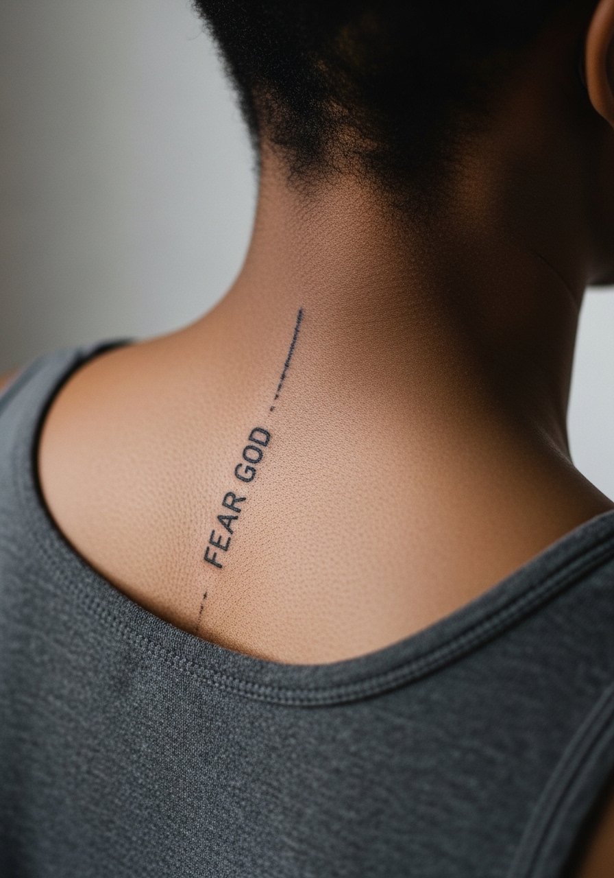
Spine placements require strict attention to alignment. The skin there moves with posture and a narrow type can stretch, so request spacing that accounts for posture changes. Pain varies but the spine can be sensitive in spots. A common error is letting the stencil sit slightly off-center which becomes obvious as the body moves. This placement looks exceptional with open-back garments. For session day wear a button-up shirt you can remove easily without tugging at the back.
13. Subtle Blackletter Accent on Sternum Side
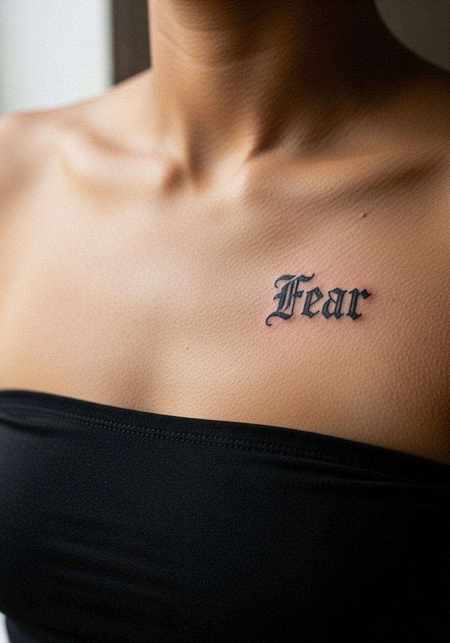
Using a compact blackletter accent gives a nod to script tradition while keeping the overall size minimal. Sternum skin can scar if too much saturation is used, so ask for thin blackletter forms with negative breathing space. The debate exists about blackletter legibility in small sizes. One camp prefers crisp thick strokes, and another prefers simplified forms to preserve readability. Expect a longer session and moderate pain. This placement reads intimate and pairs with strapless tops in special occasions.
14. Minimalist Cross Integration Behind Script
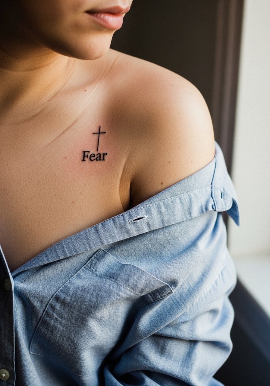
Integrating a tiny cross behind script can ground the phrase visually without heavy symbolism overload. The shoulder holds ink well and ages predictably. Tell your artist to keep the cross small and shy behind the lettering instead of overlapping heavily. A common mistake is using bold crosses that compete with the script. Sessions are short and pain is low. For access during the session wear a loose button-down shirt you can pull aside so the shoulder is exposed without rubbing.
15. Thumb Side Script for a Hidden Reminder
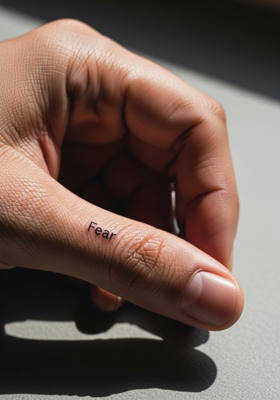
Thumb-side tattoos are private reminders you see in your own hand. They fade faster and face constant abrasion. Ask the artist for a slightly heavier starting weight and plan on touch-ups. The mistake is expecting permanence equal to larger placements. Sessions are quick but the skin is finicky. Think about how this looks in professional settings, since hands are often visible. For showing off when you want to, rolled sleeves or gloves can hide or reveal it as needed.
16. Calf Vertical Script with Negative Space
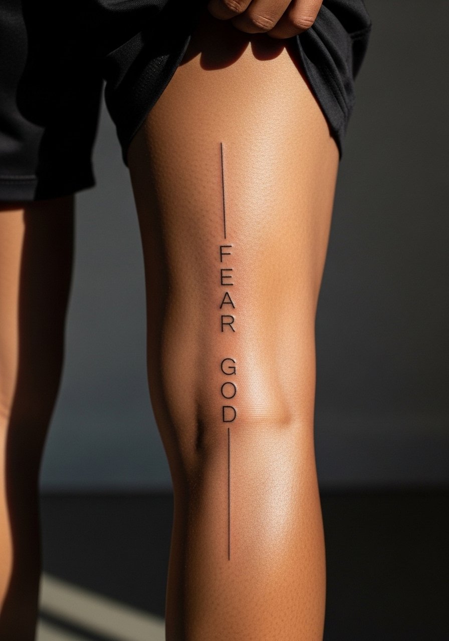
Calf placements age well and tolerate taller lettering because the skin is stable and less exposed to sun if covered by pants. Ask your artist for vertical spacing that follows muscle lines to avoid optical distortion when you walk. Session time is moderate and pain is manageable. A common mistake is making letters too small for the vertical run, which looks crowded from distance. For showing off at warm-weather events, pair with tailored shorts that keep the calf visible.
17. Subtle Neck-Side Script Near Hairline
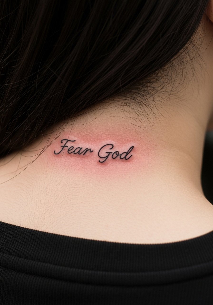
Side-of-neck script reads bold even when small because of proximity to movement and clothing collars. Artists debate neck placement for fine line. One camp warns about early blurring due to constant movement and collars rubbing. The other says with correct depth the lines can settle well. Ask where the artist stands and review healed neck work in their portfolio. Expect higher pain and specialized experience. For session wear, tuck hair back and bring a wide-neck shirt so only the area needed is exposed.
Frequently Asked Questions
Q: How long before a fine line wrist script needs a touch-up?
A: From what I've seen, wrist scripts often need a touch-up around year two or three because of sun exposure and constant hand use. Ask your artist about planned touch-ups during the consult and discuss slightly bolder initial line weight if you want more longevity.
Q: Is it worth doing blackletter tiny on the sternum versus simple script?
A: It depends on readability goals. Blackletter looks striking but can lose clarity at small sizes. If you want that historic feel, ask the artist to simplify letterforms. For clearer long-term legibility, a narrow modern script usually holds up better.
Q: Will a ribcage script blur faster than a forearm script?
A: Ribcage skin moves more with breathing and body shifts, so tiny hairline scripts there are at higher risk of softening. The trade-off is intimacy versus longevity. If you prefer ribs, plan for slightly heavier strokes and a touch-up timeline.
Q: What should I wear to a collarbone or sternum session to make it easy for the artist?
A: Bring a wide-neck shirt or a button-down you can shift aside. That way the artist has clear access and you avoid tugging fabric across fresh lines.
Q: Are hand and finger placements worth it if I want a low-maintenance piece?
A: Hand and finger work is high maintenance. Expect fading and touch-ups often. If low maintenance is the priority, choose inner forearm, calf, or upper arm instead.