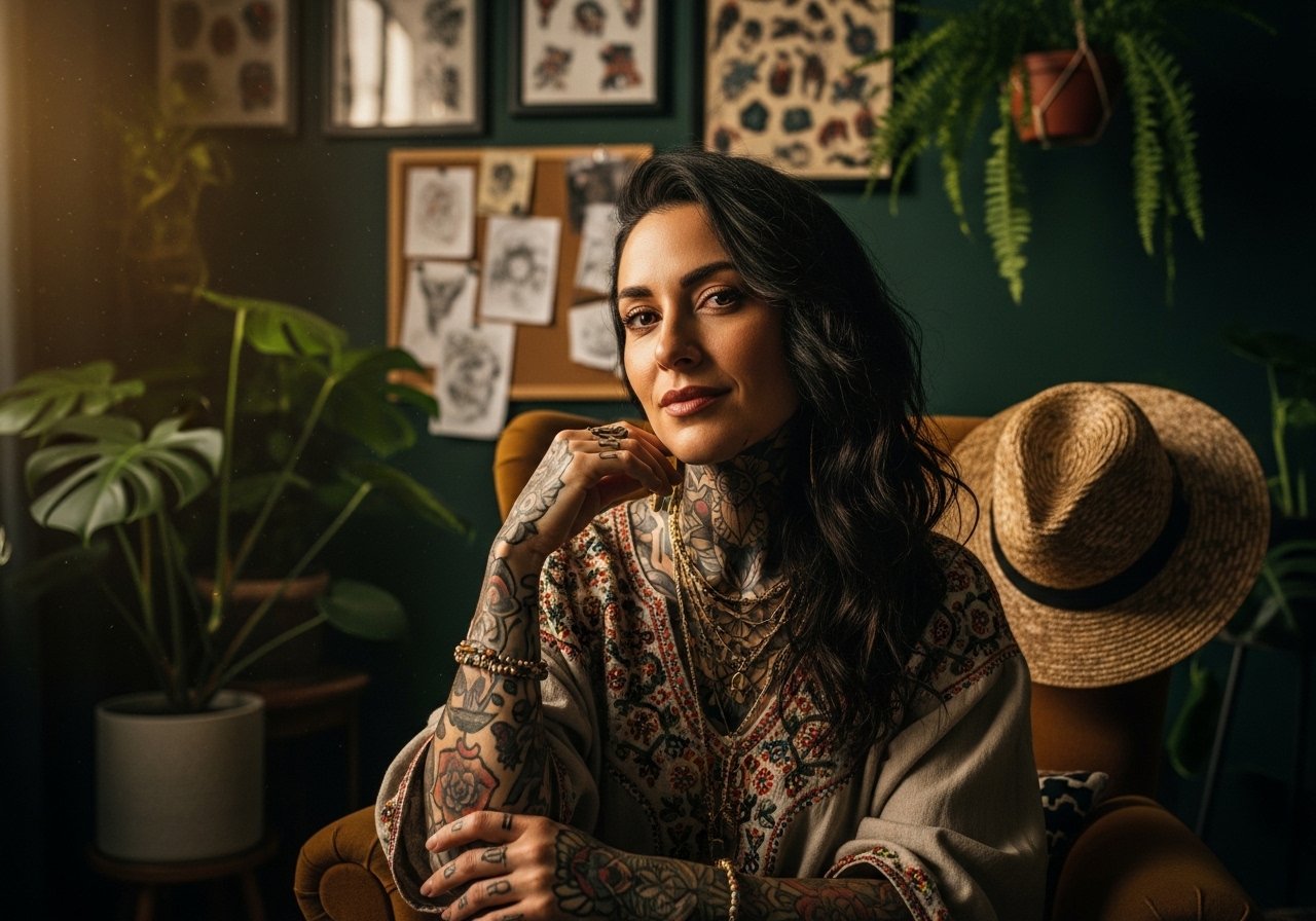
Fine line trends dominate saved boards, but what holds up is not always what looks best fresh. Bold blackwork and solid traditional lettering often read cleaner after five years. Small script can be devastatingly personal the day you get it and frustrating to touch up later. Read these 17 short mottos and placements with practical notes on how they age, what to tell your artist, and how to show them off.
1. We Are Our Choices on Inner Forearm
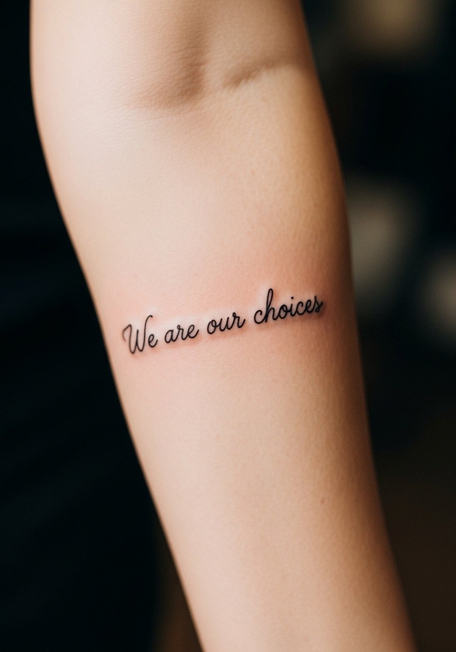
This fine line script is a good fit when you want a readable daily reminder without heavy saturation. I recommend 2 to 4 inches of height so the letters breathe and do not merge as the skin ages. Tell your artist you want slightly stronger line weight than a fashion micro tattoo and ask for reference photos with similar font scale. A common mistake is asking for ultra-thin script for trend reasons. At six months the line will look crisp. At two years expect some softening and plan a touch-up around year three. For showing it off try a rolled cuff chambray shirt with the sleeve rolled so the forearm is framed.
2. Dulce Periculum on Collarbone
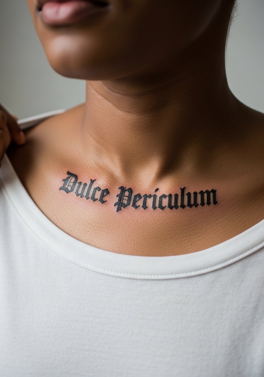
Blackwork Latin on the collarbone reads deliberately rebellious without shouting. Ask for solid black letters with a small baseline flourish and keep the script at about three inches for durability. The collarbone moves when you shrug and stretch, so tell the artist you want slightly bolder strokes to resist feathering. Expect more soreness during the session because the bone is close to the surface. For evenings out pair the piece with an off shoulder black top and a thin choker so the words sit naturally against the neckline.
3. Not All Those Who Wander Are Lost on the Wrist
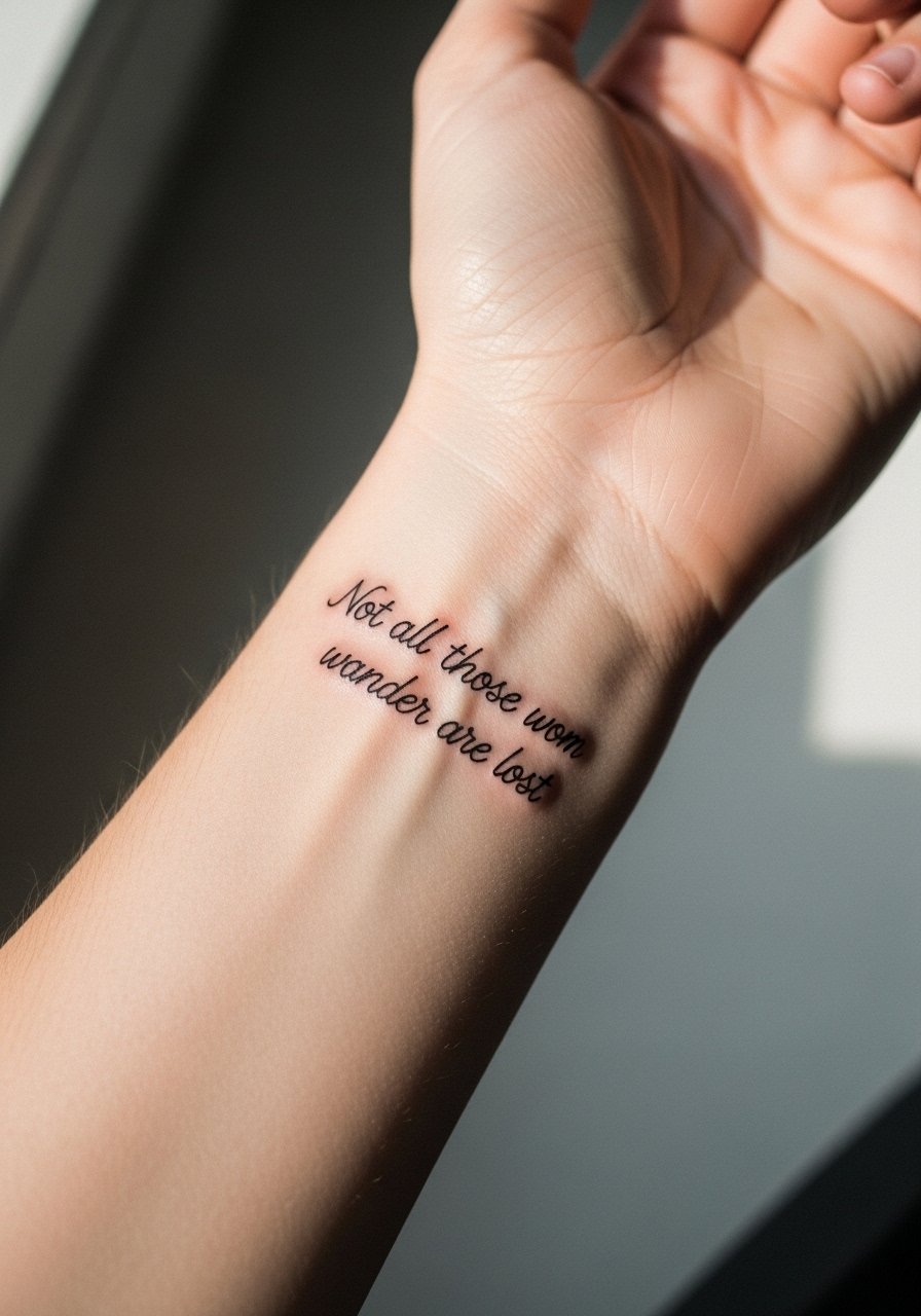
The full line is long for a wrist but it works as a gentle curve if you keep the font micro yet legible. I generally advise keeping under ten words for small wrist work, and this is a borderline case that needs careful spacing. Tell the artist you want slightly condensed letterforms and a preview wrap to check readability. At six months it will still read clean. By year two the edges will soften and may need a touch-up. For the session wear a sleeveless tank and remove jewelry. To style afterward try a slim leather cuff bracelet on the opposite wrist so the script stays the focal point.
4. Life Shrinks or Expands on the Ribcage
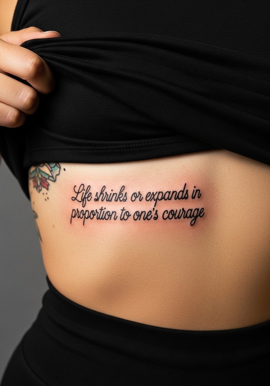
Fair warning, the ribcage is a higher pain area but it gives intimate placement for long mottos. Artists split on fine line here. One camp says the stretch and movement blur delicate script within two years. The other camp argues that with correct needle depth and spacing, larger script can settle nicely. My advice is to choose bolder line weight and slightly larger lettering if you want longevity. Expect longer session time and two sessions if you want color accents. Wear a loose button-down you can lift for access and mention you prefer arched text that follows the rib curve.
5. Amor Vincit Omnia on the Ankle
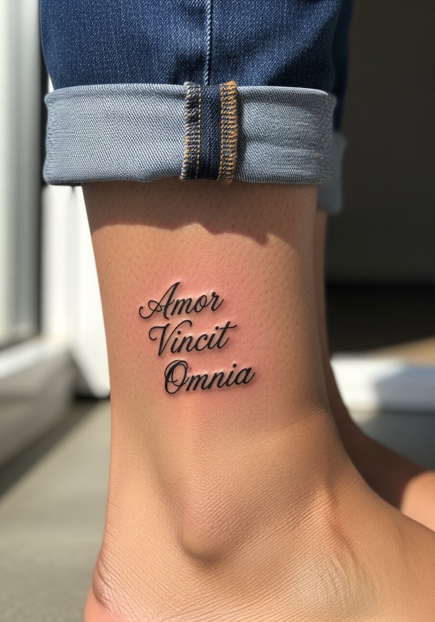
Ankle micro-realism keeps a phrase discreet and symbolic. The ankle gets a lot of friction from shoes and socks, so ask the artist to space letters slightly wider than a finger tattoo. Sessions are usually quick but healing can feel scratchy because of shoe contact. At six months it looks intimate and clean. By year three small touch-ups might be needed where footwear rubs. For show-off looks pair the piece with cuffed straight-leg jeans or sandals to expose the lettering and movement.
6. Surviving Is the New Art Form on Outer Bicep
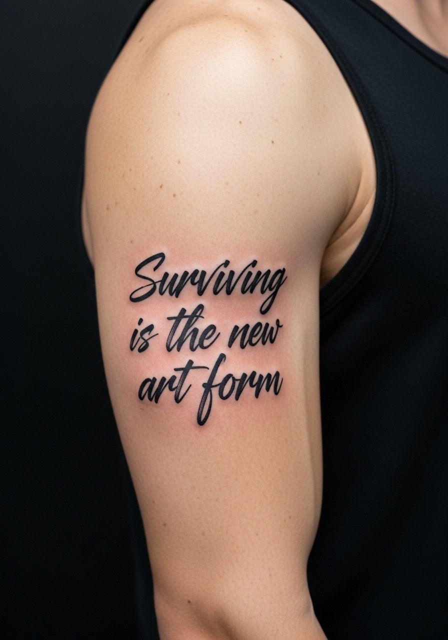
This raw handwritten aesthetic reads like a diary line you flex. Outer bicep sessions are low pain and let the artist use expressive stroke variance. Ask for deliberate shakiness in the reference so it reads authentic and not like a rushed stencil. The common mistake is trying to shrink that shaky style into too small a space which loses character. Healed at six months it looks intentional. At two to five years the heavier strokes hold, while the thin wiggles soften. Wear a black muscle tank during the session for easy access and to show it off later.
Studio Day Picks
The pieces above cover wrists, forearms, the rib line, ankle, and bicep, so a few studio essentials make those sessions easier and the first week smoother.
- Stencil transfer paper kit. Lets you preview line weight and spacing on the skin before the needle starts, which matters for long scripts and curved forearm pieces.
- Topical numbing cream. Applied per instructions 45 minutes before can reduce edge pain on ribs and collarbone sessions without obscuring detail.
- Thin protective film roll. Useful for ankle and finger placements where friction from clothing or washing can irritate the fresh work.
- Fragrance-free body wash. Gentle cleansing is key for fine line pieces that depend on clear channels to heal without scab build-up.
- Aquaphor healing ointment. Thin application in the first days keeps delicate scripts like the forearm and wrist pieces moisturized and less prone to excessive flaking.
7. Dum Spiro Spero Down the Spine
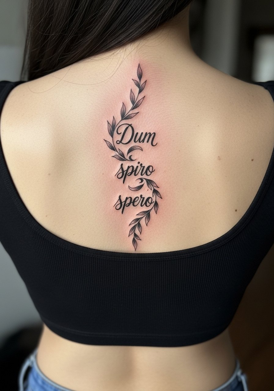
Spine placements favor vertical quotes and create a private, memorial feel. This one asks for longer scale, five to seven inches, so the letters breathe and the ornamentation does not merge. Let the artist map the vertical spacing on your back while standing and sitting so the flow reads correctly with posture. Sessions can be noisy and you will need breaks. At six months the vines will sit nicely. At two to five years expect normal softening but the vertical alignment keeps readability. For showing it off, low-back crops or backless halter tops complement the vertical flow.
8. Be the Change on the Shoulder Blade
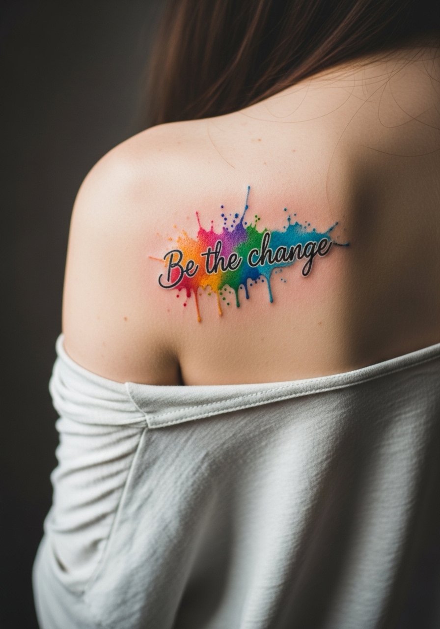
Watercolor blends add emotional punch but demand more careful aftercare and placement away from high-friction zones. Shoulder blade sessions are moderate pain and let the artist lay vibrant washes that sit under the skin. Ask for a darker ink outline or slightly heavier script to preserve legibility over time. The common error is skipping contrast, which leaves the color to read like a bruise as it fades. At six months colors mellow. At year two expect more softening and a possible color refresh if keeping vibrancy matters. Pair with a strappy cami top to let the color show.
9. Fortes Fortuna Adiuvat on the Calf
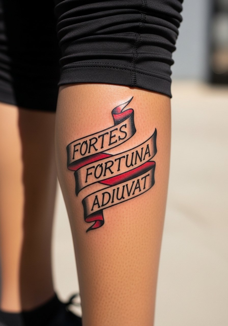
Classic block lettering in a banner on the calf reads like a declaration you can show off in shorts. Traditional work ages well because of saturated fills and solid outlines. Tell your artist you want block letters with consistent saturation and a banner to protect the edges. The session is straightforward and healing is protected from daily wash friction more easily than hands or feet. At five years the bold lines remain legible and often improve in character. Style it with rolled joggers or cropped athletic pants to let the banner peek out.
10. Everything Is Temporary on Inner Thigh
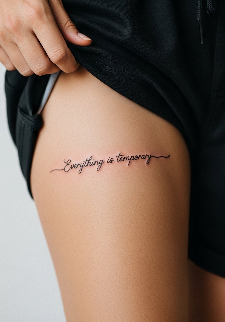
Inner thigh pieces are intimate and private, good for longer mantras you do not want on display. Expect higher tenderness during healing because the area is soft and subject to friction from clothing. Ask for slightly bolder spacing and avoid micro kerning that will blur with skin movement over time. At six months the phrase reads like a private mantra. At two to five years the lines will soften and may need gentle touch-ups. For appointment day wear loose shorts or a skirt so the artist can access the area without pressure on the skin.
11. Mine the Darkness on the Side Neck
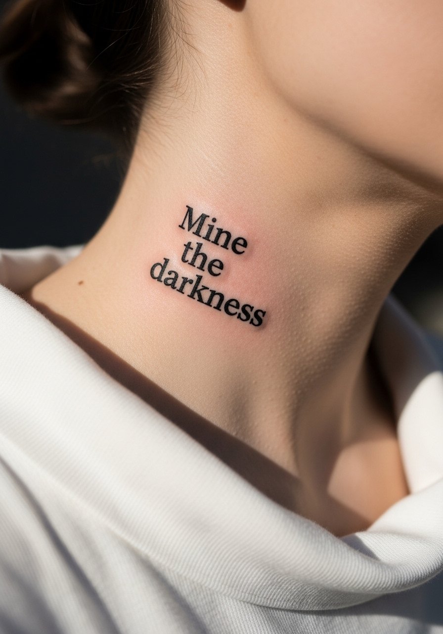
Neck work has career visibility implications and higher social reading than an ankle piece. Side neck placements give a vertical edge and demand bold strokes because skin there moves and endures sun. Ask your artist for solid black fills and a preview of how the lines sit under collars. The session can sting more than an arm tattoo. Healed at six months it reads crisp if saturated properly. For showing it off try a wide-neck shirt that frames the text while keeping the rest covered.
12. Excelsior on a Finger
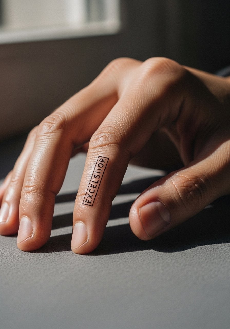
Finger pieces are tiny commitments and they trade permanence for visibility. Keep letterforms to one inch tall and accept that touch-ups are common because of constant hand use and washing. Ask for slightly bolder edges than a cosmetic micro script so the letters survive daily abrasion. The session is short but the healing weeks are touchy, especially for knuckles. At six months expect crisp letters and at year one plan for a touch-up. For session wear comfortable clothes that let your hands rest on a flat surface and avoid rings until fully healed.
13. Not All Those Who Wander Curved on Outer Forearm
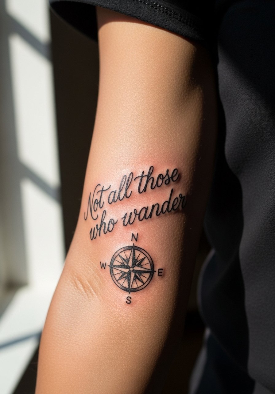
Curved forearm text with an illustration reads like a travel patch and scales well at five inches. This is the version to choose if you want the wanderer sentiment without cramming the full phrase on the wrist. Tell your artist to place the compass where the curve peaks so the eye reads the line naturally. The outer forearm resists blowout better than inner areas and fine shading holds longer. At two years the compass will keep its shape while the script softens slightly. Pair with rolled sleeves or a charcoal button down shirt to frame the art.
14. Memento Mori on Upper Chest
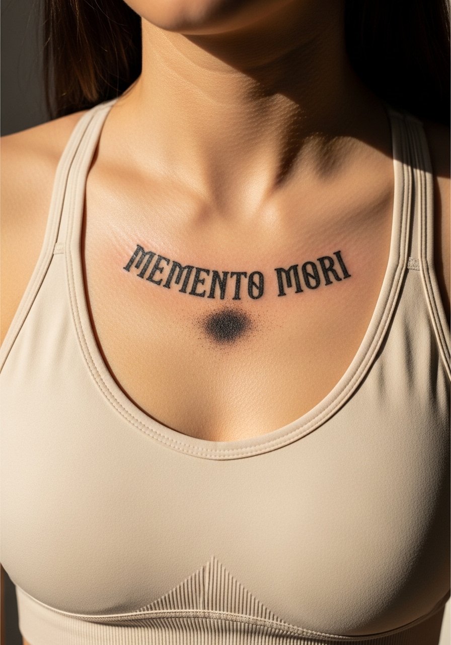
Short Latin mottos on the upper chest have weight and range. This placement keeps the phrase close to the heart but requires a session posture that avoids shallow needle angles. Ask the artist to test the stencil while you stand and while you sit so the phrase sits centered. Common mistakes are using too-small blackletter which turns muddy once healed. At six months the blackletter should read crisp. For showing it off pick a fitted sports bra or a slightly open button-down that reveals only the strip around the sternum.
15. Breathe on Behind-the-Ear Skin
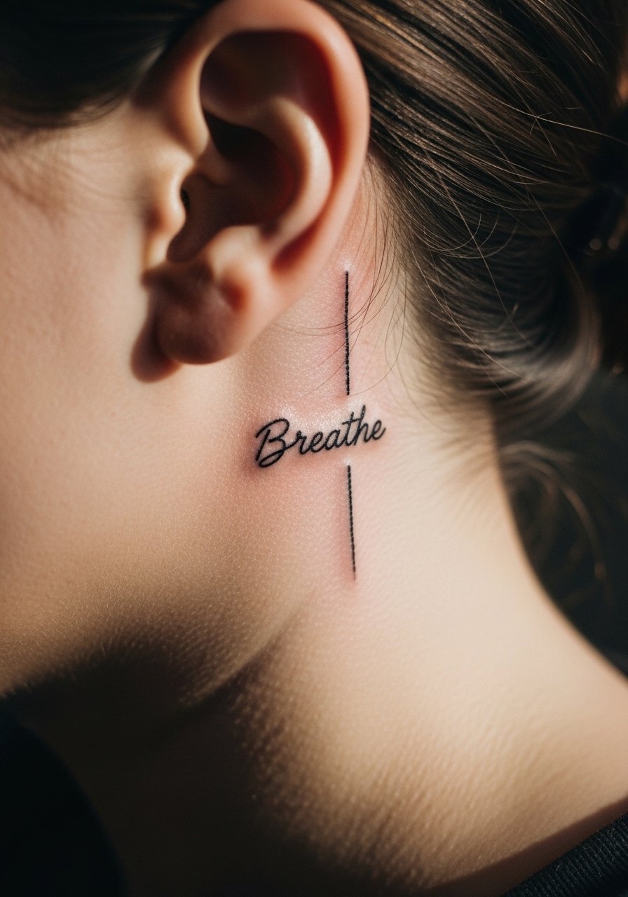
Tiny script behind the ear is private and discrete. The area has thin skin and hairline coverage so precision matters. Ask for a single-word design with letter height under a half inch and a clear stencil placed while you lean your head naturally. Sessions are quick and healing can be obscured by hair oils. At six months the word sits subtle and soft. Because placement is visible in certain hairstyles, think about hair parting for both work and social contexts.
16. Hold Fast on the Wrist Wrap
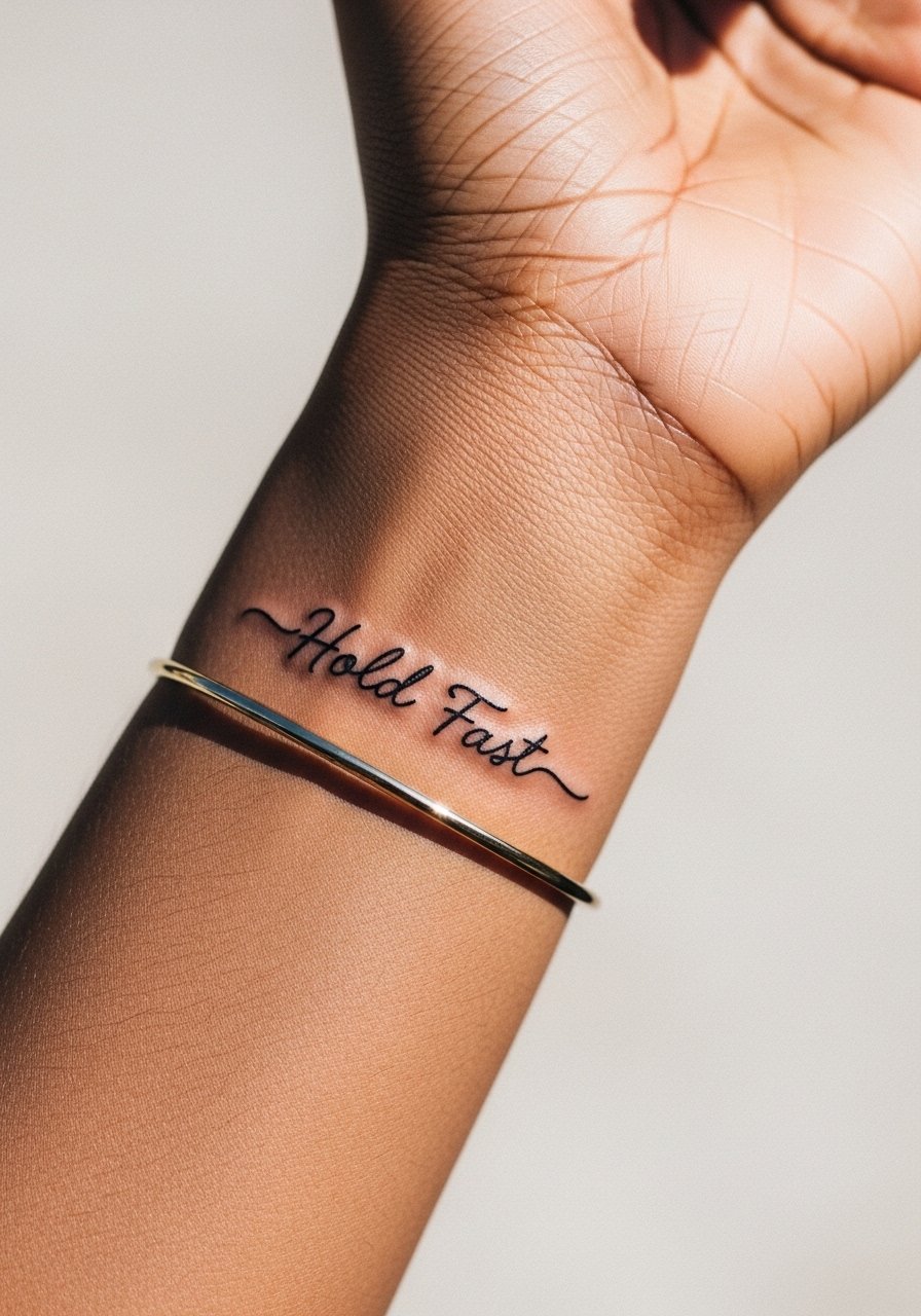
A wrap-around script works like jewelry. The trick is spacing so the phrase reads as a continuous band without letters compressing at the seam. Tell your artist you want preview photos with your wrist relaxed and flexed so the seam sits where you prefer. Light wrist pieces take low time but heal with frequent hand wash attention. At two years the seam area often needs the first touch-up because of friction. Style with a thin chain or a thin silver chain bracelet on the opposite wrist.
17. Rise Above on the Upper Arm
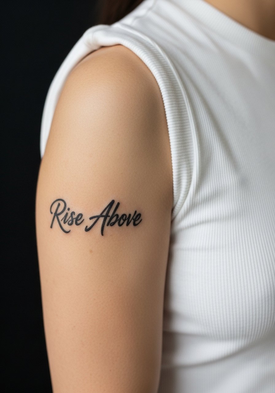
Upper arm placements are forgiving and age well. This short motto benefits from medium line weight and a small drop shadow if you want extra emphasis. Ask the artist for preview photos showing the piece from three to five feet away so you can gauge visual impact. Sessions are comfortable and healing is straightforward. At five years the bold strokes will hold character. For easy access on session day wear a sleeveless fitted tee and show it off later with short sleeves.
Frequently Asked Questions
Q: Will fine line script blur faster on the ribs than on the forearm?
A: Fine line on ribs is riskier because the skin stretches more and sessions can be done at awkward angles. One camp warns it will blur within two years. The other camp says larger scale and correct depth keep it stable. If you prefer fine line on ribs, ask for slightly larger letters and book a touch-up plan at year two.
Q: How should I dress for a shoulder blade watercolor session to keep the area accessible?
A: Wear a loose off-shoulder shirt or a strappy cami you can pull aside. A strappy cami top lets the artist work without tugging fabric and keeps the rest of your back covered.
Q: Are Latin phrases more likely to be misread once healed?
A: Latin can be very durable if letter spacing is generous and the font is bold enough. Tiny blackletter or overly ornate scripts risk merging as the skin softens. Ask for a stencil preview at your scale to check legibility in real life before committing.
Q: How often do finger and ankle scripts need touch-ups compared with forearm pieces?
A: Fingers and ankles experience more friction and washing so they generally need touch-ups sooner. Forearms typically hold longer because of less rubbing. Plan for a possible quick touch-up in year one for fingers and year two to three for ankles.
Q: Where can I find artists who specialize in quote work without naming names?
A: Look through style-specific hashtags like #scripttattoo and #latinscripttattoo, check local studio location tags, and browse tattoo directories for fine line or script portfolios. Spend time on site portfolios and ask for healed photos so you see how text reads over time.