
Fine line and saturated color live in different decades of a tattoo's life, and that gap shows up fast with band-inspired work. Bring Me The Horizon designs look electric when fresh, but placement, ink saturation, and spacing decide whether a lyric or logo still reads in year five. Pick a placement and color plan now that prioritizes long-term clarity and you get a tattoo that ages with the music instead of fading into the background.
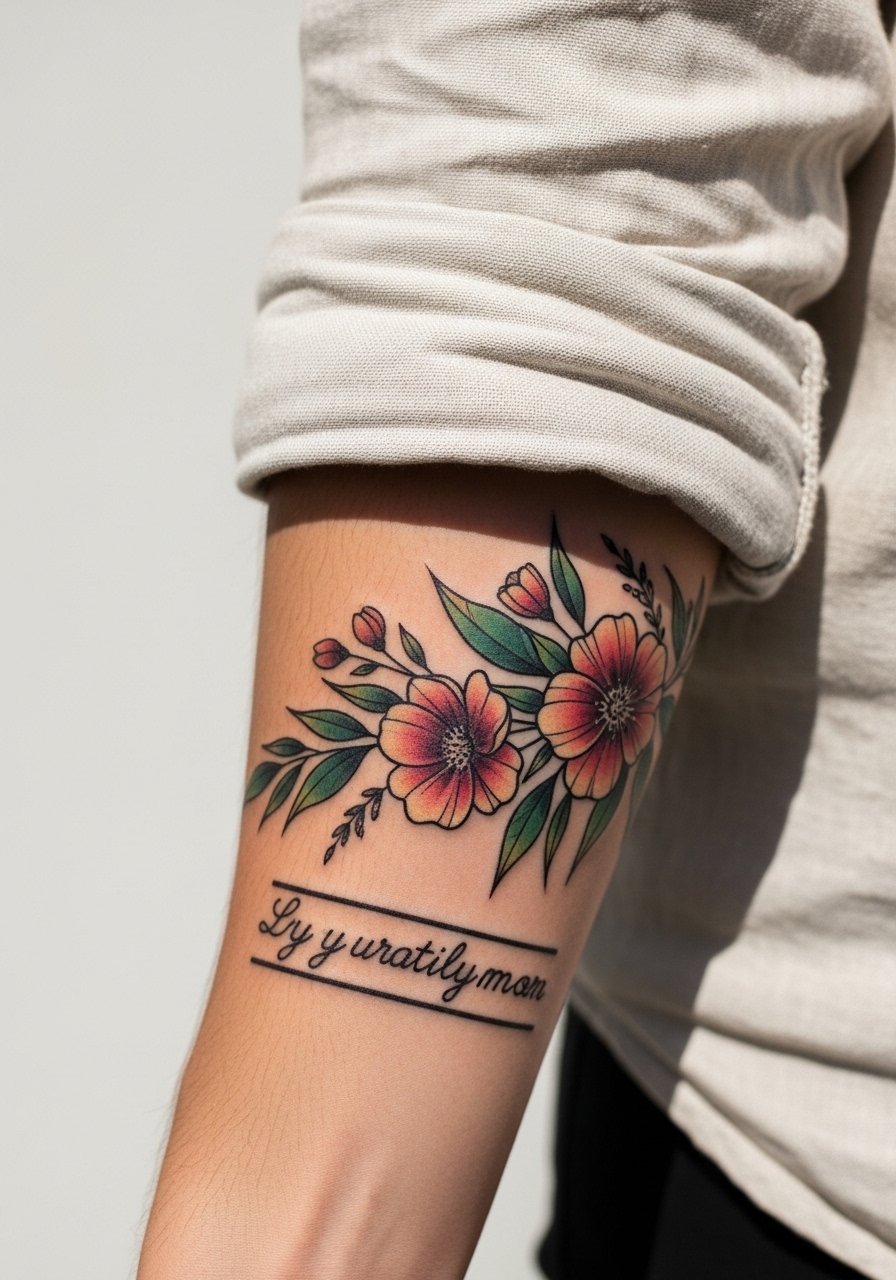
1. Watercolor Lyric Ribbon on Inner Forearm
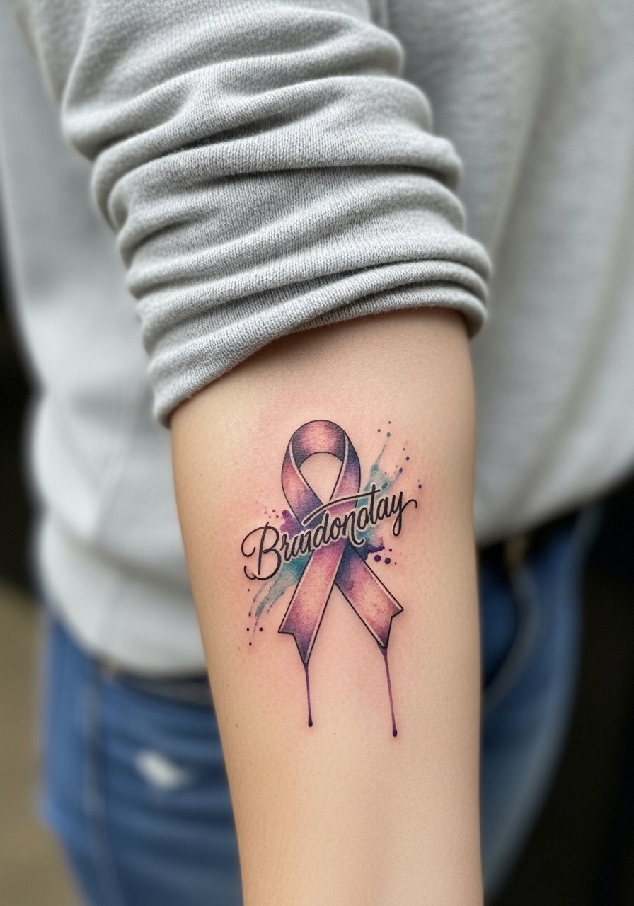
I've seen watercolor lyrics from live shows lose their definition when artists try to mimic brush strokes too small. For a Bring Me The Horizon ribbon of words, ask for slightly heavier linework for the script and layered watercolor fills that sit under the linework rather than through it. Pain is mild on the inner forearm and most sessions are one to two hours. Expect the watercolor to soften by year two and need a touch-up at year three if you want the same vibrancy. This placement is great for rolled sleeves and pairs with a rolled linen shirt that frames the piece without covering it.
2. Vibrant Album Art Patch on Upper Arm
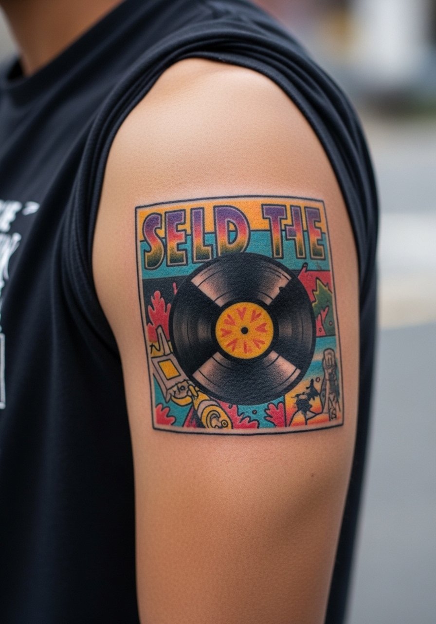
Personal observation: outer upper arm patch pieces survive a lot of sun and movement, so go for bold saturation and larger shapes. Tell your artist you want full saturation with crisp outlines to guard against early fading. Session time is typically two to four hours depending on size, and pain sits at a moderate level. A common mistake is requesting extreme tiny detail that blurs in two years. For evenings out, the piece works well with a short sleeve band tee rolled at the cuff so the artwork peeks through.
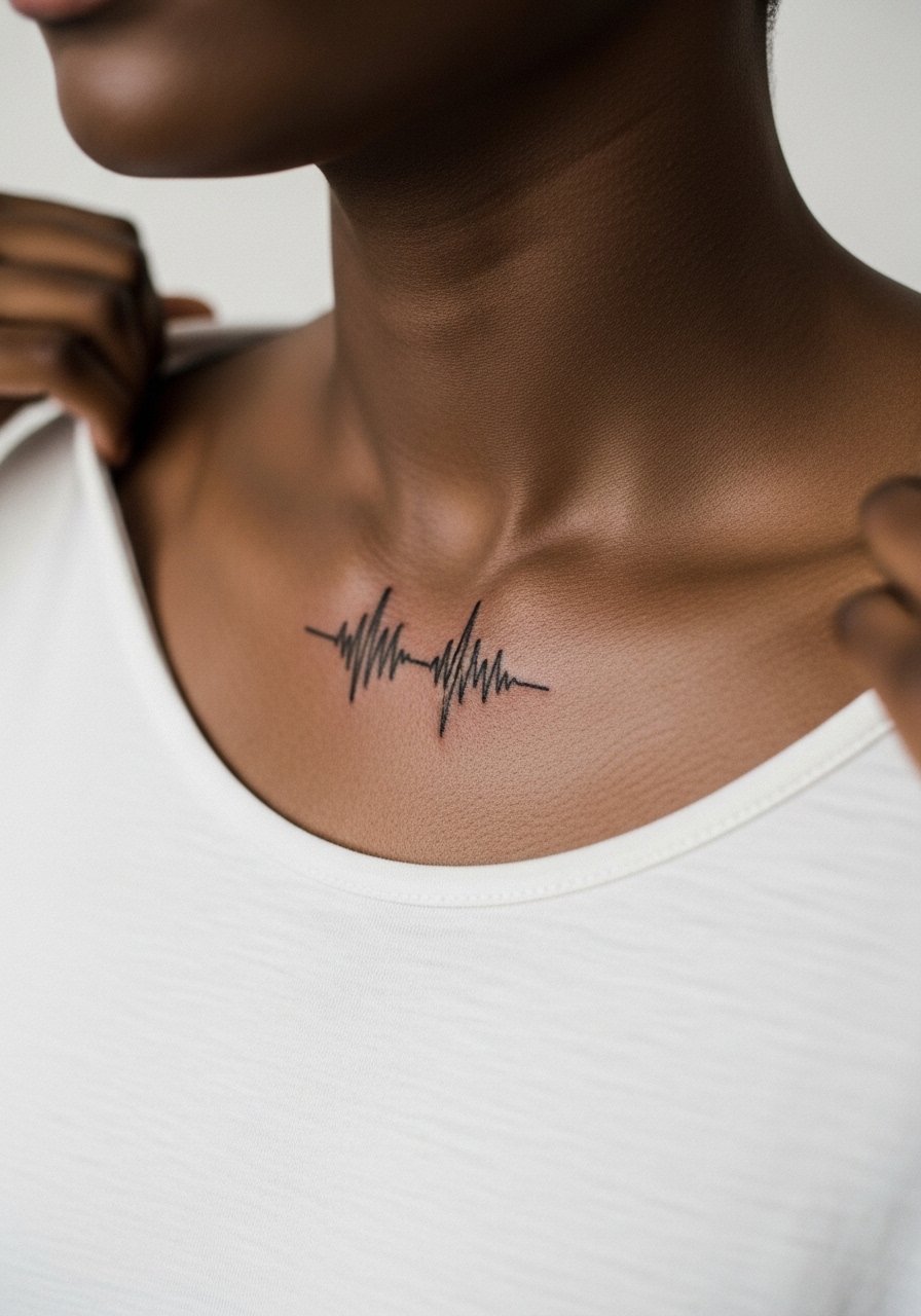
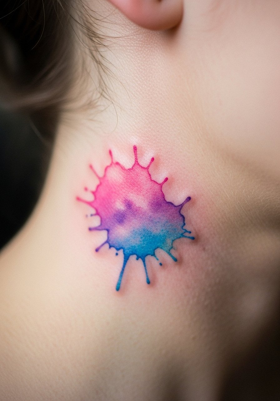
3. Neon Heartagram on the Sternum

Fair warning: sternum sessions feel sharp and take longer because the skin there is thin and close to bone. One camp of artists argues small, neon-linework here will blur quickly. The other camp says if you space the elements and use saturated fills instead of thin neon strokes, the result lasts longer. I lean toward spacing. Expect two to three hours of work and a touch-up at year two for color retention. For the appointment, wear a fitted sports bra you can lift slightly so the artist has access while you stay covered.
4. Scripted Tour Dates Around the Wrist
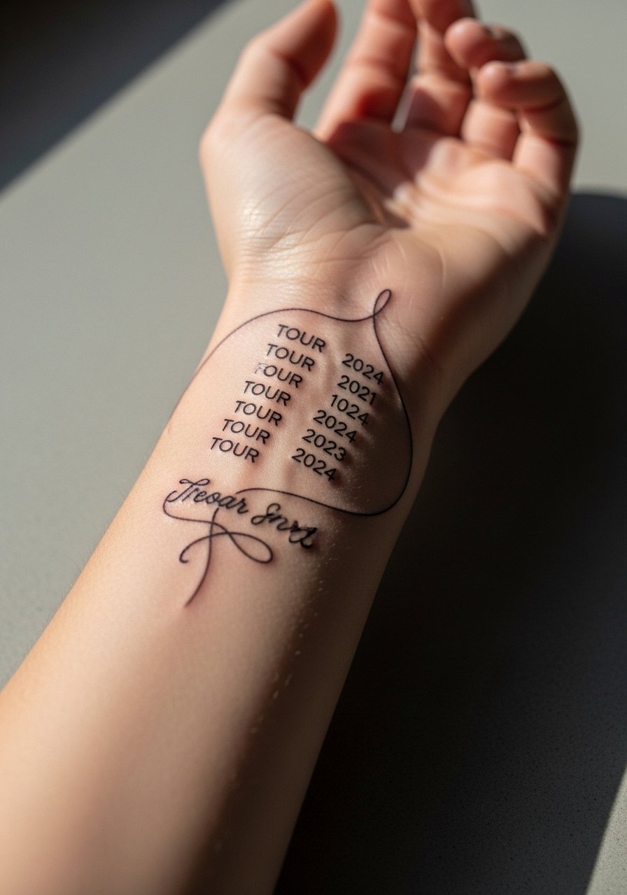
Most people underestimate how much wrist tattoo ink takes on friction from washing and watches. The visual impact lead applies here because the wrist lets script read from close range but fades faster. Ask your artist for slightly heavier linework and to avoid single-needle hairlines around the wrist. Sessions are short, often 30 to 60 minutes, with a likely touch-up in year one or two. Pair the dates with a thin chain bracelet for nights out, or a minimal watch you can move during healing so it does not rub the area.
5. Watercolor Bat Silhouette on the Calf
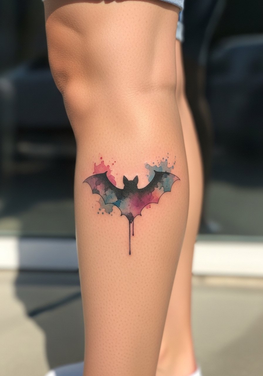
The calf tolerates heavier saturation well and is forgiving for watercolor washes. Consultation tip: show reference images that match the exact watercolor edge you want and ask the artist to incorporate a subtle outline to keep form as color blurs. Pain is moderate and sessions run two to three hours. At six months the washes look airy. At two years the edges soften and may need a color boost. For summer show-offs, pair with high-waisted shorts that stop above the tattoo so it reads cleanly.
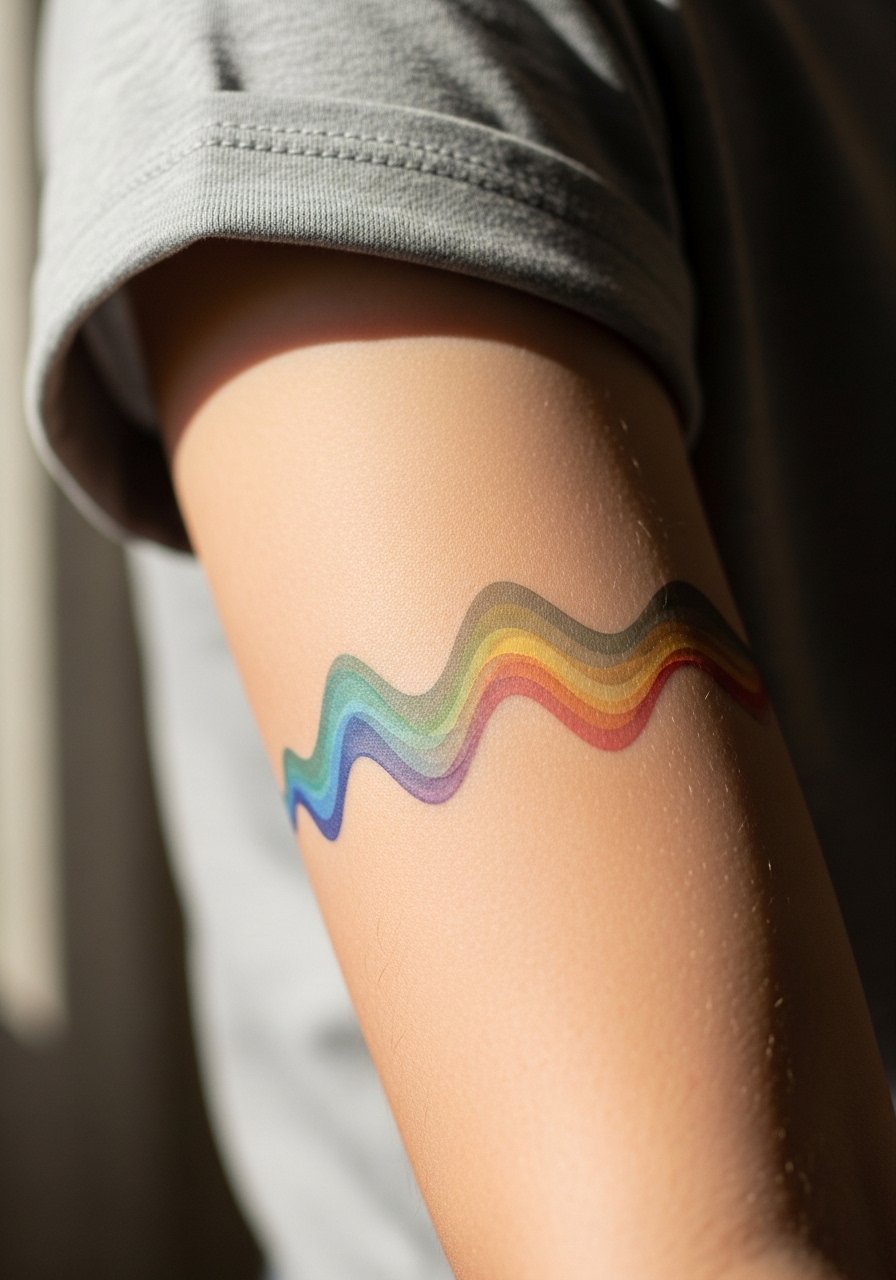
6. Soundwave of a Favorite Lyric Along the Collarbone
When you sit down with your artist for a soundwave, bring an audio file and ask them to convert it to a single-line waveform rather than dense spikes. The collarbone is a mobile area with high visibility. Pain registers at a 6 out of 10 for many. Session time is under two hours for a short waveform. The most common mistake is crowding too many peaks into a small stretch. This piece looks striking with a thin chain pendant necklace that sits just above the waveform and gives balance to the neckline.
Studio Day Picks
The pieces above include several high-visibility spots like the collarbone and wrist, and a few that need careful prep. These five items smooth the session and the first week for those placements.
-
Stencil transfer paper kit. Lets you preview exact placement on skin before the needle touches, which is useful for collarbone and wrist pieces that read differently on a curved surface.
-
Thin protective film roll. Useful for wrist and finger tattoos that face constant washing and friction during the first few days.
-
Fragrance-free gentle body wash. Cleans tattooed areas like the calf and forearm without irritating delicate linework during showers.
-
Topical numbing cream. Applied before sternum or collarbone work to take the edge off sensitivity without altering color saturation.
-
Aquaphor healing ointment. Thin layers in the first days help lock in moisture for fine line pieces that could otherwise scab and lose definition.
7. Micro-Realism Front Thigh Portrait Accent
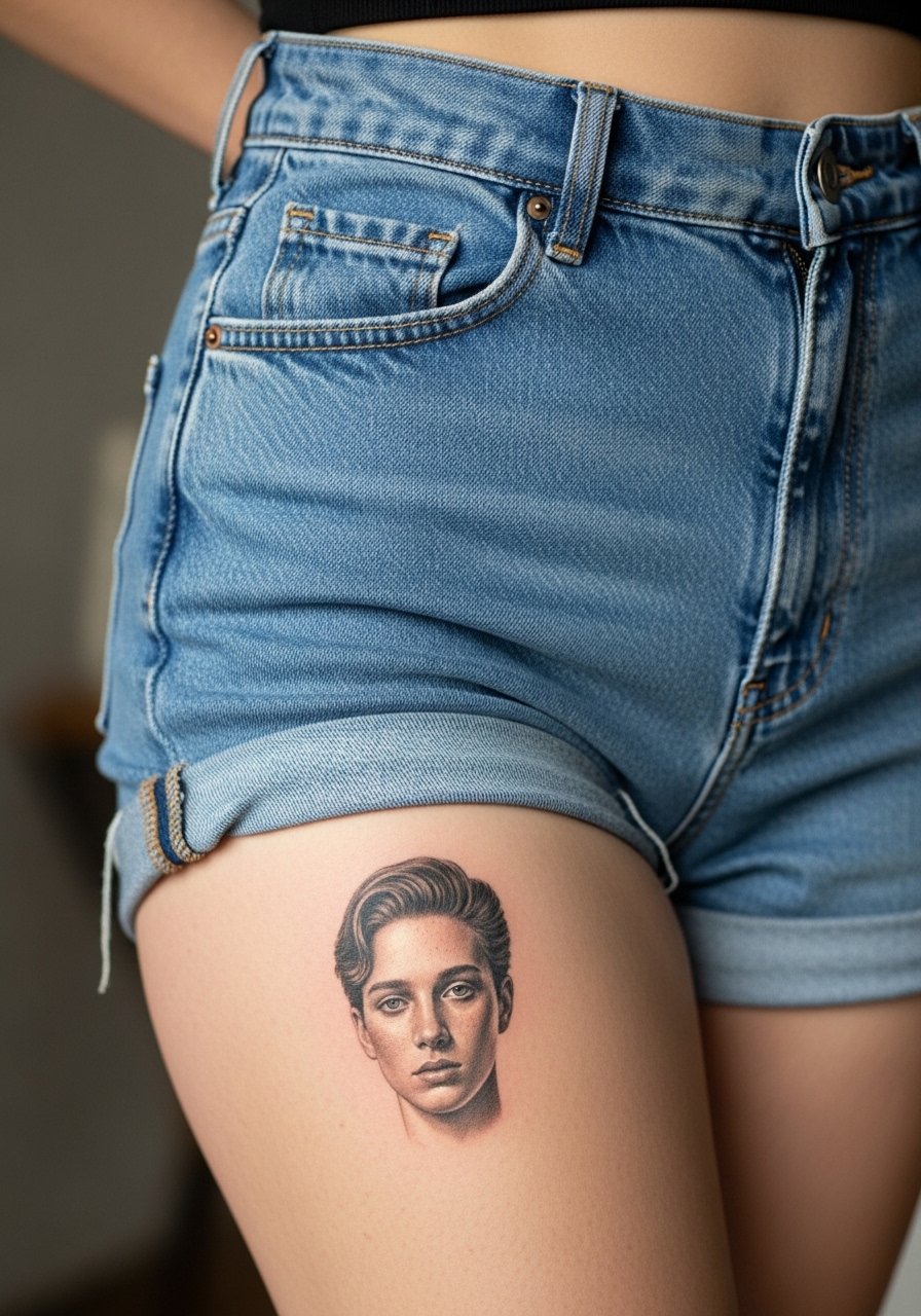
Consultation lead: show several portrait references and specify the scale you want because micro-realism loses nuance if placed too small. The front thigh tolerates high detail and larger sessions. Pain is moderate and you can expect multi-hour sittings. A common mistake is requesting micro detail without allowing for at least three inches of vertical space. Color retention is good on the thigh, but expect a touch-up if the piece sits low and rubs against waistbands. For the session, wear high-waisted jeans you can slide down slightly so the area is accessible.
8. Comic-Style Vocal Silhouette on the Ribcage
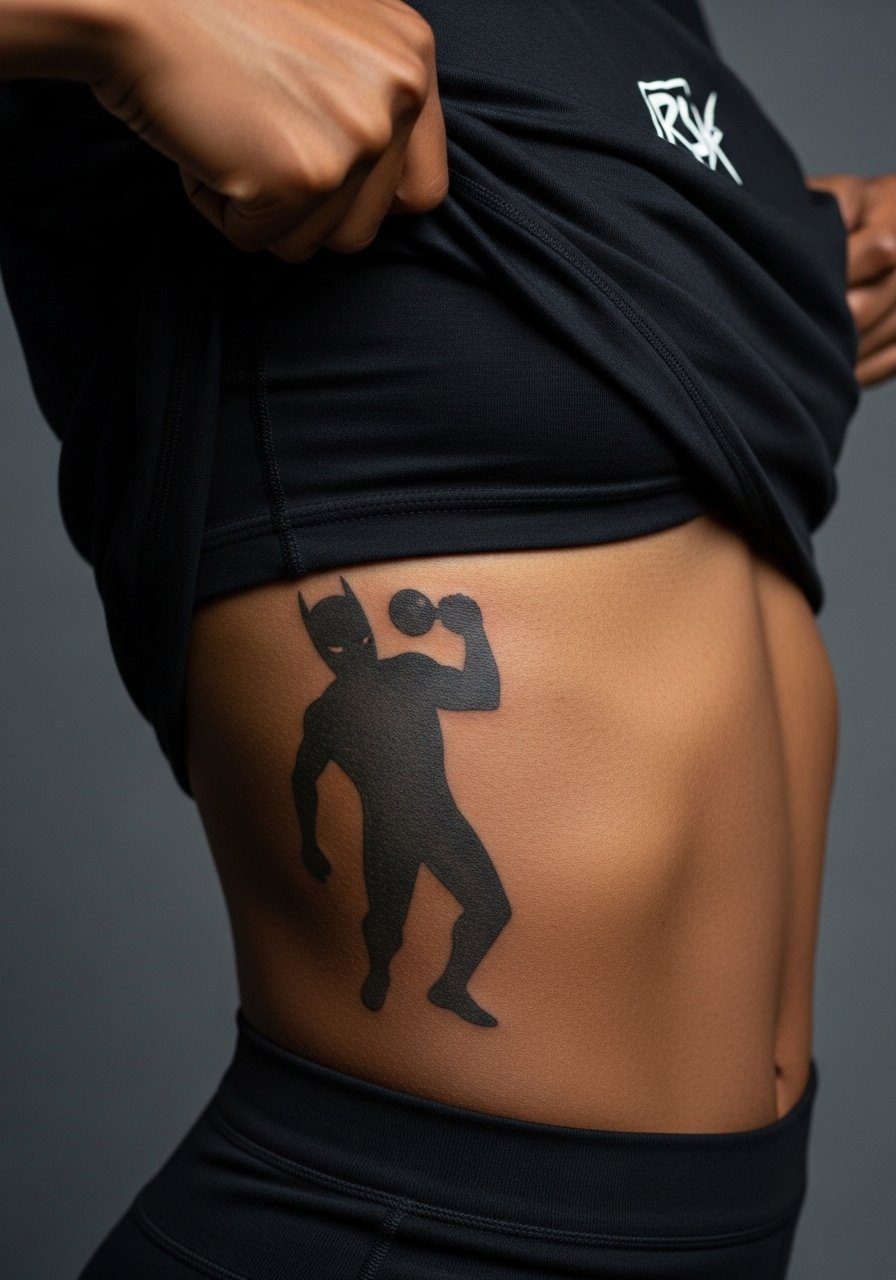
Pain warning lead: ribs are widely known as a high-pain zone. Artists split into two camps on detail here. One camp says the skin stretch and breathing cause fine lines to blur within two years. The other camp says spacing and correct needle depth keep silhouettes crisp. If you choose ribs, plan for a bolder silhouette with negative space and book short sessions. The visual holds better over time than tiny script. For appointments, a cropped athletic top is easiest to lift and keeps you covered.
9. Neon Blackwork Skyline on the Back of the Neck
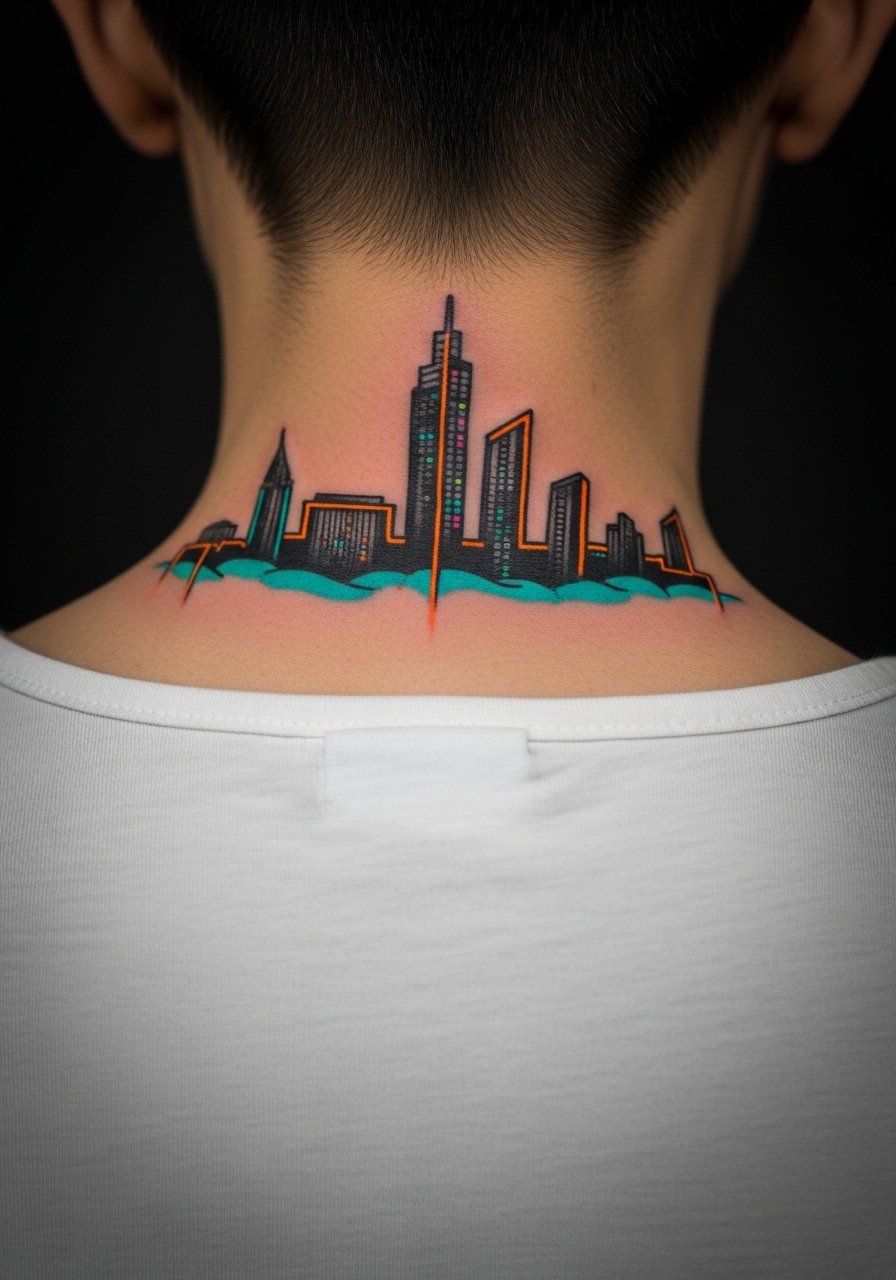
Visual impact lead: back of neck pieces age based on hair growth and sun exposure. Ask your artist to punch in saturated black areas and add neon accents inside enclosed shapes so the neon sits on solid color instead of alone on skin. Sessions are short and pain is moderate. Note that some workplaces remain strict about visible neck ink, so think about career implications before committing. Pair this with a wide-neck tee that frames the area while keeping you mostly covered.
10. Botanical Sleeve Accent with Lyric Band
Mistake lead: the biggest error with combined botanical and script sleeves is letting the script compete with dense foliage. Have your artist carve a thin band for the lyric that sits on clear background so the letters read at six months and two years. Expect multiple sessions for saturation and layering. Blowout risk is low on the forearm versus inner wrist. For show-off outfits, a rolled linen shirt keeps attention on the band and complements the botanical tones.
11. Abstract Watercolor Skull on the Shoulder Blade
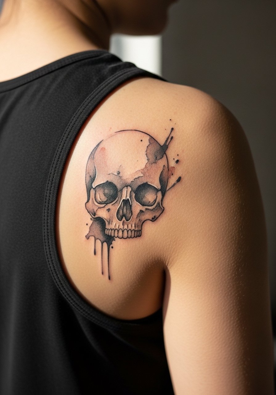
Aging and healing lead: shoulder blades tolerate color well because they get less daily abrasion. Large watercolor washes on the shoulder blade age gracefully if the artist layers pigment and keeps outlining minimal. Sessions are moderate in length. The common mistake is compressing the watercolor into too small an area which forces muddiness. For the session wear, a tank top you can pull down slightly keeps you covered while giving the artist access.
12. Bold Color Block Tie-In on the Calf Sleeve
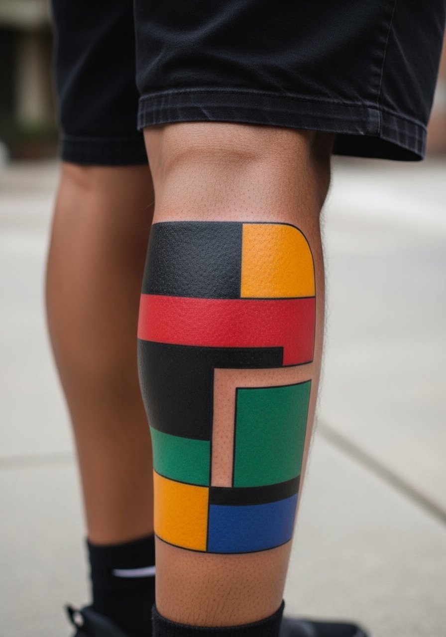
Visual impact lead: calf sleeves read well at longer distances because of strong shapes and saturation. Tell your artist you want color-block sections that are large enough to avoid early blending. Session time can stretch over multiple appointments. A common issue is asking for too many small shapes which fade into a mass of color. For casual wear, a pair of high-waisted shorts that sit above the tattoo helps show it off.
13. Geometric Mandala Between the Shoulder Blades
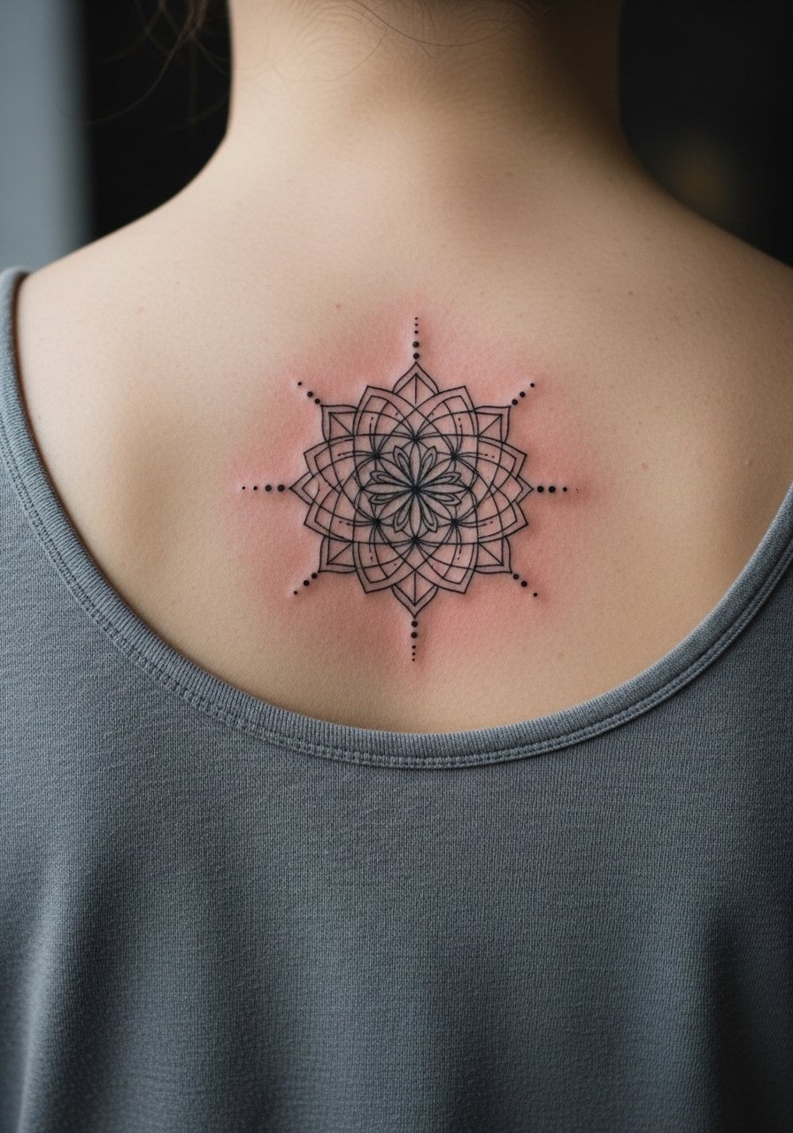
Consultation lead: mandalas require perfect spacing so the lines do not bunch. For a colorful Bring Me The Horizon twist, use saturated color fills inside spaced linework. Pain is moderate and sessions can be long. The common mistake is over-detailing the central area too small. As a cultural note, this mandala inspiration draws from traditional sacred geometry, and many people choose to modify elements as a sign of respect. For showing off wear a backless or strap tank on cooler days.
14. Scripted Album Title Wrapped Around the Ankle
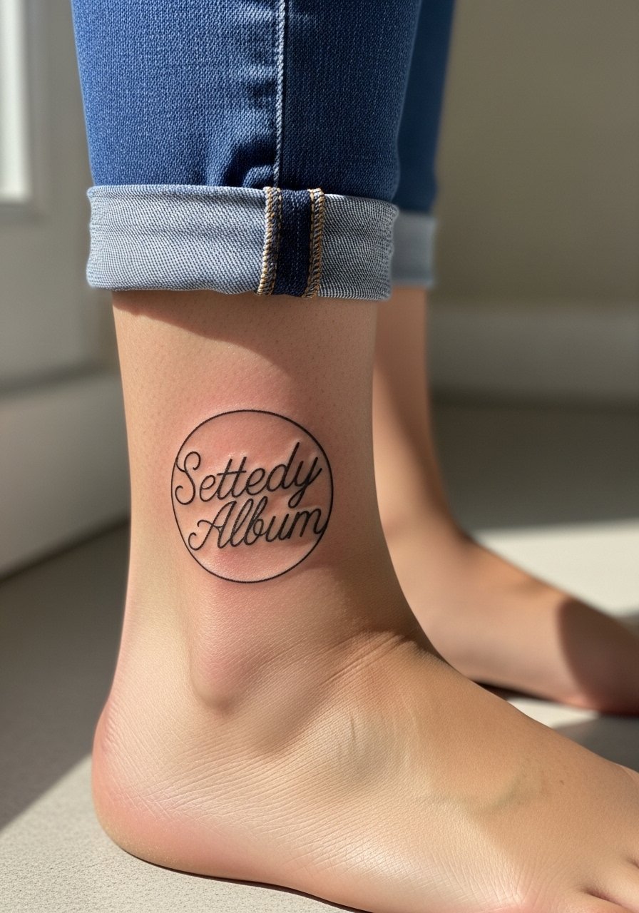
Pain warning lead: the ankle is a high-sensitivity and high-friction area. For longevity, choose slightly bolder script and a bit more spacing between letters. Sessions are short but healing is fussy because of socks and shoes. The most common mistake is tiny single-needle script that becomes patchy. Style tip: wear jeans rolled up to reveal the ankle for a night out while avoiding shoe rubbing during the first week.
15. Sticker-Style Tour Poster on the Upper Back
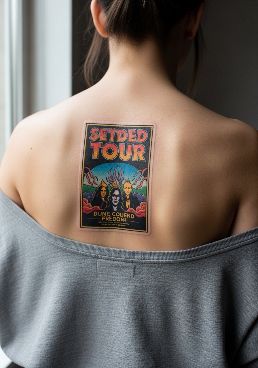
Personal observation: upper back gives room for poster-style compositions and takes saturation well. Ask the artist for bold outlines and solid color fills so the poster motif still translates after years. Sessions can be long and staged across multiple dates. The common mistake is compressing a poster into a small square which loses legibility. For show-offs, a wide-neck shirt that can be slid aside frames the art while keeping you mostly covered.
16. Electric Watercolor Micro-Notes Behind the Ear

Pain and placement lead: behind-ear tattoos are small and delicate. Artists debate whether hairline movement makes them blur. One camp says the thin skin there ages fast and details fade. The other camp argues that tiny motifs survive when kept very small and high-contrast. If you do this, keep the marks minimal and plan for a quick touch-up. These are great hidden accents paired with an updo hairstyle rather than bulky jewelry.
17. Gradient Color Bar Across the Knuckles
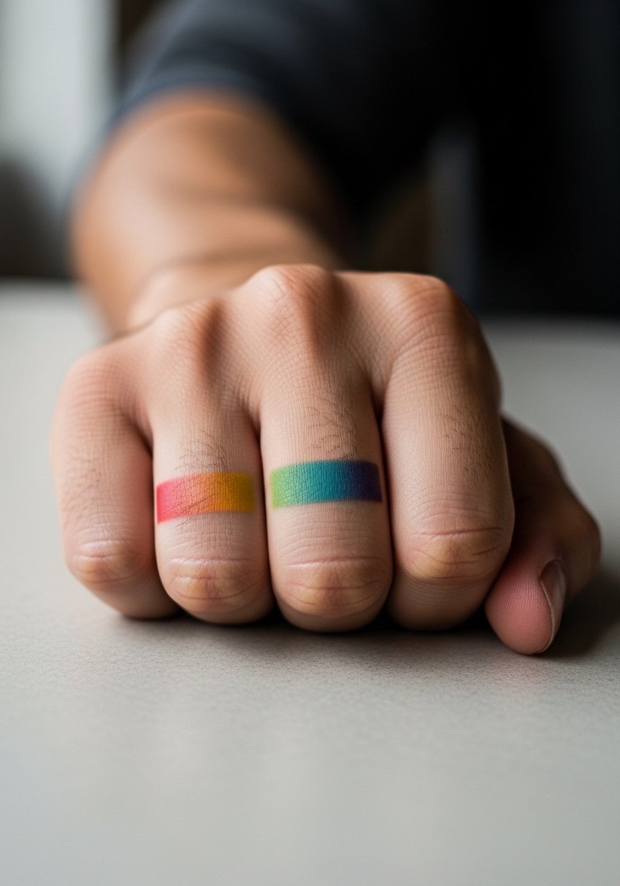
Mistake lead: knuckle work sees intense wear from daily use. For colorful bars, choose a bold block color rather than thin detail. Expect slower healing and a touch-up at year one. The pain is higher and sessions are short but intense. A common mistake is asking for lettering and color at once which speeds fading. For nights out, a stacked ring set keeps attention on the hands without rubbing the tattoos during healing.
18. Collage of Ticket Stubs on the Ribcage
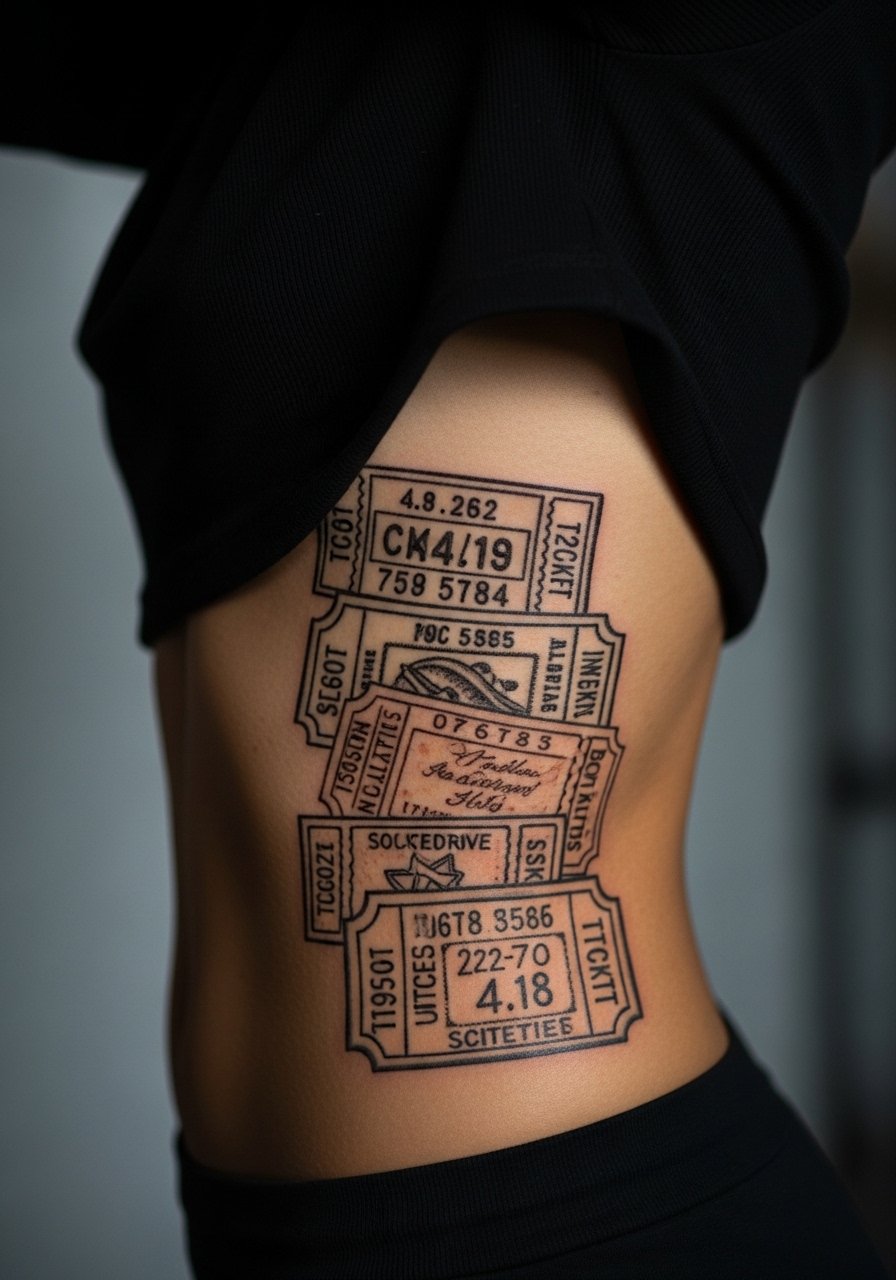
Aging lead: ribs are a high-motion area and small text inside ticket stubs blurs faster than shapes. Keep dates and venue names bold and simple. Sessions can be uncomfortable and may require breaks. The typical mistake is cramming too much microtext. For appointment day, a cropped top that lifts easily makes access easier while keeping you comfortable.
19. Chromatic Waveform Sleeve Accent on the Forearm
Visual impact lead: forearms show color well and let waveform accents read from a distance. Ask for solid head and tail anchors in black so the chromatic fills do not drift visually as they fade. Sessions are medium length and pain is mild to moderate. A common mistake is omitting anchors which makes the waveform look like a blur in a year. Pair it with a short sleeve tee that lets the color peek out without covering it.
20. Stipple Shaded Skull and Roses on the Hand
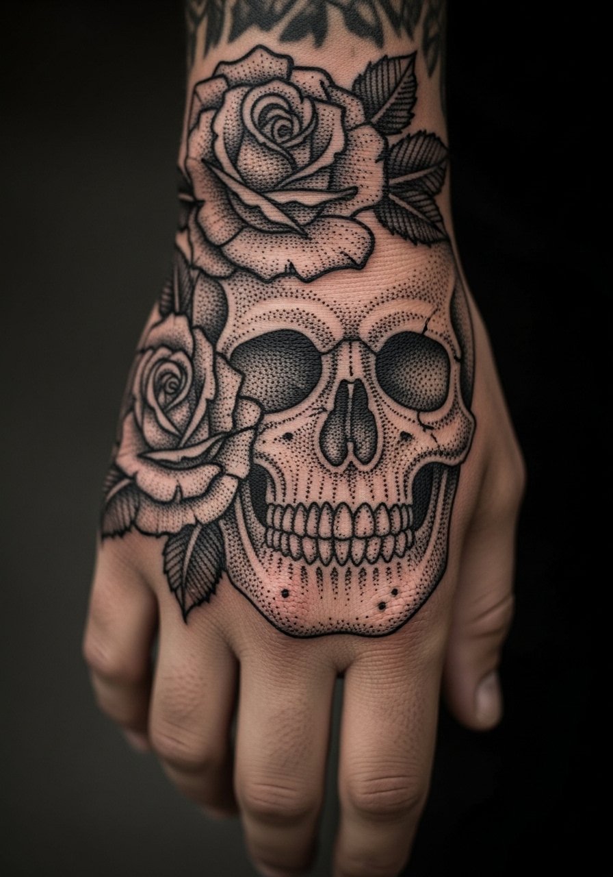
Pain and career note lead: hand tattoos still influence job outcomes in some fields. Stipple shading gives texture and can look crisp if kept large. Artists warn that heavy stipple and tiny dots on hands spread because of thin skin and friction. Expect touch-ups often. Sessions are short but healing is delicate. For showing the piece selectively, a statement ring can draw the eye while you keep your hand otherwise discreet.
21. Chromatic Arrow Cluster on the Inner Bicep
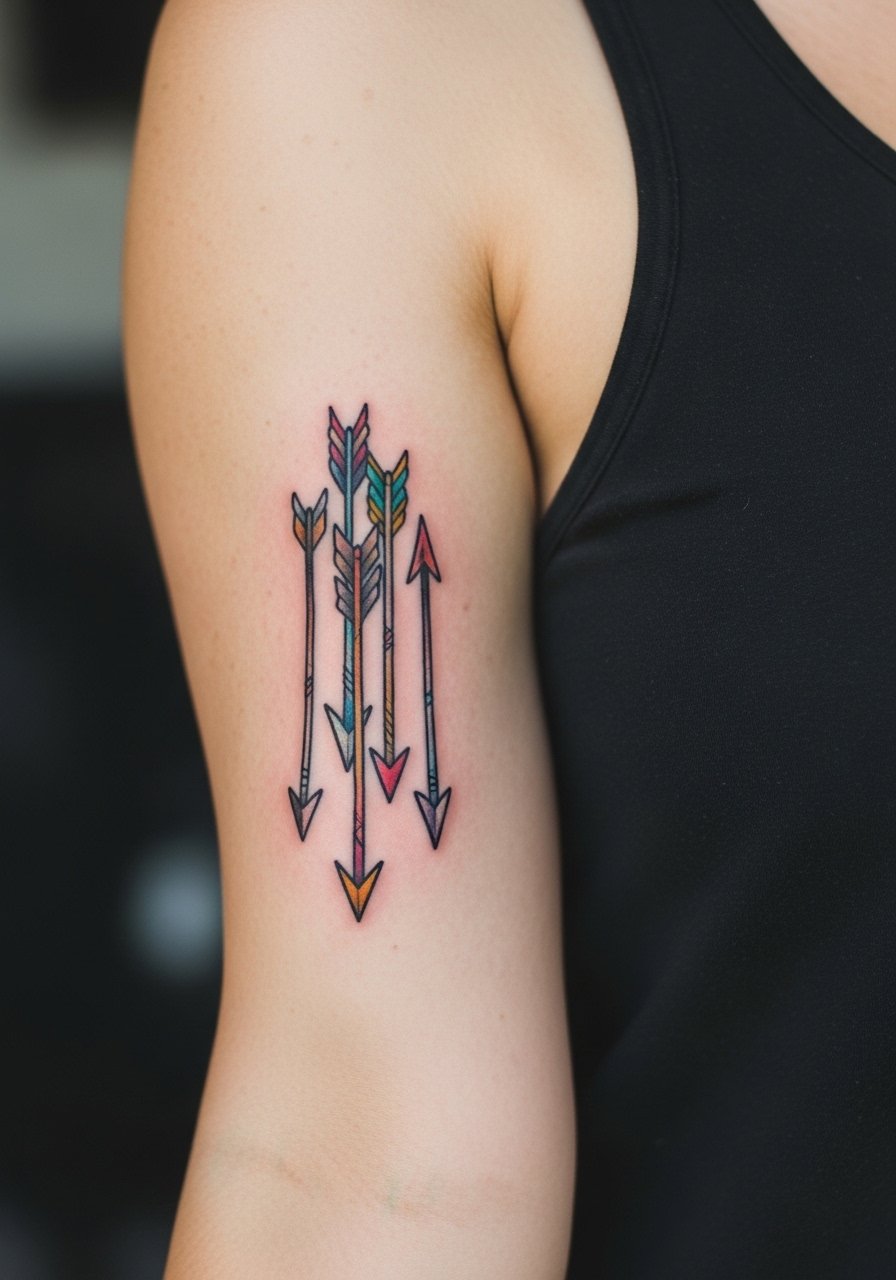
Consultation lead: inner bicep skin moves a lot and can soften fine lines. For colorful arrow clusters, ask for slightly bolder shafts and negative space between pieces so they do not merge. Pain is moderate and sessions are comfortable for many. A common mistake is packing arrows too close. For the session, wear a tank top with an easy arm lift so the artist can work without stretching the skin.
22. Comic Speech Bubble Portrait on the Thigh
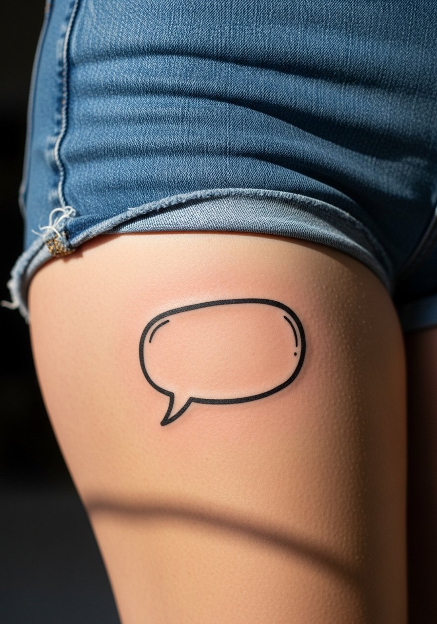
Visual lead: the thigh is forgiving for comics and larger text in speech bubbles. Ask for thicker outlines around text and fill the bubble with a flat color to preserve legibility. Sessions can be long and you may schedule two sittings for shading and color layering. At two years the color holds well unless frequently sun-exposed. For the session, a pair of high-waisted shorts makes access simple while keeping your midriff covered.
23. Gradient Watercolor Splash Behind the Ear
Mistake lead: behind-ear watercolor looks delicate but fades quickly if the artist applies washes too thin. Choose a compact splash with bold center pigment. Sessions are short and discomfort is low. One camp worries about longevity here owing to hairline oils and friction. The other camp says a high-contrast center keeps it readable. Wearing an updo frames the spot for nights out without exposing too much.
24. Stylized Barcode with Album Coordinates on the Ribcage
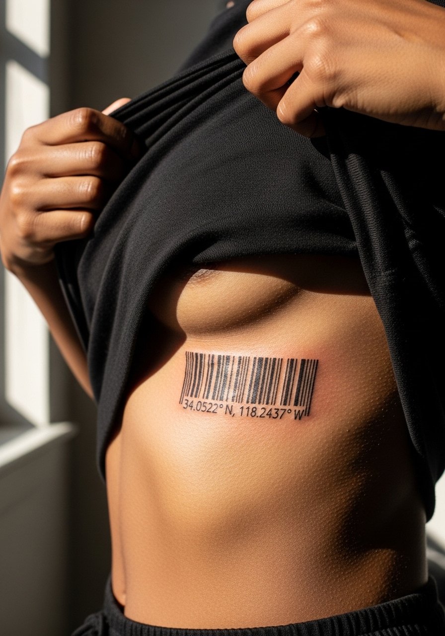
Controversy lead: fine line ribcage work splits artists into two camps. One says the skin stretch makes thin bars blur fast. The other says properly spaced bars with thicker lines stay crisp. If you want a barcode, favor thicker bars and short blocks of negative space. Sessions are sensitive and may require breaks. For the appointment, a cropped athletic top that lifts easily keeps you comfortable.
25. Color-Splashed Minimalist Handheld Microphone on the Wrist
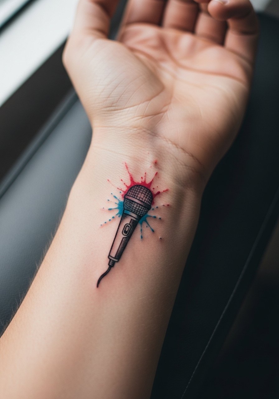
Aging lead: wrists face constant washing and friction. For a microphone motif, ask for a solid outline around the shape with color sitting inside that outline. Expect touch-ups at year one for the color. Sessions are short and pain is mild to moderate. A common mistake is relying on watercolor alone with no anchor line. For nights out, pair it with a thin bracelet stack but move bracelets during healing to avoid rubbing.
26. Psychedelic Rose Cluster on the Lower Back
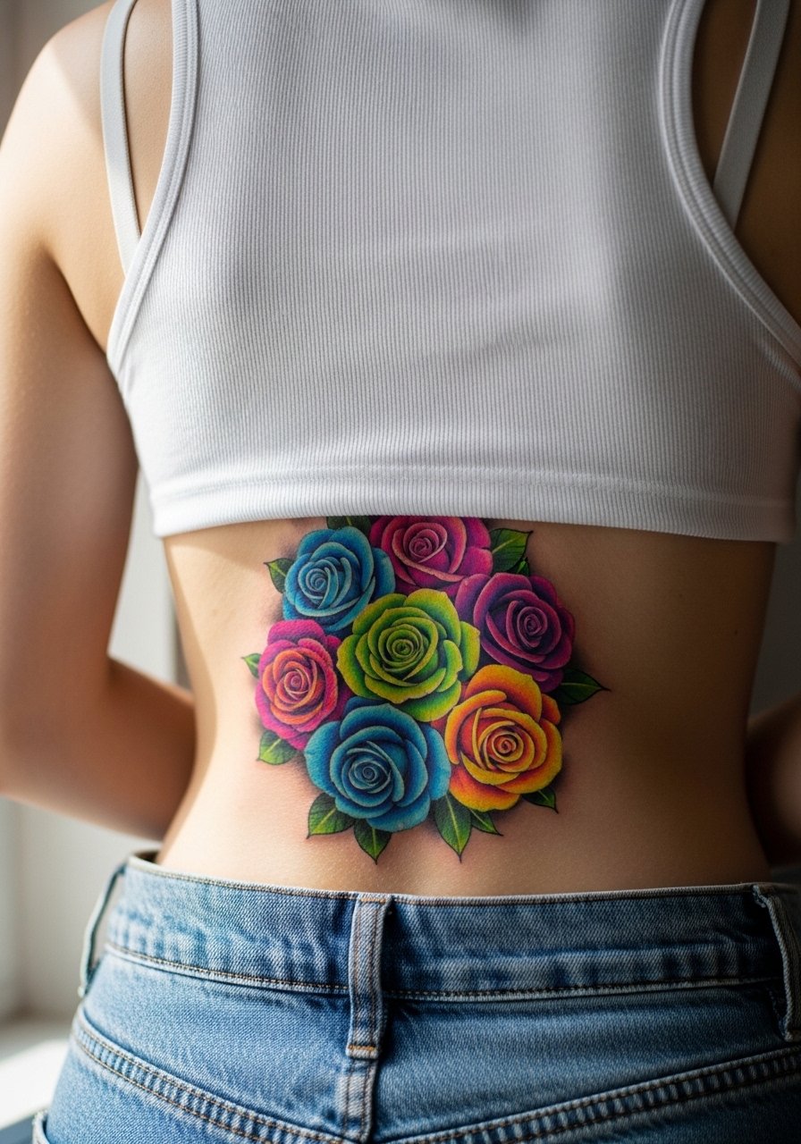
Visual impact lead: lower back is a forgiving canvas for saturated, psychedelic color. Make sure the design has clear negative space between blooms to prevent color merging over time. Sessions are longer and healing is straightforward if clothing does not rub the area. For sessions wear a tank top with high-waisted bottoms you can shift slightly so the artist sees only the tattoo zone.
27. Fragmented Logo Mosaic Along the Spine
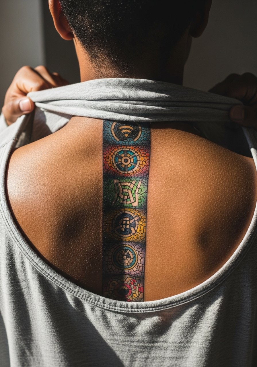
Consultation lead: spinal pieces need vertical spacing so each fragment reads individually. The spine is sensitive and sessions can feel sharp in places. A common mistake is cramming fragments too close which creates visual noise after healing. For showing it off, open-back or halter dresses work best but for appointments wear a wide-neck shirt so you stay covered while the artist works.
Frequently Asked Questions
Q: How long will colorful Bring Me The Horizon tattoos keep their vibrancy on different placements?
A: It depends on placement and saturation. Areas like the thigh and upper back hold color well and may only need touch-ups at year three to five. High-friction spots like wrists, hands, and ankles fade faster and often need a touch-up around year one to two if you want the original pop.
Q: Should I pick watercolor or saturated fills for a logo-based design?
A: Choose saturated fills if you want longevity. Watercolor looks stunning at first but often softens into a bruise-like fade unless the artist anchors it with outlines or heavier interior saturation. If you prefer watercolor, plan on a refresh sooner.
Q: How do I find an artist who can handle colorful, detailed band work without named recommendations?
A: Use discovery pathways like local shop directories, convention vendor lists, relevant hashtags, and Reddit communities to find portfolios. Look for healed photos of similar placements and ask about touch-up policies during consultation.
Q: Are there placement-specific clothing tips for the first week of healing?
A: Yes. For sternum and ribcage pieces wear a fitted sports bra or cropped top that lifts easily. For thigh and hip work wear high-waisted shorts. For shoulder and back work use a loose button-down you can slide aside. These choices reduce friction and keep the area clean.
Q: Can I get a multicolor sleeve that still reads from a distance?
A: Yes. Ask for bold shapes and strong outline anchors with color blocks rather than tiny multicolor details. This approach keeps the sleeve readable as colors soften and gives you a coherent look across years.
Q: Will fine line lyrics blur on the ribs or collarbone faster than on the forearm?
A: From what I have seen, they do. Ribs and collarbones move and stretch more, which accelerates blur. If you insist on fine line there, increase spacing and ask for slightly heavier line weight so the script holds longer.