
Bold script and blackwork last longer than most people expect, and the pieces that look best a year in are often the ones that were planned with spacing and placement in mind. Too many fresh photos hide the setup choices that keep lines crisp at year five. Read these 21 bold be brave tattoo ideas with practical notes on how to ask for them, how they age, and how to wear them so the design stays visible and intentional.
1. Bold Script "Be Brave" on Outer Forearm
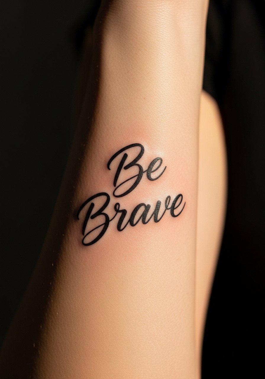
I open with a clear note from the consultation perspective. Ask your artist for 1.5 to 2 inch tall letters with heavier downstrokes and slightly wider spacing than what you like on screen. The biggest mistake is asking for very thin script that looks delicate in photos but softens into blur on sun-exposed forearms. For pain, the outer forearm is low on the scale and most sessions finish in a single appointment. Expect a touch-up around year two if you spend a lot of time in the sun. Styling tip, roll sleeves up to show the type. Pair it with a rolled sleeve graphic tee when you want the forearm to read like an intentional detail.
2. Triforce of Courage on the Wrist
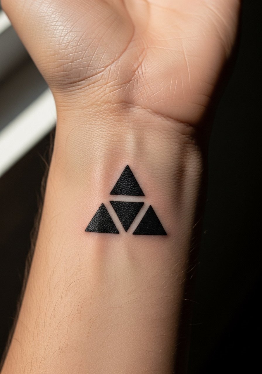
When gaming heritage matters, the Triforce works small and tight. Keep it at roughly one inch and request bold outlines rather than hairline edges so the triangles hold shape after the first year. Mistakes happen when people cram extra details around it. That creates a visual clutter that speeds fading in small pieces. Wrist skin experiences more friction and washing so plan for a brief touch-up at year one or two. For showing it off, a thin leather cord bracelet on the opposite wrist complements the geometric simplicity. Wear a minimalist cord wristband to frame the design without crowding it.
3. Geometric Sun with Bold Lines on Forearm

Visual impact is immediate with a geometric sun that uses heavy linework and a single pop of red. I recommend the forearm for visibility and for the space needed between rays so lines do not merge over time. A common error is compressing the rays for a compact look. That makes dense linework that tends to soften by year three. Tell your artist you want clear spacing and ask for a healed mockup to check spacing on your arm. The session is comfortable for most people, and larger versions may require two short passes. For outfits, rolled-up sleeves in dark tones let the black and red read strongly. Try a leather cuff bracelet men if you want a rugged pairing.
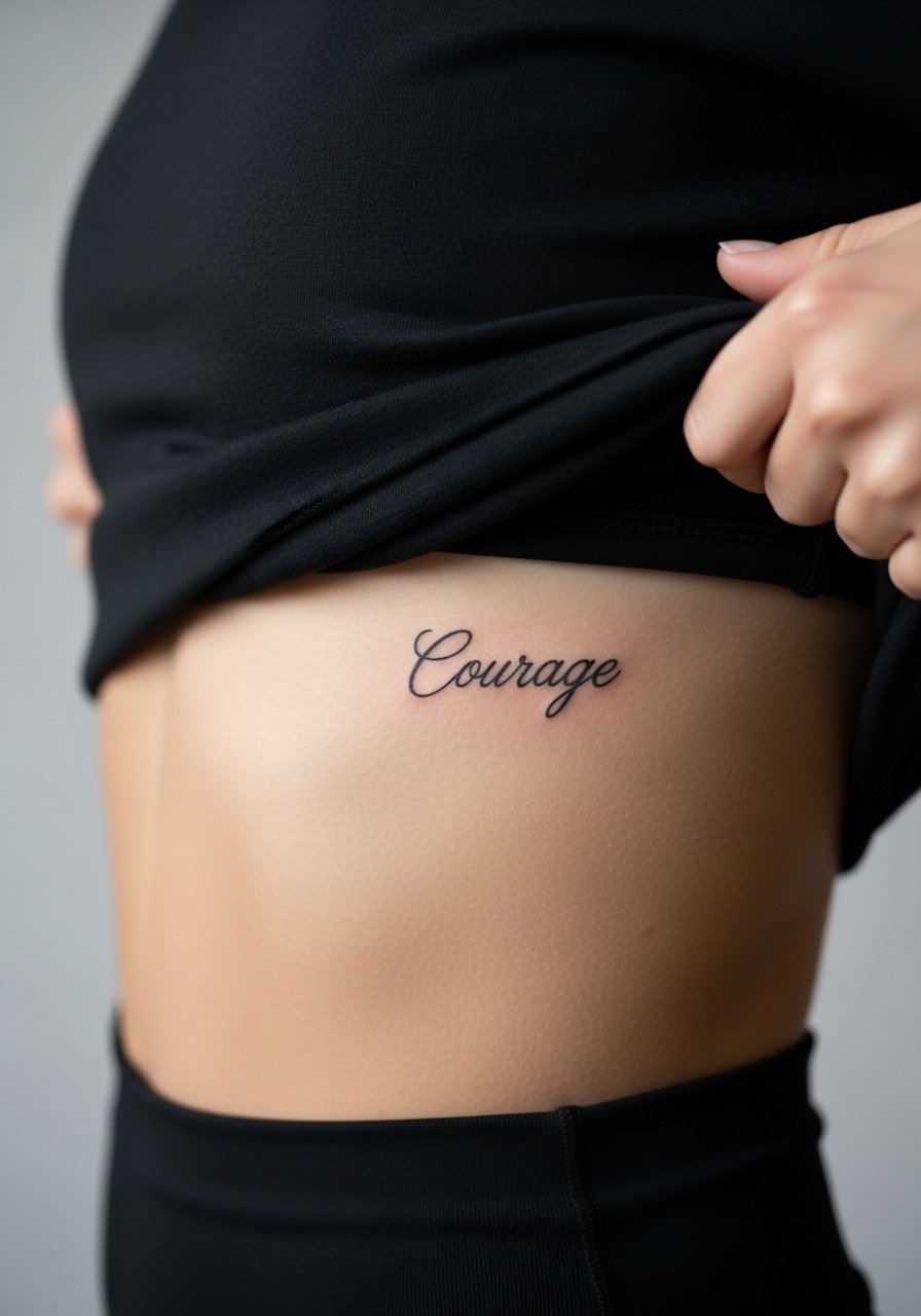
4. Script "Courage" with Lotus at the Back of Neck

Fair warning, the back of neck has movement and short hairlines that interact with script. Ask for slightly bolder line weight than typical fine line and request soft gray shading on the lotus to avoid tiny stipple areas that can spread. One camp of artists argues that neck lines blur faster because the skin shifts and hair rubs at the area. The other camp says with correct depth and spacing it holds up fine. If you plan to expose it, an updo or low ponytail shows the piece without constant friction. For session day wear, a low ponytail hair tie is a small practical touch that lets the artist work without hair interference.
5. "Courage" Infinity Script on the Back of Shoulder
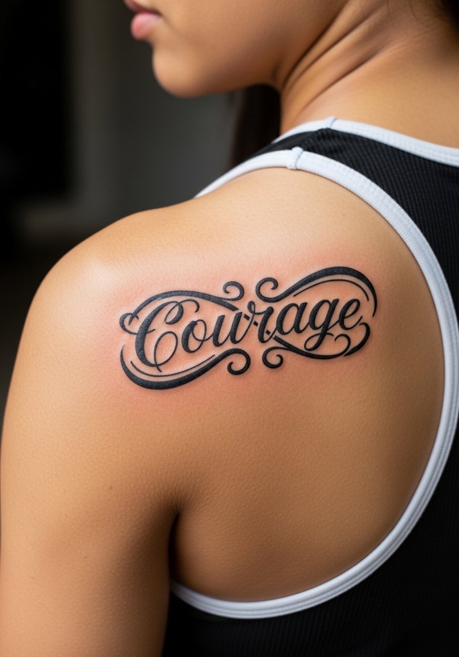
This placement reads well under straps and can be framed by clothing. The back of shoulder tolerates bold script without much blowout risk. A typical mistake is asking for too many loops or tiny flourishes inside the infinity symbol. Keep the script bold with open negative space so the design breathes. Sessions are short and usually done in a single visit. For showing the tattoo, strapless or racerback tops make the script a subtle reveal. Pair it with a racerback tank black to let the lines be the focus while layered necklaces draw the eye up.
6. Dagger with "Courage" Cursive on Forearm
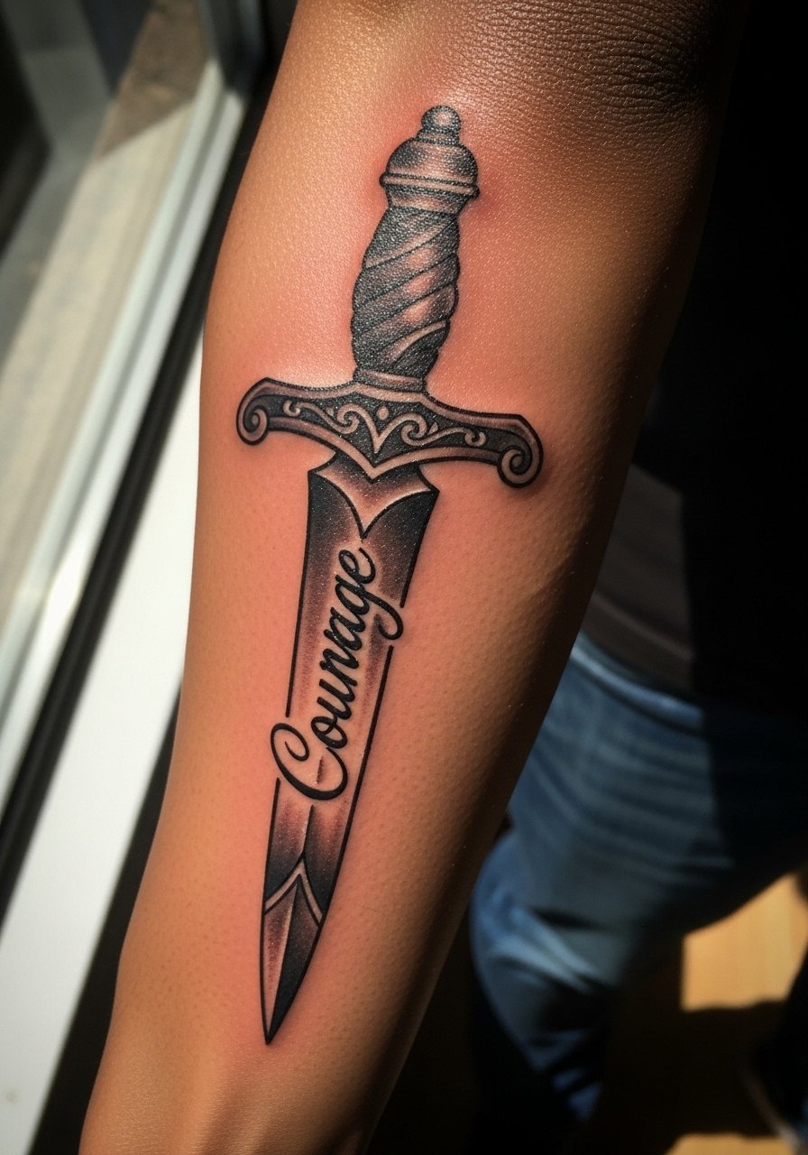
There is visual drama with a dagger and cursive pairing, and the forearm gives room for a 4 inch layout that keeps hilt detail crisp. When you consult, bring images showing the exact hilt ornamentation you like and specify that shading remain soft to avoid heavy saturation near thin script. A common aging problem is heavy black near delicate cursive which causes the letters to disappear into the shadow. Tell the artist you want separation between the blade shading and the script. Expect a two-session approach if you want high hilt detail. For session comfort, wear a loose short-sleeve button-down shirt you can pull aside without stretching fabric.
Studio Day Picks
The forearm and shoulder pieces above benefit from a few simple prep items that smooth the session and the first week of healing.
-
Stencil transfer paper kit. Lets you preview how script and line spacing sit on curved forearm contours before the needles start.
-
Topical numbing cream. Useful for tighter placements like the wrist or inner forearm when you want fewer breaks.
-
Thin protective film roll. Keeps small wrist pieces and exposed forearm lines clean during the busiest first week of hand washing and work.
-
Fragrance-free body wash. Gentle cleansers reduce irritation for healing script and shaded pieces near the neck and shoulder.
-
Aquaphor healing ointment. Thin layers in the initial days help keep fine cursive and bold outlines from drying into tight crusts that pull on the lines.
7. Lion Mane Bold Outline on Upper Arm
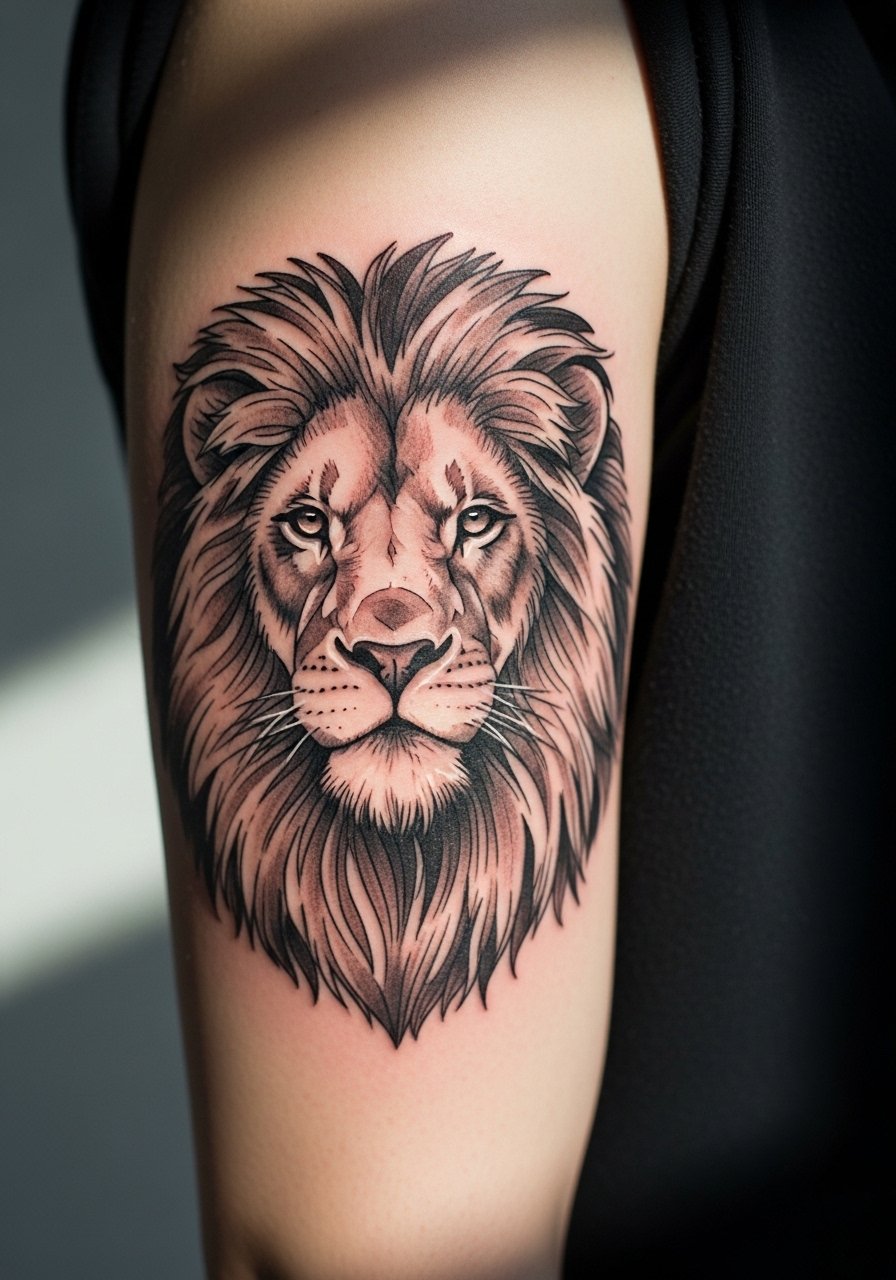
There's a reason lions show up on upper arms often. The upper arm gives enough canvas for a 4 to 6 inch mane with strong outline and optional soft shading. From a practical angle, choose a version with clear negative space in the mane. A common error is packing too much small texture into the mane which ages into muddiness. The session feels steady and tolerable. Expect the piece to hold form well at five years with minimal touch-up if you avoid heavy sun exposure. For display, roll a fitted muscle tank to the bicep or throw on a vintage leather jacket half-zipped to highlight the silhouette. A fitted muscle tank frames this classic placement nicely.
8. Bear Silhouette Bold Black on Shoulder or Calf

If you want something that reads from a distance, a solid black silhouette is effective. Pick shoulder or calf depending on how often you want it seen. The mistake I see is adding tiny internal detail to a silhouette. That undermines the graphic impact and creates small areas that can fade unevenly. A single-session fill usually handles a three inch silhouette. For calf placements, note that skin stretches with muscle change. For shoulder wear, a half-zip or rolled sleeve keeps it visible. The piece looks bold against a vintage leather jacket for contrast.
9. Dragon Bold Linework for Thigh or Back
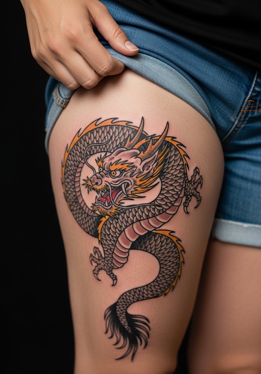
Large narrative pieces like dragons work best on expanses of skin. The thigh is forgiving for size and shading and sits well under clothing while showing when you want it to. The biggest mistake is stuffing a dragon into a small area. That results in loss of detail and a tired look after two to three years. This is typically a multi-session piece of three or more passes if you want color saturation and layered shading. For session day, wear loose shorts or a skirt that your artist can access without fabric pressure. A pair of high waisted denim shorts works well and keeps the tattoo zone comfortable during and after the session.
10. Spartan Helmet Outline on the Bicep
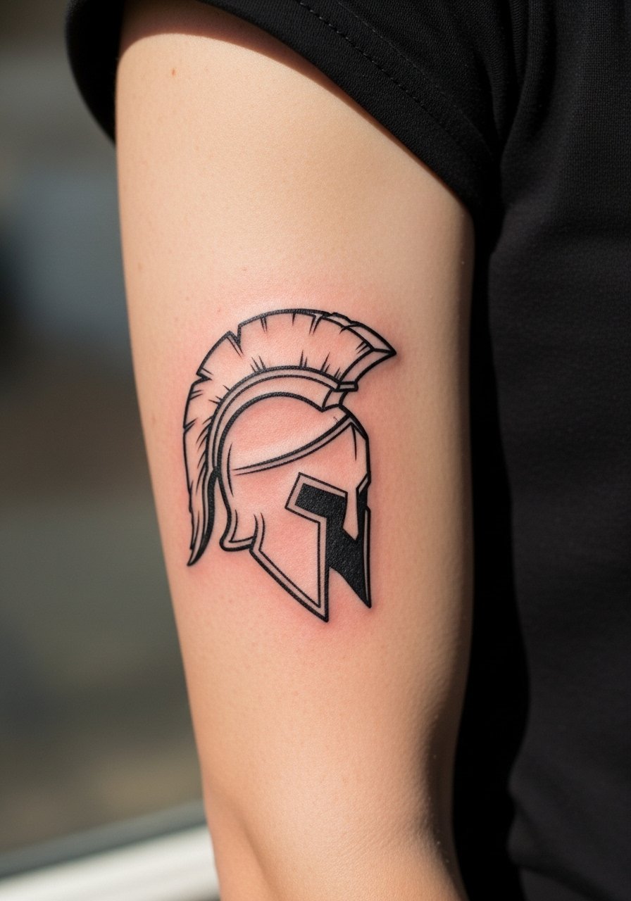
The bicep is a classic for single-symbol warrior imagery. Ask for clean, strong outline and keep interior detail minimal so the helmet silhouette reads at a glance. A frequent mistake is adding ornate filigree inside the helmet that competes with the outline over time. Expect one session for a 3 inch piece. For placement changes, a helmet on the inner bicep will read smaller and feel more tender. For showing it off, a fitted short-sleeve or a half-rolled sleeve frames the symbol best.
11. Sword and Shield Motif on Inner Bicep or Ribcage

Pain warning, the inner bicep is sensitive, and the ribcage is higher on most pain scales. The sword and shield look elegant on the inner arm if you keep details balanced. If you choose the ribs, name both camps when you discuss technique. One camp argues ribs cause lines to blur from skin movement and stretching. The other camp maintains disciplined depth and spacing corrects for that. For the inner bicep, wear a tank top with the arm raised so the artist can access the zone without tugging fabric. A loose tank top is handy for session day.
12. Minimalist Constellation on Ankle
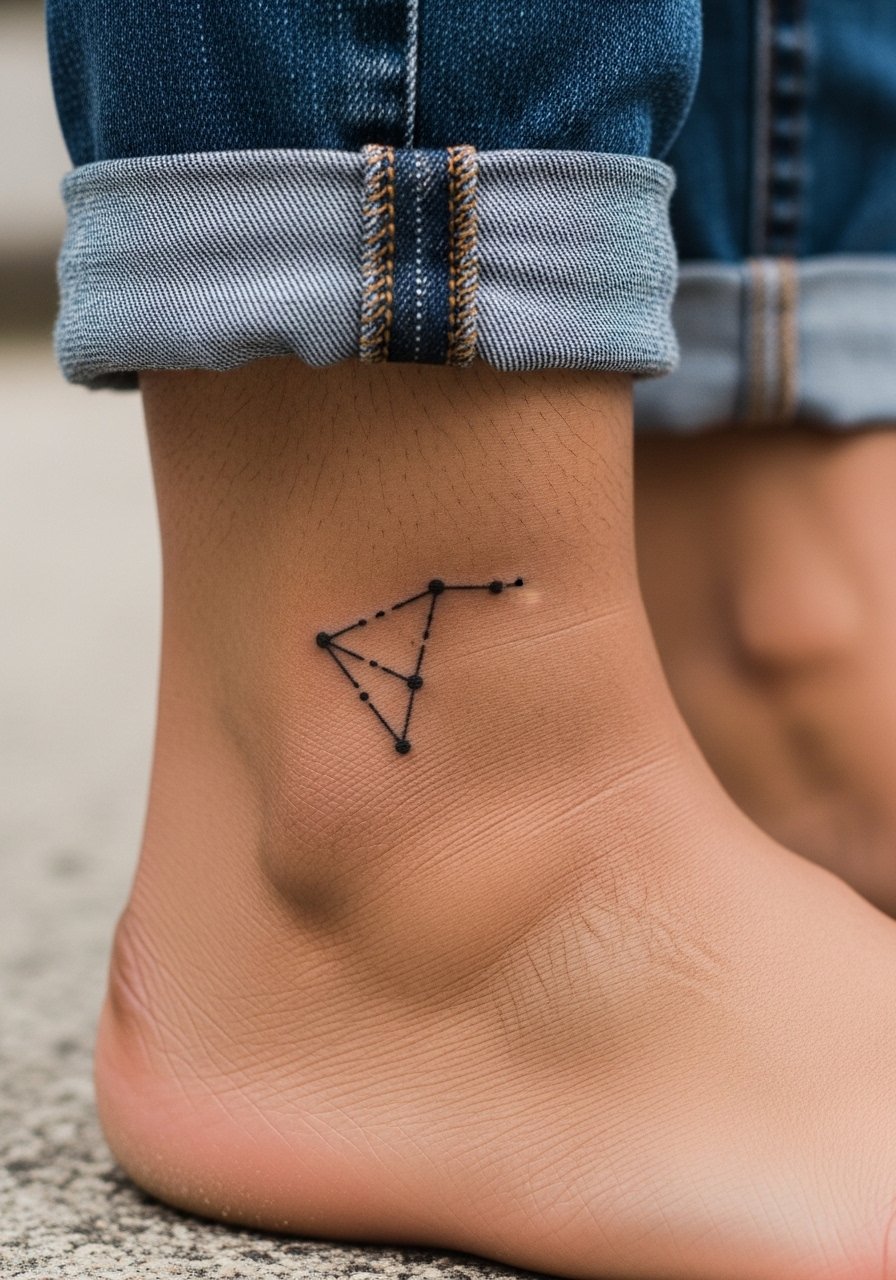
Ankle pieces are low-profile and great for scaled-down messages. For minimal constellations, ask for slightly thicker dots than your eye might prefer at first. Too-fine dots can soften into tiny smudges after heavy walking and rubbing against socks. Expect a single short session and the need for a small touch-up within the first two years if you wear tight footwear. Show-off tip, roll jeans or wear sandals to put the ankle on display. A simple pair of sandals keeps the area visible without interference.
13. Bold Traditional Rose on Inner Forearm

Personal observation leads this entry. Traditional roses with saturated fill age well because the thick outlines protect the color. The inner forearm placement sits mid-tolerance for pain and gives good protection from sun while remaining visible. Avoid requesting micro-whip shading inside the petals for this approach. That technique can create small areas that lose clarity. Ask your artist for saturated fill that is slightly muted so the rose still reads at year five. For session comfort, wear a loose short-sleeve shirt. Rolling sleeves shows the work immediately after healing.
14. Micro-Realism Wolf Head on the Bicep

Visual impact lead applies here because micro-realism looks incredible fresh but asks for careful scale. I recommend a 3 to 4 inch composition on the bicep so stipple shading retains its character. The mistake is asking for micro detail under one inch. Those tiny elements merge into gray patches after a couple of years. Mention stipple shading and crisp eye highlights to your artist during the consult. Expect a comfortable single session if the piece is moderate in size. For showing it off, a muscle tee rolled to the bicep highlights the detail work nicely.
15. Geometric Mandala on Upper Back

Aging and spacing are the critical factors for dense mandalas. An aging lead will say too-tight geometry blurs when placed on moving skin. For the upper back, you have the space to increase gaps between rings so the piece keeps definition long term. A common error is shrinking the mandala to fit a phone screen. Tell your artist you want ring spacing that reads clearly at arm's length. Sessions may be split into two to get the symmetry and even saturation right. For clothing, open-back or halter tops make the symmetry a focal point while keeping the look elegant.
16. Small Courage Word on Ribcage
Aging-reality lead matters here. Fine script on the ribs is beautiful but controversial. One group of artists says fine line blurs on ribs because the skin stretches and flexes frequently. The other group says disciplined needle depth and slightly increased letter spacing solve the problem. If you want a small piece, make sure the letters are taller rather than very narrow. Pain is higher on the ribs, so plan accordingly. For session wear, a cropped top that can be lifted without tugging helps. Consider a cropped athletic top for easy access.
17. Infinity with Single Word on Back of Shoulder

The back of the shoulder handles bold ornamental scripts well. For longevity, keep the infinity lines thick and the integrated word set in slightly wider letterforms. Narrow cursive inside an infinity loop tends to disappear as the shape ages. A single session usually covers a two inch piece. For styling, a strapless top or racerback tank frames the area without covering the script. A strapless crop top reveals that back-of-shoulder placement elegantly.
18. Compass Rose on Calf
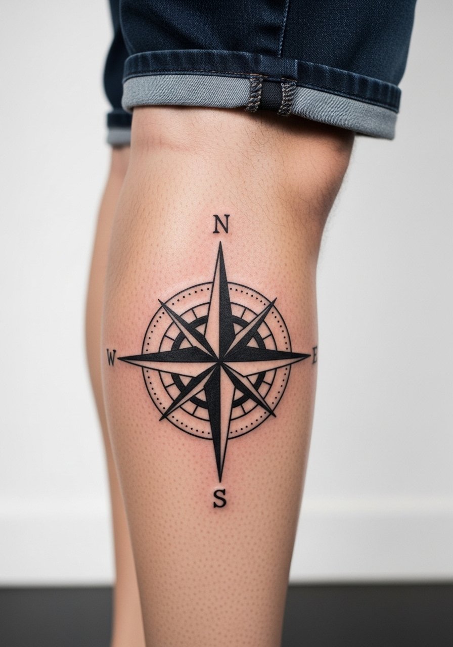
Consultation lead fits this navigation symbol. The calf gives enough room to keep cardinal points separated so the compass holds crispness over time. The common mistake is compressing arrowheads and tiny labels that fade into a blotch. For session wear, loose shorts make the area accessible without fabric pressure. For show-off styling, pair with a slit maxi skirt or high boots that let the compass peek through the hem.
19. Tiny Arrow on Inner Wrist

Mistake lead applies because tiny arrows often get overrefined. For the wrist, keep the arrow thicker and slightly longer than you think you need so the linework remains readable through daily washing and friction. The session is short but the touch-up rate is higher for the wrist compared with forearm. For showing off, a thin chain pendant necklace sits above the wrist area and balances delicate textiles when you want a subtle look.
20. Stag Silhouette on Chest Near Collarbone
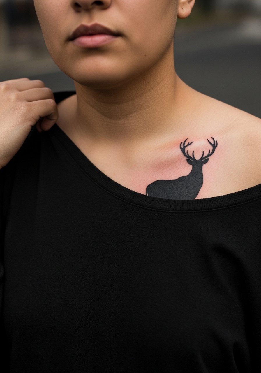
For upper chest and collarbone work, always avoid asking for extreme smallness. Solid silhouettes like a stag use negative space to define antlers which keeps the piece readable. The area sees friction from straps and necklaces so expect a minor touch-up for edges if you frequently wear shoulder straps. During the session, a wide-neck shirt pulled aside gives access while keeping exposure minimal. Pair the placement with a simple thin chain pendant necklace that sits above the design without rubbing it.
21. Lotus Linework on Sternum Edge

Sensitive placement note, sternum work requires an artist experienced with chest anatomy. The biggest mistake is requesting high-detail micro-shading in the center where the skin compresses and heals with different texture. Ask for slightly bolder outlines and a fitted sports bra on session day so the artist can work without fabric shifting. Expect moderate pain and one session for a modest piece. Respectful note on cultural motifs, if your lotus draws from a specific spiritual tradition, consider variations rather than direct, exact replicas to show respect.
Frequently Asked Questions
Q: How does bold script on the forearm age compared with fine line script?
A: Bold script on the forearm tends to hold shape longer because thicker downstrokes protect the letterforms. Fine line script can look gorgeous fresh but often needs touch-ups sooner, especially on sun-exposed areas. Ask your artist for slightly increased letter spacing and heavier downstrokes if longevity matters more than a wispy aesthetic.
Q: Will geometric designs with red accents fade faster than pure black work?
A: Reds fade differently than black because pigment chemistry and placement matter. If you want a durable red accent, have your artist layer saturation across two passes and plan for a color check at year two. Placement on the forearm or upper back helps protect color from constant sun and abrasion.
Q: Are ribcage and sternum placements worth the pain for small text pieces?
A: It depends on how much visibility and future stretching you expect. Ribs and sternum produce more pain and the skin there changes with weight and posture. If you choose those spots for small text, ask for slightly taller letters and discuss touch-up timelines with the artist before booking.
Q: How should I dress for a thigh dragon session to stay comfortable and give the artist access?
A: Wear loose shorts or a skirt you can shift without fabric pulling on the area. A pair of high waisted denim shorts is a practical choice because you can lower the waistband a touch without fully undressing and keep the area accessible.
Q: What's a reasonable timeline to expect for touch-ups on wrist and ankle pieces?
A: Wrist and ankle pieces usually see the most friction and wear. Expect a small touch-up within one to three years if you wear tight shoes or bracelets daily. Keeping those areas sun-protected reduces the chance of color breakdown and line softening.
Q: Should I look up hashtags or local directories to find a shop that does bold script well?
A: Yes. Search style-specific hashtags like #boldscripttattoo and use local studio tags or directory filters to find artists who post healed work. Also peek at community threads for healed photos so you can see how certain hands hold up over time.