
Black and grey script reads like a small remark you wear, a sentence that keeps its shape as your skin changes. The best quote tattoos land because the wording, the placement, and the spacing were planned together. Below are 21 tight black and grey quote ideas with consultation notes, how they age, styling tips, and the real mistakes to avoid so the words last like you meant them to.
1. "Memento Mori" Script Along the Inner Forearm
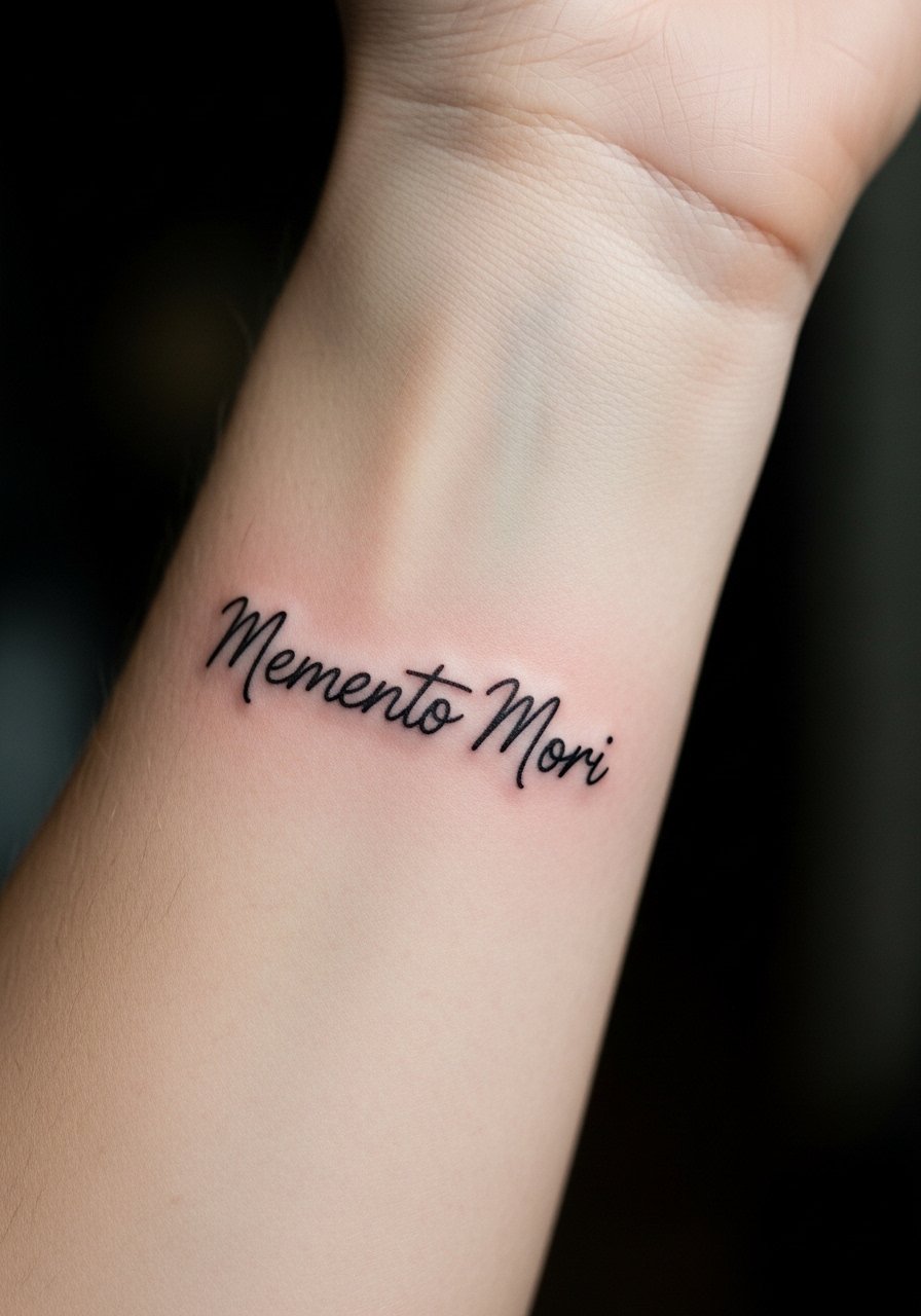
Start with a personal observation: small Latin phrases like "Memento Mori" age well when the letters have space to breathe. Tell your artist you want slightly taller x-heights and modest spacing so the letters do not compress as they settle. Fair warning: the inner forearm sees sun and friction, so plan a light touch-up at year three. A common mistake is asking for ultra-tiny calligraphy, which blurs into a dark line. Pain is low and sessions are quick, often under an hour. This placement shows off under rolled sleeves, so wear a loose button-down shirt to the appointment for easy access.
2. Single-Line "Breathe" on the Side of the Ribcage
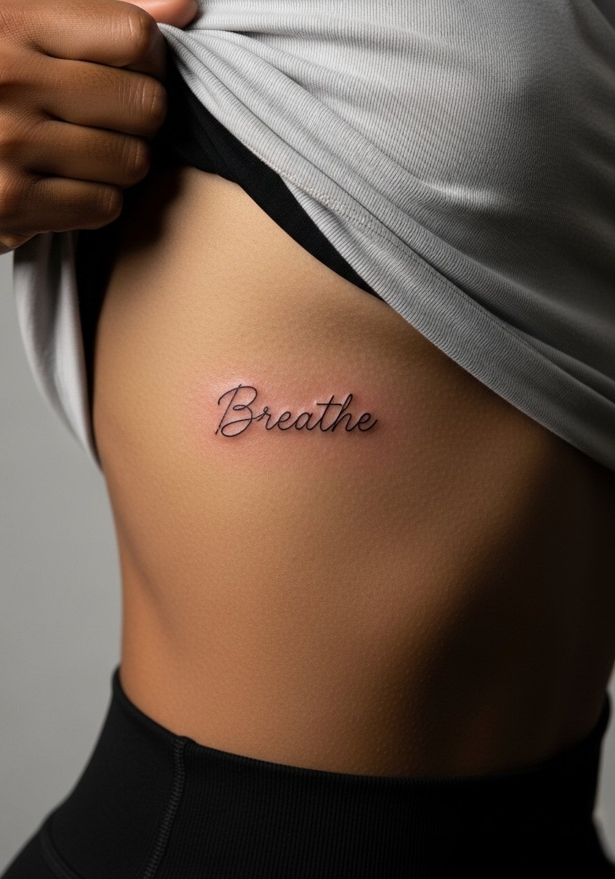
Pain warning: the ribcage rates high on most pain scales, and sessions can be interrupted for breath. Artists split into two camps on fine line ribs. One camp says thin script blurs on ribs within a couple of years because the skin flexes. The other camp says that proper needle depth and slightly increased spacing keeps script legible long term. Say where you fall in that debate during consultation and ask about touch-up timelines. Expect a one to two hour session depending on length. For the shoot and recovery, bring a zip-up hoodie you can pull aside, and consider a lightweight zip hoodie you can take on and off easily.
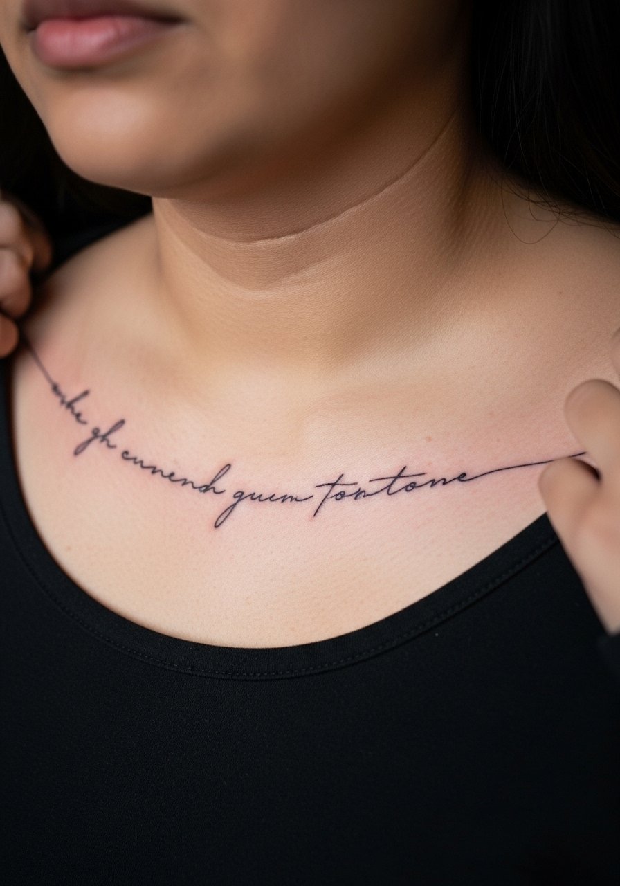
3. Curved Collarbone Quote in Blackletter
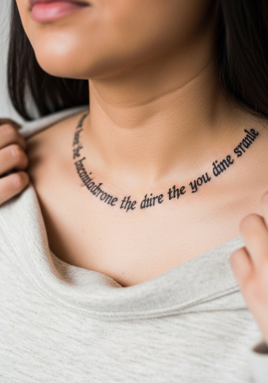
Aging lead: blackletter reads dramatically fresh and it holds shape when sized correctly for the collarbone curve. Ask your artist to arc the line with the bone so the letters sit flat visually when you move. The common mistake is packing too many words; blackletter needs breathing room. Expect moderate pain and a session under two hours. For showing it off pair with an open-neck blouse that frames the collarbone without hiding the script. Respect the style's origins by avoiding exact copies of cultural or liturgical pieces unless you have personal ties.
4. Tiny Finger Initials, Two Letters on the Side of One Finger
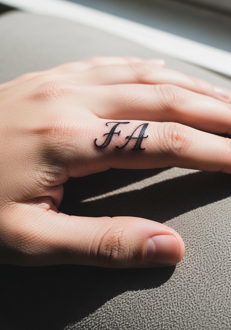
Mistake lead: tiny fingers blur fast if the stencil is placed on the lateral phalanx instead of the flatter side. Tell your artist you want the letters on the flatter surface and request slightly bolder linework so the initials remain legible after frequent hand washing. Expect quick sessions but a higher touch-up rate, commonly within one to two years. Hands are sensitive and visible in workplaces, so weigh career considerations. For after the session, wear a breathable glove during long chores. Finger pieces pair subtly with a thin chain ring when you want to keep focus on the letters.
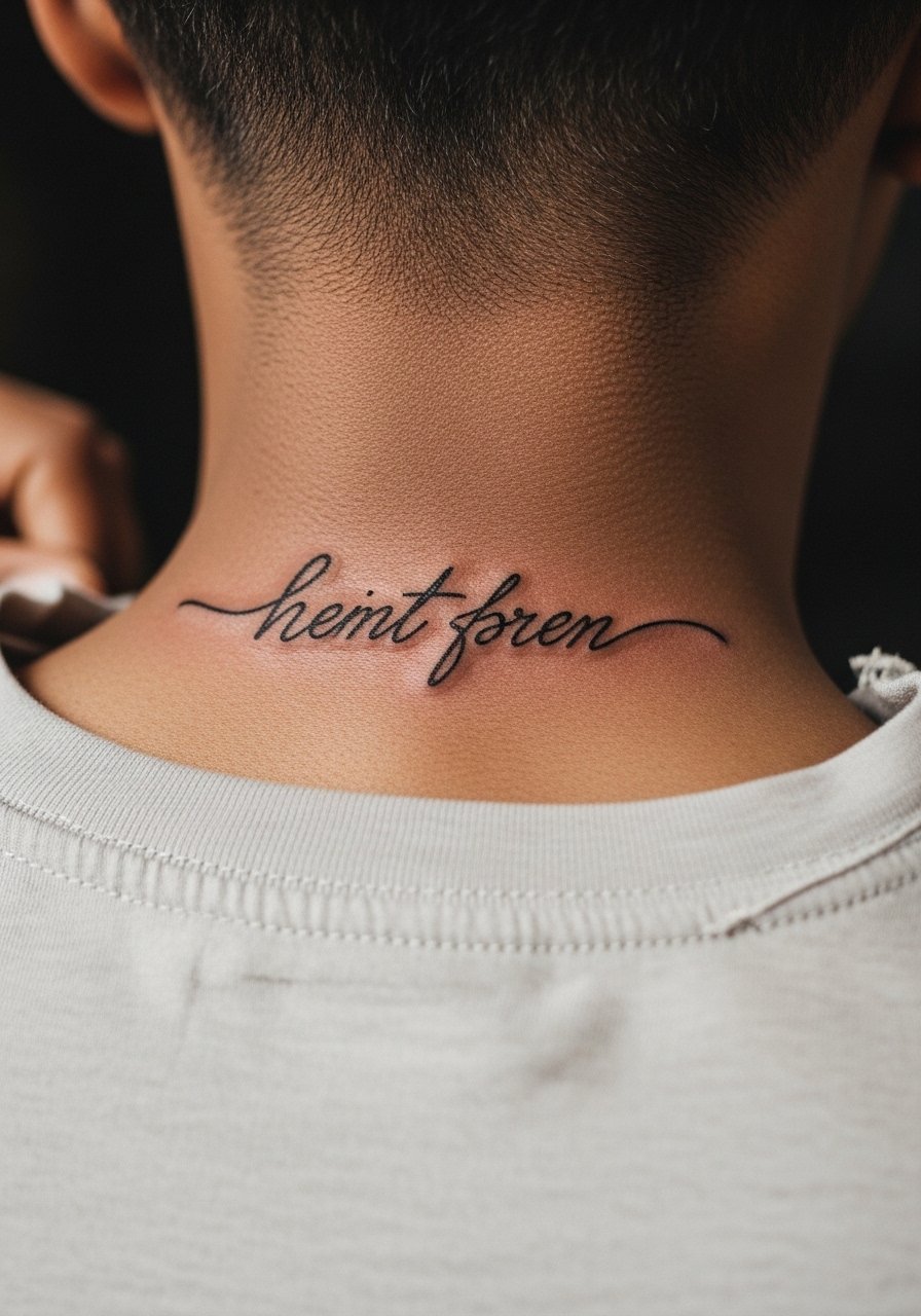
5. Short Quote on the Side of the Neck
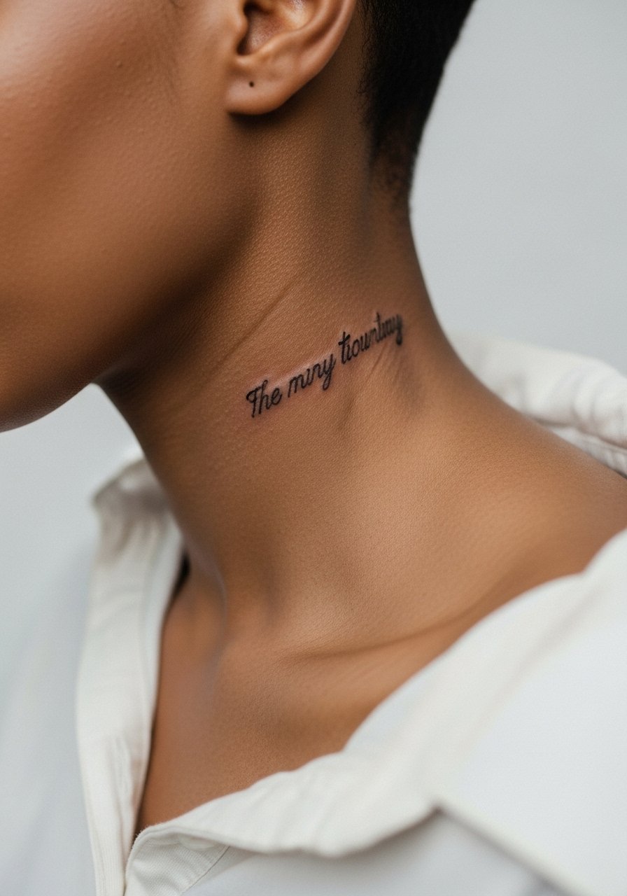
Consultation lead: neck skin moves a lot, so shorter quotes with relatively bold linework work better than tiny flourish script. The biggest mistake is over-decorating the letters with heavy flourishes that bleed into one another when healed. Expect a moderate pain level and sessions that may last 45 to 90 minutes depending on length. Hand placement and job visibility are real considerations. Pair the piece with a thin chain pendant necklace that sits above the script and draws attention without competing.
6. Sternum Phrase Framed by Subtle Dot Work
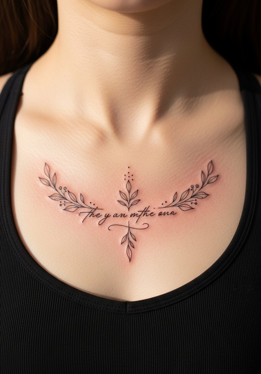
Visual impact lead: sternum text looks strong when paired with stipple shading that gives depth without heavy saturation. Tell your artist to keep the central script small but bold, and to use dot work for framing rather than solid black fills which can feel heavy on the sternum. Sessions can be longer and more painful than arm pieces because the bone is close. A common mistake is insisting on ultra-fine lines across the sternum which often require touch-ups earlier. For the appointment wear a supportive sports bra you can remove or pull down easily. Pair this piece with low-cut tops for evenings, but plan the reveal intentionally.
Studio Day Picks
The first six pieces above include wrist, neck, forearm, rib, finger, and sternum placements. These areas need different prep and light first-week care, so a few specific items smooth the chair day and the first week.
-
Stencil transfer paper kit. Lets you preview script placement on skin and adjust spine or curvature before the needle touches the surface, useful for collarbone and rib placements.
-
Topical numbing cream. Applied according to instructions it can ease discomfort during rib and sternum sessions without affecting linework.
-
Thin protective film roll. Helps protect finger and wrist tattoos from constant washing and friction during the first few days.
-
Fragrance-free gentle body wash. Cleanses healing areas without stripping oils that delicate scripts need in the first week.
-
Aquaphor healing ointment. A thin layer for the initial days helps keep fine line work moist and reduces scabbing that can pull on thin letters.
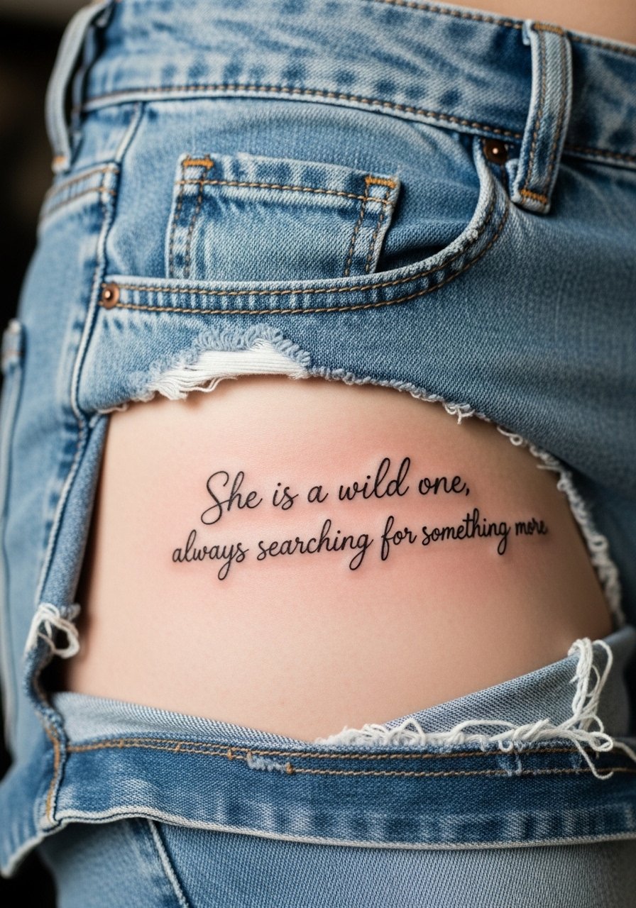
7. Lower Ribcage Quote with Fine Stippling Shadow
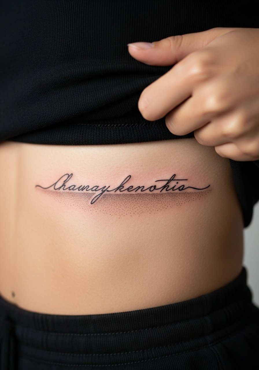
Pain warning lead: the lower ribcage is a sensitive area and sessions can be stop-and-start depending on breath. My observation is that quotes here need breathing room and a slightly heavier hand than on a forearm. Ask the artist for supportive shading rather than tight microlettering. A mistake people make is packing long sentences onto the ribs. That forces letters too small and speeds blurring. Healing feels tight and may itch more than arm tattoos. Cover this placement on long flights and sleep with loose waistbands. For revealing outfits try a high-waisted skirt with an open-back top for evenings.
8. Minimalist Script Along the Spine
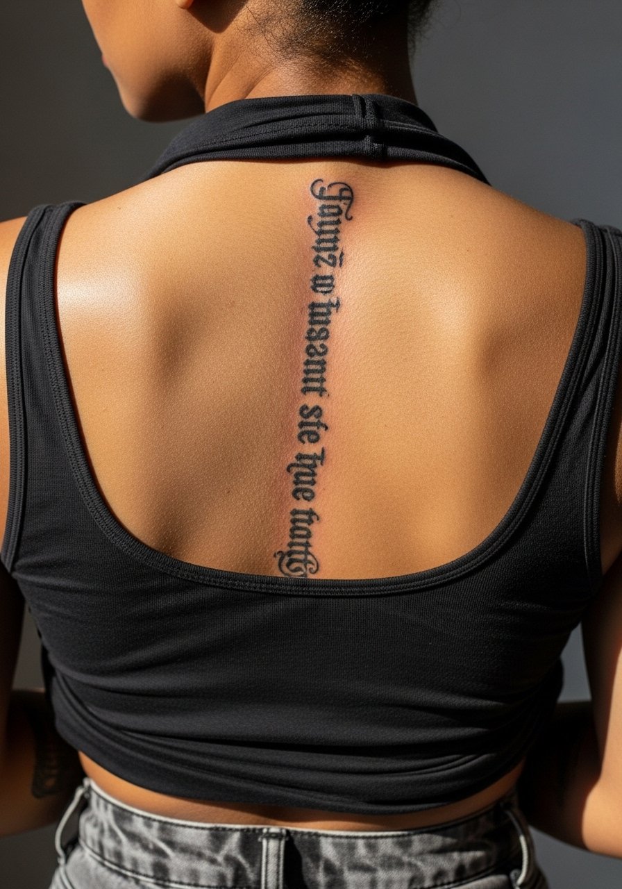
Mistake lead: the spine is a dramatic canvas but tiny letters can lose legibility if placed too close to the vertebrae. Say you want medium weight linework and even spacing so the quote reads from a distance. Sessions can be longer and uncomfortable when sitting upright is required. Expect touch-ups around year two if the skin shifts with weight change. For showing off pair it with an open-back dress that frames the central line without competing.
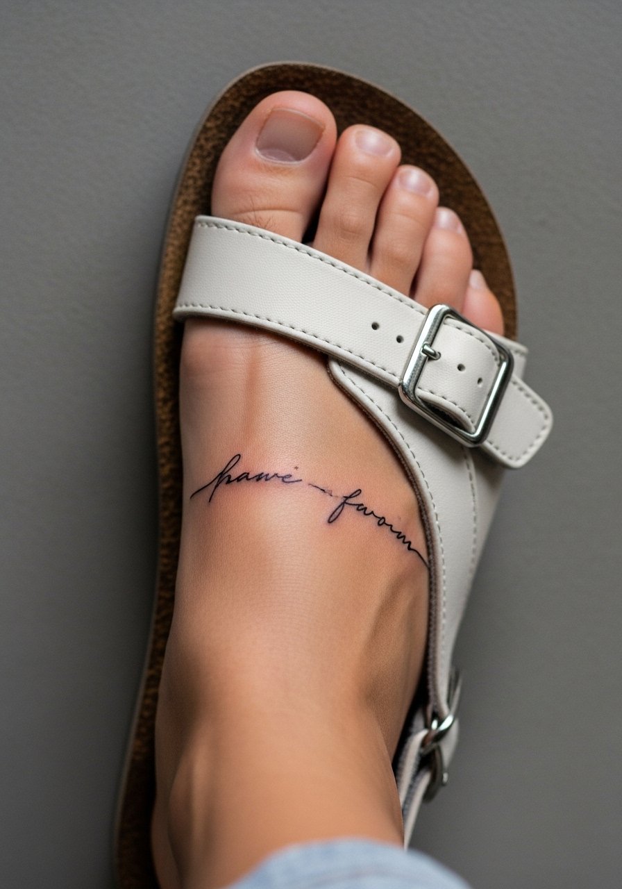
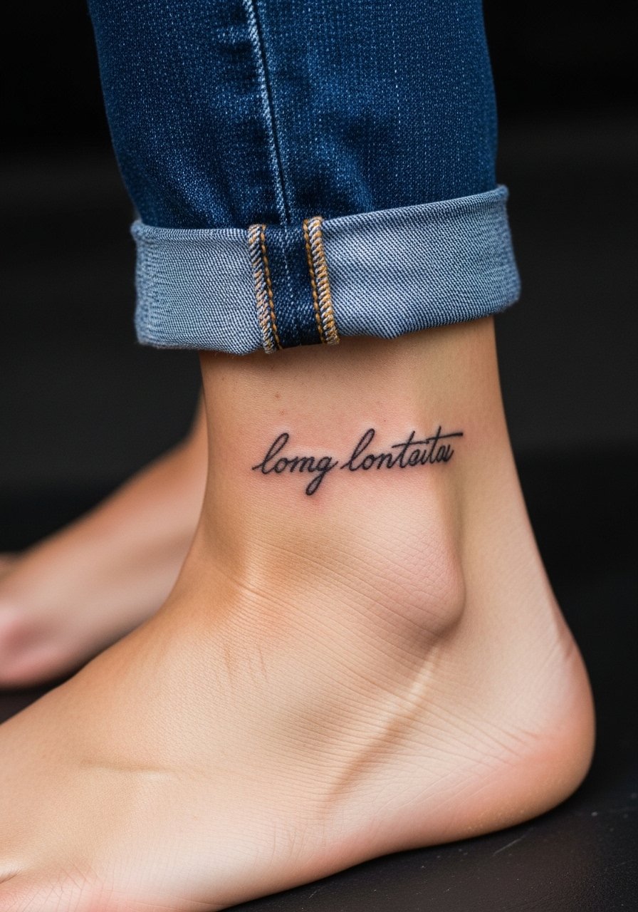
9. Single-Line Ankle Quote Wrapped Around the Bone
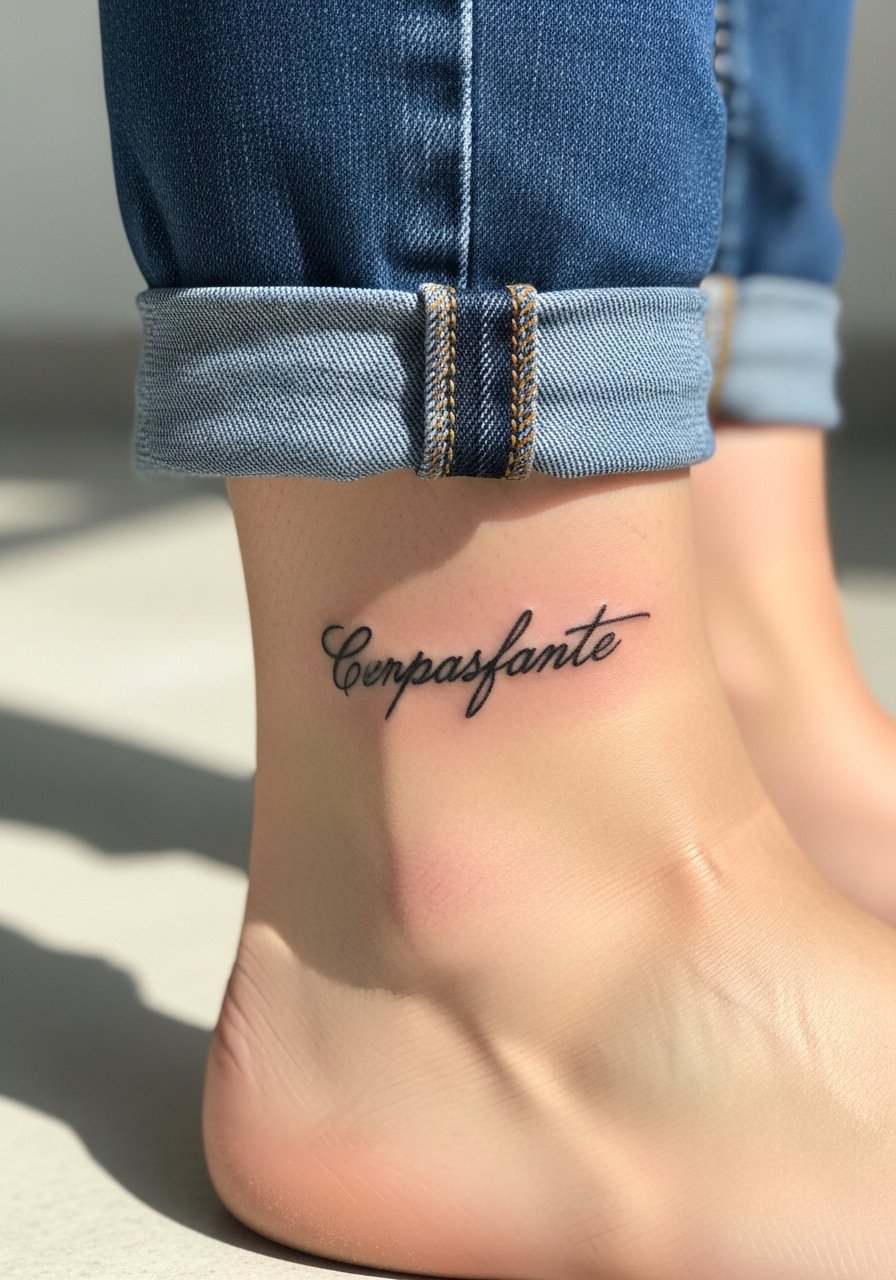
Consultation lead: ankle quotes need to account for constant friction from socks and shoes. Ask for compact, bolder letters and slightly spaced characters to prevent merging. The session is quick but expect more touch-ups than forearm pieces. Common mistakes include requesting minute flourishes that disappear after a few months. Pair this placement with sandals or rolled pants when showing it off. For the appointment wear loose pants you can easily roll up and consider a pair of slide sandals to avoid shoe friction the first day.
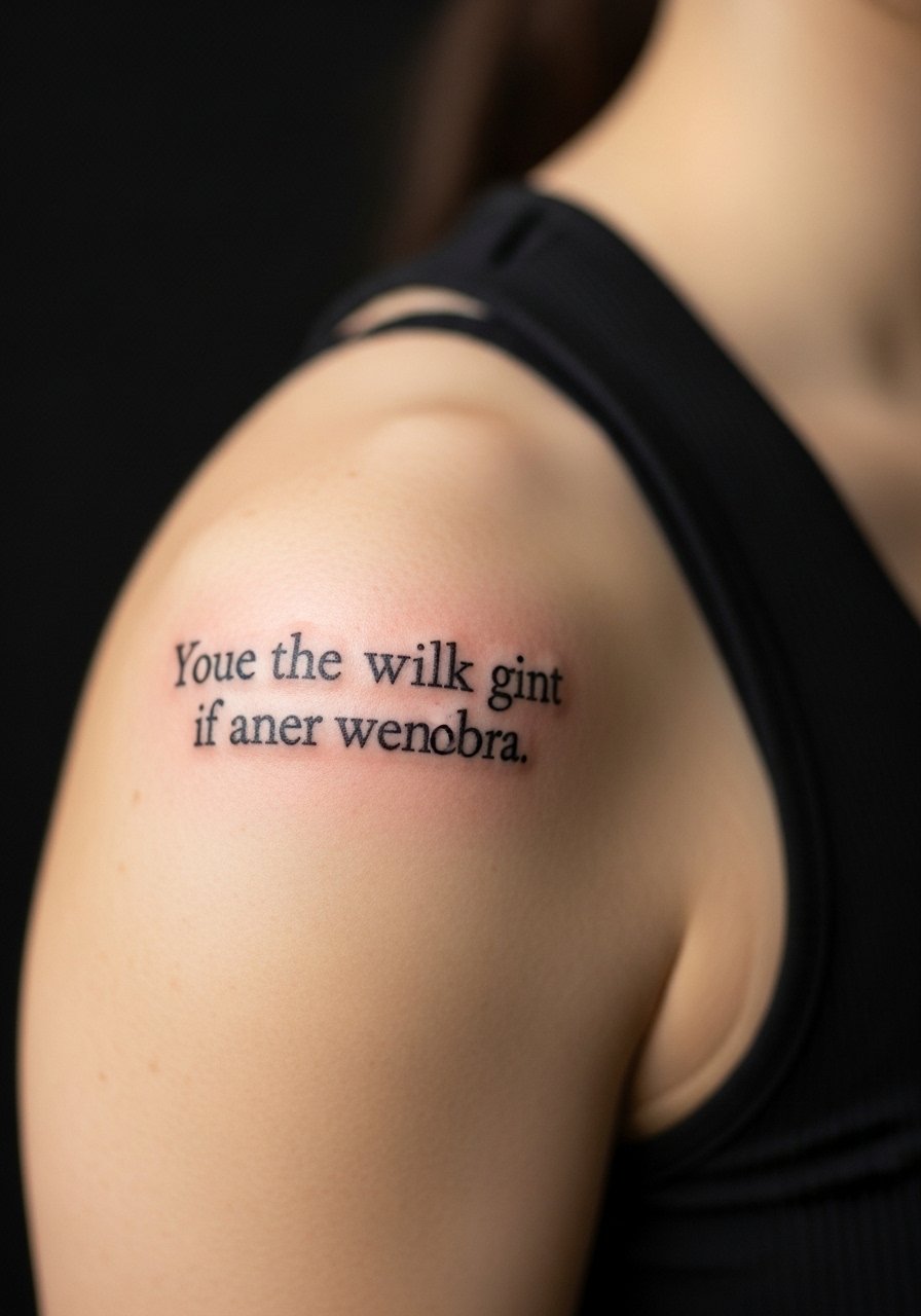
10. Short Inspirational Line Across the Upper Bicep
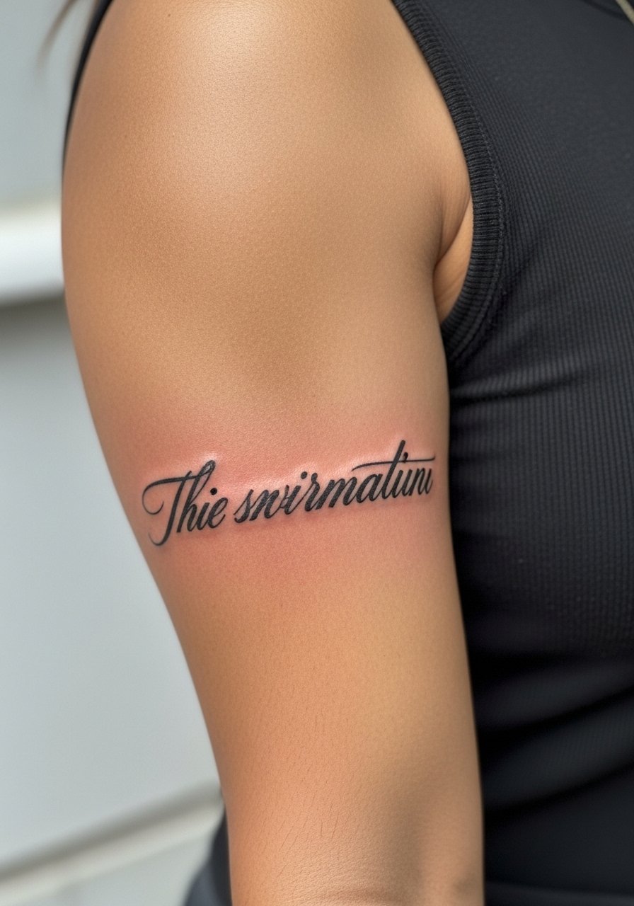
Visual impact lead: the upper bicep gives lettering room to breathe so even a modestly stylized script holds well. Tell the artist you want moderate saturation so the letters stay clear even after sun exposure. A common mistake is tiny script that looks lost on the bicep when muscles relax. Sessions are moderate in pain and often under two hours. Pair with a sleeveless linen top and use a linen tank top during the session for easy access.
11. Scripted Date in Roman Numerals on the Inner Wrist
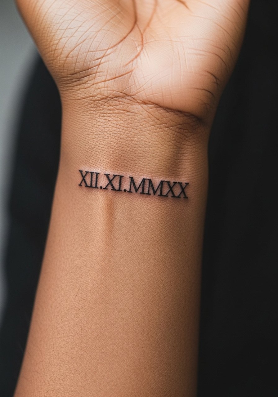
Personal observation lead: dates in Roman numerals look timeless on the wrist when the numerals are slightly bold. Ask for even spacing and avoid overly thin strokes that fade with frequent washing. The inner wrist is low to moderate pain and quick to tattoo. The common mistake is making the numerals too tight, which forces them to blur. This placement pairs well with a minimalist watch or bracelet. Consider a minimalist leather strap watch that sits above the script without rubbing it.
12. Short Latin Maxim on the Side of the Hand
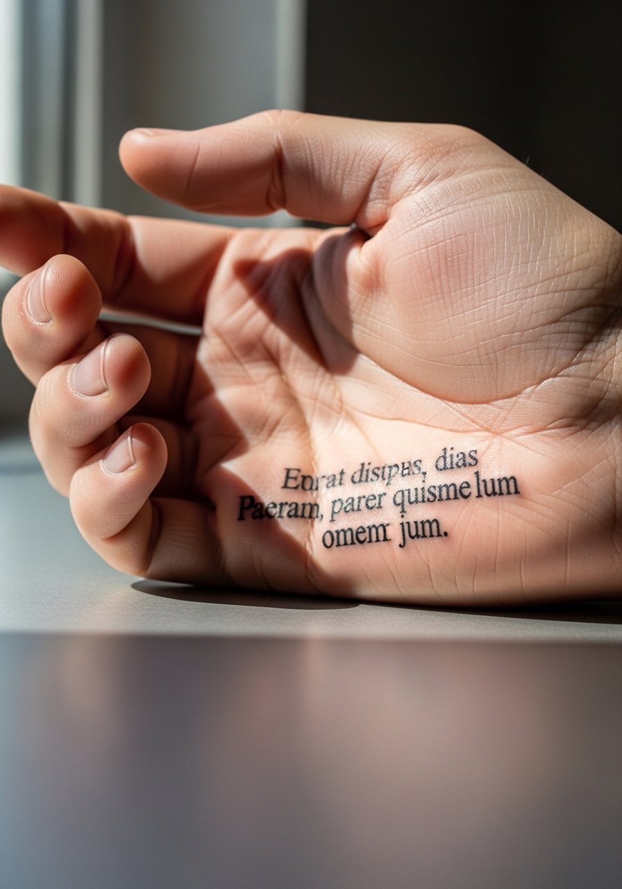
Aging lead: hand skin takes heavy use and washing, so script here softens quicker than other areas. If you want longevity pick bolder letters and limit the length. A common mistake is choosing ornate lettering that the hand cannot hold over time. Sessions are short but expect touch-ups more often than on the forearm. Hand tattoos still affect hiring in some industries, so think about career impact before committing. Keep paired jewelry simple and consider a minimal cuff bracelet to accent the piece without constant rubbing.
13. Quote Under the Clavicle, Slightly Offset
Consultation lead: offset placement under the clavicle reads best when the script follows the bone rather than cutting across it. Ask for slightly increased line weight compared with extreme fine line so the letters remain crisp over years. The area is moderate in pain and session time is often under an hour. Mistakes include long sentences that curve awkwardly across the bone. For easy access to the area at your appointment wear a wide-neck shirt you can shift aside without undressing.
14. Short Mantra in the Inner Bicep
Pain warning lead: the inner bicep can be tender and the skin is softer, so plan for a gentle approach and possibly a numbing option. The biggest mistake is cramming long quotes into this narrow zone. Tell your artist you want medium spacing and ask how the letters will sit when your arm is relaxed. Healing can feel warm and tight for the first week. Inner bicep pieces pair with sleeveless shirts for display. For the session wear a loose tank top that gives full access without rubbing on the fresh area.
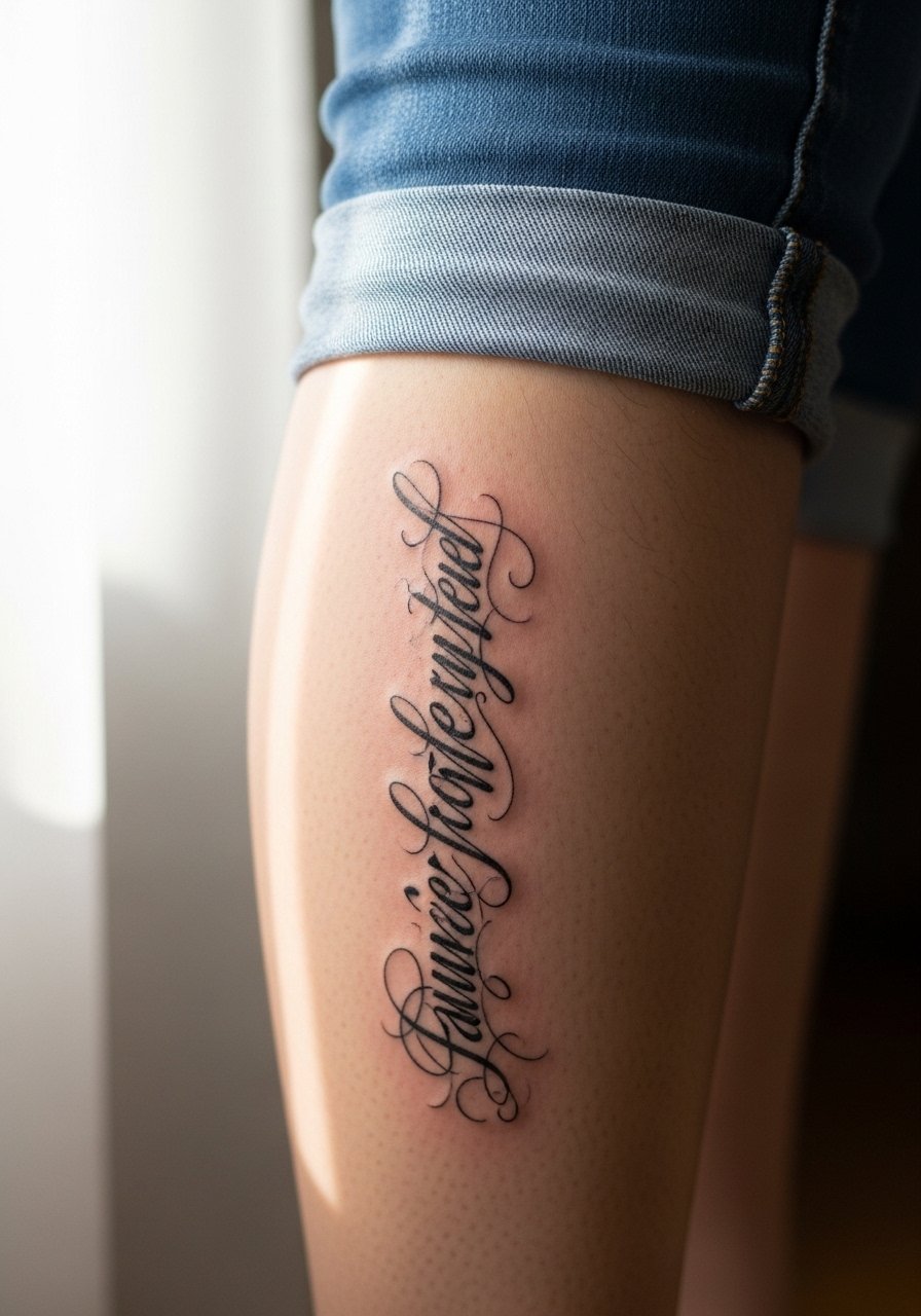
15. Two-Line Script Along the Side of the Thigh
Styling lead: the thigh is forgiving and gives space for two-line layouts that look great under skirts or shorts. Say you want clear line separation and ask the artist to test the stencil while you stand and sit so the lines keep their relationship. Sessions are moderate and healing is usually comfortable because clothing can be adjusted to avoid friction. Common mistakes include too much fine flourish which looks delicate but disappears. For the session wear high-waisted shorts you can shift without pressure on the area.
16. Short Phrase Along the Top of the Foot
Visual impact lead: the top of the foot shows text well from a short distance but faces constant shoe friction. Ask for medium weight letters and plan to avoid closed shoes for the first week. Expect a little more discomfort during sessions and a higher likelihood of scabbing. The common mistake is choosing very ornate script for an area that needs clarity. Pair with sandals and light shoes. For the appointment pick slip-on sandals like simple slide sandals to avoid pressure.
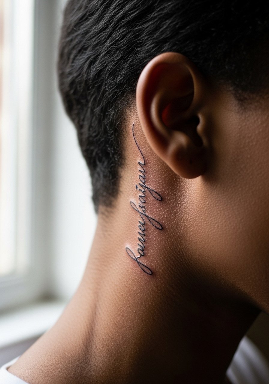
17. Single-Word Script at the Base of the Neck
Mistake lead: people want tiny script at the base of the neck and then are surprised when the letters need boldening to remain visible. Ask for a single word in medium weight and confirm exact kerning with the artist. Sessions are quick and pain is typically low to moderate. This placement is easy to hide with hair or clothing, but visibility at job interviews may be a consideration. Pair with high collars or open-neck tops. Consider a soft crew neck tee for casual coverage.
18. Short Quote Along the Calf
Consultation lead: the calf is low risk for blowout if the lines are sized correctly. Tell your artist you want medium line weight and steady spacing so the quote remains legible while you run or cycle. Sessions are comfortable and healing is straightforward because clothing can be adjusted. A mistake people make is letting the letters sit too close together which compresses after a few years. Display with cropped pants or midi skirts and try a cropped pant in your wardrobe for easy showing.
19. Short Script on the Inner Ankle
Personal observation lead: inner ankle pieces can wind up blurred if the letters are too thin because of shoe and sock friction. Ask for slightly heavier strokes and a spaced layout. Sessions are quick but expect touch-ups depending on footwear. The most common mistake is picking ultra-delicate lettering that cannot withstand daily movement. Pair this piece with cropped jeans and ankle boots. Try a pair of ankle boots that avoid constant rubbing when you are breaking them in.
20. Small Quote Behind the Ear, Below the Hairline
Consultation lead: behind-the-ear placements are small and intimate, so pick very short text or a single word. The area is sensitive and the stencil must be placed carefully to avoid the hairline. Expect a short session and low to moderate pain. Artists disagree on longevity because oil from hair can affect healing, so ask about recommended aftercare for hair-covered spots. For the appointment wear a top that allows the artist access without full hair removal. A simple barrette or pulled-back hair helps.
21. Short Script on the Outer Shoulder Blade
Visual impact lead: the shoulder blade gives a broad canvas and the quote sits naturally with movement. Request a stencil check while standing and while the artist gently shifts the shoulder so the line stays even. Sessions are moderate and healing is usually comfortable. Mistakes include long, multi-line sentences that fight the curvature of the shoulder blade. For showing it off pick tops with thin straps or racerbacks and consider a racerback tank for evenings.
Frequently Asked Questions
Q: Will fine line script blur faster on the ribs than on the forearm?
A: It depends on size and spacing. Ribs flex more and sit closer to bone, so ultra-fine script there tends to need touch-ups sooner. If you want ribs, ask for slightly more spacing and medium line weight so the letters hold longer.
Q: How do I pick a font that will age well for a wrist quote?
A: Pick a font with open counters and modest stroke contrast. Ask your artist to show how the letters look at a slightly larger size than you expect. That preview helps you see what will survive daily washing and friction.
Q: Are there placement-specific clothing tips for a sternum or ribs session?
A: Yes. Wear a fitted sports bra or a bandeau top you can shift so the artist has clean access. For post-session comfort choose soft fabrics and avoid underwires for the first week. A fitted sports bra that you can pull down slightly usually works best.
Q: Do hand and finger scripts affect career prospects?
A: They still can in some fields. Hands are highly visible and may be judged in customer-facing roles. Think about future work situations and how easily you can conceal the piece if needed.
Q: How often should I expect a touch-up for a wrist or finger quote?
A: From what I have seen, wrists commonly need touch-ups around year two to three, and fingers often need one sooner. Factors are sun exposure, hand washing, and how bold the original linework was.