
Fine line work often looks fragile in photos but the right placement and spacing are what make it last. Artists I talk to will tell you that small adjustments in line weight and a one-minute stencil reset save years on a piece. This list pairs literary motifs with lasting approaches so you can pick a direction that reads well fresh and still reads clean after a few seasons.
1. Fine Line Botanical Wreath on the Wrist
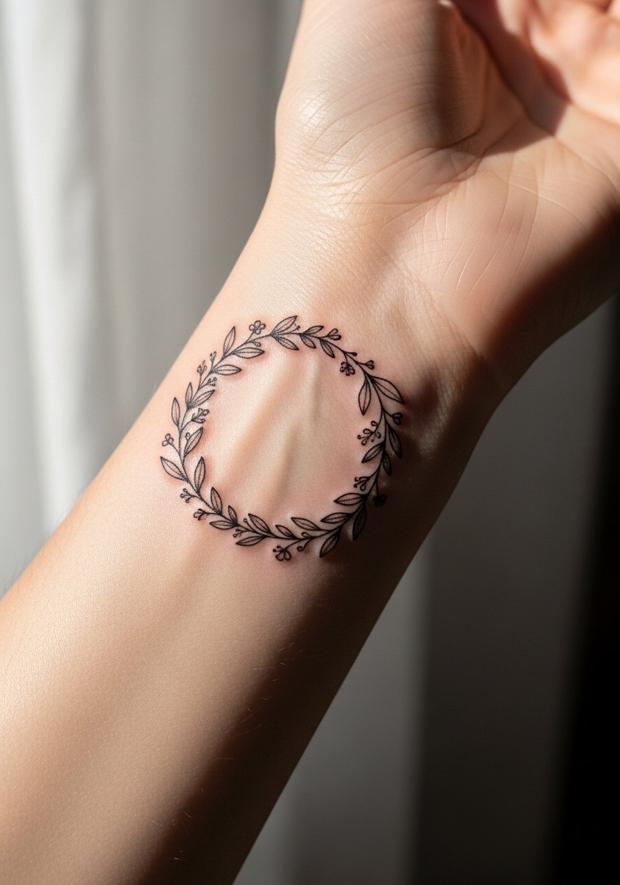
I open with a practical rule I use in consultations. For a wrist wreath pick slightly wider spacing between leaves so the linework has breathing room as it settles. Tell your artist you want single-needle fine line but ask them to thicken stems slightly where curves meet. The wrist is low on fat and the skin moves a lot, so blowout risk is real when the wreath is squeezed too small. Expect a short session and a possible touch-up at year two. For showing it off, rolled sleeves look great with this placement, try a rolled sleeve cotton shirt during casual outings, and remove bracelets for the appointment so the artist has clear access.
2. Minimalist Open Book Outline on the Inner Forearm

When you sit down with an artist for an open book outline say which page angle you want and whether the spine reads vertical or diagonal. The inner forearm is forgiving for linework, but tiny details placed too close together will blur after a few years. A common mistake is asking for micro text inside the pages, which rarely stays legible. This one is quick in a single session and good for a first tattoo. For appointments wear a short sleeve button up so the arm is easy to access and the rest of the outfit stays tidy for transit.
3. Neo-Traditional Floral Stack on the Collarbone
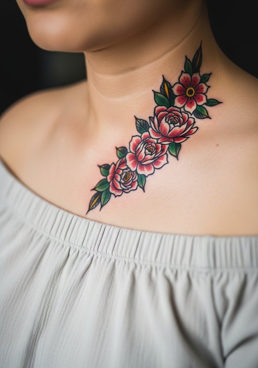
Fair warning, collarbone sessions can feel sharp because the skin lies over bone. That sensation is part of the result for many people. Ask your artist for bold outlines with restrained color blocks so the piece keeps its graphic reading from a distance. The usual error is over-detailing small petals that age into mush. Plan 2 to 3 sessions for clean saturation. For showing this placement off pick an off shoulder blouse and layered delicate necklaces that sit below the piece rather than competing with it.
4. Blackwork Mandala on the Upper Arm

There is an industry-side observation I share often. Dense blackwork holds up best when given scale and negative space. The upper arm can take large solid fills without the same blowout risk as the inner forearm. If you want symmetry ask your artist to sketch the outer radius slightly larger than you expect so the center does not compress. Most mistakes here are trying to cram a complex mandala into a tiny patch. Expect a multi-session build with a touch-up at year three. Pair this with a racerback tank black for nights out.
5. Watercolor Book Page Splash on the Ribcage

Most watercolor pieces on ribs age differently than on limbs. Artists are split on fine line on ribs. One camp says the skin stretch there blurs lines within two years. The other camp argues that with correct needle depth and spacing it settles fine. If you prefer the watercolor splash keep edges soft and avoid hyper-detailed linework near the sternum. Rib sessions rank higher on pain scales, plan for two shorter sessions if the artist recommends it. For the appointment wear a cropped athletic top you can lift slightly so the artist can work without you being uncomfortable.
6. Micro-Realism Novel Icon on the Inner Thigh
The inner thigh gives micro-realism the space to show three-dimensional depth without looking crowded. Expect a one to two hour session for a 2-inch icon and discuss contrast in your consultation so the artist knows how dark to push shadows. A common mistake is placing micro portraits too close to seams or areas that rub. The inner thigh usually heals well but needs short-term protection from clothing friction. For showing and comfort wear high waist shorts after healing so the piece peeks out without constant rubbing.
Studio Day Picks
The first six entries above cover wrist, forearm, collarbone, ribs, and inner thigh, and that spread calls for a few specific prep and healing items.
- Stencil transfer paper kit. Lets you preview line placement on skin before the needle touches, which is handy for the forearm and wrist pieces above.
- Topical numbing cream. Applied per instructions it helps with the ribcage session without affecting linework when used correctly.
- Thin protective film roll. Useful for ankle and inner thigh pieces that face friction during the first week.
- Fragrance free gentle body wash. Cleanses delicate linework areas like the wrist without irritating the skin.
- Aquaphor healing ointment. A thin layer helps lock in moisture during the first days for fine line work.
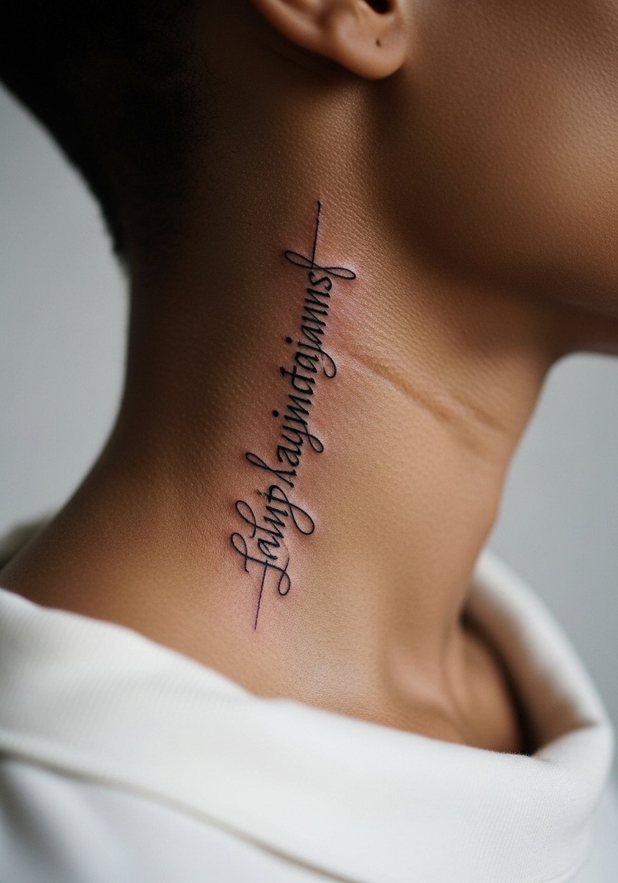
7. Ornamental Spine Quote Running Vertically
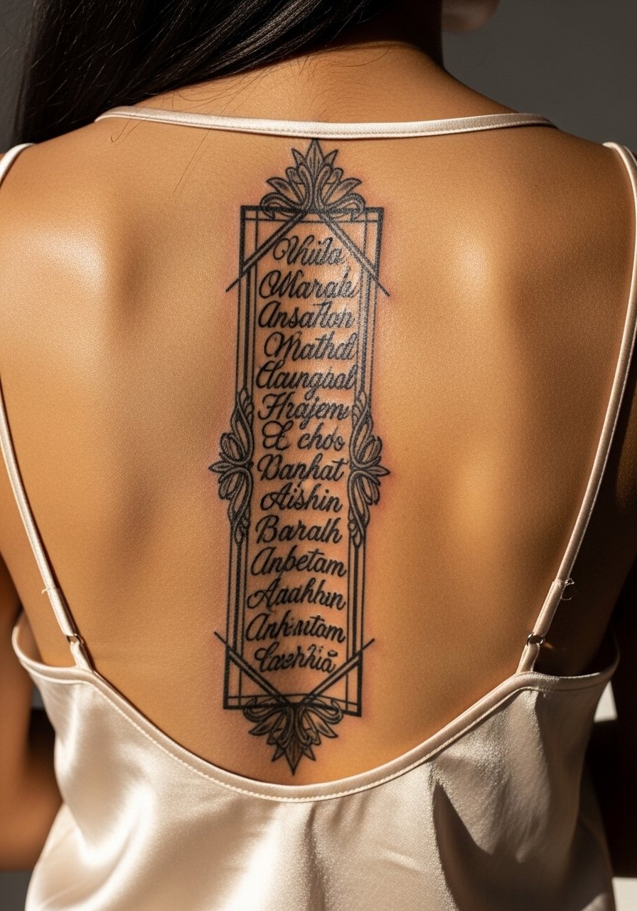
There is a clear trade-off with vertical spine pieces. They look elegant in photos but session positioning can be long and uncomfortable because you lie prone for extended stretches. Tell your artist if you want the script to read from top down or bottom up so they map spacing around vertebrae. Artists split on whether very small script works well on the spine. One camp favors larger letterforms because motion compresses small strokes. The other camp will accept micro script if the spacing is generous. This piece often needs four sessions. For showing it off a backless silk top highlights the vertical flow.
8. Patchwork Book Sleeve Elements for a Collector
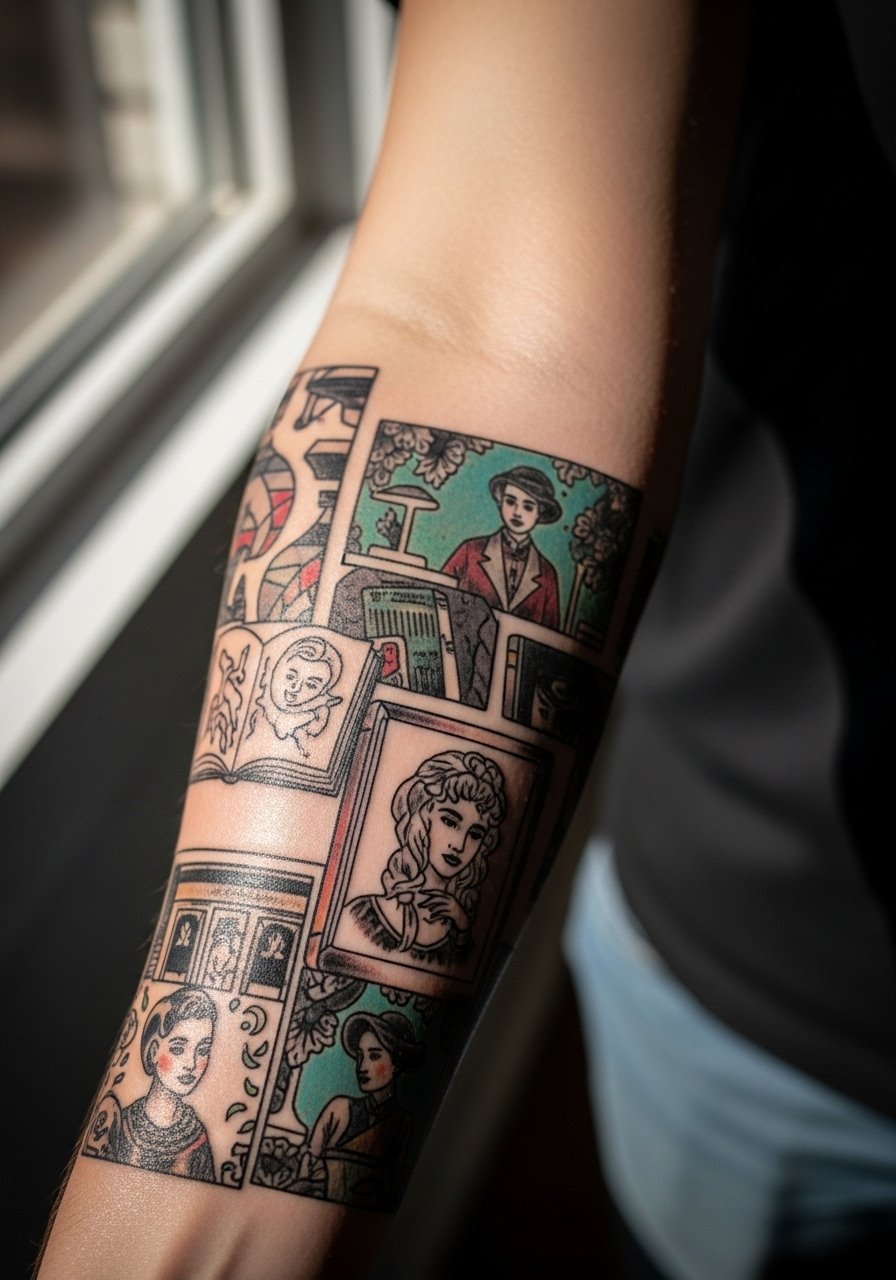
Building a patchwork sleeve is a marathon not a sprint. I advise starting with anchor pieces that read from a distance and filling in smaller scenes later. During consultation bring the specific design reference catalog pages you want to borrow from so the artist can reverse-engineer without copying. The typical error is asking for too many tiny frames up front. Plan for five plus sessions and expect touch-ups as the sleeve settles. For session comfort roll up a rolled sleeve cotton shirt so the artist can access the outer forearm easily.
9. Dark Ornamental Feather Quill on the Calf
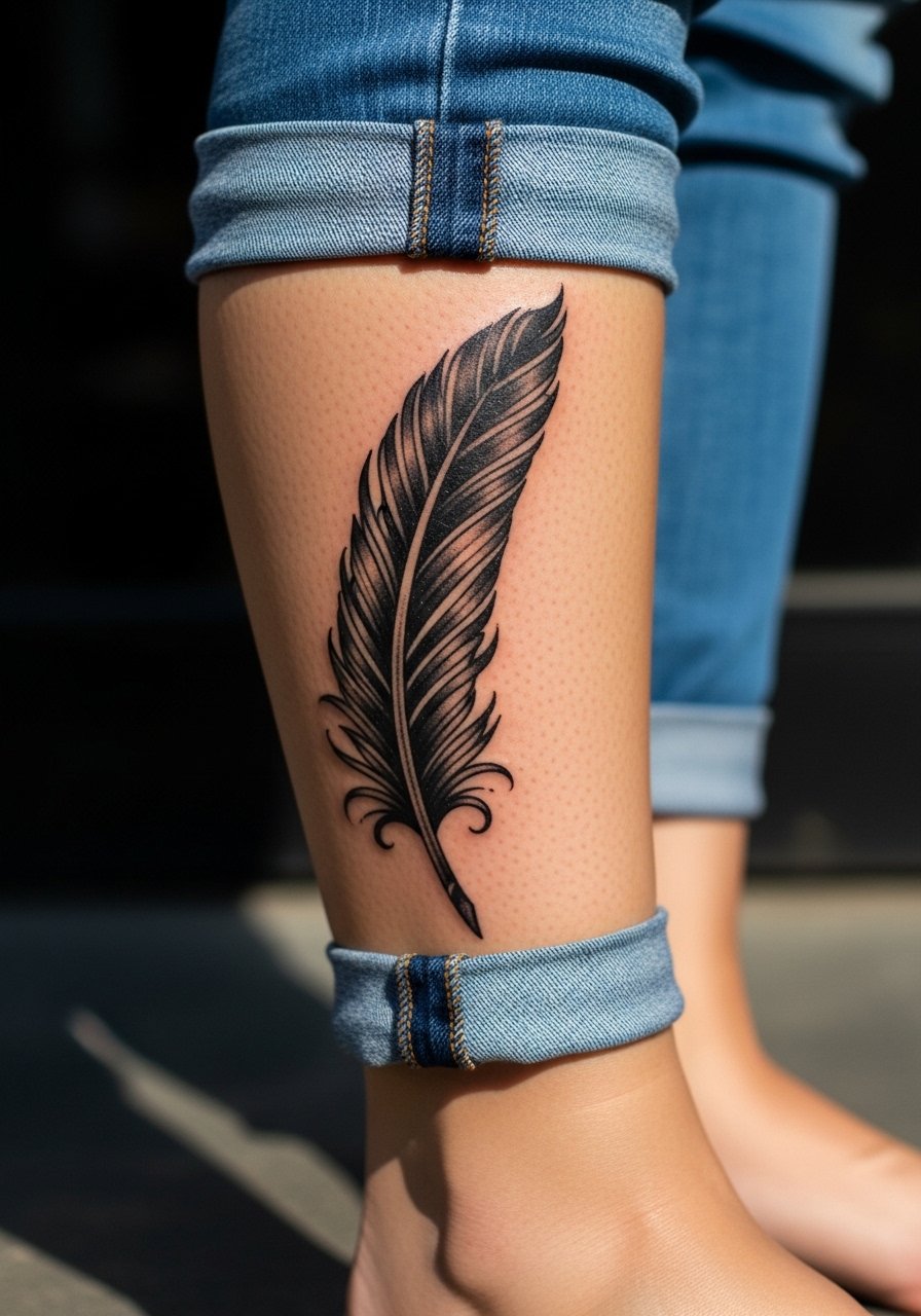
Calf placements accept bold black ornamental work well because the skin there is thick and movement is predictable. For a feather quill ask the artist to plan negative space along the shaft so the detail does not merge during healing. A common mistake is adding tiny filigree too close to solid fills. Sessions are usually two to three sittings for saturation and line refinement. For seasonal showing pair the calf piece with bootcut jeans rolled at the hem and chunky socks when you want a framed reveal.
10. Embroidery-Style Book Ribbon at the Ankle
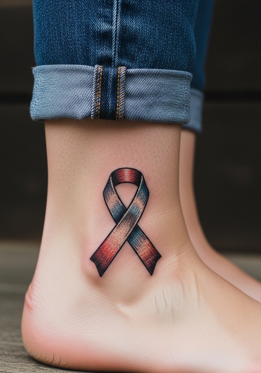
Ankle tattoos must contend with friction and movement during the first month. The embroidery look uses dotted shading to mimic thread, which ages gracefully when not packed too tightly. Tell your artist you want visible stitch gaps in the design so it retains texture as it heals. Mistakes come from trying to make the "stitch" too dense, which flattens into a blob. This is a quick one-session piece. For summer showing pair it with cropped straight leg jeans and a dainty anklet on the opposite leg for balanced asymmetry.
11. Botanical Illustration Cover on the Shoulder Blade
Shoulder blade canvases can take medium to large illustrative work and are forgiving for layered color. If you are covering old ink, bring clear photos of the area so the artist can plan leaf placements to mask the old saturation. The main mistake is underestimating how many sessions a cover-up needs. Expect three to four sessions when color blending is involved. For showing pick an off shoulder blouse or a tank top you can pull aside to reveal just the design.
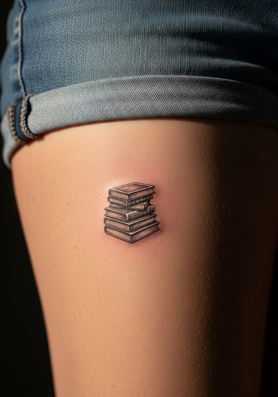
12. Minimal Geometric Stack of Books on the Wrist
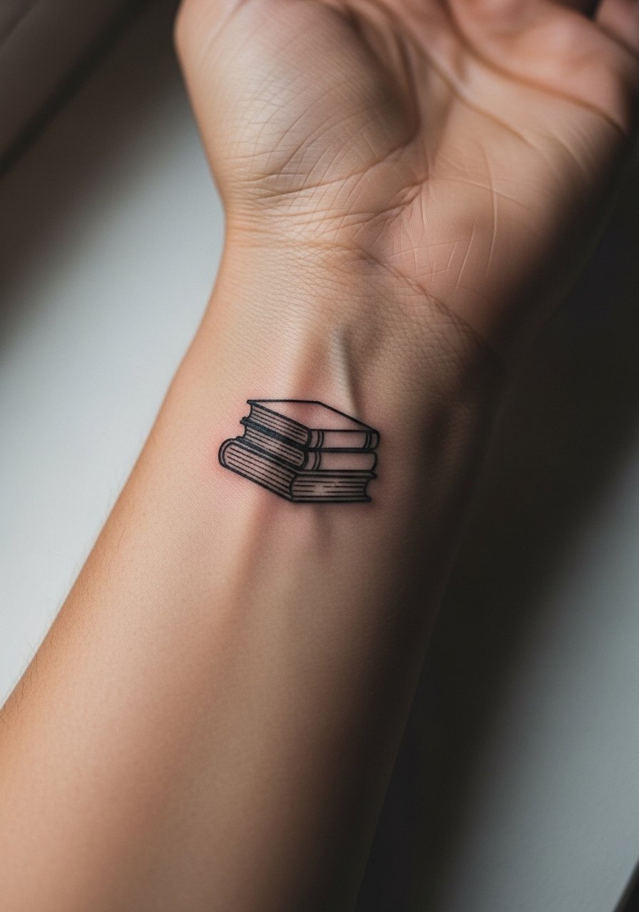
The geometric stack relies on crisp linework and negative space. The biggest mistake is asking for perfectly parallel lines at too small a scale. Ask the artist to space the stack slightly and to use a simple parallelism guide in the stencil phase. Wrist pieces heal quickly but face friction from watches and bracelets during the first week. For showing off try a slim leather cuff on the opposite wrist rather than layered chains that crowd the piece.
13. Pop Surrealism Open Novel on the Outer Thigh
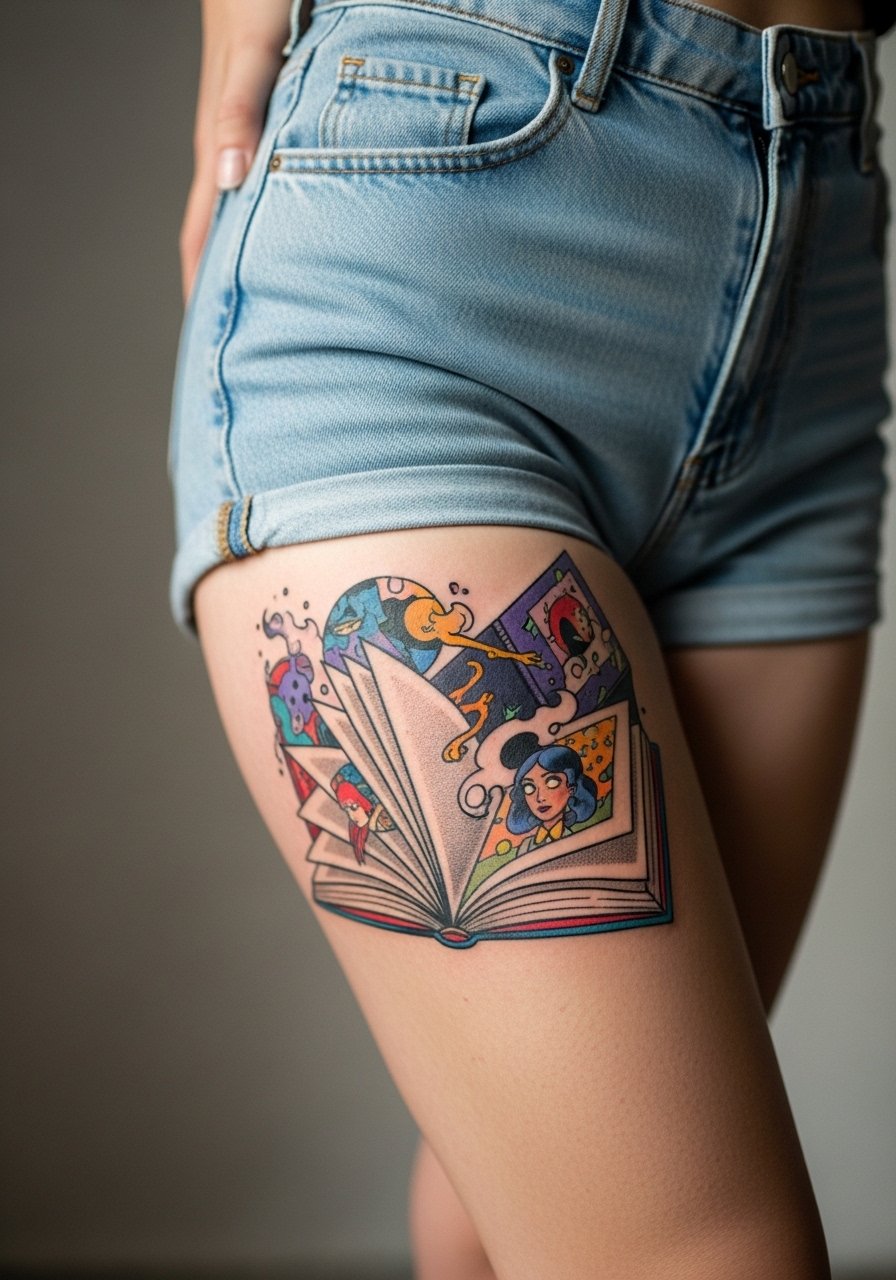
There is a visual impact lead I use for bold thigh pieces. Thighs can carry large color narratives without interference from seams. For a surreal open novel request clear focal points so the eye can rest on one element amid the chaos. A common error is packing too many tiny motifs without a strong focal anchor. Expect two to three sessions depending on color saturation. For casual reveal wear high waist shorts that frame the piece.
14. Reverse-Engineered Reference Cover Adaptation for a Custom Piece

Reverse-engineering designs from reference catalogs is a useful path for originality. Bring the design reference and point out which elements you want reworked versus kept. The practical mistake is asking for a pixel-for-pixel copy of a cover that was not designed for skin. Your artist will recompose elements to follow muscle curves. This approach suits collectors building a coherent library across sessions. Expect multiple consults and a clear conversation about what can be adapted without losing the spirit of the reference.
15. Ancient Script Inspired Literary Lines with Cultural Sensitivity
When integrating ancient scripts or designs that trace back to indigenous systems respect matters. Some people split into two camps. One insists on direct cultural apprenticeship before copying sacred motifs. The other supports adapted, informed references that pay homage rather than replicate. If you want to borrow letterforms like Tā moko elements ask your artist how they will modify the motif and explain the cultural context. This piece needs a sensitive consultation and a clear decision about intent before the needle touches skin.
16. Polygonal Abstract Book Forms on the Inner Forearm
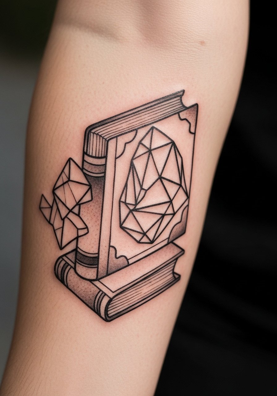
The polygonal approach gives a modern, almost architectural reading to literary motifs. The inner forearm allows the facets to wrap without distortion. Tell your artist whether you want hard angles or softened junctions so the composition reads as you expect. Tiny acute angles are a common mistake because they can blur into points. This style ages well if edges are given space. For session ease wear a short sleeve button up so the arm is accessible and the artist can check symmetry.
17. Stone Texture Effects on Book Spines for an Aged Look

Stone texture is a niche trick that creates an aged, tactile feel on spines. The key consultation note is to ask for stipple shading and small negative highlights instead of continuous gray washes. A frequent mistake is over-smoothing the texture which removes the stone illusion. This technique works well on arms and shoulders. Expect the session to include layered stipple passes and a touch-up to reinforce small highlights.
18. Patchwork Jacket Patch Sleeve Element for Cover-Ups
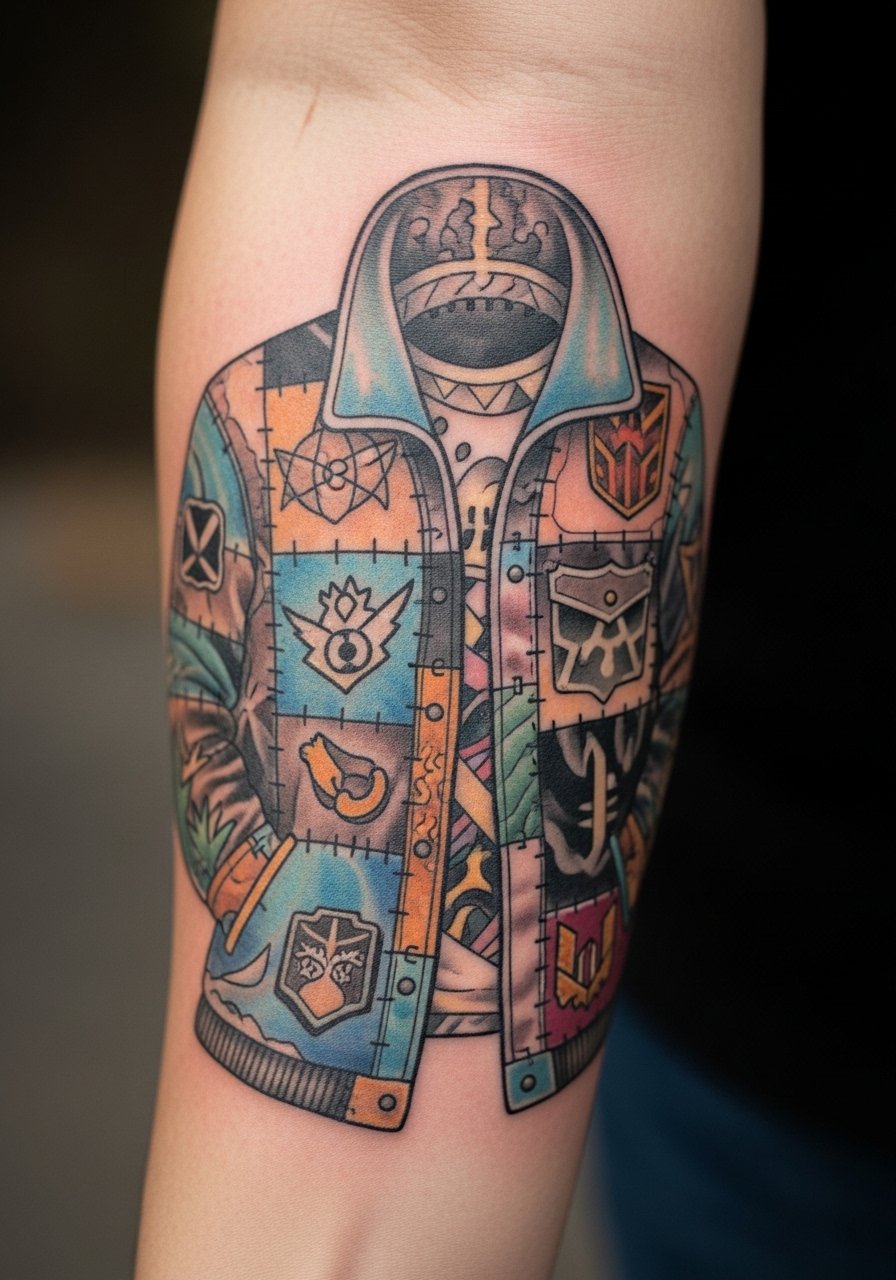
If you are doing a cover-up use a patchwork approach that layers motifs instead of trying to obliterate old ink in one pass. Bring clear photos of the old work and ask your artist how many sessions they estimate. The main error is assuming a single session will hide dense old color. Patchwork gives you flexibility to build over time and to add narrative elements from reference catalogs. For session comfort roll up a rolled sleeve cotton shirt so the artist can work without fabric interference.
19. Micro-Realism Book Stack Portrait on the Upper Thigh

Micro-realism stacks need contrast in each volume so each spine reads separately. The upper thigh is forgiving for detail work and keeps the composition intact when seated. The common mistake is crowding tiny text on the spines. Request stronger shadow anchors and fewer minute inscriptions. Sessions are generally longer than simple outlines because shading builds depth. After healing the piece maintains detail well if touch-ups reinforce the darkest shadows.
20. Small Scripted Page Number at the Sternum Edge

Sternum-adjacent work is intimate and often comes with extra sensitivity during the session. Keep script larger than you think so it remains legible as the area moves. A frequent error is choosing micro lettering that looks crisp fresh but becomes unreadable after a year. For the appointment wear a fitted sports bra or a zip-front robe so the artist can access the area without you being uncomfortable.
21. Ornamental Bookplate Nameplate with Frame on the Collarbone
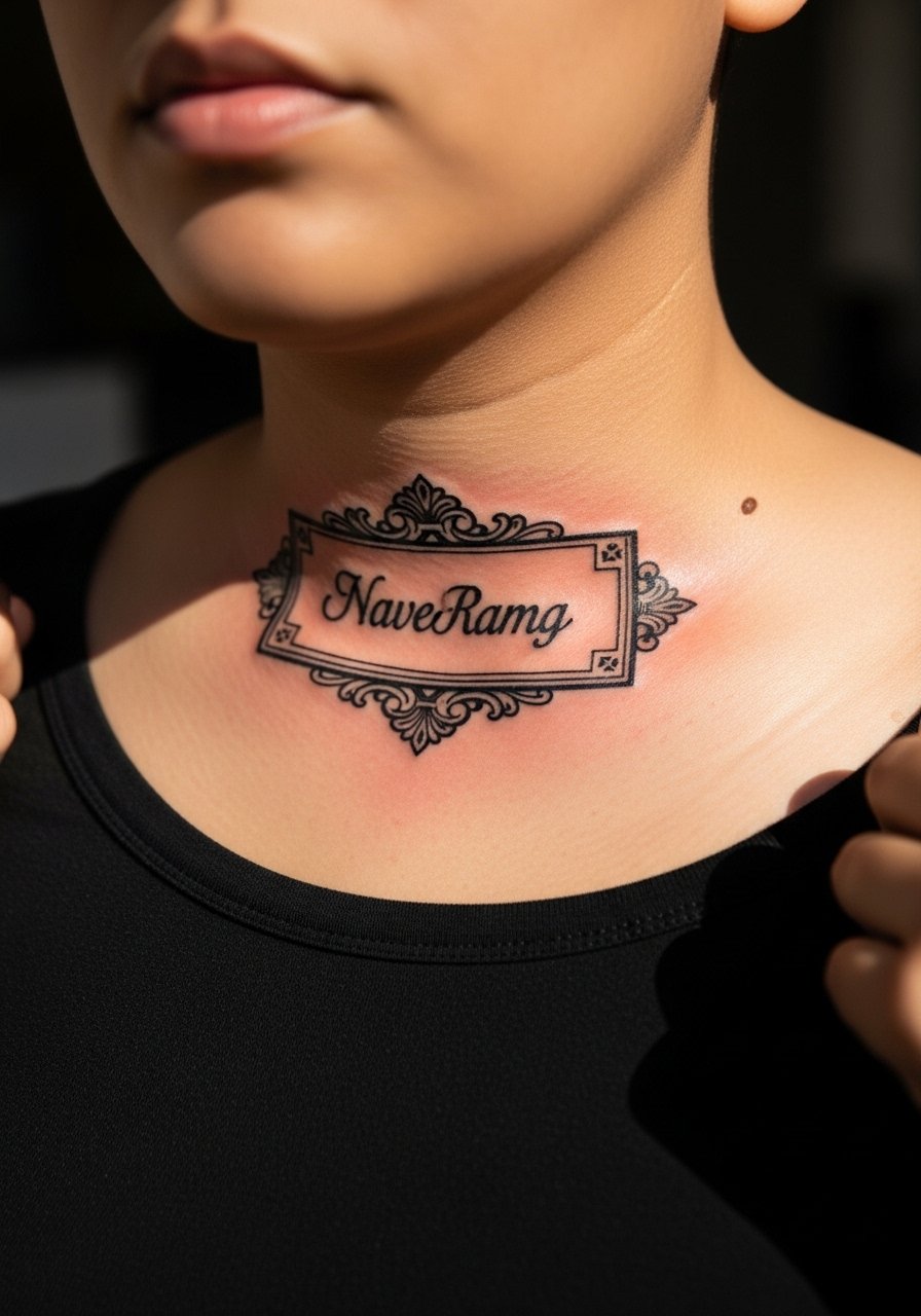
A nameplate reads like a small label and frames content neatly along the collarbone. When you choose this, specify whether you want serif or script lettering and how much ornament runs into the frame. The main mistake is over-ornamenting at small scale which reduces legibility. This placement shows well with layered necklaces if the chain falls below the plate. For showing pair it with a wide neck shirt that reveals only the plate.
Frequently Asked Questions
Q: How long will fine line botanical pieces, like the wrist wreath, typically need a touch-up?
A: It depends on placement and sun exposure. For a small fine line wrist wreath expect a likely touch-up around year two to three if you are active outdoors. Spacing and slightly reinforced stems at your initial session reduce the frequency of touch-ups.
Q: Are watercolor page splash designs on ribs more painful and more likely to fade than on limbs?
A: Yes ribcage sessions often feel sharper and the skin there moves more, which can make small lines lose clarity faster. Many artists recommend softer edges and slightly larger color pools on ribs so the piece reads well as it heals. Plan for two sessions and a conversation about spacing.
Q: If I want a patchwork sleeve built from reference catalogs, what should I bring to my consultation?
A: Bring printed or screenshot images showing each element, note which parts you want adapted, and indicate any old ink photos if this is a cover-up. Ask the artist about session pacing so you can budget time and touch-ups across the build.
Q: How should I prepare clothing-wise for a collarbone or shoulder session?
A: Wear tops that can be pulled aside without exposing your torso. A strapless top or an open button-down shirt you can slide off the shoulder works well for easy access and modesty during the session.
Q: Are there respectful ways to reference indigenous scripts or Tā moko forms in literary motifs?
A: Yes consider adapted motifs and have an open conversation with your artist about cultural origins. Some people choose to commission artists who specialize in those forms or to use abstracted elements that acknowledge the source while avoiding direct replication.