
Fine line tattoos are trending on feeds, and the ones that still read sharp after three years are often not the flashiest on day one. What holds up is spacing, intentional negative space, and matching line weight to the forearm canvas. Read these 17 abstract forearm ideas with notes on what to ask your artist, how they age, and what to wear for the session so the piece settles the way you expect.
1. Fine Line Constellation Strip on Inner Forearm
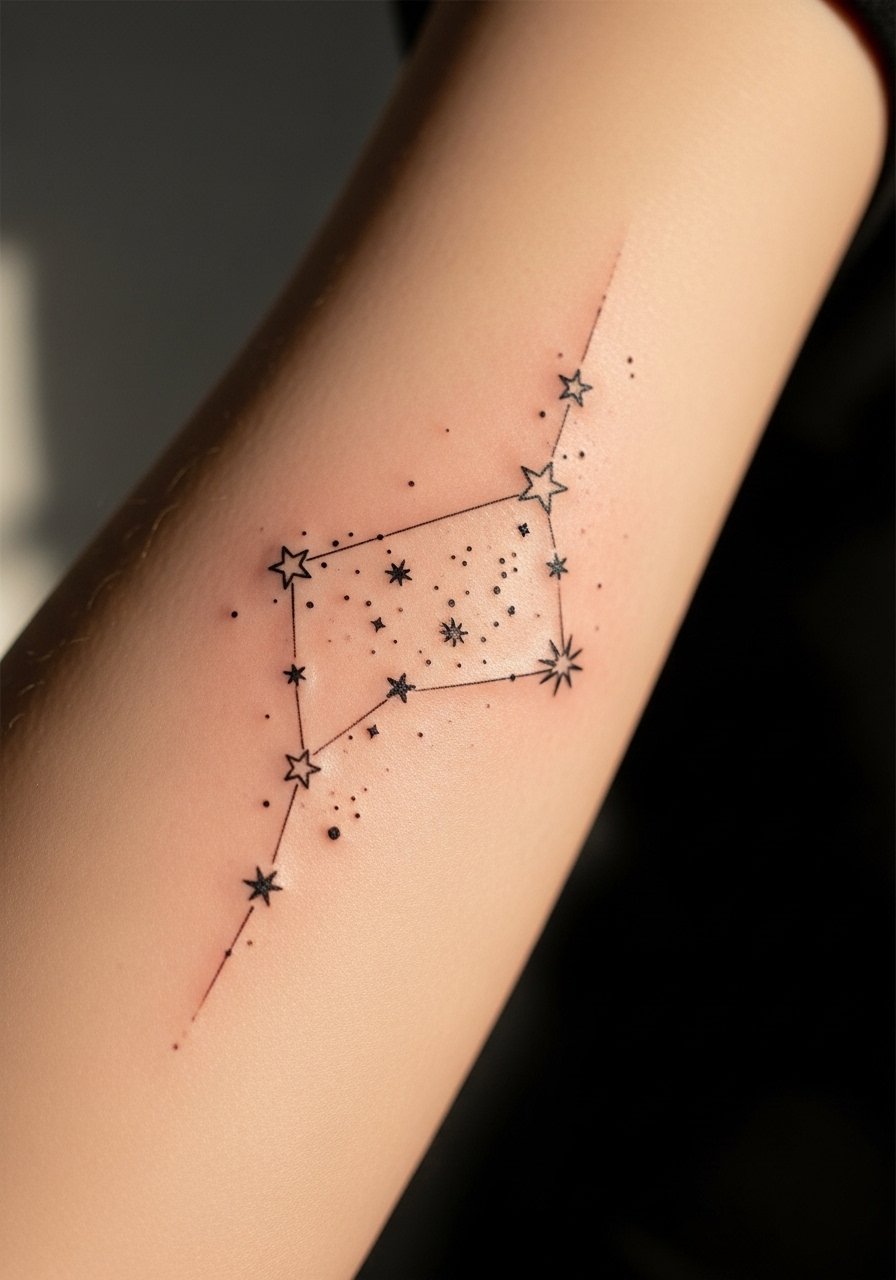
I've seen inner forearm constellations last when the dots are given room and the connecting lines are slightly bolder than they look on a screen. Tell your artist you want dot spacing that survives yearly wear, and ask them to mock the stencil on both arms to check scale. The common mistake is shrinking the design to fit a reference photo, which causes lines to merge at year two. Pain is lower on the inner forearm than on ribs, and a single short session usually does it. For the appointment wear a loose button-down shirt you can roll or pull aside for clean access.
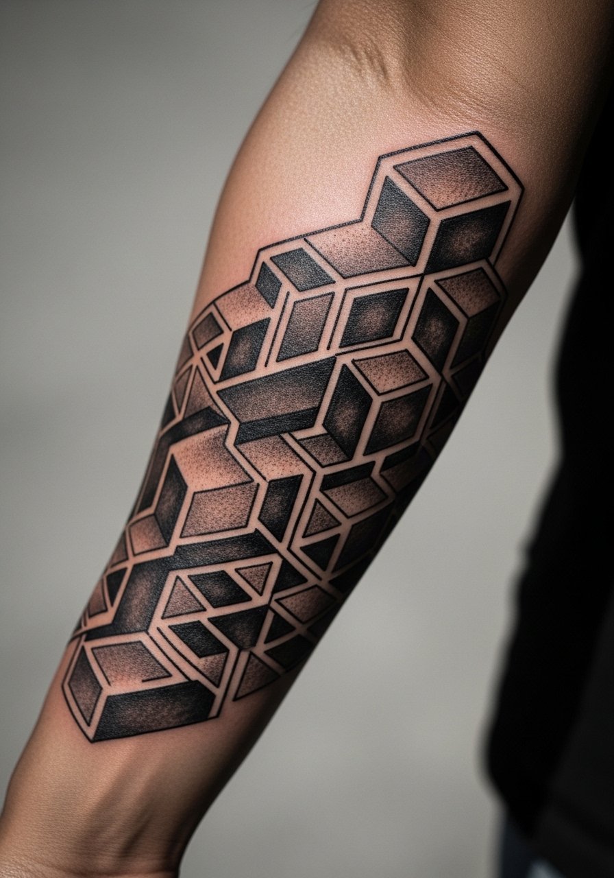
2. Geometric Fragment with Negative Space on Outer Forearm

Fair warning, the biggest mistake with geometric work is crowding shapes too close. When shapes breathe the design keeps its contrast as it heals and as the skin ages. In consultation, show the artist where your veins sit so they can orient the geometry to the anatomy. This style has blowout risk if lines are placed too shallowly, so ask about line depth and dot work used to anchor edges. Expect a one to two hour session depending on complexity. For showing this off pick a solid black tee with sleeves that can be rolled up to frame the outer forearm.
3. Organic Flow Composition That Follows Muscle Lines

When a design follows the way your forearm moves it reads as part of you, not pasted on. Bring photos of your arm in motion so the artist can sketch the flow rather than copy a flat reference. A common aging problem is forcing mirrored symmetry across an arm that is naturally asymmetrical. The better route is asymmetry that respects contours, which holds up longer. Session feel is straightforward but plan for breaks on longer pieces. For the day wear a short-sleeve shirt you can push up without rubbing the fresh work.
4. Abstract Butterfly Wing in Stipple and Whip Shading
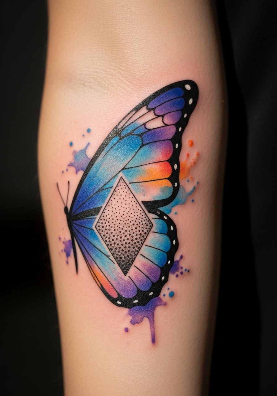
Controversy exists around watercolor effects on forearms. One camp says soft washes fade into uneven blotches quickly. The other camp argues that controlled stipple and whip shading mimic watercolor without losing structure. Name both camps in your consult and ask which approach the artist uses. If you want a watercolor feel that ages, request stipple anchors and small solid elements to guide the eye as saturation softens. This piece usually takes one longer session and a touch-up at the year mark. Pair it with a thin chain bracelet when you want the forearm to read like an accessory rather than a patch.
5. Minimalist Arrow and Line Cluster Along the Wrist-to-Forearm
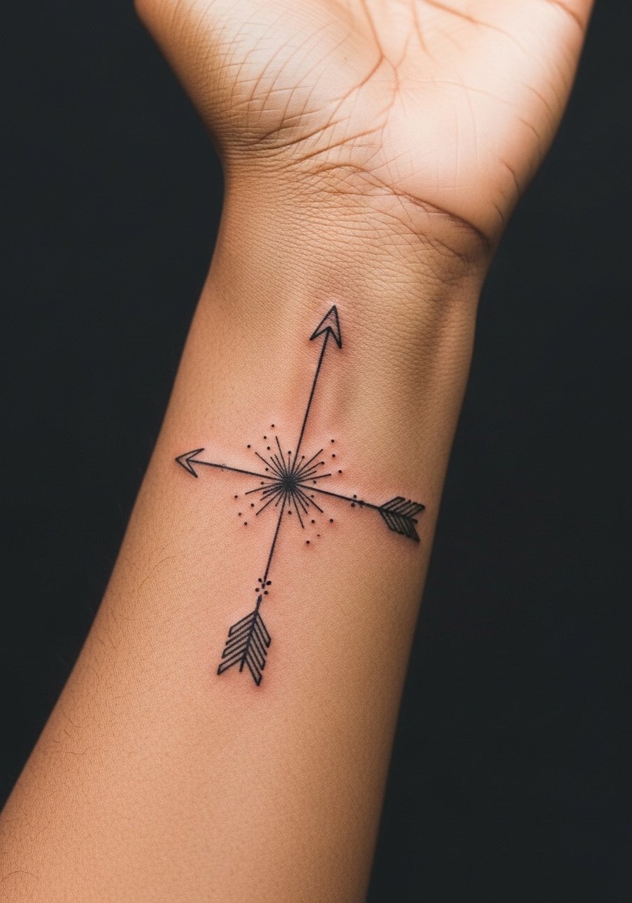
The wrist-to-forearm run is deceptively technical. Tiny arrows and micro lines look crisp fresh and then can blur if placed too close to the wrist crease. Ask for slightly thicker line weight near high-friction areas or alternate spacing to avoid merging. This placement is higher on the pain scale around the wrist, so topical numbing can help if you are sensitive. For the session wear a minimalist watch band on the opposite wrist so the healed piece still feels intentional rather than competing.
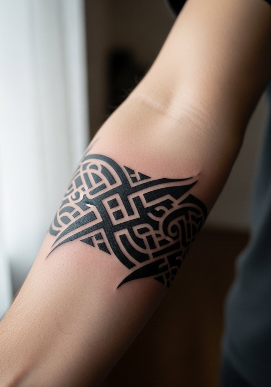
6. Sacred Geometry Panel with Mandala Edgework

Geometric mandalas split artists into two camps. One group says tight concentric detail should be done larger to avoid line fusion. The other group believes tiny precise work with proper spacing holds if the artist uses the right needle grouping. Ask which camp your artist follows and have them draw scale variations on you. These panels often need two sessions, one for the core and one for edgework. For showing them off try a linen overshirt you can wear open so the mandala sits centered on the forearm.
Pre-Session Essentials
The inner and outer forearm pieces above respond differently to friction and sleeves, so a few targeted items smooth the session and first week.
-
Stencil transfer paper kit. Lets you preview how scale and placement read on your actual forearm before the needle touches skin.
-
Topical numbing cream. Applied as directed 30 to 45 minutes before eases wrist sensitivity for tight linework sessions.
-
Thin protective film roll. Useful for wrist-adjacent pieces that rub against clothing or watches during the first days.
-
Fragrance-free gentle body wash. Cleans the area without irritating the delicate channels that fine line work depends on.
-
Aquaphor healing ointment. A thin layer for the initial window helps retain moisture for detailed linework without clogging pores.
7. Fragmented Animal Silhouette in Geometric Planes

This hybrid marries organic silhouette with rigid geometry. When the silhouette is kept intentionally fragmented each plane can age independently so the overall form remains readable. Avoid asking for too many tiny planes. The common mistake is over-detailing the geometric fills, which softens into muddiness over time. Discuss contrast and saturation during the consult so the artist can plan touch-up points. For the session wear a sleeveless tank that gives full arm access and stays comfortable through longer sessions.
8. Single-Panel Optical Illusion that Wraps the Forearm
Optical illusions work when scale and rhythm are correct. The mistake is forcing a full wrap on a narrow forearm which compresses the illusion. Ask your artist to show a mock wrap on your arm so you can see where the perspective breaks. These pieces can take multiple sittings and need a steady hand to avoid blowout along tight curves. Expect the tactile session to feel repetitive as the artist builds the pattern, but breaks will keep your arm from cramping.
9. Monochrome Watercolor Wash with Geometric Frame

If you want watercolor vibes without the risk of scattered color loss, ask for monochrome washes anchored by solid geometric borders. That way the wash can fade slightly and the frame keeps the composition intact. Most watercolor-only camps and hybrid camp debates center on pigment saturation versus structure. Request shading samples on less visible skin during consults to preview how the wash settles. For show-off looks, pair this with a rolled-up linen shirt in neutral tones so the wash reads against uncluttered fabric.
10. Micro-Realism Abstract Eye with Dot Work Halo

Micro-realism on the forearm demands precise stippling and careful depth control. The common error is insisting on photo-scale detail in a too-small area. Size up slightly so the iris and lashes can hold at year two. Ask the artist about using stipple shading rather than soft greywash for longevity. Sessions are detail-heavy and can take multiple passes. This piece pairs well with minimalist accessories but avoid heavy wrist jewelry that might rub while it heals.
11. Broken Line Portrait Abstracted into Bands
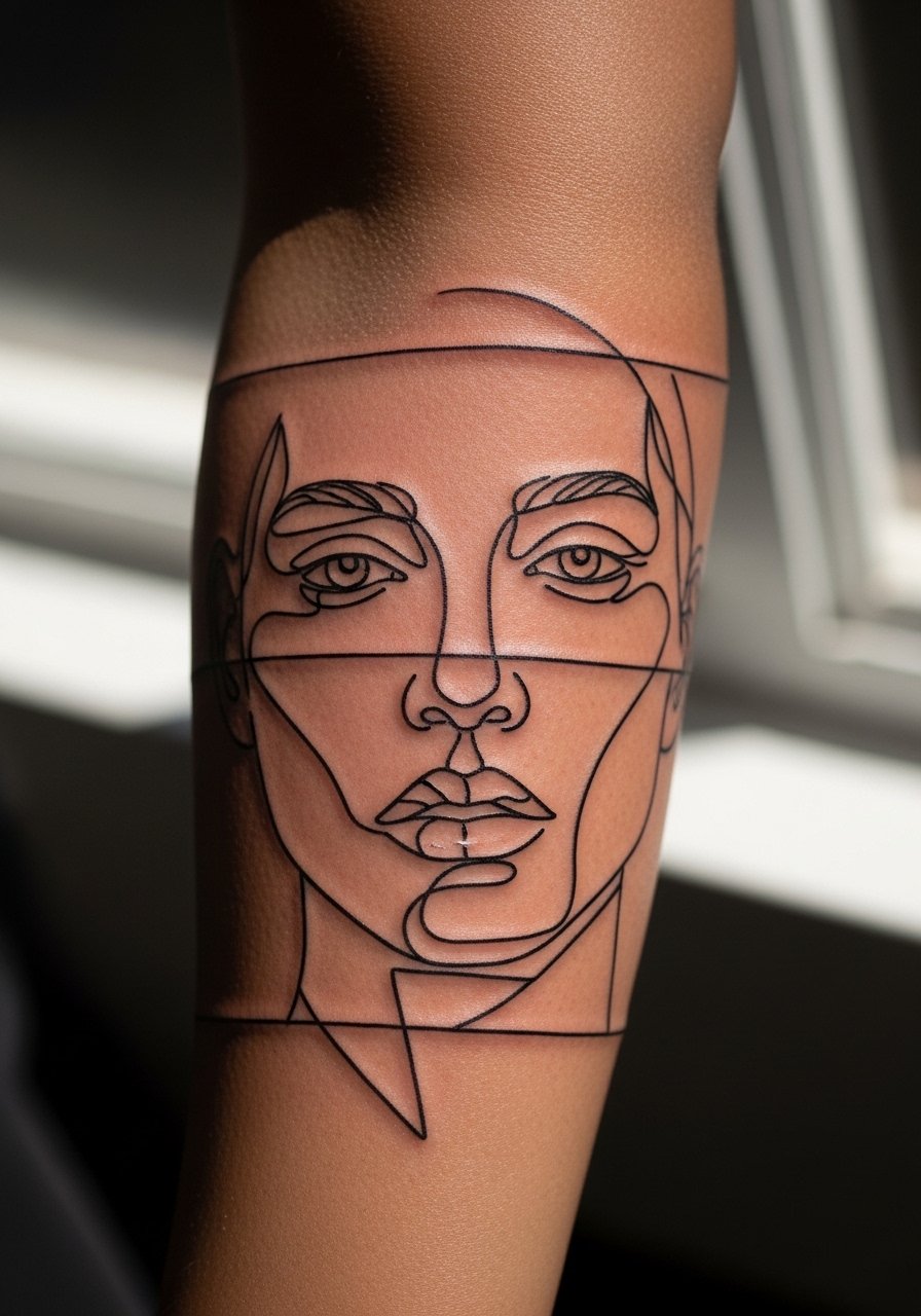
Breaking a portrait into bands creates a readable silhouette without relying on dense shading. The mistake is over-smoothing the bands so they lose edge definition. Tell your artist you want crisp band edges and selective saturation inside each band. This approach reduces blowout risk because less continuous shading sits directly against the skin. For the session wear a loose button-down you can slide aside without rubbing fresh ink.
12. Minimalist Botanical Line Looping Around the Forearm

A one-line botanical reads modern when it flows with the arm. The usual issue is turning a long loop into too many tiny turns that blur together. Ask for simplified nodes and fewer crossing points so the main silhouette keeps clarity at year five. This style is low to moderate pain and often a single session. For the appointment choose a short-sleeve shirt you can roll up so the artist has clear access without fabric creasing the stencil.
13. Abstract Waveforms with Gradient Dot Work

Waveform patterns benefit from gradation done with dots rather than broad greywash. Dot work preserves texture as skin moves and tends to avoid the blotchy look that can plague small greywashes. The common mistake is using a single flat tone for the gradient which flattens with time. Expect a longer session because stippling is meticulous. To keep the piece visible in casual wear, try rolling sleeves and pairing it with a minimalist watch band on the opposite wrist.
14. Abstract Arrowhead Cluster with Solid Black Anchors
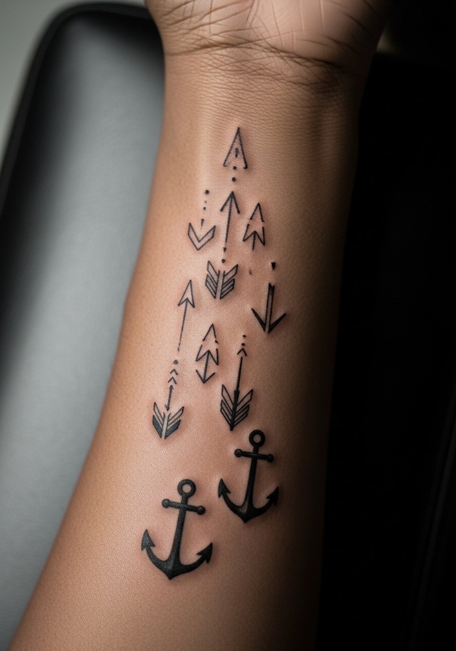
Anchoring a cluster with a few solid black shapes helps the whole composition hold as lighter bits fade. The frequent error is making everything the same weight which collapses into an indistinct patch. Ask for a plan that balances solids and hairlines and point out areas where clothing might rub during healing. This placement takes moderate pain at the wrist taper and may need a small touch-up once healed.
15. Narrow Abstract Sleeve Band That Hugs the Forearm
A narrow band sleeve reads like jewelry and often looks intentional with simple repeat motifs. The mistake is making the repeat too tight which ages into a single bar. Ask for spacing that keeps each motif distinct at year three. These pieces are great for people who want sleeve presence without full coverage. For the session wear a sleeveless tank top so the artist can reach around the arm easily.
16. Fragmented Script and Shape Hybrid on Inner Forearm
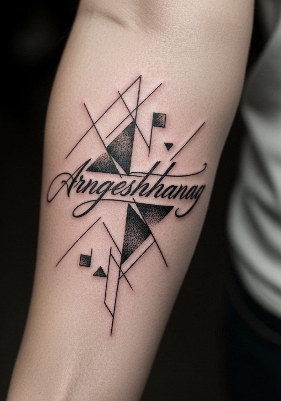
Combining script fragments with shapes can read cryptic and modern when the lettering is treated as texture rather than a focal point. The common misstep is dense text that needs regular touch-ups. If you want letters that age gracefully, ask that script be spaced and stroked lightly and that the shapes give it breathing room. Inner forearm is lower pain and the piece usually sits in one session. Consider a thin chain pendant above the wrist when you want to direct attention upward from the script.
17. Asymmetrical Patchwork That Plays with Skin Tone

Patchwork pieces that vary black density can harmonize with different skin tones when the artist plans contrast deliberately. The controversy here is whether dense black should sit directly next to open skin. One camp warns about heat and saturation causing a muddy edge. The other camp says carefully feathered transitions avoid that. Bring this up in consultation and ask to see healed examples on similar skin tones. This piece typically needs staged saturation and a scheduled touch-up to perfect transitions. For the session wear a comfortable shirt with easy sleeve control.
Frequently Asked Questions
Q: Will fine line forearm tattoos need touch-ups more often than bold blackwork?
A: In my experience fine line does tend to need touch-ups earlier because thinner lines lose crispness under sun and daily abrasion. Bold blackwork usually ages into a solid silhouette and needs fewer early touch-ups. Factor in your lifestyle and ask your artist about planned touch-ups at the consult.
Q: Do geometric mandalas on the forearm risk turning into blurred blobs over time?
A: They can if they are drawn too small or packed tightly. One camp recommends enlarging the pattern so lines have breathing room. The other camp says highly precise work with correct needle depth holds fine. Ask your artist which approach they use and to sketch scale options on your arm.
Q: How should I prep clothing for a long forearm session that includes both wrist and mid-forearm work?
A: Wear a loose button-down or a sleeveless top you can adjust so the artist can access the whole length. For wrist work plan to remove watches and bracelets from the start. Packing a clean shirt to change into after a long session helps keep the area from friction.
Q: Are abstract watercolor washes on darker skin tones a poor choice?
A: Watercolor effects can be less visible on darker skin if they're done in faint color. Ask for monochrome or higher-contrast anchors to keep the composition readable. Request to see healed examples on similar skin tones during your consult.
Q: Can I combine micro-realism and dot work on the same forearm piece without causing early fading?
A: Yes if the artist plans the transitions. Micro-realism benefits from slightly larger scale, while dot work preserves texture. Good artists will map where the micro detail goes and where stipple should take over so both elements age together.