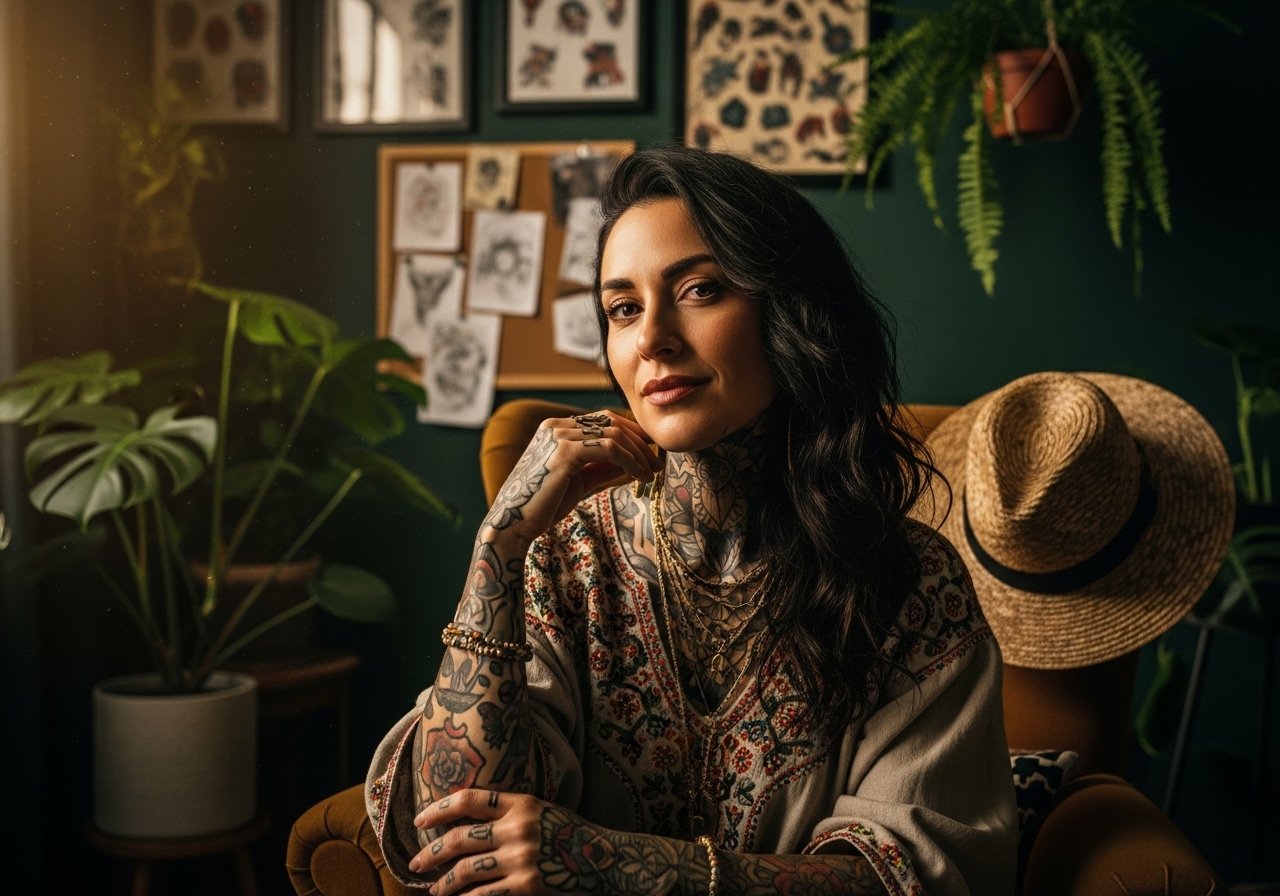
Fine line pieces rule the saved boards right now, but trends and reality often disagree. What looks featherlight on a phone can blur on a wrist after months of handwashing. This list gives 17 variations of "trust the process" that balance the fresh look with real-life wear. Each idea explains why it holds up, what to ask at consult, and how to show it off or hide it when you need to.
1. Minimalist Script on the Inner Wrist

The inner wrist is a classic spot for tiny reminders, but it is also a high-movement, high-wash zone so plan for longevity. Ask for slightly heavier lineweight than an ultra-fine needle so the letters keep shape after six months. Expect a quick, 30 to 45 minute session and moderate sensitivity when the needle crosses near the bone. A common mistake is asking for letters too small and too close together. If you want it visible with daily outfits, pair the piece with a thin chain bracelet on the opposite wrist to balance attention. Touch-ups at year one are common for fine wrist scripts.
2. Neo-Traditional Winding Path Banner on Forearm
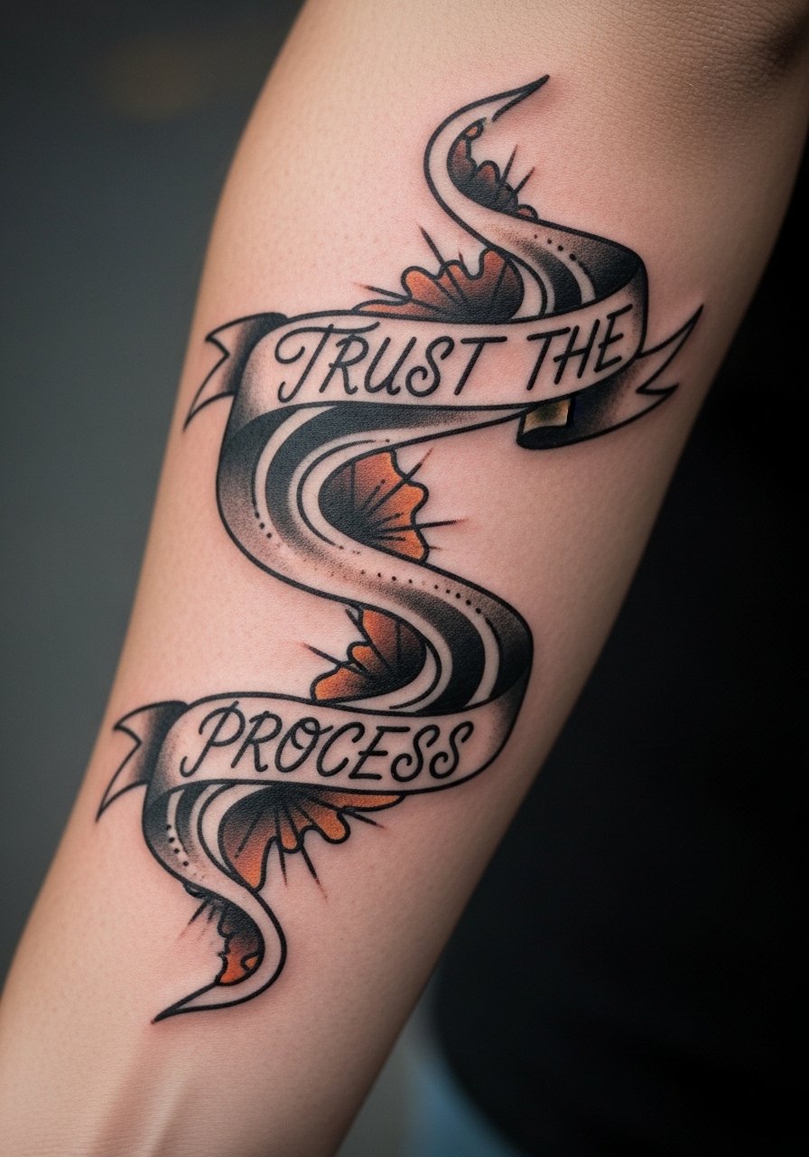
Forearm canvases allow bigger compositions and clearer narrative shapes. This neo-traditional route uses thick outlines and controlled saturation so the path motif remains legible as it settles. Tell your artist you want bold contour lines with softer color fills so the banner reads from arm distance. Expect two sessions if you want layered color and shading. The forearm stretches differently than the inner arm, so avoid tiny script inside the banner. For showing it off, roll up a linen button down shirt sleeve or throw on an olive green bomber jacket when the weather cools. Plan a touch-up at year two for saturation refresh.
3. Black and Gray River Flow on Inner Bicep
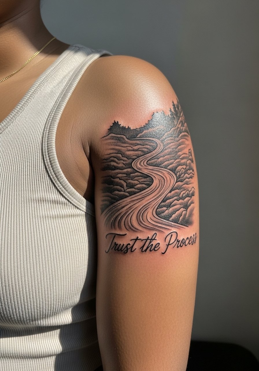
The inner bicep is skin that moves a lot during day-to-day motion. A black and gray river reads like a quiet metaphor and the shading helps mask minor softening over time. When you consult, request stipple shading to keep texture rather than smooth washes that can look patchy on darker tones. This placement is higher on the pain chart than a forearm but easier than a rib. The mistake people make is asking for tiny text running along the riverbank. Instead, integrate the phrase into the flow so the composition ages as a whole. Expect one or two sessions and a possible touch-up after the first year.
4. Dotwork Progression Mandala on Shoulder Blade

Dotwork demands patience in the chair and patience from the owner during healing. The stipple shading creates meditative texture that holds surprisingly well if given space. Ask for slightly more spacing between dense dot fields so they do not merge as the skin ages. The shoulder blade is low-friction and a forgiving placement for a five-inch mandala. Wear an off-shoulder sweater or a halter neck top to frame the design. Dotwork sessions run long and can stretch across two or three sittings depending on size.
5. Watercolor Splash Behind Bold Script on Collarbone
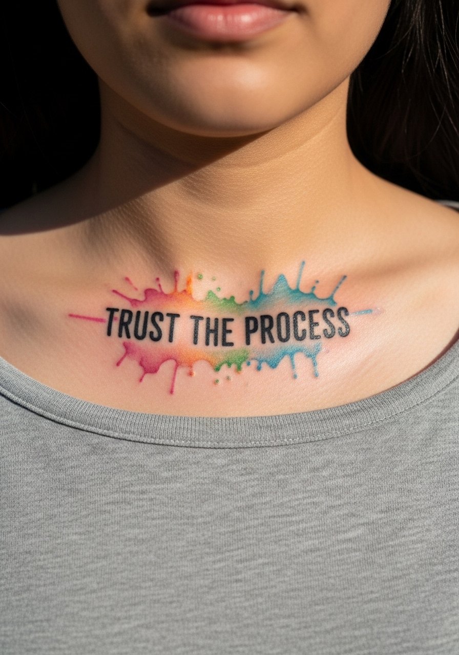
Watercolor gives emotional color but it is less forgiving over time. For collarbone work, ask for a bolder script overlay so the phrase retains legibility as the washes soften. The skin here is thin and mobile with clothing friction, so plan for two sessions to layer colour without overworking the area. A common aging issue is wash bleed in bright palettes. Pair the piece with a dainty gold necklace that sits above the text and a strapless midi dress for evenings out. Collarbone tattoos can need color refresh work by year three depending on sun exposure.
6. Fine Line Hourglass Inscription at the Ankle
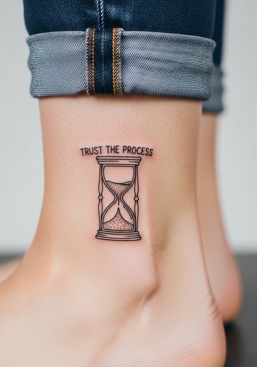
Ankle placements are small and discreet but face constant friction from socks and shoe collars. Fine line hourglass imagery fits the idea of patience, but ask for an hourglass sized to hold the lines without crowding. Pain on the ankle varies with proximity to bone. Session time is short. For showing it off in summer, cuffed straight-leg jeans or espadrille flats keep the area visible. The common mistake is making the hourglass too thin. Expect a touch-up once the area has fully healed and been exposed to regular wear.
Studio Day Picks
The wrist, collarbone, and ankle pieces above all face different healing demands, and a small kit smooths session day and the first week.
-
Lush Oat Tattoo Balm. A thinner option that users say avoids the greasy residue of heavier ointments during the first few days for fine line pieces on the wrist.
-
Ink-Illustrated Breathable Tattoo Balm. Favored for color work on collarbones because it helps color settle without leaving a white cast in photos.
-
Australian Tea Tree Salve. Gentle anti-itch relief for dotwork or stipple shading during weeks two to four.
-
Hada Labo Hydrating Lotion. Lightweight hydration for clients who prefer a dry healing baseline without heavy balm buildup.
-
Hustle Butter Original. A mainstream ointment choice that many shops recommend for initial moisture control on larger blackwork pieces.
7. Newschool Electric Ribbon on the Calf
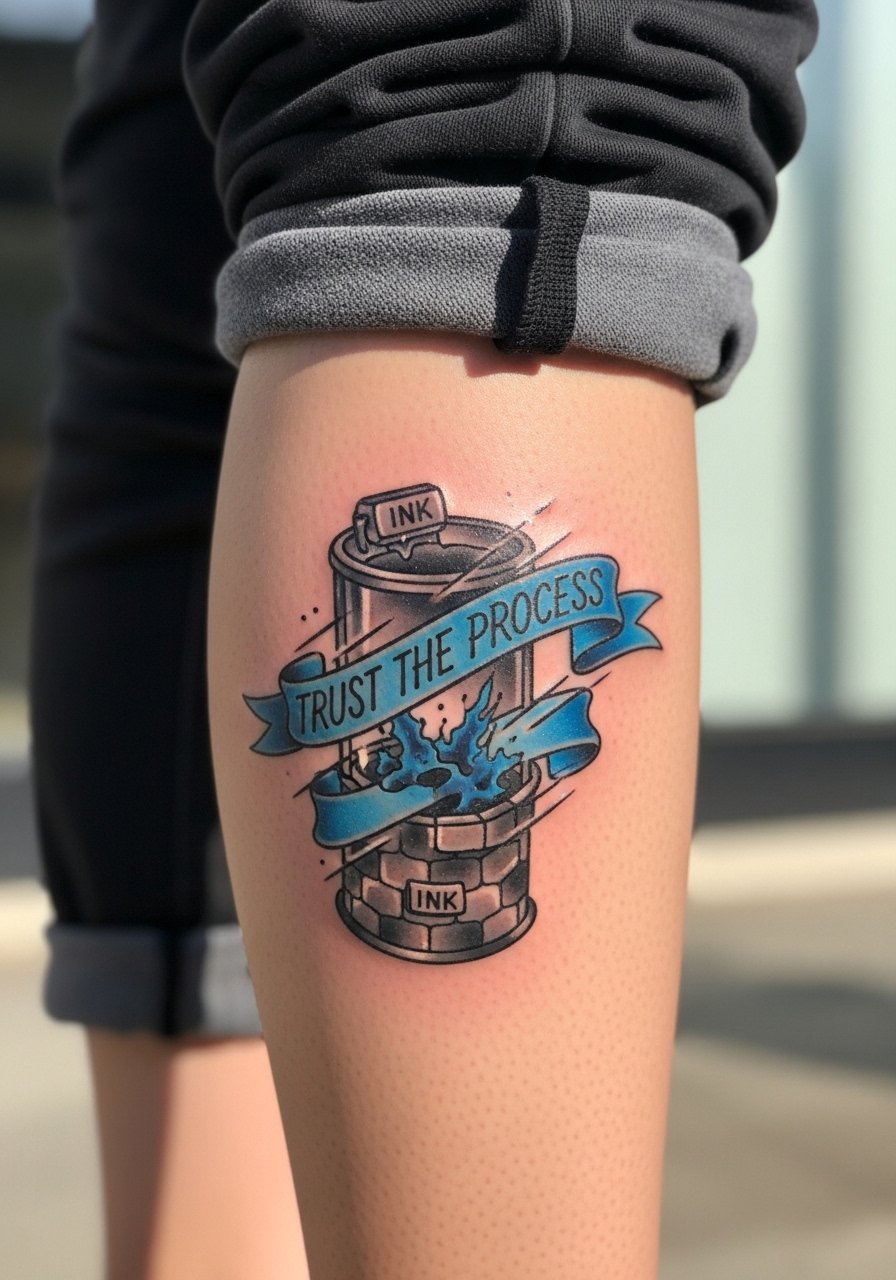
Calf placements are great for bold color and playful compositions. The newschool ribbon reads well at a distance and the thicker saturation ages better than thin script. Prepare for modest pain and a one or two session build depending on color layering. The common error is over-detailing small elements that lose clarity as the skin moves. Roll joggers or wear boots off in summer to show the piece. Touch-up may be needed after seasonal fading if you spend a lot of time outdoors.
8. Ornamental Geometric Spine Path
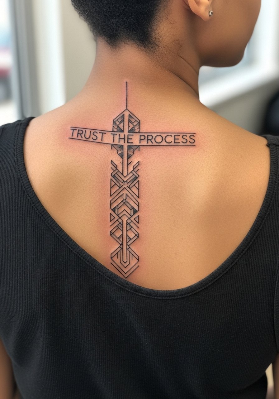
Spine work needs plenty of vertical real estate and confident linework. Ornamental geometry benefits from generous spacing so intersections do not merge as the skin ages. This placement requires an artist comfortable with consistent lineweight and placement. Pain is higher near the vertebrae but the result is striking when framed with open-back tops. For output, an open-back or halter pairs well. Ask about how the design will breathe along the spine rather than packing detail into narrow bands. Expect two to three sessions for larger vertical pieces and a check-in touch-up within two years.
9. Micro-Realism Seedling on the Ribcage
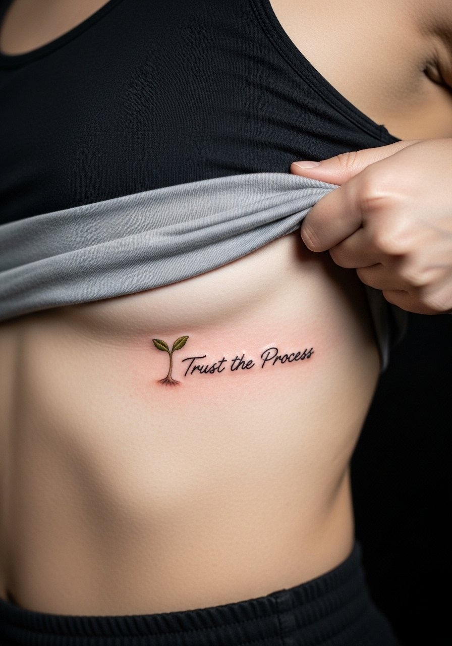
Rib tattoos are notorious for both pain and for how skin stretch affects fine detail. Micro-realism can be stunning here because the seedling is small and intimate. Expect high sensitivity and a session-length that depends on positioning and breath control. Artists debate whether ribs are ideal for fine line. One camp says the constant expansion causes blurring and loss of crisp edges. The other says with correct needle depth and spacing, fine lines can hold. Ask your artist where they stand and plan for a possible touch-up after healing. For discretion, rib tattoos are easy to conceal under workout gear.
10. Blackwork Bold Block Letters on Outer Thigh
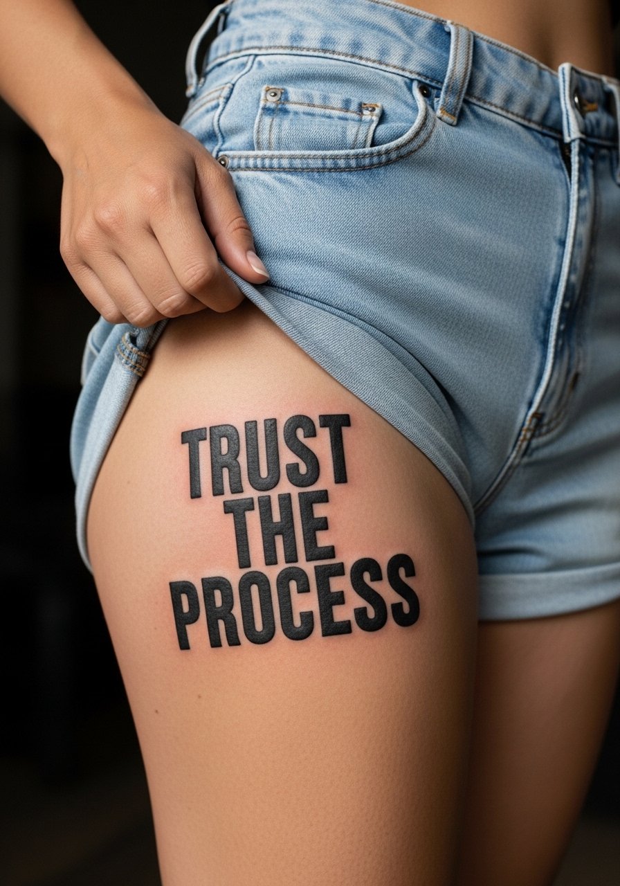
Thigh canvas gives plenty of space for bold statements and solid blackwork that stays readable for years. The outer thigh tolerates saturation well and is forgiving with weight changes when placed on the upper quadrant. Expect two sessions for crisp fill and edge work. A common mistake is placing block letters too low where gym shorts rub. Pair this with high-waisted shorts or an asymmetrical black skirt when you want it on display. Touch-ups are usually minor and mostly about edge sharpening.
11. Ignorant-Style Hand or Side-Hand Script
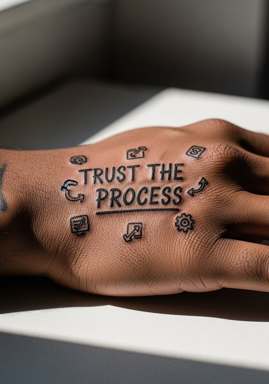
Hand tattoos age faster because of constant washing, UV exposure, and friction. The ignorant style leans into rough edges so some softening can be part of the aesthetic. Still, hand placements require the owner to accept faster fading and more frequent touch-ups. If you choose the hand, plan for thicker strokes and simplified shapes to survive daily wear. The most common mistake is requesting ultra-fine detail on skin that will erode. This placement has career implications in some workplaces, so think through visibility. Session times are short but touch-ups are often needed within a year.
12. Negative Space Continuous Path Across the Sternum
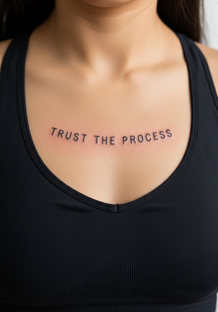
Negative space designs depend on the artist's stencil precision and on skin that settles without scabbing into the voids. Sternum placement is sensitive and will need careful shading choices so the negative letters read over time. Be explicit in consultation about letter spacing and the background texture. Expect a short but intense session with higher pain. The mistake is compressing negative letters too tightly. For a session, a fitted sports bra helps the artist access the area without exposing more skin than necessary.
13. Curved Vein-Following Script on Inner Arm
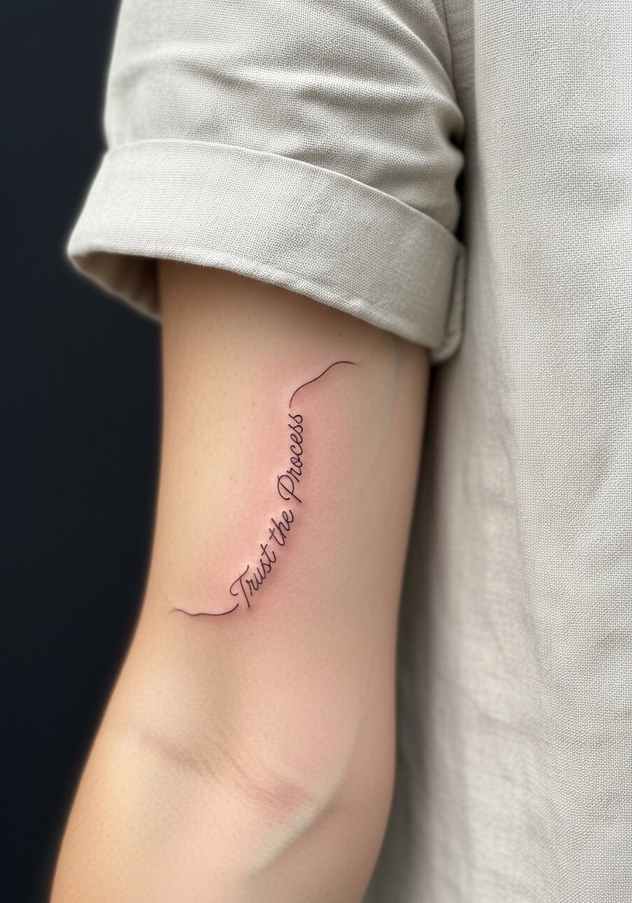
Following vascular lines creates an organic flow that looks custom and intentional. This technique reads naturally with the arm's motion and avoids awkward straight text on curved anatomy. Tell your artist you want the script to mirror, not cross, major veins. The inner arm can blur if letters are too tight, so give letters space and a slightly heavier line. For the session, wear a rolled sleeve linen top so the artist can access the area comfortably. Expect low to moderate pain and a likely touch-up window at year one.
14. Micro-Realism Seedling on the Ribcage (Negative Space Variant)
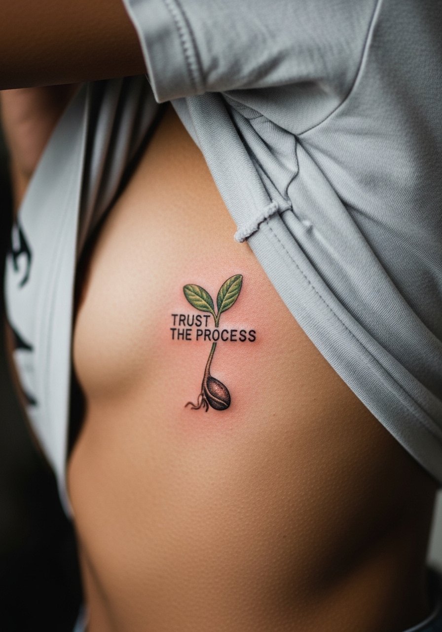
This is a variation that blends micro detail with negative space lettering. The seedling anchors the metaphor of growth while the letters sit in the surrounding skin. On ribs, minute detail is vulnerable to stretch during weight changes. The common issue is overloading the area with detail that will compact. Keep the seedling slightly larger than a dot so text remains legible. Plan for a longer healing check and possibly a single touch-up. If you want private motivation during workouts, this placement is ideal because it stays hidden under activewear.
15. Ornamental Geometric Thigh Panel
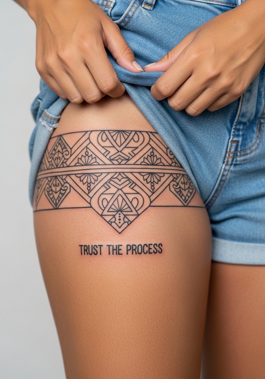
A thigh panel gives room for ornament and precise geometry. Because the thigh has larger surface area, small gaps and negative spaces can be larger so the design stays crisp. This placement handles heavier blackwork and complex patterns better than smaller zones. For showing off, pair with high-waisted shorts or gym wear that frames the outer thigh. Ask your artist about how the pattern will react to muscle changes. Sessions can be longer but the durability is generally strong.
16. Process Icons Cluster on the Upper Arm

A meta nod to the tattoo journey is fun and low-commitment. Small icons let you commemorate the act of getting ink without heavy text. The upper arm is forgiving and good for collectors who want modular additions later. Keep icons bold enough so they do not blur into one another after a year. For the session wear, a loose tank helps the artist access the area. Expect low to moderate pain and an easy touch-up if you want cleaner lines later.
17. Micro-Realism Pocket Seed on the Rib Edge for Private Motivation
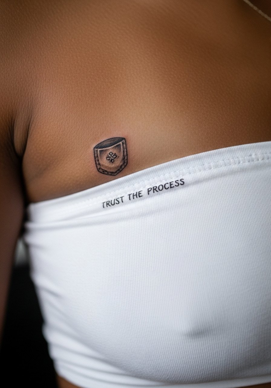
When privacy is the priority, a pocket seed near the rib edge sits where only you and chosen outfits see it. Micro-realism here must be scaled so that the needle work has room to breathe. Pain is high on the ribs, so plan for a short, focused session and expect sharper sensitivity. The mistake is pressing for extreme micro detail that turns into a smudge after healing. This placement favors emotional resonance over visibility. Keep expectations realistic and schedule a check-in touch-up if the edges feather.
Frequently Asked Questions
Q: Will fine line scripts on wrists fade faster than bold blackwork?
A: In my experience, fine line scripts do tend to lose crispness sooner on high-movement areas like the wrist. Artists split into two camps. One camp says fine line ages gracefully if done with ideal depth and spacing. The other camp argues that bold blackwork holds shape longer on wrists. Ask your artist which approach they use and expect a possible touch-up at year one for fine line wrist pieces.
Q: How should I ask for a watercolor splash without losing color after a few months?
A: Ask for a stronger script or outline over the wash so the text stays readable as the watercolor softens. Mention you want layered sessions rather than one saturated pass. Also plan for sun protection and minimal friction from clothing in the first month to preserve pigments.
Q: Are there wardrobe hacks to keep collarbone watercolors from rubbing during healing?
A: Yes. Wear a loose tank top or a button-front shirt you can pull aside instead of tight straps that rub. During the first two weeks, avoid narrow straps and choose soft fabrics like cotton or linen that won’t catch on the area.
Q: If I plan to gain or lose a moderate amount of weight, which placements best tolerate stretching?
A: The outer thigh, upper arm, and shoulder blade tolerate moderate body changes better than forearms or ribs. Avoid packing very fine text into zones that expand a lot. If you expect change, ask for larger lettering and more spacing so the composition can adapt.
Q: Is Saniderm better than dry healing for fine line tattoos?
A: The community is split. One group prefers Saniderm for less mess and better early color retention. The other group favors dry healing to let scabs form naturally. Both approaches work when applied properly. Decide based on your skin type and the artist’s aftercare protocol.