
Fine line script is trending, and the gap between a design that still reads sharp at year five and one that blurs begins in the sketch. Placement, spacing, and needle depth matter more than how pretty the stencil looks on a screen. Read these 21 directions for the phrase in many guises, pick the size and placement that match your life, and bring the right questions to your consultation.
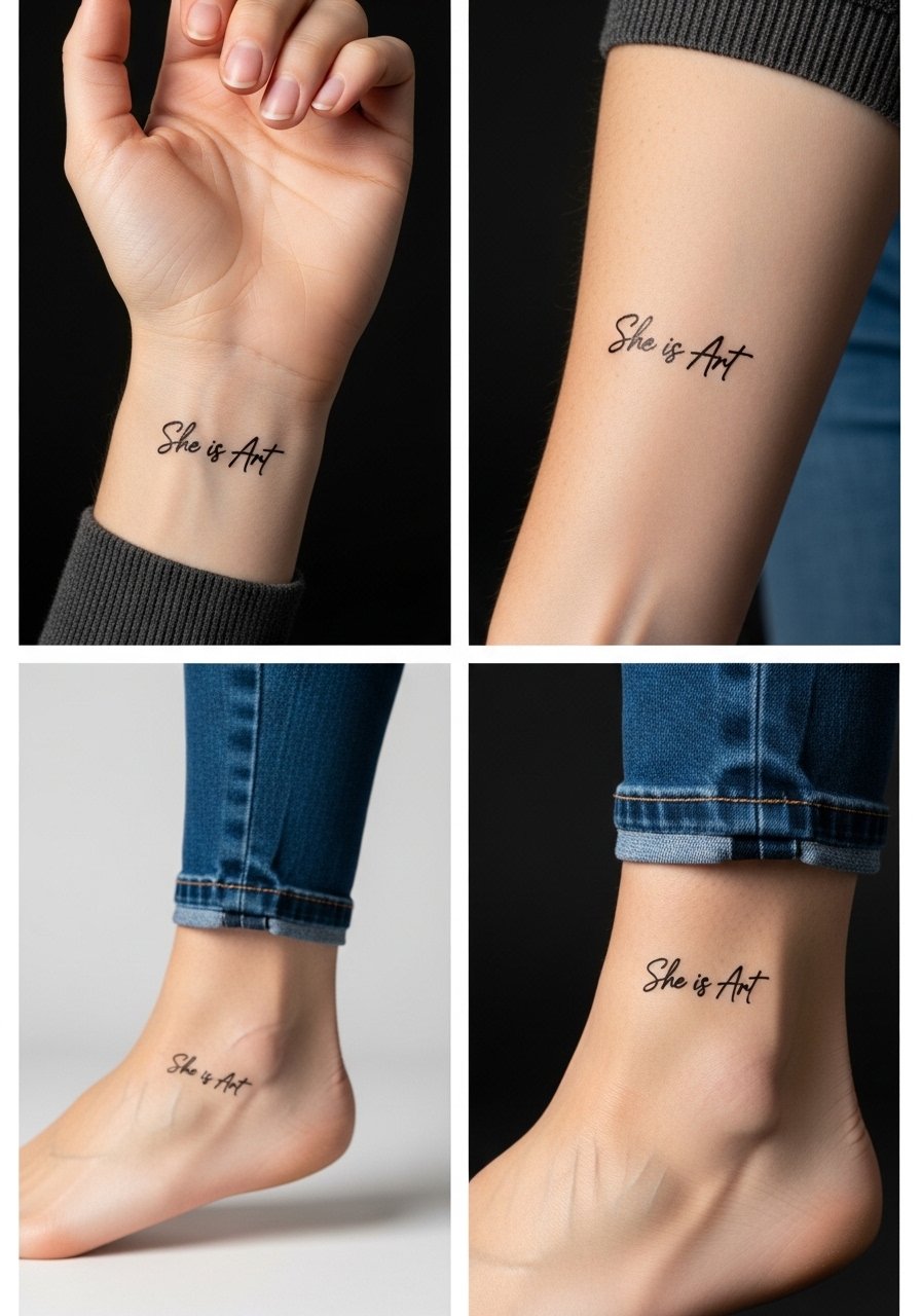
1. Inner Wrist Script Band for Everyday Visibility
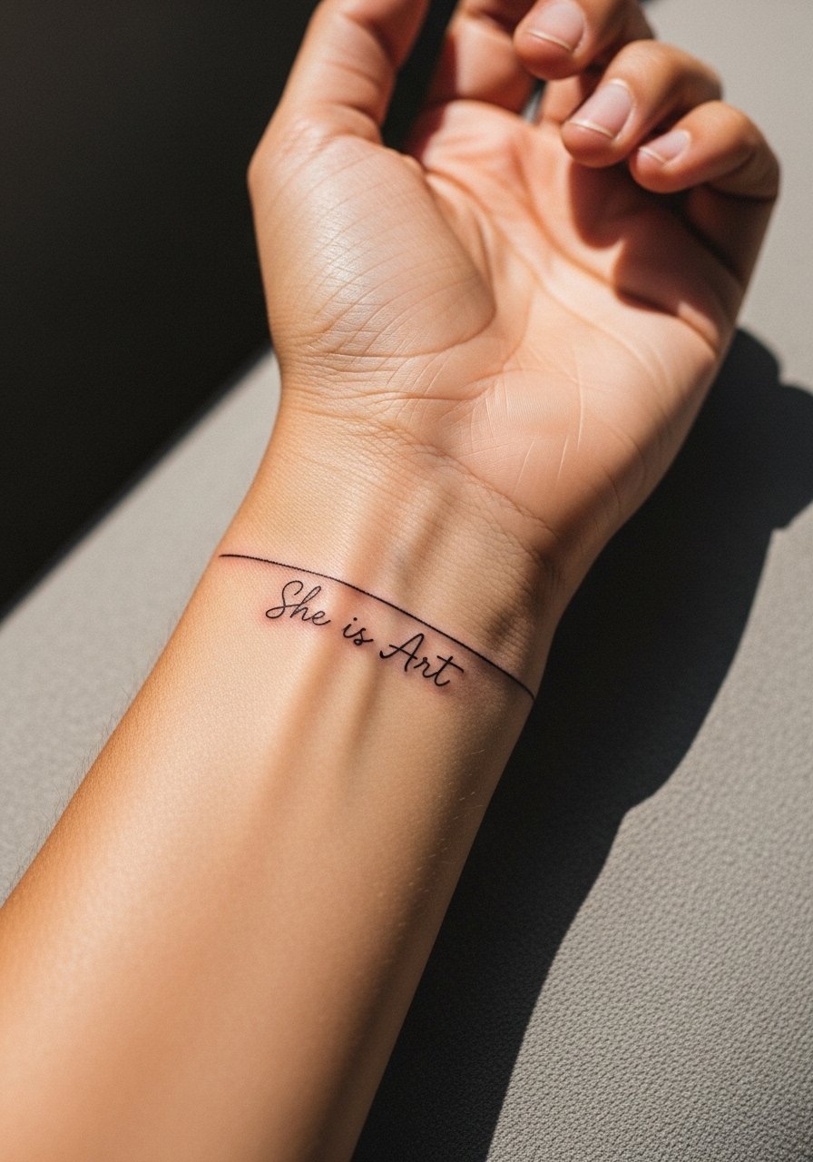
I've seen small wrist scripts last best when they are given breathing room. Ask for 1.5 to 2 inch height, simple fine line, and one-pass outline with light saturation to avoid heavy trauma. Fair warning, the inner wrist sees a lot of movement and friction so expect a touch-up timeline around year two for many people. For the appointment, wear a loose long sleeve you can roll up easily. Pair this look with a thin gold chain bracelet on the opposite wrist to keep attention balanced without crowding the script.
2. Forearm Floral Accent with Integrated Script
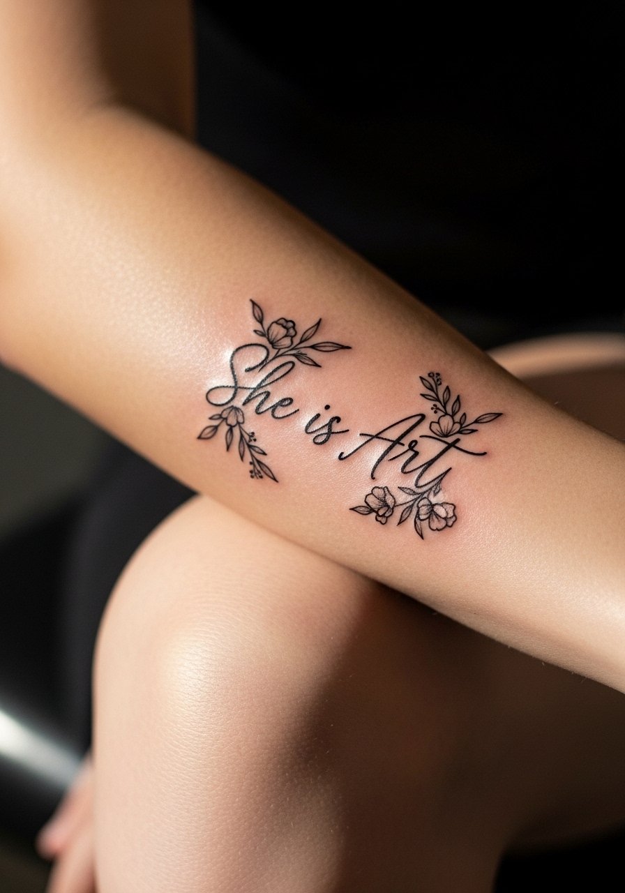
If you want the phrase softened by nature, a 3×4 inch outer forearm piece with subtle color blooms around the letters is a reliable choice. In consultation, specify where the flowers should sit relative to the baseline of the lettering so the blooms do not distort the linework when the arm bends. This placement ages well because the forearm gets less stretch than the inner arm, but sun exposure is the real long-term enemy. Show it off with a rolled linen button down in neutral tones and thin bangles on the opposite wrist for balance.
3. Bold Banner Across the Ribcage for a Confident Statement
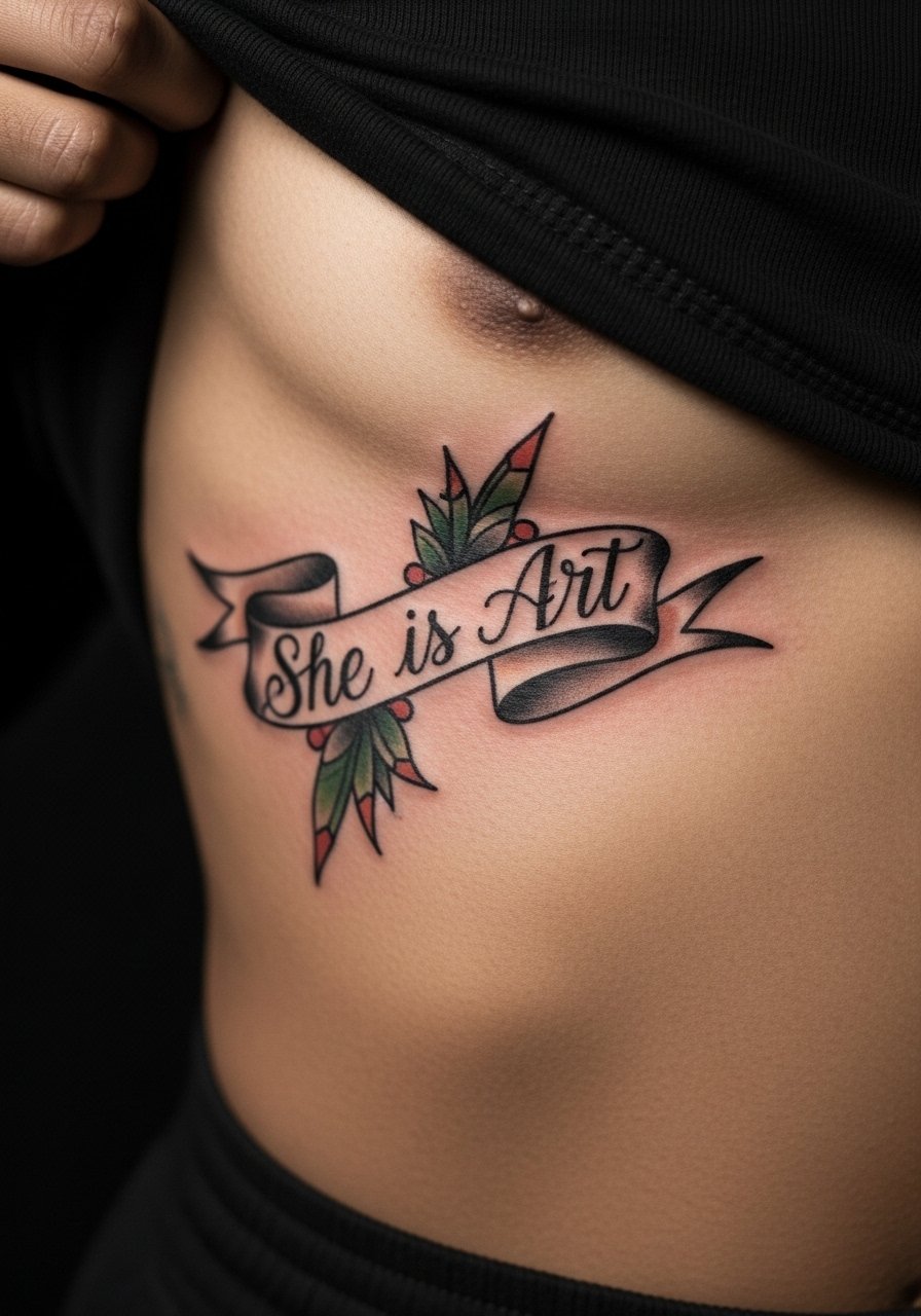
Fair warning, the ribcage is a high-pain area for most people but it hugs the curves in an elegant way. There is a split in opinion about fine script on the ribs. One camp says the skin there stretches and fine lines merge within a couple of years. The other camp argues that with correct needle depth and spacing, a bold banner or slightly heavier line will hold up. If you lean toward ribs, specify a banner style with confident linework and ask about touch-up cadence. Wear a crop top or loose shirt you can lift easily during the session, and expect the chair time to run longer than a wrist piece.
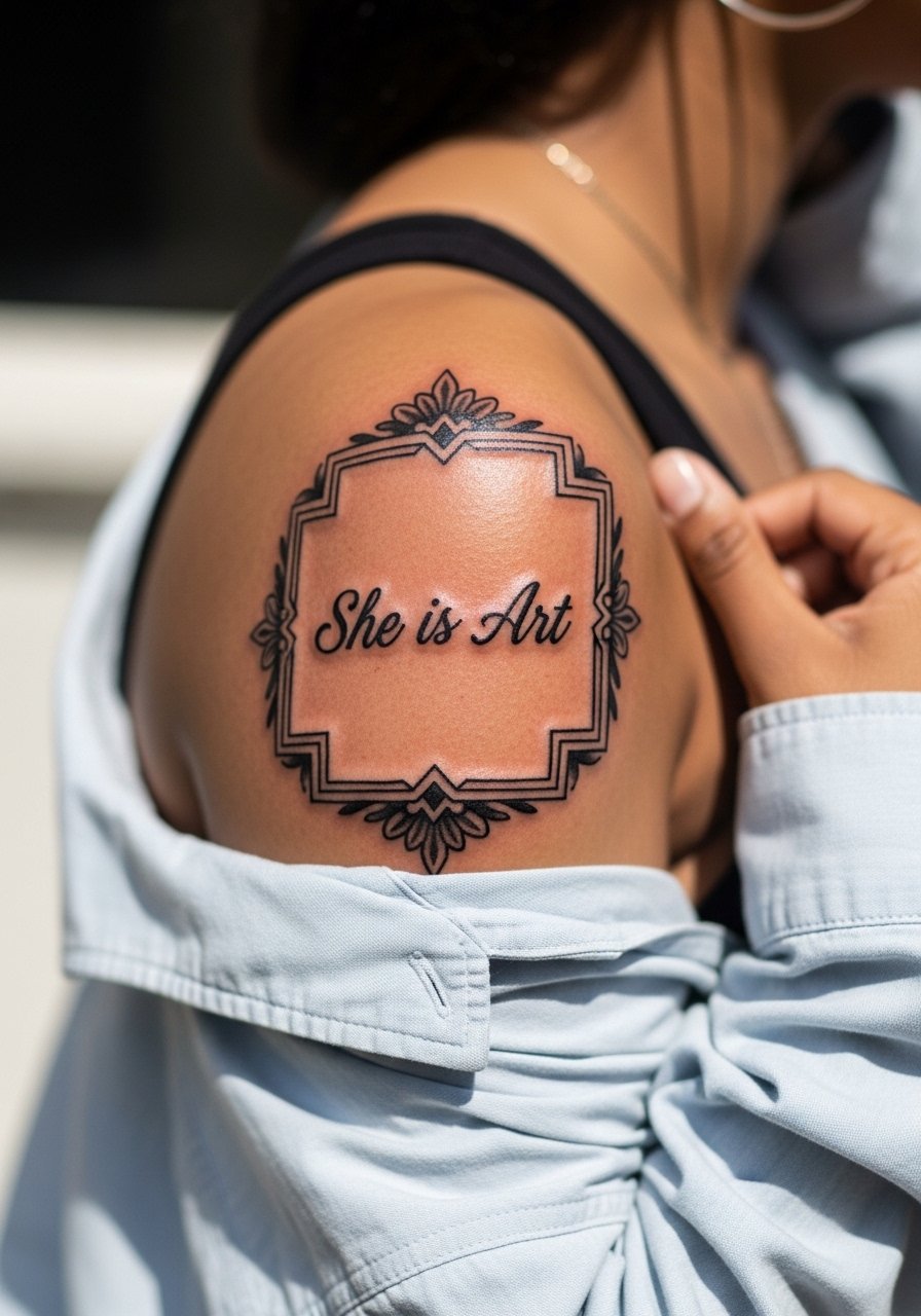
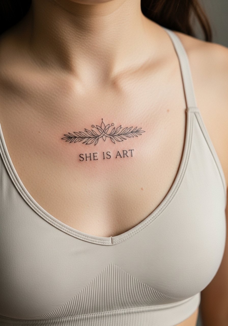
4. Micro Collarbone Outline for Quiet Strength
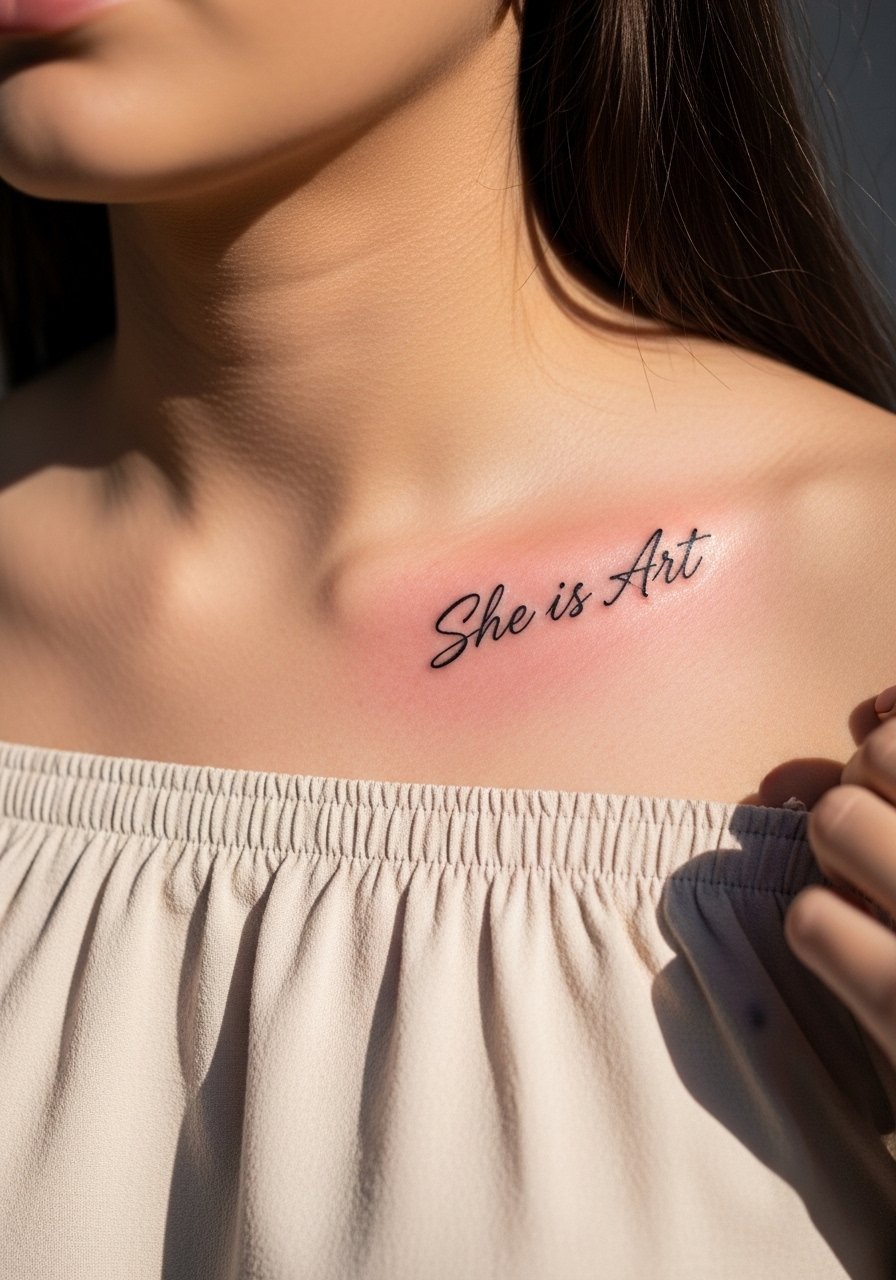
Collarbone pieces read as discreet and visible at the same time, and they look best when sized around 1.5 to 2 inches across the curve. Ask your artist to respect the clavicle line so letters follow the natural contour rather than sit flat. Expect a moderate pain level and a single short session. For the session, a button-front shirt or loose tank is easiest. When you want to frame it, pair with an off shoulder blouse and a delicate choker sitting just below the script.
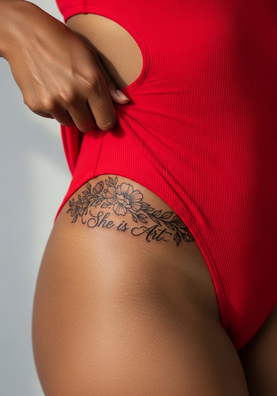
5. Mandala Fusion Emblem on the Outer Thigh
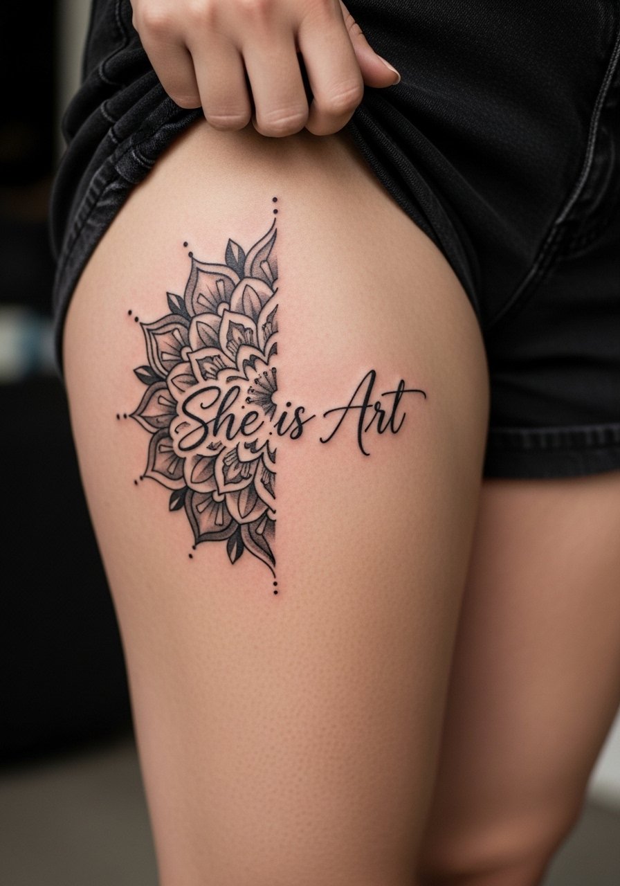
Larger ornamental pieces like a 5 to 7 inch mandala around text need spacing and symmetry to avoid visual crowding as the skin settles. The thigh is forgiving for saturation and detail, but expect 2 to 3 sessions if you want deep blackwork and fine stipple shading. For the appointment wear loose drawstring shorts so the artist can expose the outer thigh without pressure on the area. For warm-weather show-offs, pair the piece with high waisted shorts or a slit midi for easy visibility.
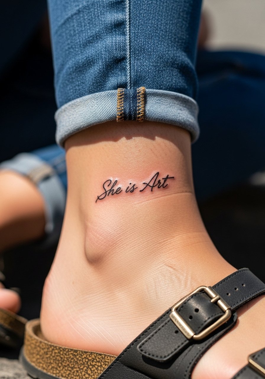
6. Watercolor Splash Ankle Wrap that Reads Like a Sketch
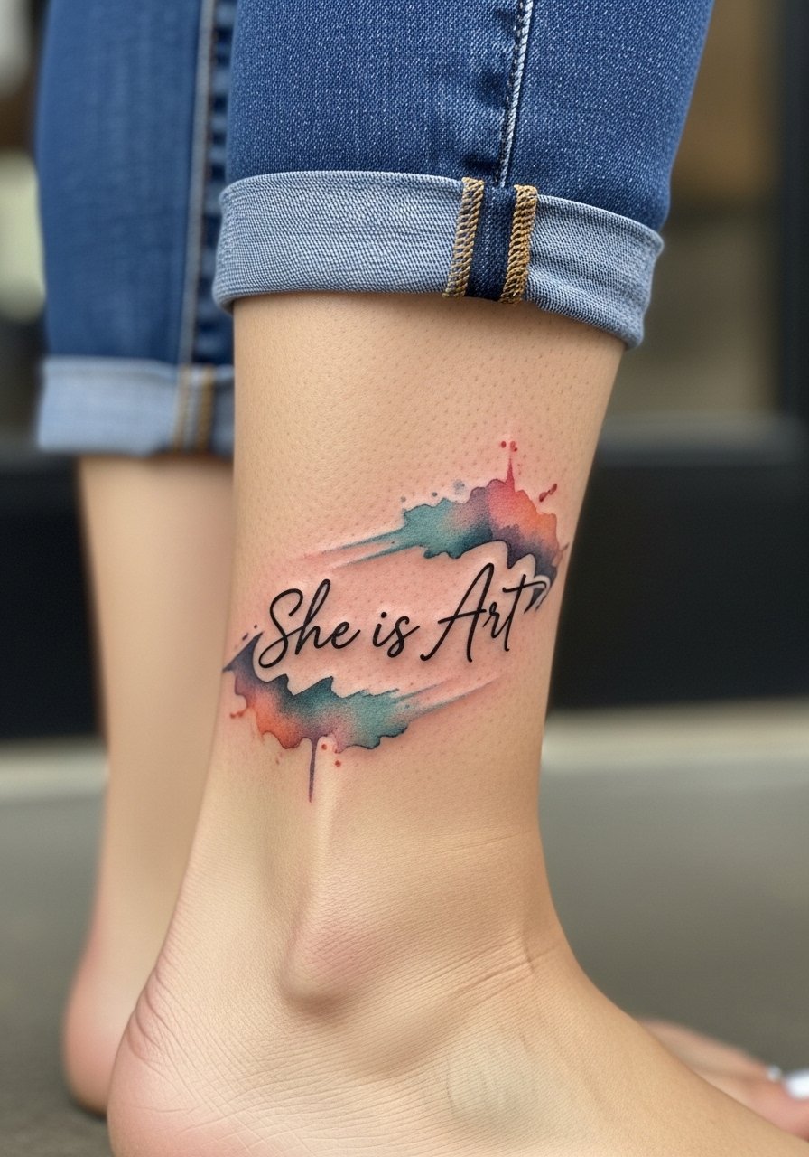
Ankle wraps are fun and seasonal, but they face constant friction from shoes and socks. Use vivid washes behind a crisp black line for contrast and expect color to need refreshment sooner than solid black. For the session, wear cropped ankle pants or sandals so the artist can access the area easily. When styling, a cropped ankle pant and a thin anklet on the opposite leg keep attention on the wrap without competing with the watercolor.
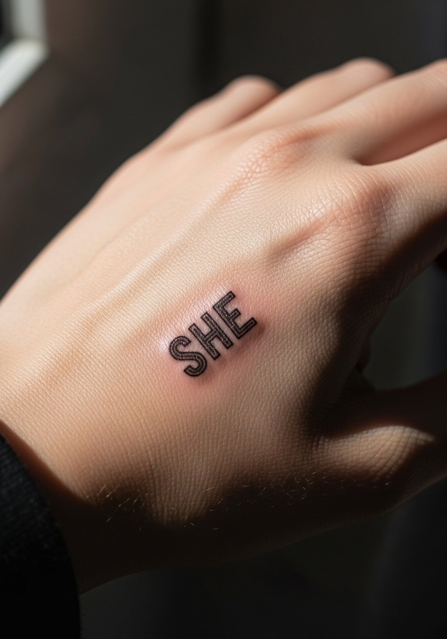
7. Ignorant Style Block Letters on the Back of the Hand
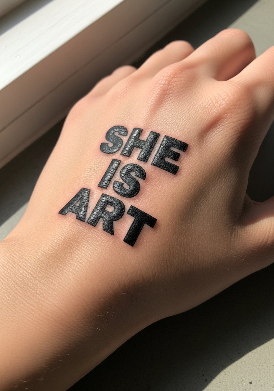
Hand pieces are bold and public, and they require a blunt honesty about future fading and employment implications in certain fields. The back of the hand is high friction and sees frequent washing, so thick, confident letters work better than ultra-fine scripts. Expect a single-session hit with a higher likelihood of touch-ups in the first year. Many artists will advise heavier line weight to resist early blowout and fading. Hand tattoos still affect hiring in some industries, so consider placement consciously before committing.
8. Fine Line Vertical Script Down the Spine
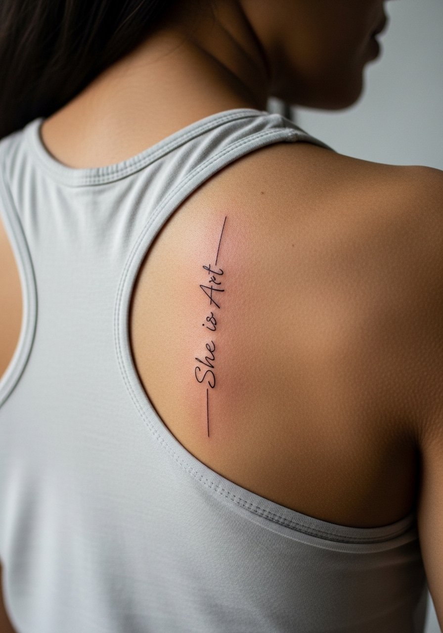
A vertical spine script reads like a private mantra when you bend and reveal it. The upper spine takes movement and posture into account, so request spacing between characters to prevent dense clusters that can blur with time. Pain is moderate to high depending on the exact vertebrae, and many people break the work into two sessions for comfort. For session wear, a racerback tank or easily removable top keeps the area accessible. Over five years this placement softens in linework more than a forearm piece, so plan realistic touch-ups.
9. Blackwork Frame on the Shoulder Blade for Sculptural Impact
There is something about solid black framing that turns text into a wearable sculpture on the shoulder blade. This area handles heavy saturation well and reads from a distance, but it can take 2 to 3 sessions depending on size. For the appointment, wear a loose button-down you can slide to the side so the artist has unobstructed access. Pair show-off shots with a sleeveless tank top for mirror selfies that emphasize the framed work.
10. Minimal Fingerprint on the Inner Bicep for Personalization
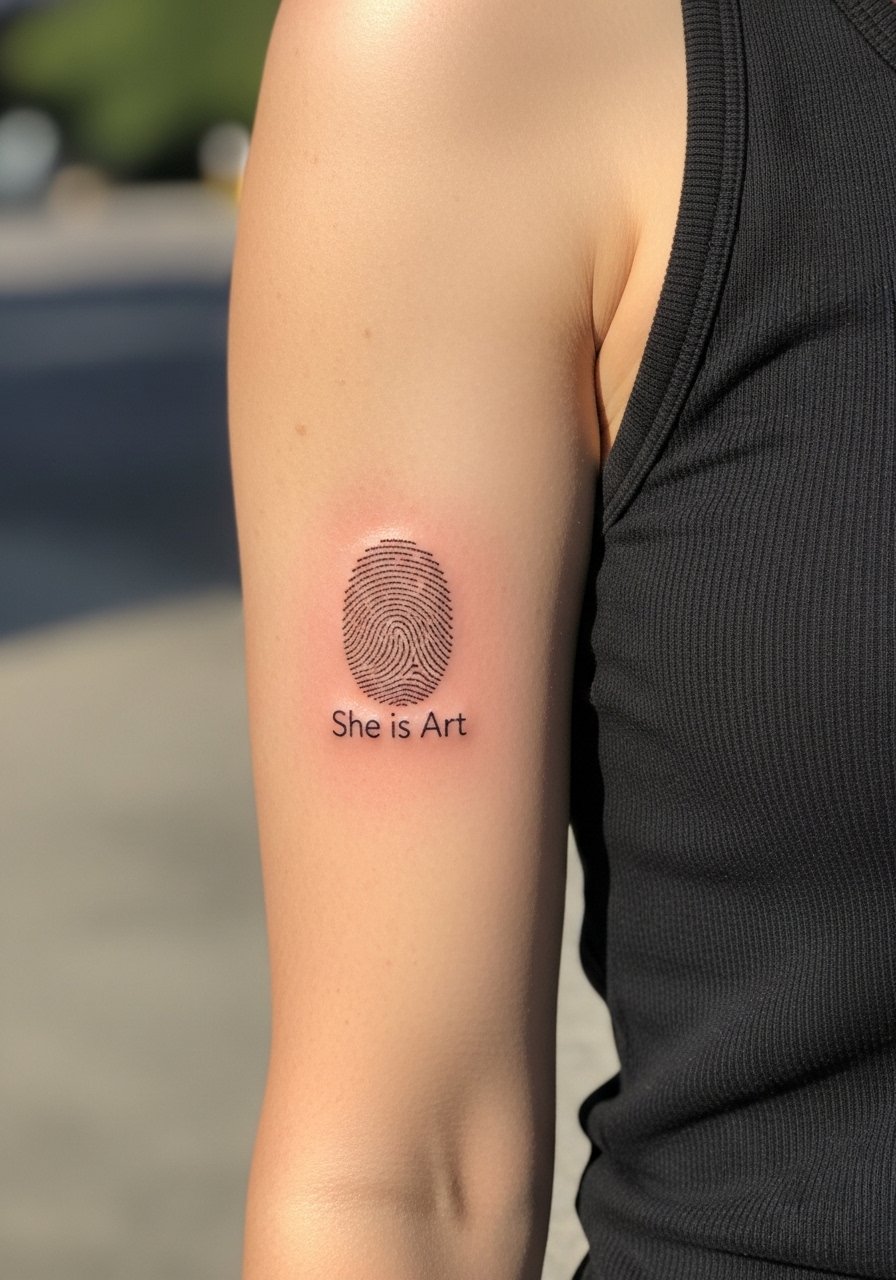
An inner bicep piece like a fingerprint or tiny script is intimate and surprisingly low-visibility, which many people prefer. The inner arm sees stretching with muscle changes so keep the design compact, about 1.5 inches, and ask your artist to use dot work rather than heavy single-line runs. Session wear should be a removable tank so the artist can work with the arm relaxed. For styling, a sleeveless crop top or fitted tank highlights the inner bicep without crowding the area.
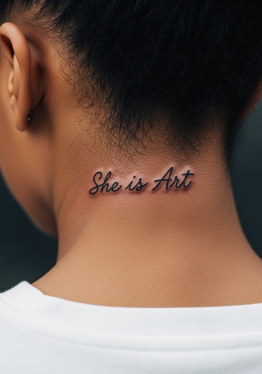
11. Single-Needle Nape Script Under a Wide Collar
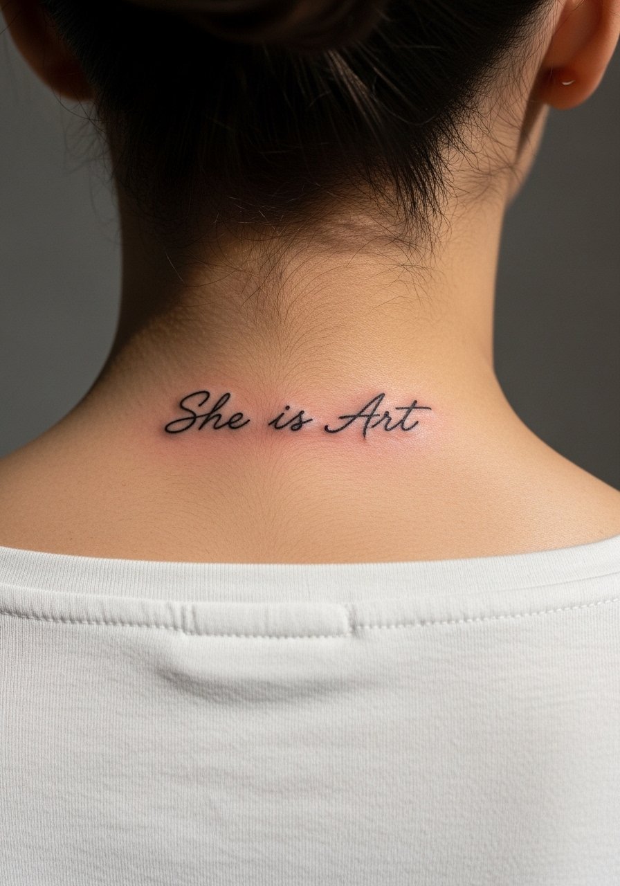
The back of the neck is a great spot for a small single-needle script that can be shown or covered depending on hairstyle. This placement is visible in low-cut collars or wide-neck shirts, so talk placement with your artist using photos of your neck in different positions. Pain is moderate and sessions are short. For the appointment, a wide-neck shirt or collar you can lower slightly is easiest. Keep in mind hair length affects how often you see it in the mirror.
12. Tiny Behind-the-Ear Script That Hides in Hairline
This micro placement reads like a private note that peeks out depending on hairstyle. Because the area is small, specify exact letter height so the script does not overwork the skin and blur. Artists often recommend a single-needle approach but note that the skin near the hairline can be tricky for consistent saturation. Frame the session so you can easily tuck hair and allow the artist to work without hair interference. Consider the stencil placement carefully before the needle hits.
13. Ornamental Sternum Piece with Integrated Lettering
Sternum work can be dramatic, and the right aesthetic ties the lettering into a centered ornamental composition. Expect higher sensitivity and a session that requires precise positioning for symmetry. Wear a fitted sports bra or bandeau you can keep in place while exposing just the sternum area. Because the chest moves with breathing, spacing is the key to longevity. Some people prefer slightly bolder line weight here to resist early feathering.
14. Inner Thigh Botanical Script for Private Art
Inner thigh pieces are private and sit under clothing often, which helps protect them from sun but increases friction from clothing. If you pick this spot, expect a more meditative session with careful positioning. Ask your artist to use dot work and moderate saturation to avoid dense areas that might blur. Session wear should be loose shorts or a wrap skirt so the artist can access the area without pressure. Because this placement is intimate, many people choose it as a test piece before larger visible work.
15. Geometric Mandala on the Shoulder Cap That Frames the Phrase
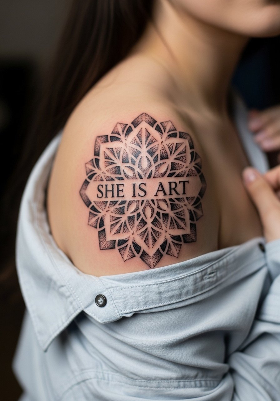
A shoulder cap mandala holds detail well because the shoulder resists long-term stretching and sees less daily abrasion. For a piece that frames text, request clear negative space around letters so they do not get lost in the pattern. Expect one to two sessions depending on size. For the session, a loose button-down you can slide aside is convenient. To show it off, opt for a sleeveless tank top or halter silhouettes.
16. Stacked Mini Scripts Along the Fingers
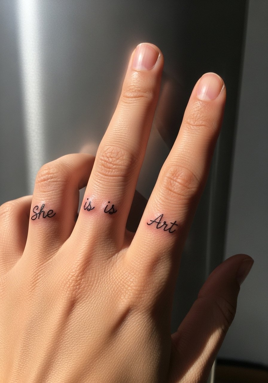
Finger scripts are charming but face fast wear due to frequent washing and skin turnover. Keep text very small and bold enough that the strokes retain shape, or expect touch-ups often. A common mistake is making letters too thin. The session is short but possibly uncomfortable. Protect the design with mindful hand care in the first week and understand that fingers are among the quickest places to fade.
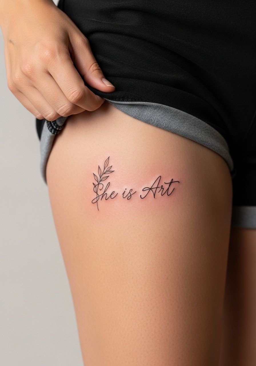
17. Decorative Hip Accent That Peeks from Swimwear
Hip pieces work well when you want something that shows seasonally and stays private otherwise. The skin here handles detail and shading nicely, though shifts in waistline can affect how the piece sits over time. For the session wear high-cut bottoms or jeans you can pull slightly down at the hip. If you plan to show it off, pair with high-waisted shorts or a swimsuit that reveals the design.
18. Typographic Block on the Palm Edge for a Graphic Touch
Edge-of-palm or thumb-side text is bold and very hands-on. These spots confront constant movement and moisture, so heavier inks and thicker lines will last longer than delicate work. Many artists caution that palm-side work often requires multiple touch-ups early on. Expect quick sessions but potentially repeated visits. Think through career visibility and day-to-day wear before committing.
19. Subtle Top-of-Foot Script That Fits in Sandals
Top-of-foot pieces are visible in warm months and sit in a high-friction zone for shoes. Keep the script compact and avoid ultra-fine elements that will break up with repeated rubbing. For the appointment, wear pants you can roll up or sandals for easy access. A cropped ankle pant works well for show-off looks in summer and protects the area when you need it covered.
20. Negative Space Crescent Back Piece Near the Lower Back
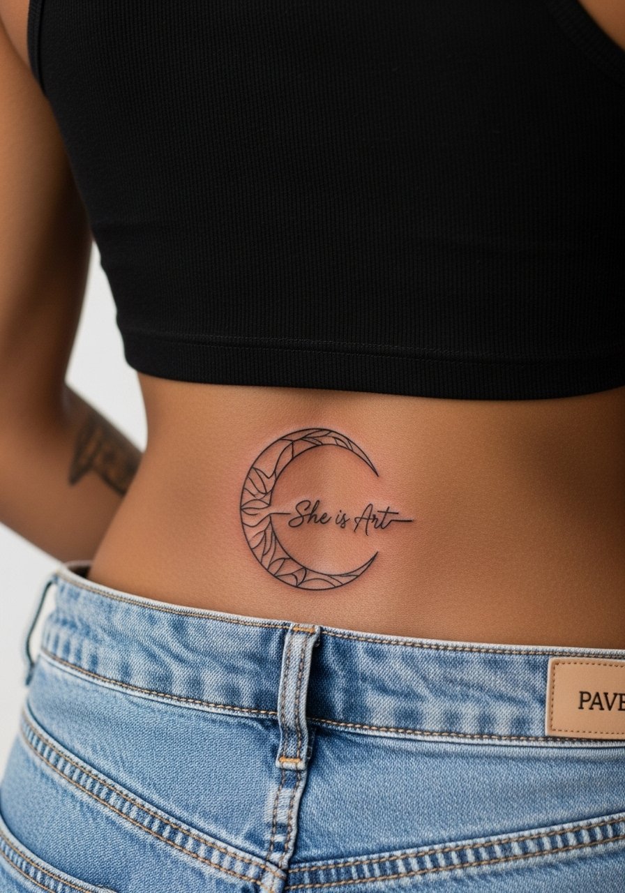
Lower back work has returned as a tasteful placement for curving designs that sit just above the waistband. The area tolerates bold shapes and negative space well, but avoid overly dense detail near the spine. For the session, wear a tank top and high-waisted pants you can shift slightly. Keep in mind clothing friction from waistbands during the first healing weeks.
21. Temporary Set Trial Across Three Small Placements
If you are unsure about a permanent location, try a set-of-three temporary decals that let you live with the phrase on three placements for one to two weeks. This is a low-commitment way to test sizing, spacing, and how often the placement will catch your eye. When you bring references into your consultation, show which temporary placement felt most natural and why. Temporary tests are also great for gifting a friend a trial run before they book.
Studio Day Picks
The wrist, forearm, and ankle pieces above need different prep and short-term protection than larger work like thigh or shoulder blade. These items smooth the session and the first week of healing.
-
Stencil transfer paper kit. Lets you preview exact placement and line weight on skin before committing, which is especially useful for small wrist and finger scripts.
-
Topical numbing cream. Applied about 45 minutes before reduces edge pain on rib and sternum sessions without changing the artist's final linework when used correctly.
-
Thin protective film roll. Helpful for ankle and hand work that sees lots of friction, it shields the area during the first day when scabbing is most delicate.
-
Fragrance free gentle body wash. Use during the first weeks to cleanse without irritation, especially around fine line forearm or collarbone work.
-
Aquaphor healing ointment. Thin layers during the first 48 hours keep fine line channels hydrated and reduce cracking on smaller script pieces.
Frequently Asked Questions
Q: Will a fine line wrist script need a touch-up sooner than a forearm script?
A: It depends on how much friction and sun exposure the wrist faces in your daily life. I have seen wrist scripts often need a touch-up by year two, while forearm pieces can hold longer if protected from UV. Size up the letters slightly and plan a realistic touch-up timeline when you book.
Q: Is a mandala fusion on the thigh a good first big piece or should I test with a temporary decal?
A: Testing with a temporary set across thigh, wrist, or ankle is a smart move. The thigh handles detail well so if the temporary feels right you likely have a good match for a larger, multi-session project.
Q: Are there real risks to getting script on the ribs, and how do artists differ on this?
A: Yes, ribs are sensitive and skin movement affects fine lines. Some artists avoid ultra-fine script there and prefer bolder banners. Others will execute single-needle script with wider spacing. Ask your artist which camp they belong to and request healed photos of their rib work before booking.
Q: What should I wear to a shoulder blade session to make the appointment easy?
A: Wear a loose button down shirt you can slide to the side or a tank top. Anything that gives the artist clean shoulder access without you having to be shirtless makes the session smoother.
Q: How do watercolor splashes on the ankle age compared with black script?
A: Watercolor tends to fade faster, especially on high-friction zones like the ankle. Black script offers better contrast over time. If you want a watercolor look, ask for a stronger black outline to hold the composition as the colors soften.
Q: I want a hand or finger piece. What common mistakes should I avoid?
A: The biggest mistake is requesting ultra-thin script in a high-wear area. Go slightly bolder in stroke and accept that touch-ups are very possible. Also discuss placement so letters do not sit over joint creases where movement will blur the linework quickly.