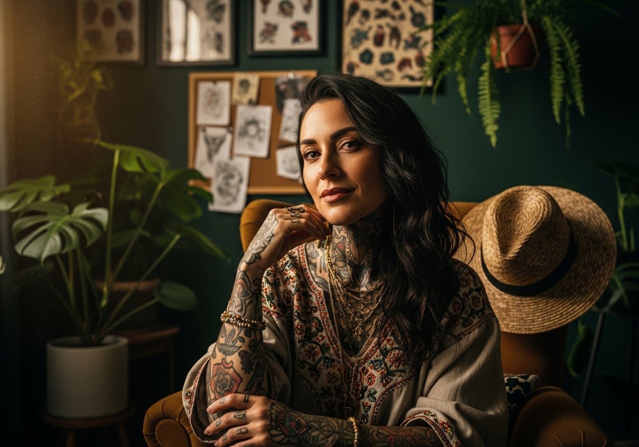
Fine line tattoos are everywhere online, but what holds up over time is not always what gets the most saves. Popular trends like micro linework and watercolor look incredible fresh. In practice they need thoughtful placement, a patient artist, and realistic expectations about touch-ups. Below are 21 concrete style drawings and placement ideas that balance immediate impact with longer-term wear so you can picture how each choice will age and read on skin.
1. Fine Line Arrow on Inner Forearm
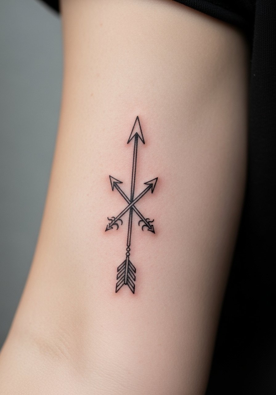
I recommend this when you want a micro design that still reads across short distances. Tell your artist you want single-needle linework with slightly increased spacing between parallel lines so the arrow shaft does not blur at year three. Common mistake is making the shaft too dense, which invites merging in thin skinned areas. Expect a mild pain level on the inner forearm and a single 30–60 minute session. For showing it off, rolled sleeves work best because they frame the forearm without competing with the ink, so consider a rolled sleeve t-shirt you can push up during warm months.
2. Color Realism Portrait on Calf
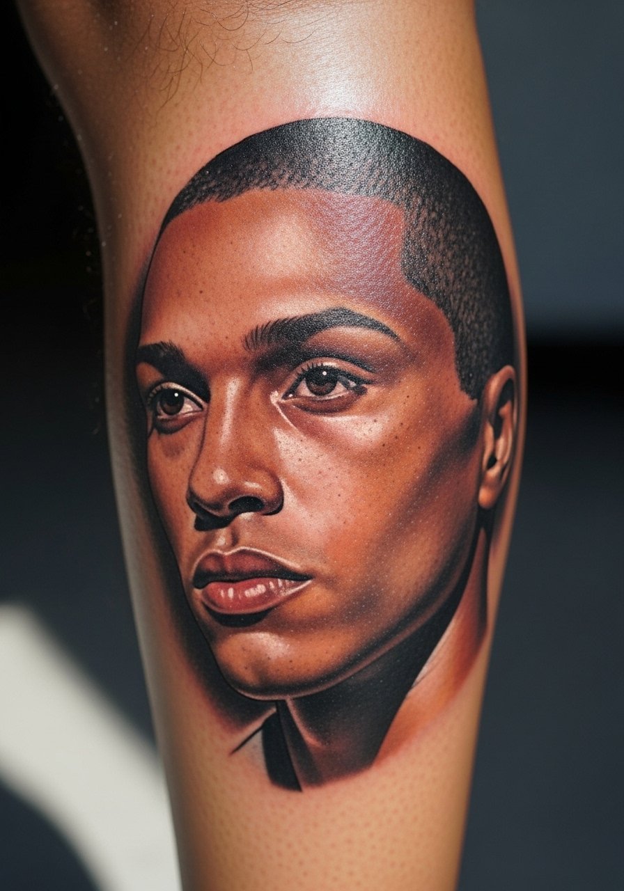
Forearms and calves are the typical canvases for portraits because they hold detail. For a calf portrait ask for a bold focal point and softer peripheral shading so the face keeps contrast after healing. The calf tolerates longer sessions, expect multi-session work and a heavier fatigue in the leg during 3–4 hour sittings. A common error is insisting on a tiny portrait that becomes a blurred smudge in two years. Plan for a large enough scale to preserve facial features and a realistic touch-up at year three if you want crisp eyes.
3. Watercolor Snake Splash on Upper Thigh
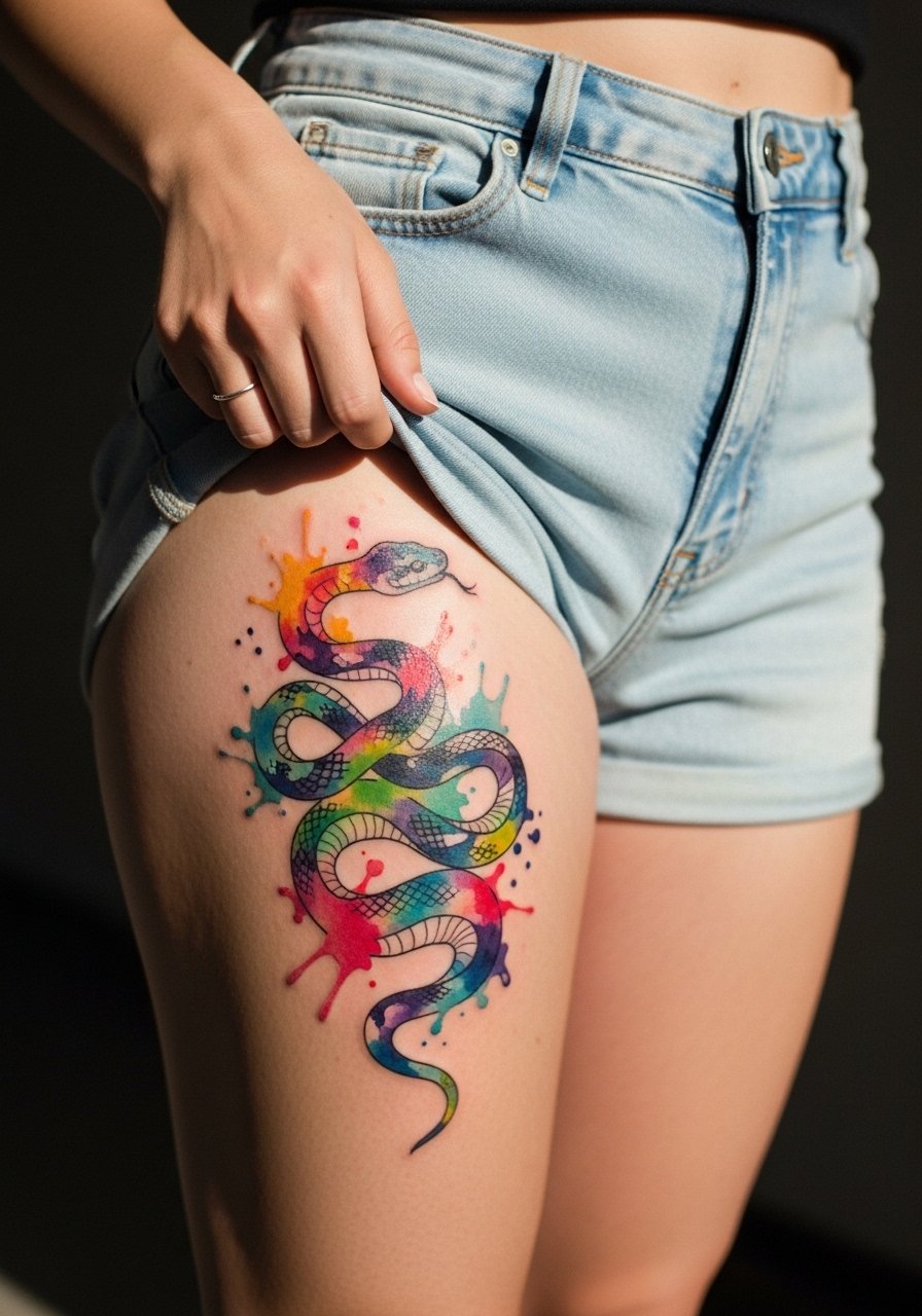
Watercolor work is expressive but controversial when longevity matters. One camp says watercolor fades into unattractive halos quickly. The other camp argues strategic black anchors and spaced color patches hold better. My take is to add fine black anchors or outline fragments so the color has structure. The thigh is forgiving for touch-ups and sits low in sun exposure when covered, which helps longevity. Wear high-waisted shorts or a high waisted shorts women when you want to show it off, and choose loose joggers for session comfort.
4. Butterfly Outline with Soft Shading on the Wrist
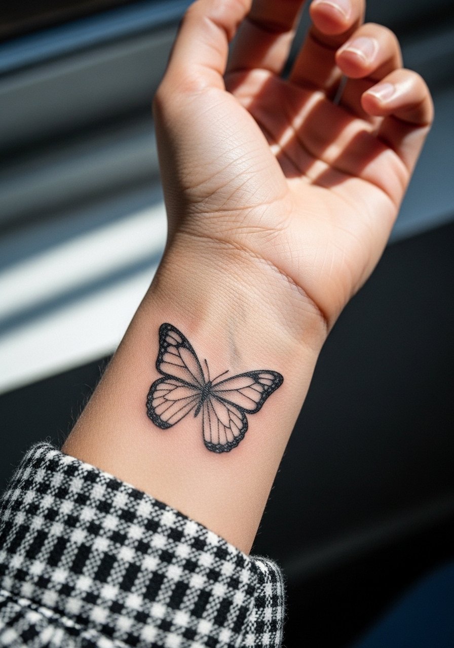
Wrist pieces read intimate and delicate. If you want transformation imagery without heavy maintenance, ask for slightly thicker outer lines and minimal internal detail so aging looks intentional rather than messy. The wrist sees constant washing and friction, which accelerates fading, so expect a touch-up at 18–36 months for fine internal strokes. For showing the piece, thin silver chain bracelets stack well, so pair it with a thin silver chain bracelet. During the session skip jewelry on that wrist and wear a sleeveless tank to give the artist clear access.
5. Skull with Floral Accents on Collarbone
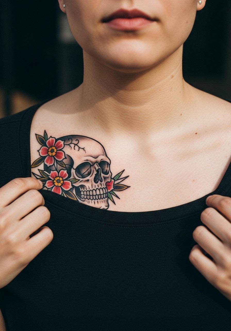
Collarbone work looks dramatic but can be tricky. The biggest mistake is packing too much dense detail into a shallow plane. Tell your artist to prioritize clear negative space so the skull silhouette reads from a distance and the floral accents sit around it to frame, not crowd. Pain is often higher at the collarbone because the bone is close to skin, with sessions varying from 60 to 120 minutes. It ages by losing subtle shading first, so bold contrasts help preserve form.
6. Classic Snake Coiling Around Dagger on Ribcage
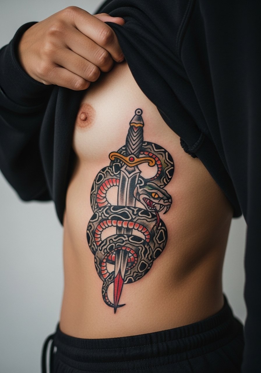
Fair warning: the ribcage rates high on most pain charts, and the stretching there can alter very fine lines. Artists split into two camps on fine detail in ribs. One side says the constant breathing motion blurs microline work. The other side says with proper needle depth and spacing, lines settle fine. If you choose ribs, ask for slightly bolder outlines and allow for two sessions if color and shading are large. For session wear bring a loose jogger pants so you can pull the waistband down without pressure on the area.
Pack Smart
The rib, collarbone, and wrist pieces above demand different prep, and a few specific items make the session and first week easier.
- Stencil transfer paper kit. Lets you preview exact line placement on curved areas like the ribcage and collarbone before the needle touches skin.
- Topical numbing cream. Applied as directed can ease rib and sternum sensitivity for longer sessions.
- Thin protective film roll. Useful for wrist and finger tattoos to protect against friction during the first days.
- Fragrance-free gentle body wash. Cleanses healing areas without irritating delicate linework.
- Healing ointment. A thin layer during the initial window helps skin stay supple for fine line pieces.
7. American Traditional Feather on Inner Forearm
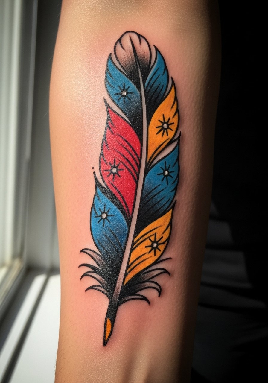
A traditional feather ages like a classic because of heavy outlines and saturated fills. If you want the Americana look, ask for solid black outlines and restrained color panels that will patina gracefully. The inner forearm is low pain and typically finishes in one or two sessions. A common error is adding intricate micro-shading inside the feather which blurs; keep internal detail simple. When showing it off roll up sleeves or wear a short sleeve button shirt you can style up or down.
8. Black and Gray Realism Feather on Shoulder Blade
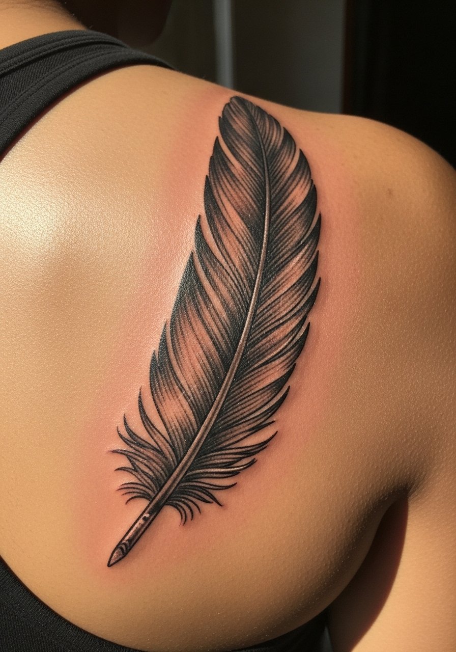
The shoulder blade takes shading beautifully and is forgiving for realism. Ask your artist for layered stipple shading and gradual saturation so the feather keeps texture over time. Mistakes happen when artists overwork contrast in the first session, which can scar and flatten subtle texture. Expect a medium pain level and multiple sessions if the feather is mid-sized. This placement is low-friction and tends to need fewer early touch-ups compared with wrists.
9. Traditional Rose with Banner on Calf
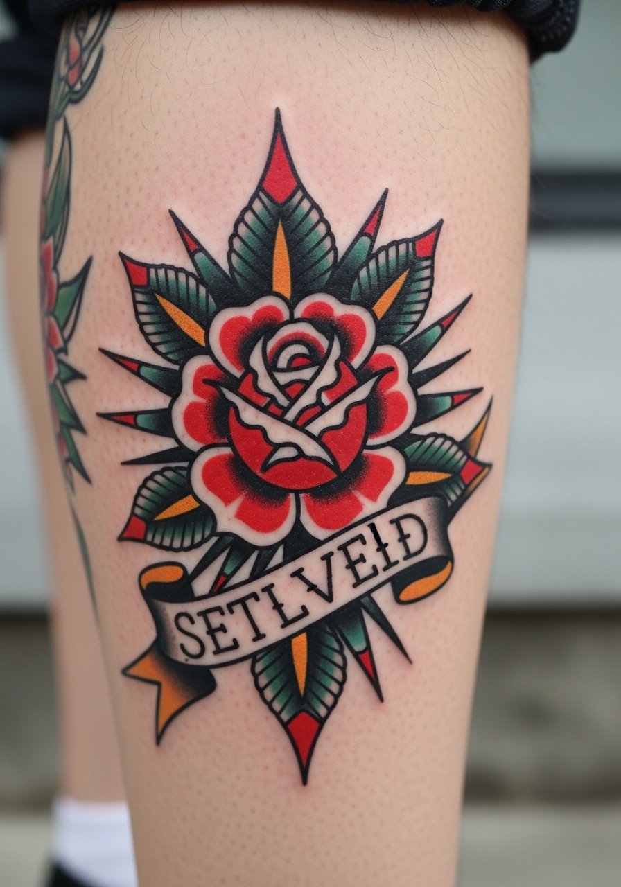
Calf pieces like a traditional rose hold saturated color well because skin there has density and less daily abrasion. For longevity tell your artist you want clear negative space around the banner text and thick outer lines. Common error is crowding the banner with tiny lettering, which becomes illegible. The session is comfortable for long stretches and usually finishes in a single visit unless sized large. Show this off with fitted shorts or rolled joggers and consider a pair of fitted athletic shorts on casual days.
10. Neo-Traditional Lady Head with Florals on Upper Arm
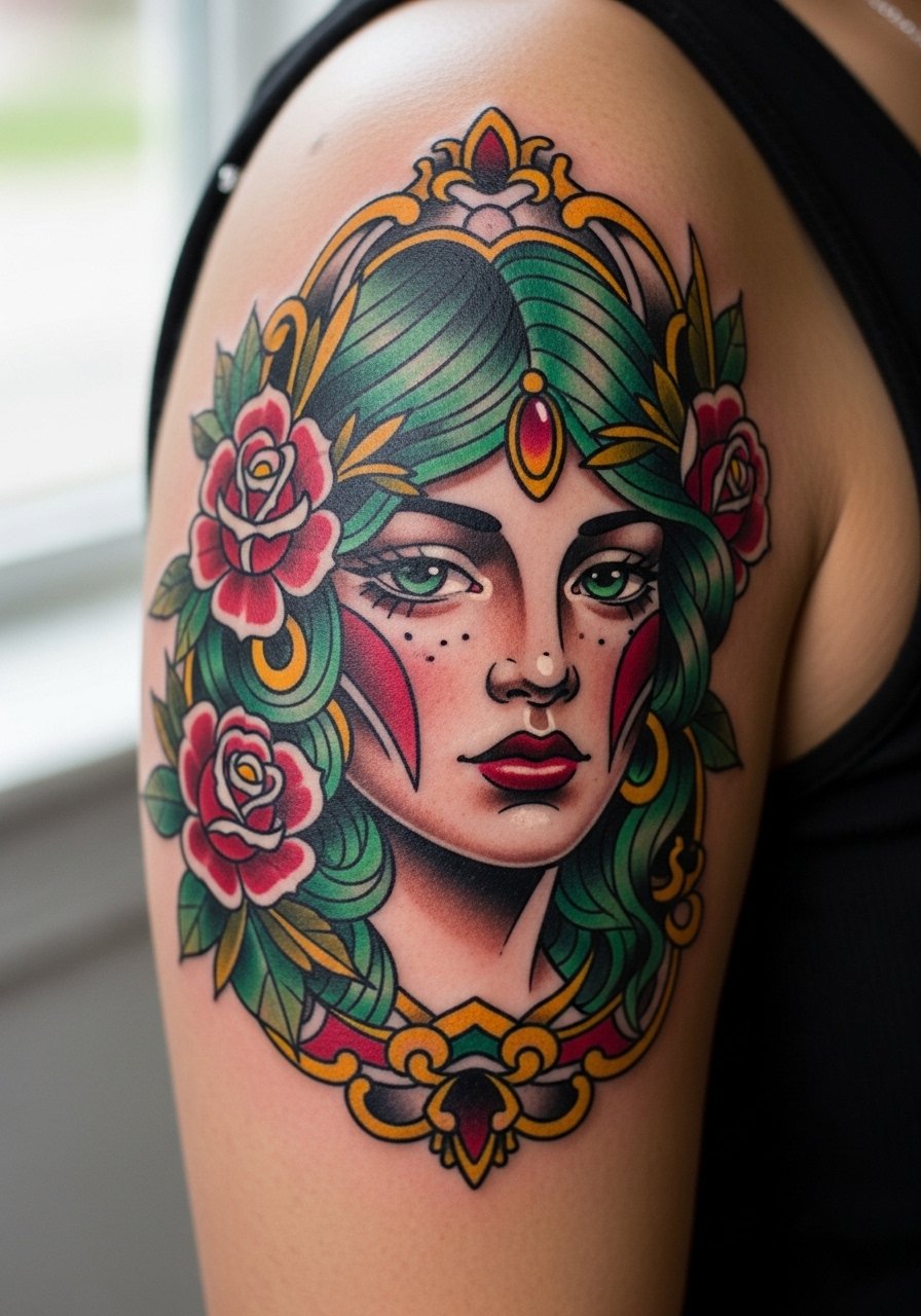
Neo-traditional portraits combine bold outlines with painterly fills. I suggest larger scale on the upper arm so the facial features have room to breathe. The common mistake is insisting on photo-level detail at a very small size, which ends up looking muddy. Upper-arm sessions are moderate pain and typically take two to three sittings for color saturation. Over time, bold outlines keep the graphic silhouette intact even if some color softens.
11. Minimalist Butterfly Wing Behind Ear
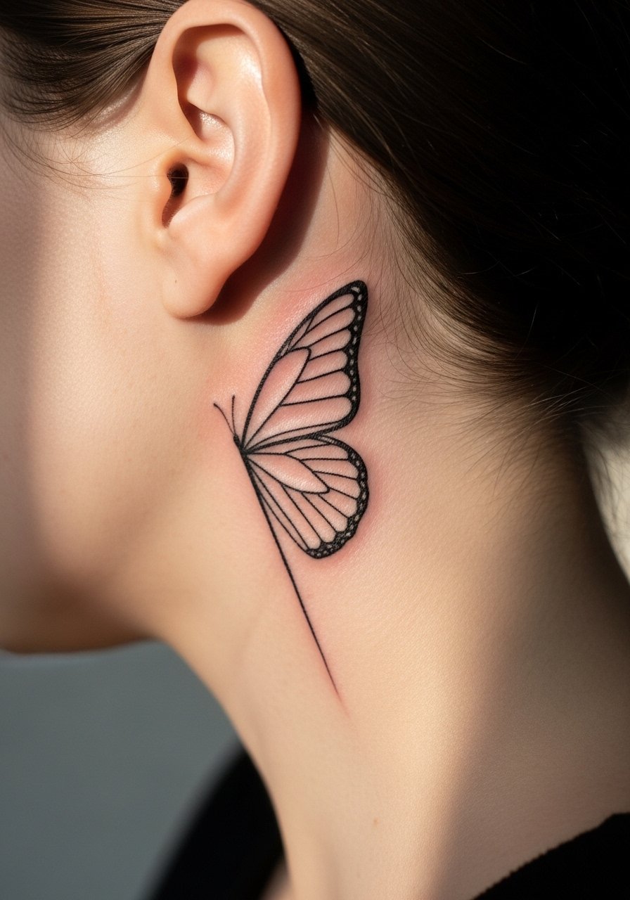
Behind-ear tattoos need delicate planning because hair and collars change how they show. Ask for a slightly simplified wing and avoid dense stippling that can disappear under hair. The skin there is thin so expect quick sessions and mild sensitivity. A professional note: this placement can feel more visible than you expect when your hair is up, so pick a design you are comfortable seeing daily. Keep the outline airy and plan a small touch-up at year two.
12. Ornamental Mandala Skull on Upper Back
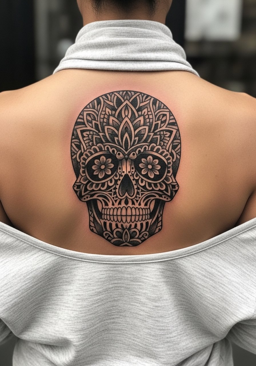
Mandala skulls pack a lot of line density which challenges long-term clarity. The usual mistake is compressing too many concentric details into a small area. If you want symmetry and longevity, scale it so negative space separates tight patterns, and choose stipple shading rather than packed black. The upper back tolerates long sessions and heals relatively well with low friction. For cultural sensitivity note that mandala patterns have spiritual origins and many clients choose stylized variations rather than direct reproductions.
13. Surreal Multi-Dimensional Animal on Back
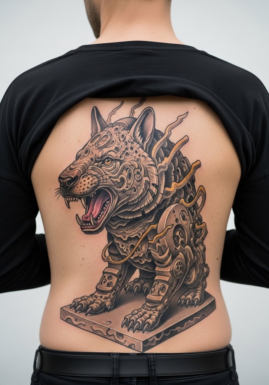
Surrealism lets artists bend anatomy and space. I recommend clear anchor elements such as a realistic eye or bone to keep the illusion readable as colors soften. The back handles large compositions well but demand multiple sessions. A common error is overcomplicating transitions between layers which blur over years. During consultation be explicit about which part of the piece should remain the focal point at three and five years healed.
14. Minimalist Butterfly Wing on Finger
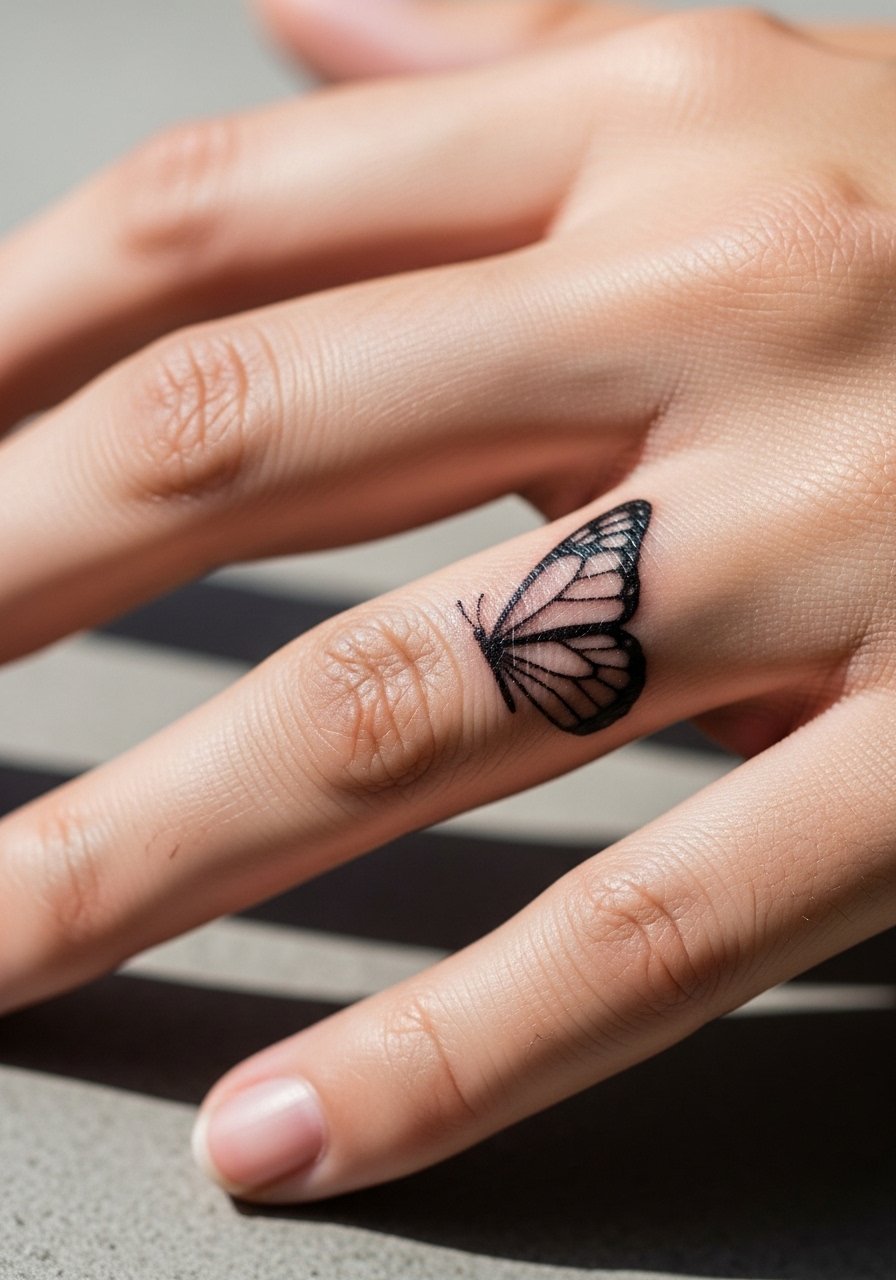
Finger tattoos are appealing but high maintenance. The skin there exfoliates often and friction makes micro work fade quickly. If you want a finger wing, ask for bolder outer strokes and accept that yearly touch-ups might be needed. The session is quick but the healing window requires care to avoid scabbing that disrupts linework. Think of finger pieces as semi-permanent unless you plan regular refreshes.
15. Neo-Traditional Panther Sleeve Concept on Outer Arm
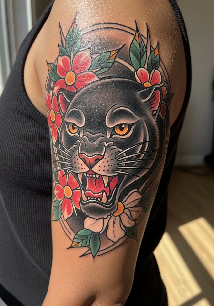
Full sleeve animal motifs read strongest when the panther is the primary visual anchor with surrounding elements flowing into negative space. The typical mistake is trying to cram competing focal points into the same zone. For sleeves expect many sessions across months and heavier pain toward inner arm panels. Saturation is key up front, and a realistic touch-up plan at year two to maintain color intensity helps sleeves keep impact over time.
16. Minimalist Mountain Range Behind the Ear/Neck
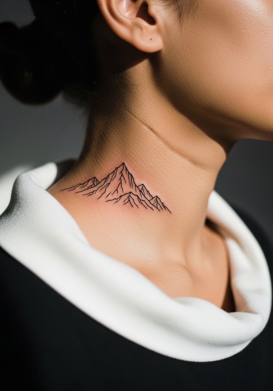
Side-neck tattoos are visible and can influence first impressions. The skin is thin so tiny details blur faster. For a mountain range choose fewer peaks with thicker line weight and slightly increased spacing. Session time is short but sensitivity can be moderate. Ask your artist about placement height so the piece sits where you intend relative to collars and hairlines.
17. Adapting Feathers: Bold Traditional vs Black-and-Gray Realism
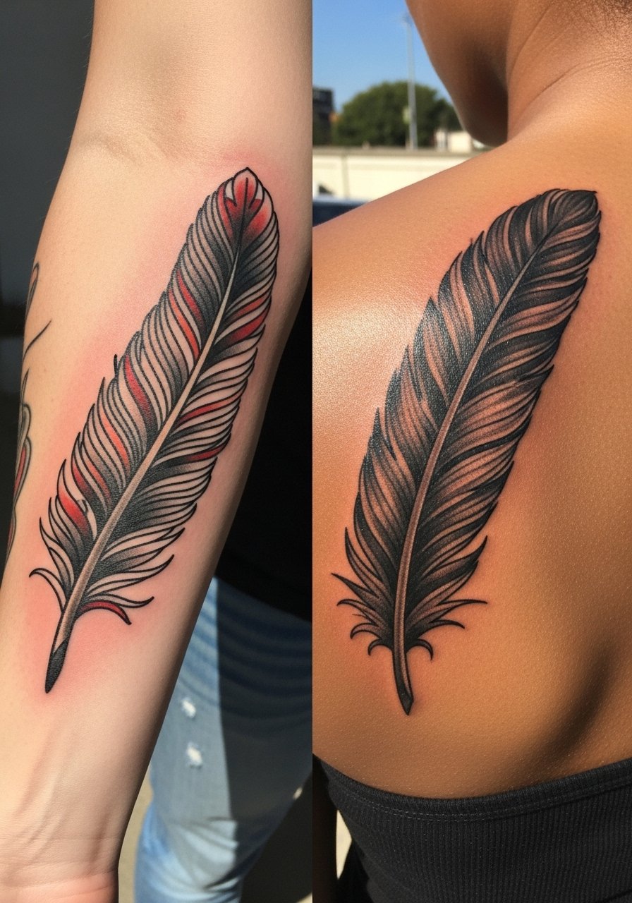
Feathers are a great example of how style changes meaning and durability. For a traditional feather keep heavy outlines and saturated panels. For realism opt for layered stippling and a softer quill. The mistake is asking for realism at a small scale. The forearm handles traditional feathers in one session and looks intentional as color settles. If you want realism pick a larger shoulder or back placement to preserve textural detail. When discussing this with your artist, bring two reference sketches to clarify which approach you prefer.
18. Watercolor Splash Snake Variant on Thigh
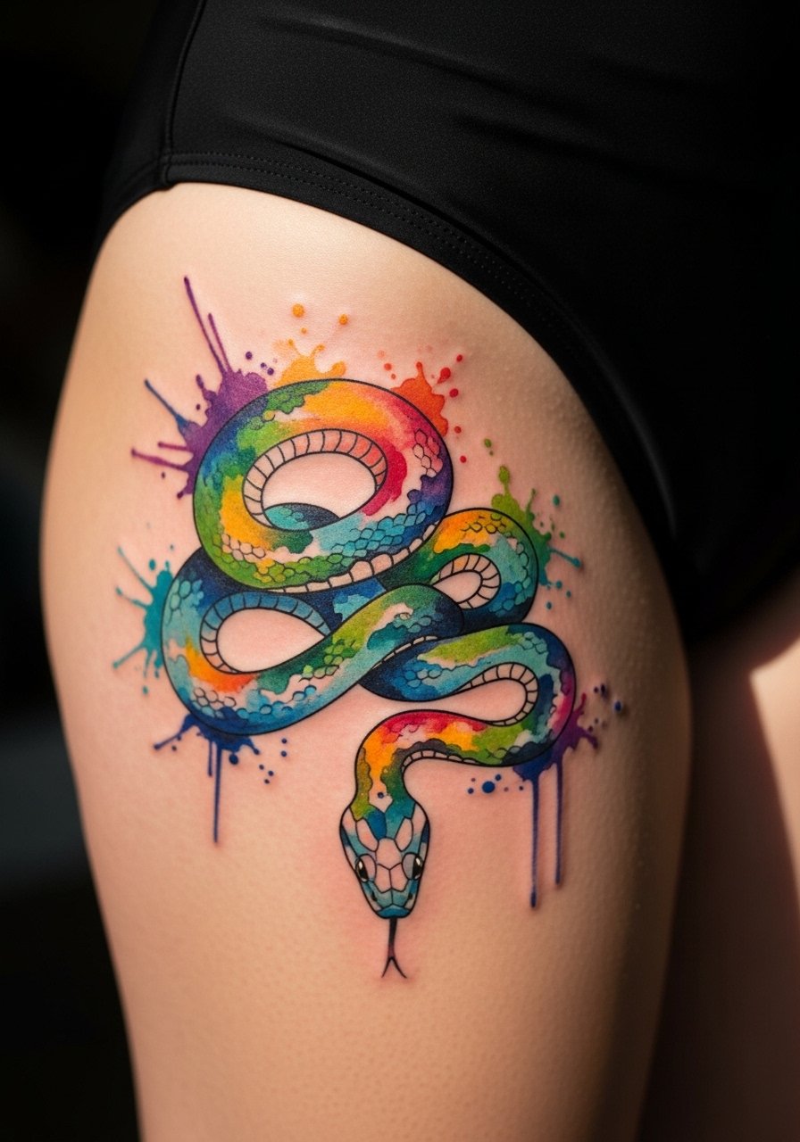
A variant on the watercolor snake uses heavier black anchors and segmented color pools to limit bleeding over time. The thigh is great for painterly work because it sees less daily abrasion. The main error is relying solely on diffuse color with no structure. Plan two sessions if you want both vivid color and crisp black anchors. Choose session clothing that lets you expose the hip cleanly, like high-waisted shorts or a swimsuit bottom during the appointment.
19. Geometric Mandala on Sternum
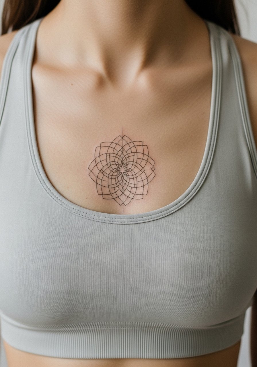
Sternum work is intimate and sits on a moving plane, which complicates dense geometry. Artists disagree on micro mandalas at this spot. One group warns that breathing and torso movement blur lines. The other group says if you space radial elements and avoid overly tiny geometry, the pattern holds. For a sternum mandala prioritize negative space and thicker radiating lines. Sessions can be sensitive and usually require staging into shorter sittings.
20. Scripted Coordinates Along the Rib Line
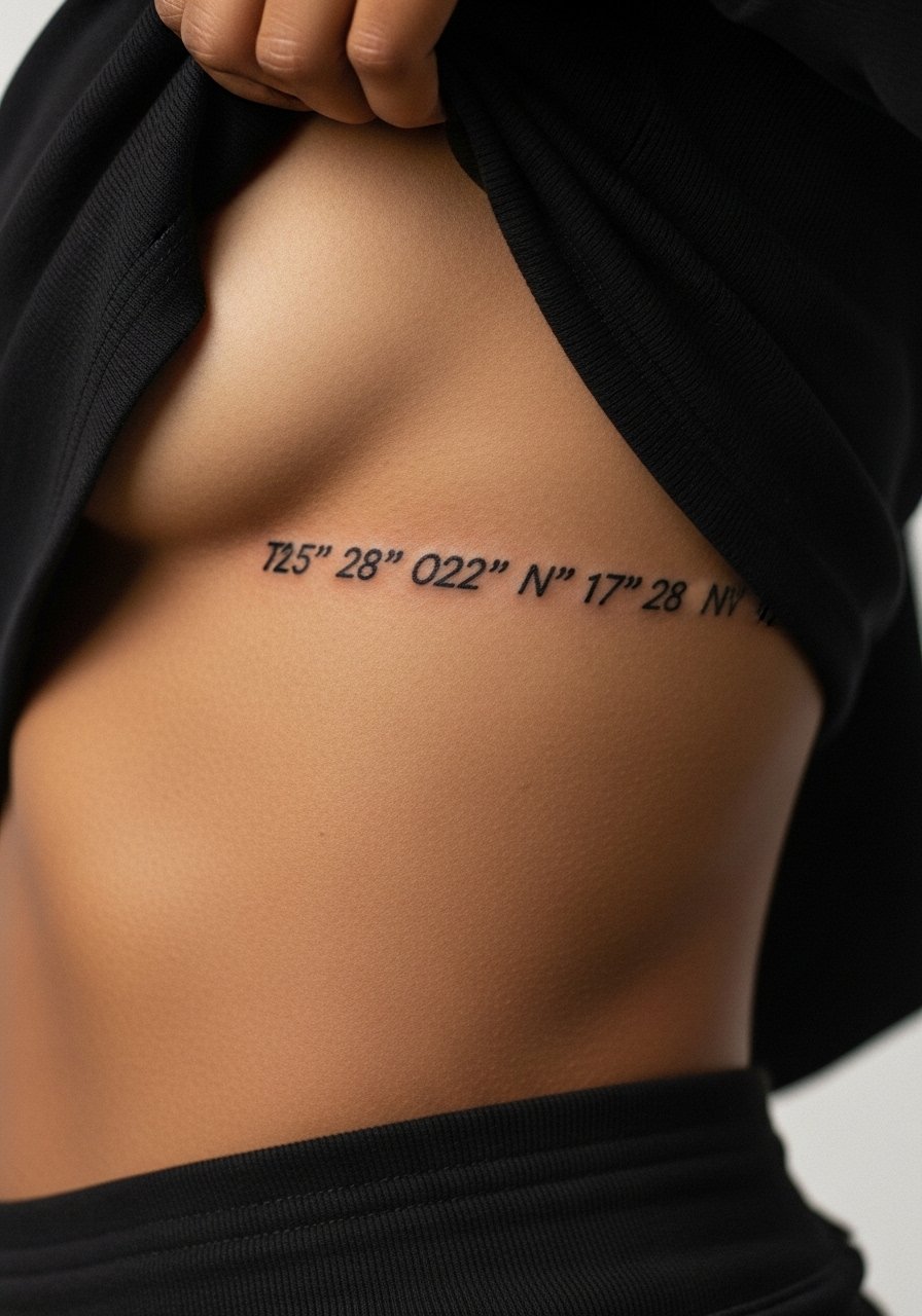
Script across ribs looks poetic but is sensitive to movement. The key is choosing a typeface with open counters and moderate weight so digits do not collapse into one another. A common mistake is selecting a dense serif at a small scale which becomes unreadable. Expect a higher pain level and plan for a small touch-up once healed to sharpen edges if needed.
21. Collage of Small Flash on Ankle
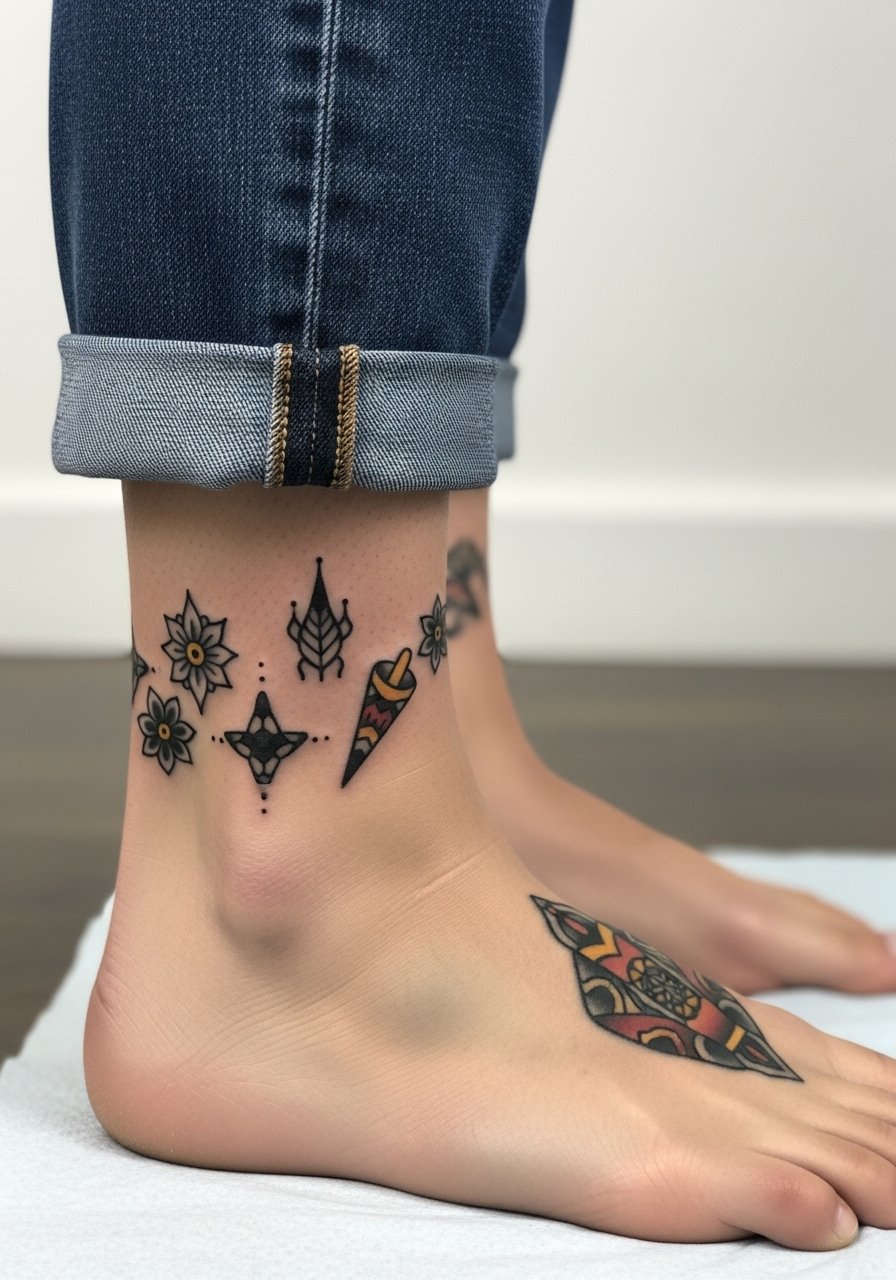
Ankle flash pieces are perfect for mixing classic motifs like tiny roses, stars, or anchors into a compact zone. The ankle undergoes friction from shoes, so place heavier outlines on outer-facing motifs and keep the inner ankle simpler. Sessions are short and typically finished in one visit, but expect regular fading along areas that rub against footwear. Show them off with strappy sandals or cuffed jeans and consider strappy ankle sandal styles for warm weather.
Frequently Asked Questions
Q: Will a fine line wrist tattoo blur faster than a traditional wrist piece?
A: Fine line tattoos on the wrist tend to lose crisp internal detail faster than traditional pieces because the skin there sees constant washing and friction. If longevity is a priority choose slightly thicker outer lines and leave space between internal strokes. Expect a touch-up around year two to three depending on daily wear.
Q: Do watercolor tattoos need different aftercare than blackwork pieces?
A: The immediate aftercare steps are largely the same for watercolor and blackwork: gentle cleansing and keeping the area protected during the initial window. Watercolor benefits from limited sun exposure once healed because pigment contrast relies on subtle hues. After the first month use sunscreen on exposed watercolor areas to slow color loss.
Q: How should I discuss scale with my artist for a portrait on the forearm or calf?
A: Be explicit about the smallest facial detail you want preserved like eyes or nostrils. Ask to see reference portraits at the exact size on paper or a temporary stencil on skin. Many artists will recommend a minimum diameter so features do not merge after healing.
Q: Are there career considerations for visible placements like neck or hand?
A: Yes, hand and neck tattoos remain more visible in professional settings, and policies vary by industry. If you have job concerns consider placements that are easily covered by collars, sleeves, or accessories until you are ready to reveal them.
Q: How often should I expect touch-ups for finger or ankle tattoos?
A: Fingers and ankles typically need more frequent touch-ups because of constant friction and thinner skin. Plan for a possible refresh every 12 to 24 months to keep lines sharp if you want the design to read like fresh ink.
Q: What should I bring to a consultation when I want mixed styles like neo-traditional plus watercolor?
A: Bring clear references for each style and a short note about which part of the piece you want to read as neo-traditional versus watercolor. That helps your artist map contrast points and decide where to anchor color with black outlines so the composition stays readable over time.