
Fine line chest pieces are all over mood boards, but what holds up best on skin that moves and sweats under a shirt is not always what looks best in a photo. Designers and clients chase detail, and then a year later the same pieces need softening or touch-ups. This list focuses on bold, matched chest ideas for men that aim to read strong over time while still looking graphic fresh. Start with a placement that suits your daily shirts and one design that reads as two halves, not a faded puzzle later.
1. Symmetrical Blackwork Eagles Across the Chest
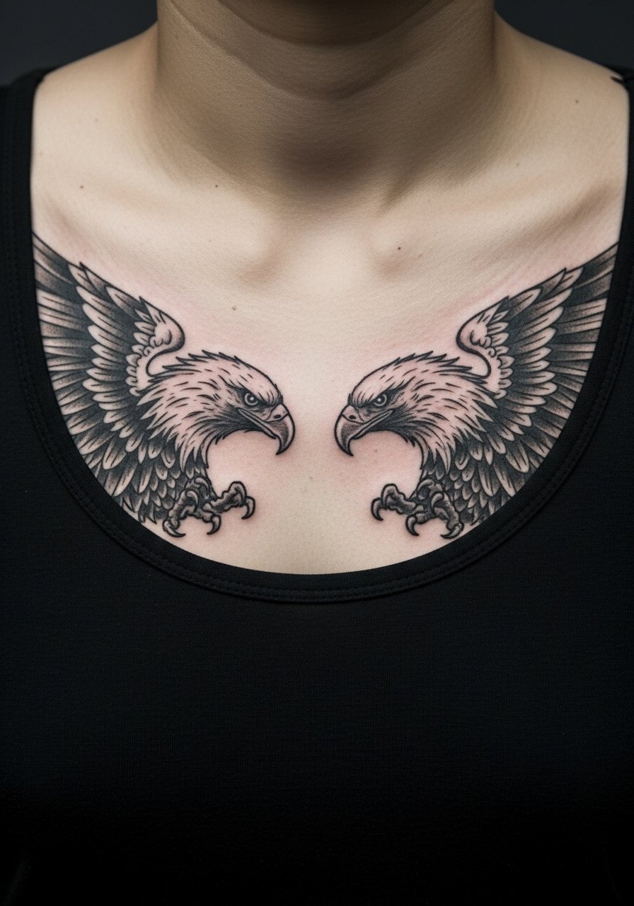
Start with a personal observation: blackwork holds up on the chest because saturation resists blur better than hair-fine detail. For a paired eagle piece, tell your artist you want thick outlines and solid fills on the wing edges so the motifs keep their silhouette as the skin settles. Pain on the sternum center can spike, but most of the pectoral surface sits at a moderate level. A common mistake is carving every feather in micro-detail. That reads great fresh and then ages into muddiness. For showing it off, deep V-necks or wide-neck shirts frame the spread without overexposing the sternum.
2. Paired Roman Numerals on Collarbones
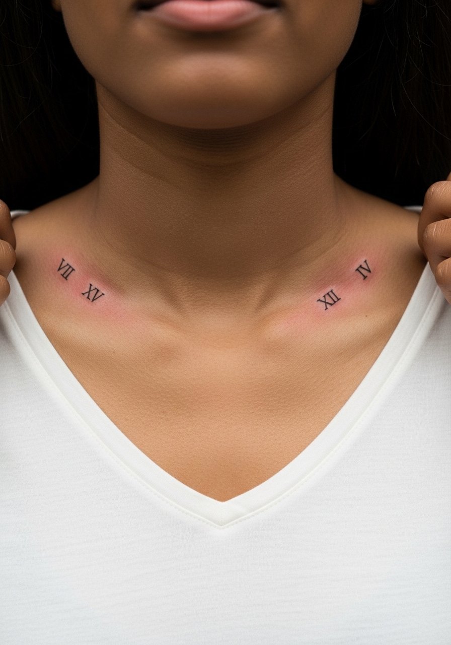
I've seen these done for dates, milestones, and sibling pairs. Keep the numerals at a size that reads from a short distance and avoid tiny serif work that blobs with time. During consult mention exact font weight and spacing so both sides match on the chest curve. Collarbone skin is thin and can sting more than the pectoral; expect shorter sessions and possible touch-up at year two. For easy display, pick shirts with a neat V-neck that puts the numerals in soft focus without tugging on the skin during daily wear.
3. Mirrored Geometric Panels Over Pectorals
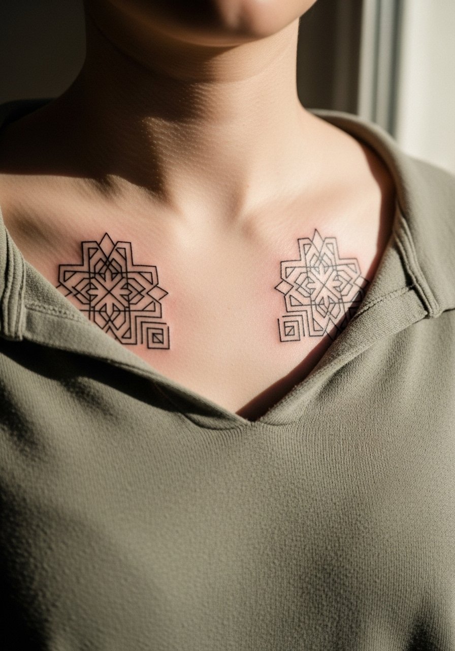
The visual impact lead fits this one because geometry reads from across a room when the lines retain crisp edges. The biggest mistake is scaling the shapes too small against the chest's expanse. Ask for negative space between the shapes to prevent dense areas from merging after a few years. Tell your artist you want consistent lineweight and a test stencil placed while you stand so gravity and chest anatomy are accounted for. For styling, a crew-neck lifted slightly frames the panels and keeps attention on the pattern without exposing the sternum.
4. Twin Linework Anchors on Left and Right Chest
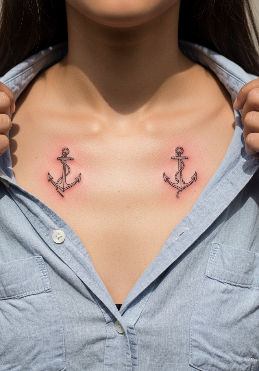
Fair warning: very thin anchors can blur on oily or thick skin. I recommend modest lineweight and single-needle detail limited to internal cues, not full shading. The outer pectoral is lower on the pain scale than the sternum and you can usually finish both anchors in one appointment. A frequent error is asking for micro-shading inside the anchor that presses too much ink into shallow skin. For show-off looks, roll up the sleeves and pull a loose button-down shirt slightly aside so the anchors peek out without being the whole outfit.
5. Matching Traditional Daggers Pointing Inward
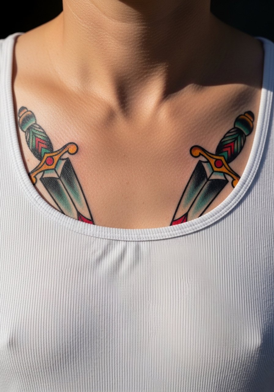
A visual and tactile note: traditional saturation ages differently from fine detail. Daggers with bold black outlines and solid color blocks are easier to touch up and tend to hold their shape. During the consultation, specify how much color saturation you want and request that outlines be bold enough to carry the composition. The big mistake is crowding the central sternum with tiny accents that age into noise. Expect moderate pain at the center and an appointment time long enough for color packing. Pair this with a tank top for casual show-off without exposing the whole chest.
6. Chest-to-Shoulder Samurai Crest Pairing
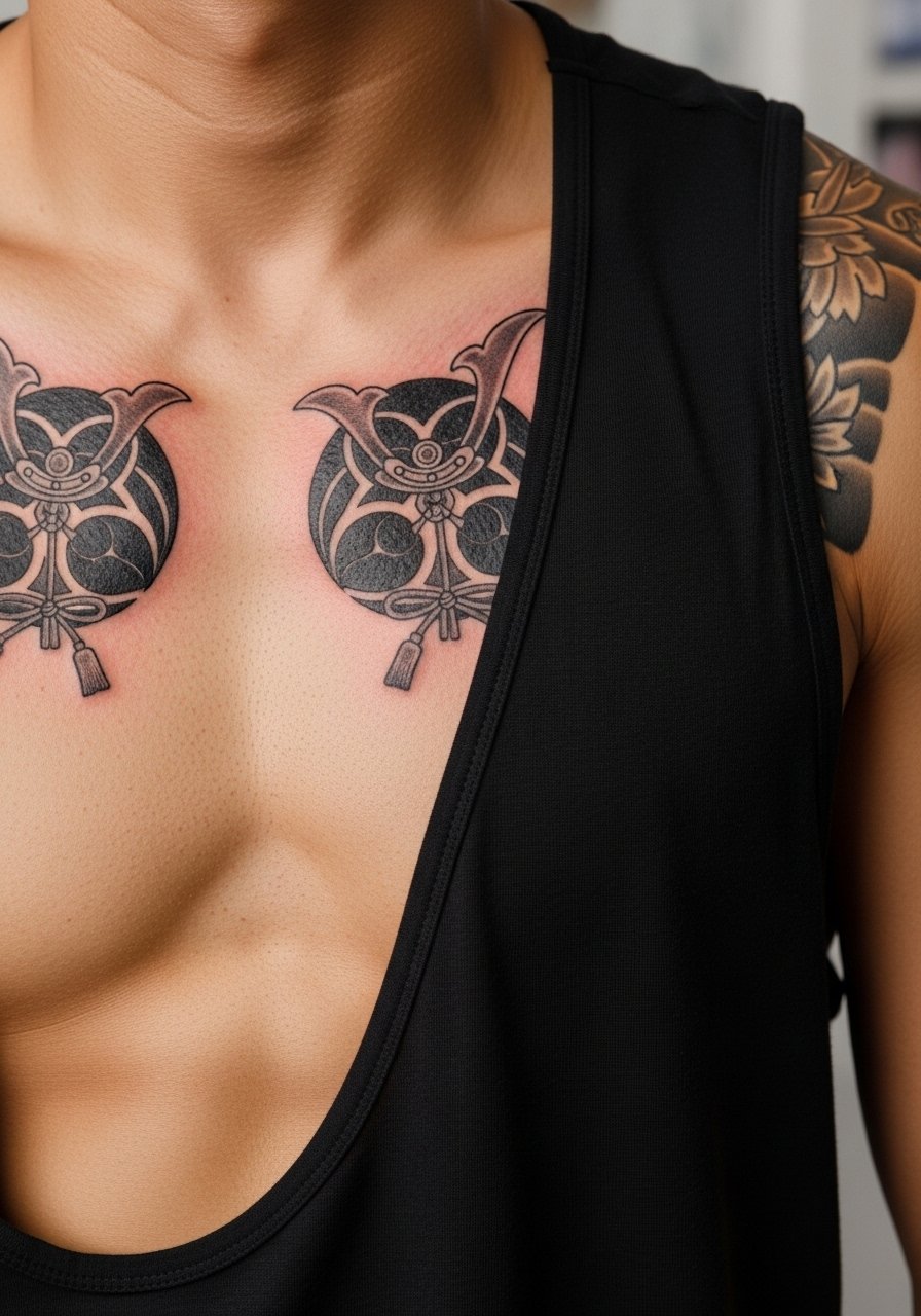
When you sit down with your artist for a chest-to-shoulder crest, bring references that show scale and shoulder flow. Contour matters here because the crest needs to read from the front and the side. The major mistake is not accounting for arm movement, which can skew a crest when the arm is raised. Chest-to-shoulder pieces take longer sessions and sometimes two sittings. For studio day wear, a loose tank top gives the artist easy access and keeps the session comfortable.
Studio Day Picks
The paired pectoral and shoulder crests above ask for different prep than a simple collarbone piece, so a few targeted items smooth the session and the first week.
-
Stencil transfer paper kit. Lets you preview how each mirrored crest hits the chest curve, which is key for symmetry before the needles touch skin.
-
Topical numbing cream. Applied as directed about 45 minutes before helps with sternum or inner-chest sensitivity without altering how the ink sits.
-
Thin protective film roll. Useful for covering small paired collarbone or wrist work during the first day of healing when clothing rub is inevitable.
-
Fragrance-free body wash. A gentle wash keeps chest tattoos clean during showers without stripping delicate linework or irritating swelling.
-
Aquaphor healing ointment. A thin layer in the first 48 hours locks in moisture for bold blackwork and fine line pieces while you sleep.
7. Sternum Crescent Moon Duo
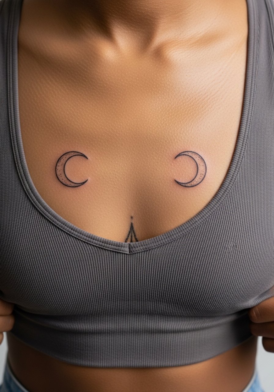
Aging and healing are front of mind here because sternum skin shifts with breathing. Most artists split into two camps on sternum fine line. One camp argues the stretch blurs delicate lines in two years. The other camp says with proper needle depth and spacing it settles fine. Ask your artist which approach they favor and expect a touch-up timeline at year two to three if you pick very fine detail. Session pain is higher on the sternum but visual payoff from a symmetric moon pair is strong. For session wear, a fitted sports top you can pull slightly aside keeps modesty and comfort.
8. Mirror-Image Micro-Realism Portrait Halves
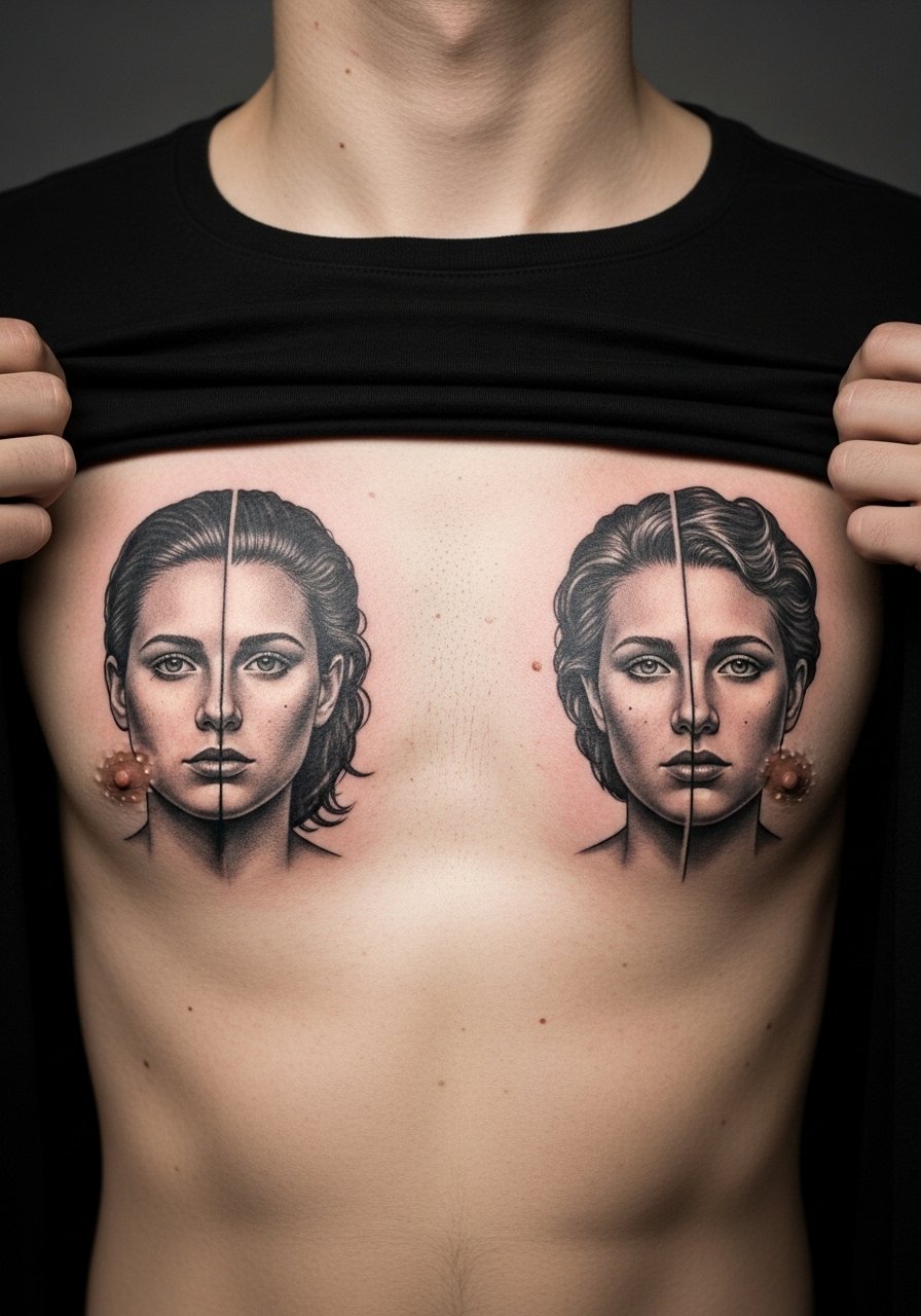
The consultation lead works here. Bring high-contrast photo references and request that the artist map the faces across your chest while you stand. Mirrored micro-realism needs negative space buffers because skin movement and gravity can soften tiny facial details. The common mistake is forcing micro texture into the center seam where touch-up access is hardest. Sessions run long and often require two sittings. For showing it off, a wide-neck shirt keeps the composition visible without tugging at the center seam.
9. Bold Tribal Panels Framing the Sternum
There's something about bold black tribal panels that reads as architectural on the chest. The right version uses negative space to define the sternum rather than tiny intricates that won't survive heavy sweat or friction. Tell your artist you want large fields of saturation with clear edge breathing room to avoid blowout risk. A common error is packing thin curves too close to the center where motion merges them. These pieces heal predictably if you limit time in the sun for the first six months. Pair with a wide-neck top when you want the panels to frame the chest.
10. Fine Line Constellation Across Upper Chest
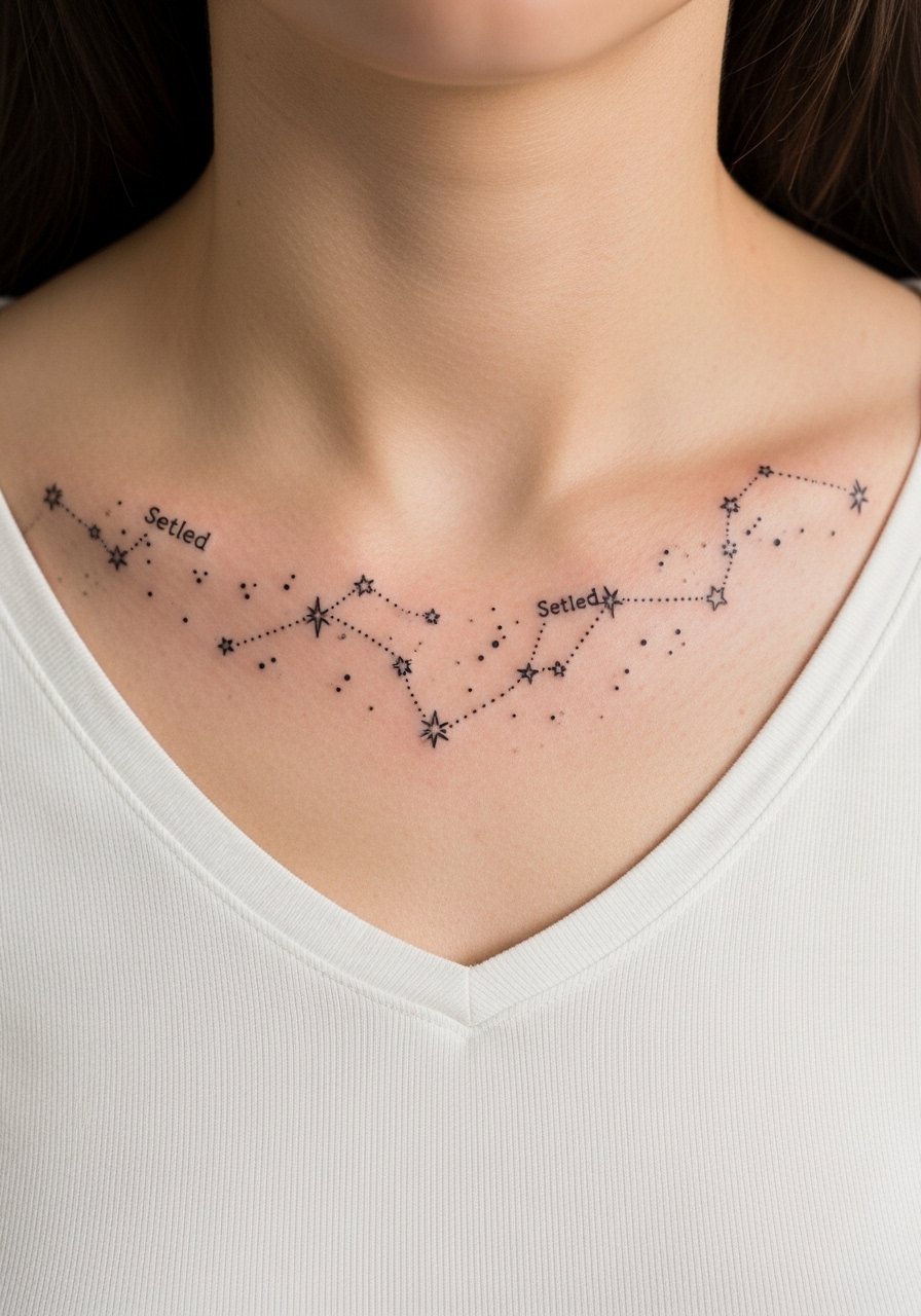
Most watercolor and ultra-fine pieces look fragile after five years. With constellations the trick is spacing and slightly heavier pinpoints for star anchors. Artists disagree about chest fine line in general. One group warns that thin work on the chest fades and merges quickly. The other says careful spacing and slightly heavier dots prevent softening. I recommend asking for dot anchors set at distances that allow the skin to age without losing the pattern. Pain is moderate and touch-up at year three is common. For wearing, a V-neck or open collar shirt shows the map without stretching it.
11. Paired Script Phrases Under Each Collarbone
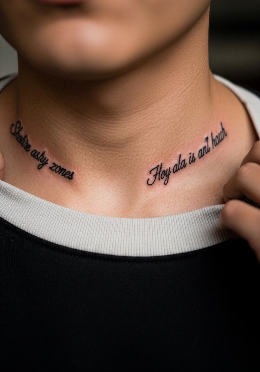
When you choose mirrored script, be precise about font and spacing in the consult. The wrong script size looks charming at first and then turns into a blur of loops. A mistake people make is asking for tiny flourishes that lose definition when the skin moves. Collarbone script heals faster than sternum work but may need a light touch-up at year two. For a clean display, a crew-neck shirt pulled slightly aside keeps the lines visible and reduces friction during daily wear.
12. Anatomical Heart Halves That Meet at the Center
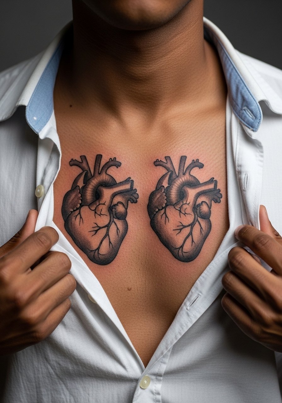
Aging/healing lead fits this one because heavy shading at the center needs room to breathe. Ask your artist to leave a narrow but clear seam between the halves so the join reads intentionally as two parts. The common mistake is punching contrast too close to the center where touch-ups are fiddly. Expect a moderate session length and plan for one light touch-up in the first two years. For studio day wear, a loose button-down shirt keeps the area accessible while staying modest.
13. Matching Mandala Halves Over the Pecs
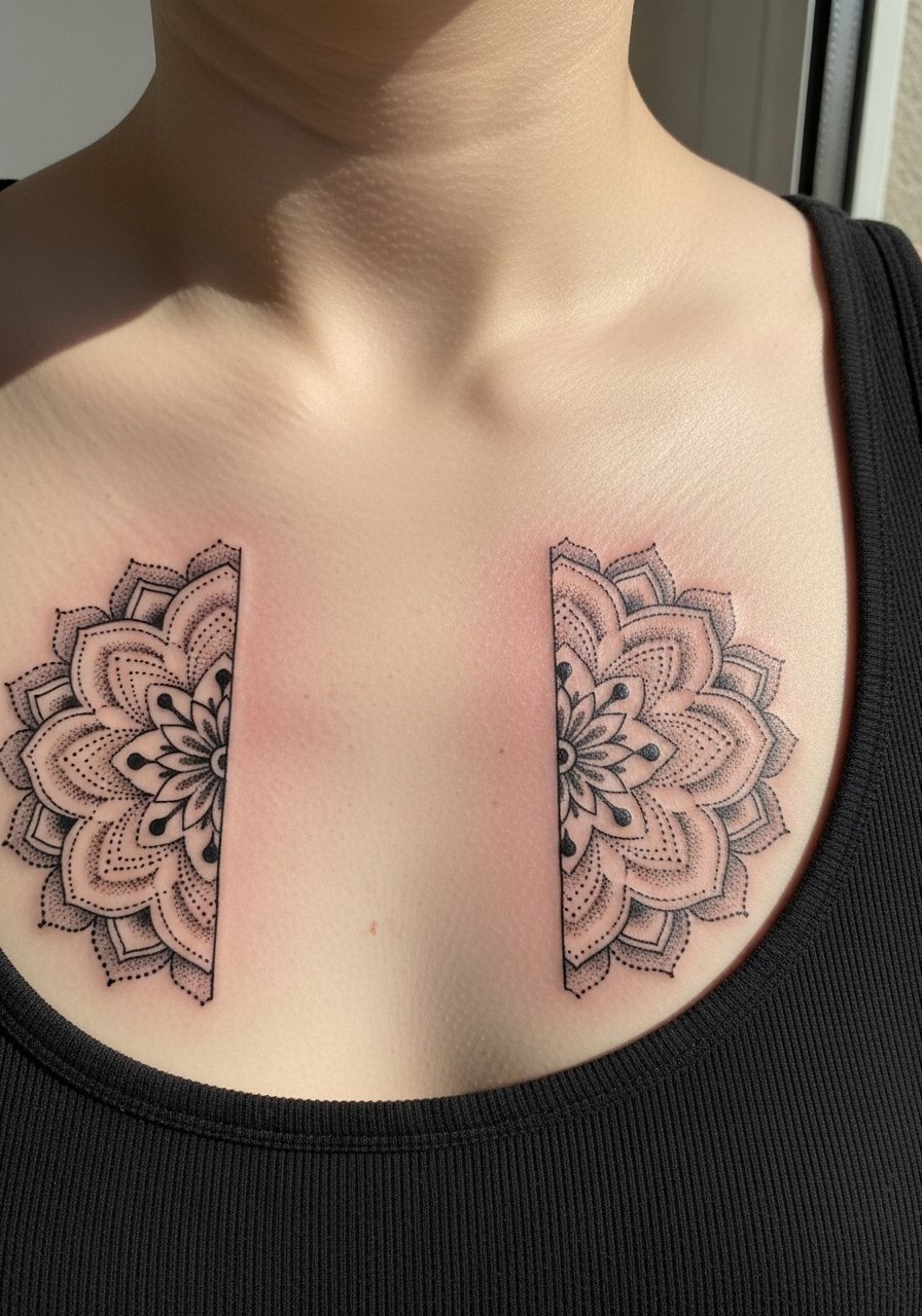
The controversy is visible here because mandala detail tempts tiny repetition. Artists split into camps on chest mandalas. One camp insists micro linework on the chest softens too quickly. The other camp accepts slightly heavier lineweight and expanded spacing to preserve motif integrity. If you want a mandala look that ages well, request stipple shading instead of dense black fill and ask for radial spacing that avoids crowded rings. Pair with a tank top when you want the radial symmetry to read in casual settings.
14. Chest Compass Paired with Back Map
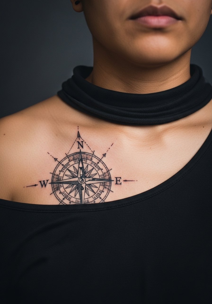
A consultation note: when a chest piece is designed to relate to a back map, line weight and scale must match across sessions. Visually the compass needs strong primary lines so it remains legible when viewed with the back piece from different angles. The mistake is treating them as separate projects. Plan the two pieces together so the composition reads cohesive. For studio prep wear a wide-neck shirt that can be shifted for chest and back access during different sittings.
15. Minimalist Bar Bands Under the Pectorals
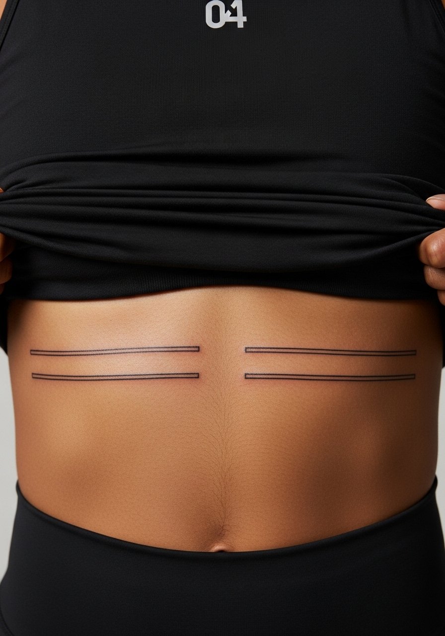
The visual lead: simple bar bands look graphic when the linework maintains straightness over time. The key is not asking for hairline single-needle bands on active or oily skin because they blur faster. Ask for a modest lineweight and for the artist to stencil the lines while you stand to account for posture. Bands heal cleanly but may require a touch-up at year three. For session wear, a fitted athletic top you can pull slightly down is the most practical option.
16. Matching Barcode or Coordinates on Each Side

The mistake with barcode or coordinates is demanding ultra-tight machine precision without considering skin grain. Tell your artist you want clear spacing and thicker line endpoints so the code reads visually instead of melting into a grey strip. Coordinate tattoos with exact text should include the exact characters in the consult and in the image prompt if used for reference. These pieces are fairly low pain and quick to execute. For show-off wear, a crew-neck shirt pulled aside frames the graphic without overexposure.
17. Flanking Lion Heads in Realistic Black and Grey
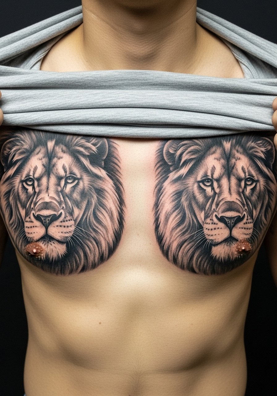
A visual impact lead works here because realism across the chest reads powerful when contrast is preserved. Tell your artist to prioritize strong midtones and avoid overworking tiny whisker details near the seam. The central join at the sternum is a common spot where details can muddle if too dense. Sessions are long and may benefit from staged sittings to maintain color saturation and minimize swelling. For wardrobe, a wide-neck shirt lets the faces sit in view without pulling at the center.
18. Rope and Chain Linkwork Framing the Chest

The consultation lead: materials like rope and chain read as texture when line spacing allows each link to breathe. The common error is packing links too tightly to save space. If you want these to remain legible, ask for slightly exaggerated negative gaps and request the artist demonstrate the stencil while you move your arms. Pain is mild across outer pectorals and the session time is moderate. Style with a loose button-down shirt that reveals the framing without tugging.
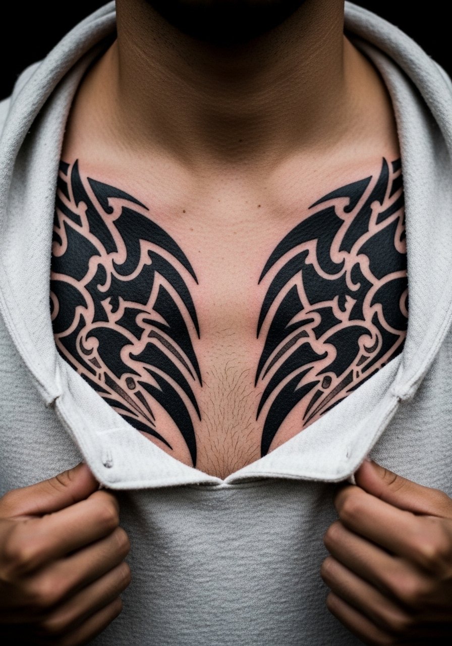
19. Paired Wing Motifs Spanning Across the Sternum
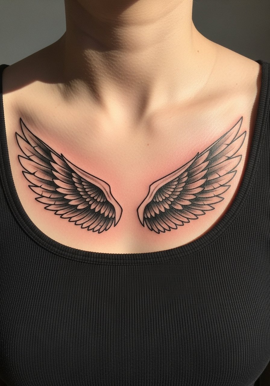
The visual lead applies because wings give motion to the chest when done with the right spacing. The common mistake is drawing every feather and expecting it to stay crisp. Instead, ask for bold primary feathers with lighter, suggestive inner strokes so the wing reads from a distance and close-up. Sternum center will be the most painful part to ink and may need a brief break. For display, use a tank top that reveals the wings without exposing the torso fully.
20. Two-Panel Nature Scene Split at the Center
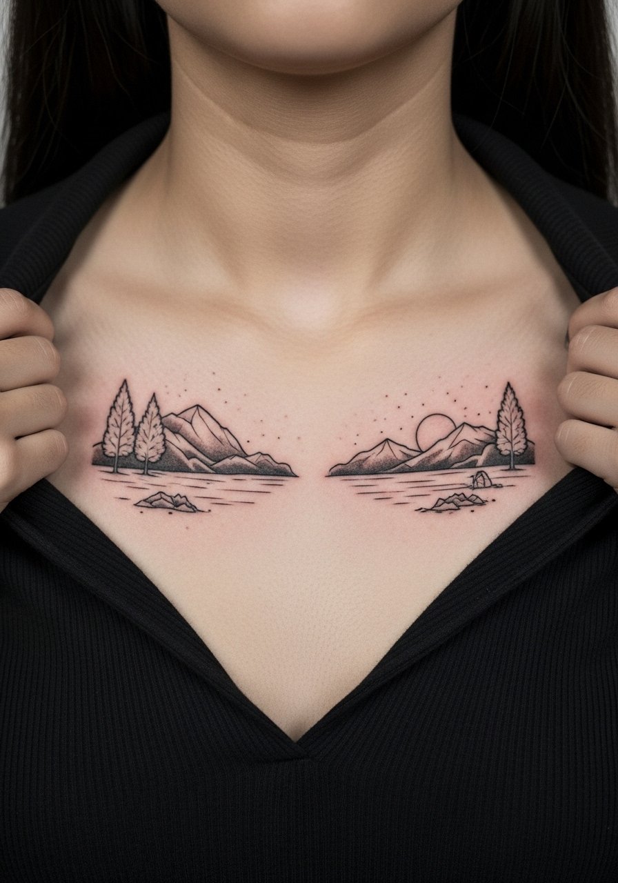
A mistake people make is over-detailing the halves so they compete instead of complementing. Ask your artist to design with matching tonal language so the two panels read as a single landscape when seen together. Expect moderate session time and a likely touch-up for any delicate lines near the center seam. For the session, a wide-neck shirt pulled aside gives good access while keeping things modest.
21. Armor Plate Blackwork That Mirrors Across the Chest
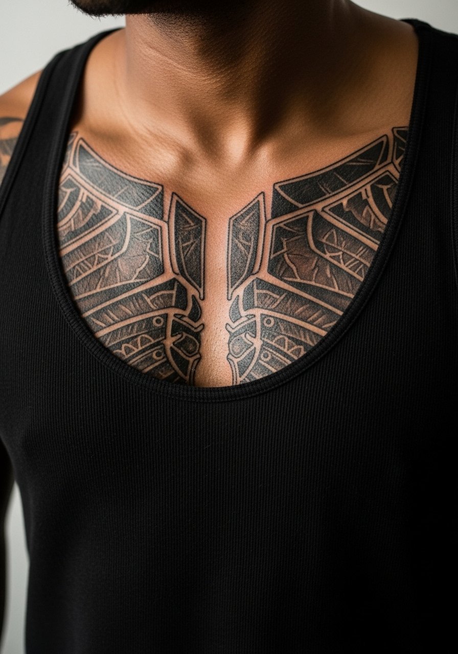
The visual and aging lead: armor plate blackwork reads strong because it relies on silhouette and edge contrast rather than micro detail. The biggest mistake is trying to force metallic highlights into solid black fields. For longevity, ask for clean edges and a bit of negative space at hinge points so the plates stay defined. Sessions for heavy blackwork can be long and may need two sittings to avoid excessive swelling. For outfits that make the plates read, a tank top or an open button shirt frames the design without exposing the whole torso.
Frequently Asked Questions
Q: Will fine line chest tattoos blur faster than bold blackwork?
A: In my experience fine line tends to soften sooner because chest skin moves and gets friction from clothing. Bold blackwork trades some delicate detail for longevity by maintaining silhouette. If you prefer fine line, plan for a touch-up window at year two to three and request slightly heavier anchor points during your consult.
Q: How should I choose between a mirrored chest piece and a single-centered design?
A: Think about how your wardrobe shows the chest. Mirrored pieces play well with V-necks and open shirts while a centered design works with crew and athletic tops. Also consider movement. Mirrored halves can age more predictably if each side has room to breathe rather than forcing detail into the center seam.
Q: Do chest tattoos affect professional settings more than arm tattoos?
A: This depends on your industry and how often you shirtless or wear low collars during work. Chest tattoos are easier to conceal under buttoned shirts and crew necks than hand or neck tattoos, but if you often wear open-collar looks consider a design placement that sits higher under the collarbone.
Q: What should I wear to the studio for a sternum or pectoral session?
A: Wear something you can adjust so the artist has access without you getting cold. A loose button-down shirt or a tank top you can shift works best. Avoid tight fabrics that pull at the skin near the stencil area.
Q: Are chest tattoos from specific cultures safe to use as inspiration?
A: Designs with clear cultural origins deserve respect. If you choose a motif from a living tradition, consider modifying it or asking the artist about culturally informed alternatives. Discovery channels like community forums and cultural centers can help you learn more before committing.